CHER Beauty | Packaging Rebranding

Anita Autorino


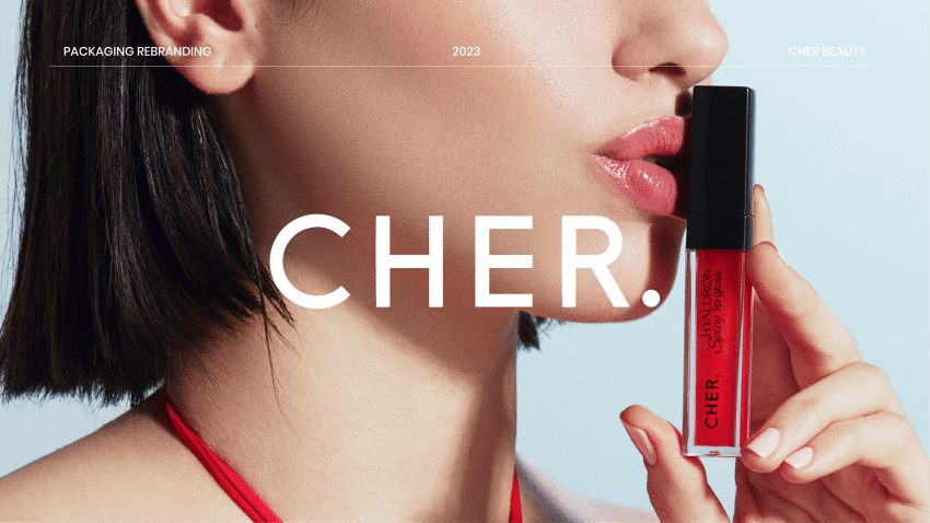


CHER Beauty is an innovative and sophisticated brand committed to excellence and creating exceptional experiences for its customers. It blends boldness and timelessness in its design, offering high-quality products. The rebranding of CHER Beauty's packaging emerges from the pursuit of aspirational minimalism. In our collaboration, we have revitalized CHER Beauty's identity, capturing.
THE ASK
My task was to revamp the packaging design, seamlessly integrating the key attributes of both Maria Cher (a renowned Argentinean fashion brand) and the spirit of Argentinean women. Distilling the essence of both entities, we identified a set of core values. Among these, certain traits emerged as particularly impactful: boldness, creativity, innovation, classic elegance, timeless appeal, strength, and inspiration.

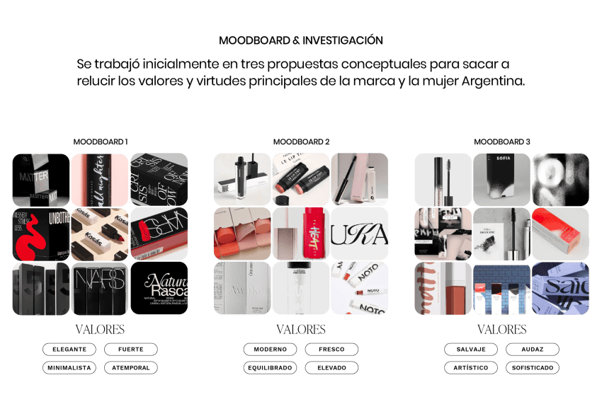
Following this exploration, I delved into creating moodboards and exploring styles that would effectively convey these values. This initial research laid the groundwork for designing conceptual drafts that aimed to encapsulate the unique synergy between Maria Cher and the empowering essence of Argentinean women.
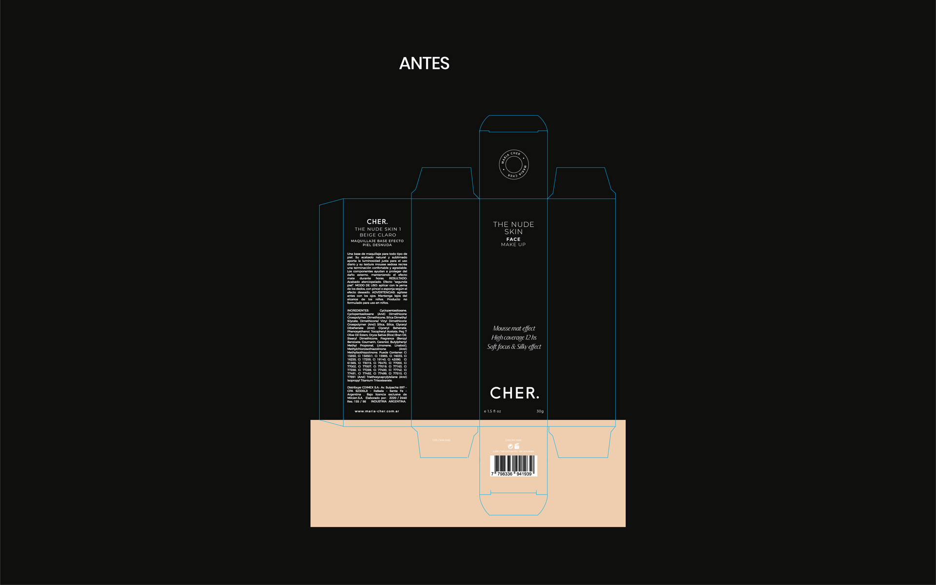
From the packaging analysis I could find 3 issues to solve:
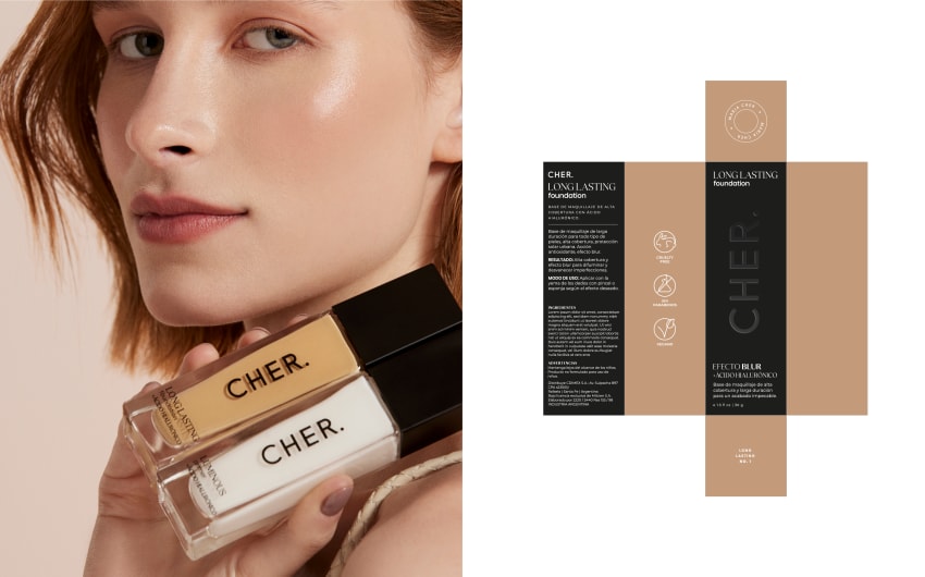
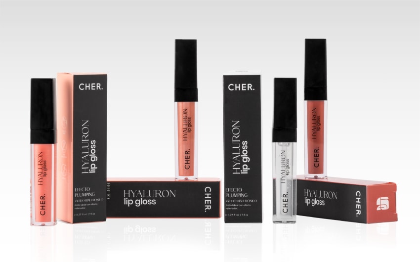
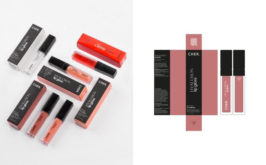
- INFORMATION AND IDENTITY: Products lack information resulting in a loss of benefits and the product's promise. Lack of identity and reflection of brand values.
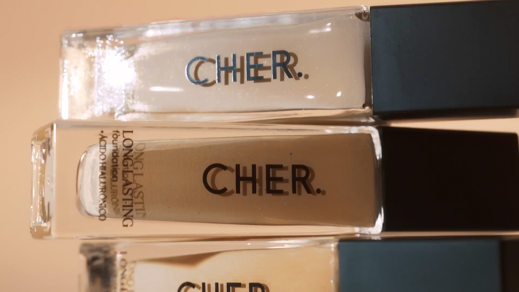
- SHY TYPOGRAPHY: The product name is challenging to grasp at first glance, requiring extensive reading. While the brand has a presence, it is timid.
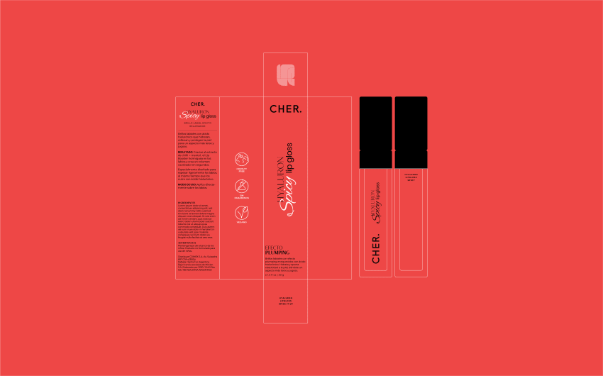
- LACK OF HIERARCHY: The back features an unconventional layout, with ingredients at the same level as product information. Justified typography hinders readability, creating irregular spaces and uneven distribution on the page.
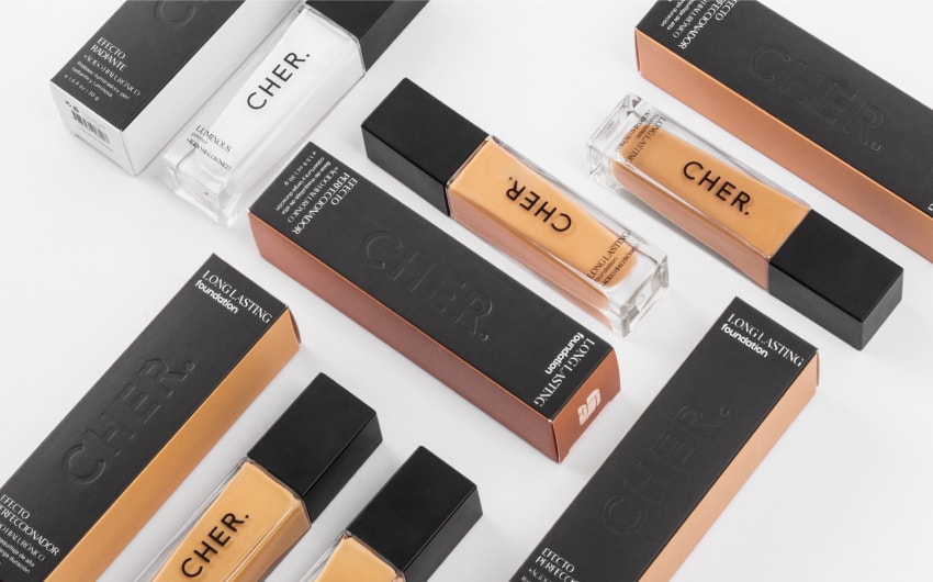
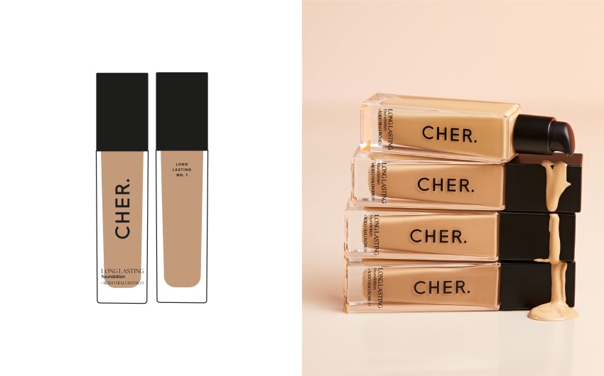
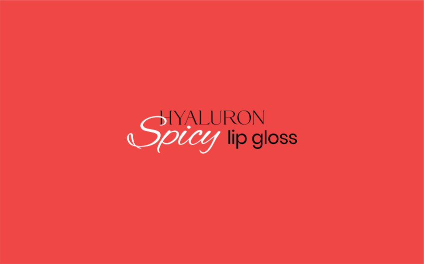
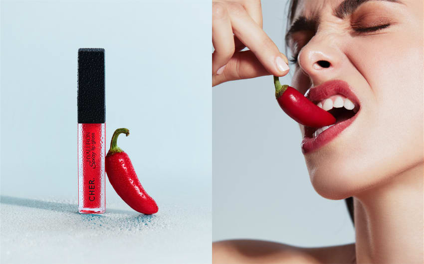
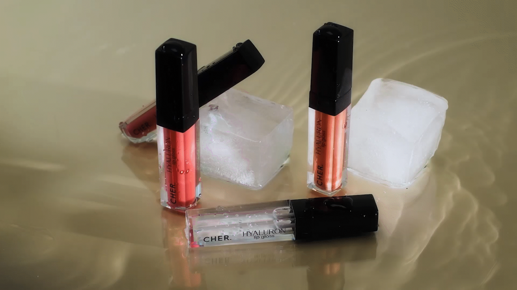
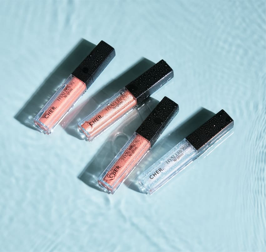
THE RESULT