Designing a Seamless Promo Code Flow
Maty Sandoval
🎟️ Case Study: Designing a Seamless Promo Code Flow
Role: UX/UI Designer
Client: Confidential – Marketplace App (in development)
Duration: 1-day design sprint
Context
The client approached me with a small but high-impact request:
“We need users to apply promo codes easily before checkout.”
It sounded simple, but as every designer knows, a promo code flow can either elevate or frustrate the shopping experience. The goal was clear — design a smooth, transparent interaction that lets users feel rewarded, not confused.
The Challenge
The marketplace already had a well-structured cart and checkout experience, but no way to apply promotions.
I needed to:
Introduce the promo flow without breaking the checkout rhythm.
Provide instant, clear feedback for valid/invalid codes.
Keep everything aligned with the existing visual and UX language of the app.
The Process
🧠 Step 1: Mapping the User Flow
I started by sketching out all possible user scenarios — from adding products to removing an invalid promo code.
The flow covered success, error, and removal states, ensuring the system always communicates clearly with the user.
(Flow diagram shown on the left.)
💻 Step 2: Designing the Experience
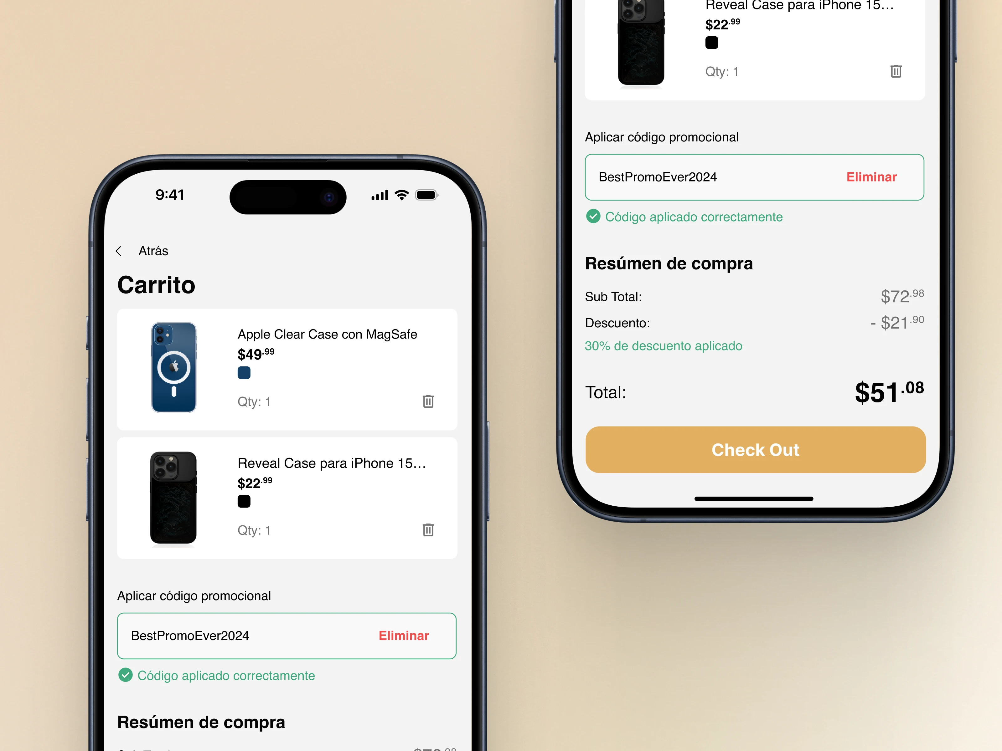
I created four key states to tell a simple story:
1️⃣ Product Page – Users add products to their cart.
2️⃣ Cart Page – A subtle promo field appears, prompting engagement.
3️⃣ Apply Code – The user types and taps Apply.
4️⃣ Success Feedback – A satisfying green confirmation message and updated total appear.
Each transition was designed to feel predictable, responsive, and rewarding.
The Result
✅ Clear and intuitive promo code experience
✅ Visual consistency with the marketplace’s design system
✅ Instant feedback and reduced friction
✅ Future-proof flow — easy to scale for multiple codes or automatic discounts

Like this project
Posted Nov 4, 2025
Designed a seamless promo code experience that boosted user engagement and made saving feel effortless.
Likes
1
Views
16
Timeline
Nov 3, 2025 - Nov 3, 2025