Mobile app design - AI Nutrition App

Ruslan Subbota


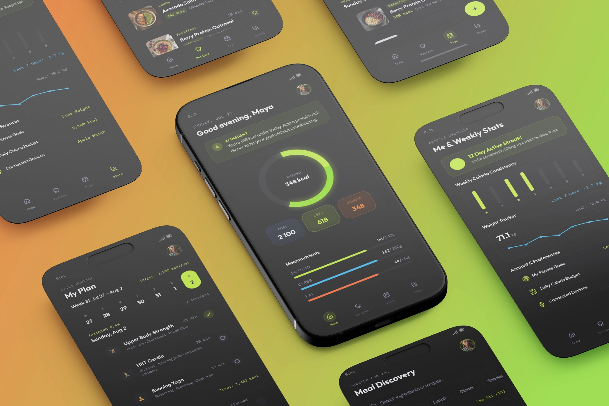
Mobile app for AI nutrition
Overview
A daily nutrition and training companion for people who don't want to think in spreadsheets. The app pulls calories, macros, workouts and meals into one dark, glanceable interface - built around a single idea: you should understand your day in three seconds, not three taps. Home surfaces an AI-generated insight the moment you open the app, Plan turns the week into a single scrollable routine, Recipes recommends meals that actually fit what's left in your budget, and Stats turns consistency into something you can see, not just track.
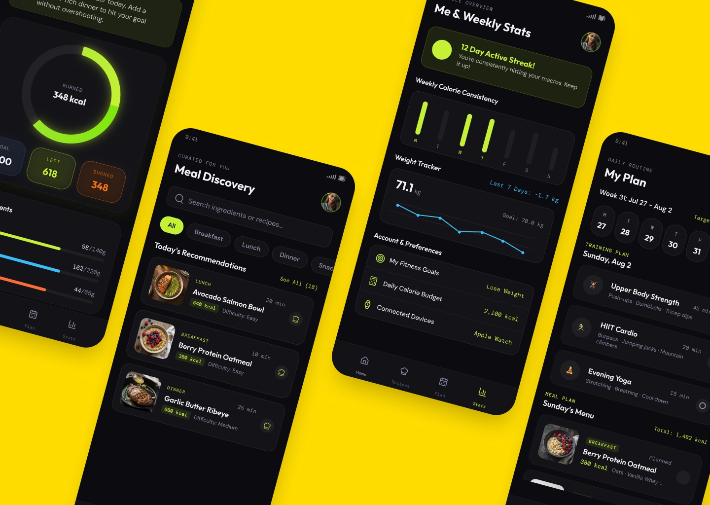
User Dashboard
Challenge
Most fitness and nutrition apps drown people in numbers - grams, percentages, streak counters, charts - and call that "motivation." The real problem isn't missing data, it's that raw data doesn't tell you what to do next. A user finishing dinner shouldn't have to do mental math to figure out if they're on track; they should just be told. At the same time, the app needed to avoid the two failure modes of this category: clinical and cold (looks like a hospital chart) or loud and gamified (looks like a kids' app). It had to feel premium and calm even while showing motion, color and live numbers on every screen.
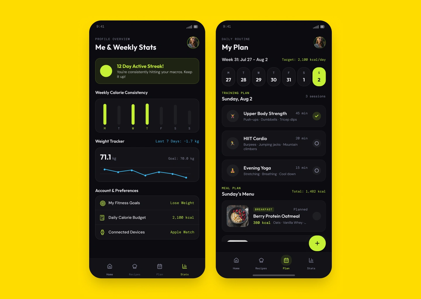
Personal Plan
Solution
The interface leans into a single visual signature - a near-black canvas with one accent color, lime green, reserved for anything that means "on track" or "you're doing this right." Everything else stays quiet: warm dark grays, soft card surfaces, no clutter. That restraint is what makes the accent color mean something every time it appears - the calorie ring, the streak badge, the active tab.
The result is an app that feels less like a tracker you maintain and more like a coach that already did the math.
Concept project - designed as a speculative case study, not built for a real client.
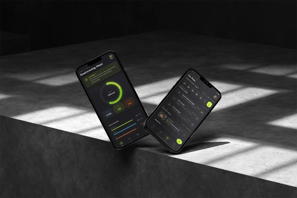
The bigger shift was structural, not visual: instead of separate screens for "log food," "see stats," and "plan workouts," every screen leads with an answer, not a form. Home opens with an AI-generated sentence, not a dashboard - "you're 618 kcal under today, add a protein-rich dinner" - and only then shows the ring and macros as supporting evidence. Plan compresses a full week of training and meals into one horizontal day-picker, so the user never has to think about navigation, only about today. Stats reframes progress as a streak and a trend line instead of a wall of metrics, which reads as encouragement rather than a report card. Recipes closes the loop by recommending meals filtered against what the user has already eaten, turning "what should I cook" into a decision made for them, not a search problem handed back to them.
Like this project
Posted Jul 27, 2026
Designed a concept app for AI-driven nutrition tracking, optimizing user experience.
Likes
0
Views
17
Timeline
Jul 6, 2026 - Jul 27, 2026