Logistics is not a boring
Samson Akintunde
Logistics is not a boring category. It just keeps getting boring designs.
Blevox is a freight and logistics brand built to move across land, sea, and air without stopping. The brief was straightforward. My approach was not.
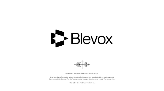
I started with a Swift. A bird that spends months in the air without touching the ground once. Scientists have tracked them crossing continents and oceans on a single flight. No layovers. No detours. Just locked-in forward movement until arrival. I did not want a mascot. I wanted a standard. So I reverse-engineered that standard into a brand identity.
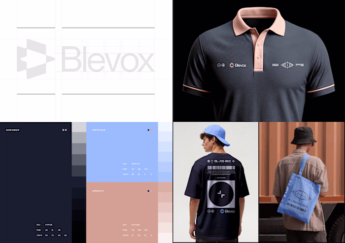
The colors came from the three worlds this brand operates in. Dark Knight for the sky it moves through at night. Pastel Blue for the horizon where sky and sea become one body. Apricotta for the earth; warm and human where every shipment finally lands.
The style is dark. Precise. Industrial. Every alphanumeric code, every dock marker, every grid line is a brand decision. Nothing decorative. Nothing arbitrary. A cap, a truck, a drone delivery box, a phone UI, the identity does not break on a single surface because I did not let it.
Most freight companies look like freight companies. I built Blevox to look like the thing freight companies are compared to.
Available for sale.
Full project here: https://www.behance.net/gallery/250824121/Blevox-Logistics
Like this project
Posted Jun 24, 2026
Logistics is not a boring category. It just keeps getting boring designs. Blevox is a freight and logistics brand built to move across land, sea, and air wit...