Humantra Retail-Ready Boots Packaging
Lala P.
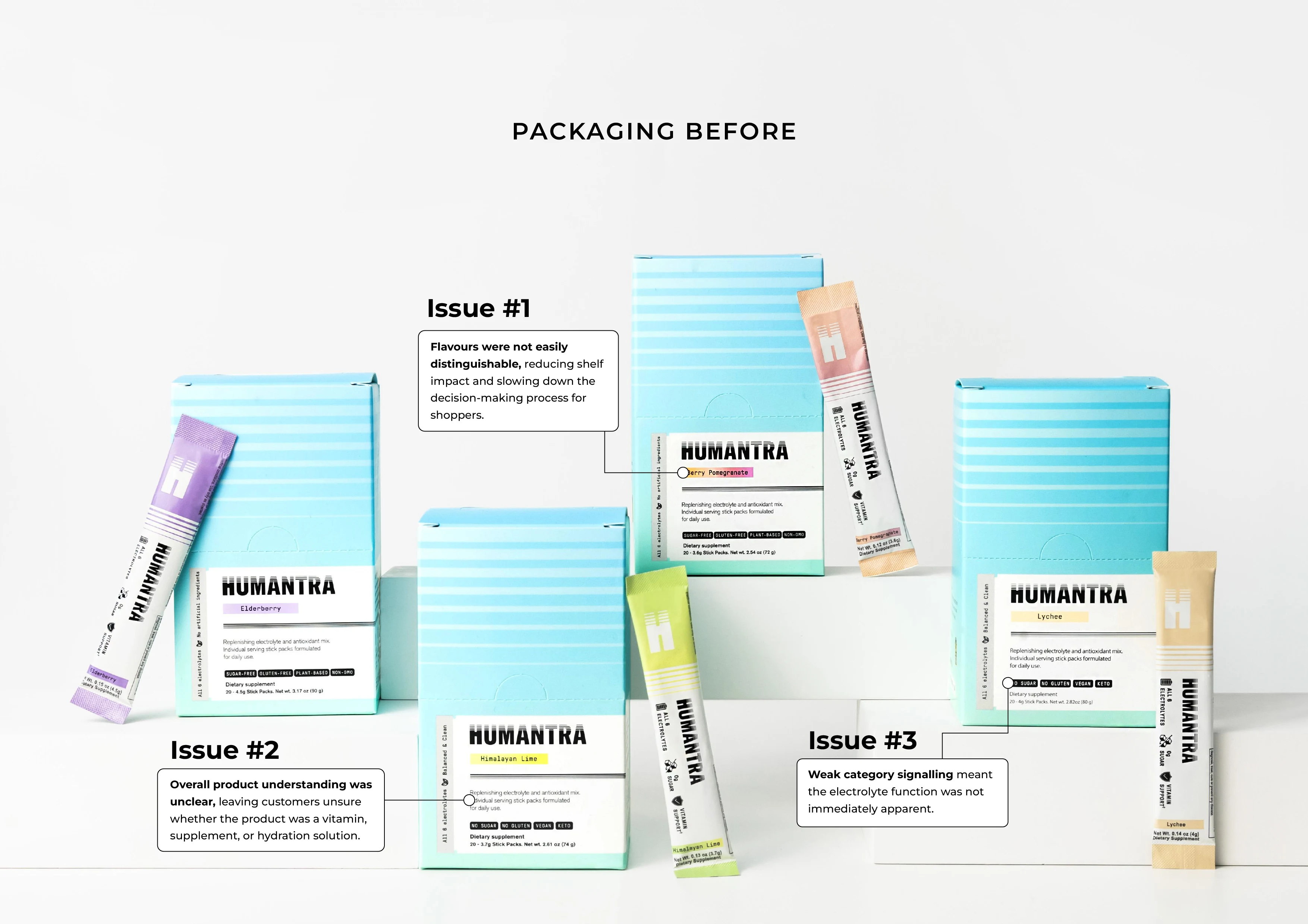
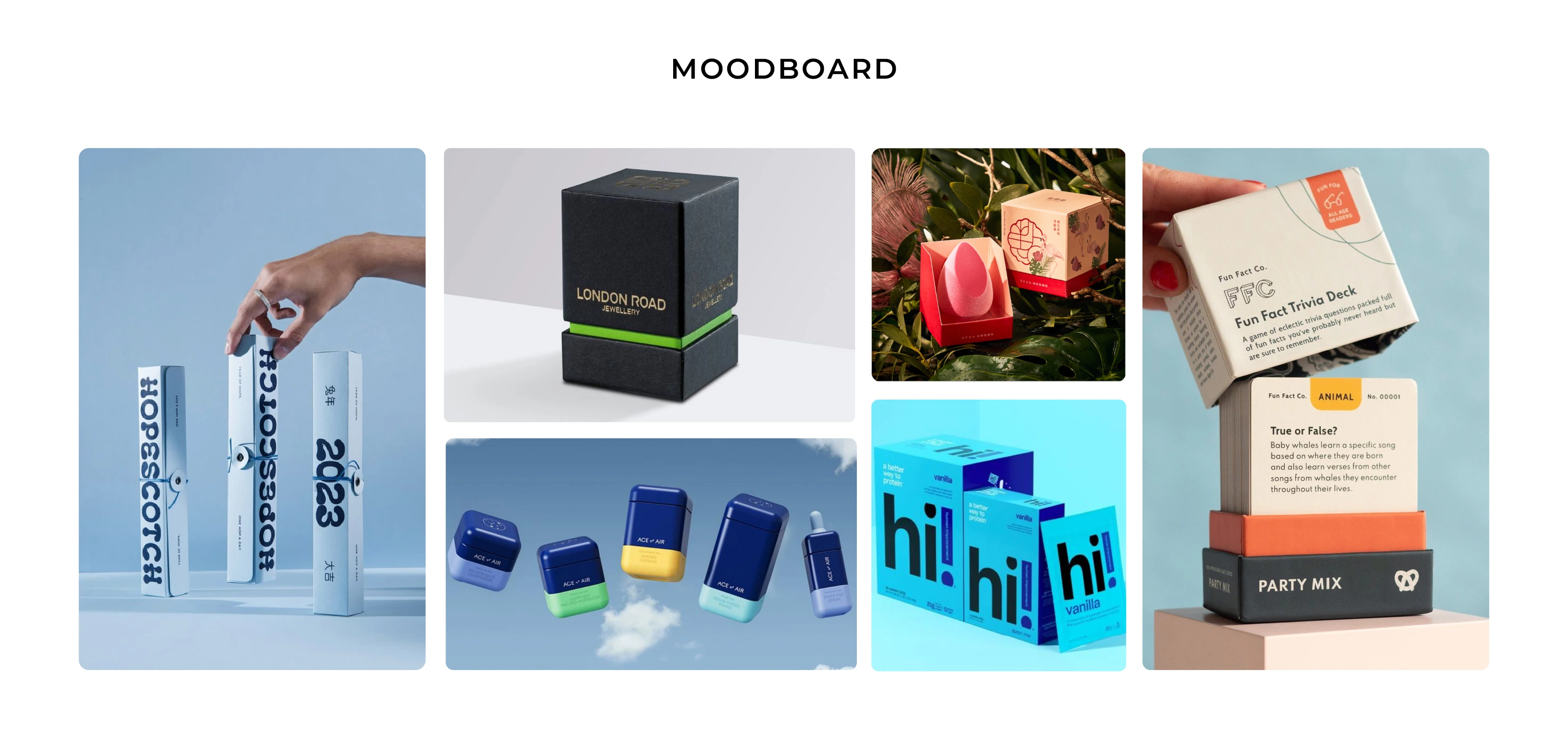
Project Challenge
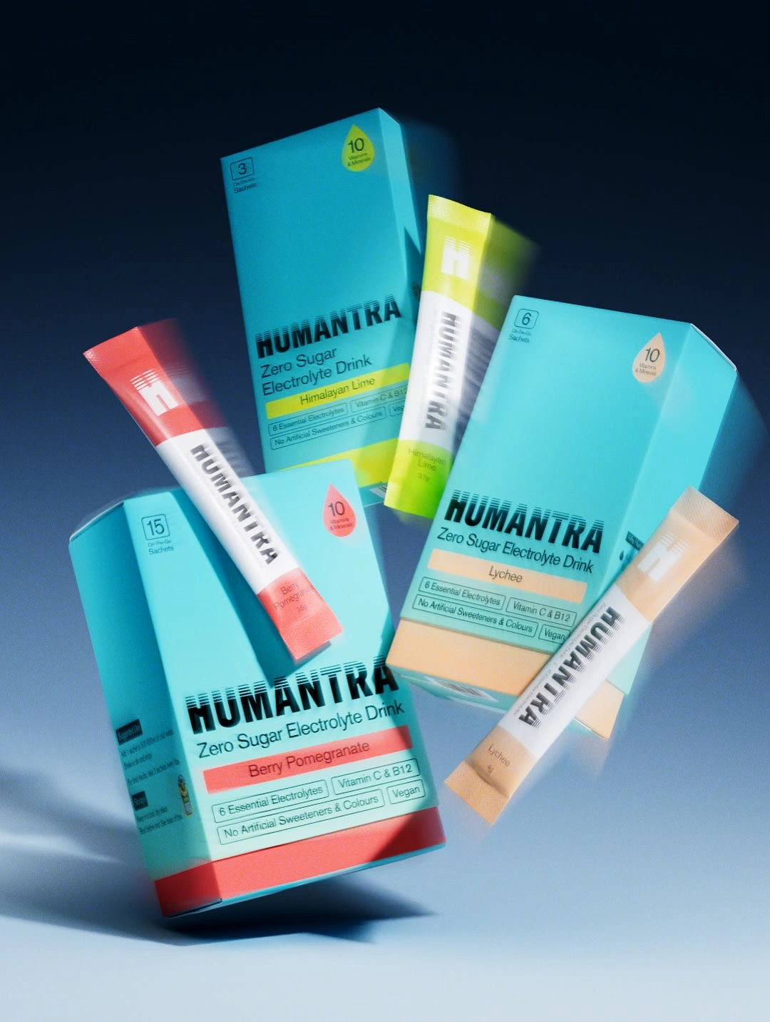
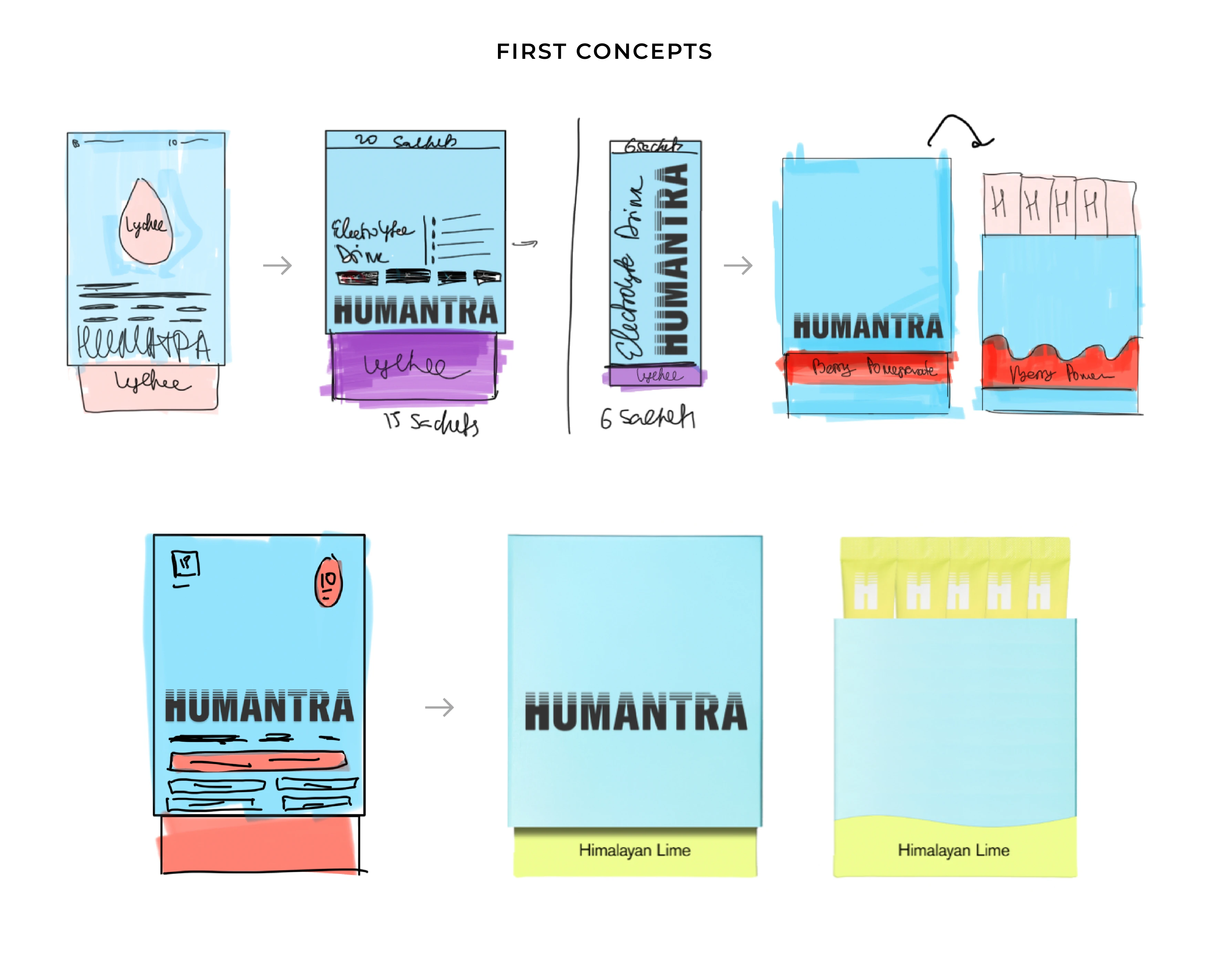
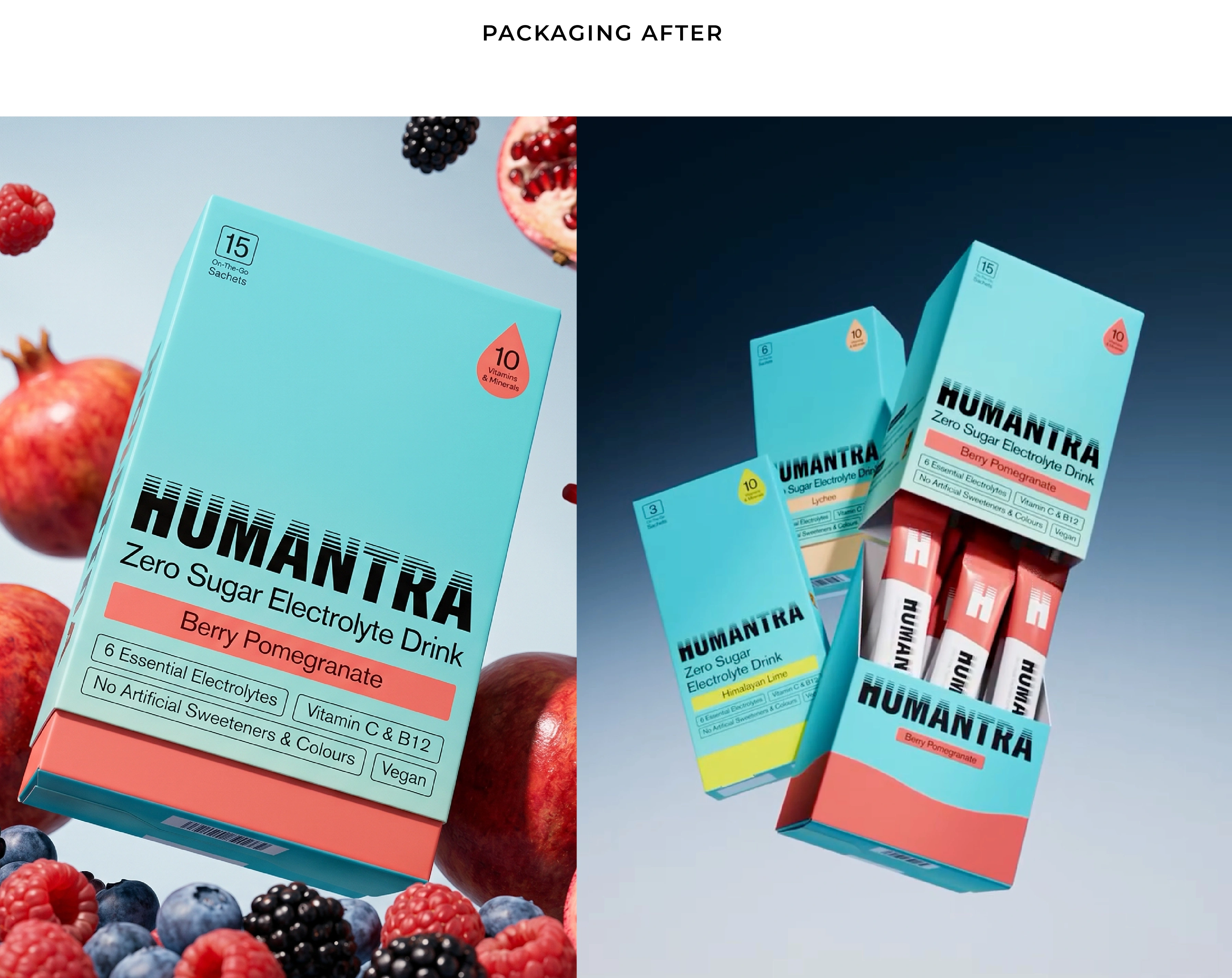
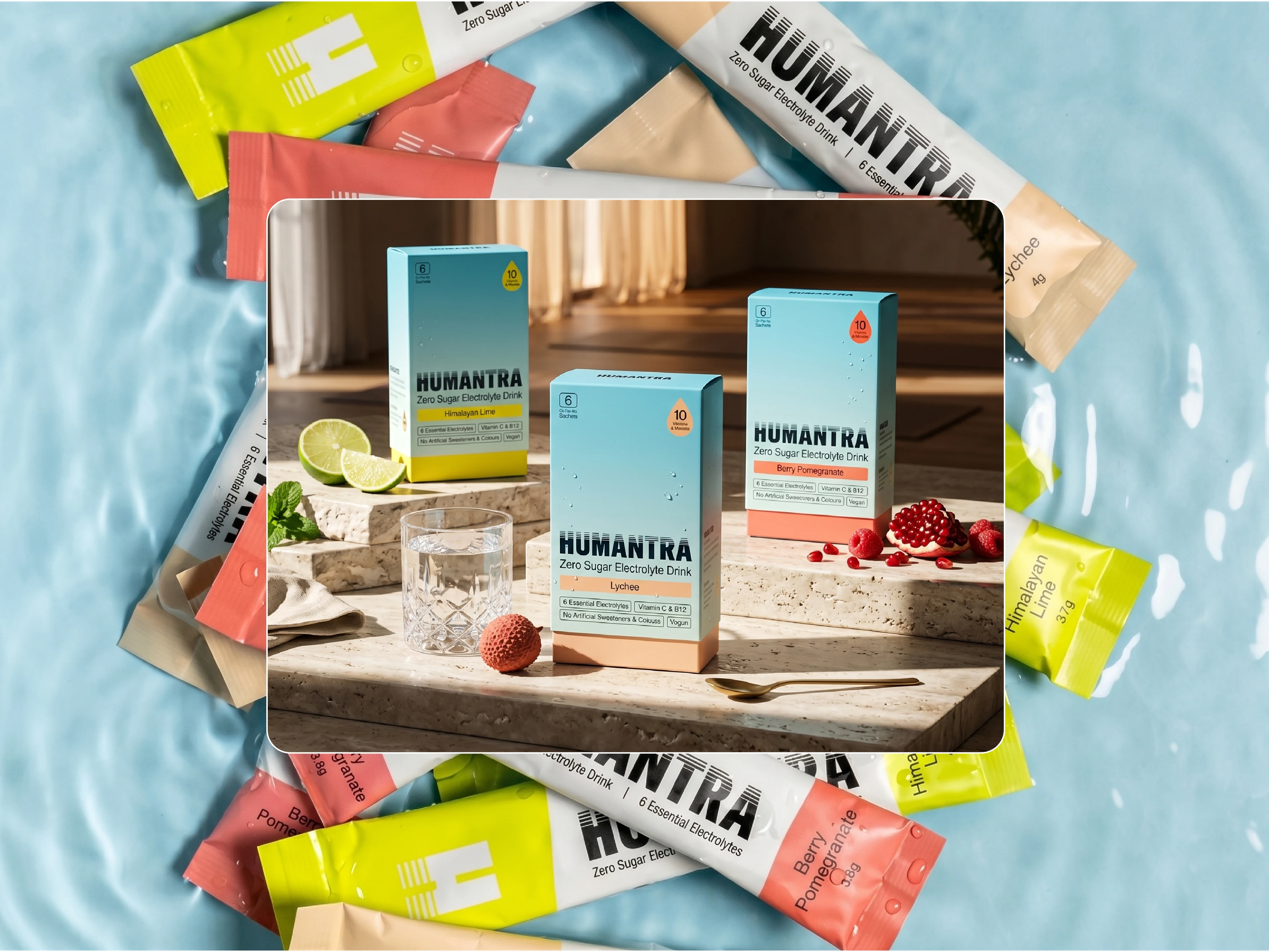
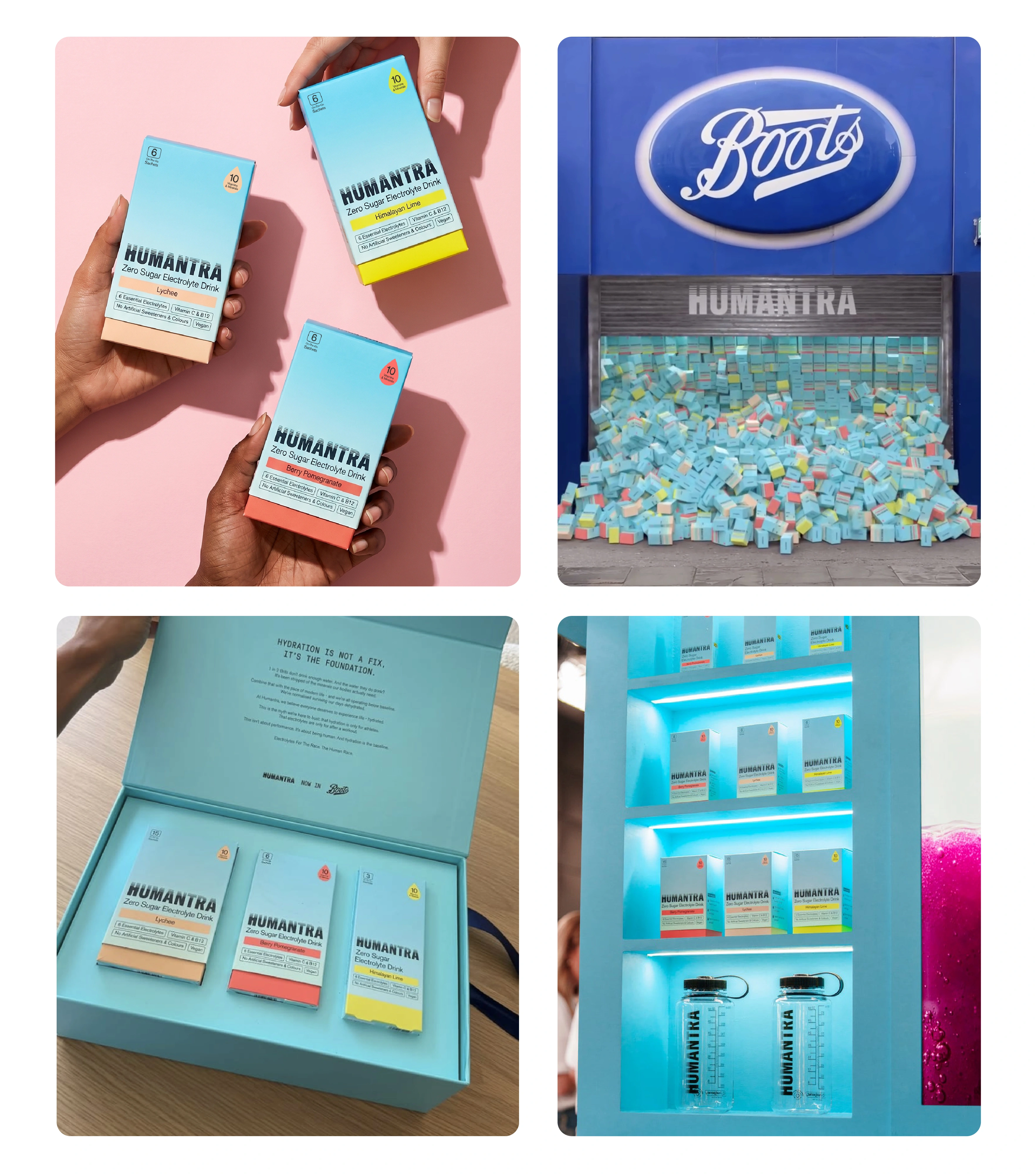
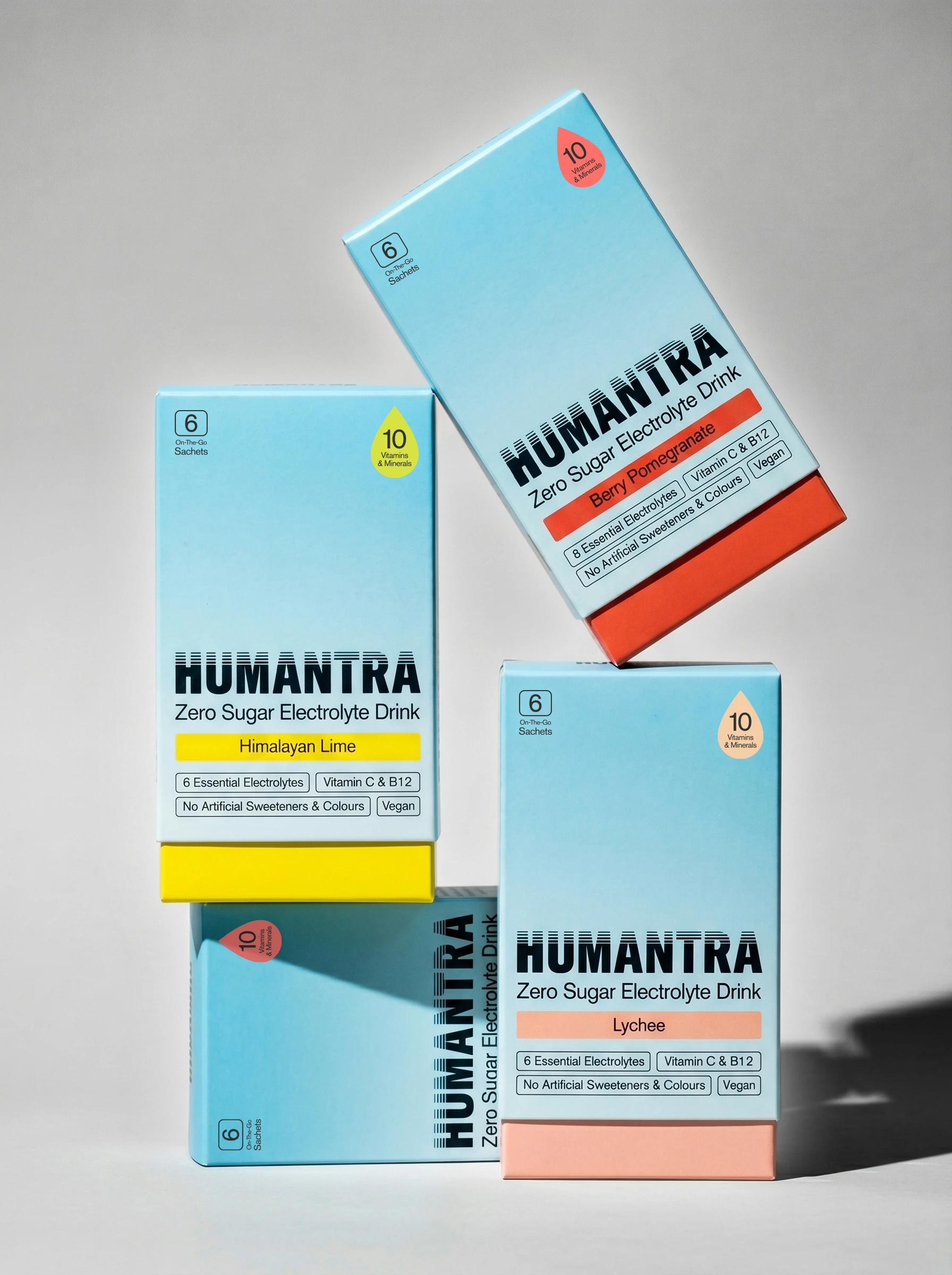
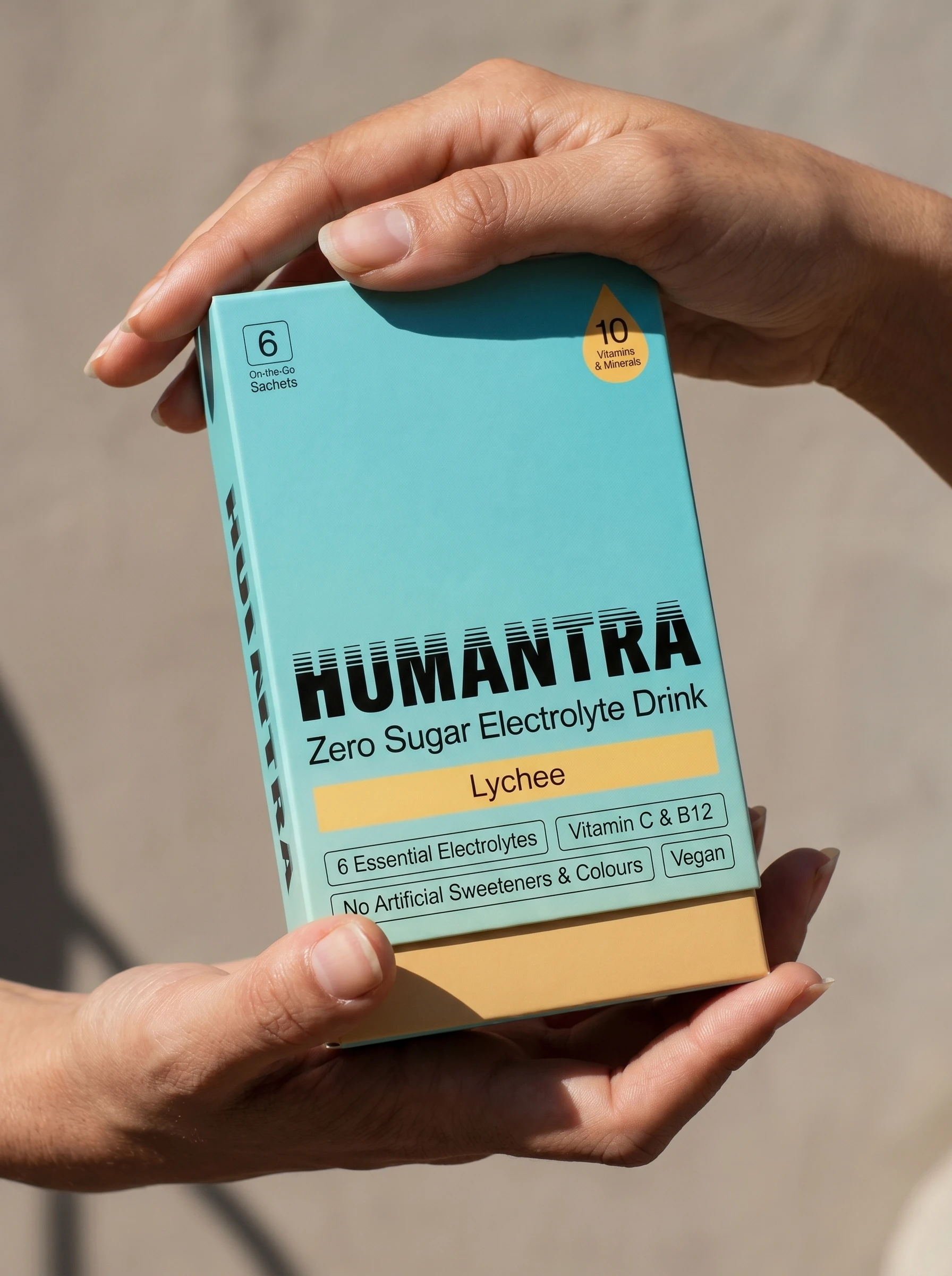
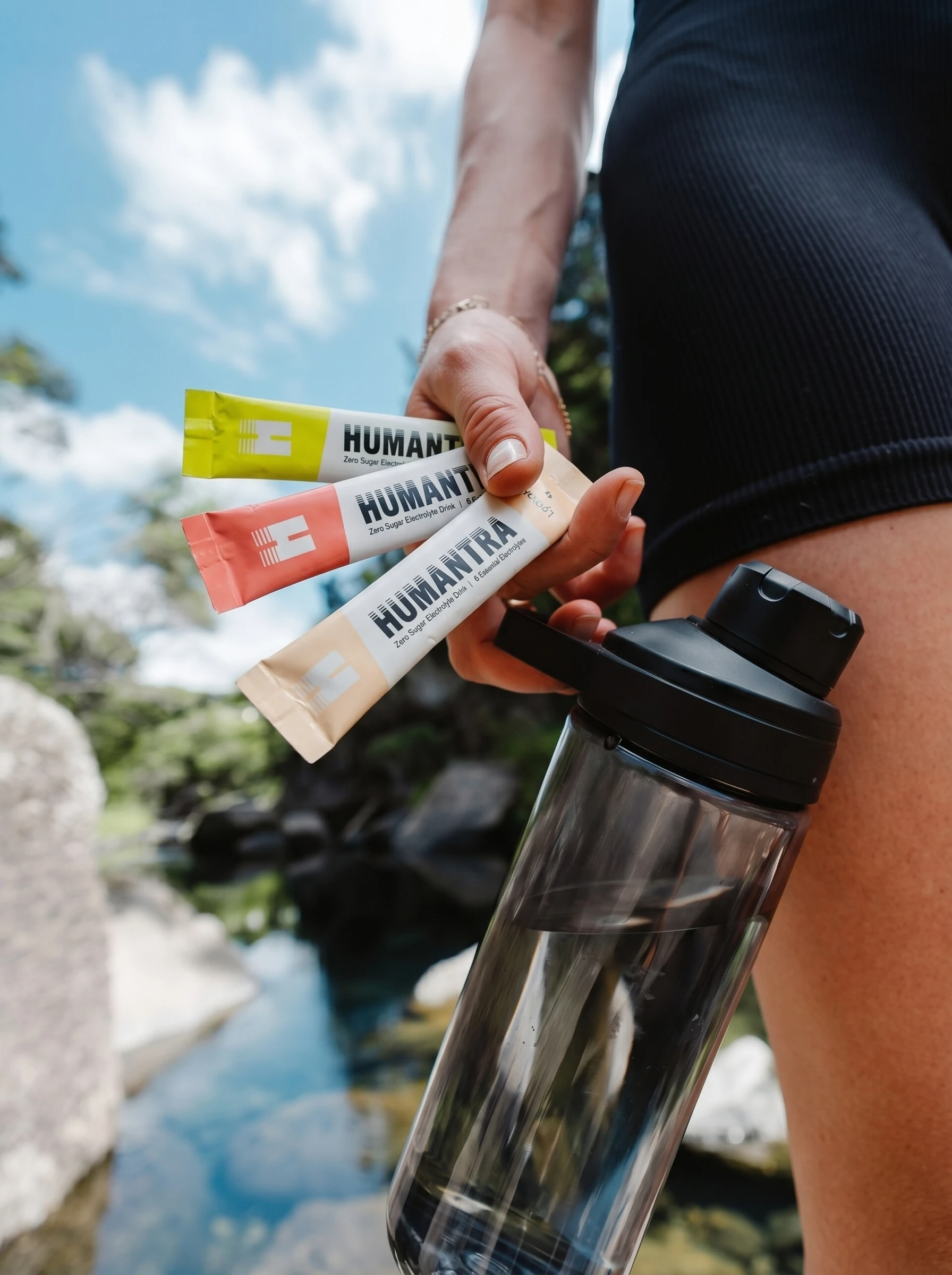
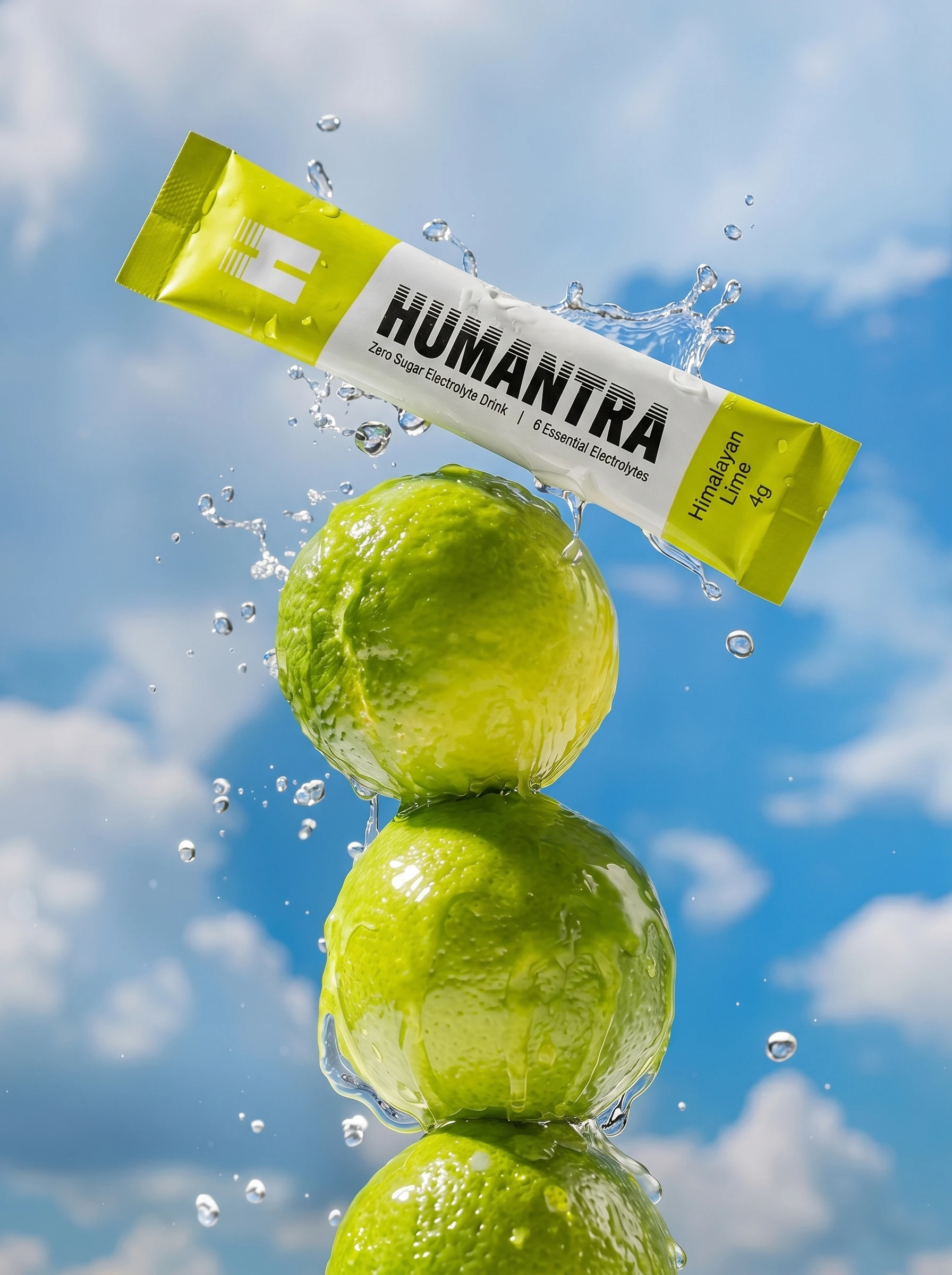
Humantra tasked me with redesigning their retail packaging for the Boots UK & Ireland launch in just one week. The challenge was to modernize the look without changing the familiar logo, keeping brand recognition strong.
Objective
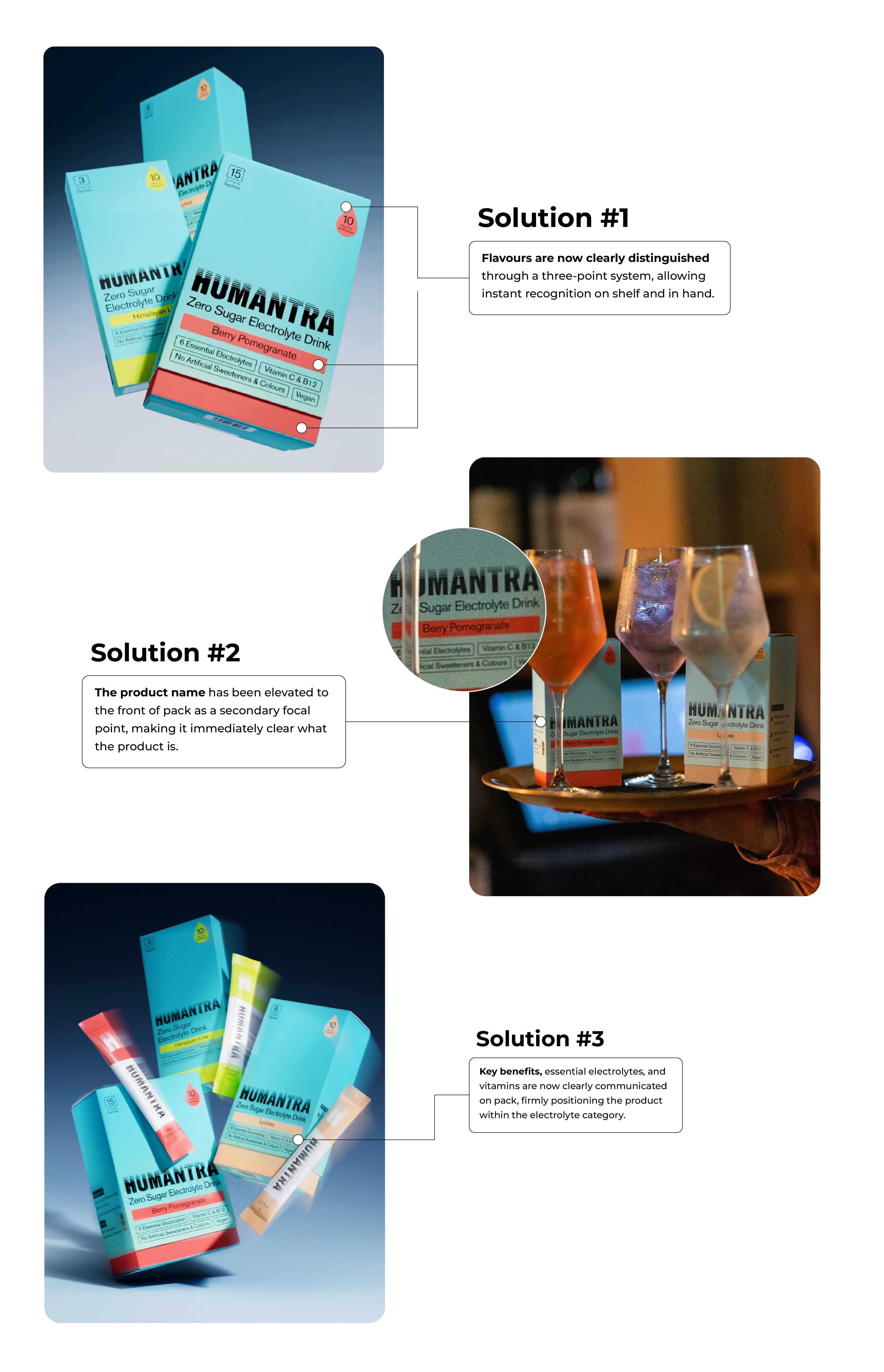
Make each flavor instantly distinguishable while elevating the overall packaging to feel modern and retail-ready. Maintain familiarity for loyal customers while standing out on shelves.
Approach
I focused on clarity and hierarchy: keeping the iconic logo front and center, refreshing the visual style, and using design cues to clearly differentiate each flavor. I also developed the concept of a blue billboard-style design, where packs placed together create a bold, unified wall of color in stores, strengthening shelf impact. Every decision was guided by strategy to balance brand recognition with a contemporary look.
Outcome
The updated packaging made flavors easy to identify, strengthened brand distinctiveness, and retained the familiar logo that customers recognize. The redesign is now successfully rolling out in stores.

Like this project
Posted Aug 13, 2025
Redesigned Humantra’s retail packaging for Boots, keeping the familiar logo, modernizing the look, and making each flavor and the brand more distinguishable.