Run Club ReBranding - Humantra
Lala P.
Scope of Project: Brand Identity, Print Marketing Assets, Digital Marketing Assets, Event Branding
I developed a fresh identity for Humantra’s Run Club by evolving the existing brand system into something more vibrant, dynamic, and community-driven. The rebrand incorporates symbolic elements, a bold color palette, and practical event touchpoints to connect with runners in a real, meaningful way.
The Brief
Humantra wanted to extend their brand into the wellness and fitness space by creating a sub-brand for their Run Club. The goal was to design an identity that felt like a natural extension of Humantra, but with its own energy, something bold, social, and movement-focused that could come to life during community events.
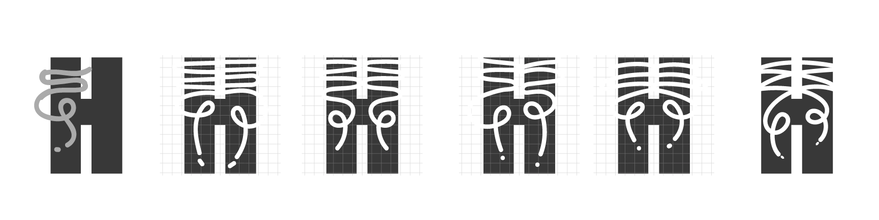
The Challenge The biggest challenge was maintaining brand consistency while adding something new and exciting. How do you evolve an existing logo without losing recognition? How do you create a system that feels energetic and athletic but still premium? Also, typical running visuals (like sneakers and tracks) often feel generic, so the task was to find a fresh, ownable visual hook that would still feel personal to Humantra.
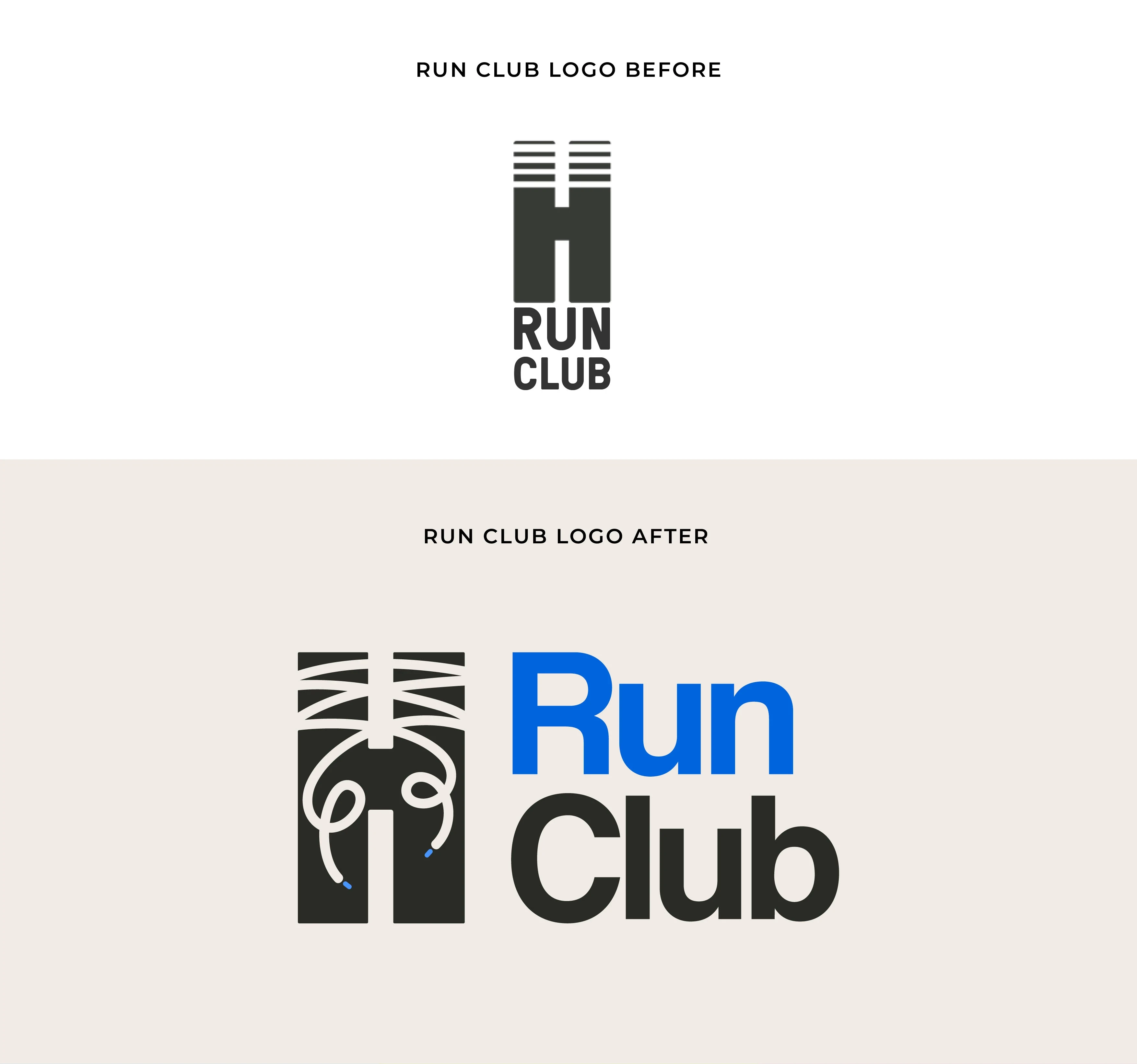
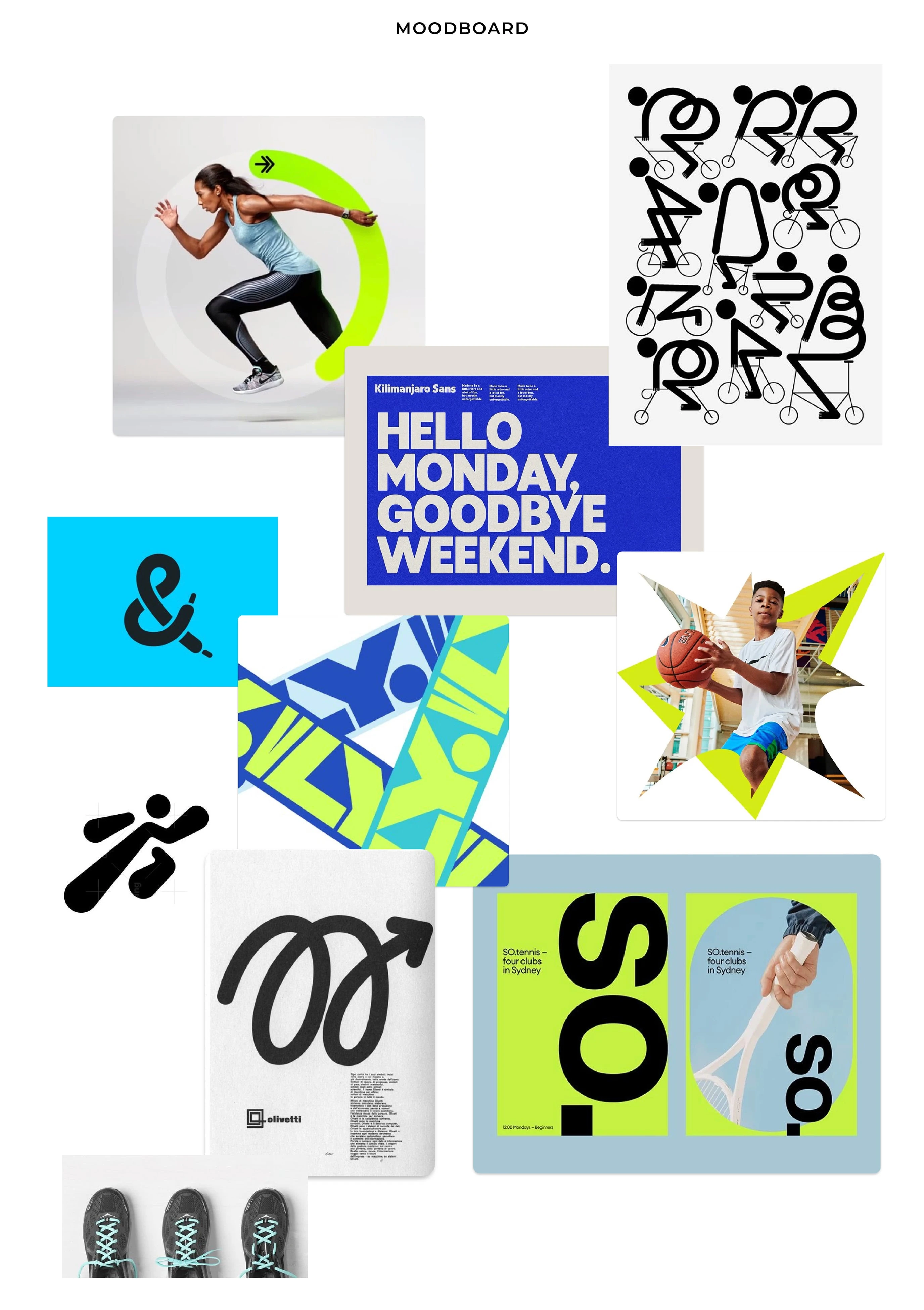
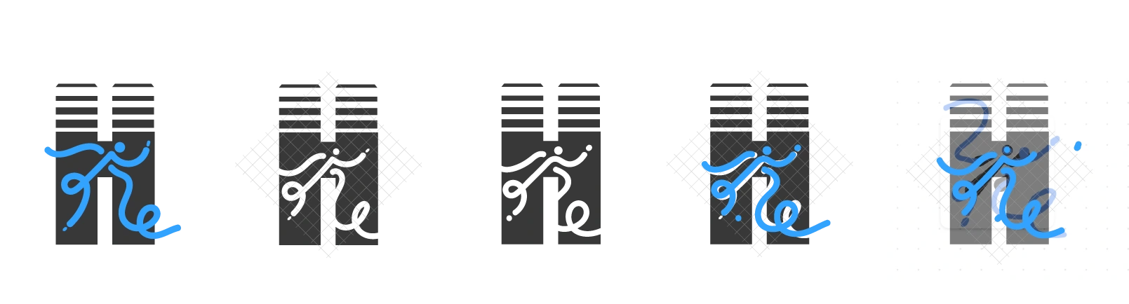
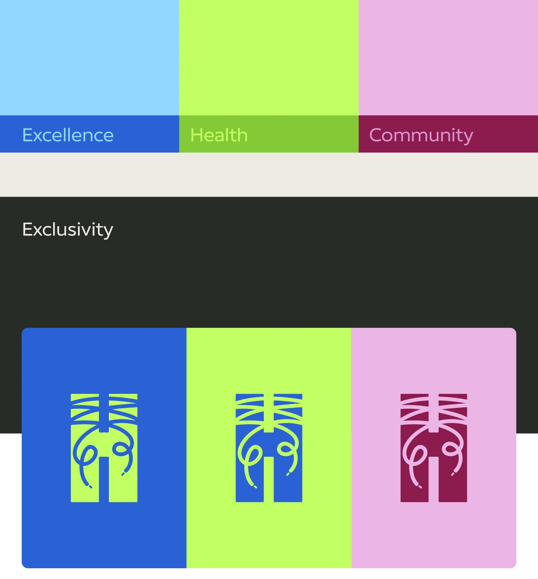
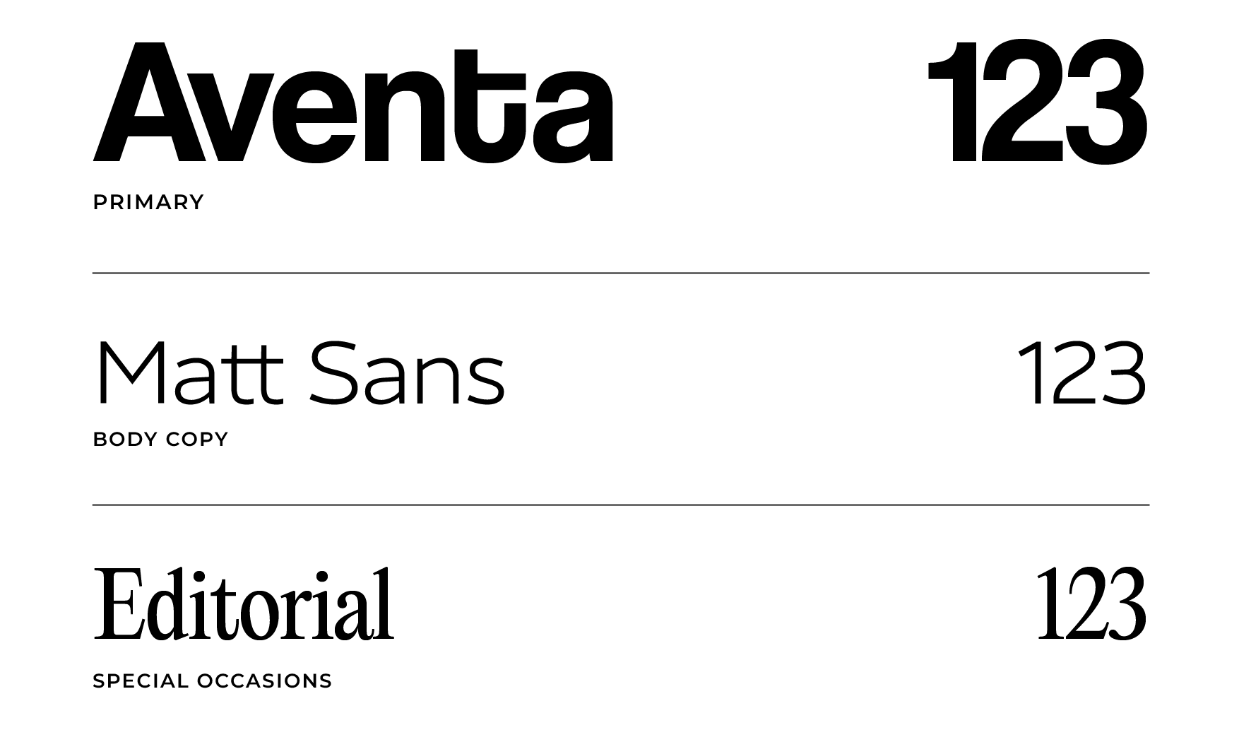
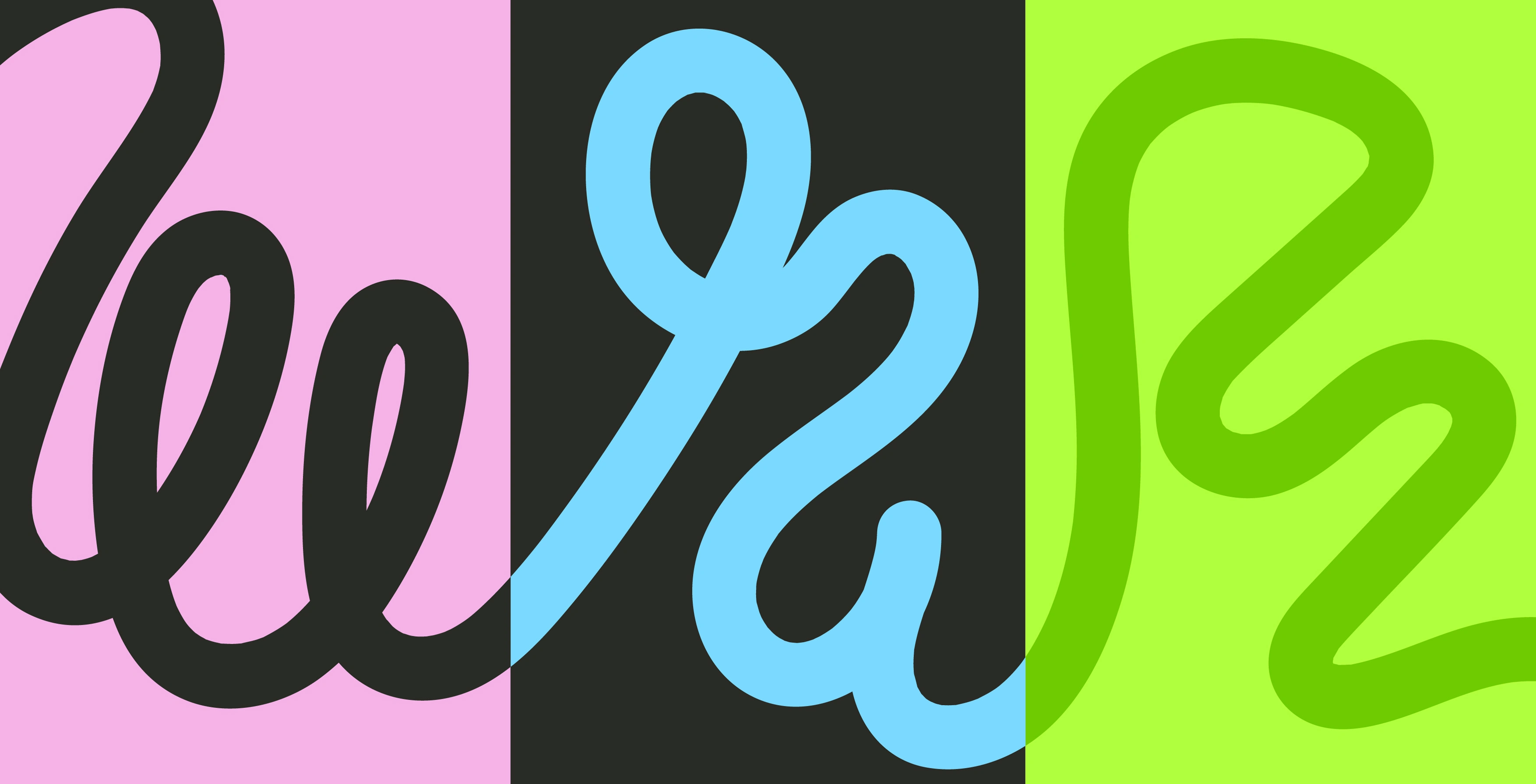
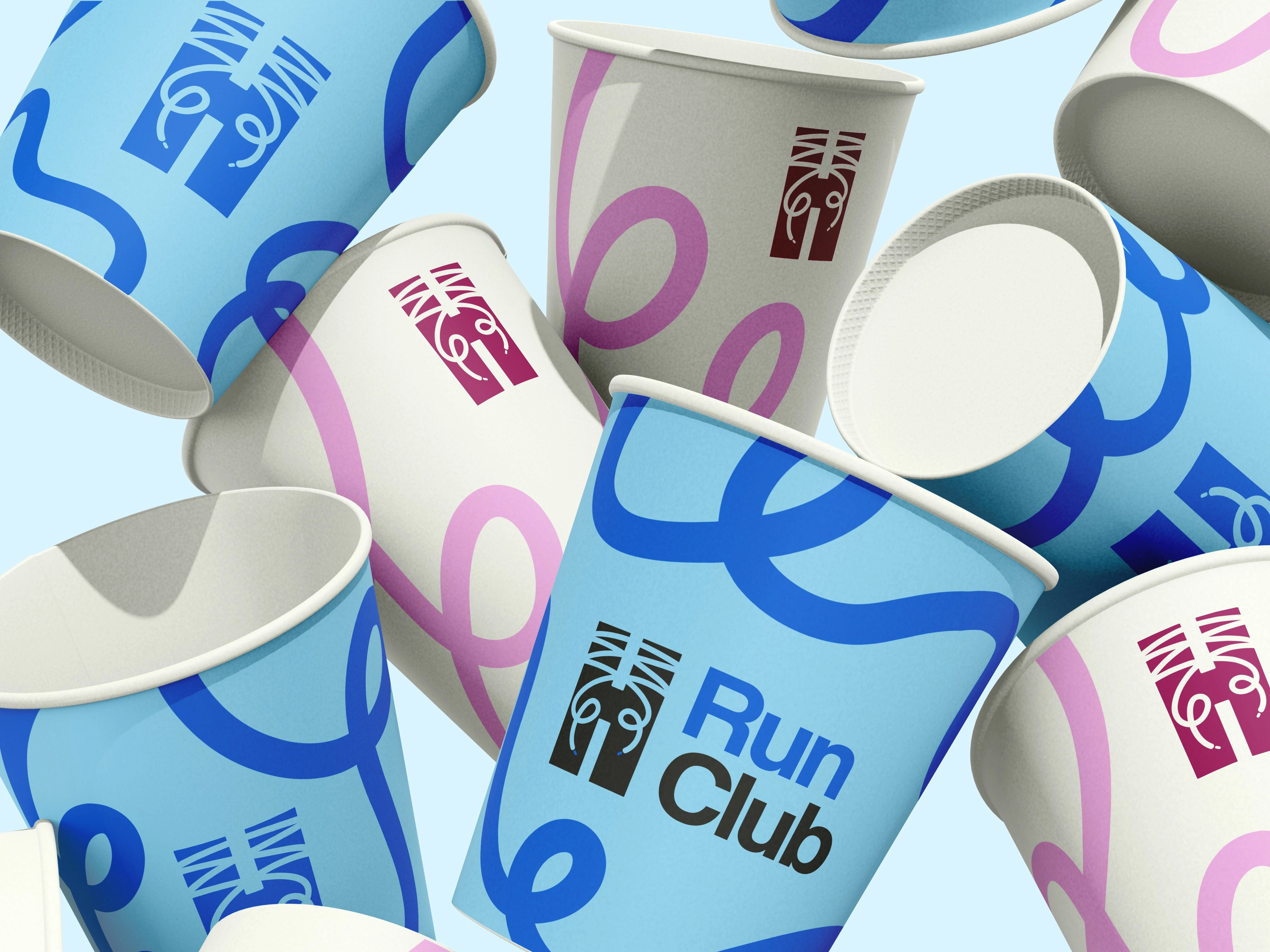
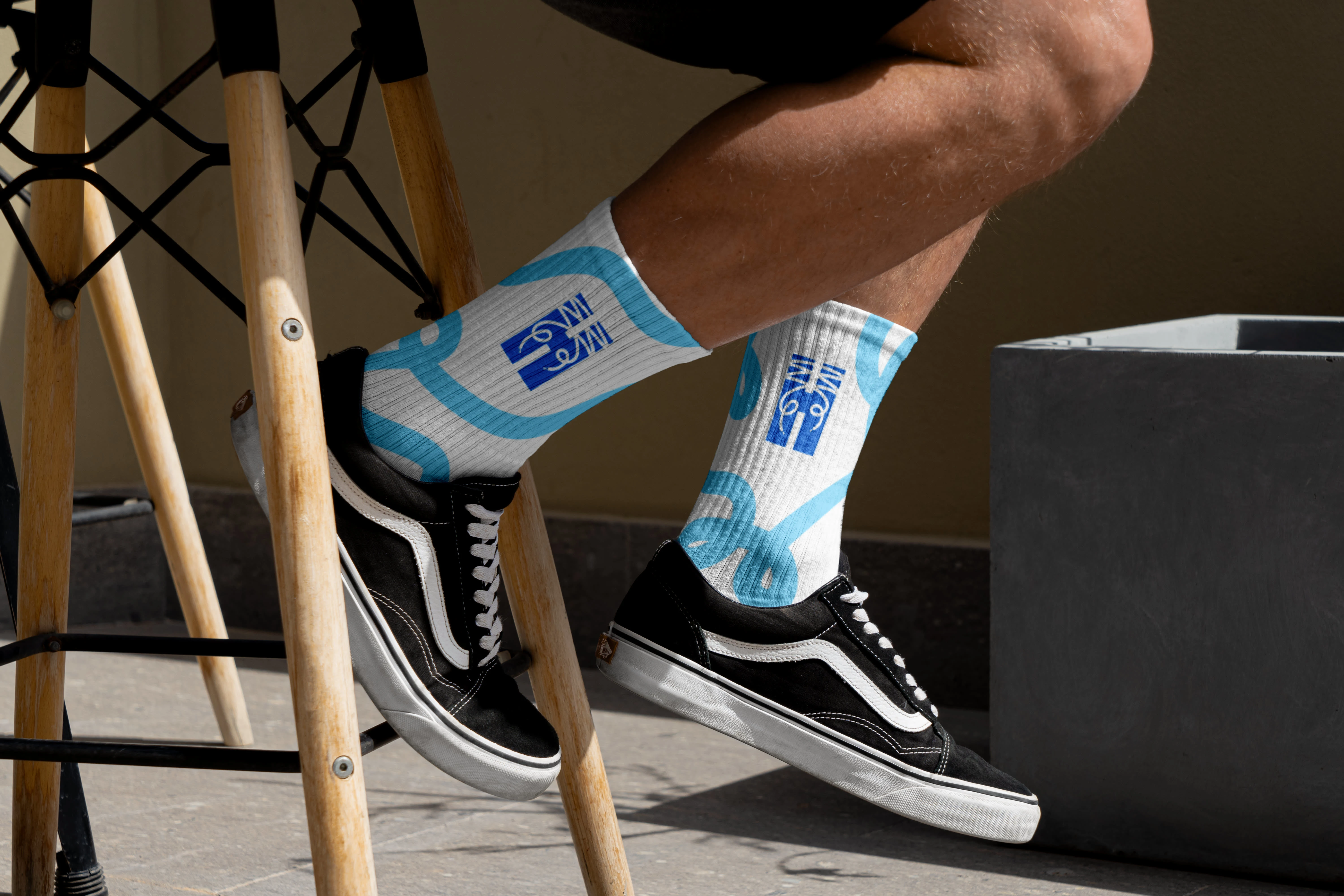
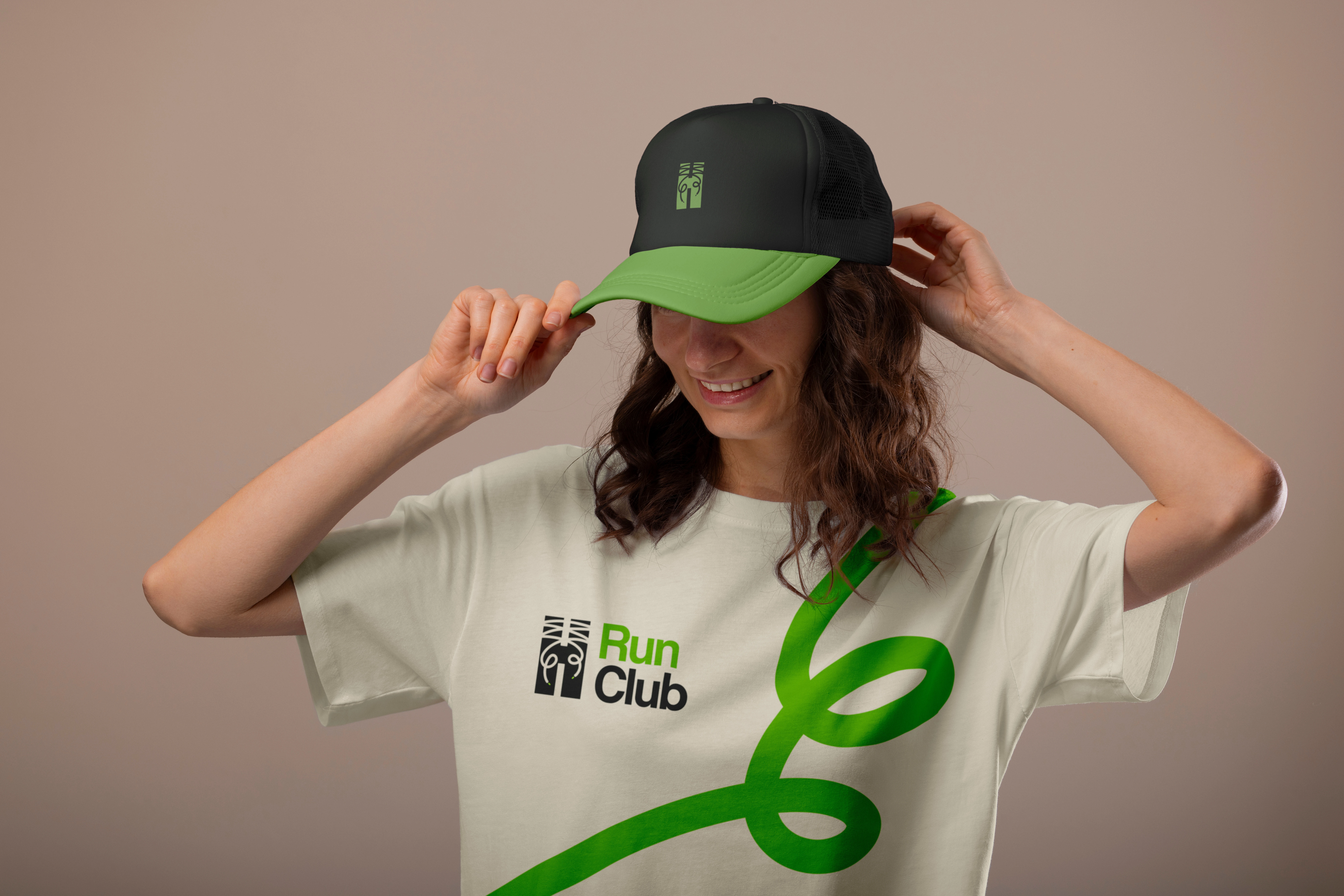
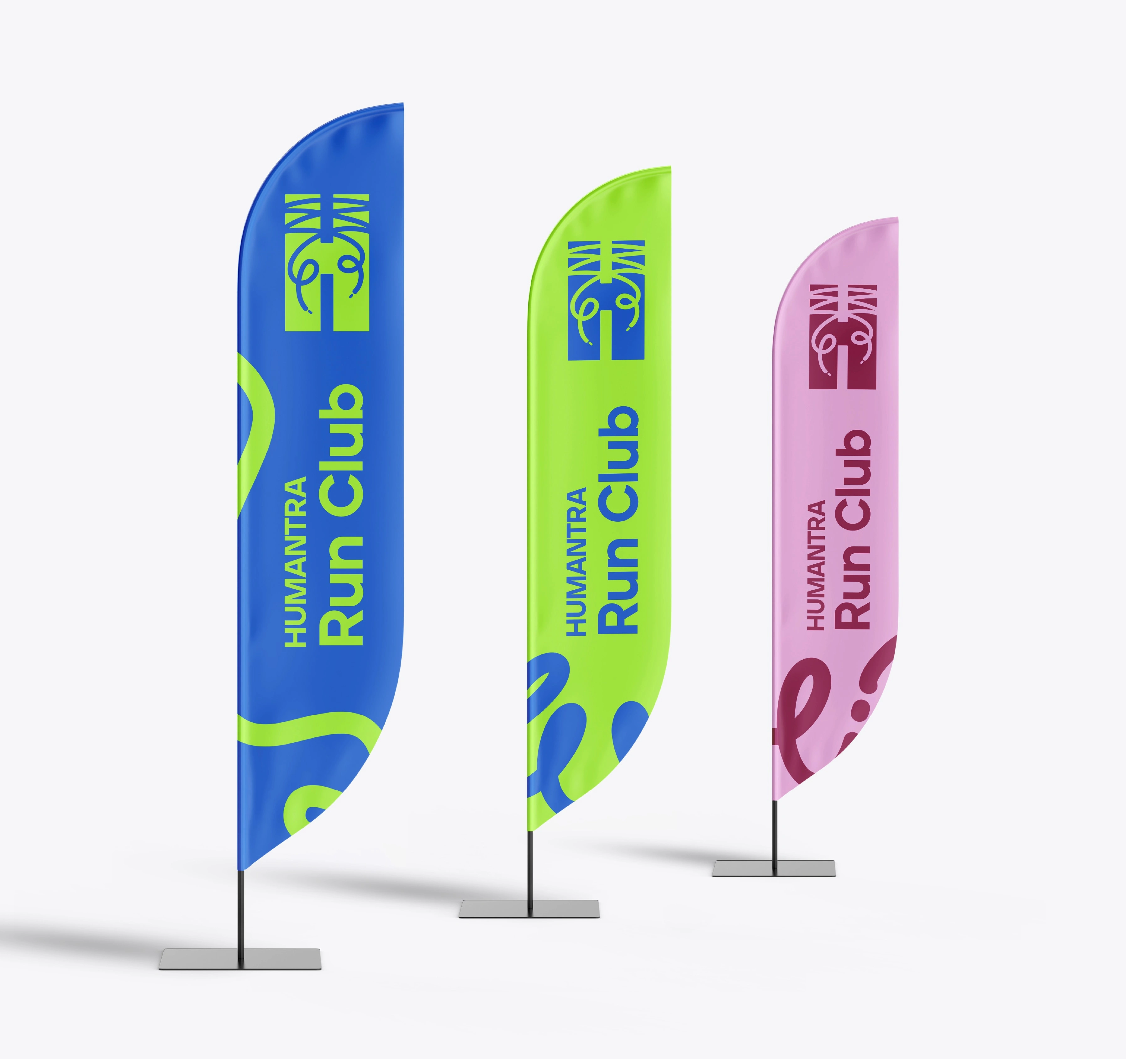
The Solution I started by reimagining the logo, transforming Humantra’s signature vertical lines into shoelaces, a subtle but meaningful symbol of running. The laces were hand-drawn to keep the look organic, playful, and full of motion, while preserving the structure of the original logo for brand continuity. For the color palette, I introduced vibrant neons (blue, pink, and green) alongside neutral tones to reflect excellence, health, and community. These colors make the identity stand out at events and create an inclusive but exclusive feel, inviting yet premium. I also designed a full set of event-focused mockups, including meeting point flags, hydration tents, apparel, and accessories, to make the brand interactive and visible in real-world settings. This ensures the Run Club feels cohesive, both in digital spaces and on the streets.
Like this project
Posted Jul 20, 2025
Designed a bold sub-brand for Humantra Run Club with vibrant visuals, symbolic elements & event assets, bridging premium identity with active community vibes.