Built with Kittl
JOHBAN Deep Moisturizing Cream: Packaging Transformation
Seth D'Creator
JOHBAN Deep Moisturizing Cream – Elevating Skincare through Tactile Luxury
Overview
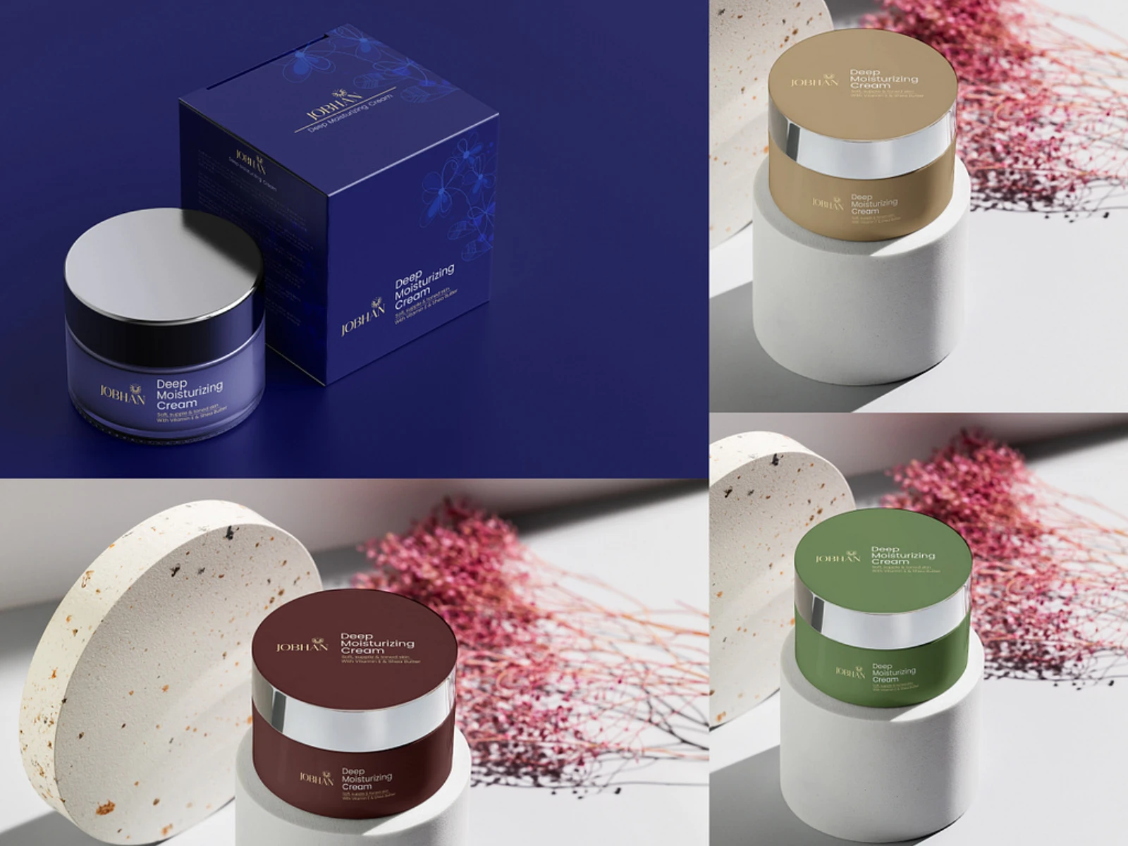
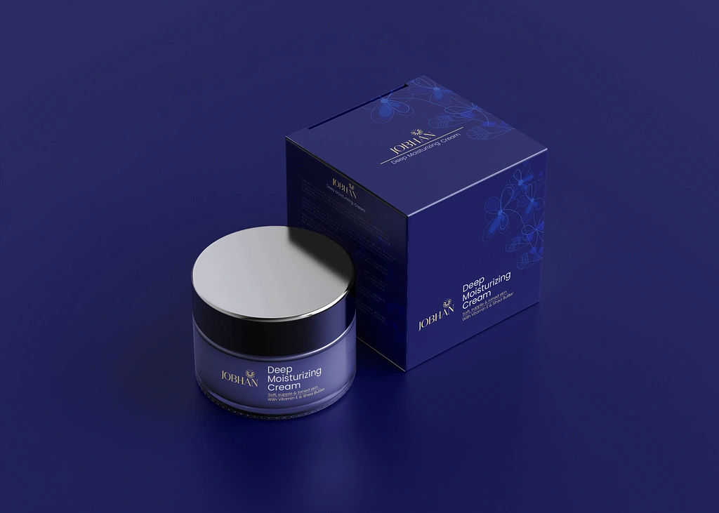
JOHBAN approached us to transform the market perception of their Deep Moisturizing Cream. While the formula was superior, the existing packaging failed to communicate the product's premium efficacy or the brand’s commitment to deep, restorative hydration. We were tasked with redesigning the brand experience to ensure the product felt as transformative in the hand as it did on the skin.
Challenges
Shelf Presence: The previous design lacked visual authority, often getting lost among larger, high-visibility competitors.
Perceived Value: The packaging did not reflect the premium ingredients and high-performance nature of the formula.
Emotional Disconnect: Potential customers failed to grasp the "deep hydration" promise immediately, resulting in lower conversion rates.
JOHBAN Deep Moisturizing Cream – Elevating Skincare through Tactile Luxury
Approach
We centered our strategy on the concept of "The Ritual of Restoration." We shifted away from generic clinical aesthetics, opting instead for a tactile, sensory-focused design. By utilizing premium matte-finish textures, minimalist typography that emphasizes clarity, and a color palette inspired by natural hydration and deep, calming moisture, we turned the act of unboxing into a prelude to the skincare experience. We used audience psychology to guide the visual hierarchy, ensuring the core benefit, deep moisture, remained the primary focal point.
JOHBAN Deep Moisturizing Cream – Elevating Skincare through Tactile Luxury
Goals
Increase Brand Authority: Establish JOHBAN as a high-end, effective contender in the premium moisturizer market.
Elevate User Experience: Create a sophisticated, memorable unboxing process that fosters brand loyalty.
Drive Shelf Conversion: Utilize bold, intentional visual cues to capture attention in a saturated retail environment.
Deliverables
Brand Identity Refresh: A cohesive set of brand guidelines focusing on refined, high-end aesthetics.
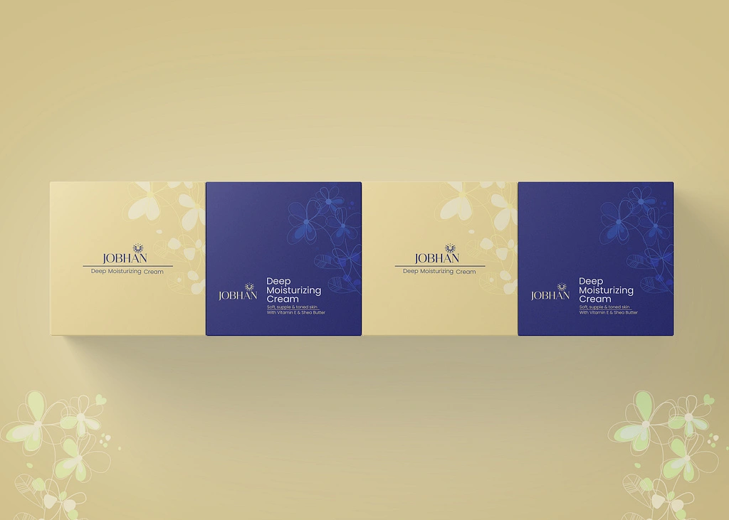
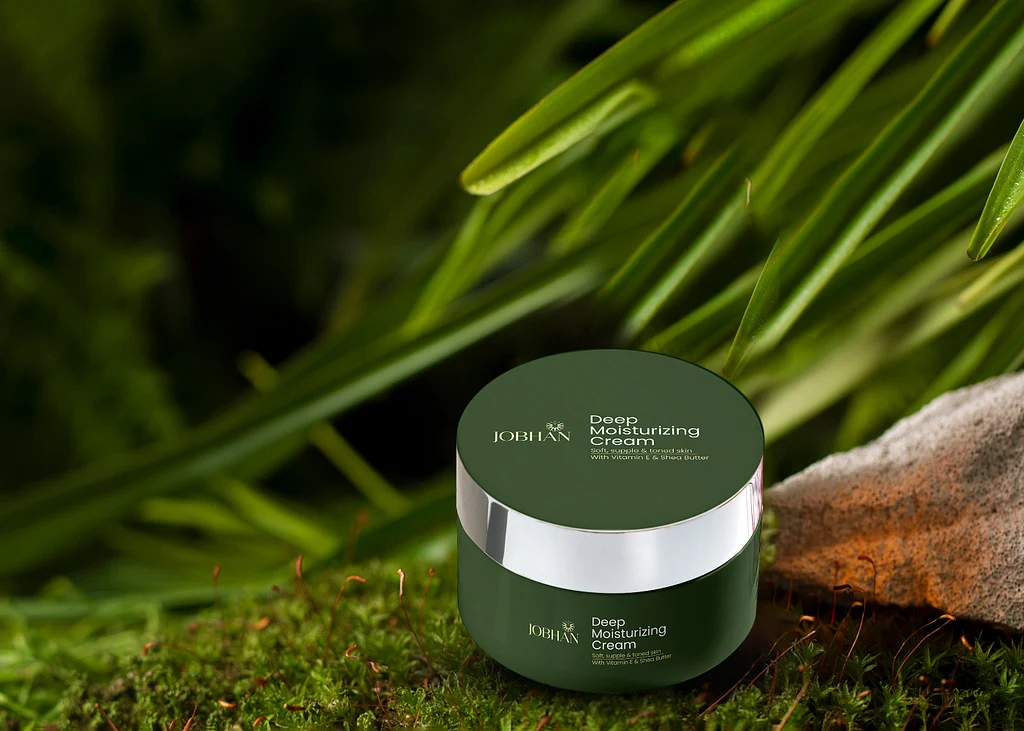
Primary Packaging: Redesign of the cream jar, featuring weighted materials and tactile labeling for a luxury feel.
Secondary Packaging: An eco-conscious, premium-feel outer carton with embossed detailing to highlight the brand’s craftsmanship.
Visual Assets: A library of brand imagery and layout templates for retail displays and digital marketing materials.
JOHBAN Deep Moisturizing Cream – Elevating Skincare through Tactile Luxury
Like this project
Posted Jun 5, 2026
Redesigned packaging for JOHBAN's cream to enhance market perception and brand authority.