Designing a Mouse Pointer for a Digital Metaverse
The mouse pointer has a long history of being a fundamental part of the modern interface. Windows and Mac system pointers have barely changed in the last few decades. On the other hand, video games have a history of reimagining the pointer. A high proportion of modern desktop video games use custom pointers that are branded for their experiences. But what would it take to design a video game pointer that also works in an OS-like interface like Roblox? Roblox is a platform where users can create and explore immersive virtual experiences. Since it serves as a seamless metaverse between games and experiences, the Roblox app presented a unique UX challenge I was excited to work on.
I’ve seen the terms “cursor” and “pointer” used interchangeably. I’m mostly going to opt for “pointer” to distinguish from text cursors, which are used in input fields and command interfaces.
The Problem
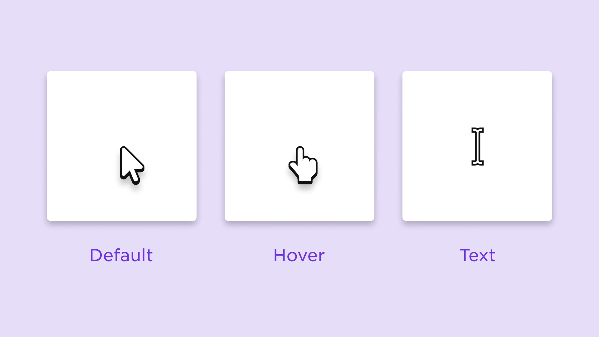
The new Roblox desktop client was under way, but the app was missing a crucial UX element — mouse state changes. Unlike how browsing and playing are separate experiences for most desktop games, the new Roblox desktop client allows users to browse and play seamlessly in a single window. However, the mouse pointer experience needed work. The “Link Select” or “Hover” state had poor visual affordance. And the “Text Select” state, which appears when a user hovers over a text input field, was missing altogether. This was an opportunity to redesign and improve the mouse pointer trifecta: Default, Link(Hover), and Text.
Designing a pointer for both an operating system and video game is challenging due to their different use cases. An OS cursor needs to be a neutral color, high enough contrast for visibility, practical enough for everyday use, and not too lurid to cause eye strain. A video game cursor can ignore a lot of these rules because it usually corresponds to the brand’s look and feel to deliver an immersive experience. But is there a successful way to combine both of these attributes?
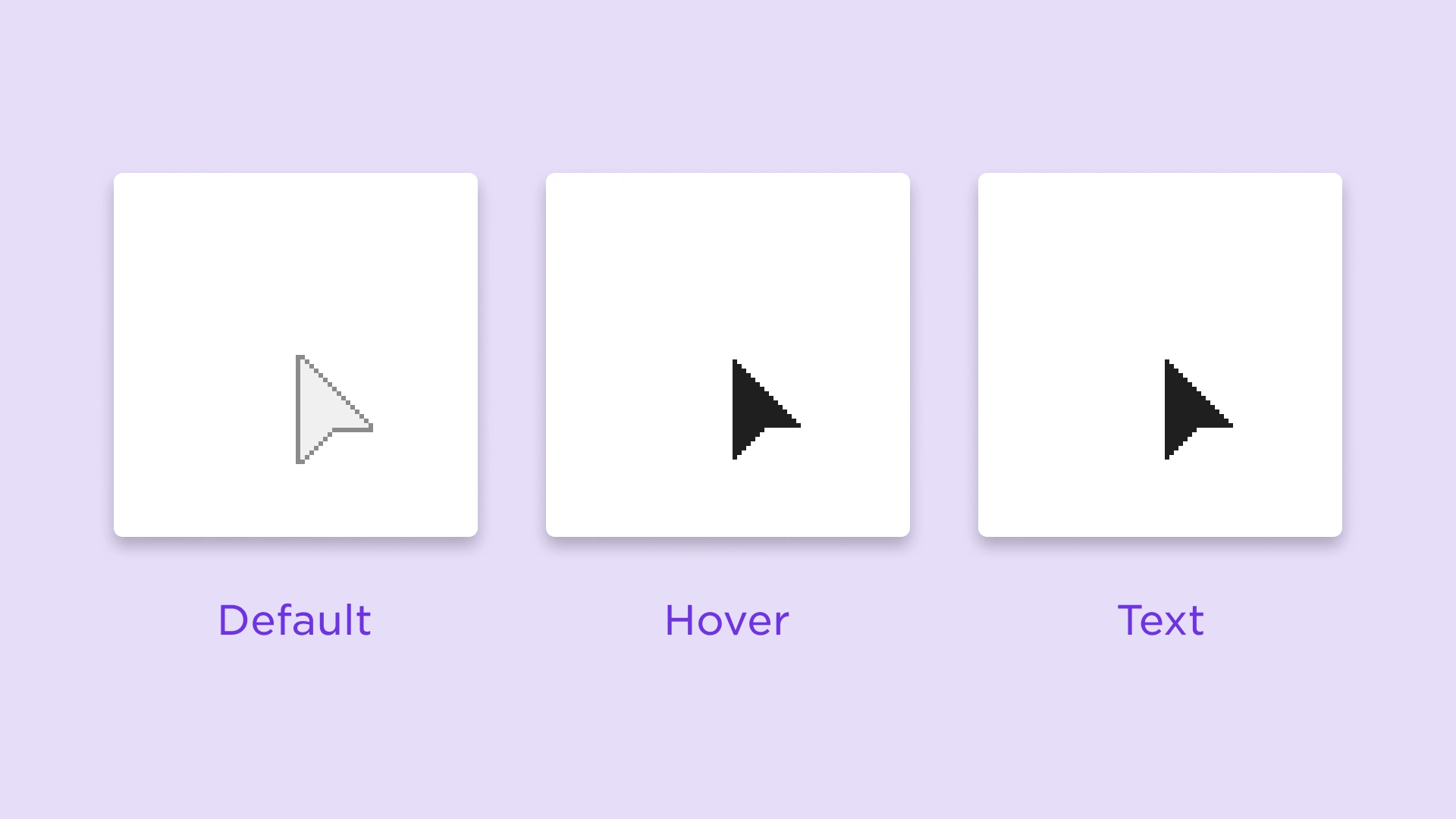
Roblox’s 2012 mouse pointers. There was no text pointer, so the hover pointer was used instead.
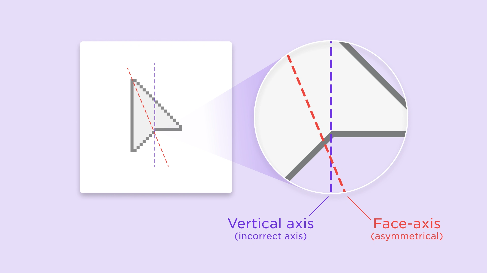
Take a look at Roblox’s 2012 pointer. It went in the right direction by using neutral grayscale colors. However the hover state used a black pointer, which confused new users on a Mac computer. One other mistake is that the arrow shoulders were drawn using the vertical axis instead of the arrow face axis. This means the arrow is asymmetrical by about 6.8%.
Look and Feel
Here comes the fun part. What are the current trends of video game pointers for desktop? I compiled some of the most popular gaming pointers and ranked them by graphicality and practicality. Most gaming pointers opt in the direction of branded graphicality. The Roblox pointer would need to be slightly more graphical than the common OS pointer while still maximizing practicality.
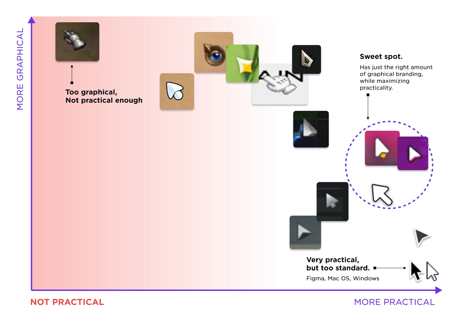
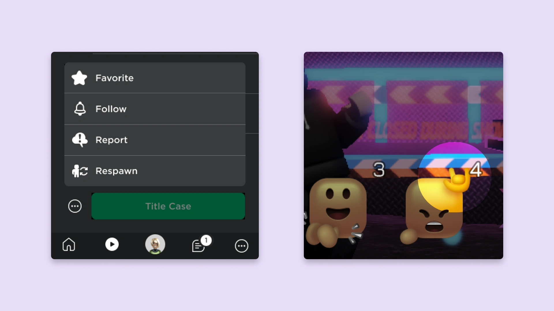
Not only does the Roblox pointer need to look adequate across all experience genres, but it needs to complement our design system, uiBlox. The uiBlox design system currently uses #FFFFFF icons on a default dark theme. Our style uses 2px radius curves and a rough ratio of 3:1 round-to-square corners in each icon. For the pointing hand cursor, I was inspired by our new emote artwork illustrated by one of our awesome designers, Amy Liu.
Putting It All Together
After getting feedback from other designers, we developed the final pointer set for Roblox. The new default pointer is now symmetrical and adds an arrow tail for visibility. A drop shadow delivers modernity and depth in a 3D environment. The new hover pointer heightens accessibility by making the shape distinct from the default pointer. Lastly, the text pointer is reshaped to a #FFFFFF 1px cursor to give it contrast on our dark theme. The dark stroke creates visibility on our light theme and other Roblox experiences with light backgrounds.
A redesign is only as effective as its user feedback. We surveyed 215 Roblox developers on what they had to say about these new cursors. A significant majority agreed that the cursors were an improvement in both aesthetics and usability. The most exciting statistic is our developers’ response to the Text pointer. Of the whopping 89% that agreed it was an overall improvement, 74% of them strongly agreed with that statement. Knowing our users have a positive reaction to these UX improvements will help us when we develop the rest of our pointer set, as well as other UI elements in-experience.
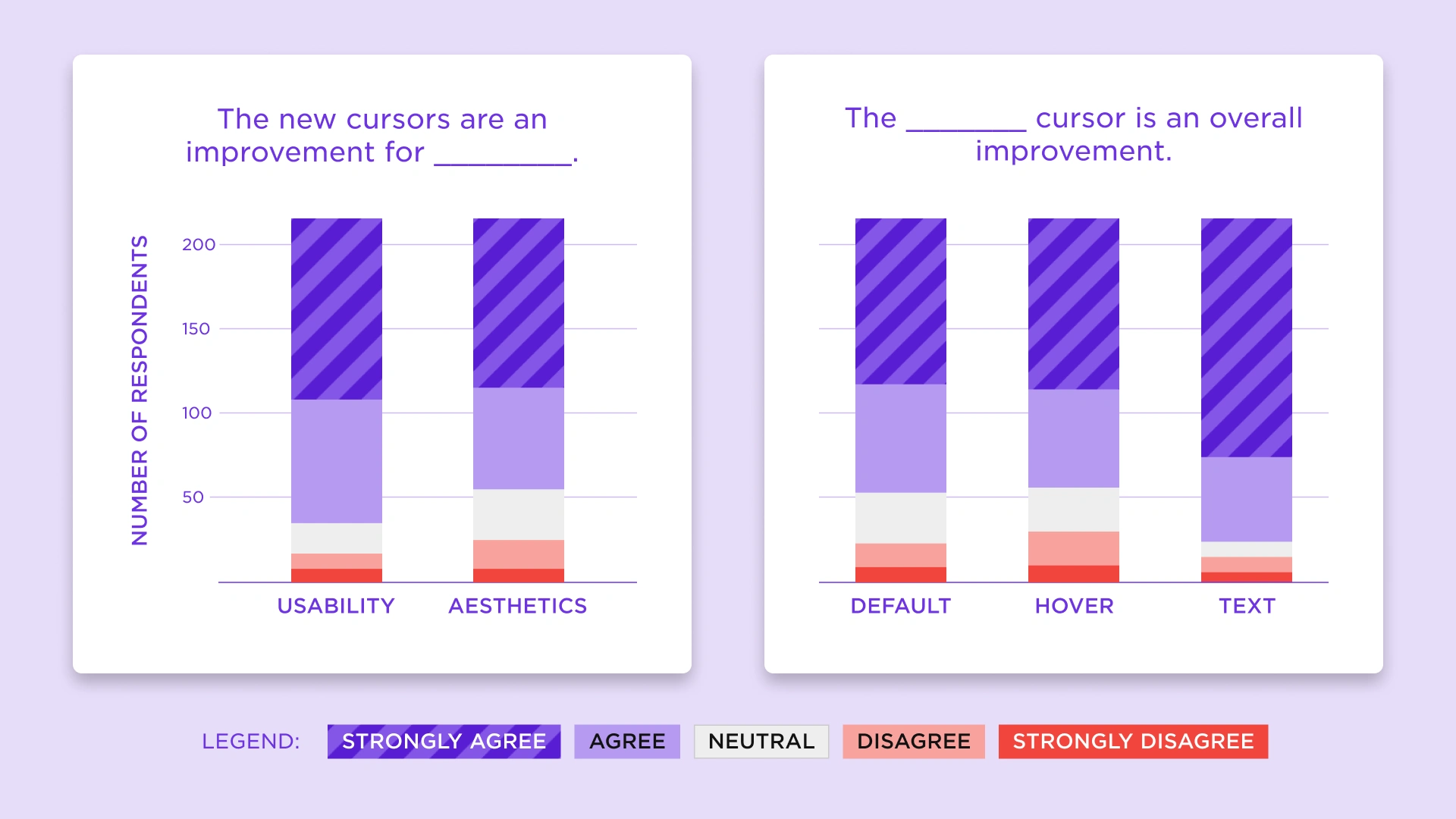
A significant majority of Roblox developers agree or strongly agree that the new pointers are an improvement to usability and aesthetics.
As Roblox expands beyond gaming into a communication, social and even transactional platform, this one aspect of the product will help guide the user as they navigate between the application and its experiences. Our hope is that this will serve as a prevailing standard for digital metaverses from here on out!
Interested in joining the Roblox Design team and solving problems like this? Check us out at corp.roblox.com/careers/ for the latest opportunities.
Derek Wong is a Visual Designer at Roblox. He works on Roblox’s design system, which shapes the user interface of the Roblox website and desktop app. Neither Roblox Corporation nor this blog endorses or supports any company or service. Also, no guarantees or promises are made regarding the accuracy, reliability, or completeness of the information contained in this blog.
©2021 Roblox Corporation. Roblox, the Roblox logo, and Powering Imagination are among our registered and unregistered trademarks in the U.S. and other countries.
Like this project
Posted May 23, 2024
How Roblox designs mouse pointers for a seamless virtual experience.

