Foodmama - Healthy Food branding
ABOUT FOODMAMA
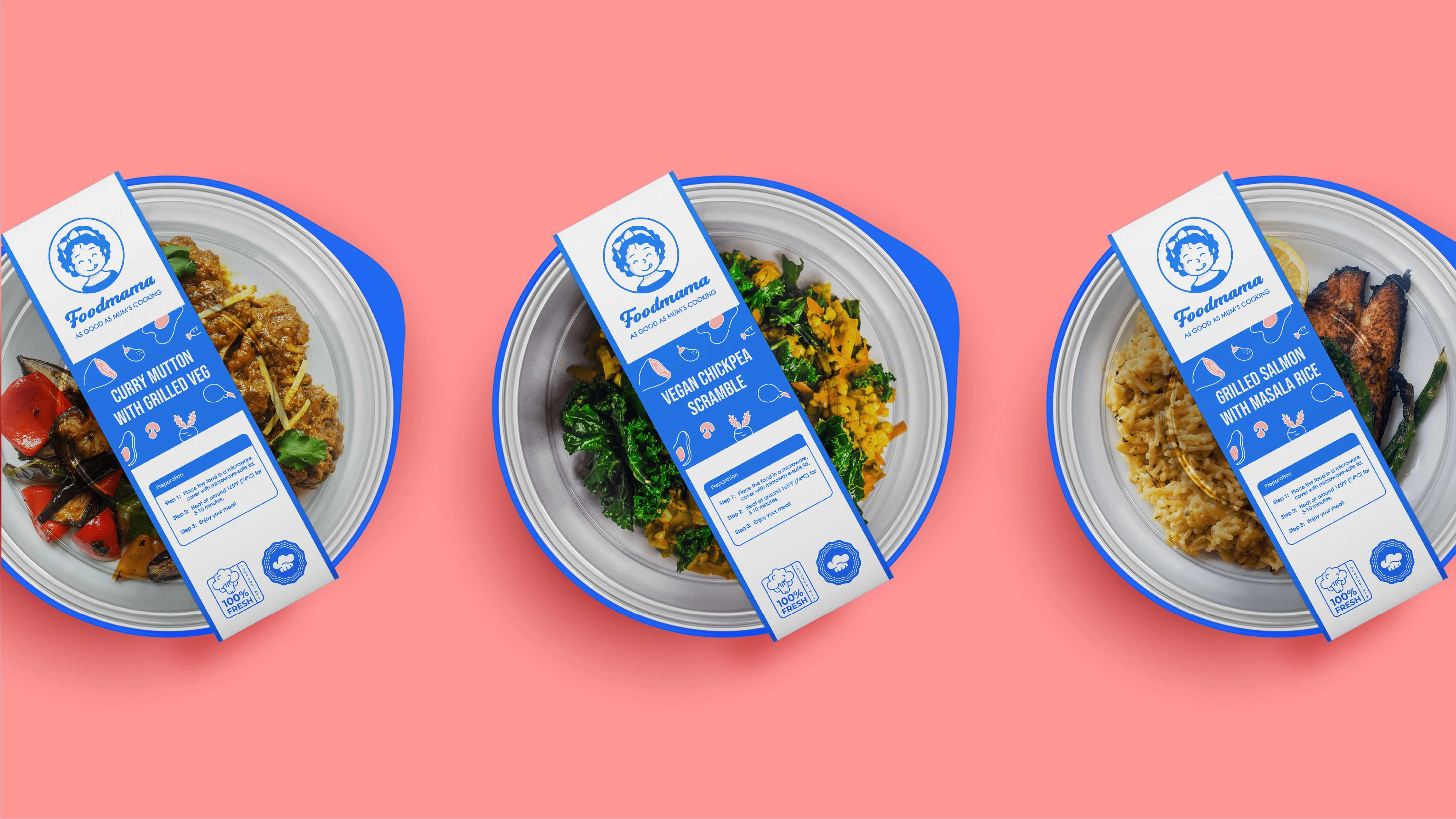
Foodmama is one of the sub-brand under AirAsia that aimed to provide accessible and affordable healthy meals for people through their food tech innovation. It has a unique approach to helping people to enjoy delicious and nutritious meals with minimal or simple reheating processes.
Their mission is to become everyone’s diet planner and the everyday food on every household’s dining tables.
THE DESIGN CONCEPT
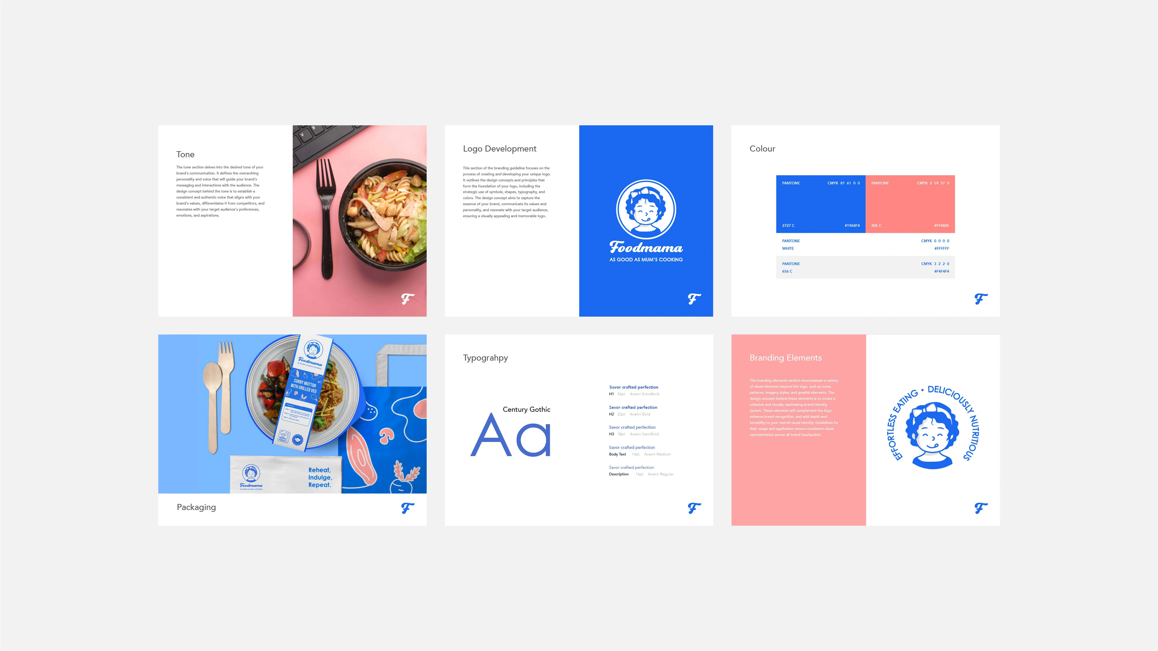
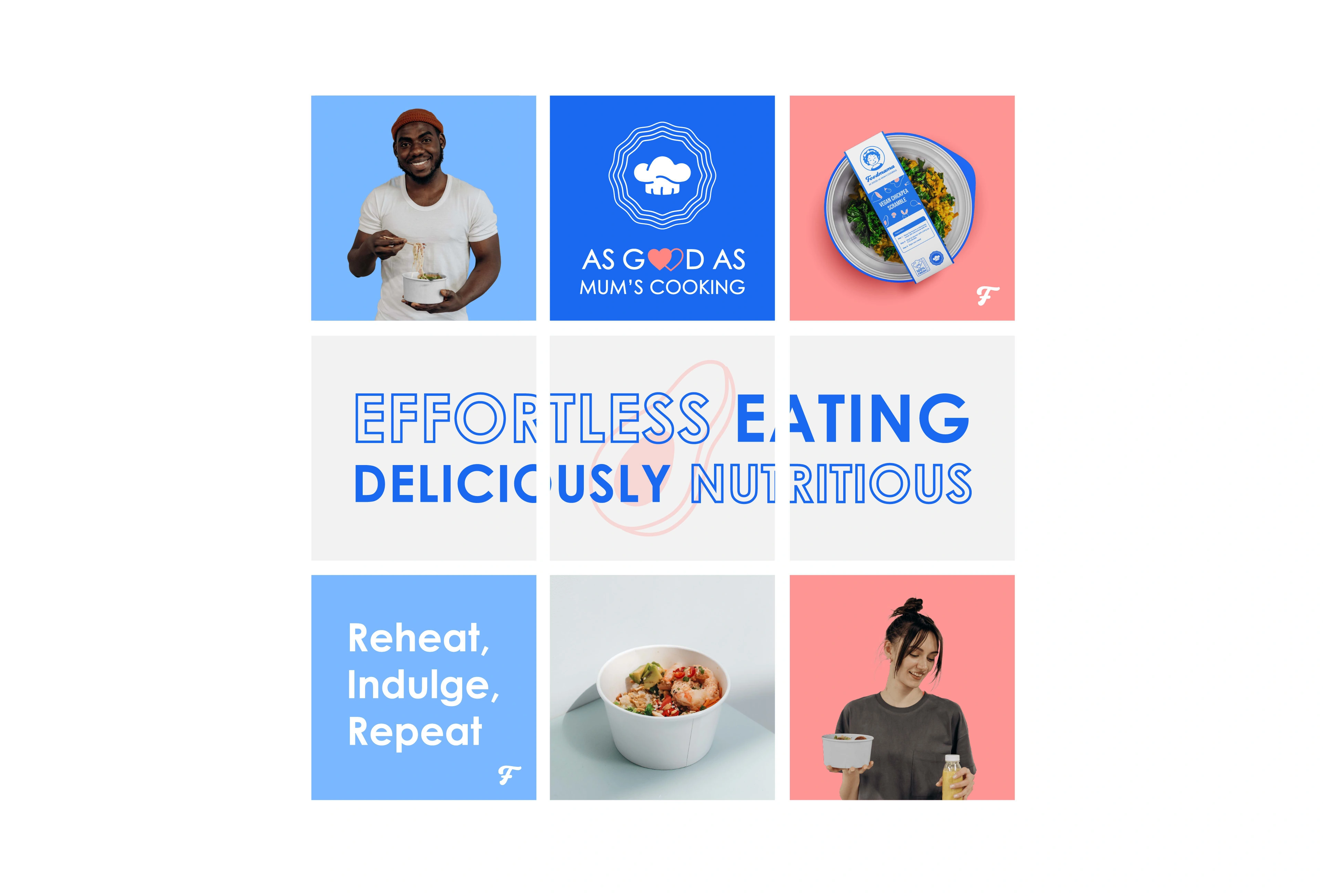
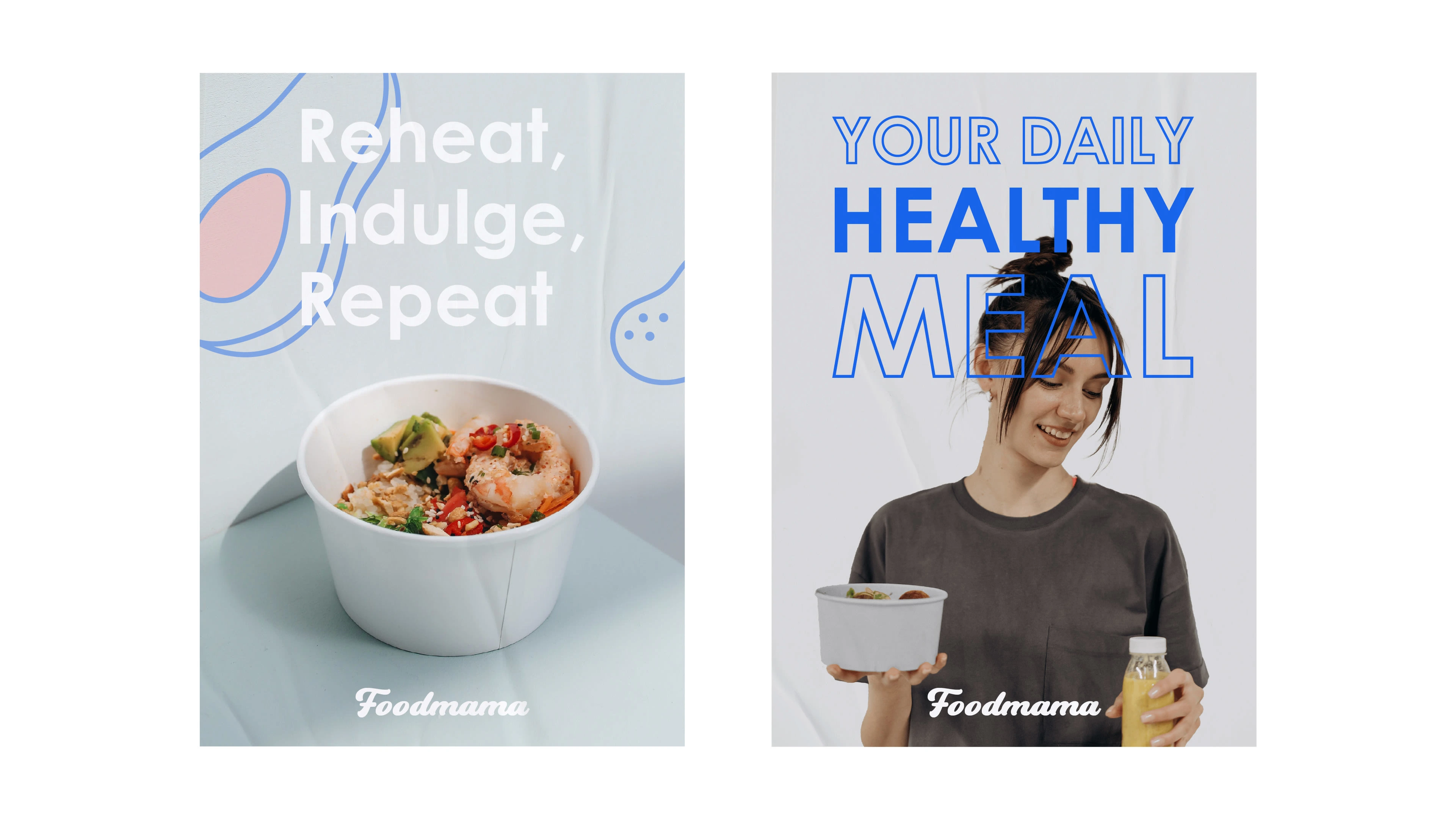
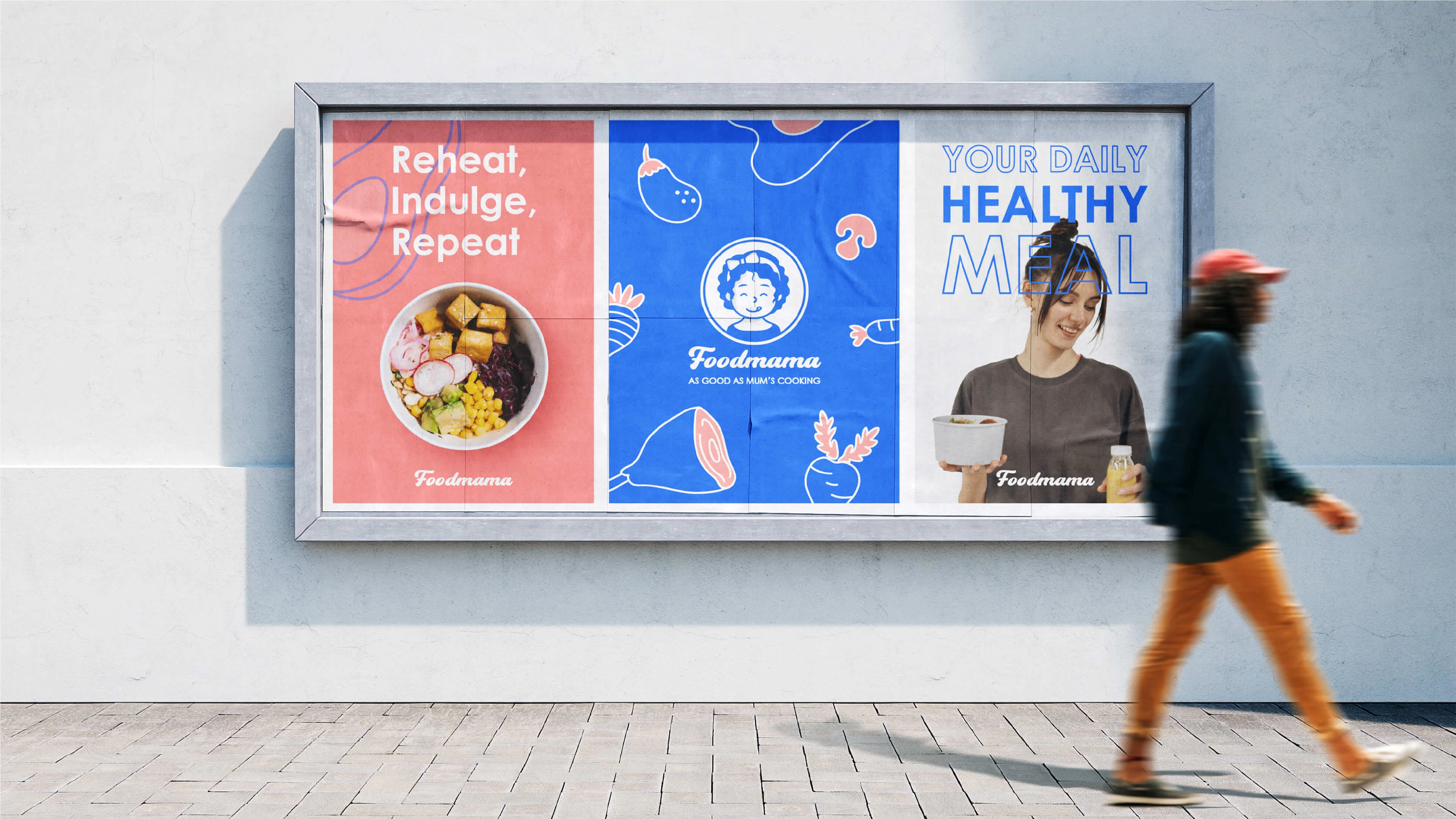
We have carefully crafted a brand identity that embodies healthy eating as a fulfilling lifestyle. Our focus has shifted beyond mere targeting, as we believe in promoting the essence of nourishing choices for everyone.
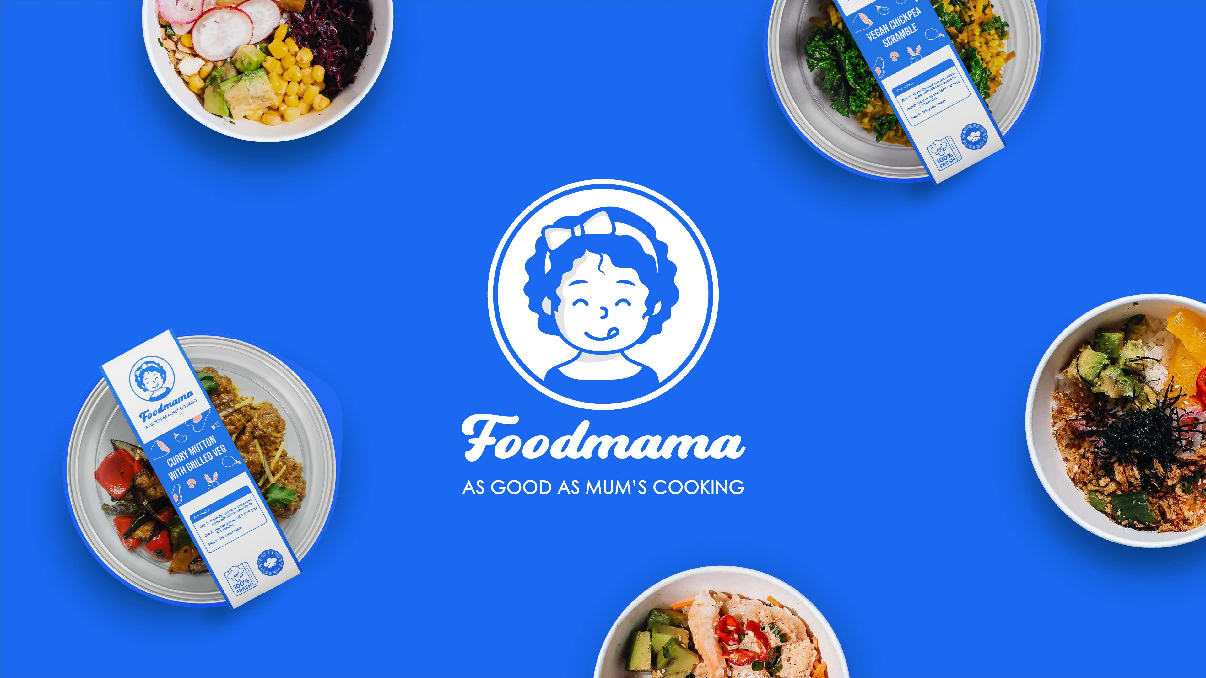
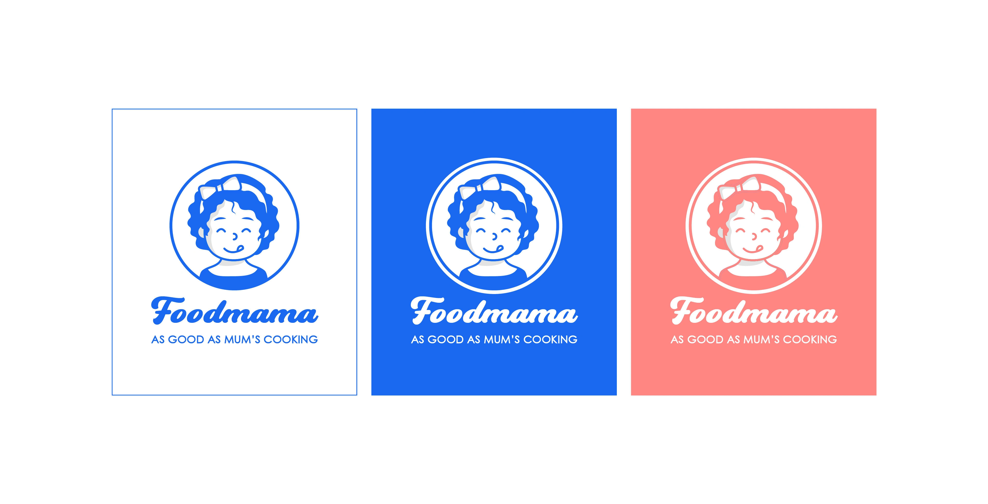
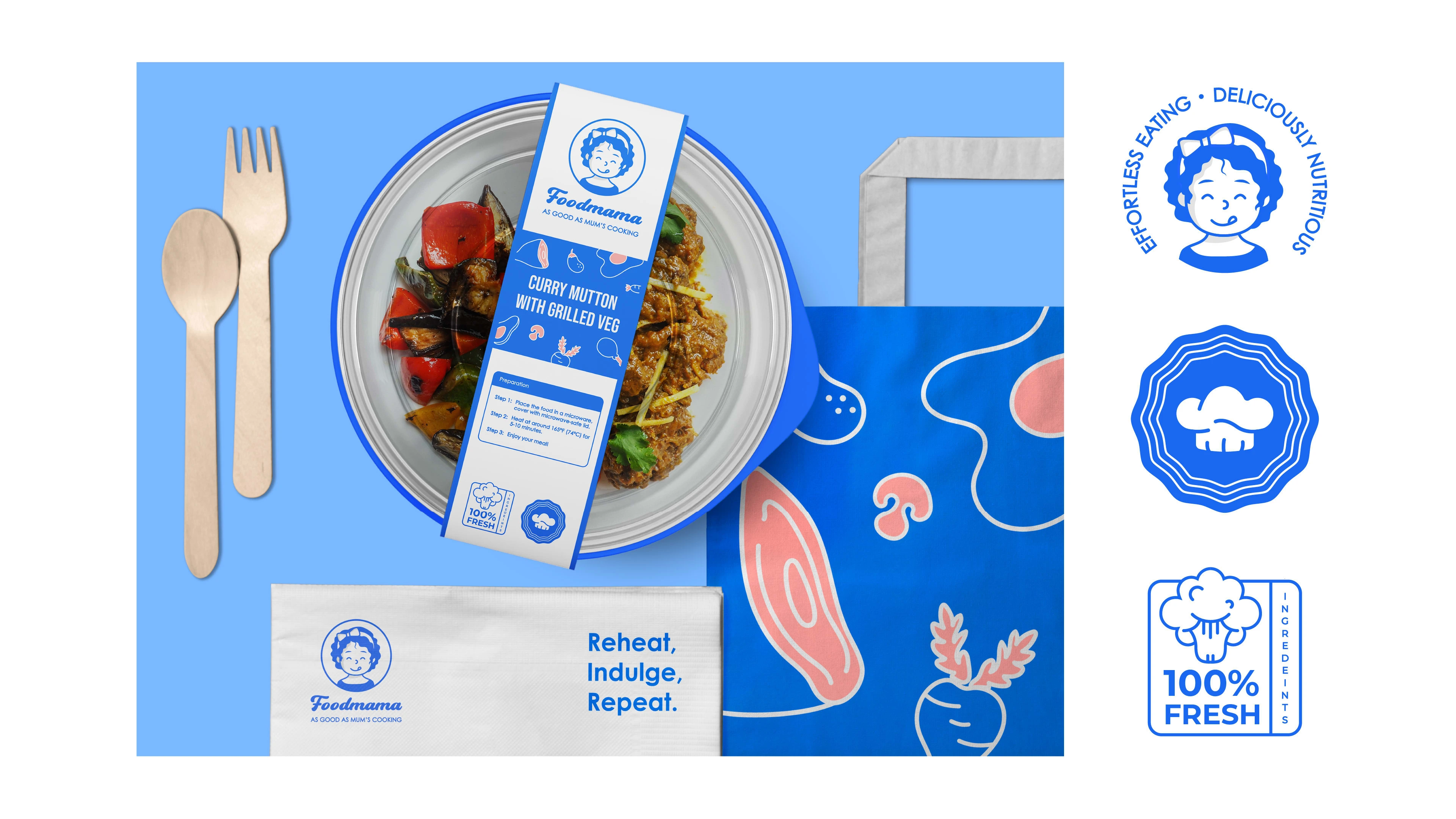
We firmly believe that healthy food can be both affordable and convenient to prepare. To exemplify our warm and inviting approach, we've introduced Mum's mascot logo, representing friendliness and delectability to resonate with our audience. Our aim is to evoke cherished memories of home-cooked meals, filled with love and care, just like the ones prepared by mums.
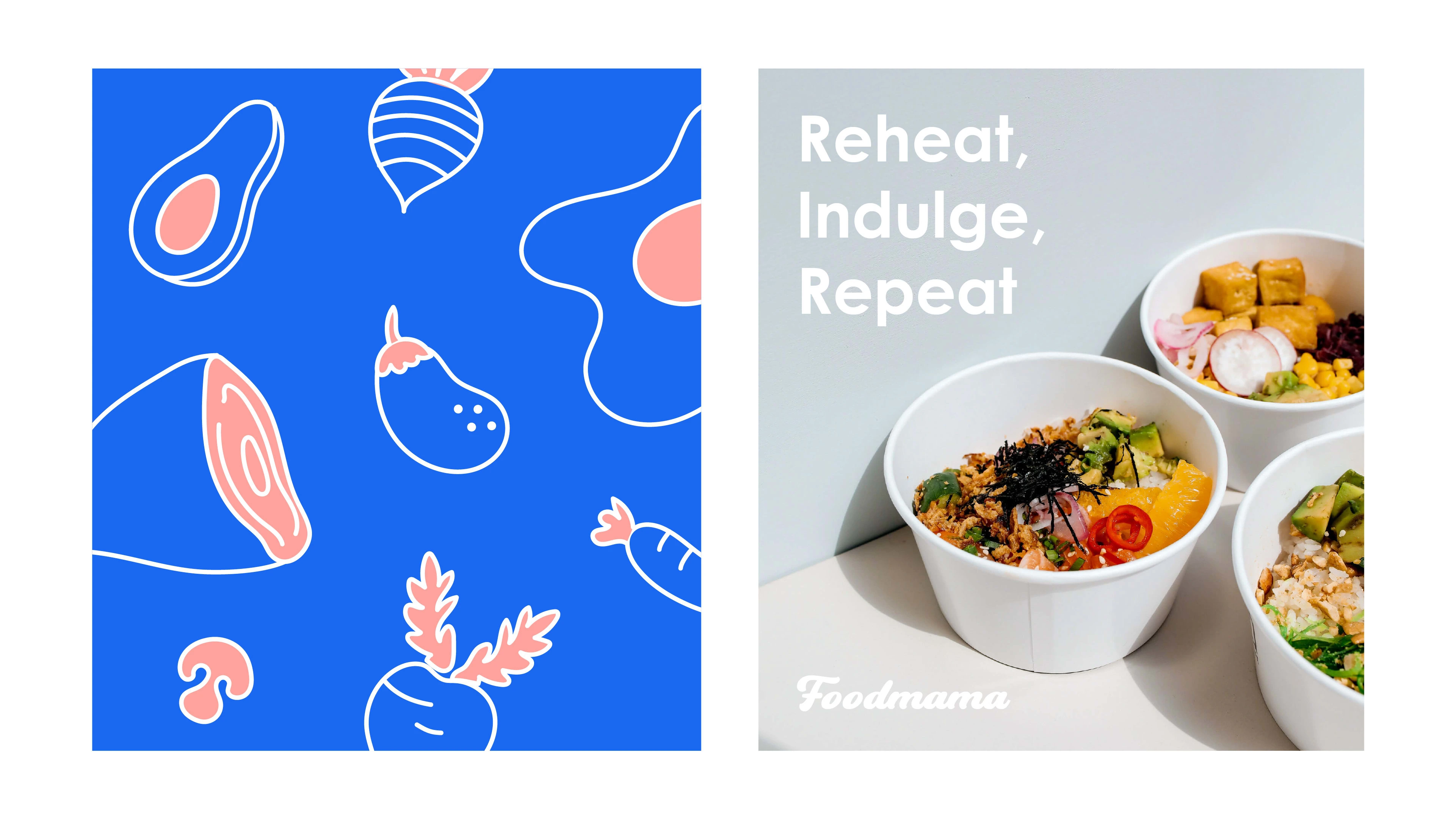
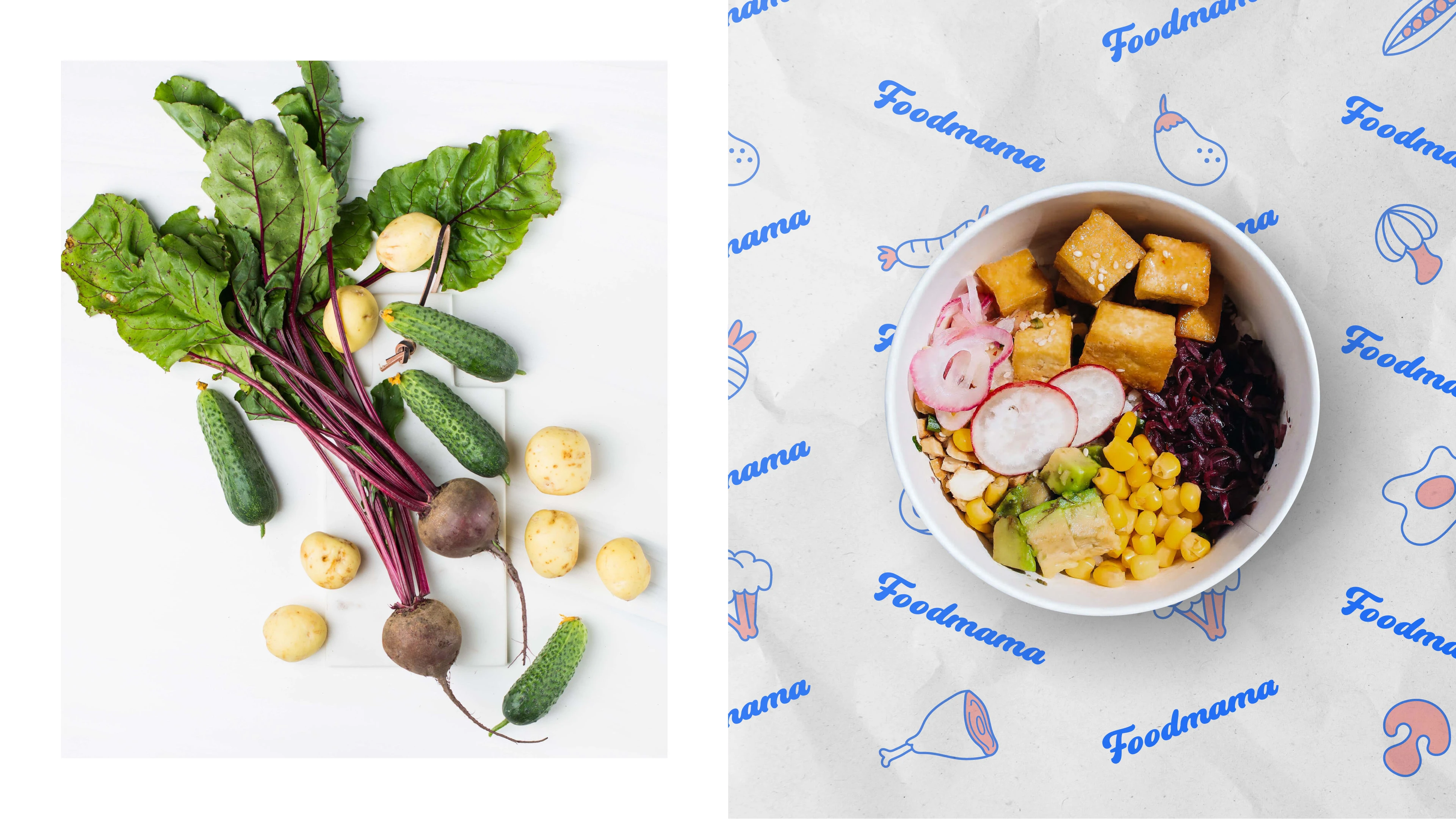
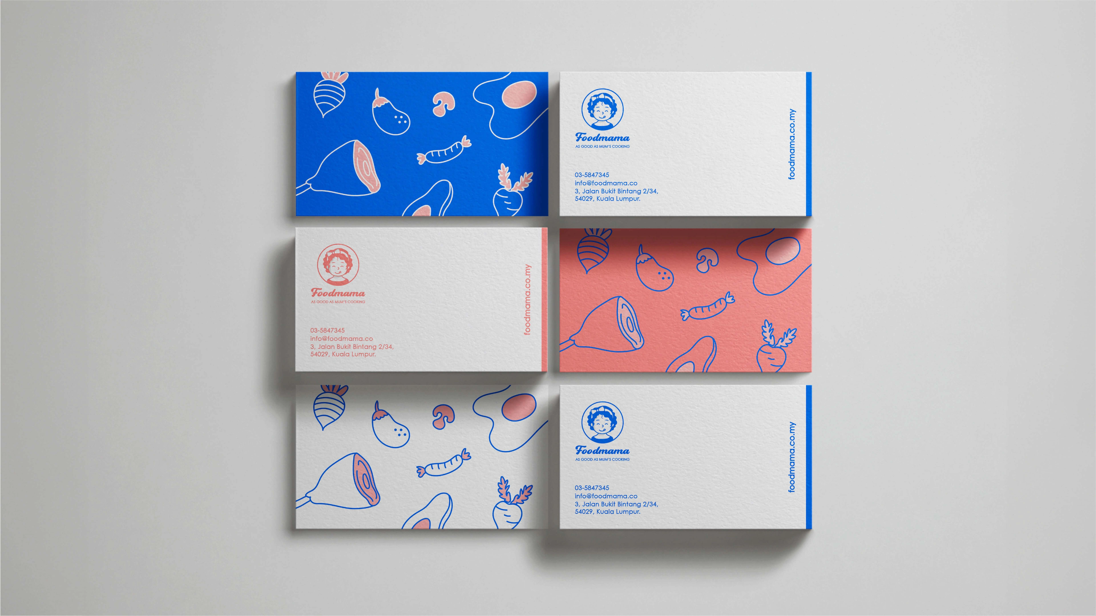
In our branding, the color blue symbolizes the dedication to innovative food technology, while pink represents the values of love, nurturing, and approachability. These elements come together harmoniously, crafting an attractive brand identity that embodies the spirit of healthy eating and evokes a comforting sense of familiarity.


Like this project
Posted Aug 11, 2023
Logo & brand identity design for Foodmama, a healthy meal brand with a simple or minimal re-heating process.

