Optimizing Application Flow & Educating New Investors in Amartha

Natasha Satya


Optimizing Application Flow & Educating New Peer-to-Peer Investors in Amartha
Project Overview
Amartha is a Peer-to-Peer Lending (P2PL) instrument offering Crowdfunding & Full investment system for Investors. Their borrowers are mainly SMEs/UMKM, from local stores to local farmers. What's more, to help lenders select their potential borrowers, Amartha provides a credit scoring system based
on the borrower’s in running their businesses.
My final approach to this revamp was to optimize their whole experience with an added feature to educate new P2PL in choosing the right borrowers. This approach was based on research result and idea prioritization.
Impact-Given
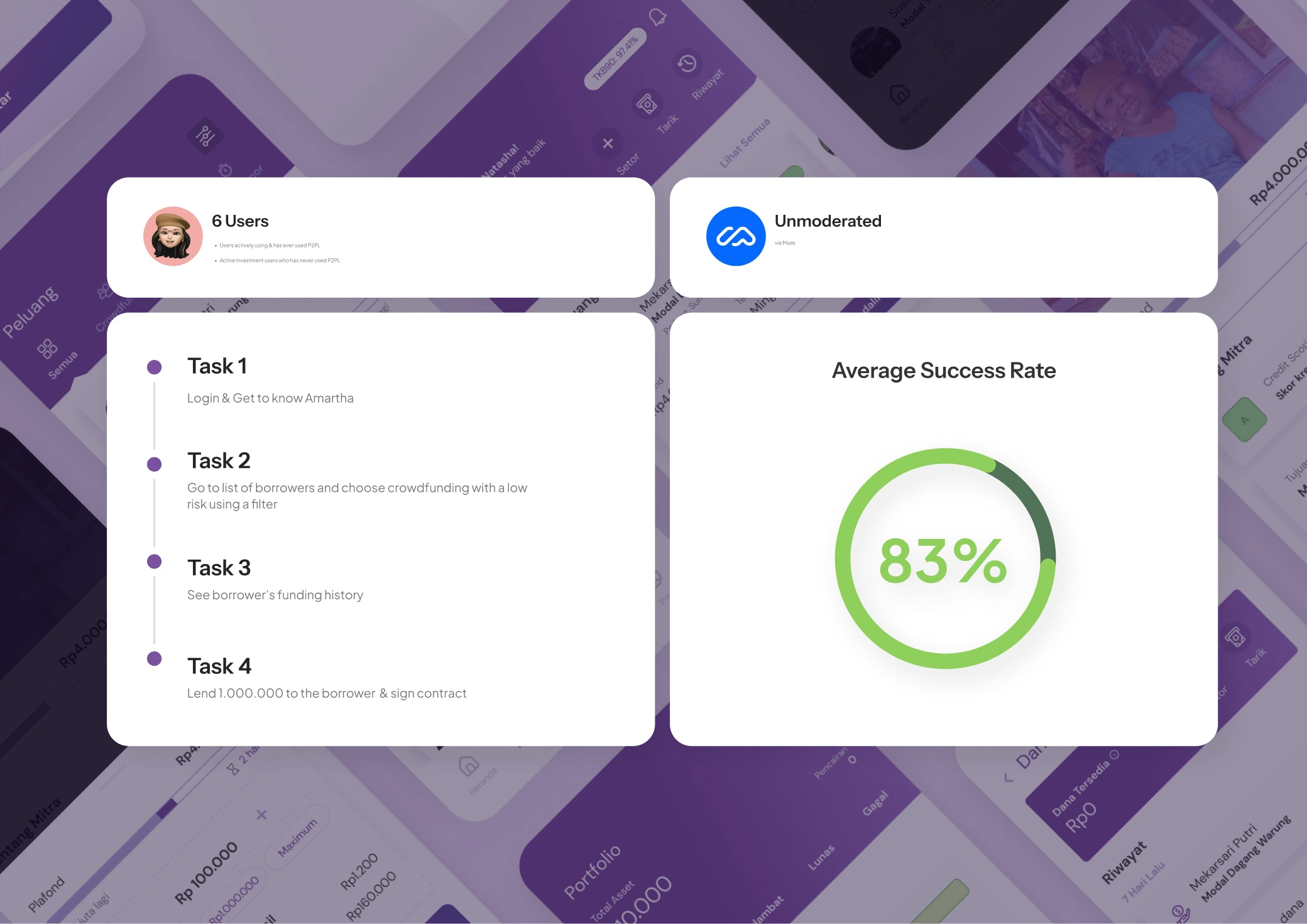
+83 Success Rate
Context & Research
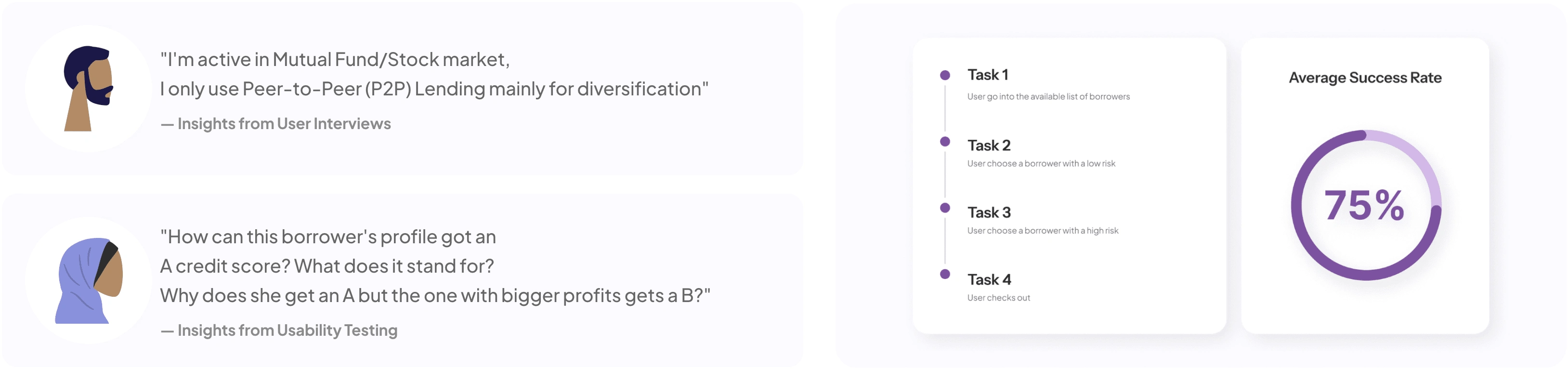
I did user interviews and usability testing to gather contexts. As it turns out, investment is not some rocket science anymore for new Amartha users but they still experience problem using the app, especially their vague credit-scoring system.
Key Insights
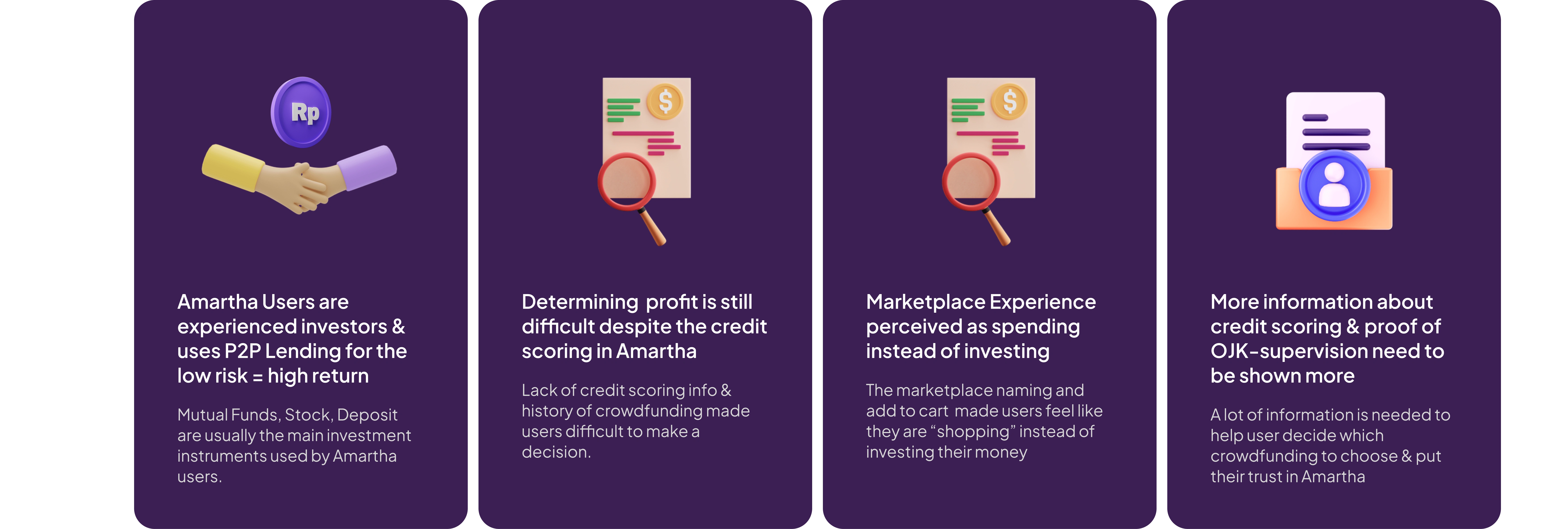
The insights above brings my core challenge in this revamp project:
How Might We help educate new P2P Lending investors in optimally funding SMEs in Amartha App?
Opportunities in The Experience
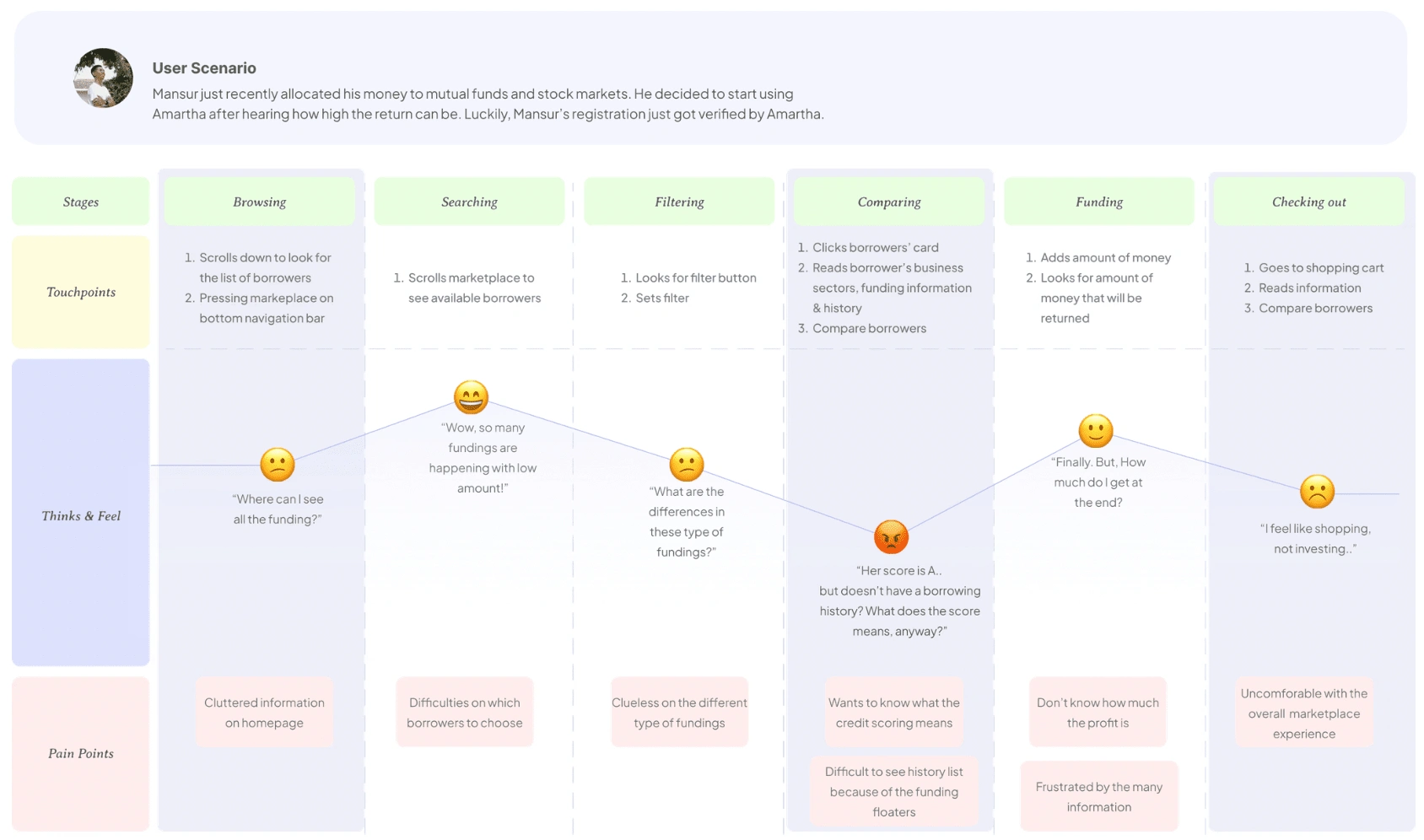
I created a user journey map to identify where frustrations could most likely occur. The map revealed that browsing, comparing, and checking out are the three key areas to prioritize during brainstorming. This helped me stay focused on answering the How Might We questions later on.
From there, I began my most creative process. From diverging ideas using How Might We, to converging ideas through Priority Matrix (Priority x Impact)
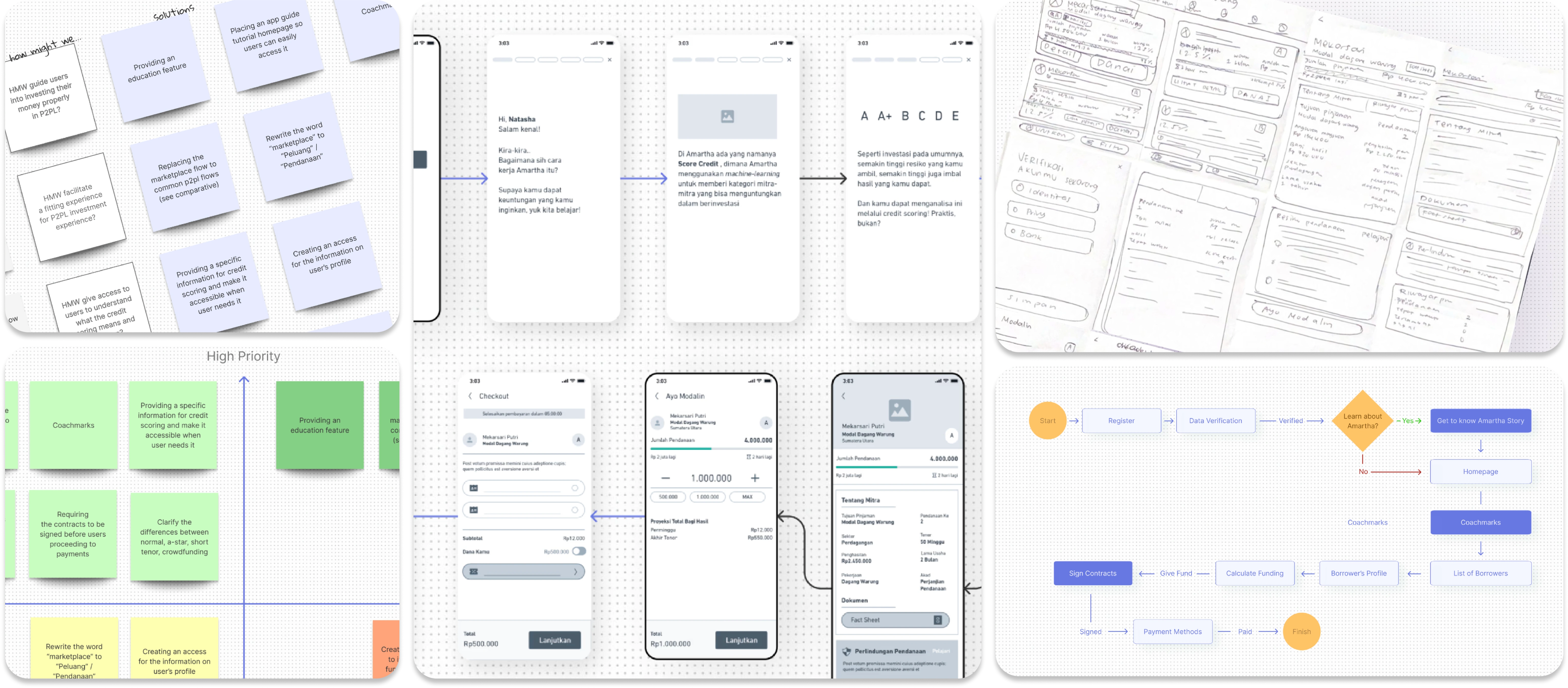
The Solution
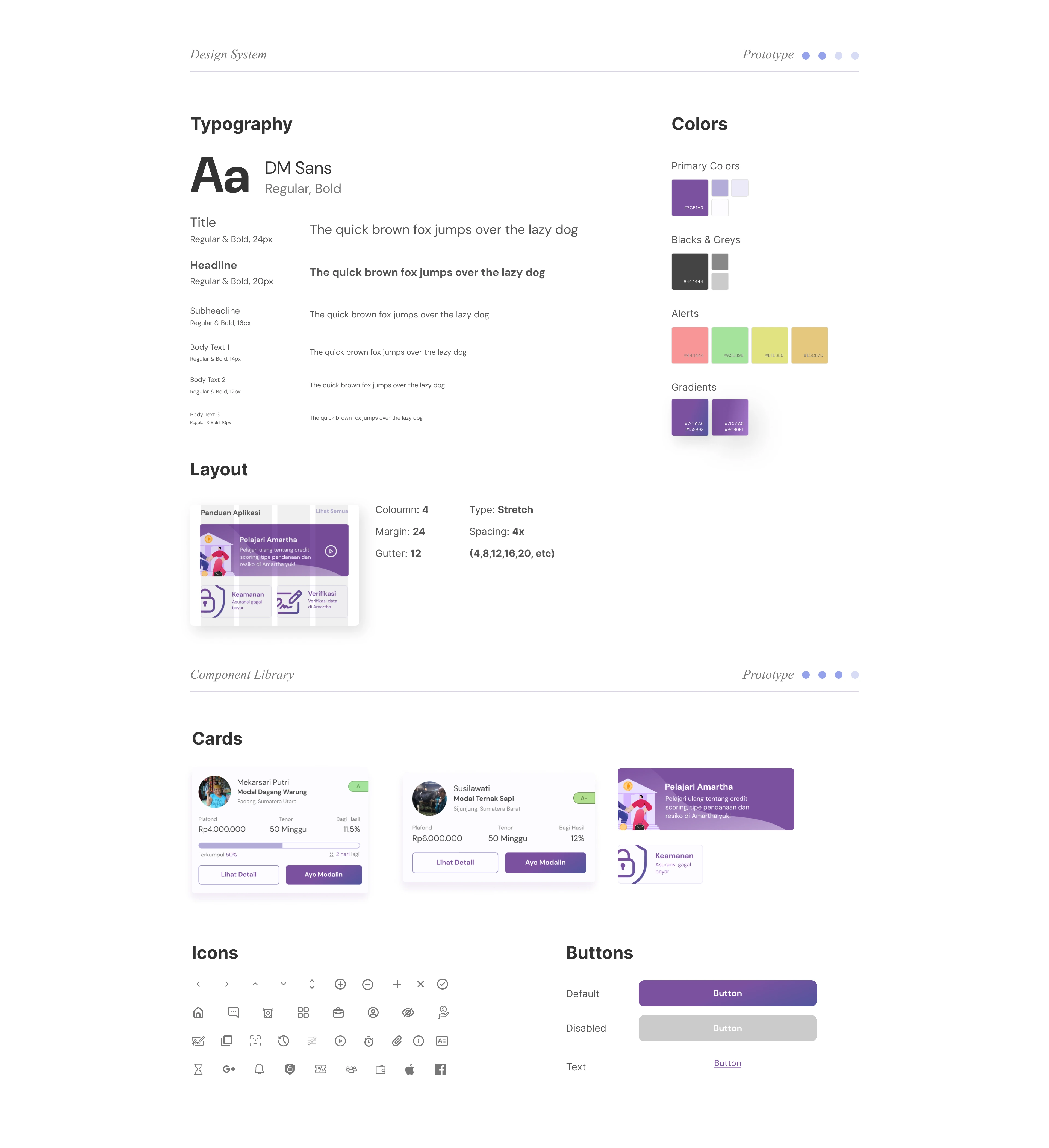
I built the design system incorporating Amartha's rich purple color which represents their traditional-kinship culture in Indonesia. I added more gradients to elevate the finance identity and implementing cleaner fonts
New Feature: Onboarding Screens
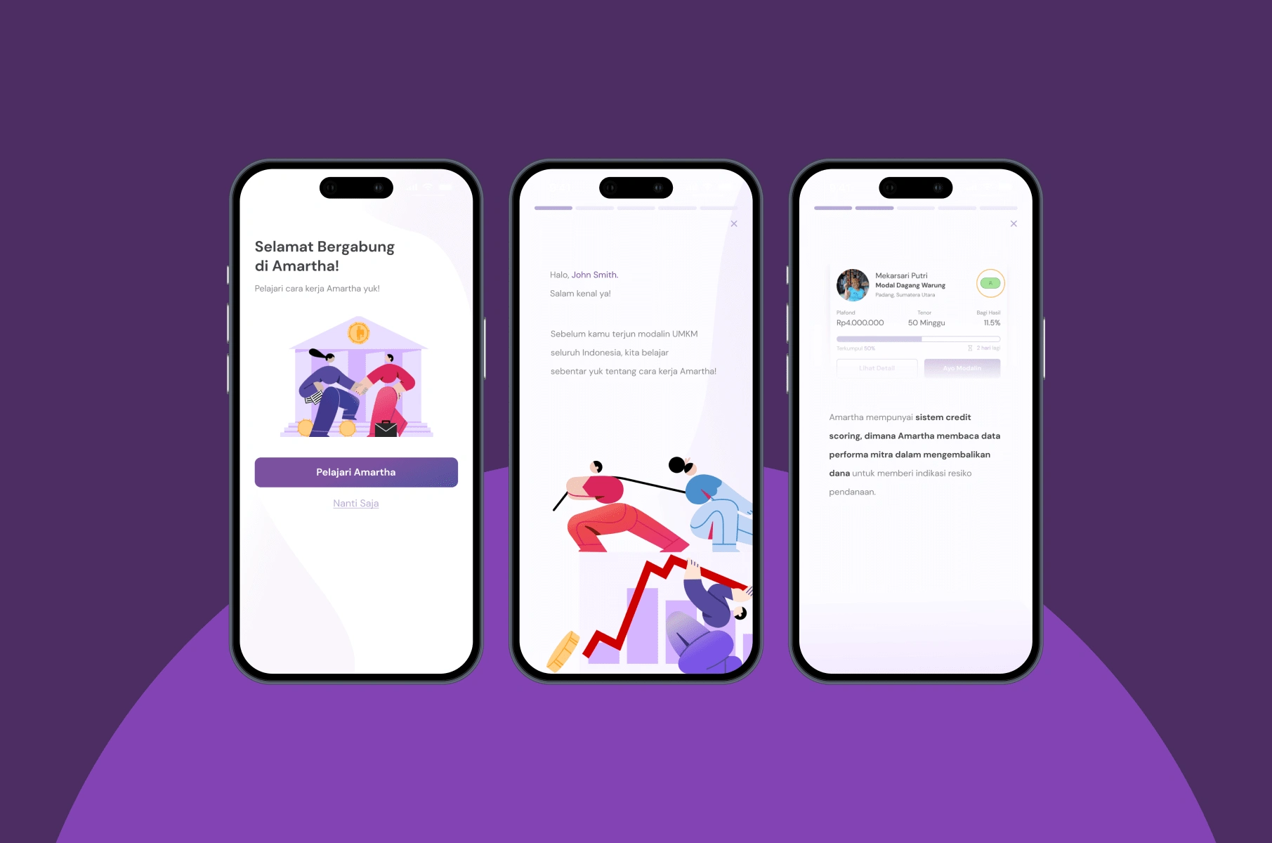
An educative onboarding is introduced upon registration. This feature provides essential information about Amartha’s borrower profiles, credit scoring system, and different types of lending. By integrating this feature, I aimed to bridge the knowledge gap for first-time investors.
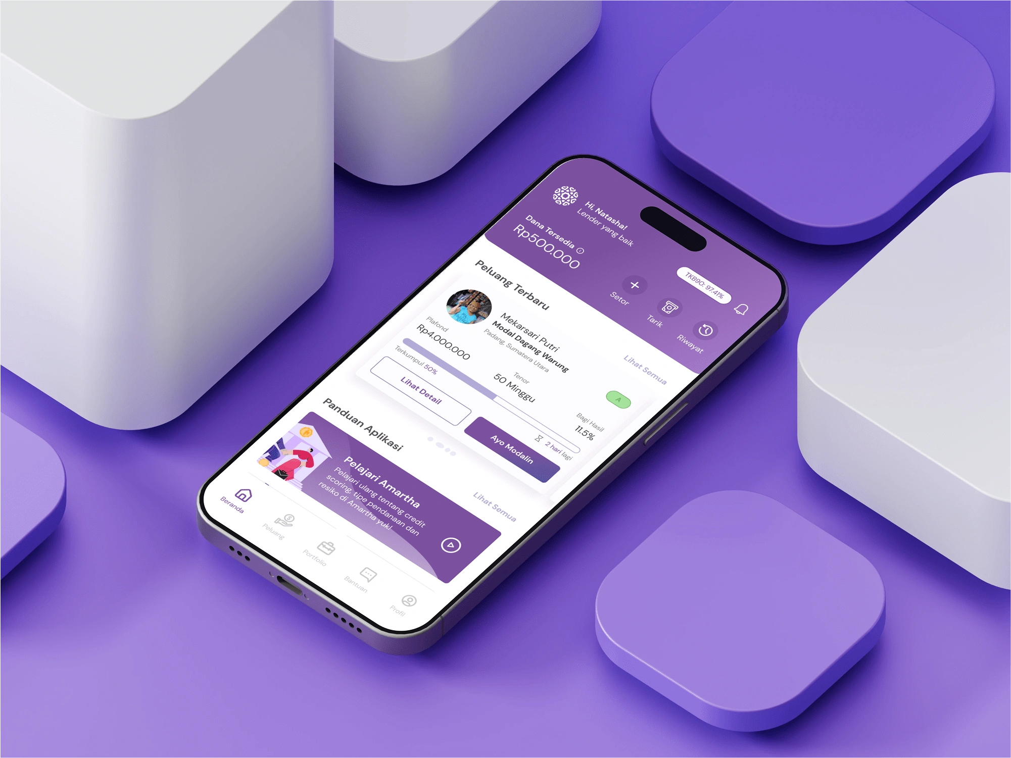
2. Revamped Dashboard for better accessibility and visibility
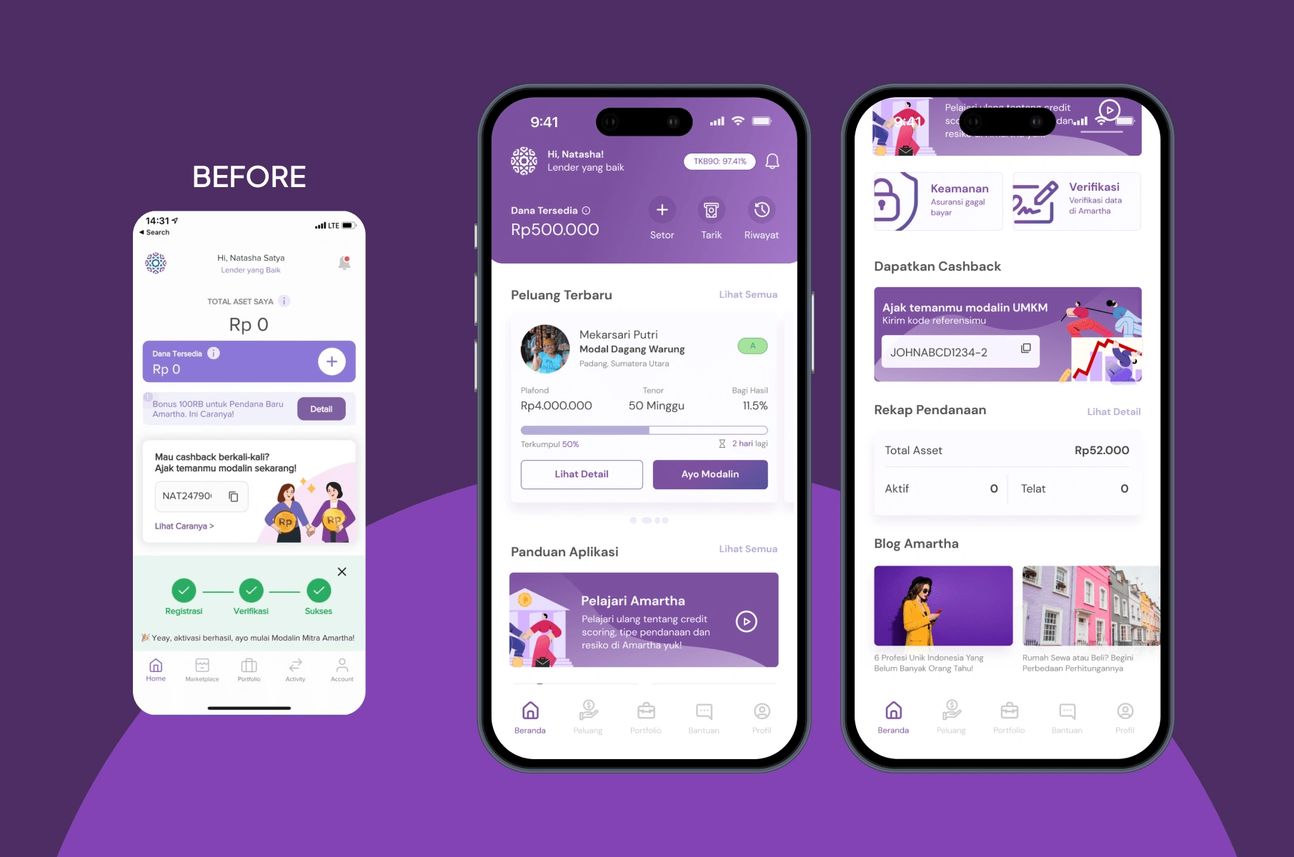
The dashboard is redesigned to improve accessibility and visibility, making it easier for users to navigate the app. One of the key improvement was the borrower preview section, allowing investors to quickly glance at available lending opportunities and seamlessly access the full borrower list.
3. Revamped List of Borrowers: from Marketplace to Peluang
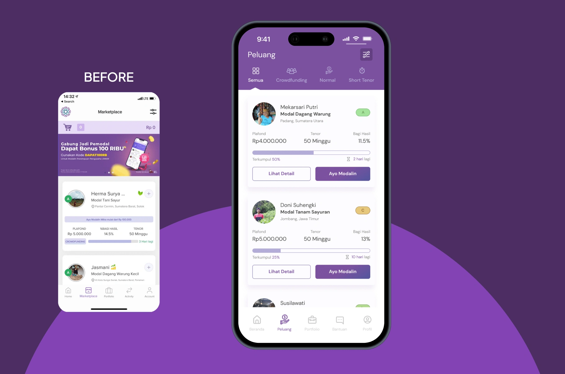
I revamped the copywriting from "Marketplace" to "Peluang" (which means Opportunity) due to many insights that "Marketplace" made investing feel like shopping. By renaming it to "Peluang," the app now conveys a investment-oriented representation while also reinforcing the idea that users are seizing opportunities rather than simply purchasing.
4. Revamped Borrower's Profile: More Transparent Info & Faster Transactions
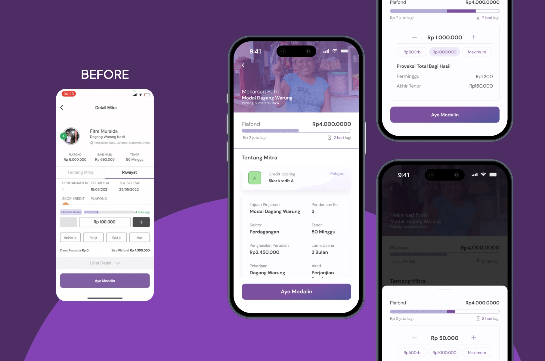
For transparency, I implemented a dynamic loan calculator that allows investors to simulate potential returns. This feature displays how much profit lenders will earn at the end of the borrower's tenor, as well as their expected monthly earnings. By making the financial projection more visible, it helps users make more confident and data-driven investment decisions
The Impact
Like this project
Posted Apr 10, 2025
This was my final project in UI/UX course, where I was able to contribute to +83% Success Rate.


Mobile Application Concept for Employee Engagement
Website Design for Chemical Industry