Medical Billing and Payment System Product Landing Page Design

Akil Ashraful


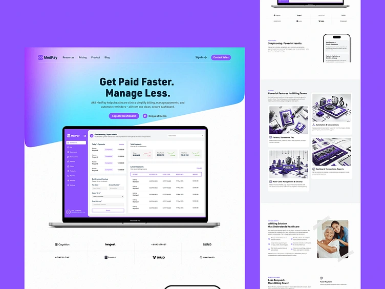
Healthcare Payment Platform Website Homepage UI Design
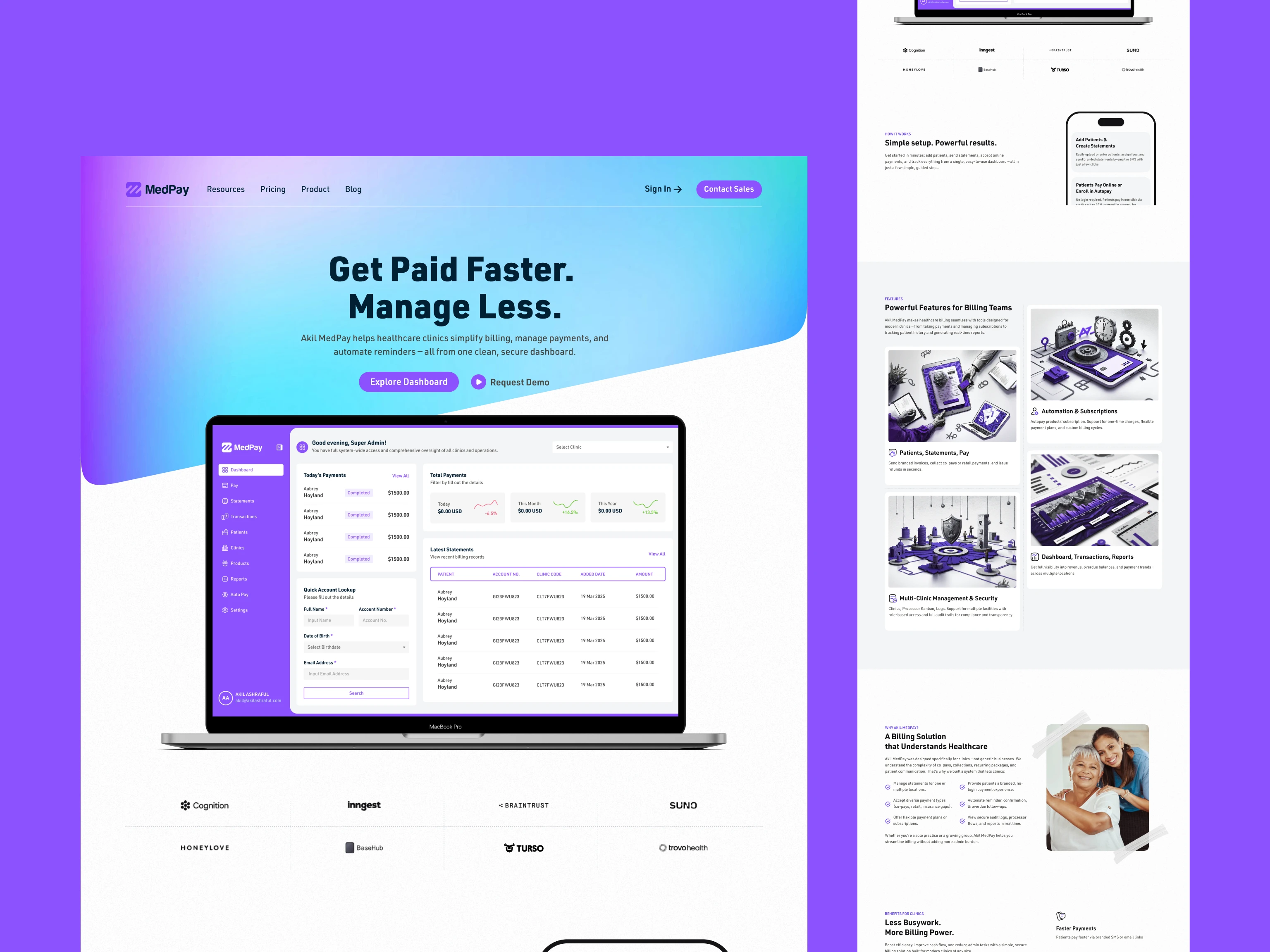
The UX design of the Medical Billing Payment System product landing page strategically aligns with the needs of healthcare professionals by prioritizing clarity, trust, and functionality. The top section uses a purple-to-blue gradient—a color palette often associated with professionalism, calm, and trustworthiness—to create a welcoming entry point. The primary headline, "Get Paid Faster. Manage Less." is concise and benefit-driven, instantly communicating the product's value. Clear CTA buttons, "Explore Dashboard" and "Request Demo," guide users toward either self-exploration or direct engagement, accommodating different user intents.
The design also leverages visual storytelling with a central MacBook Pro mockup showcasing the MedPay dashboard, allowing potential users to immediately visualize how the tool simplifies billing. The clean interface with transaction history, analytics, and payment tracking reinforces efficiency and ease of use. The consistent use of purple and white in the UI maintains brand coherence while supporting visual hierarchy. Informational blocks such as "Simple setup. Powerful results." and modular feature illustrations support scannability and facilitate fast comprehension.
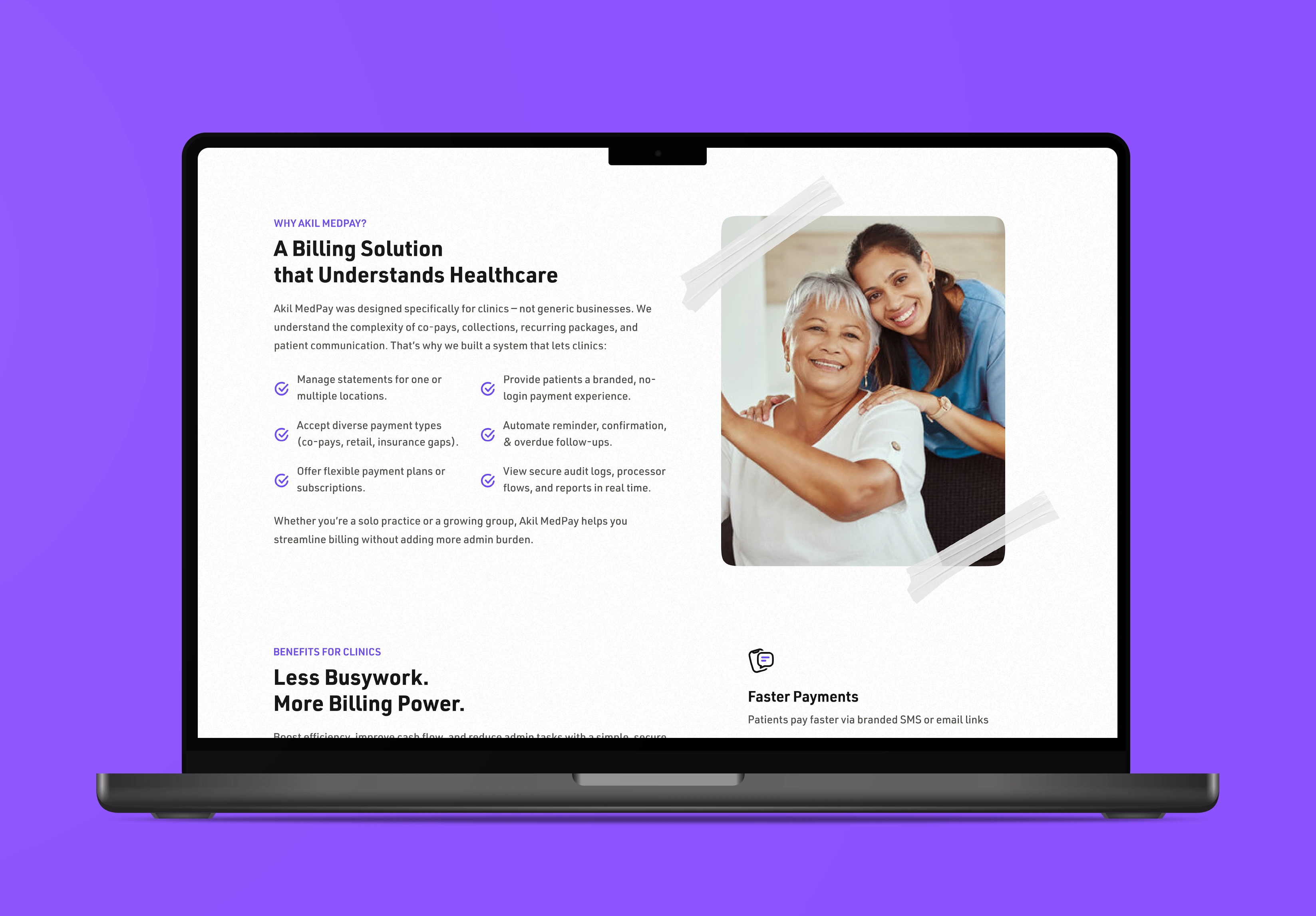
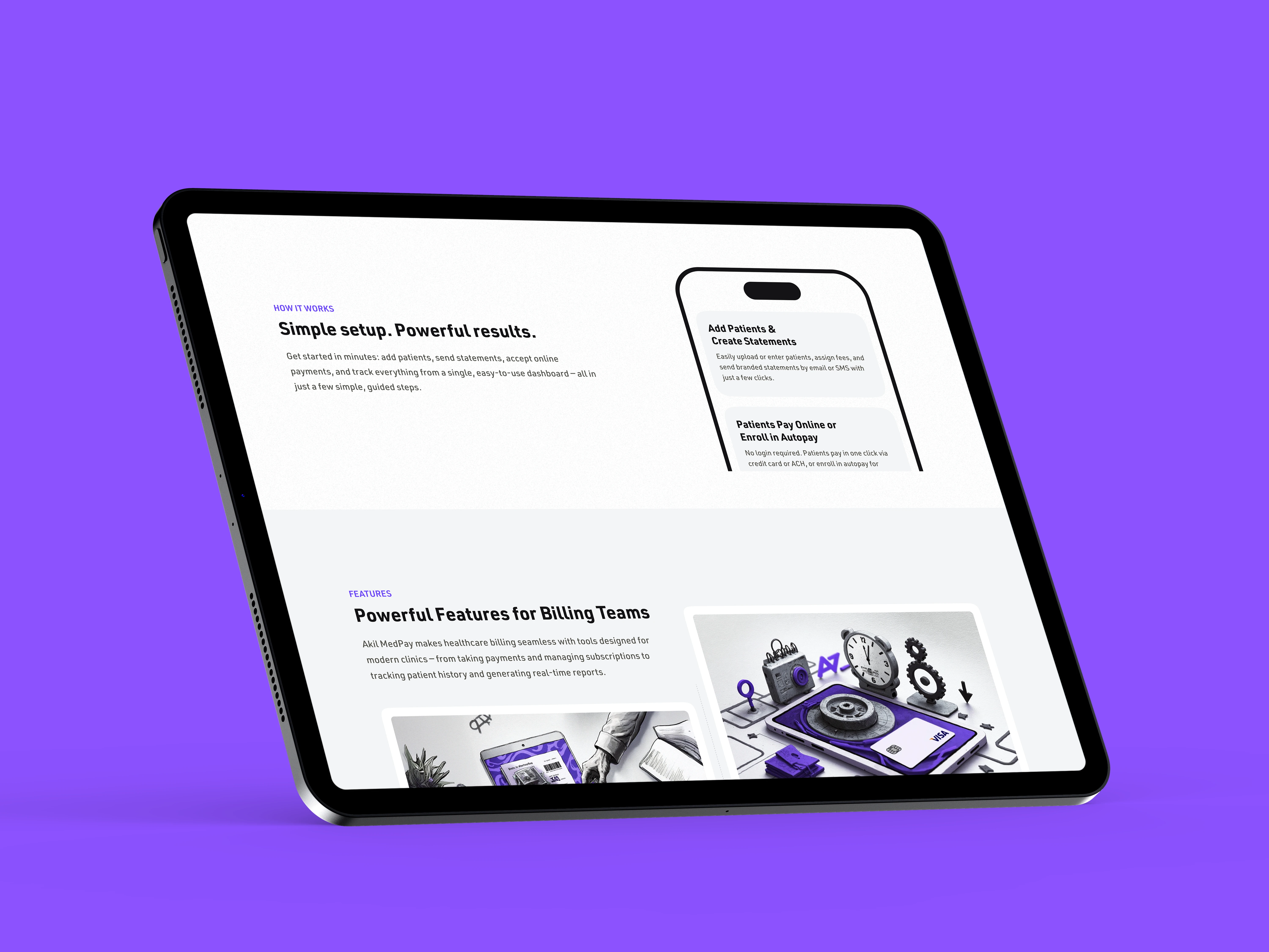

Further down, the layout emphasizes credibility and trust. Displaying real company logos, high-quality illustrations, and a testimonial-inspired message ("Let’s Make Billing the Easiest Part of Your Clinic") helps establish professional authority. The use of a responsive, minimalist design with ADA-friendly color contrast ensures the platform is accessible and user-friendly across a wide range of devices and user needs, including staff in clinics with varying levels of tech proficiency.

Medical Billing Website Design
Healthcare Payment Platform UI
Billing Software Landing Page
HealthTech SaaS Product Design
Clinic Billing System Website
Healthcare Invoicing Platform Design
Medical SaaS Product Homepage
Medical Payment System UI
Hospital Billing Software Website
Telehealth Payment Solution Design
Healthcare Billing Dashboard UI
Medical SaaS Landing Page
Medical Billing System Design
EHR Billing Website Design
EMR Payment System UI
Billing Automation Web Design
HealthCare SaaS Landing Page
Like this project
Posted Oct 13, 2026