AURA - Premium Plant E-Commerce Mobile App UI/UX Design
Diyoke Stanley N.
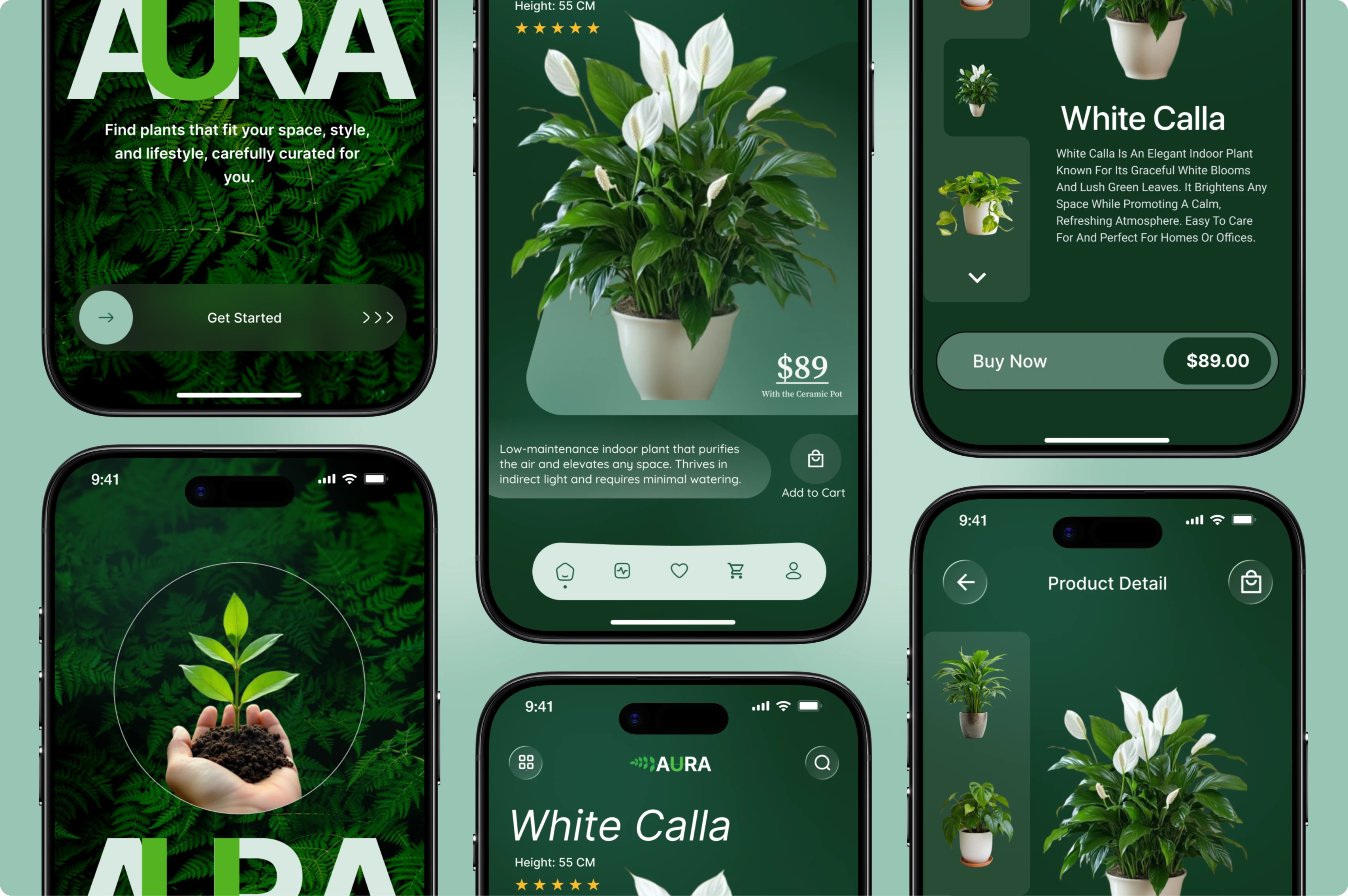
Overview
AURA: Plant E-Commerce Mobile App
People don't just buy plants. They buy the feeling of a better-looking, better-breathing space. Most plant shopping experiences fail to capture that. They're cluttered, generic, and do nothing to inspire confidence in the purchase.
AURA was built around a single idea: make buying a plant feel as good as having one.
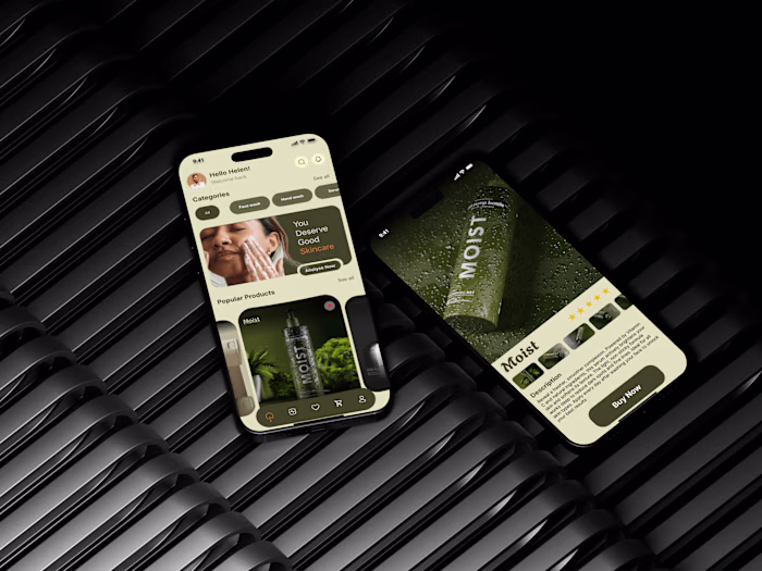
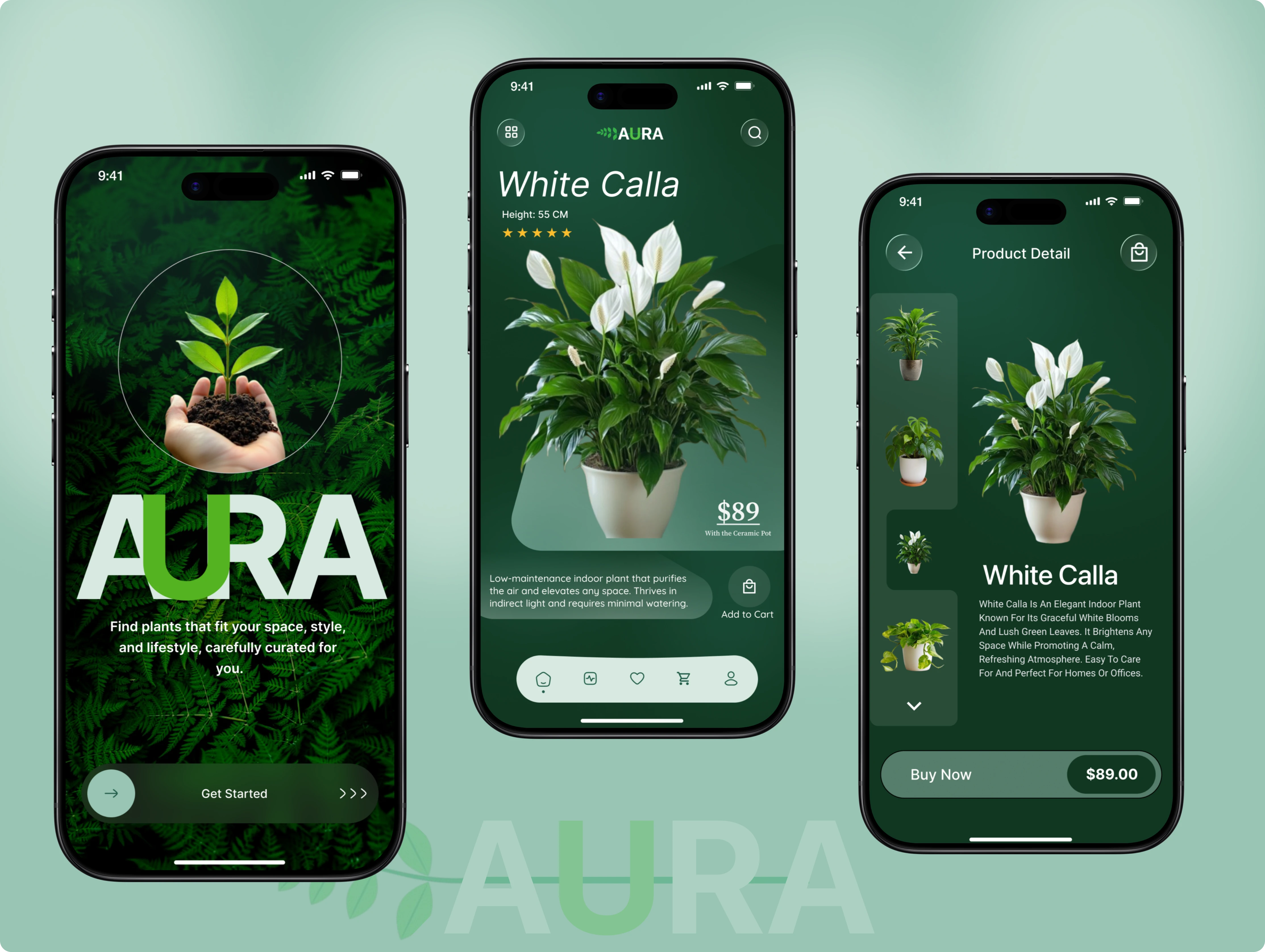
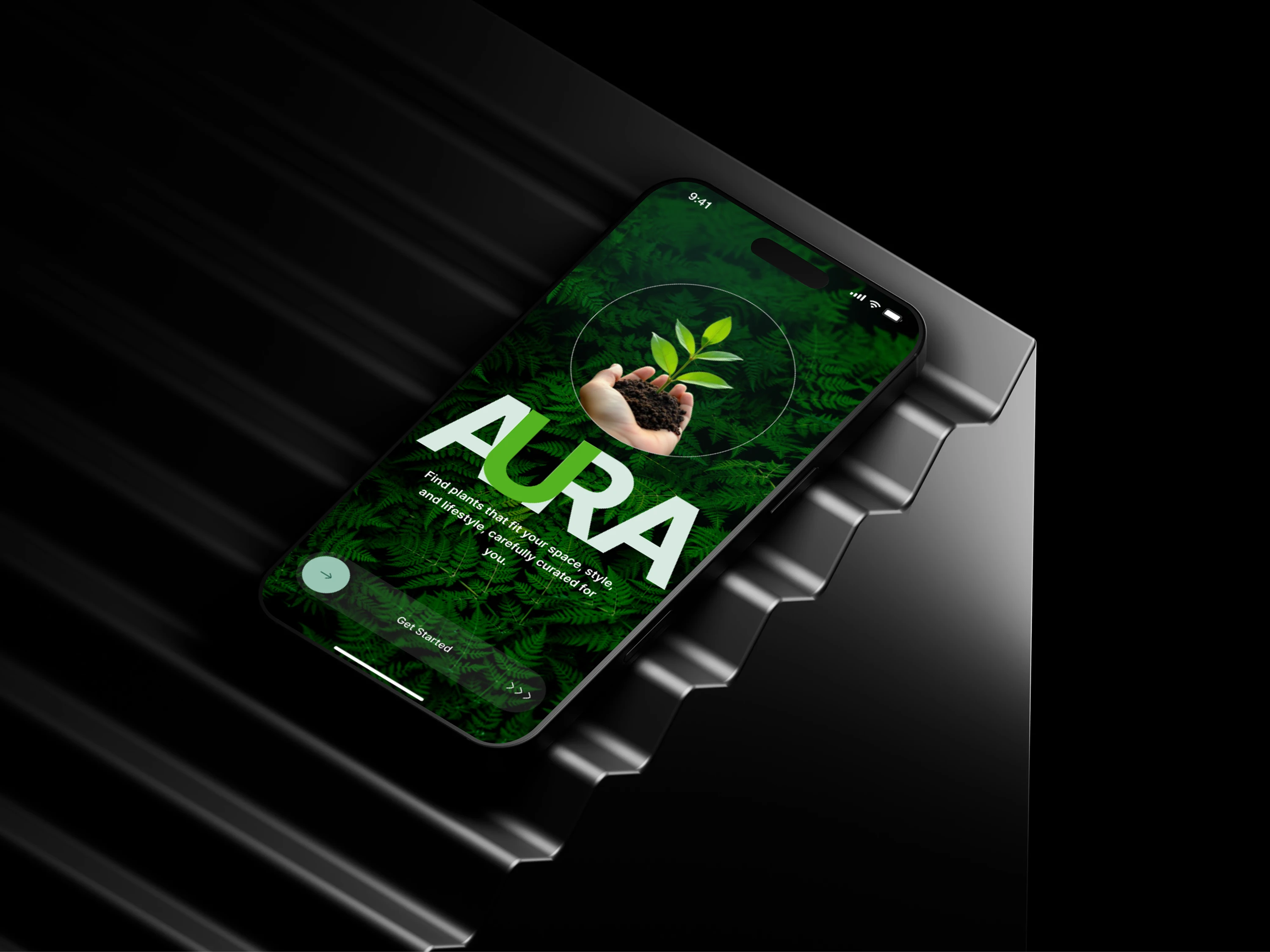
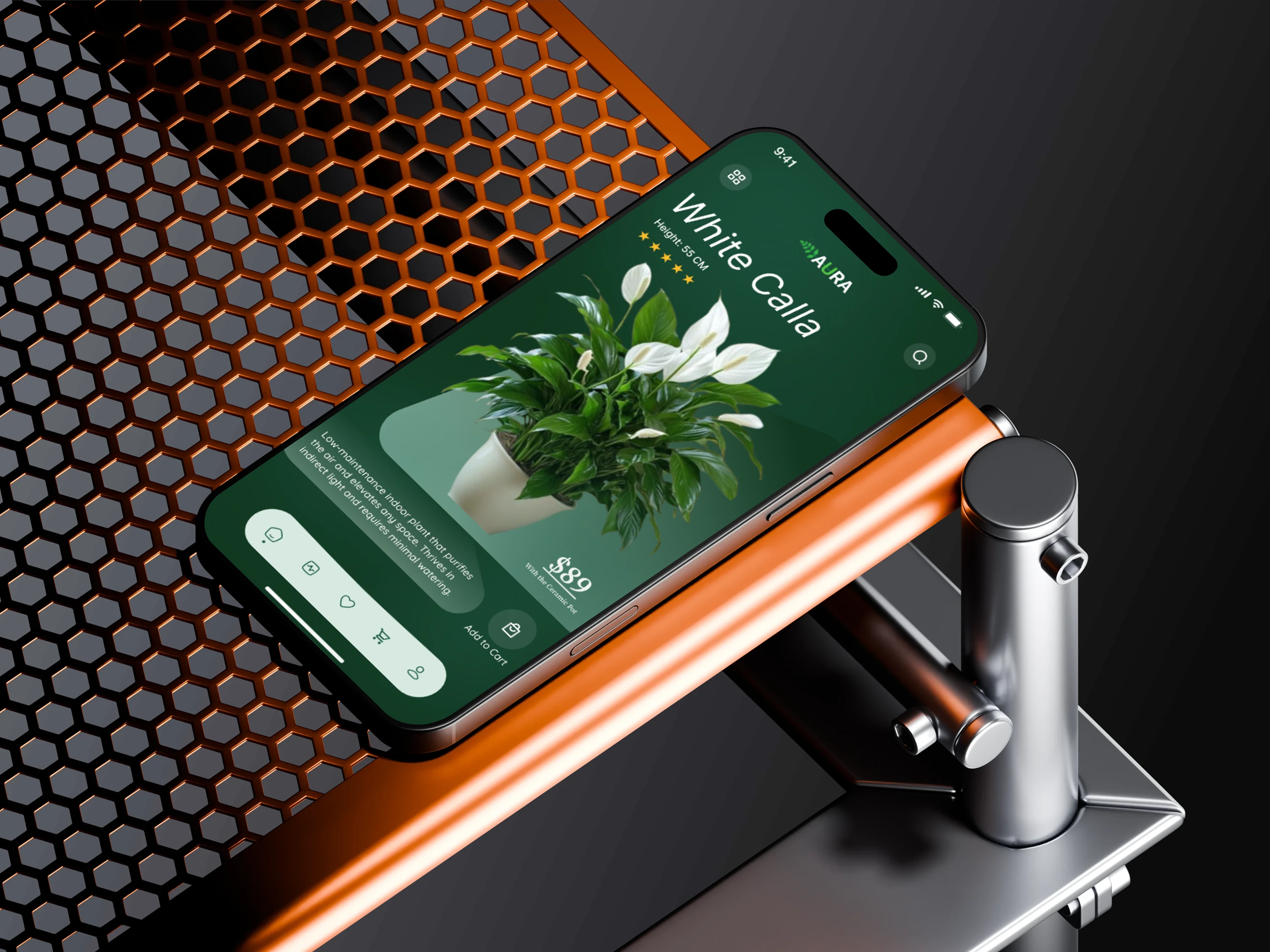
The deep forest green palette and full-bleed botanical photography create an atmosphere before a single product is browsed. The onboarding screen doesn't just introduce the app. It makes a promise. From there, every screen is engineered to reduce hesitation. Product pages lead with beauty, follow with credibility. Height, ratings, and a clear price all come together with a checkout path that never gets in the way.
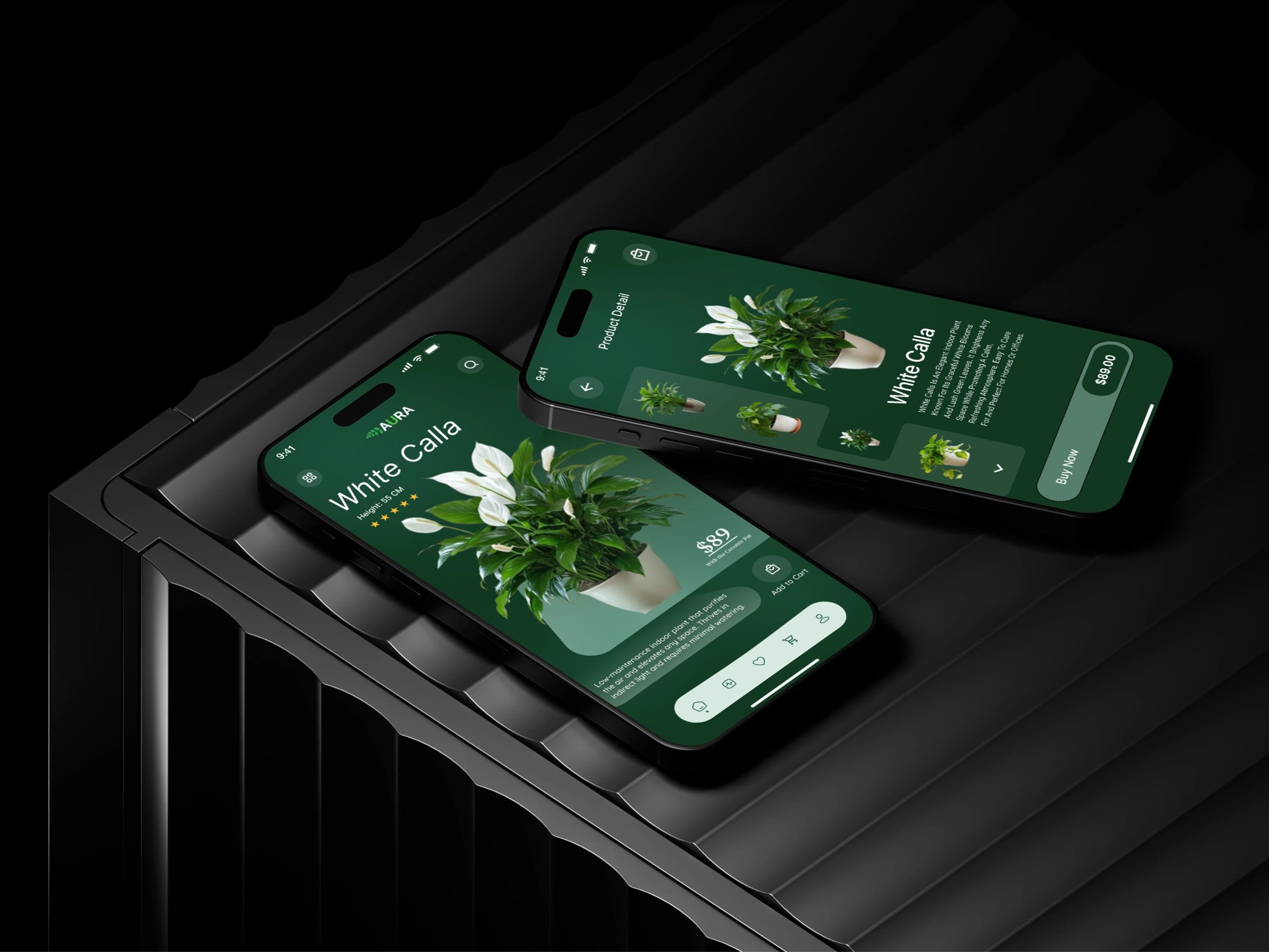
The detail view goes further, offering a thumbnail gallery that lets buyers explore without feeling lost, paired with a description that sells the lifestyle, not just the plant.
AURA doesn't look like a store. It looks like somewhere you'd want to spend time, and that's exactly what turns browsers into buyers.
Problem Statement
Most plant e-commerce experiences are built for people who already know what they want. Browse a category, pick a plant, add to cart. But the majority of plant buyers, especially first-timers and interior styling enthusiasts, don't shop that way. They're looking for guidance, inspiration, and reassurance that they're making the right choice for their space.
Instead, they're met with plain product grids, inconsistent photography, and zero emotional connection to the brand. The result is hesitation, abandoned carts, and customers who end up going back to their local shop simply because it felt more trustworthy.
Solution
AURA reframes the entire buying experience around the customer's lifestyle, not just the product catalog.
Rather than dropping users into an overwhelming grid, the app opens with a brand promise, setting the tone that this platform genuinely understands them. Product pages are designed to inspire first and inform second, pairing editorial-quality photography with just enough detail to build confidence. Ratings, dimensions, and pricing are surfaced clearly, without cluttering the visual experience.
The detail screen combines a curated image gallery with a lifestyle-driven product description, giving buyers both the emotional and rational justification they need to commit. Every screen flows toward one action, with a checkout experience that removes friction exactly where it matters most.
Deliverables
User flows and low-fidelity wireframes were developed early in the process to map out the core shopping journey, from onboarding through to checkout. These laid the structural foundation before any visual decisions were made.
A full design system was established to ensure consistency across every screen, covering typography, color, component styles, and spacing rules all rooted in the AURA brand identity.
High-fidelity screens were designed for all key app states, including the onboarding screen, product listing, and product detail page, with careful attention to visual hierarchy, photography integration, and mobile usability.
An interactive prototype was built in Figma to simulate the end-to-end user experience, allowing for realistic flow testing across the main purchase journey.
Like this project
Posted Mar 8, 2026
A curated plant shopping app designed to inspire confidence and turn casual browsers into buyers through lifestyle-driven UI.
Likes
0
Views
1
Timeline
Feb 2, 2026 - Mar 8, 2026