Chapa: Concept Redesign of Ethiopia's Leading Payment Platform

studio.et


The Brief
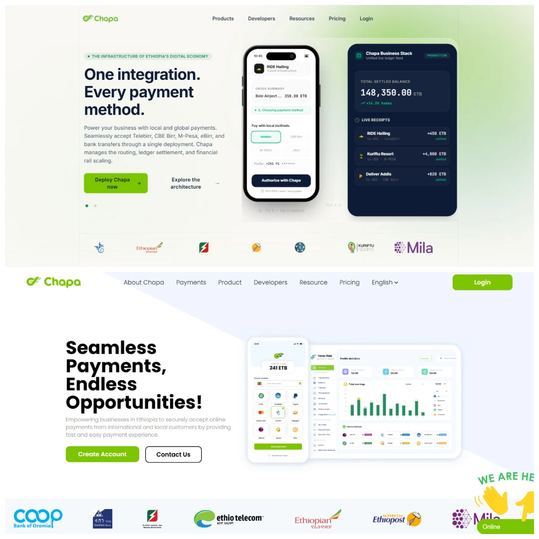
Chapa is Ethiopia's leading payment infrastructure company. Think Stripe, but built for the Ethiopian market. The product is serious. The website wasn't.
This was a self-initiated concept redesign. No client brief, no constraints, just a clear problem: one of the most important fintech companies in East Africa was being represented online by a website that looked like it was built in 2012 and never touched again.
The goal was to redesign the Chapa landing page to match the weight of what the company actually does.
What Was Wrong With the Original
Everything. The typography had no hierarchy. The color system was flat and dated. The layout had no rhythm. The visual language communicated nothing about trust, scale, or modernity, which are the three things a payment infrastructure company needs to communicate above all else.
For a company that processes real money for real businesses, the website was actively working against them.
What Was Built
A full concept redesign of the Chapa landing page, built in React and TypeScript.
The redesign focused on:
Typography: a proper type system with clear hierarchy, weight contrast, and intentional scale
Color: a modern palette that communicates trust and authority without defaulting to generic fintech blue
Layout: structured, breathing layouts that guide the eye and give content room to land
Visual language: a design direction that feels like a serious technology company, not a startup that hasn't updated its site since launch
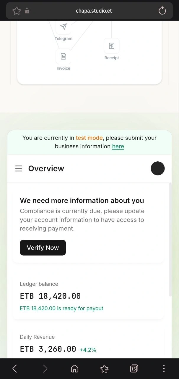
One detail worth calling out: I actually signed up for Chapa's service, took a screenshot of the real dashboard, and rebuilt it pixel by pixel as a live interactive component, the same approach Linear uses on their marketing site. A real product UI, not a mockup. It's the difference between showing what a product could look like and showing what it actually looks like, just better presented.
No Framer. Built directly in React and TypeScript, which meant every interaction and layout decision was implemented in code from the start.
Process
3 days of focused work. The concept came together quickly because the problem was obvious and the direction was clear from the beginning. Most of the time went into getting the details right, not figuring out what to do.
Live Preview
Original: chapa.co
Like this project
Posted Jul 12, 2026
Chapa is Ethiopia's leading payment infrastructure company. Think Stripe, but built for the Ethiopian market. The product is serious. The website wasn't.