Luther: Premium Dark Framer Template for Creative Agencies

studio.et


The Brief
Most agency and studio templates look the same. Dark background, white text, a hero section with "We build digital experiences," and three generic service cards. Luther was built to fix that.
The goal was to create a template that feels like it belongs to a studio with actual taste and actual clients. Built for boutique creative agencies, design studios, and independent consultants who want their web presence to command respect before they say a word.
Most studios doing serious work are represented online by templates that undercut their credibility. Luther fixes that perception problem.
What Was Built
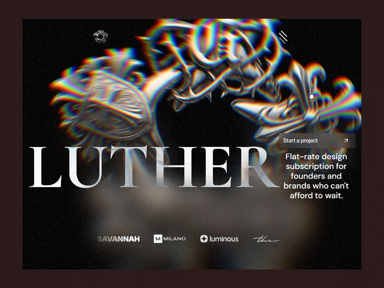
Luther is a premium multi-page Framer template built around storytelling, typography, and motion. Think Chrome Hearts meets a Parisian creative studio.
Key pages include a cinematic homepage, projects and case studies, services, about, blog, careers, contact, and a polished CMS setup for scalable content.
The full feature set:
Typography system — type used as a design element, not just a content vessel. Headlines that dominate. Layouts that breathe.
Color system — pure obsidian, signal red, and electric lime. Nobody else in the Framer marketplace is running this combination.
Custom motion system — subtle glitch-inspired effects, micro interactions, premium transitions, and layered animations that make the interface feel alive without becoming distracting.
Custom cursor — bespoke code that's deeply unique to Luther, not a plugin or off-the-shelf component.
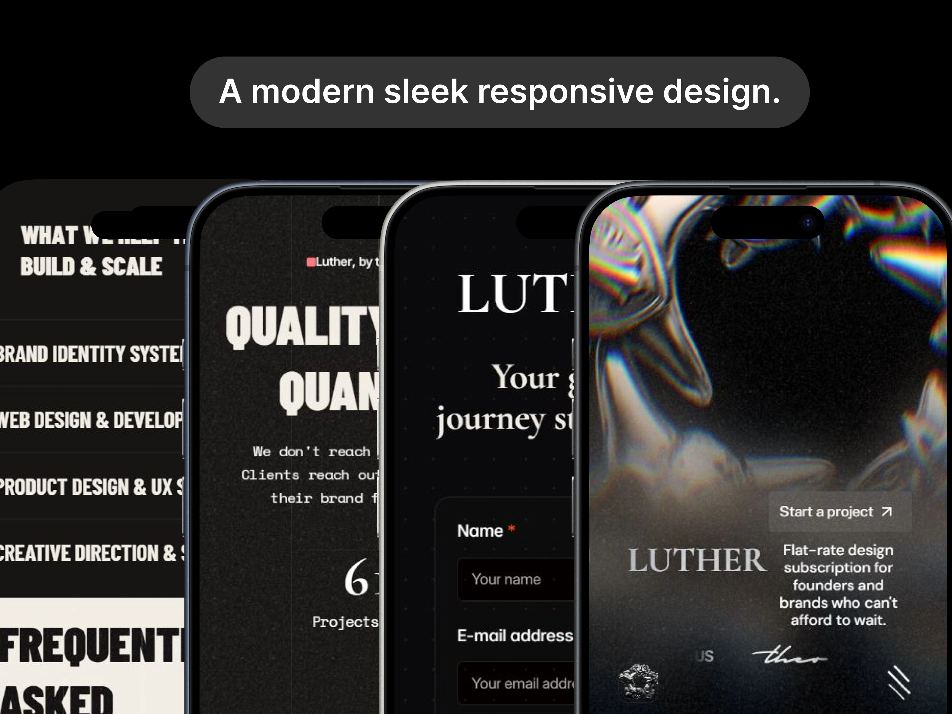
Reusable components — responsive layouts, SEO optimization, CMS collections, utility pages, and a comprehensive style system that's easy to customize.
Every section was designed with intentional restraint. Nothing is there by accident.
What Makes It Different
Most dark agency templates focus on aesthetics. Luther focuses on perception.
It was approached like a branding project rather than a website build. Every decision, from the typography and pacing to the motion language and layout hierarchy, was made to create a sense of confidence and authority.
The editorial typography direction comes from fashion and culture, not tech. That is a deliberate choice. Instead of relying on flashy animations or overly complex visuals, Luther uses restrained motion, dramatic spacing, and subtle interactive details to create a premium experience.
The goal wasn't to make the loudest template. It was to make one that feels expensive.
If your studio does work that makes people stop scrolling, Luther is the template that matches that energy. If you want safe and corporate, this is not for you.
Process
Luther was built concurrently with running a client acquisition experiment, managing two active leads, and maintaining AURA-OS post-submission. Realistically 3 to 4 weeks of focused work squeezed between everything else, with a significant amount of time going into refining the creative direction, interaction design, and motion system rather than simply producing pages.
Much of the work involved iterating on typography, visual hierarchy, and subtle details that collectively shape the experience.
Live Preview
Like this project
Posted Jul 12, 2026
Luther is a premium multi-page Framer template built around storytelling, typography, and motion. Think Chrome Hearts meets a Parisian creative studio.
Likes
0
Views
5
Timeline
May 4, 2026 - May 15, 2026