The Good UI

Ana Estrela
1 collaborator

Where it came from
While working on a new theme for Swell ’s storefront editor I found myself building a complete ecommerce UI from scratch for the third or fourth time. Header, product card, product detail page, cart drawer, checkout. These patterns are well understood and don’t change much between stores, yet every project started at zero. The Good UI was an attempt to stop doing that: one library that covered the pieces you need to design an ecommerce site, built for designers and developers who wanted a starting point they could trust and extend.
The closest reference was Untitled UI, which we admired for its curation and finish. The difference was scope. Rather than a general purpose kit, this was meant to go deep on commerce.
Keeping it small on purpose
The first decision was to resist completeness. Every component added to a design system raises the cost of maintaining it and makes it harder for someone new to understand what each piece is for. We treated v1 as the minimum set that lets a team move quickly, with the expectation that people would add on top of it for their own needs rather than wait for us to cover every case.
How it was organised
The library follows a layered structure so that each level only depends on the one below it.
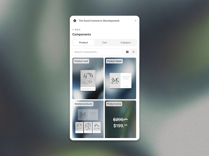
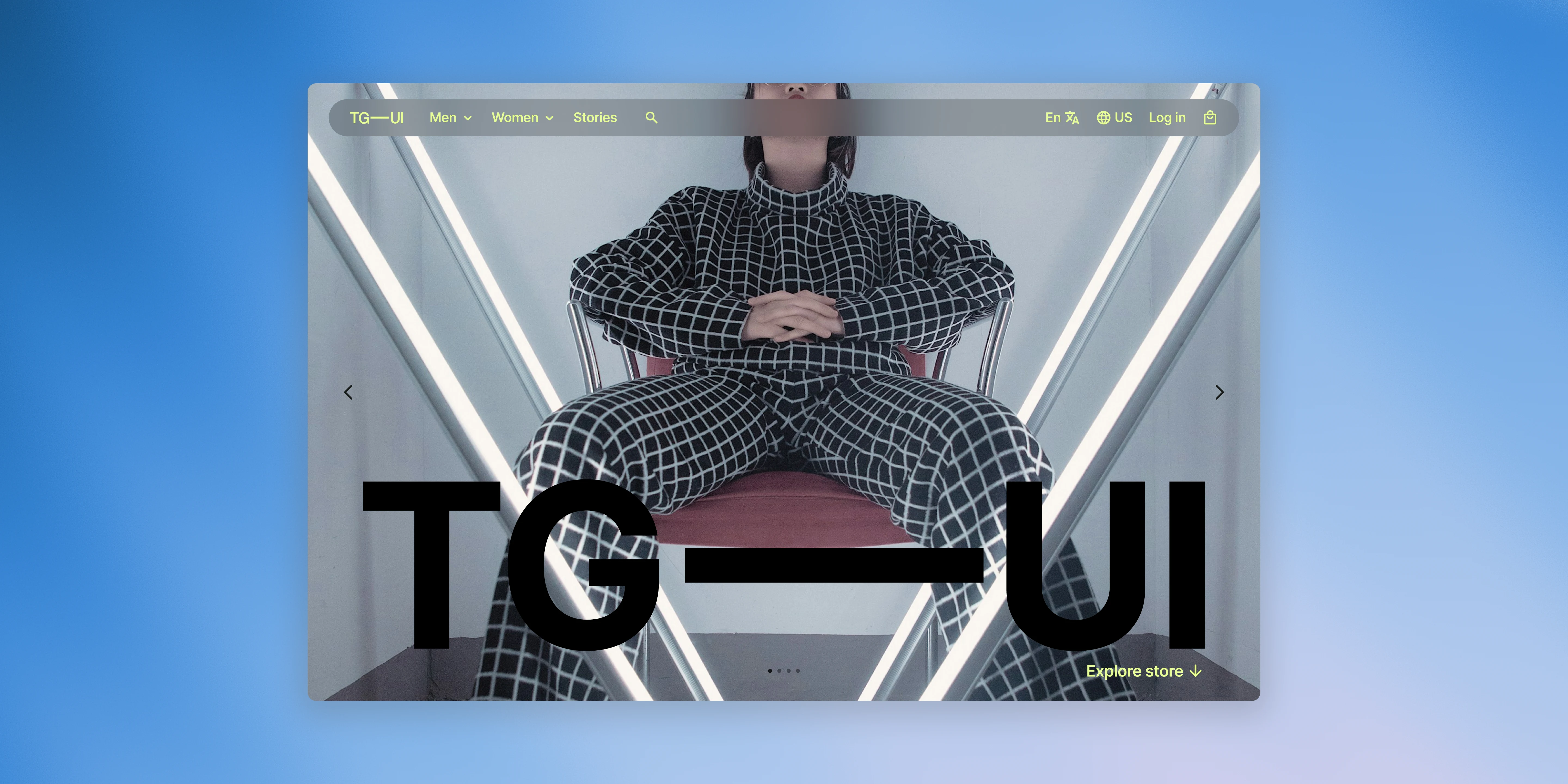
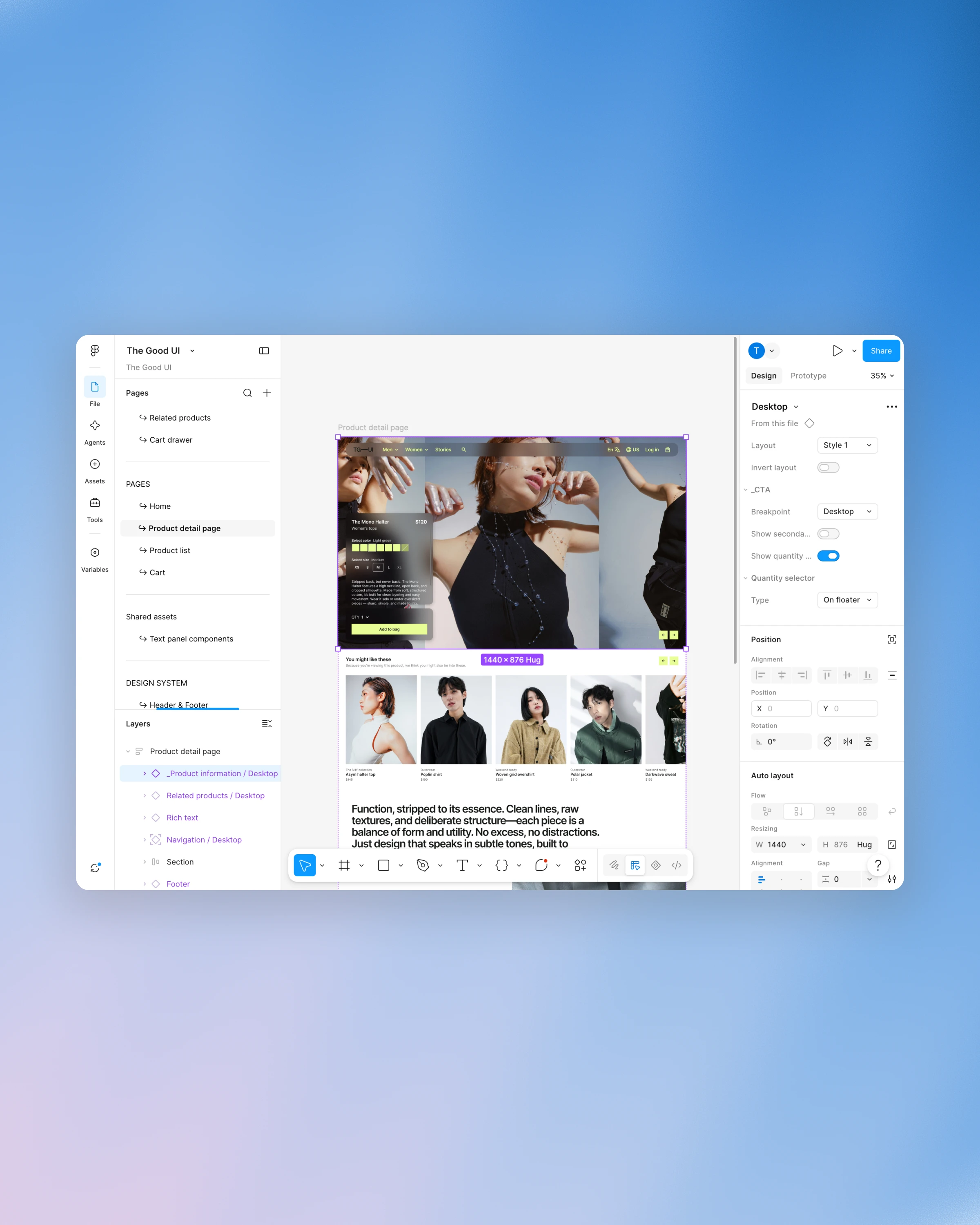
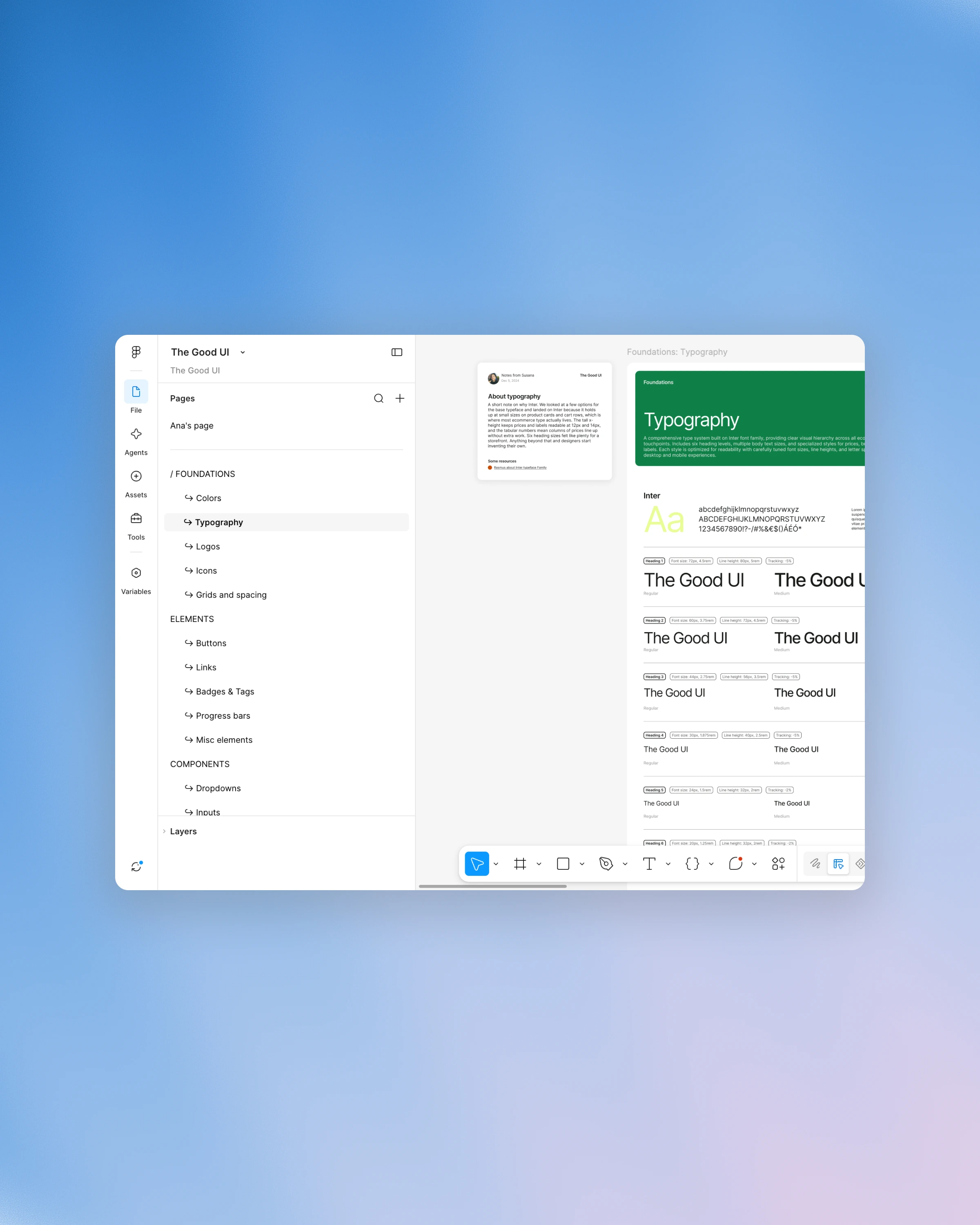
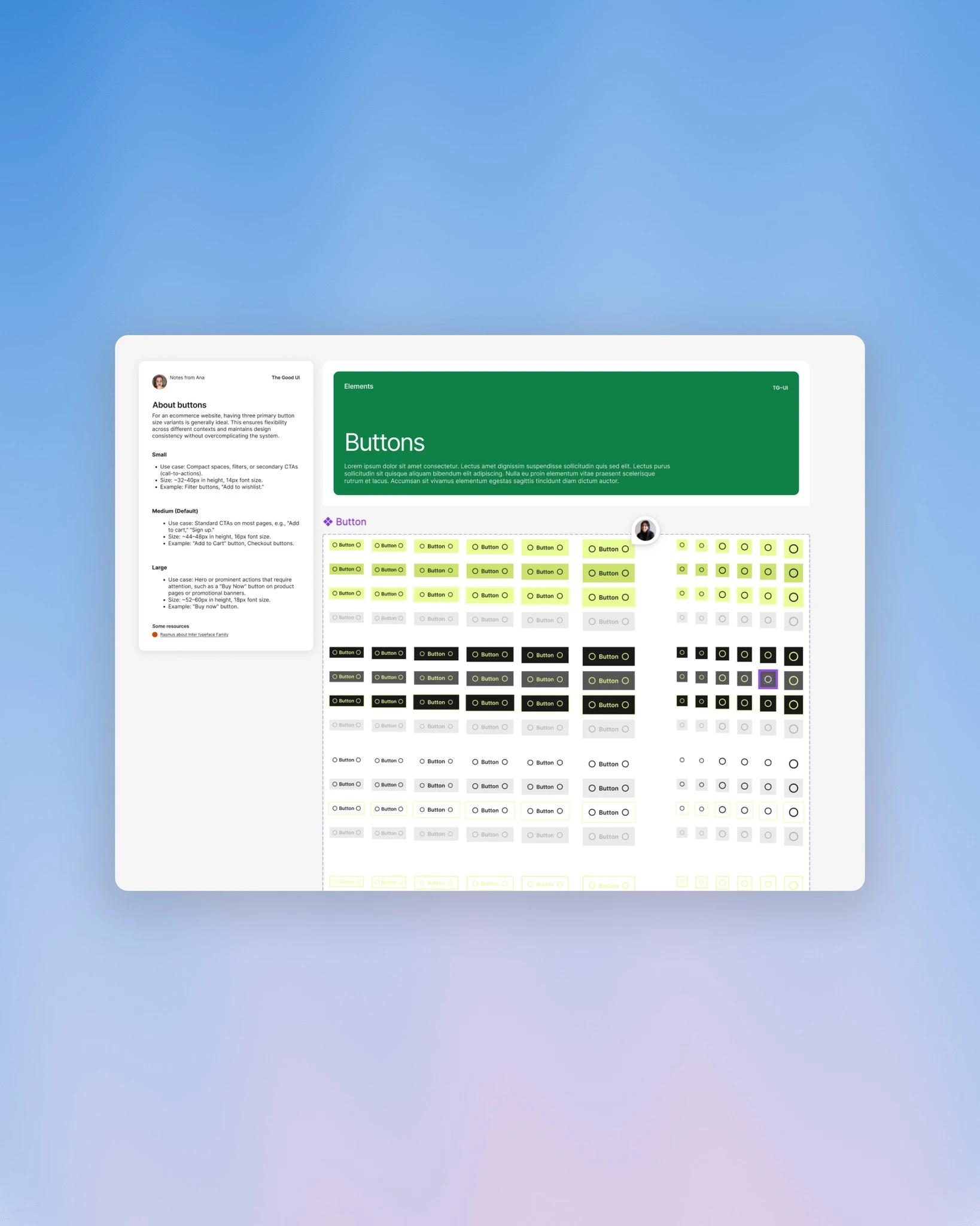
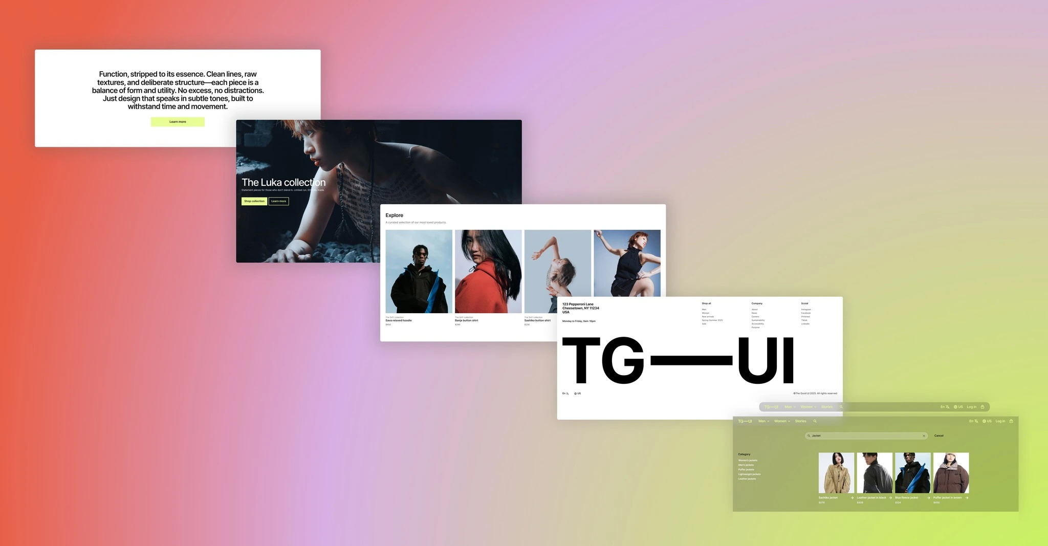
Foundations cover colours, typography, icons, logos, grids and spacing. Elements are the smallest reusable pieces: buttons, links, badges and tags, progress bars. Components build on those with dropdowns, inputs, toggles, checkboxes, tooltips, alerts, sliders, filters and accordions. General sections are the full width blocks that appear on most pages, such as header navigation, footer, slideshow, rich text, image banner, featured category and collection list. Template specific sections hold the commerce heavy parts: product information, related products and the cart drawer. The pages layer assembles everything into home, product detail, product list and cart.
Each page in the file carried its review state in its name, so at any point we could see what was finished, what had been checked by the other person and what was still open. By the time we paused, the foundations, elements and most sections were complete and reviewed. Icons, grid definitions, the checkbox set and the mobile product list were still in progress.
Why we didn’t launch
Somewhere in early 2025 it became clear that the library might not be as useful as we first thought. Tools like Framer were changing how people build storefronts, and designing everything in Figma first then rebuilding it elsewhere started to feel like extra work rather than saved work.
Like this project
Posted Nov 2, 2026
Design of a focused ecommerce UI/component library for a storefront editor, organised as a minimal layered system.
Likes
0
Views
1
Timeline
Nov 2, 2024 - Jun 18, 2025
Collaborators