
Overview
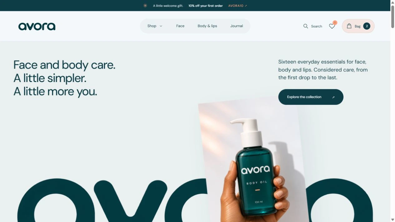
Avora is a skincare brand I created around a simple idea: a little care should feel easy to understand and enjoyable to shop for. I developed its visual direction and responsive ecommerce frontend, carrying one consistent identity across the website, packaging and product imagery.
My scope covered brand identity, UI/UX design, product presentation, motion and Next.js development. The result brings a 16-product collection, two shopping categories, product education, favorites and a three-step checkout journey into one experience.
Project type: Self-initiated brand and ecommerce project
Built with: Next.js, React, TypeScript, Vercel
Live website: avora-kohl.vercel.app
The challenge
The goal was to balance an expressive beauty brand with practical shopping needs. Visitors should be able to understand the collection, compare products, find supporting information and move toward checkout without losing the calm feel of the brand. This was a self-initiated design and build project; the decisions reflect the project goals rather than formal customer research.
1. One recognizable brand system
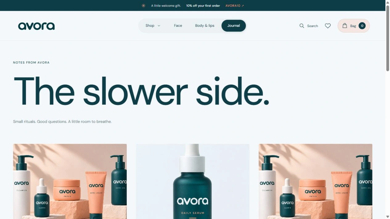
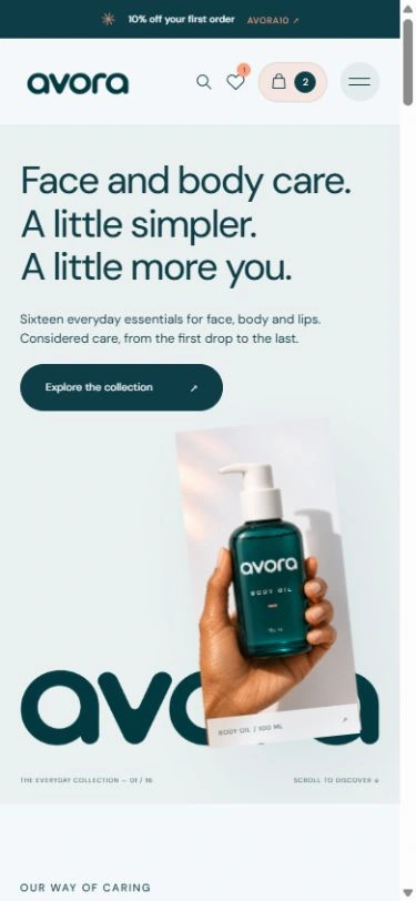
I used ice white, deep teal and soft peach to create a calm visual direction with warm accents. The rounded Avora wordmark appears across the site and product mockups. Soft glass cards, pill-shaped navigation and generous spacing give the interface a consistent character. Packaging and lifestyle visuals help the collection feel connected, rather than like separate product listings.
2. Easier product discovery
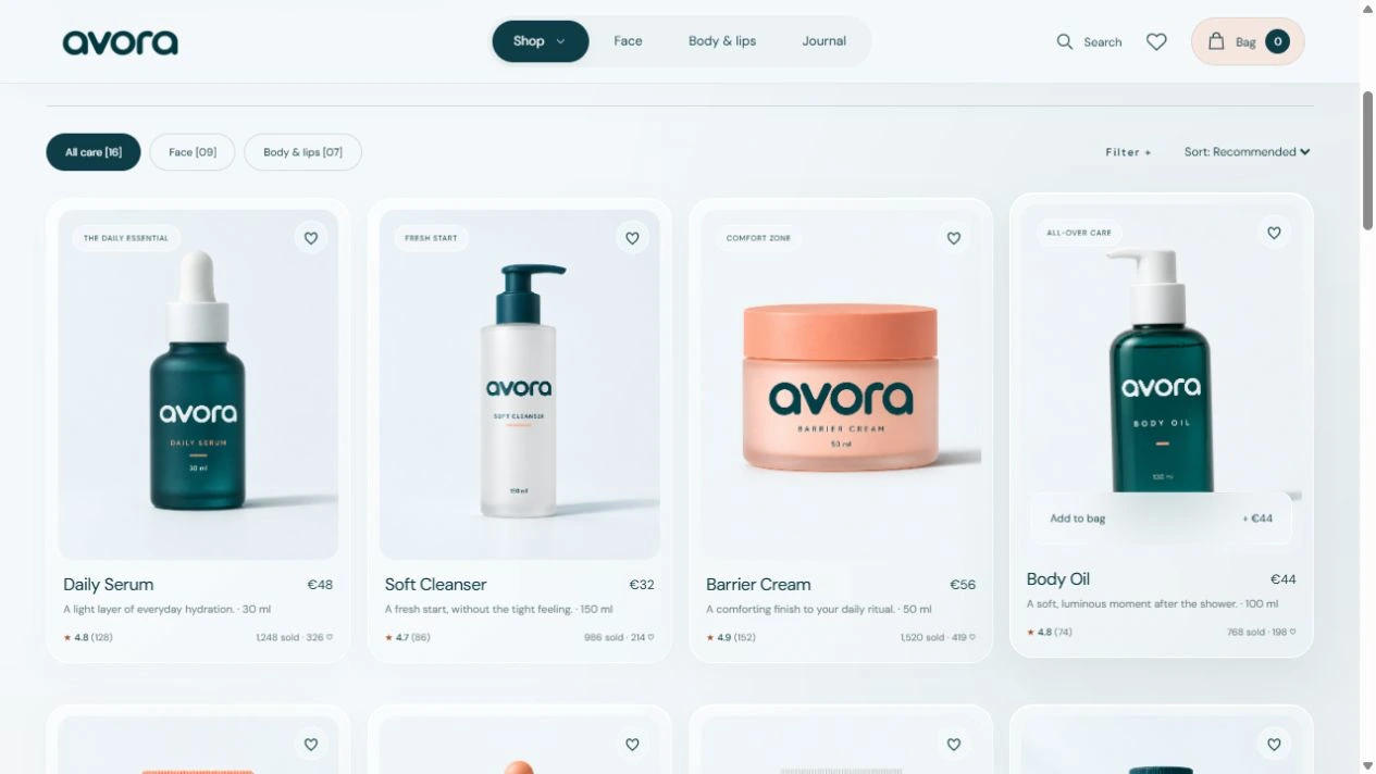
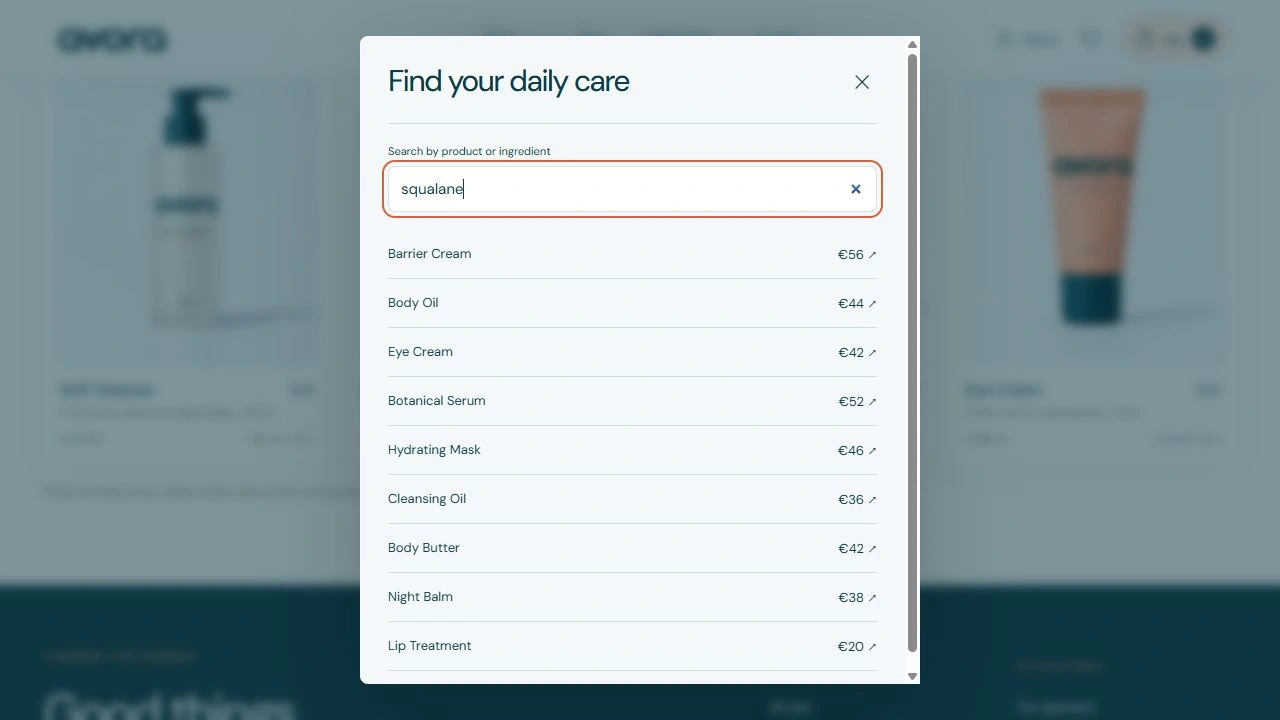
The catalog is divided into Face and Body & lips. Category tabs, product-type and price filters, and sorting help visitors narrow the collection. Search also supports ingredient terms, giving shoppers another way to find relevant products. Quick-add controls reduce extra navigation, while favorites let visitors save an item for later.
3. Product information that answers questions
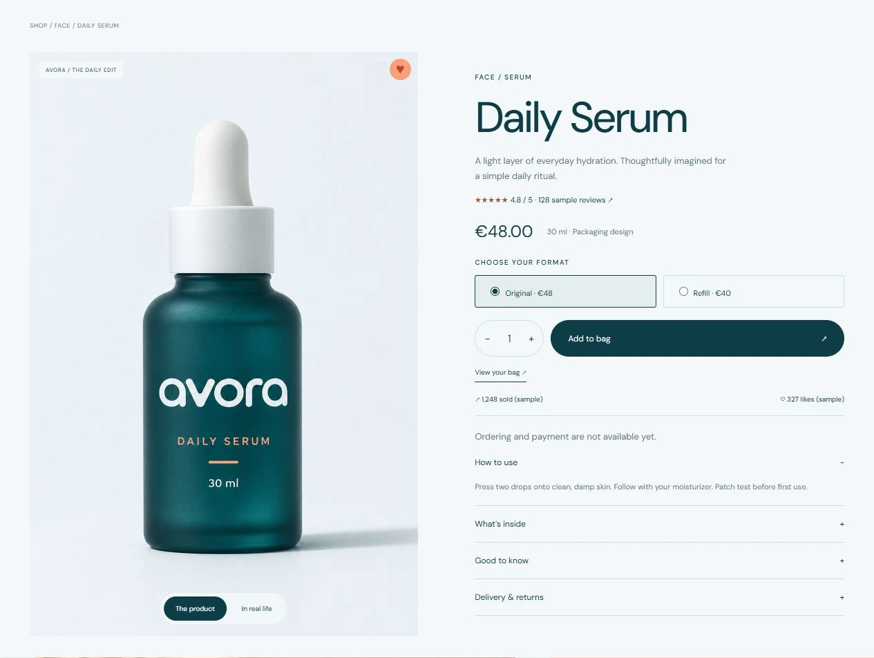
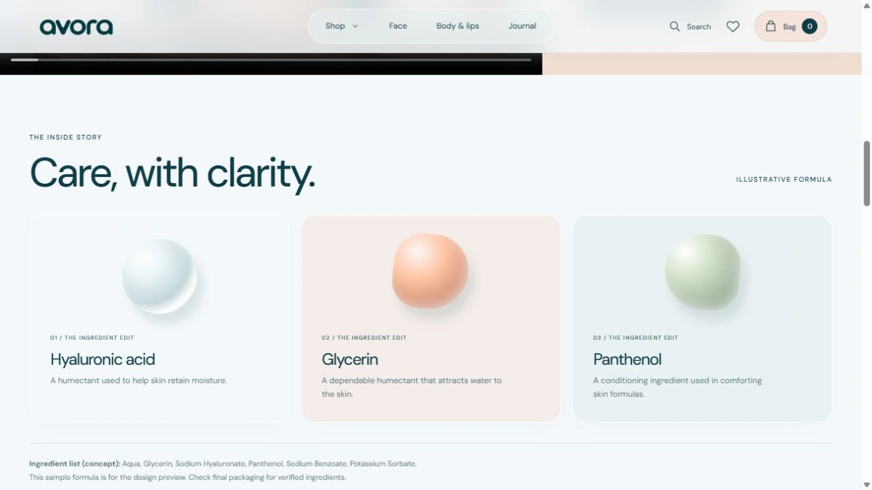
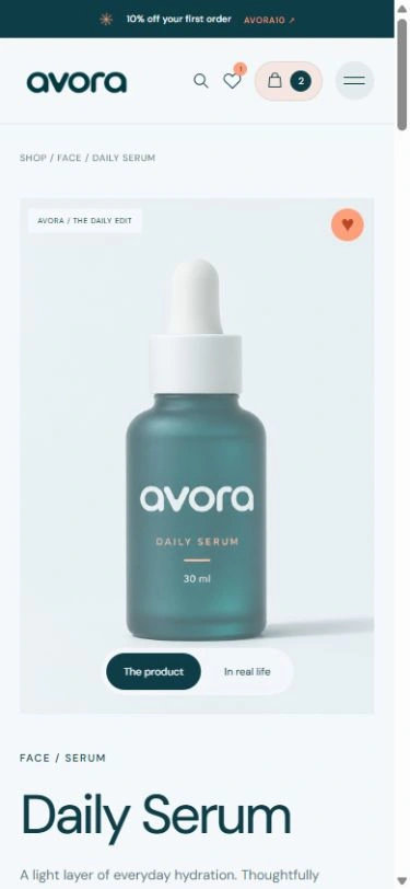
Product pages combine packaging and lifestyle views with visible prices, sizes, quantity controls and original/refill options. Usage instructions, ingredient cards and a sample ingredient list make the product story easier to understand. Supporting details sit in accordions, and related products provide a path to continue exploring a routine.
4. Reviews designed to support trust and feedback
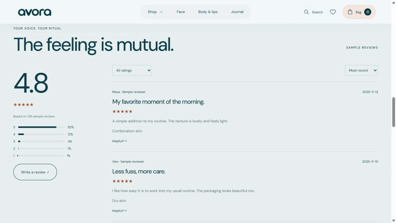
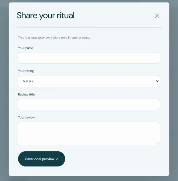
I added a dedicated review section with a rating summary, rating filters, sorting and helpful controls. A review form gives customers a clear place to share a star rating and written feedback. Ratings, sales and like indicators near the products preview a social-proof pattern. The design intent is to make other people's experiences easier to explore and create a feedback channel for the brand. Current testimonials and counts are illustrative, and newly added reviews remain in the visitor's browser; a shared review service is a future integration.
5. An entry point for future email marketing
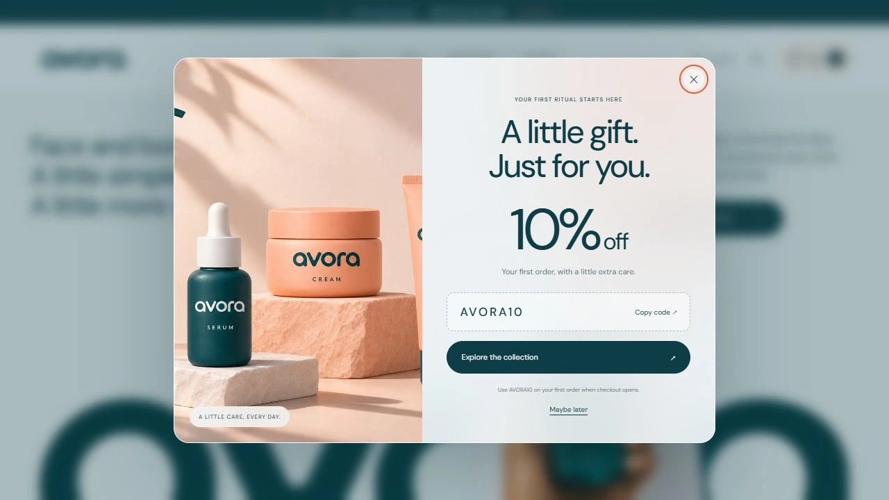
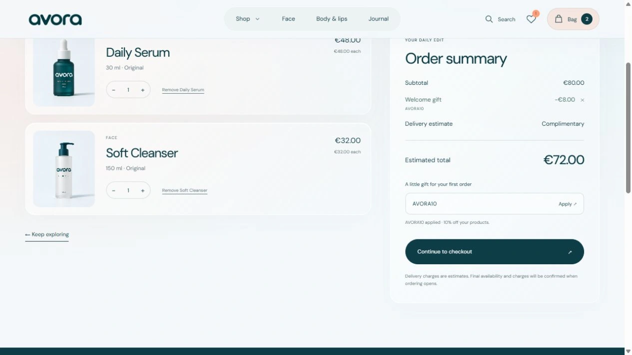
The footer includes a newsletter signup design so the brand has a visible place to invite an ongoing relationship. Once connected to an email platform, this can support product announcements, care tips and promotional campaigns. The current site does not save email addresses or send campaigns. A one-time welcome offer and top announcement introduce 10% off with AVORA10, and the coupon is reflected in the bag totals.

6. A guided shopping journey
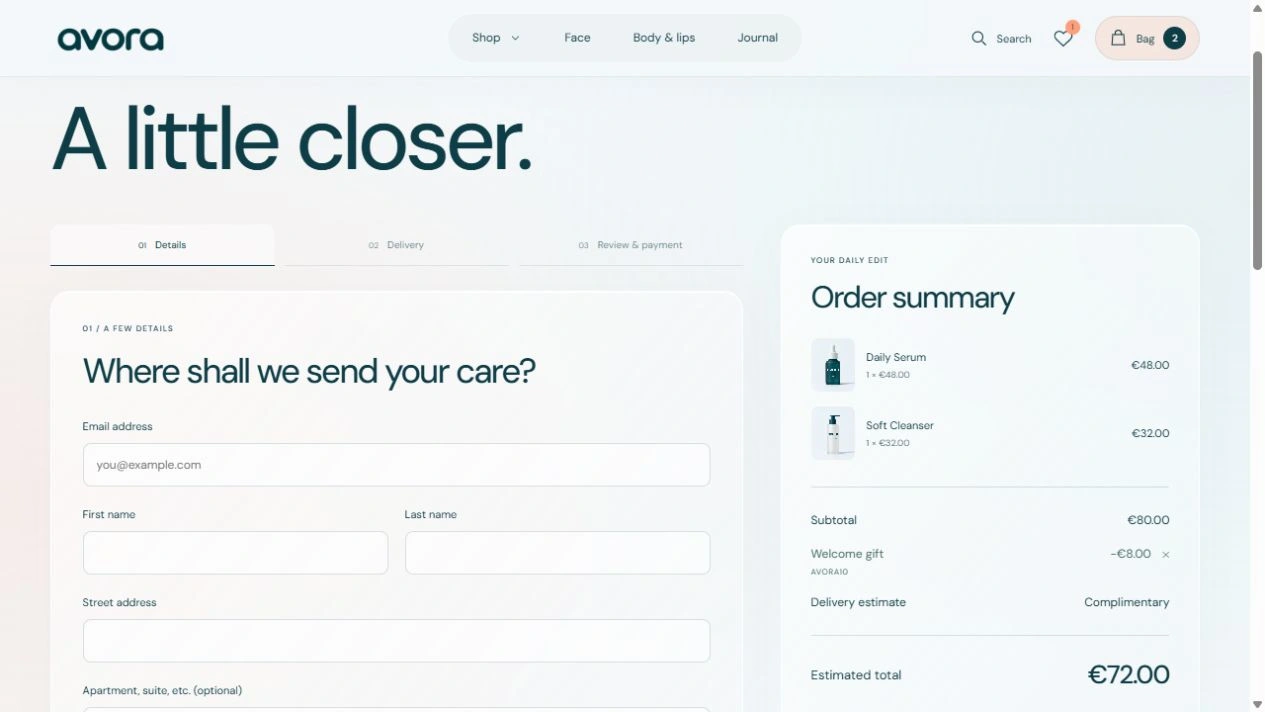
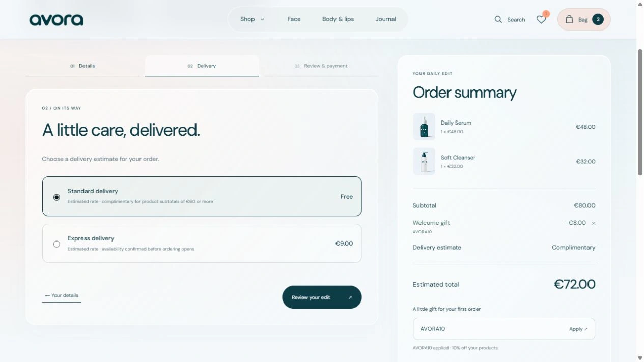
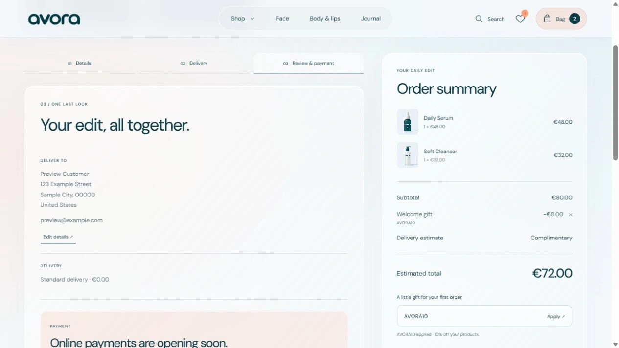
The shopping bag supports quantity changes, removal, coupon application and clear estimated totals. Checkout is organized into Details, Delivery and Review & payment. I checked the flow through its final review state using fictional information. Live payments and order submission are not enabled. Favorites and bag contents persist across page visits, so shoppers can return to their selection.
7. Storytelling, motion and mobile
The journal connects everyday rituals and ingredient education to the collection. Lifestyle mockups and a ritual video add context to the product experience. Scroll reveals, hover responses and branded loading states provide feedback while respecting reduced-motion preferences. The layout adapts to mobile, including the navigation and shopping pages.
Outcome
The result is a coherent, responsive storefront built with reusable Next.js, React and TypeScript components and deployed on Vercel. The delivered value is a consistent brand experience and an implemented frontend journey from discovery to checkout review. Conversion, trust and retention improvements have not been measured.
The next stage is to connect payments and order handling, email subscriptions and shared reviews, then replace illustrative product and social-proof content with verified data. After launch, I would track product-to-bag rate, checkout completion and email opt-ins to evaluate the design's business impact.
Product and lifestyle imagery includes AI-assisted mockups. Screenshots in this case study show the live website reviewed on 16 November 2026.
0 likes · 0 views · Nov 16, 2026
I designed a skincare brand and built a responsive Next.js storefront for product discovery, ingredient education, reviews and a guided checkout.


