The Overhang Brand Identity
Background
I remember my first visit to this location like it was yesterday. I got lost for a while as it is tucked away quite deep in a forest and by the time I arrived it was dark. So after a brief chitchat with my host I went off to bed. I slept to the sounds of waves crushing - just surreal - and couldn't wait to see what was out there.
I was up very early and what I witnessed is hard to express in words. I stood at the porch of my cabin, and watched as the sun rose to reveal the most breathtaking view of the Indian Ocean. I was in awe.

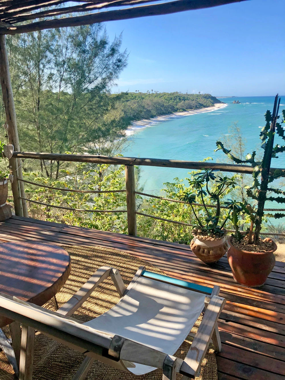
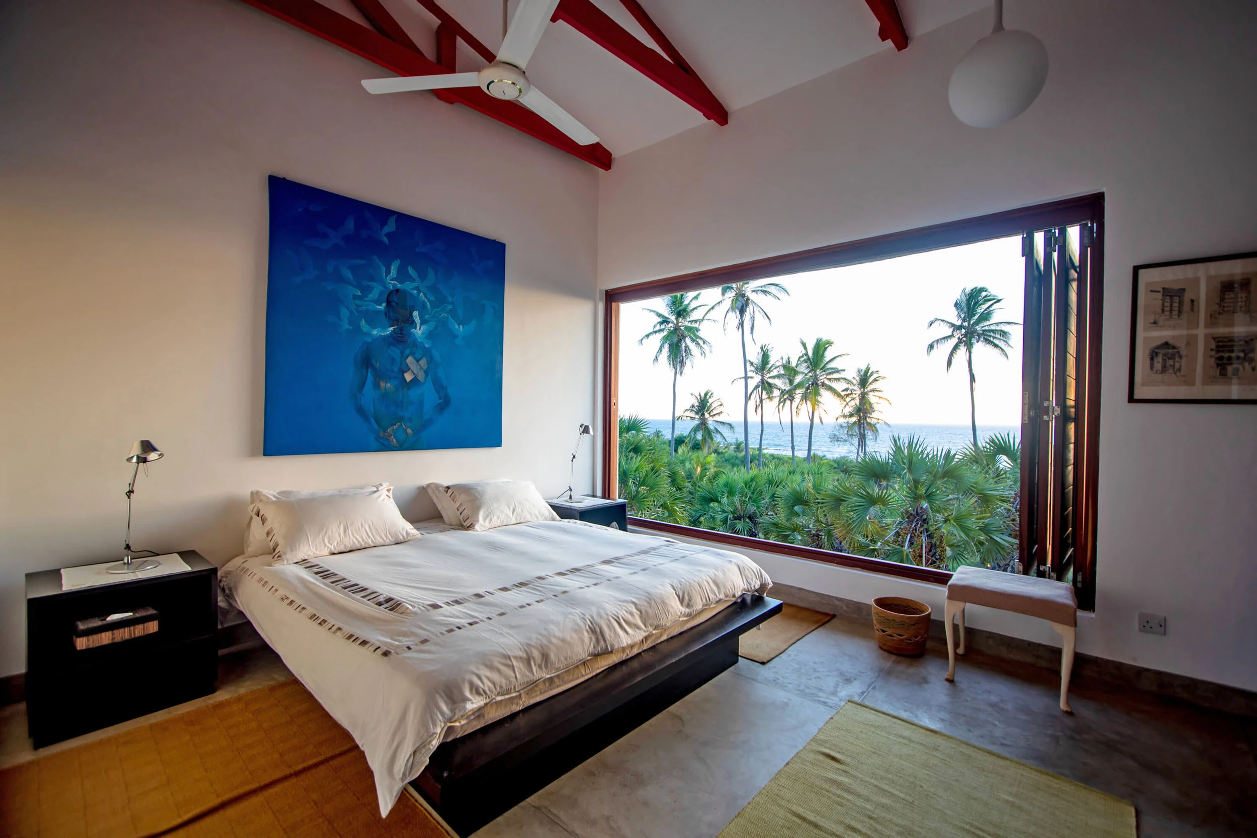
The resort sits at the shores of Kigamboni in Tanzania and is host to four wooden cabins each with its own personality. These cabins hang (literally) over the edge of a near 30 foot cliff overlooking the ocean. A beautiful contemporary beach house has since been added to the collection.

The Brief
The client had acquired the property with the cabins and a few other existing structures, and was looking to turn it into a boutique holiday hideaway. Ergo a name and brand identify was needed.
The Approach
After that first visit I went back to the agency unpacked all I had experienced to the team. We began by conducting market research to understand the luxury resort market in our region, and the target audience. We explored numerous names including several portmanteaus in both English and Swahili.
One evening while I was brainstorming "Overhang" popped up - as a direct reflection of the cliff-hanging cabins, and to my surprise it was approved.
The name was chosen for its simplicity and the fact that it aligned with the target group (young millenials). We added emphasis by introducing 'The'.
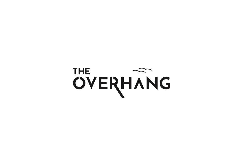
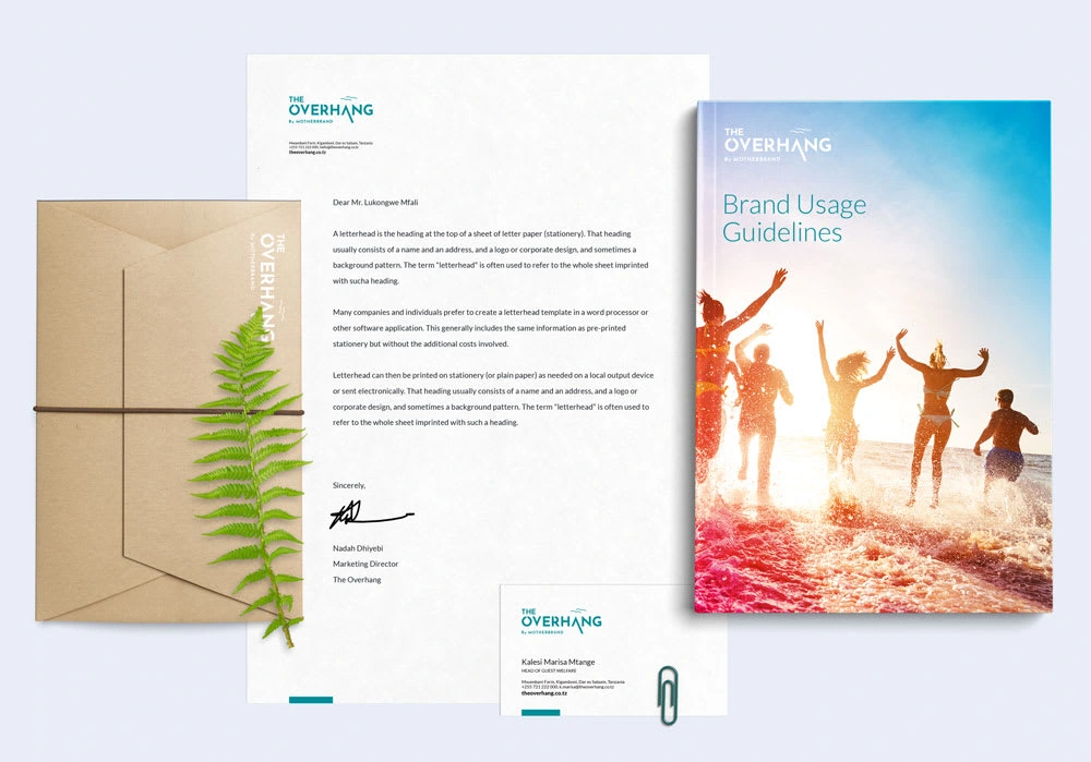

The phrase was self-explanatory which prompted me to try a logotype (logo made of only letters) so as to keep things minimal and simple. I started by studying similar brands, then moved to hand sketching, and almost immediately found an interesting play where if we stretched a part of a character below the baseline it could mimic a drop and the letters that followed would appear to be suspended or hanging.
The results was a marquee that has since become the central identifier of The Overhang brand, an exclusive destination that is now quite popular with holiday-makers.
Like this project
Posted Oct 26, 2023
Brand strategy, namimg and identity development for a one of a kind boutique resort.


