
E-commerce · UI case study · Web
Overview
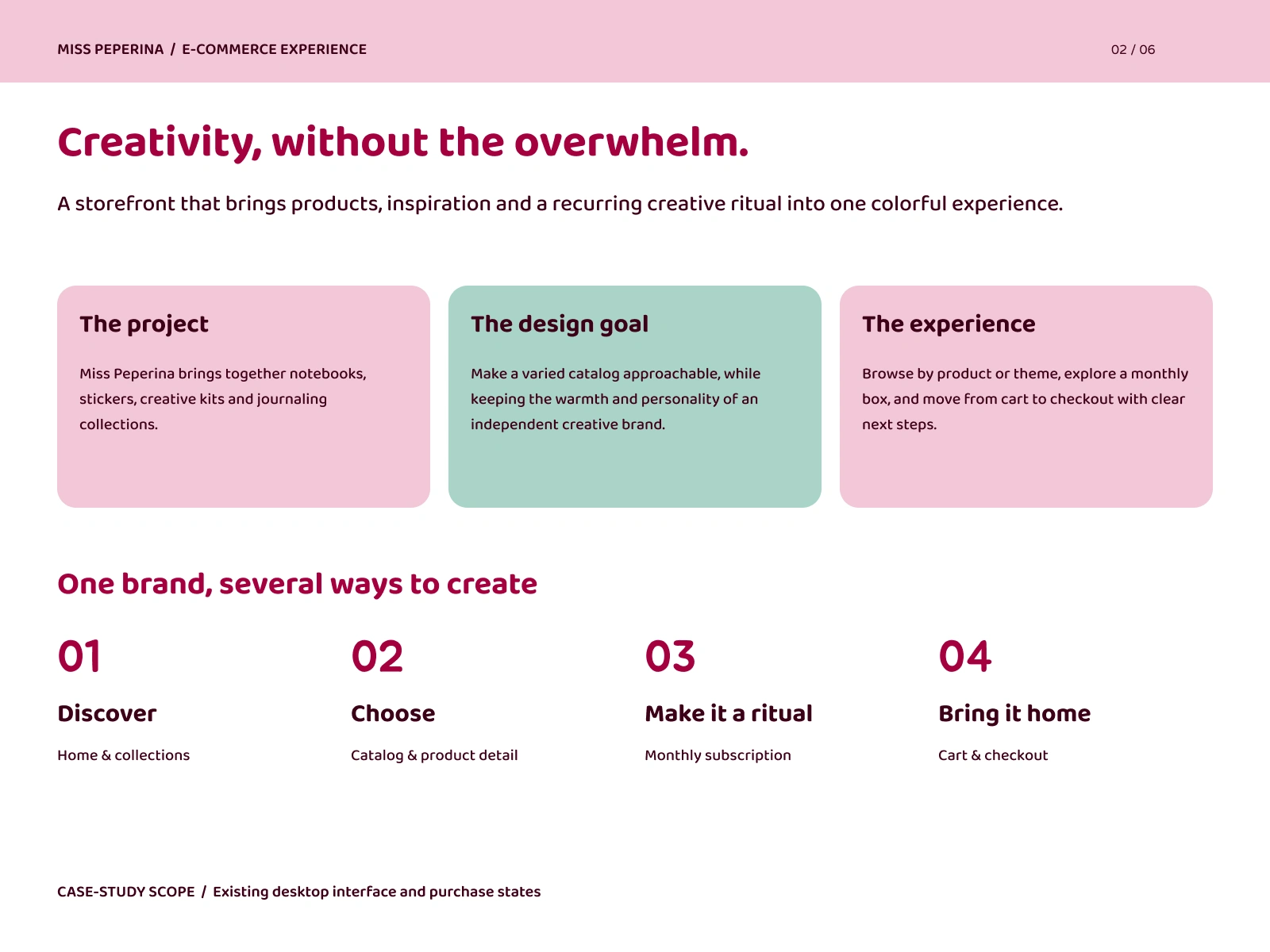
Miss Peperina is an independent brand that sells notebooks, stickers, creative kits, and journaling collections, plus a monthly subscription box. I redesigned its existing Tienda Nube storefront as a self-initiated portfolio project, keeping the brand’s warmth and personality while making the shopping experience easier to read, navigate, and complete for more people.
Note: This is a concept redesign for my portfolio, created with the permission of the brand.
The Challenge
The catalog is varied, with planners, stickers, kits, and a recurring box. The brand is also playful, with lots of color and illustration. The challenge was to make that variety approachable without flattening the personality, and to improve accessibility: I added more contrast to the colors, used more white where color was used as a background, and used better typography hierarchy to generate more visual appeal and clarity. The navigation was reorganized because it had too many subcategories that could be bundled together by using filters on the page.
Accessibility Approach
Contrast: Text and UI colors checked against WCAG AA.
Readable type: Baloo 2 for headings and Varela Round for body text, both rounded and highly legible.
Clear hierarchy: Consistent heading levels, section titles, and spacing so pages are easy to scan.
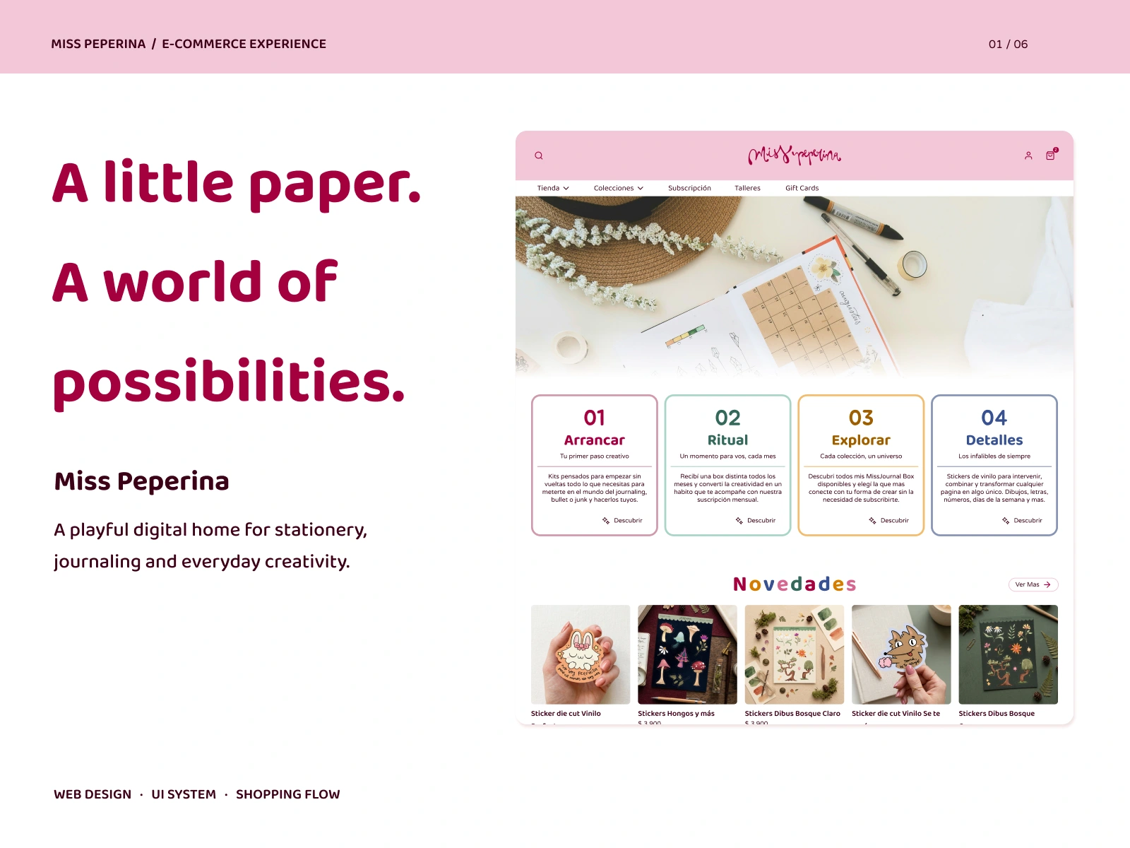
Not relying on color alone: The four themed cards (Arrancar, Ritual, Explorar, Detalles) use color, but also numbers, titles, and short descriptions.
Predictable navigation: Category navigation, a visible search, and a cart indicator in the same place on every page.
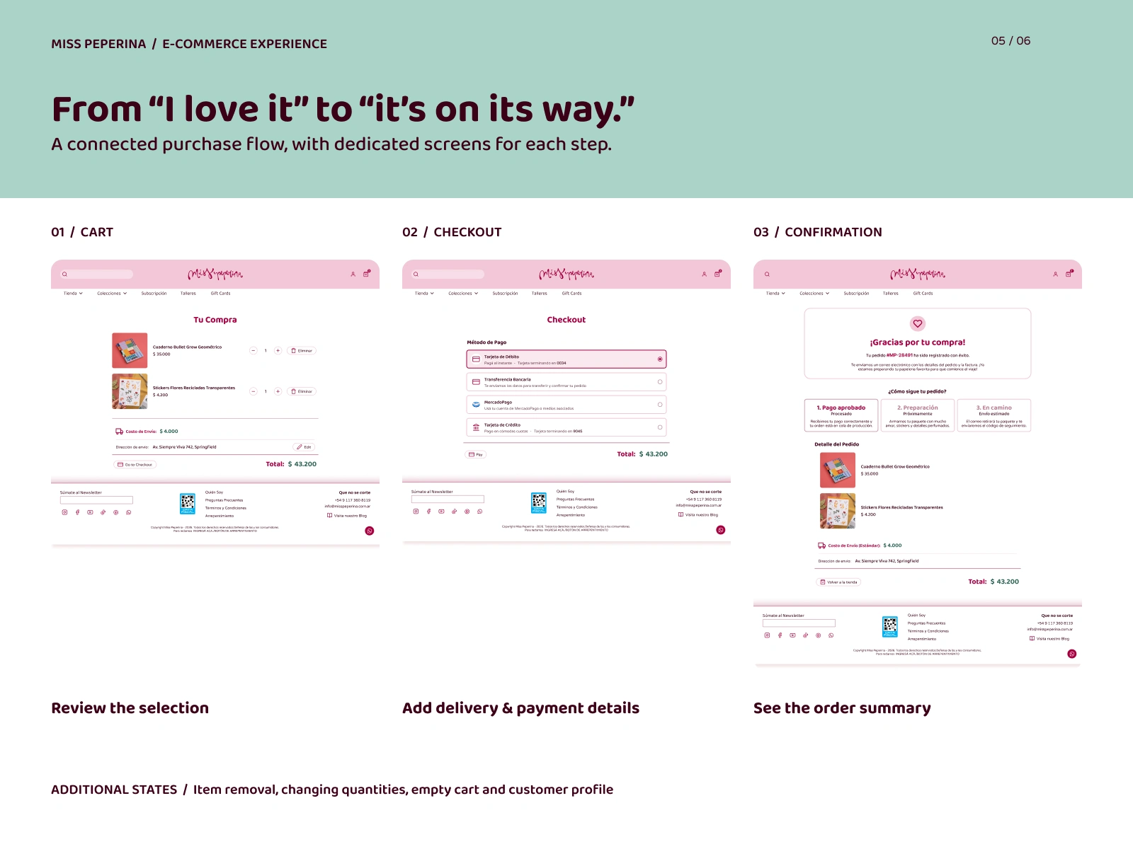
Clear purchase steps: Radio-button payment options with descriptive labels, and a confirmation page that explains what happens next.
The Solution
1. Discover: a home page that guides instead of overwhelms
Four themed entry points (Arrancar, Ritual, Explorar, Detalles) turn a large catalog into clear starting paths, each with its own color and a “Descubrir” action. Below them, a “Novedades” row shows new products through photography.
2. Choose: product-led browsing
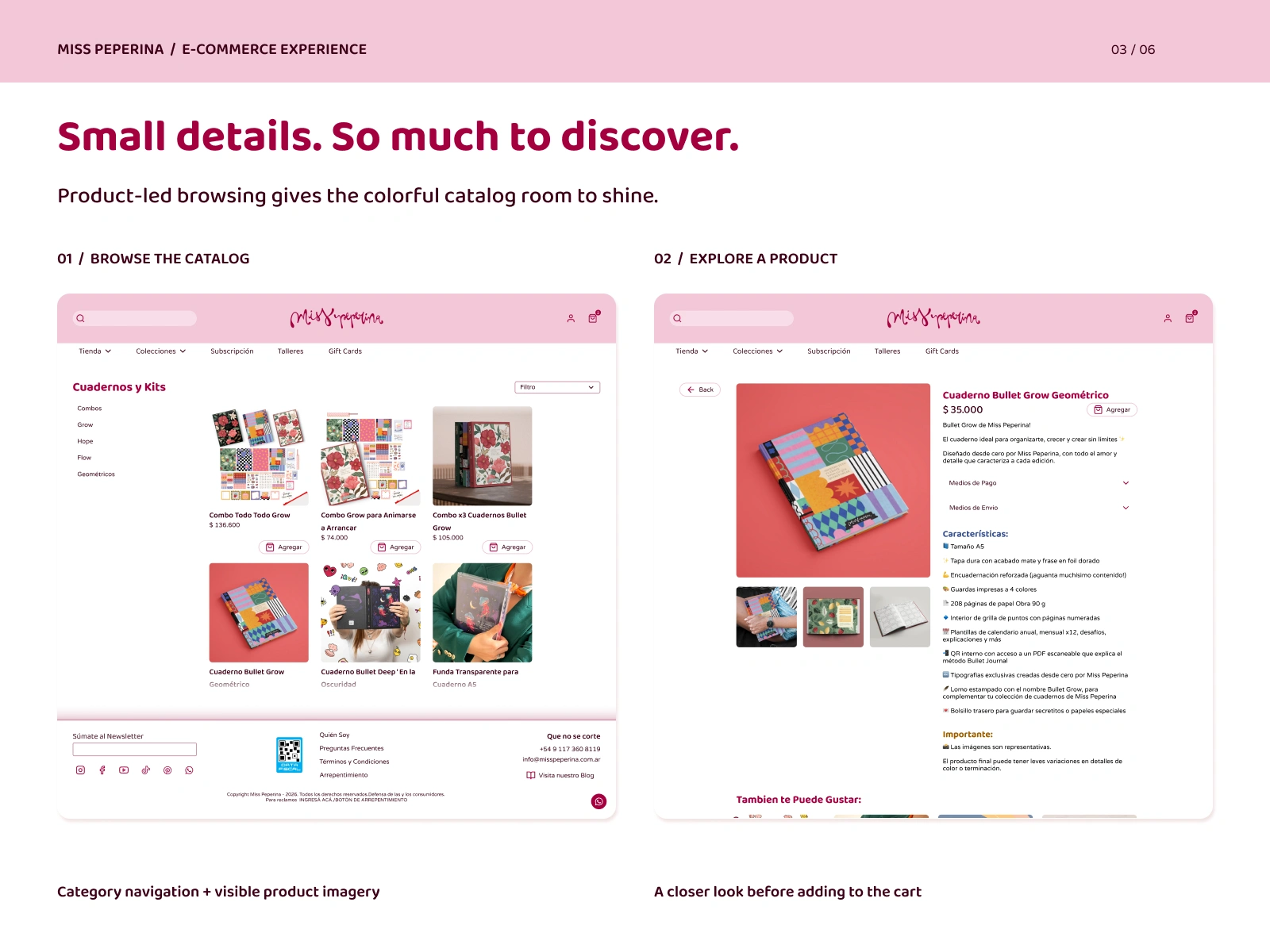
The catalog has category navigation on the left and large product images, so the products themselves do the work. The product page adds a gallery, price, an “Agregar” action, and a structured feature list (size, cover, pages, extras), with payment and shipping info in collapsible sections that keep the page short.
3. Make it a ritual: the monthly subscription
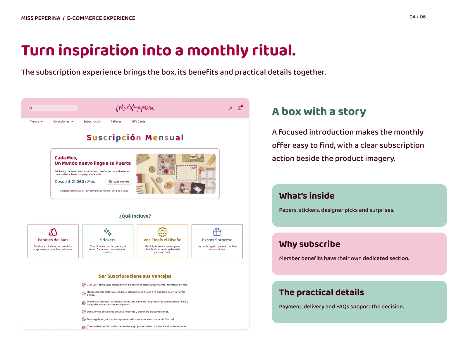
A focused introduction with the price “Desde $21.060/mes”, a clear subscribe action, and the terms stated up front: cancel anytime, no minimum commitment. Below it, “¿Qué incluye?” breaks the box into four cards, and a dedicated benefits section explains why to subscribe.
4. Bring it home: cart to confirmation
Three dedicated steps: cart, checkout, and confirmation. Checkout offers debit card, bank transfer, MercadoPago, and credit card. The confirmation page shows the order number and a three-stage tracker (payment approved, preparing, on its way) with the full order details. I also designed the additional states: item removal, quantity changes, an empty cart, and the customer profile.
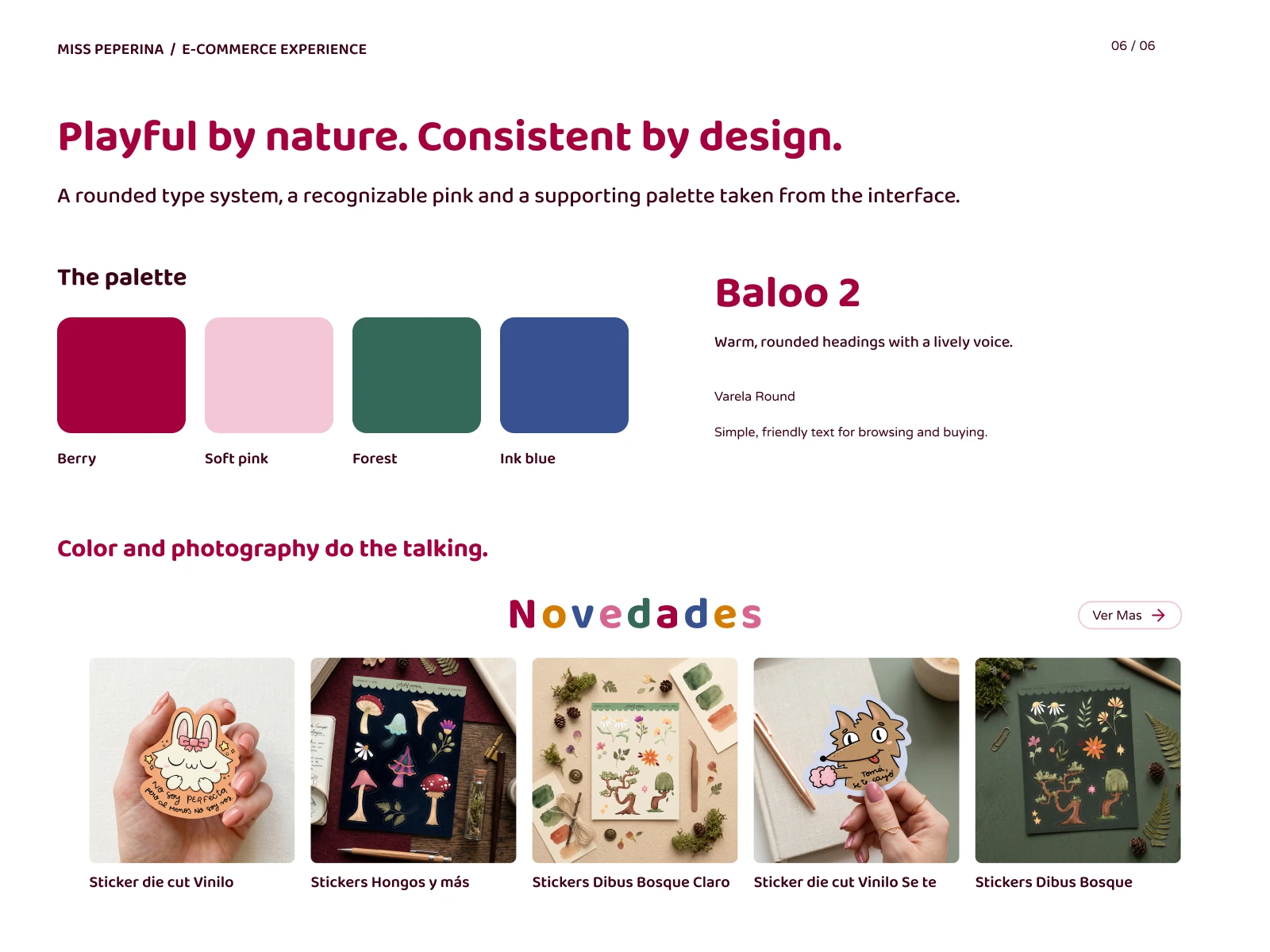
Visual Language
The palette comes from the brand’s interface: Berry and Soft pink as the recognizable core, with Forest and Ink blue as supporting colors. Rounded typography and product photography carry the playful tone, while consistent layouts keep it organized.
What I Learned
I learned how to balance a large vibrant color palette while maintaining a design system and WCAG AA accessibility.
Next Steps
Mobile experience and a user-tested accessibility review.
0 likes · 0 views · Nov 13, 2026
Redesigning an e-commerce shop to improve accessibility.


