
A calmer workspace for freelancers
Product design · Web + mobile
Overview
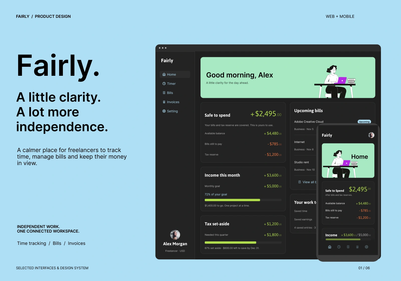
Fairly is a web and mobile app that brings time tracking, bills, and invoicing into one workspace for freelancers. Its promise is “a little clarity, a lot more independence.” I designed the interface and design system for both platforms and built the interactive prototype in Figma.
The Problem
Freelancers juggle their time, their invoices, and their expenses across separate tools. Especially for freelancers starting it can be overwhelming, the question that matters most is: how much of this money is actually mine?
Rarely has a clear answer. Fairly makes that answer the first thing you see.
The Solution
1. “Safe to spend” as the home screen’s hero
Instead of a raw account balance, Home leads with one number: what’s left after upcoming bills and a tax reserve are set aside. The breakdown sits right below it (available balance, bills still to pay, tax reserve), so the figure is easy to trust. Income progress and tax set-aside use simple progress bars with plain text for clarity and security that nothing is being missed.
2. Track the work, then bring it into an invoice
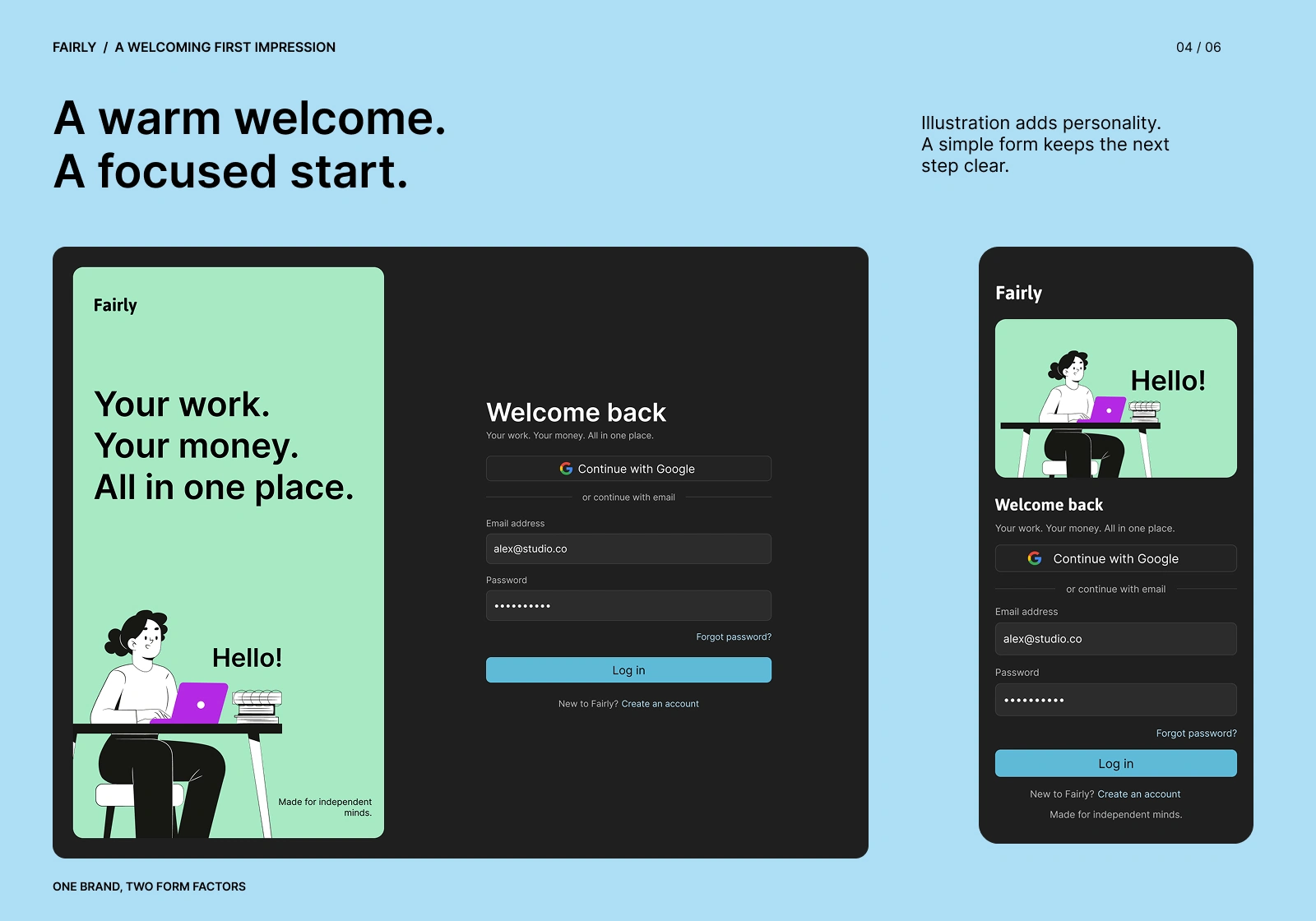
Time tracking and invoicing share one visual language, so the flow feels connected. A running session shows live earnings next to the timer. The invoices view groups status and amounts in one focused place, with a “Ready to invoice” panel that surfaces unbilled time and a gentle nudge to follow up on overdue payments.
3. Mobile focused on the essentials
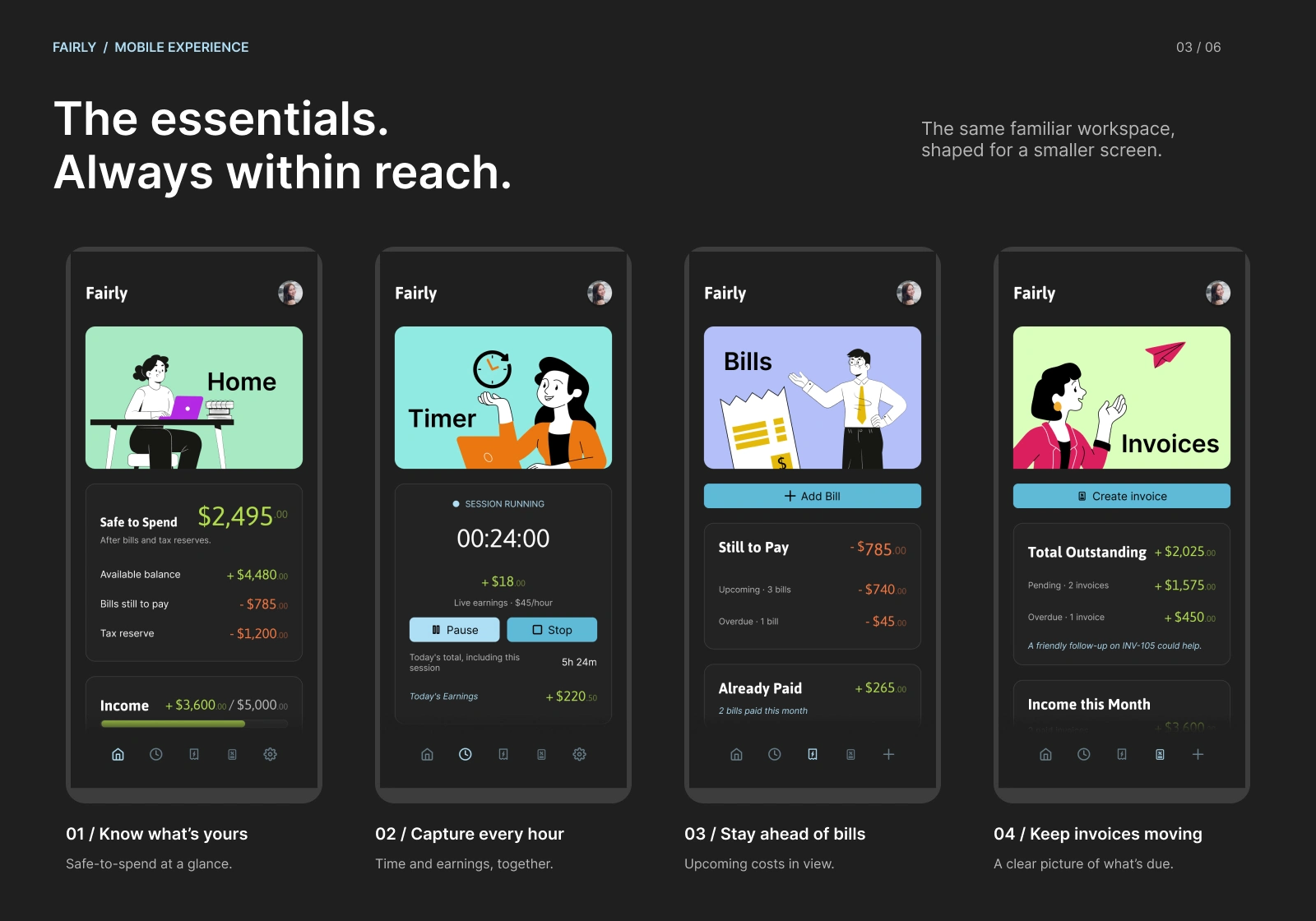
The mobile app keeps the same workspace but trims it for a smaller screen: Home, Timer, Bills, and Invoices, with a bottom navigation bar. On Bills and Invoices, the fifth nav slot becomes a quick “+” action for adding a bill or invoice, so the most common action stays within thumb reach.
4. A warm first impression
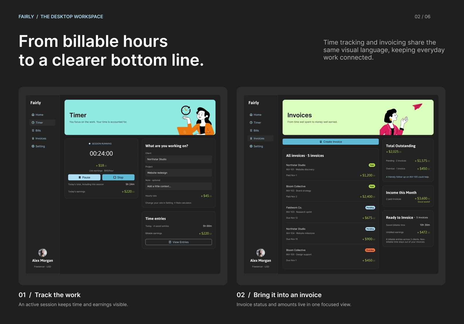
The login screen pairs a friendly illustration with a short form: Google sign-in first, email second, and one clear primary action. The desktop layout splits the screen between brand and form, while mobile stacks them.
Design System
I built a small system so both platforms stay consistent as the product grows.
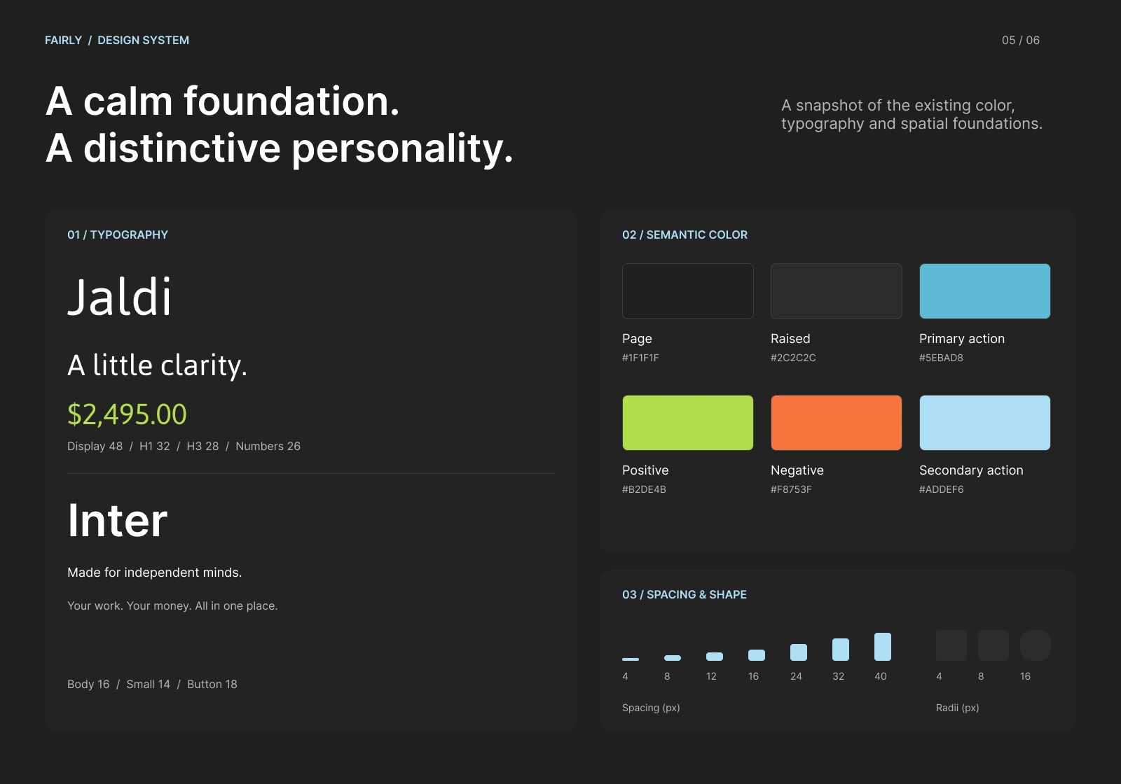
Typography: Jaldi for display text and key numbers, Inter for body copy and UI. This gives the product personality while keeping data readable.
Semantic color: A dark base (
#1F1F1F page, #2C2C2C raised surfaces) with meaning-driven accents: lime for positive amounts, orange for negative, and two blues for primary and secondary actions.Spacing and shape: A 4–40px spacing scale and 4/8/16px.
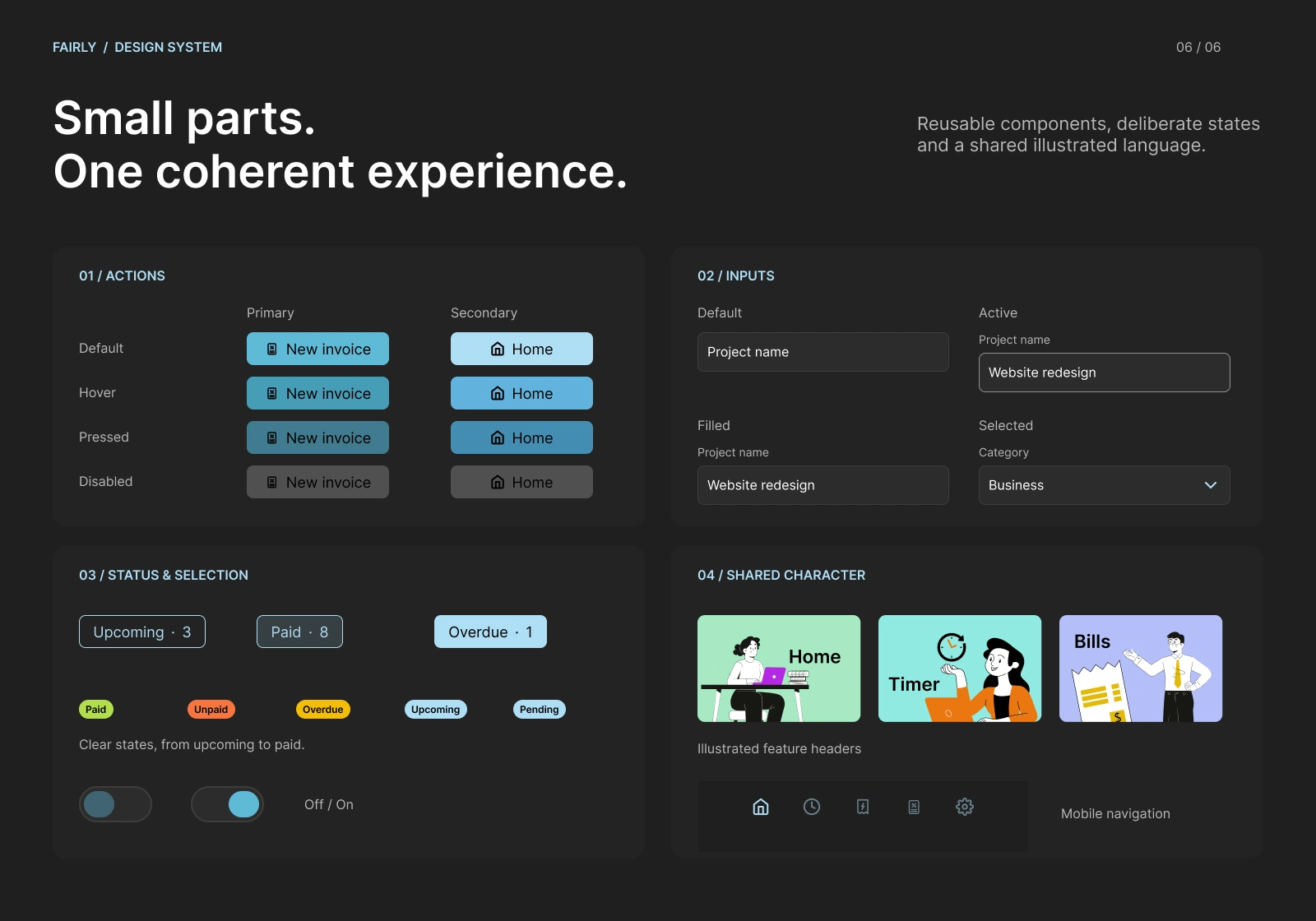
Components: Buttons and inputs with defined default, hover, pressed, and disabled states, plus status chips (Paid, Unpaid, Overdue, Upcoming, Pending) and toggles.
Shared illustrated character: Each feature has its own color-coded illustrated header (Home, Timer, Bills, Invoices), giving the product a friendly identity and helping users know where they are at a glance.
Key Design Decisions
Orange, not red, for negative amounts: it's the only color similar to the red in the color system, so I decided to go with it for warnings and negative amounts; the idea was to have a less aggressive and cohesive color while standing out, but not clashing with the rest of the color palette.
Dark theme by default: I chose it because it makes the currency amounts stand out more while not having the white background; it also strains the eyes less. And it's more practical for battery life on mobile.
One brand, two form factors: Same components, tone, and illustrations across web and mobile, with the layout adapted rather than redesigned.
Outcome
For people who are not used to using tracking systems that are more complex, having to jump from one app to another, they found the app to be easier to use, and the aesthetic made it feel more human to them, so they didn't feel intimidated when using it.
What I Learned
I learned how to balance dark theme color palettes and card color systems by using colors for card backgrounds instead of shadows. This is used for light backgrounds.
0 likes · 0 views · Nov 13, 2026
App to help freelancers keep track of their expenses and hours worked for better billing.

