Alphatechs

Visual Identity
Client
Alphatechs
Year
2023
Agency
Arra Studio
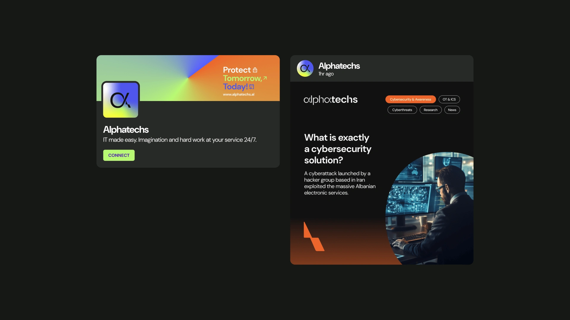
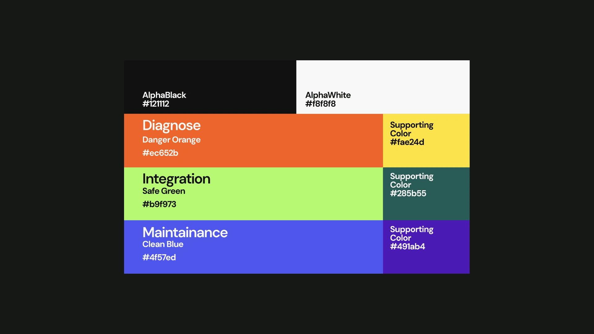
AlphaTechs is a Cybersecurity Company. After the 1st year as a startup, they were ready to take their branding seriously.Ready to catch new markets and represent their self to the world. Once they approached me I had a clear idea where to start from. Since their identity had no strong elements that were recognizable and worth keeping, I started it from scratch. Decided to bring the Alpha symbol and work with that in the form of a logotype. The symbol we came up with represents the upcoming threats that get broken by security. The Glitch represents the high dynamic of the threats in the digital world. While the 3 main services of Alphatechs were Cuber Check, Integration & Maintenance we decided to give each of those services their feel by Identifying each with their color. Orange for Cyber Check, Green for Integration, and Blue for Maintenance. The colors were highlighted in the whole branding process and integrated into each service webpage. So when a user enters a specific page they immediately know where they are. This way we reinforced their services and made it easier to digest from their target.


What I did:
I worked with the whole Visual Identity of Alphatechs. Working closely with the client to ensure that the vision of Alphatechs is reflected in the new rebrand. The project was a success and now the company is proud and ready to reach new markets.
Here is what Alphatechs says about me:
I am delighted to recommend Rubin for his outstanding work in rebranding Alphatechs. As a co-founder, I was impressed by Rubin's professionalism and his ability to quickly understand and align with our vision. His approach was not only efficient but also highly creative, resulting in a rebranding that perfectly encapsulates our company's ethos. Rubin's dedication to delivering on time while maintaining high standards is commendable. He is a true asset to any branding project.
Best regards,
Mateo Gosnishti
Co-Founder, Alphatechs








Like this project
Posted Jan 22, 2024
AlphaTechs is a Cybersecurity Company. They approached me to rebrand their self, we did a great job and now Alphatechs is on new markets.

