Built with Framer
Hot Houses Framer Landing Page Design for Outra

Picture this
A marketing data startup with a new targeting product, no sales tools for their team promote it with, and an ever-evolving visual identity. That was the status when Measured Branding hired me to design and build the Hot Houses landing page for their client, Outra.
What I worked on
UX/UI design
Framer Development
Microanimation
Asset creation
Helping UK enterprises unlock smarter targeting
Outra supplies the user data critical to running the marketing campaigns of household names like Sky, Shell, Zoopla and AXA. No more relying on narrow social media demos or limited website cookies. Outra provides clients with a plethora of trustworthy data sources—a combined 75 million data points.
How it started
Oli, Outra’s Head of Growth & Go-to-Market, recently worked with Measured on a rebrand. Tom, Measured’s Founder, brought me on to work on the new Hot Houses landing page.
Oli had developed a content plan before approaching us with the project. Tom worked on copy while I explored designs. It was a very collaborative project, with regular discussions between myself Tom and Oli to nail down the project’s direction.
What’s a Hot House?
Business problem
Outra developed Hot Houses, a way to target specific demographics like home-movers for their clients marketing campaigns, and needed to develop a convincing sales tool to effectively explain the product and generate leads for it.
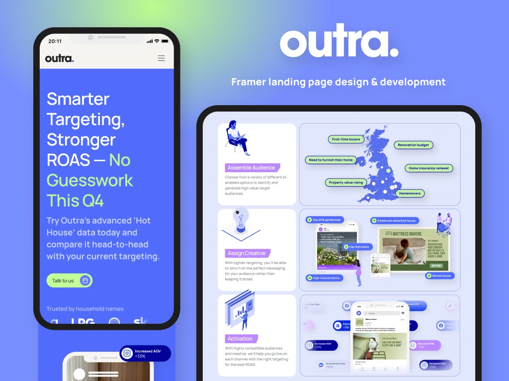
Hot Houses hero section
Target in sight
Our goals
Outra’s other landing pages weren’t converting well and users weren’t scrolling below the fold, so they wanted to push boundaries with this landing page and make it as engaging as possible.
Maximize conversions and lead-generation
Educate new and existing clients about Hot Houses
Make Hot Houses come across as plug n’ play, no brainer, easy to buy
Ensure the landing page’s UI is cohesive with the rest of the site, eye-catching, and makes a splash with e-commerce and enterprise clients alike.
The constraints
Oli was figuring out the direction for the landing page as we worked, so there was a lot of iteration and visual exploration.
Tom was working on copy as I was designing
Brand assets were limited and the project scope was expanded to include asset creation
Despite the recent rebrand, the brand’s visual identity remains in flux
Mobile view
Making moves
Demo’s aren’t it
Users weren’t signing up for product demos on other Outra landing pages. We decided to move away from the Calendly booking form to a built-in contact form to collect leads.
Hot Houses process section
Show and tell
I created animations and visual representations of the new offering, helping clients and staff alike better understand the new product and its use cases. I also added an animation to the hero to peak interest and encourage users to scroll below the fold.
Utilizing the full color palette
The website hadn’t taken advantage of the entire brand color palette and the team felt it was getting “too blue." I brought in the lighter lavender and periwinkle colors to break up the monotony of grey and blue. The Outra team now has broader use cases for their color palette that better reflect their brand and target audience.
Lead form and final hook
We want receipts
We added a section where users could download reports detailing industry trends and the theory behind the Hot Houses data sets.
Take a look
Check out the final page here.
All packed up and ready to go
Project results
The Outra team paused promotion of the Hot Houses product after I finished the page’s design & build, so I don’t have hard data on the page’s conversion rates or success.
Impact on product
Created a landing page with animated elements to improve engagement
Refined the lead collection form to improve conversions
Better defined brand assets that further differentiate Outra’s brand and visual identity
Created new assets and animated components that Outra can use across platforms and webpages
Impact on process
Outra’s Growth & Go-to-Market team has a new tool to source leads
The team now has better tools to explain the benefits and features of the Hot Houses offering
What I’m proud of
I created simple but effective animations that help tell the story without distracting from the page’s purpose
I applied Outra’s brand colors in a much more colorful, upbeat, and unique way than elsewhere on their site.

Want to see more?
Check out my newest collaboration with Measured Branding and Outra where I designed and built Outra's Careers page.
Like this project
Posted Jan 2, 2026
Pushing the boundaries of an analytics startup’s visual identity to create an eye-catching new Framer landing page that better targets e-commerce clients
Likes
1
Views
24
Timeline
Sep 14, 2025 - Oct 10, 2025
Clients
Measured Branding
Collaborators

