Veltrick Modern Brand Identity & Logo Design
Samuel O
Veltrick Brand Identity & Logo Design
Project Overview
Veltrick is a forward-thinking brand built for growth in a competitive landscape. The client needed a visual identity that felt premium, dynamic, and instantly memorable, something that communicates precision, momentum, and unshakable confidence across both digital platforms and print materials. The goal was to position Veltrick as a modern, future-driven leader that stands out without feeling overcomplicated.
Design Approach
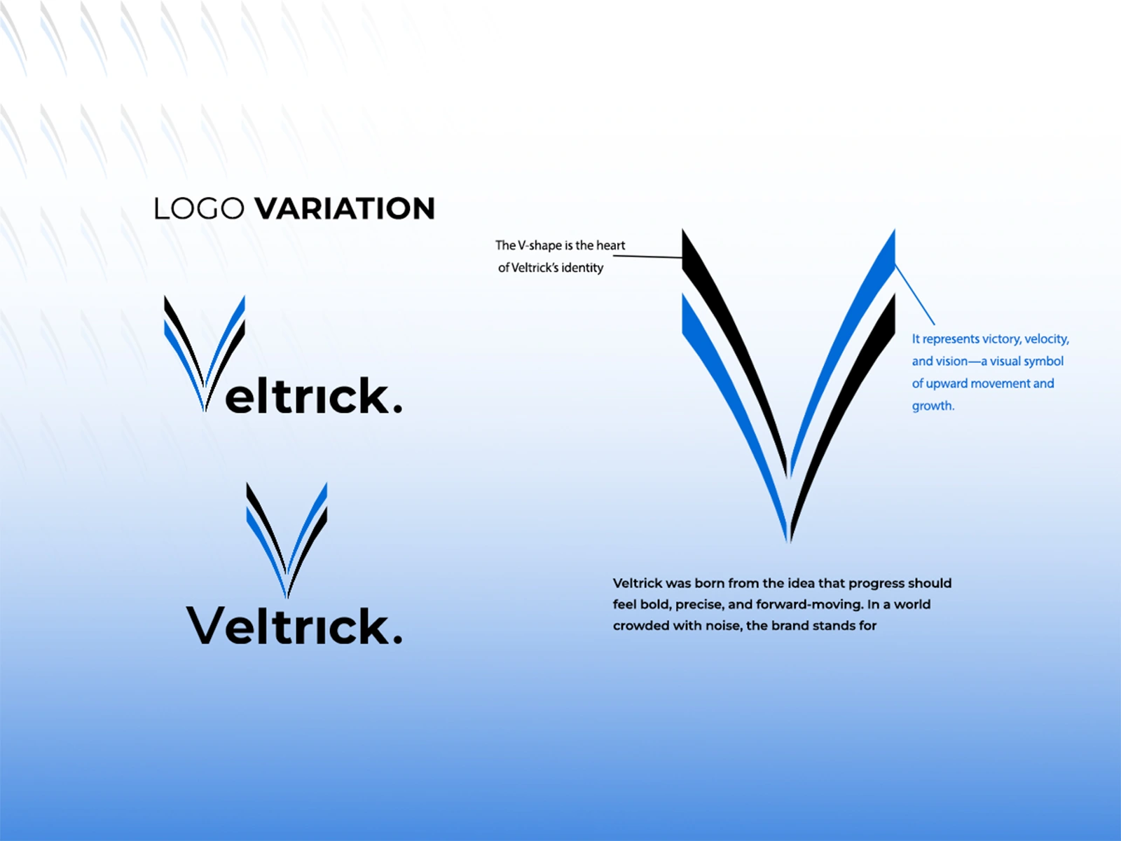
We started with a deep dive into the brand’s core values: growth, precision, clarity, and velocity. The entire identity system revolves around a sharp, geometric V-shaped symbol that serves as its visual anchor. To balance boldness with minimalism, we paired the mark with clean, contemporary typography and a high-contrast color palette of deep navy blue and black, accented with strategic white space. This combination evokes trust, innovation, and strength while remaining versatile for everything from app icons to large-scale signage.
Logo Concept
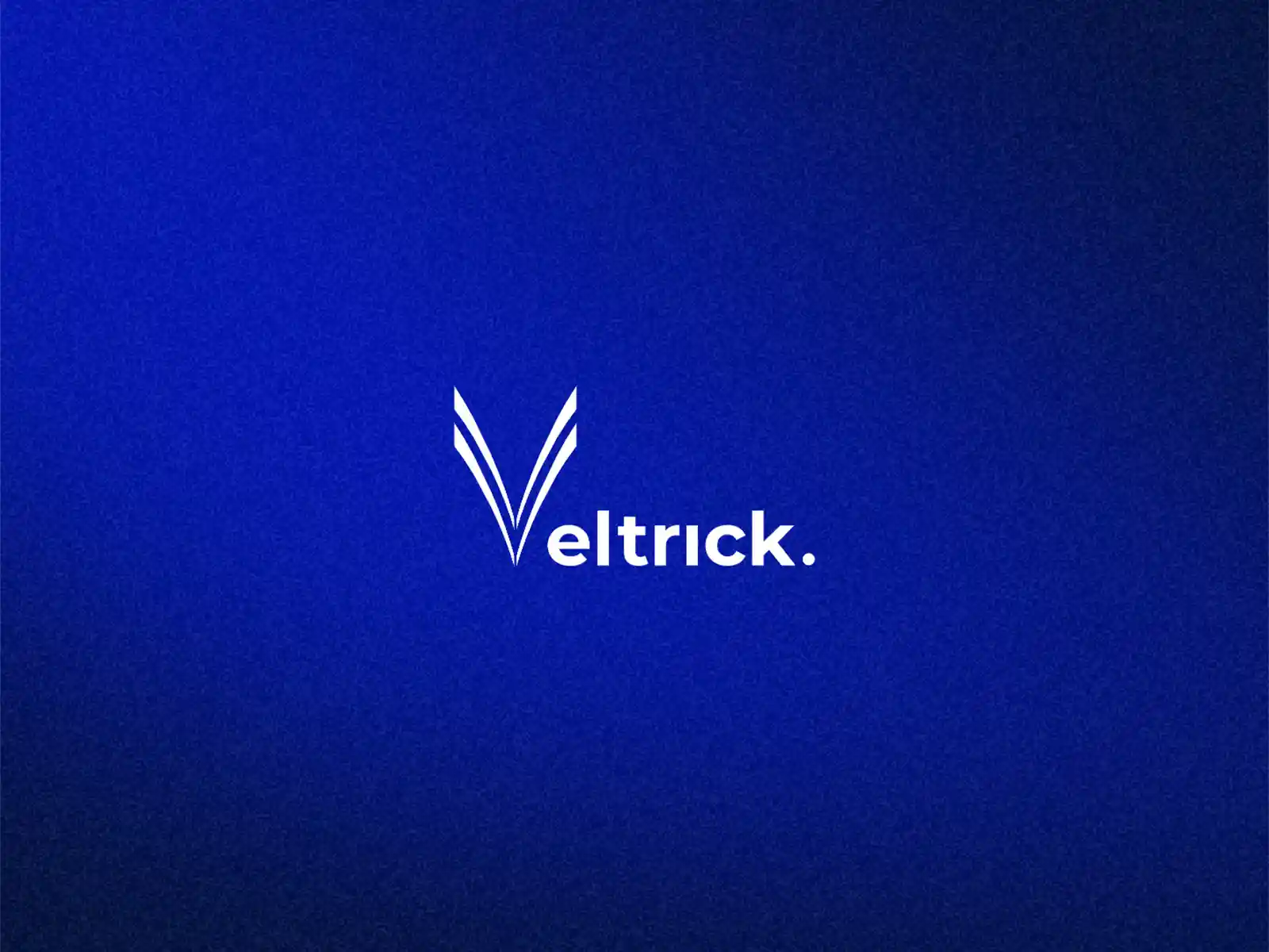
The central V-shape is more than just a letter, it symbolizes Victory, Velocity, and Vision. Its upward, dynamic angle suggests continuous upward movement and forward momentum, perfectly aligning with Veltrick’s growth-oriented mission. The form is intentionally flexible: it works as a standalone icon, a full wordmark, or in stacked variations, ensuring strong recognition at any size or context. We developed multiple logo lockups and applications to demonstrate real-world adaptability.
Outcome & Impact
The final brand identity delivers a sleek, scalable system that instantly elevates Veltrick’s presence. It feels confident and professional yet approachable—helping the brand cut through the noise in both digital and physical spaces. Clients now see Veltrick as a premium, future-focused player, and the identity provides a strong foundation for all future marketing materials.
Like this project
Posted Mar 31, 2026
Bold minimal identity for velocity & vision. Clean typography and high-contrast blue-black palette convey trust and dynamic growth. Scalable for all platforms.