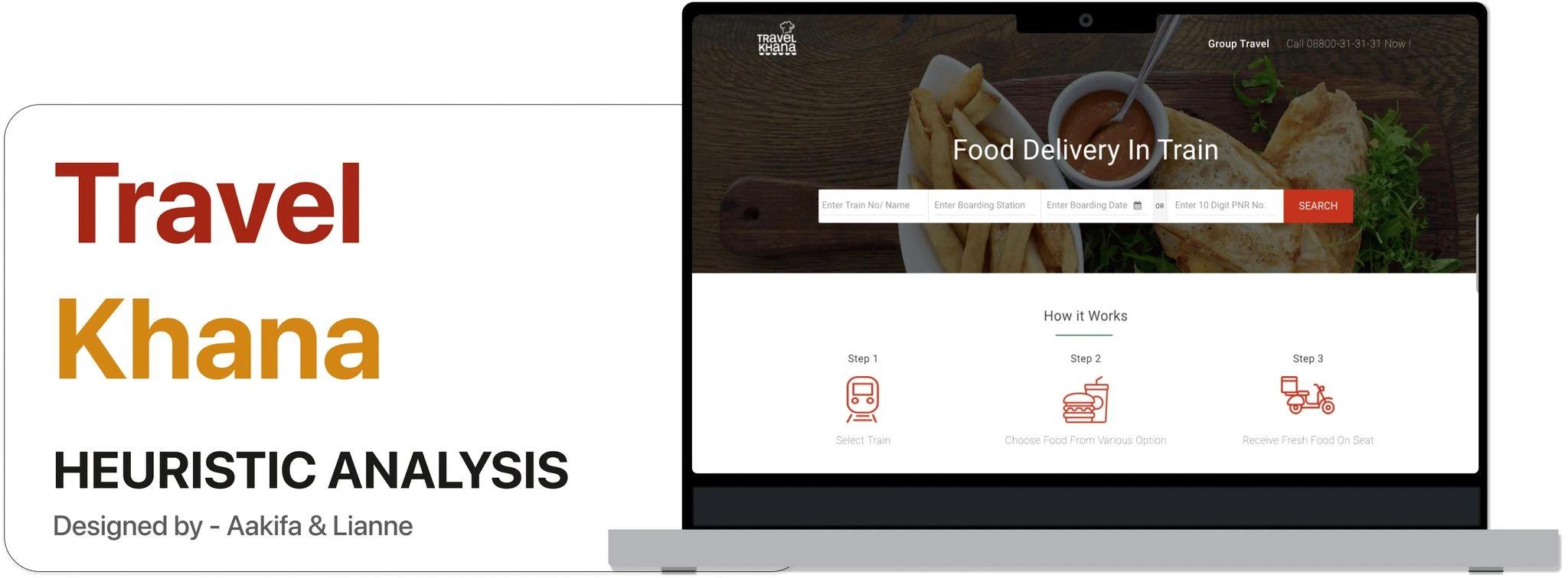
Travel Khana UX Case Study
Aakifa Baig
Heuristic analysis of travelkhana.com — a UX case study
My Role
Conducted a heuristic analysis with a peer designer using NN/g’s 10 usability heuristics. Identified key UX issues, rated their severity, and suggested actionable improvements for smoother food ordering during train travel.
Team
UI/UX
Platform
Website
What is Travel Khana?
Travel Khana is a well established and growing online food-in-train service provider, catering to more than 4000 trains at 250+ stations.
Why Travel Khana?
Overall, the railway network has transported over 22 million passengers every day pre-pandemic era. Millions of people in India use train travel as a feasible option to travel across the country. Some people bring their meals on the train, whereas others have to wait for the train to stop at a station so that they can step out and get a bite. Travel Khana has made it relatively easy for passengers to order food from the train to the nearest station.
The goal is to explain how Heuristic Analysis is conducted based on the rules of heuristics, popularly used in user experience and user interface design to evaluate a website, portal, or app for their confirmation of heuristic principles.
Travel Khana website is evaluated using The 10 Usability Heuristics for User Interface Design established by Nielsen Norman Group. The number of heuristics errors and the defects examined from these tasks were further categorised into discover and issue. At last, a suggestion to fix usability issues is recommended.
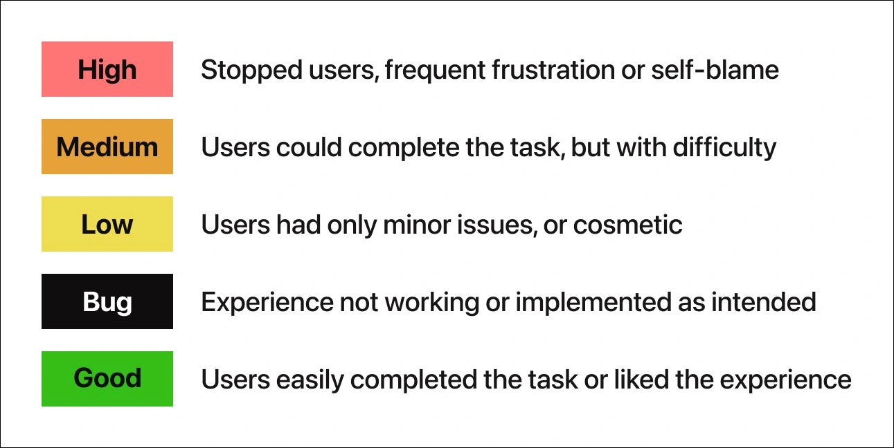
Severity scale for this case study
Certain usability problems can have a devastating effect on the popularity of a product, even if they are "objectively" quite easy to overcome. Even though severity has several components, it is common to combine all aspects of severity in a single severity rating as an overall assessment of each usability problem in order to facilitate prioritising and decision-making.
Compliance with each usability rule; is measured against the five severity criteria below.

Are users informed about what's going on?
On websites with many pages, breadcrumb navigations can enhance the trail users find their way around. In terms of usability, it reduces the number of actions a website visitor needs to take to get a higher-level page, which allows a person viewing a web page to see the various levels within the website's hierarchical structure through which they have navigated.
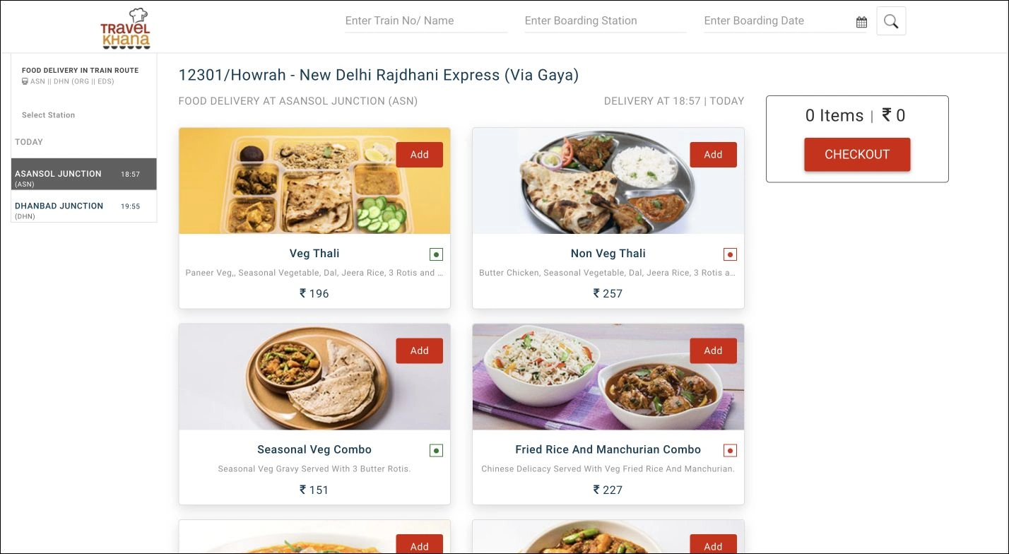
Unfortunately, In the example below, there is no clear indicator of a progress tracker to show the user where they are on the travel khana website, which makes it challenging to navigate through it. There is no top navigation menu, which makes it difficult for the user to find everything that's important on a website. There is also no option (other than the browser back button) to go back to the previous screen.

However, while entering the checkout details, the progress tracker helps users through a 3 step process. It helps keep users informed about what section they are currently on, what section they have completed, and what tasks remain.

Conclusion
We found a lot of usability problems and user interface issues. The defects listed here can vary from user to user. This case study reflects those heuristic guidelines are crucial for improving the user's satisfaction and experience and raising the chances of a digital product's overall success.
Like this project
Posted Jun 4, 2026
Heuristic analysis of Travel Khana's website focusing on UX improvements.
Likes
0
Views
0
Tags