Brand Development for Goodsense Superfoods

Alexander Weaver


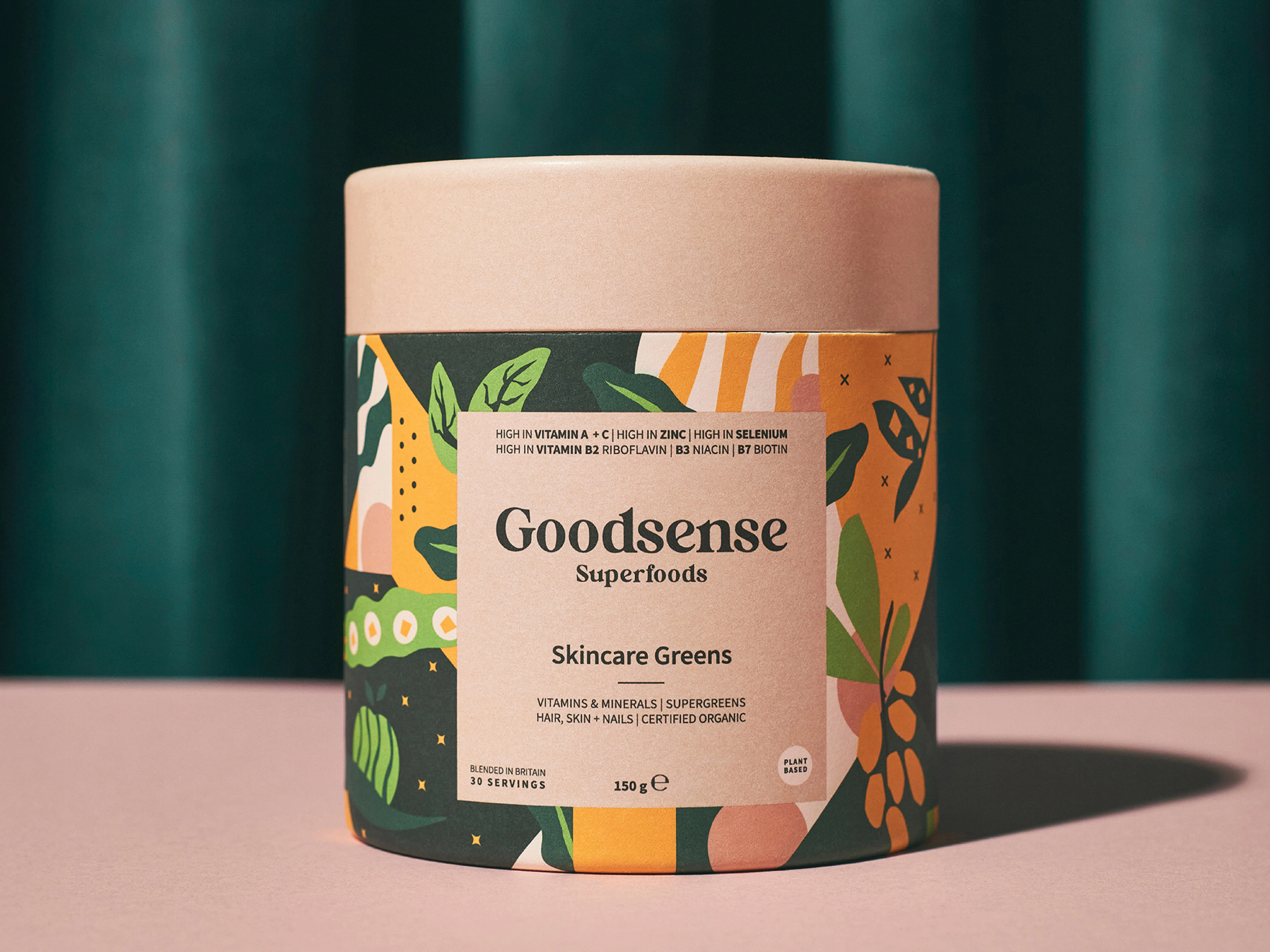
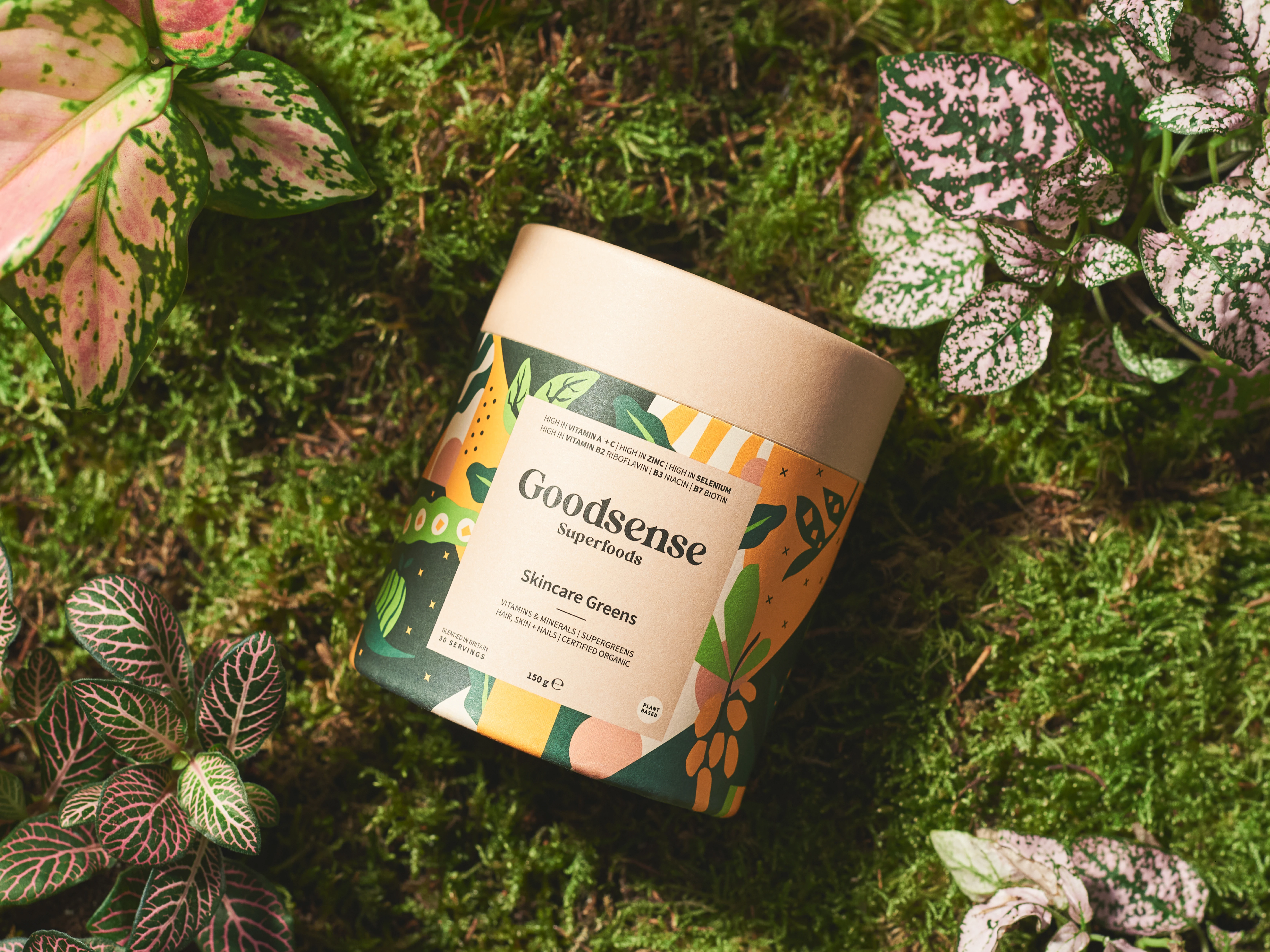
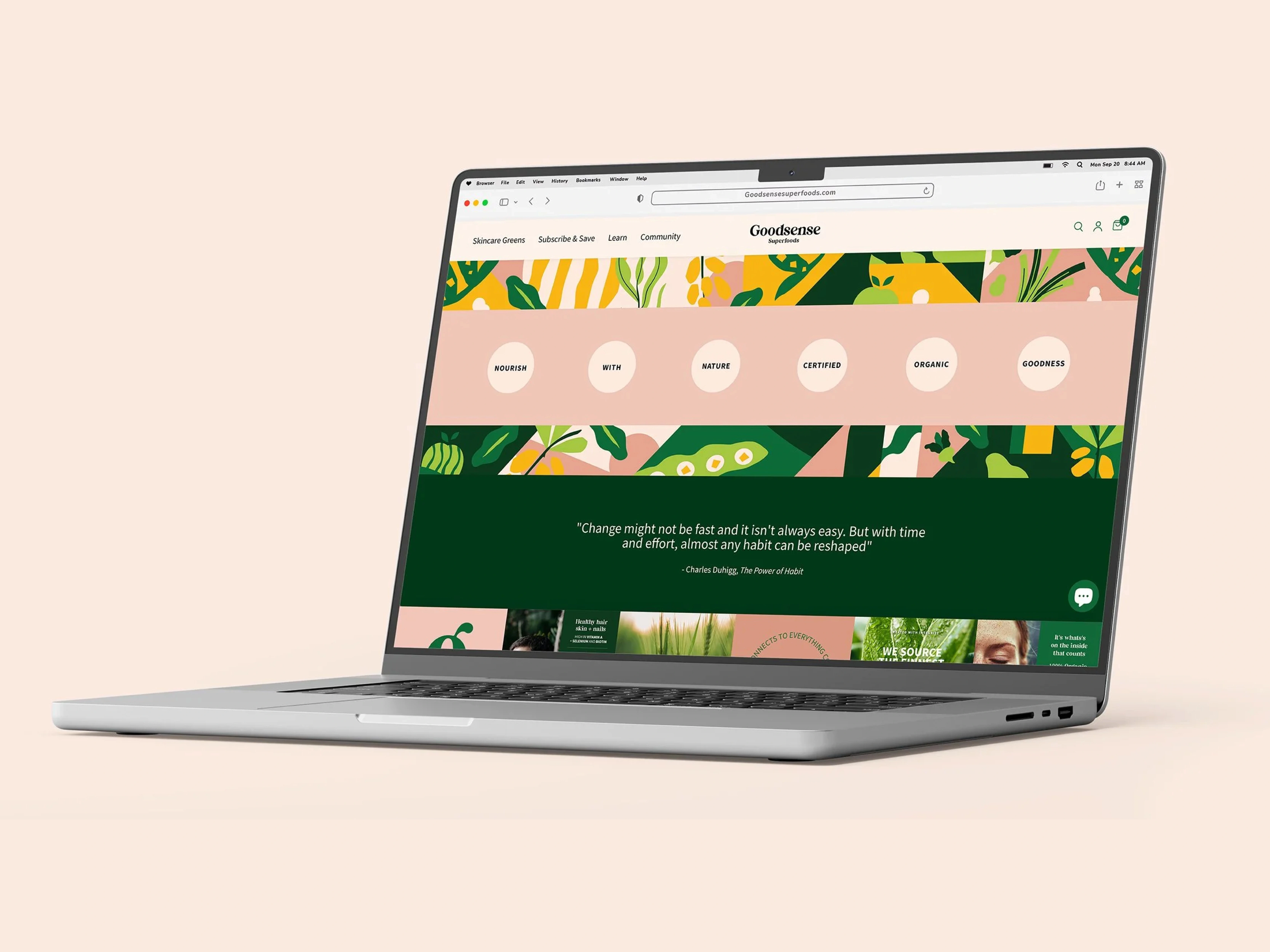
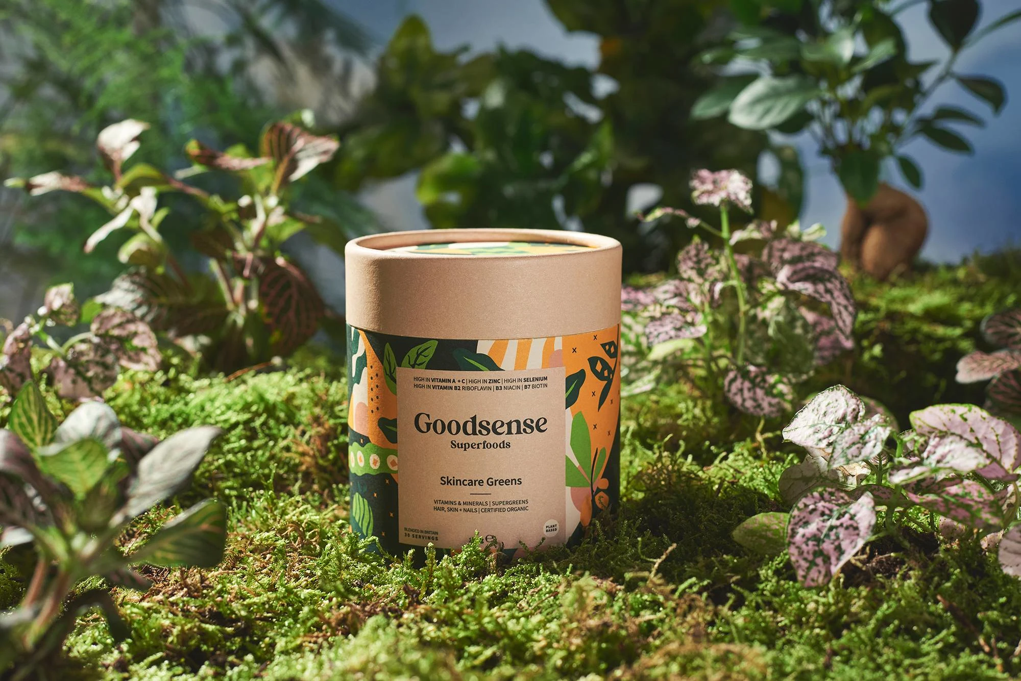
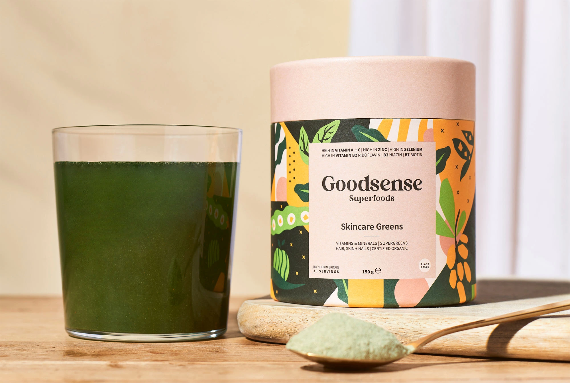
Goodsense Superfoods - Overview
Goodsense (Goodsense Superfoods) was created to make skincare feel simpler, smarter, and more sustainable by starting where results actually begin: inside the body. In a market crowded with loud wellness claims and copycat greens, the category often feels fragmented, with products sold as quick fixes rather than a cohesive daily system. The challenge is to position Goodsense as a premium, credible, and memorable destination brand for “internal skincare”, one people trust, return to, and recommend. That means unifying the story (skin + nutrition + daily ritual), sharpening the identity, and building a clear message that customers can immediately understand, retailers can back, and the community can rally around.
Brand Approach:
Goodsense needed a brand world that turns “greens powder” into a credible, premium daily ritual, one that feels both science-led and human. So the focus was on building an identity that creates trust fast, feels ownable in a crowded market, and makes the idea of “internal skincare” instantly understandable, memorable, and easy to adopt.
I shaped the mood and visual language around three core themes:
Clinical Credibility – Clean typography, disciplined layout, and a restrained tone that signals “doctor-formulated” and results over hype.
Nature-Grown Purity – Organic textures and ingredient-forward cues that feel grounded, not gimmicky, reinforcing “from plant to presence.”
Modern Ritual & Lifestyle – Premium, calm visual pacing that makes the product feel like part of a morning routine and a way of living, not a short-term fix.
This direction guided every decision, from hierarchy and colour to imagery and graphic elements, creating a brand with clarity and presence. The result positions Goodsense not as another supplement, but as a distinct category: drinkable skincare that people can trust, return to, and build into their daily life.
Because Goodsense sits at the intersection of skincare, nutrition, and daily ritual, the colour palette had to do more than “look nice”. It needed to signal clinical credibility, natural purity, and premium calm, without drifting into generic wellness green or feeling inconsistent across ads, packaging, web, and content. The solution was a strategic colour system: each colour was given a clear job, so Goodsense can flex across audiences and touchpoints while still reading as one cohesive brand.
Like this project
Posted Mar 2, 2026
Developed brand identity for Goodsense focusing on internal skincare.