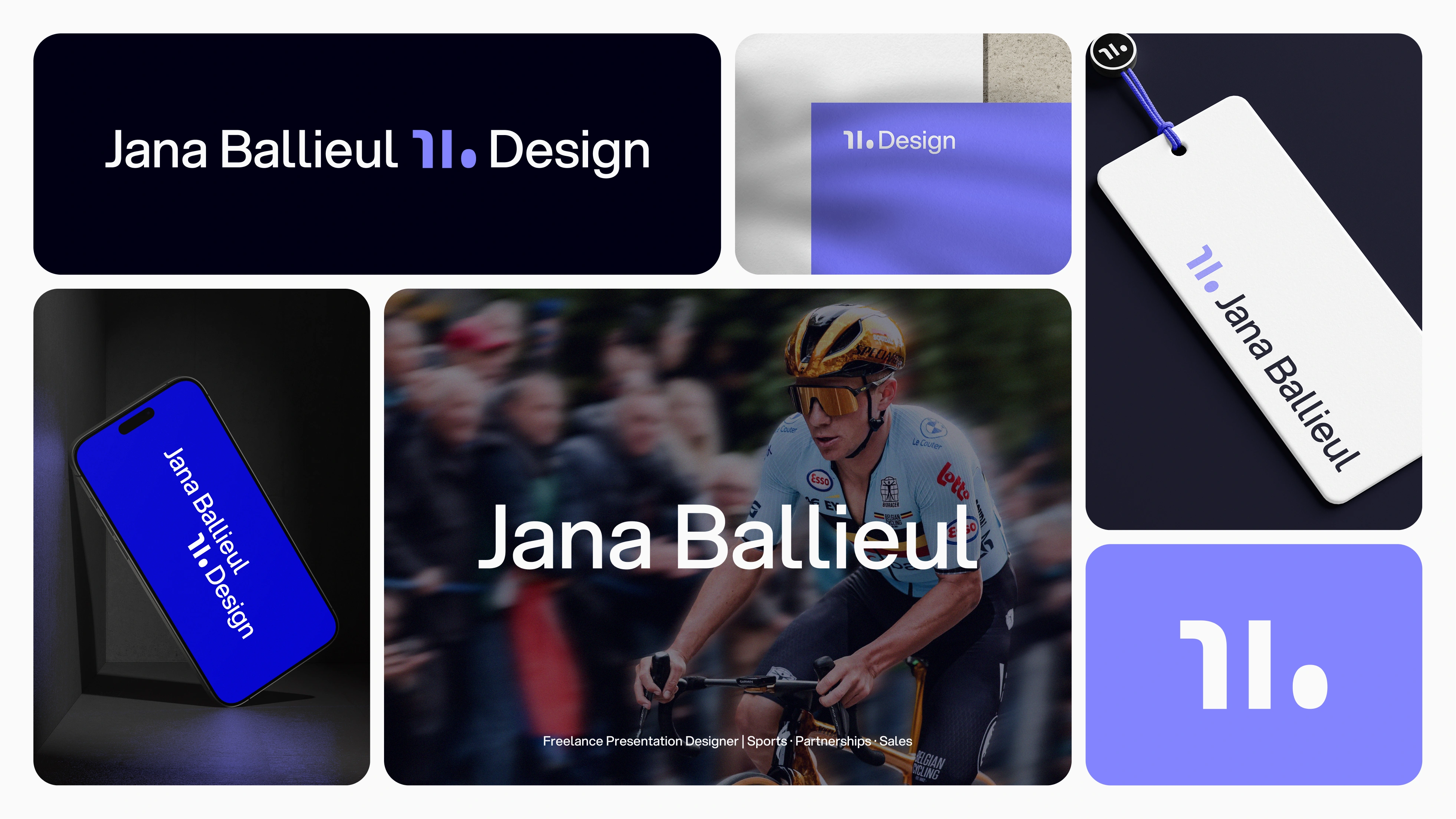
Jana Ballieul - Personal Brand Refresh
Jana Ballieul
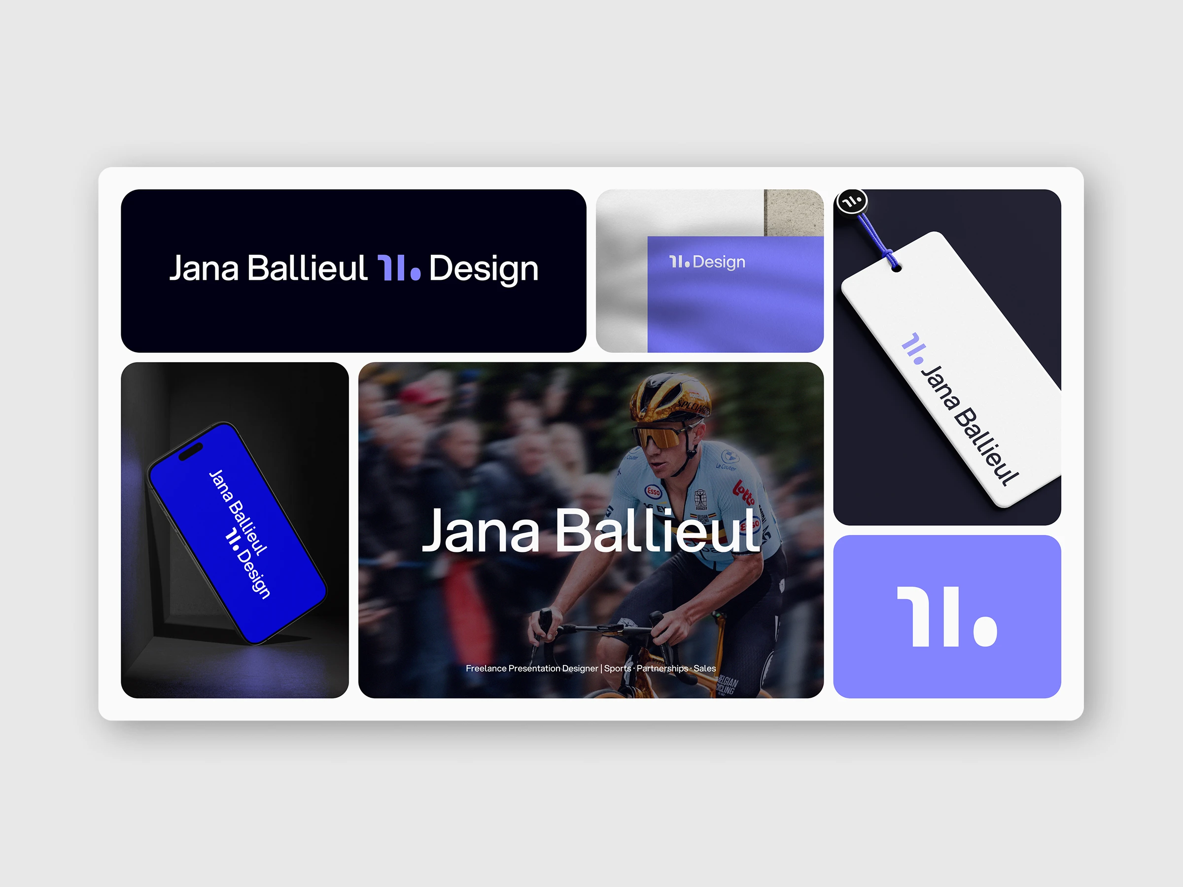
Jana Ballieul - Personal Brand Refresh
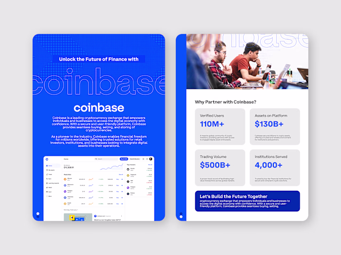
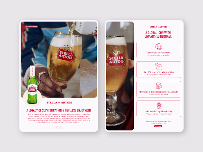
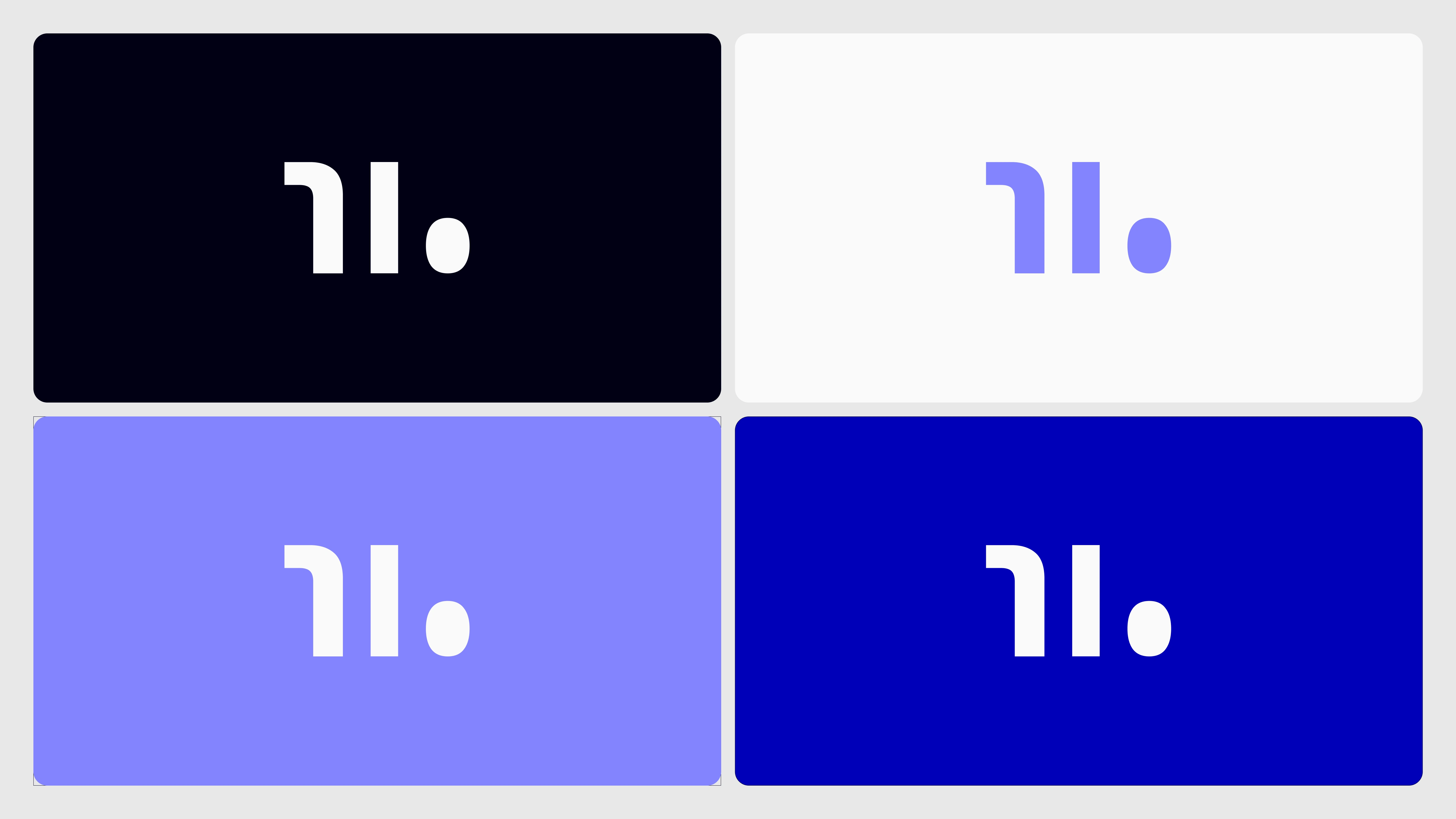
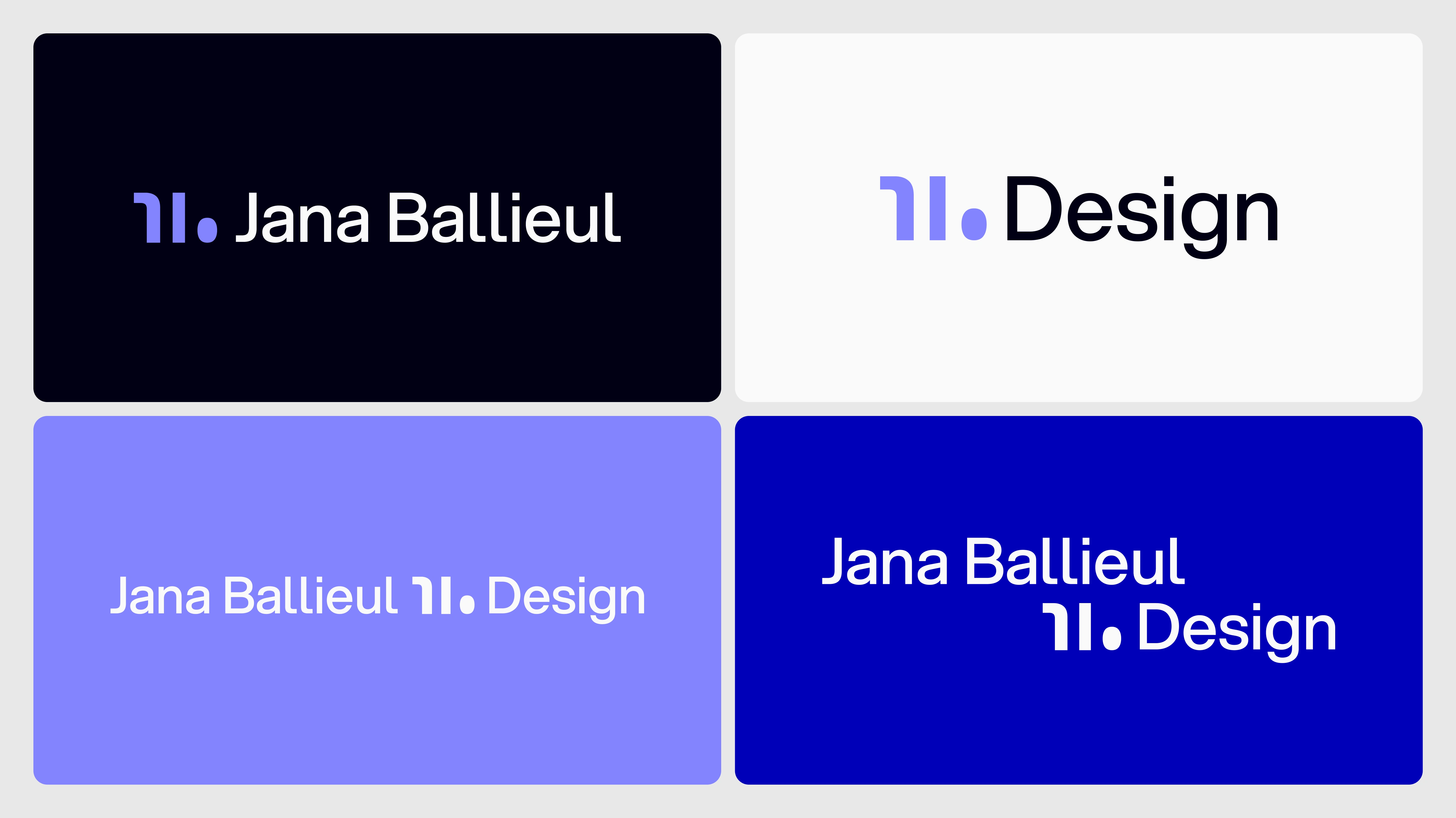
After a few years of using my original visual identity, I decided to refine my brand to better reflect where I’m headed as a designer—balancing structure, clarity, and creative precision. The updated system keeps the core symbol concept (a custom monogram built from my initials) but introduces a more modern typeface and a bold violet-toned palette that feels confident, not corporate. The result is a flexible, minimal identity system that feels clean and tech-forward—mirroring the kind of work I deliver across pitch decks, commercial storytelling, and sports branding.
Like this project
Posted Jul 11, 2025
Refined my brand with a modern font, bold violet palette, and a simplified monogram—clean, minimal, and built to reflect clarity and creative precision.
Likes
1
Views
24
Timeline
Jul 11, 2025 - Jul 11, 2025