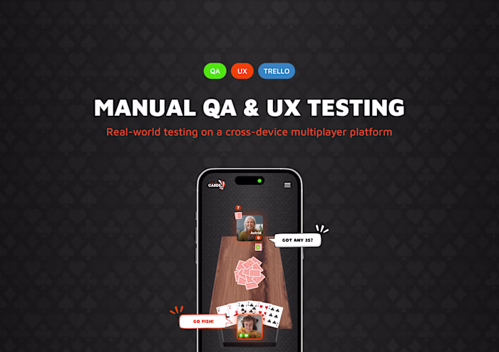
Let’s Play Cards | Branding/Marketing
Vilde Sofie Mathisen
As the visual designer at Let’s Play Cards, I created a wide range of marketing, print, and brand assets to build recognition, explain gameplay, and boost engagement. This included social media visuals, launch campaigns, mascot development, printed material, and a full set of game logos and brand animations. Every asset was designed with clarity and emotional connection in mind.
Table of Contents
Google Ads Campaign for the game "President"
Catchy, character-led visuals crafted to launch a classic card game with flair across Google Display.
Goal
This set of Google Display Ads was designed to promote the game President on Let’s Play Cards. The aim was to grab attention fast, spark curiosity, and drive clicks, all while staying fun, bold, and brand-aligned.
Approach
I created three ad variations featuring distinct characters (a stylish grandma, a geeky teen, and a confident young woman) to reflect a wide range of player personalities. The phrase “Be the next President” was central, playful and provocative enough to make viewers pause. Vibrant colors, spotlighting, and energetic crowd silhouettes helped create a sense of excitement and urgency, while still maintaining clarity even at small ad sizes. Each visual was carefully adapted across horizontal, square, and vertical formats for optimal performance on web and mobile.
Results
The campaign achieved a click-through rate above industry average and helped reinforce Let’s Play Cards’ playful identity. It also set a clear creative tone for future marketing campaigns for individual games.
Social Media Visuals for Game Launch Campaigns
Playful social media content designed to build awareness, highlight gameplay, and engage new users during key game launches on Let’s Play Cards.
Launch visuals to spark curiosity.
Goal
Build excitement around new game launches while making the games feel approachable and easy to understand, even for users with limited experience or language barriers.
Approach
For each game launch, I first created a playful and eye-catching announcement post to spark interest and engagement. This was followed by a “Did you know?” fact post and then a simple carousel explaining the rules. The idea was to balance fun and clarity, introducing the game, reinforcing curiosity, and offering clear guidance.
Fact post to build interest.
Results
The launch visuals improved recognition and shareability. Rule carousels became helpful references, while the fun tone of the launch posts increased social engagement and strengthened the brand personality. The campaign also established a clear, reusable launch template for future games, making each rollout faster, more consistent, and easier to scale.
Rule carousel to explain how to play (these are just chosen slides).
Orange Personas for Story Content
Branded character system crafted to organize and energize Stories on Let’s Play Cards, turning feature updates, polls, quizzes, and emotional prompts into instantly recognizable content.
Goal
Make Stories feel more intentional, interactive, and on-brand by assigning a clear, visual personality to each type of content, helping viewers instantly understand the purpose of each Story and engage more easily.
Approach
We already had the Orange mascot, but I thought we could take it a bit further. While planning a quiz to follow a “Did you know?” post, I realized we could make the Stories experience more engaging and thematic by turning the mascot into a set of distinct personas. That’s how the idea of character-driven categories like the Quizmaster, Detective, and Therapist was born.
Each visual was created by generating the characters, props, and environments separately using AI, then carefully composing and refining them by hand. This gave me full control over tone, expression, and atmosphere, allowing each persona to feel unique while still fitting the overall brand. The result is a playful, recognizable system for organizing and delivering Story content in a way that feels cohesive and fun.
Results
The personas have quickly become a recognizable part of our Story content, adding character and consistency across categories. While still new, the system has already made it easier to plan, create, and deliver content with a clear tone and purpose. It also opened up new creative directions for engaging our audience and strengthening the brand’s playful identity.
Print Design for Offline Marketing
Supporting real-life promotion with tangible designs that inform, attract, and invite, all while staying true to the Let’s Play Cards brand.
Goal
Build real-world awareness, generate interest, and encourage sign-ups by meeting people where they are: cafés, restaurants, venues, and casual social spaces. Each piece had a specific purpose: to inform, invite, or reinforce the playful identity of Let’s Play Cards.
Approach
The print package included four core elements, each with its own role:
1. Business Card–Style Game Invitation
This small, pocket-sized card was designed for easy sharing. It’s playful, scannable, and simple enough for anyone to tuck into their wallet or purse. It served as a quick-access reminder to visit the platform and try it later, ideal for casual players who were intrigued but not ready to sign up on the spot.
2. Brochure
The brochure was created for the marketers and team members introducing LPC in person. It supported conversations with a friendly overview of the platform, explained how it works, and showed game visuals. The brochure wasn’t meant to be handed out widely, but to help explain the value of LPC clearly during outreach efforts.
3. Table Tents (Three Variants)
To better understand which messaging resonates most, I designed three different table tent variants and gave each its own QR code. This setup allowed for simple A/B/C-style testing in the field.
– Variant A focused on appealing to people who love playing cards
– Variant B highlighted the startup nature of LPC to attract early adopters
– Variant C spoke to families and the emotional value of connection across distance
All three versions were placed in local bars, cafés, and rental accommodations to naturally catch attention in social settings.
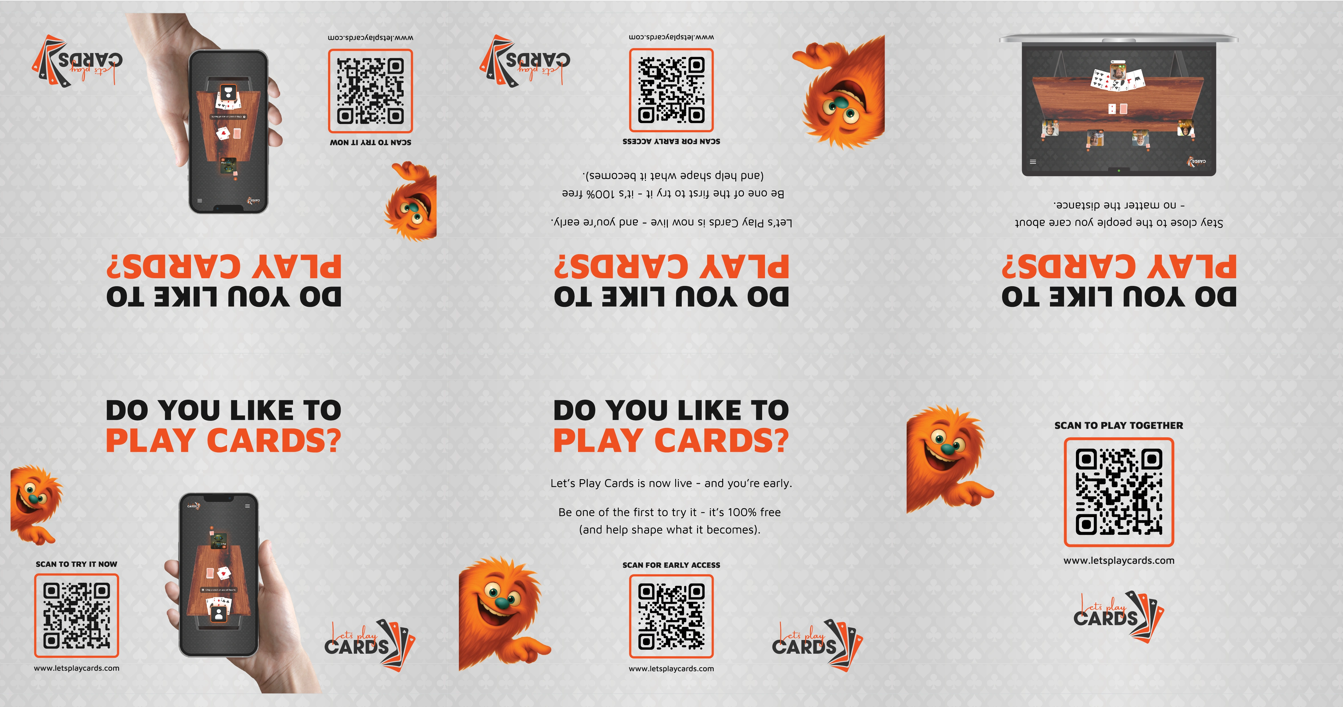
Results
The print package brought the platform into the physical world, making it easier to introduce LPC in real-life conversations and locations. The business card–style invitation offered a quick and accessible way for people to take LPC with them, literally, while the brochure supported more in-depth demos and discussions. The A/B/C-style table tents allowed for early insights into which messaging resonated most across different audiences. Combined, these print materials gave the team flexible tools to increase visibility, start conversations, and encourage signups through offline touchpoints.
Note: The visual identity of Let’s Play Cards, including game logos and the Orange mascot, is woven throughout these assets. I created the logos for each game and designed multiple AI-generated Orange character variations to keep the tone consistent, expressive, and playful across touchpoints.

Like this project
Posted Aug 5, 2025
Led marketing and branding for Let’s Play Cards, from visual identity and mascot use to print, campaigns, and content tailored for social engagement.
Likes
0
Views
8
Clients
LPC Global SL