Crescendo
Hy Nguyen
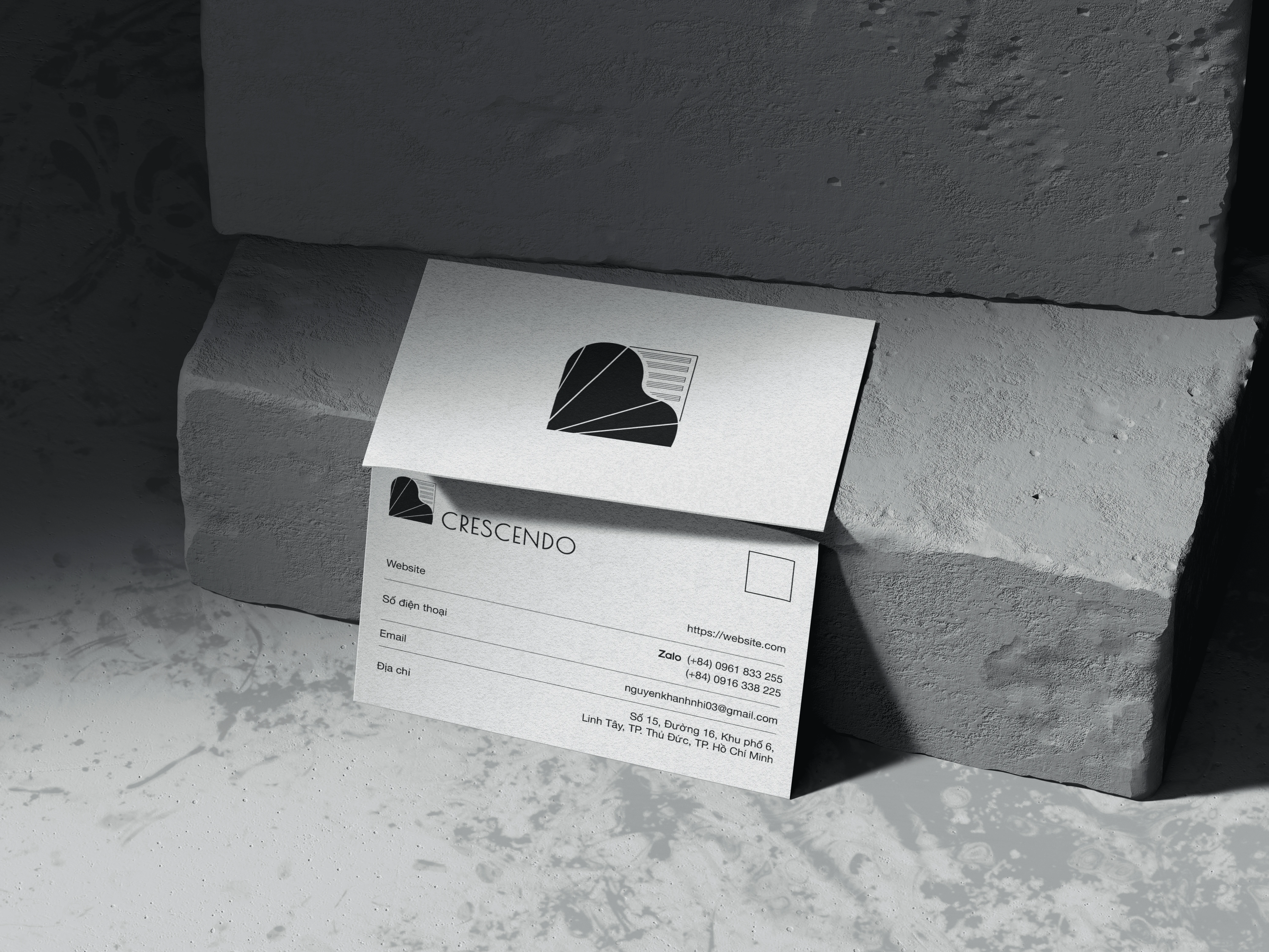
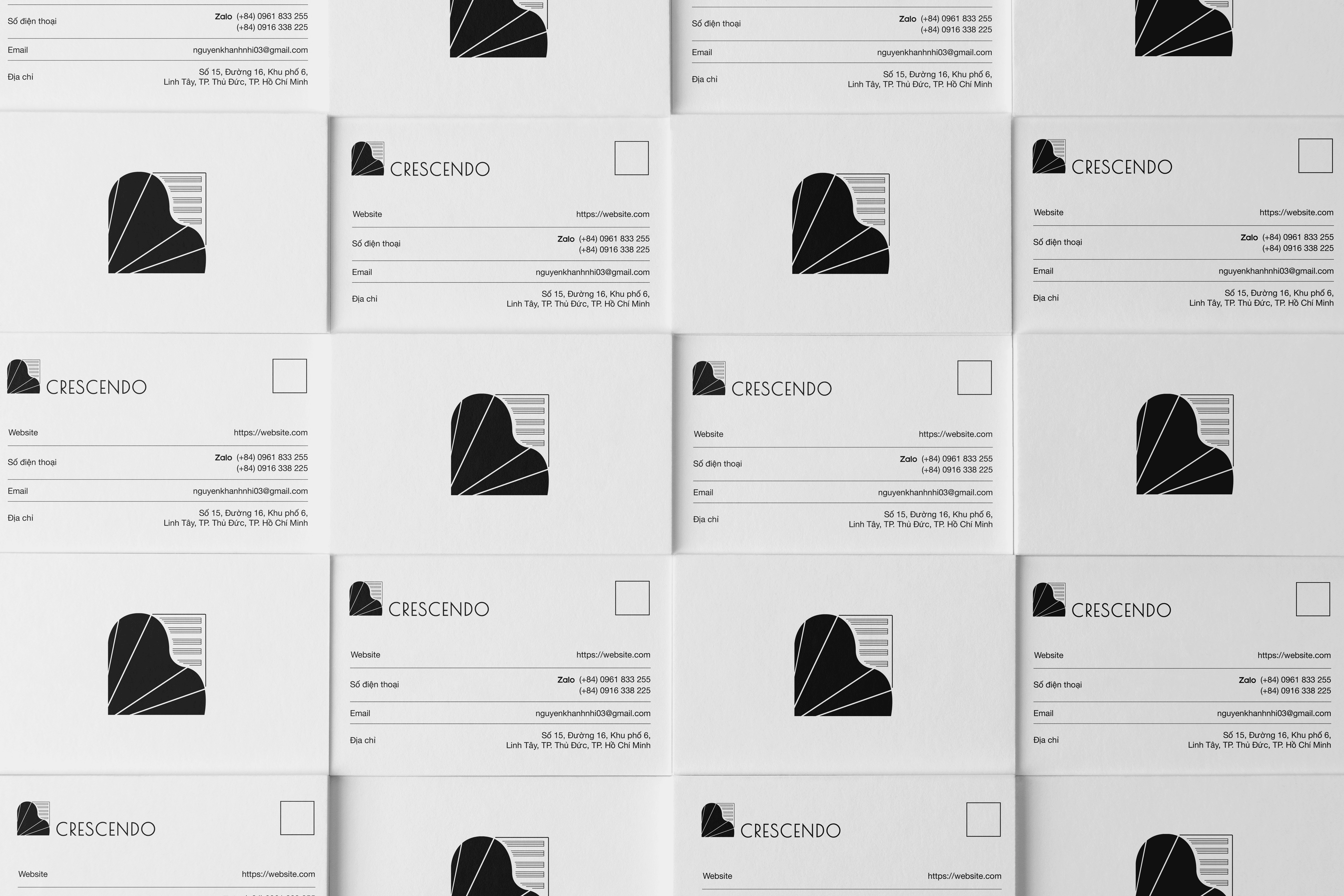
CRESCENDO
Services
Brand Identity
Category
Brand Designer
Client
Crescendo
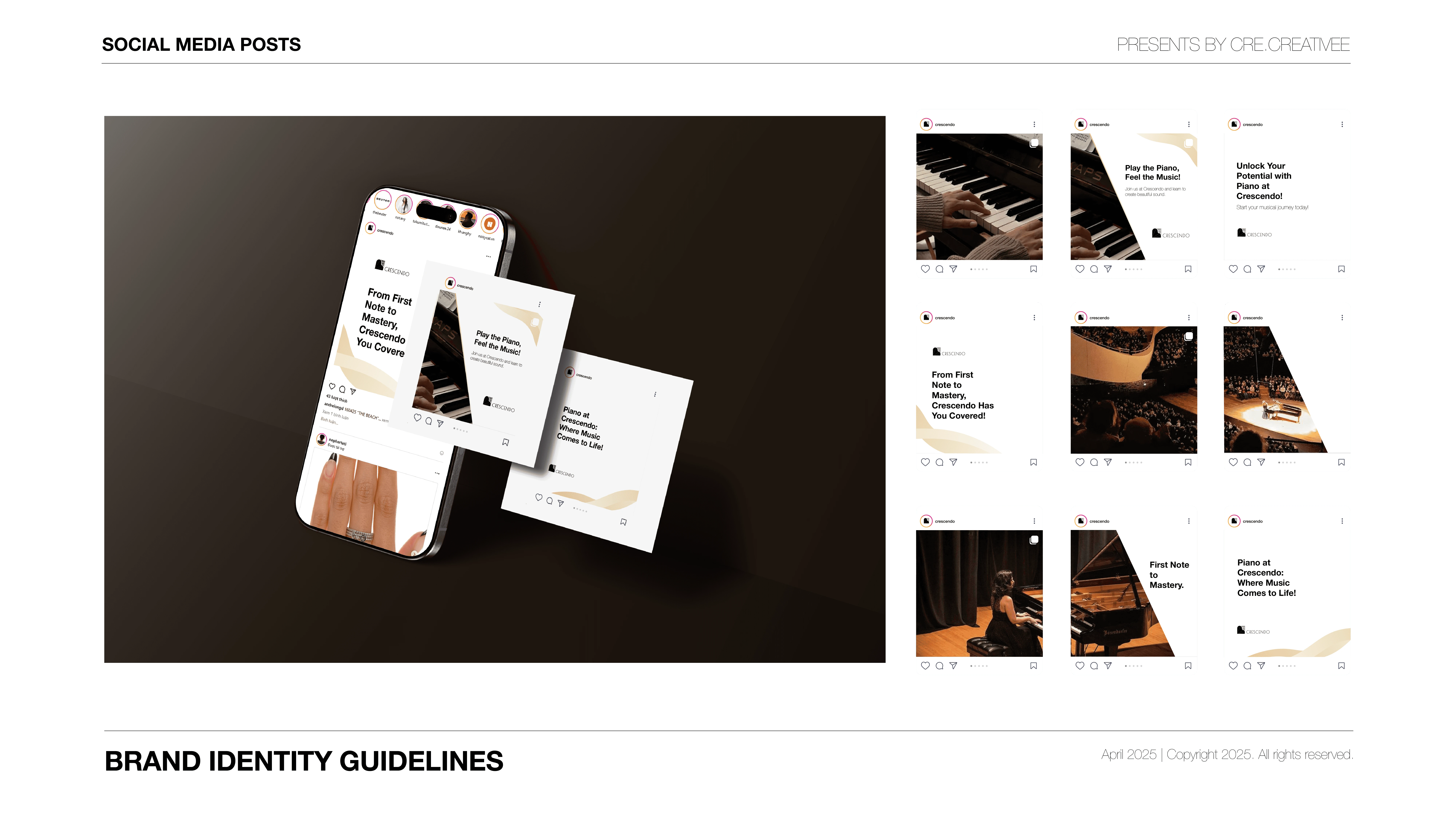
Crescendo is a brand that represents a music academy located in Ho Chi Minh City. The academy not only focuses on teaching piano but also offers a wide range of other disciplines such as violin, vocal performance, guitar, and music theory. With a mission to ignite a love for music in every student, Crescendo provides a creative and inspiring learning environment. Its team of dedicated, professional instructors and modern teaching methods serve as a strong foundation for students to nurture their talents holistically.
As a Brand Designer, I craft brand identities with a minimalist and modern approach. My focus is on clarity, elegance, and brand coherence. Each design aims to be functional, memorable, and visually consistent.
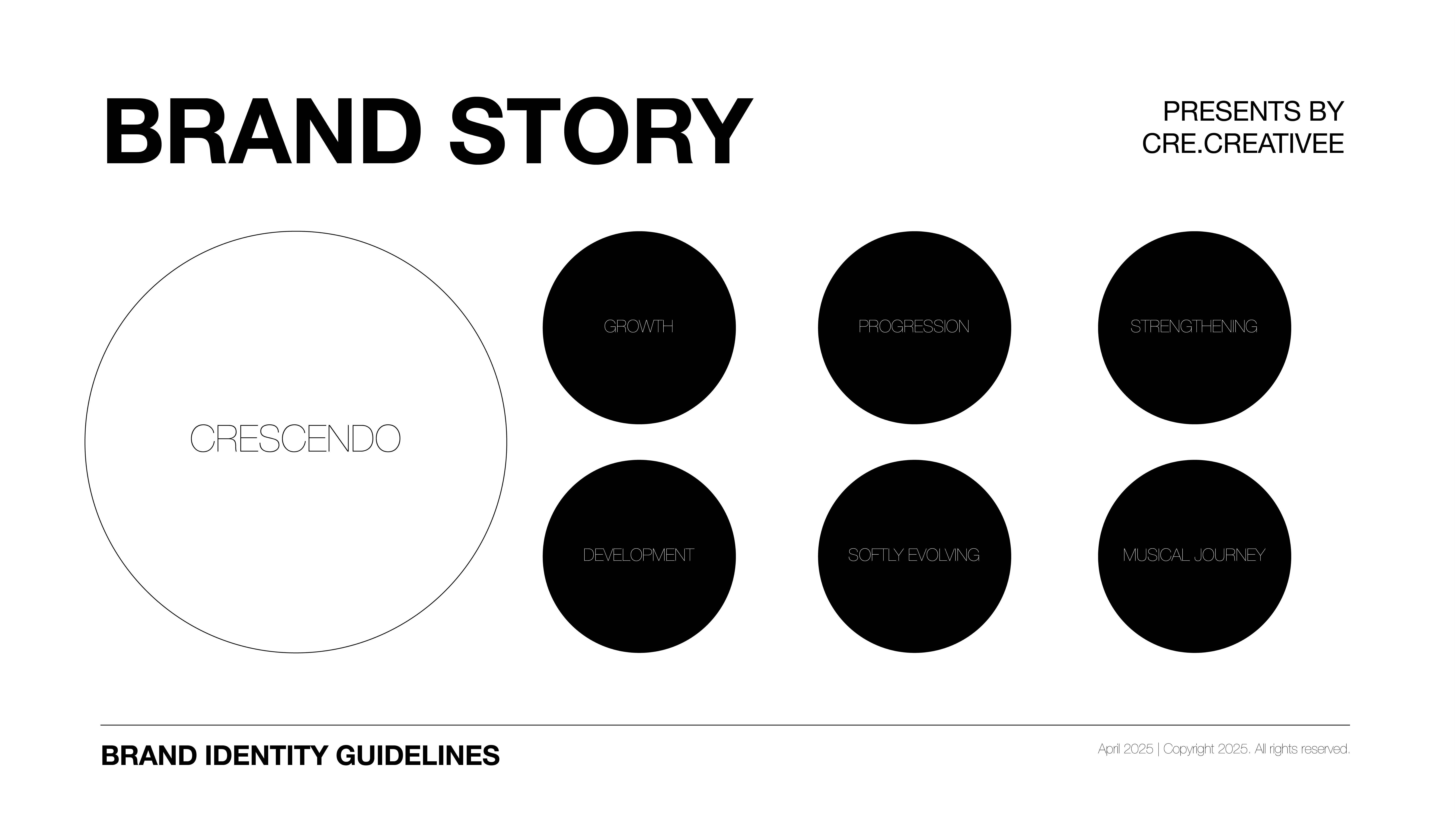
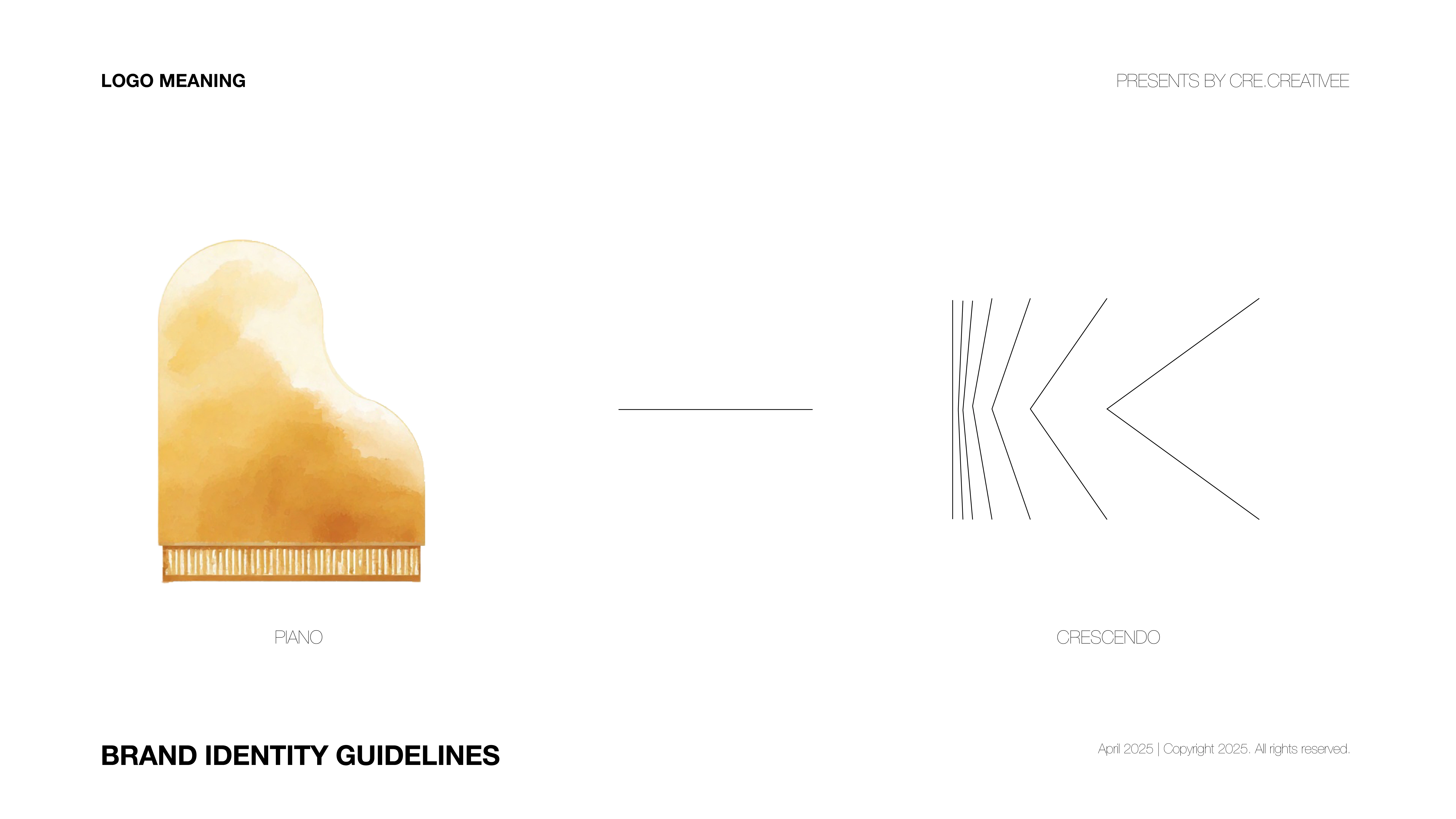
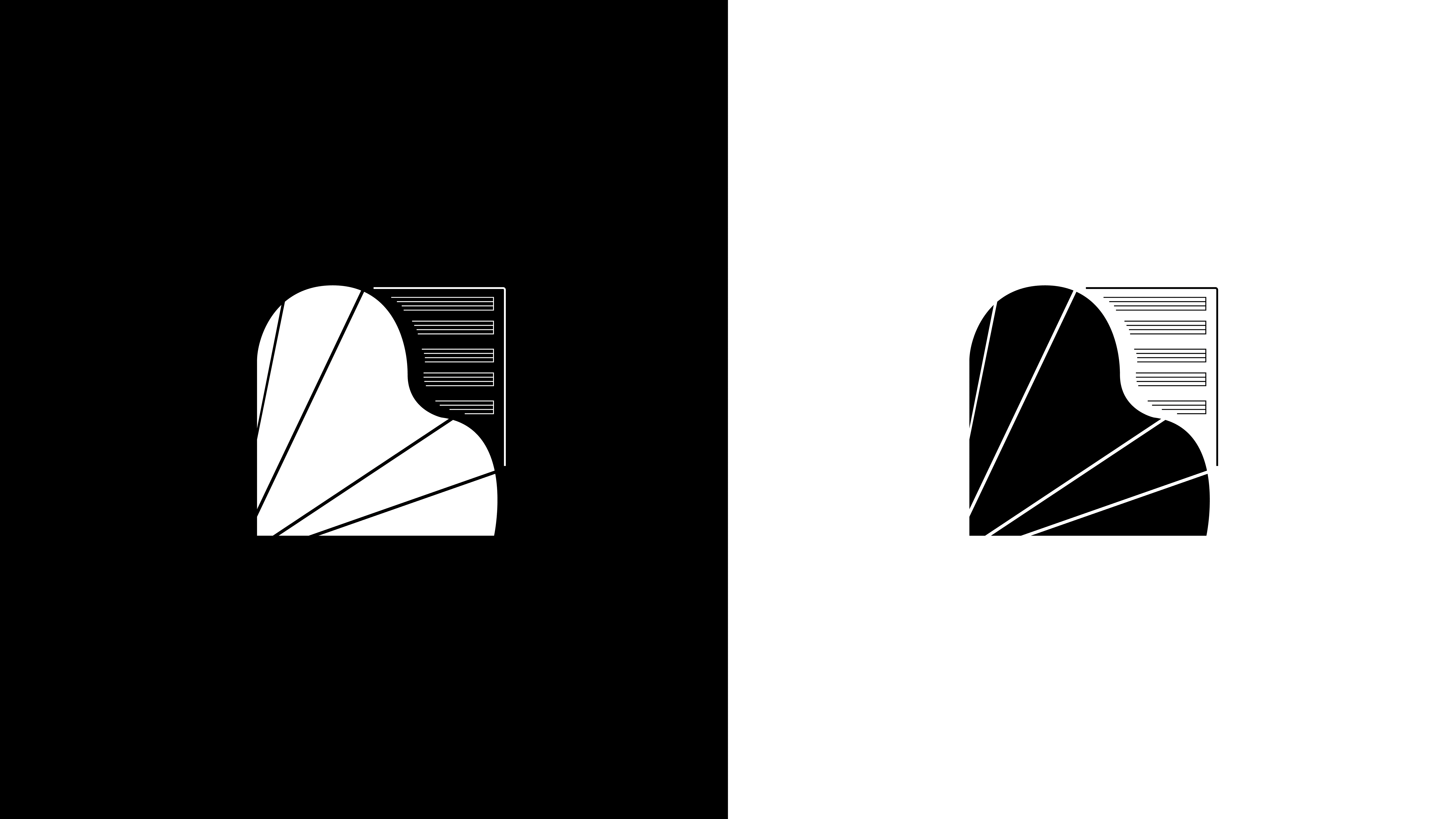
Crescendo means “gradually increasing,” and I translated this idea into ascending visual lines that echo musical growth. Blending these lines with the iconic shape of piano keys, I crafted a distinctive logo that is both symbolic and emotionally resonant. From this foundation, the brand identity was developed to align visuals with the academy’s spirit. Every element was designed to reflect continuous growth and artistic elevation.

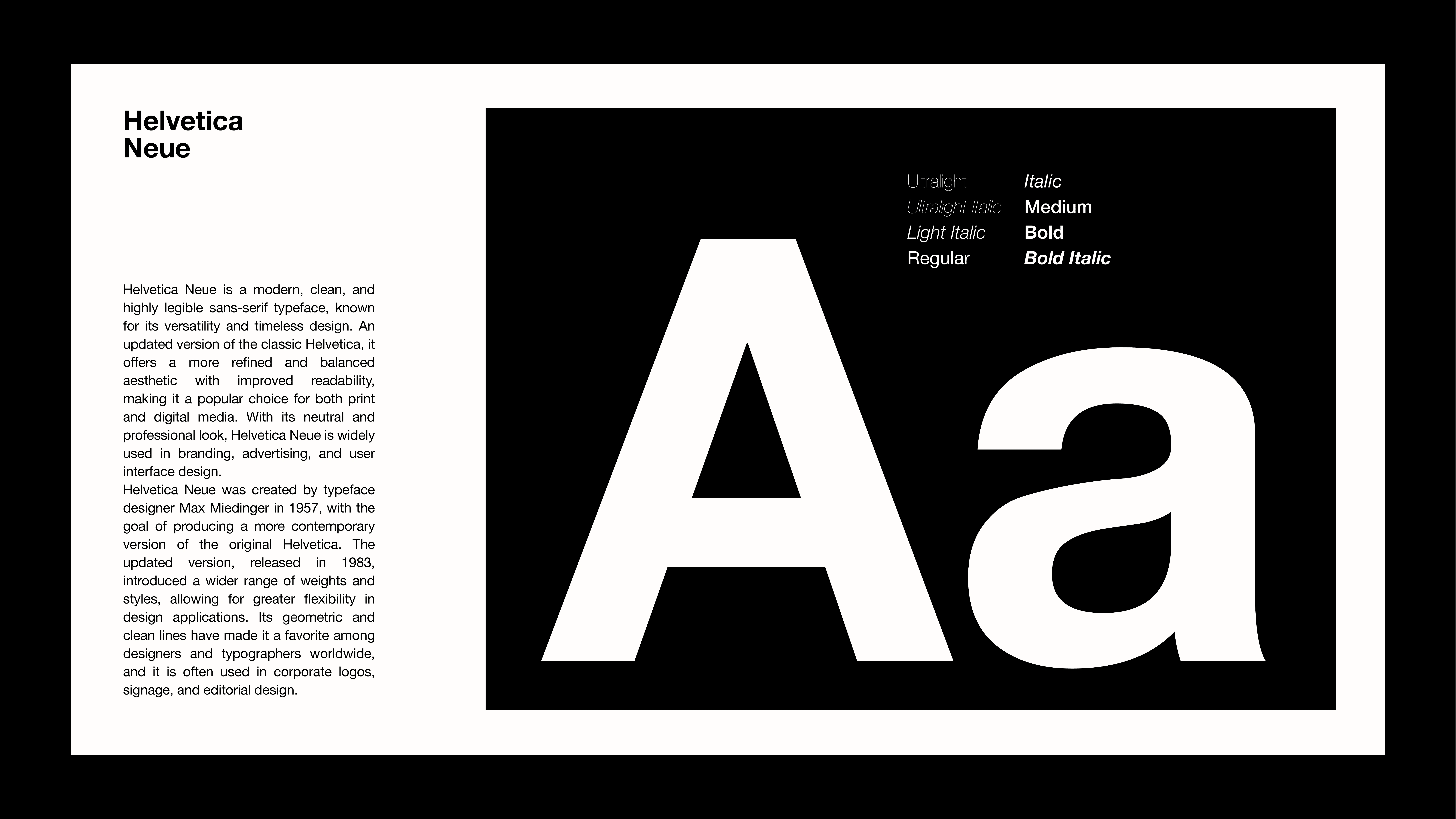
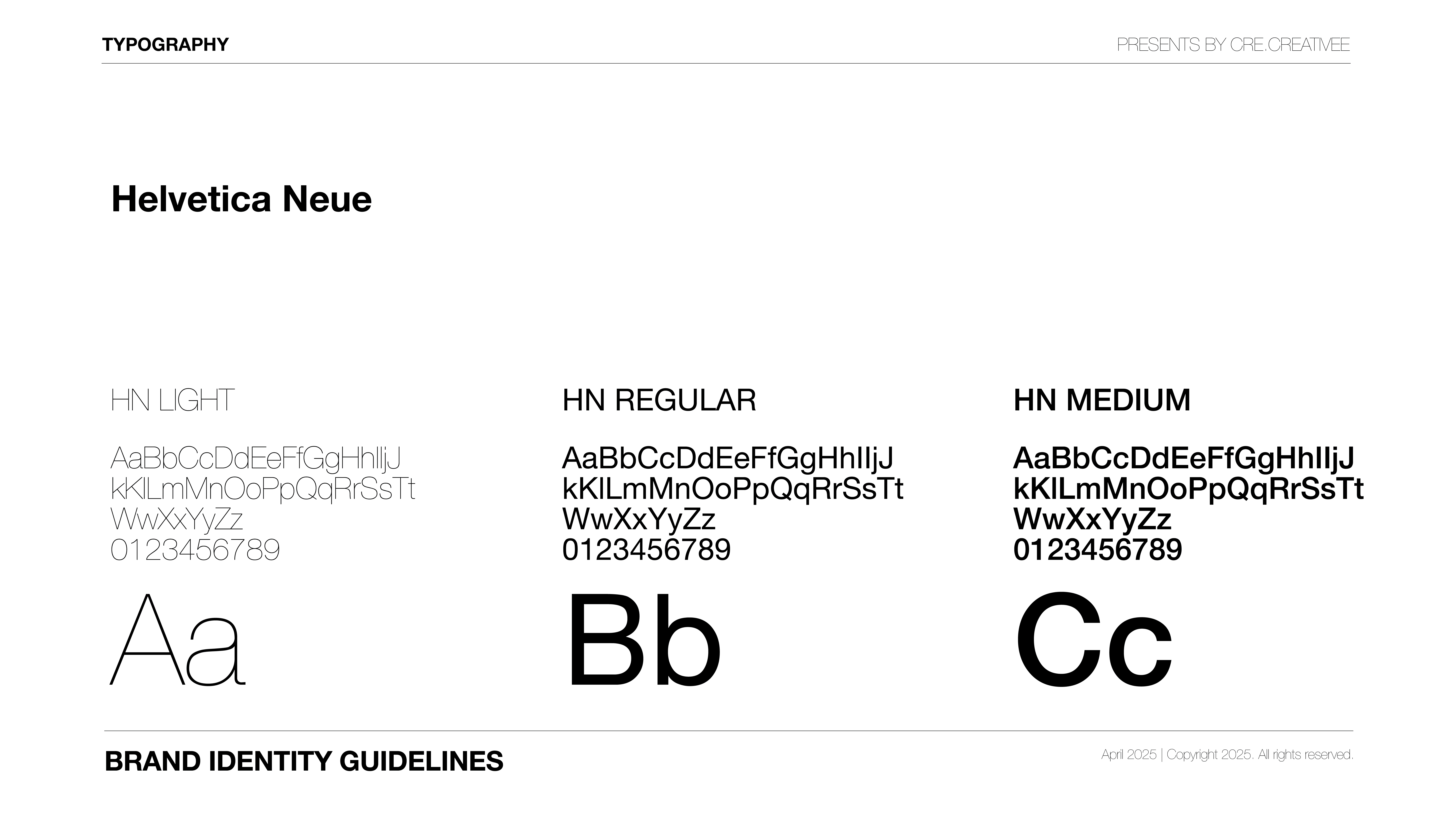
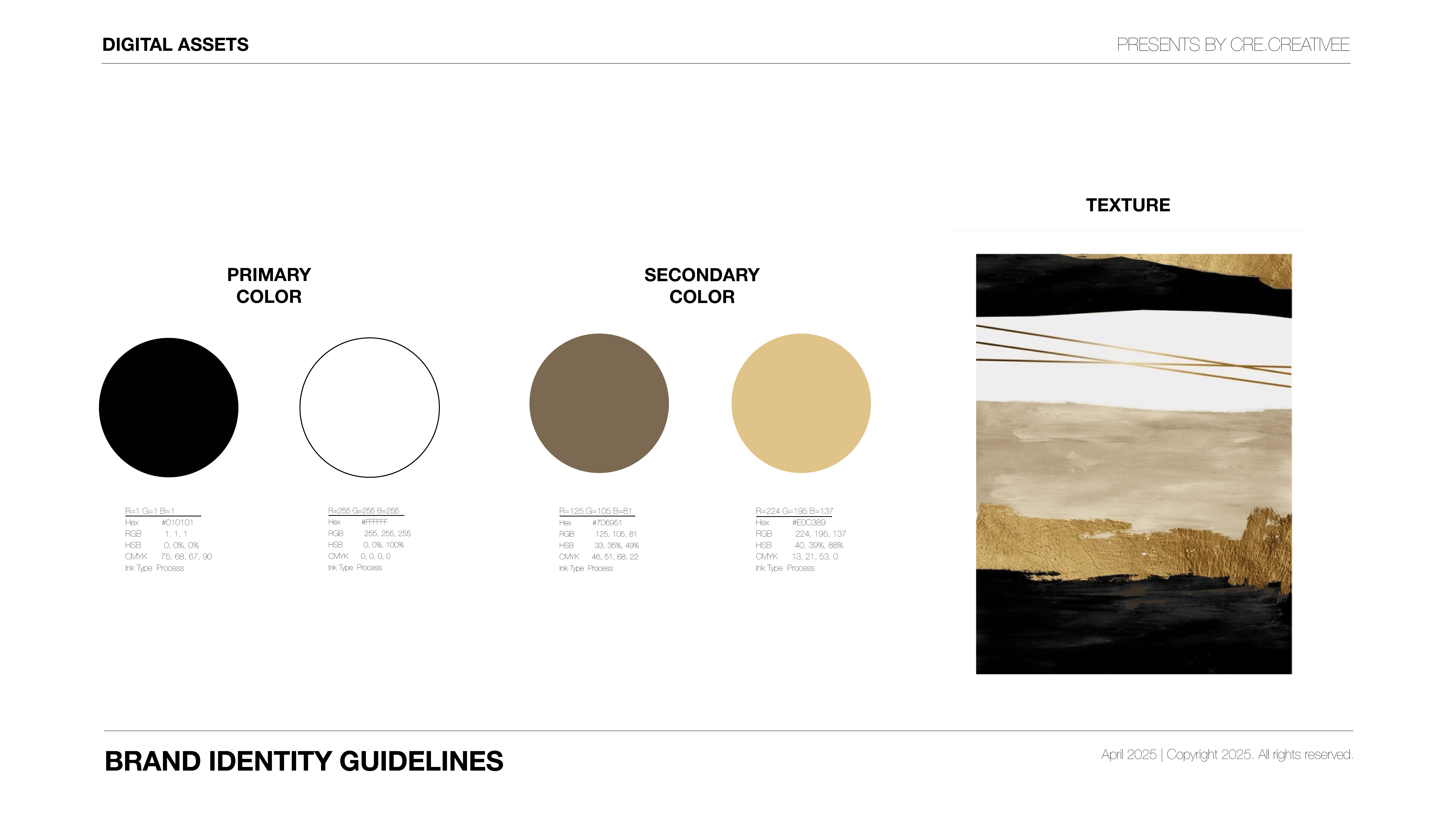
The primary font used is Helvetica, chosen for its modern and highly legible look that enhances the brand's professionalism. The color palette revolves around warm yellow tones, evoking brightness and positive energy. The visual guideline incorporates wave-like materials, symbolizing the fluidity of sound and emotional resonance. Together, these elements form a cohesive and expressive brand language.
Like this project
Posted Jun 19, 2026
Brand identity design for Crescendo, a music academy in Ho Chi Minh City.
Likes
0
Views
2
Tags