Tailspin Jerky
Tailspin Jerky
Scott took the leap from being a Software Engineer at Apple to starting his own jerky company. He knew he had an amazing recipe but needed a brand to match. There were only two major requirements; keep things humorous, and don’t just be another ‘cookie cutter’ jerky company.
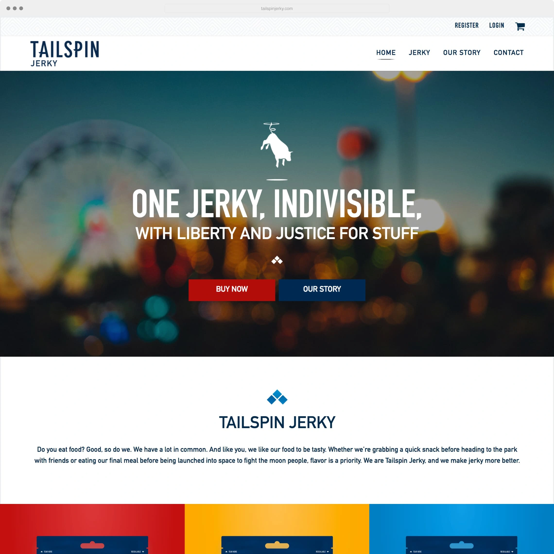
From the beginning, we sifted through dozens of possible names but kept coming back to 'Tailspin'. We ironically embraced the traditionally negative name because of its amusing visual implications, memorable nature, and to emphasize that this company is anything but a safe, boring, run of the mill jerky company. This is a company unafraid of embracing the nontraditional, whether that be unique packaging, outlandish copywriting, or moist, tender jerky… a stark contrast in a market space dominated by dry meat products.
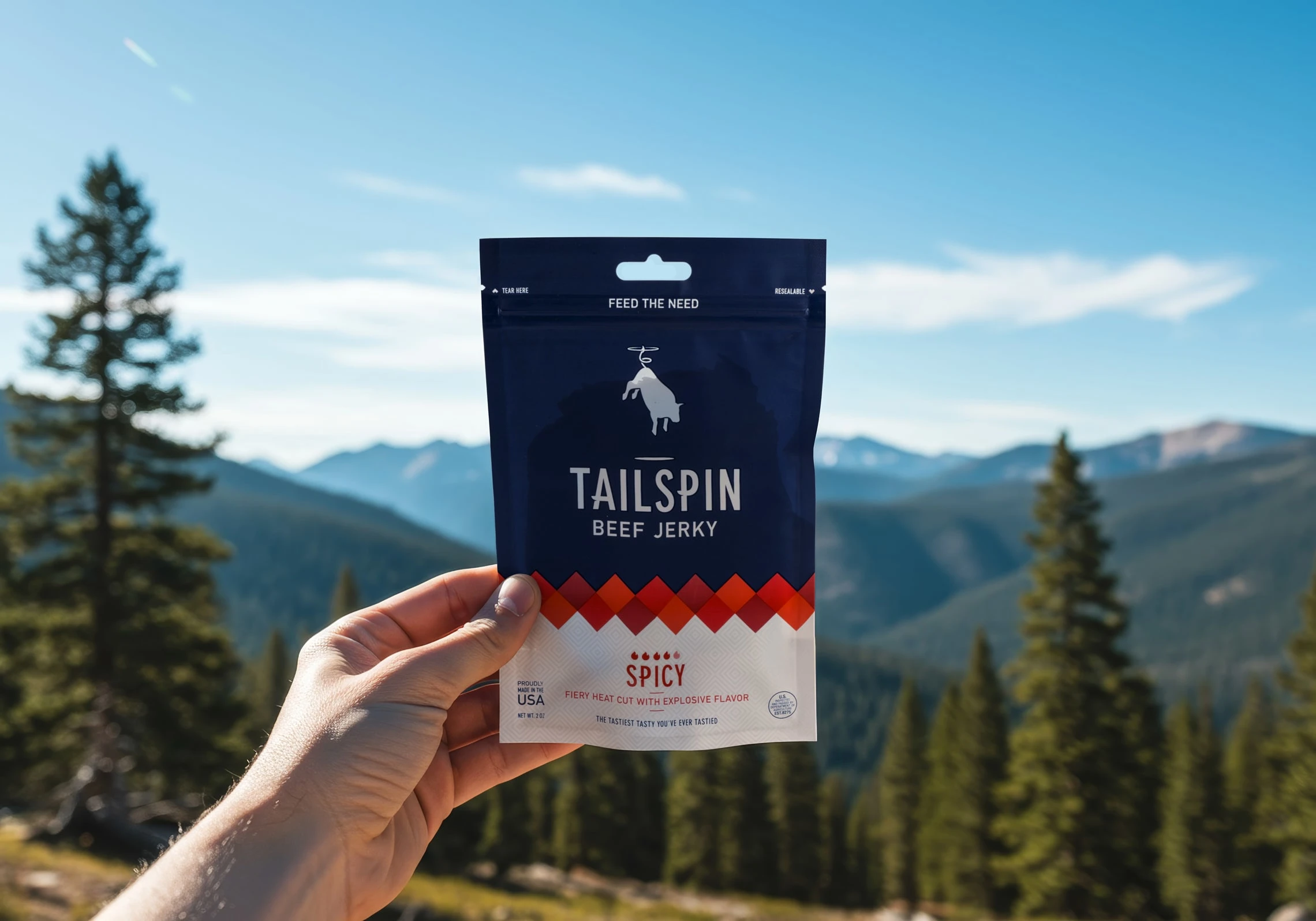
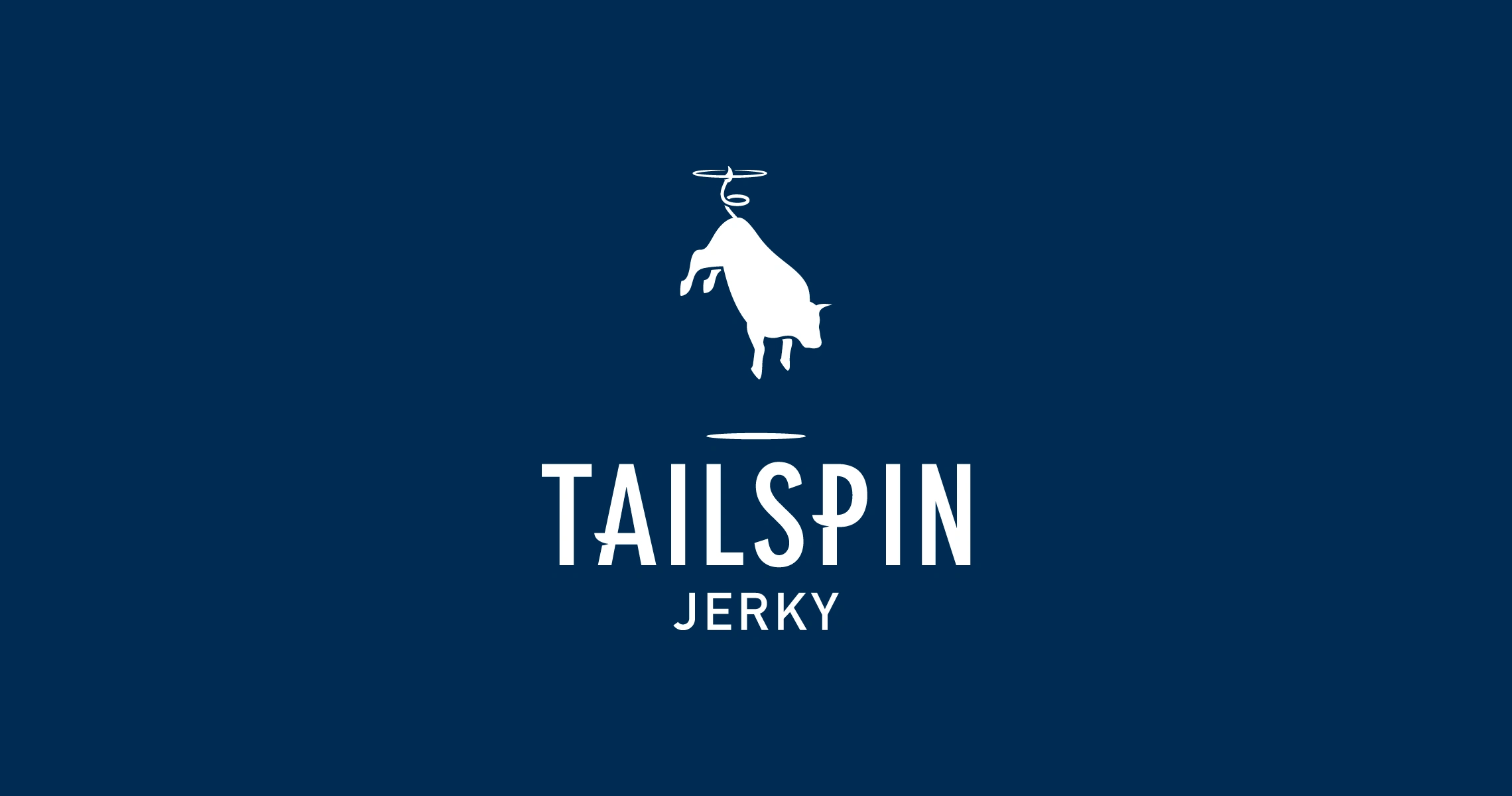
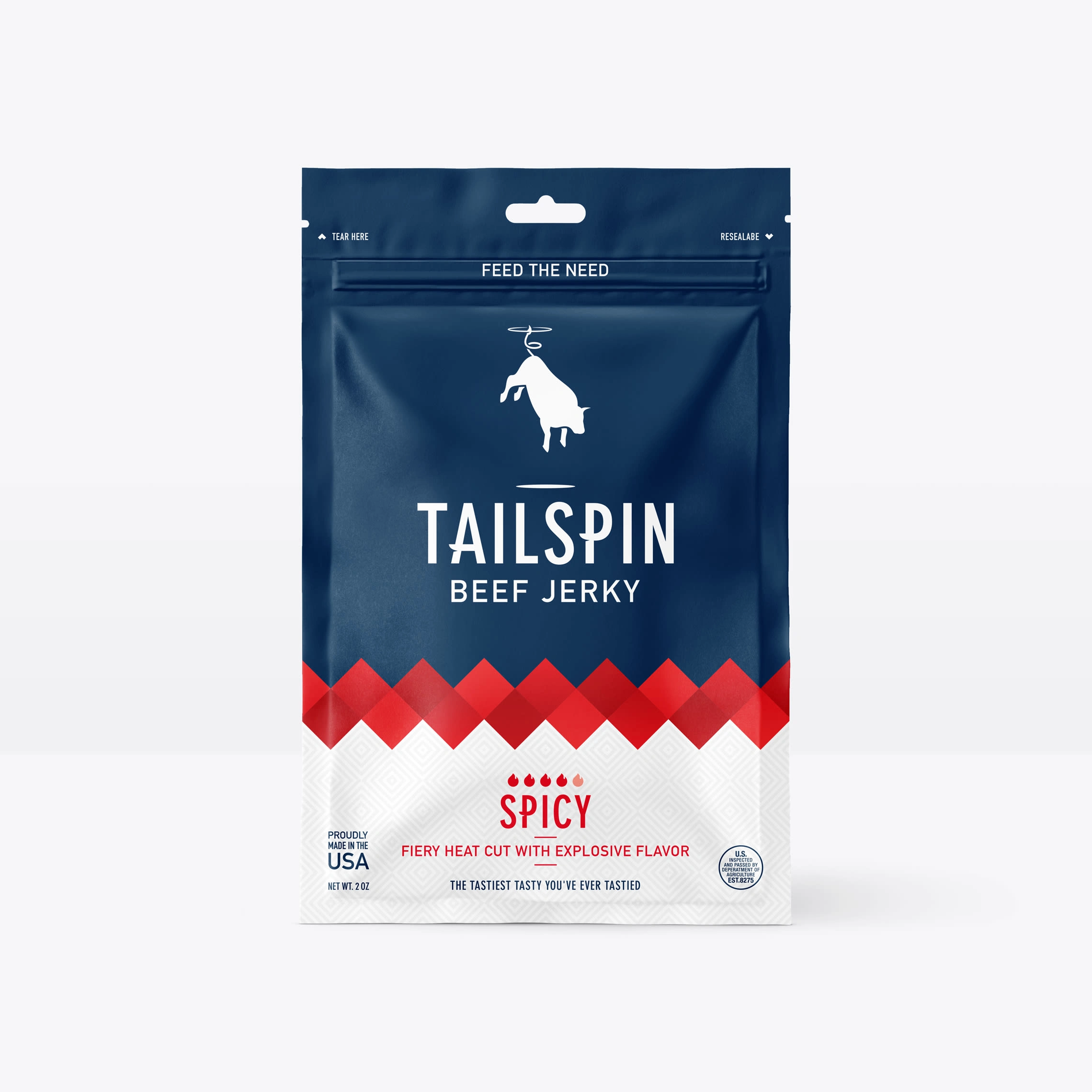
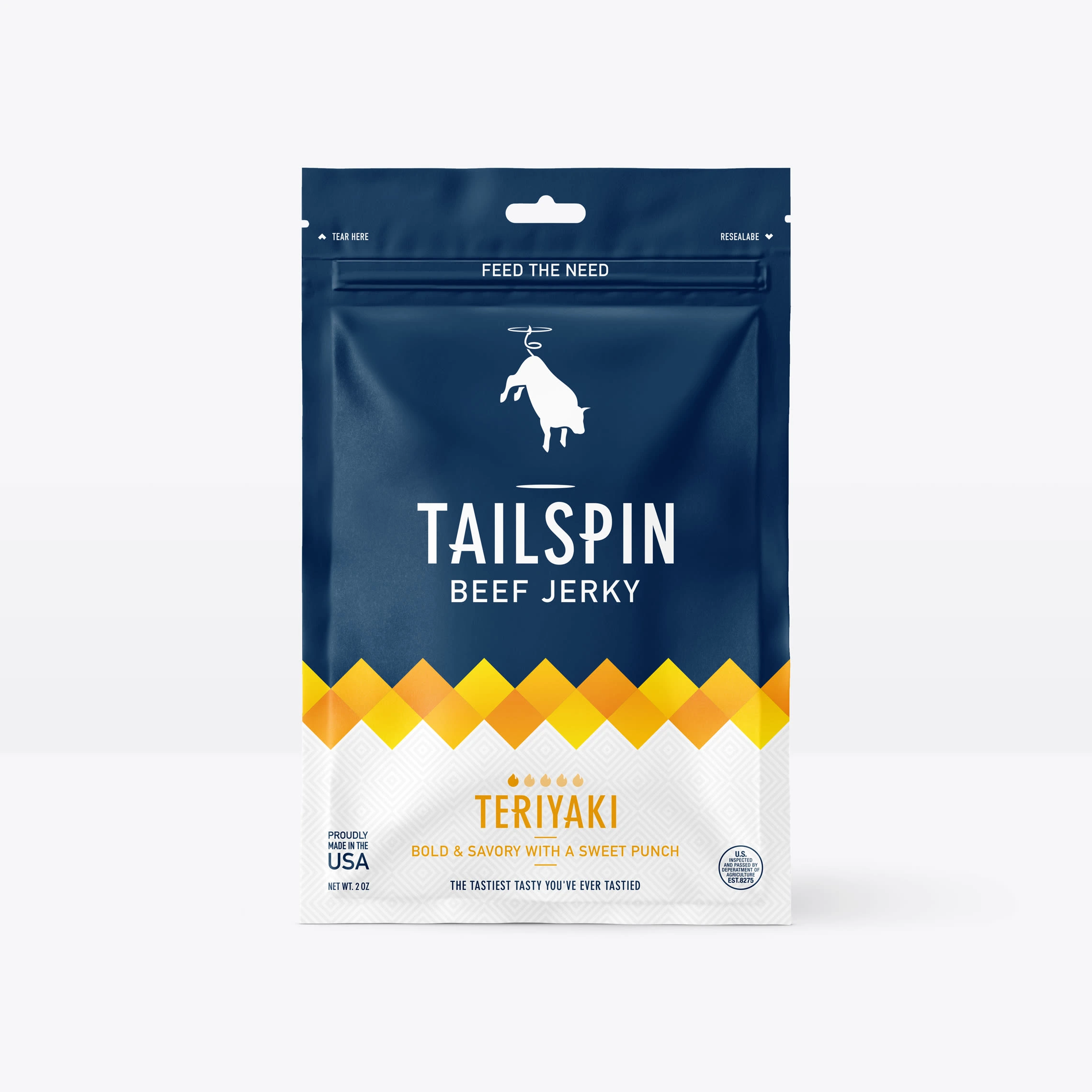
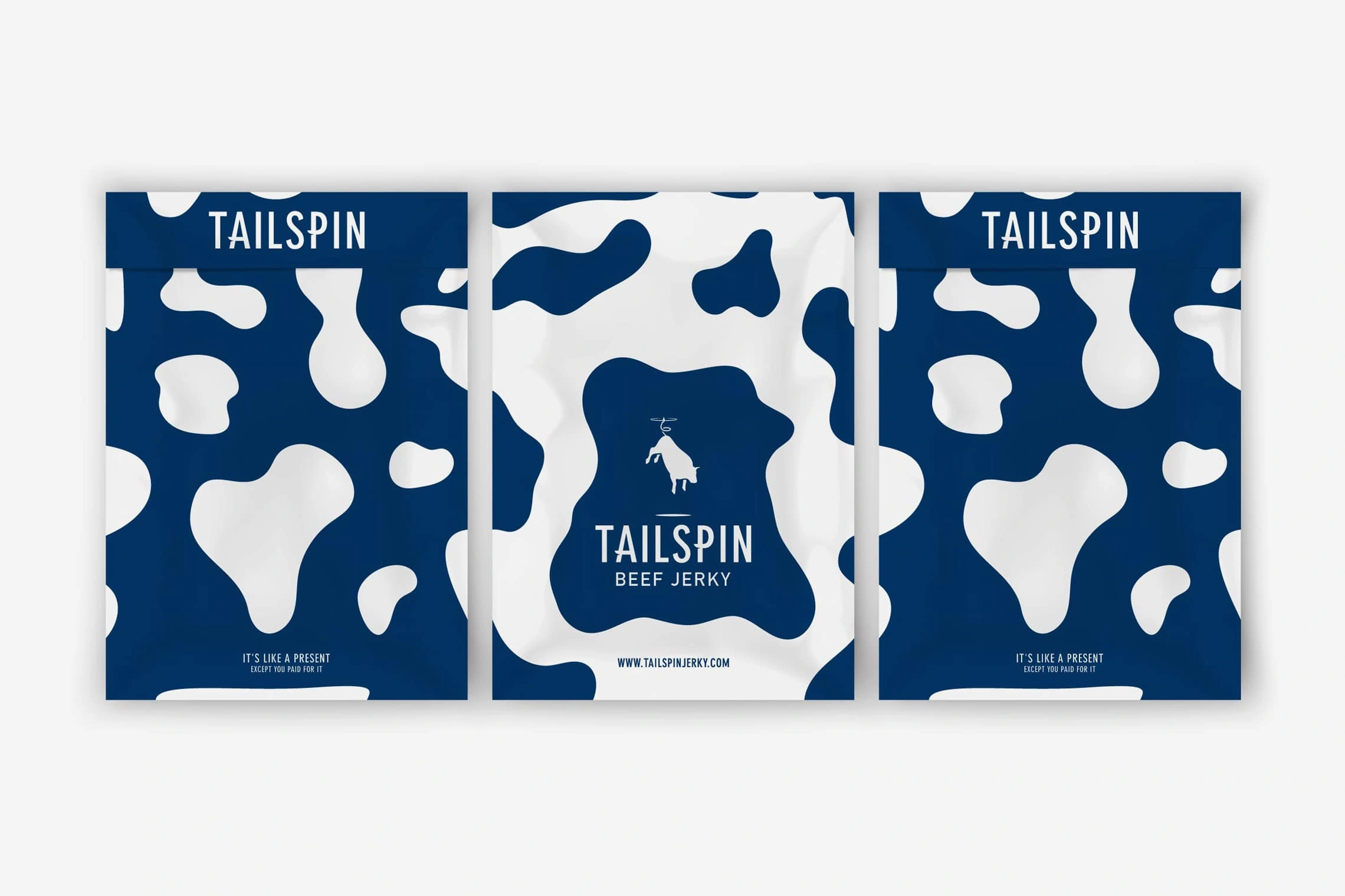
With the name chosen we moved onto identity design. After going back and forth on a variety of different design solutions, we ultimately found ourselves embracing the logo of a flying cow… being carried through the air by its spinning tail.
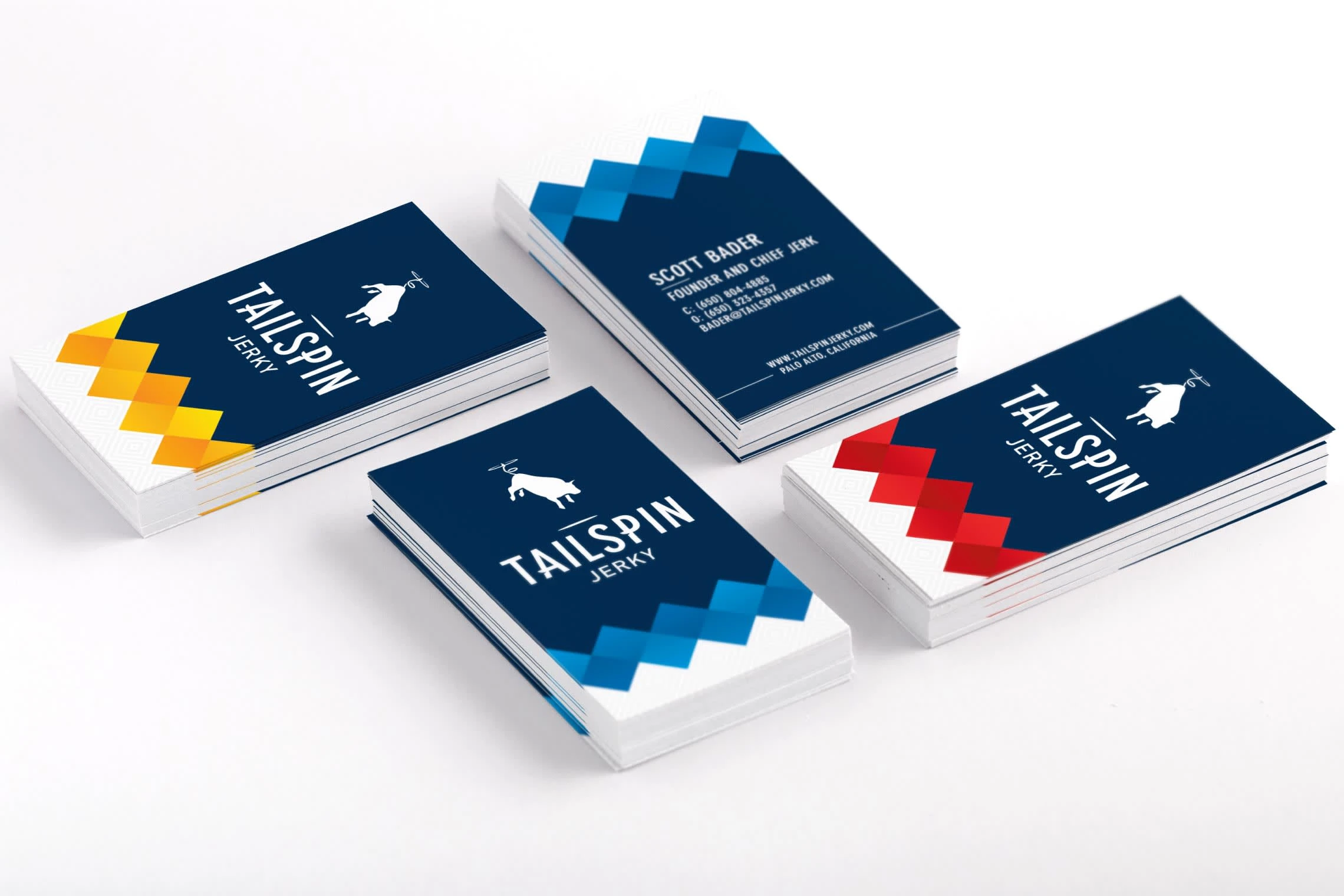
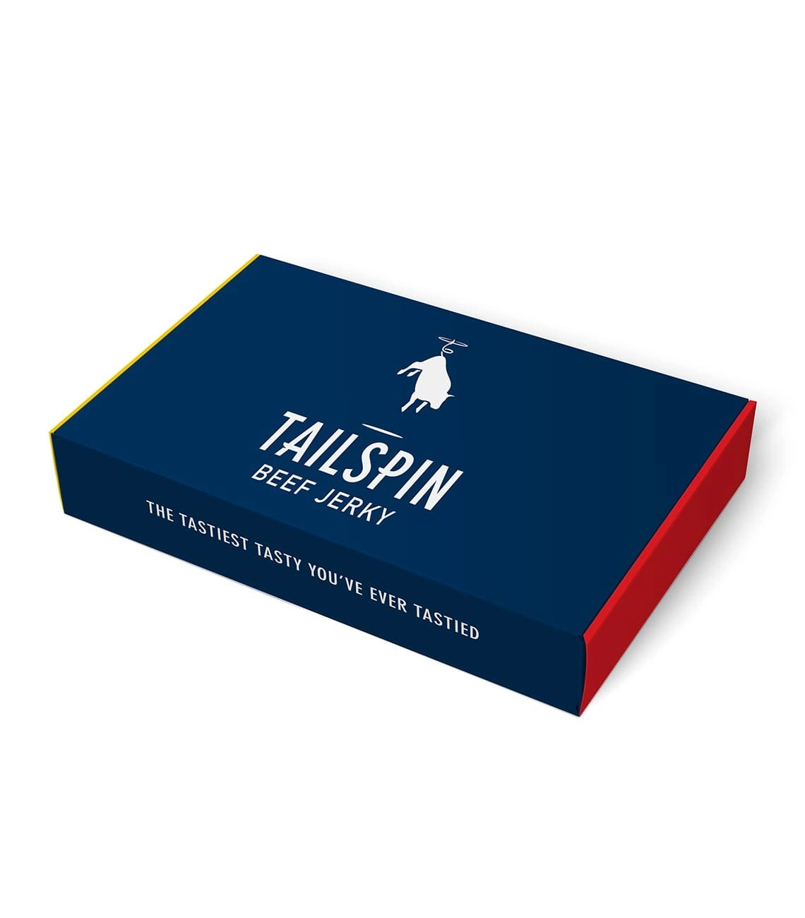
To bring the identity together, the logotype was customized with cuts to mimic the cow's tail. With the foresight to avoid black in the branding, we went with a dark blue that was bold and nontraditional.
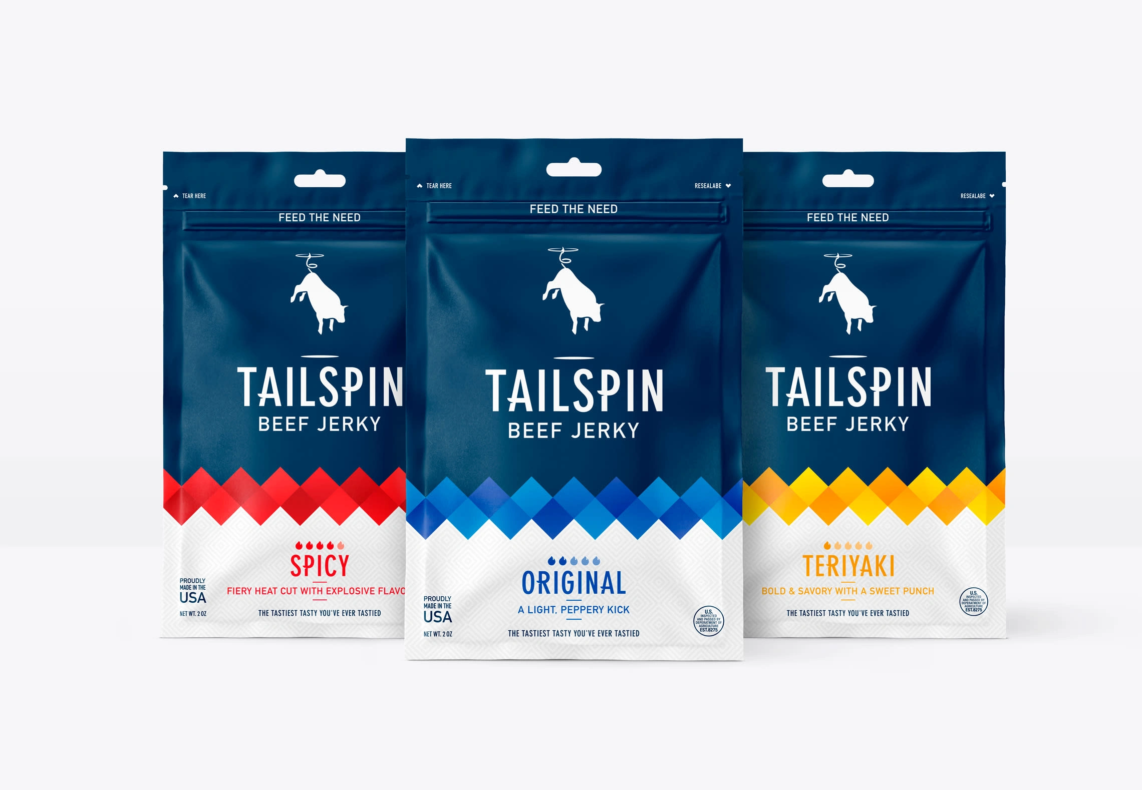
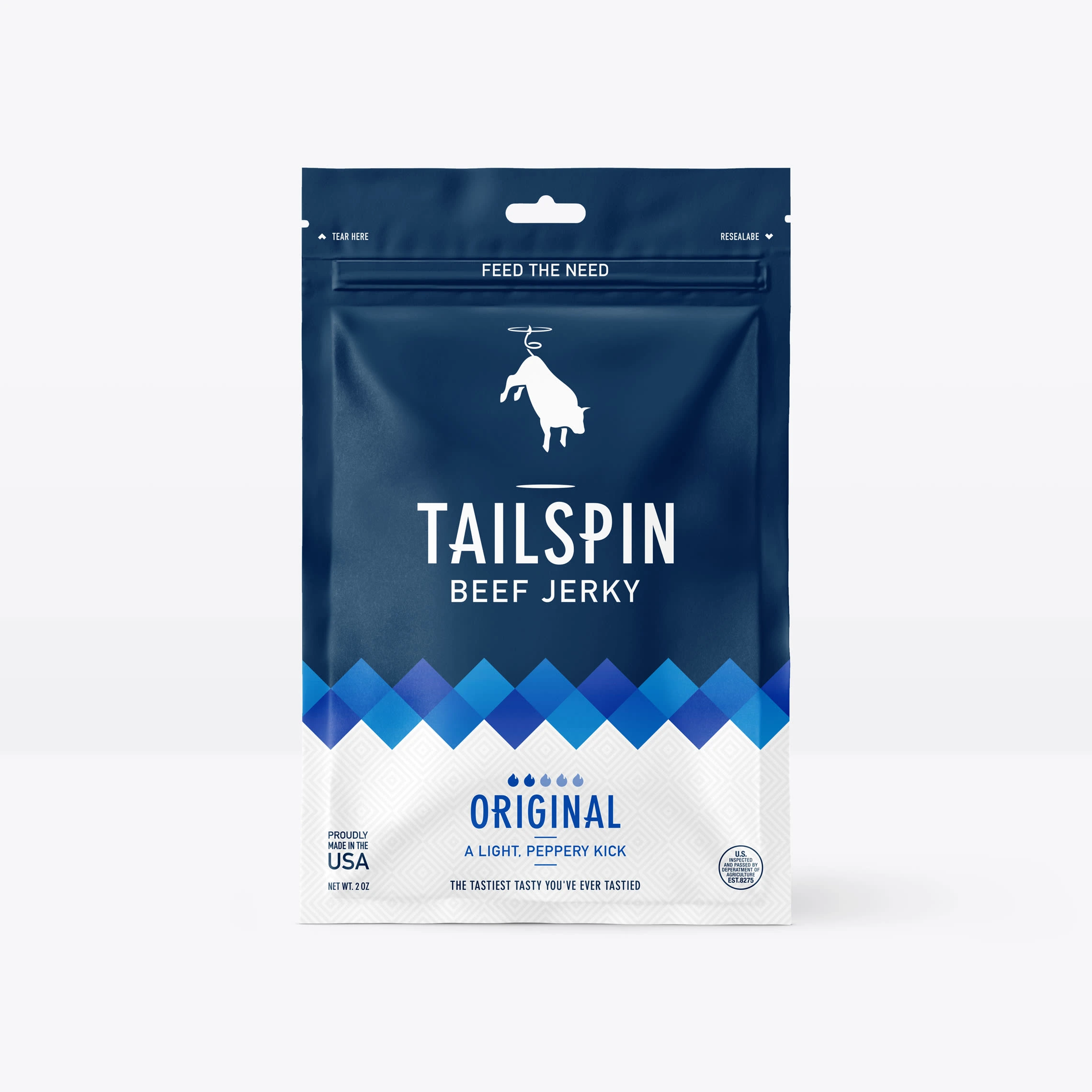
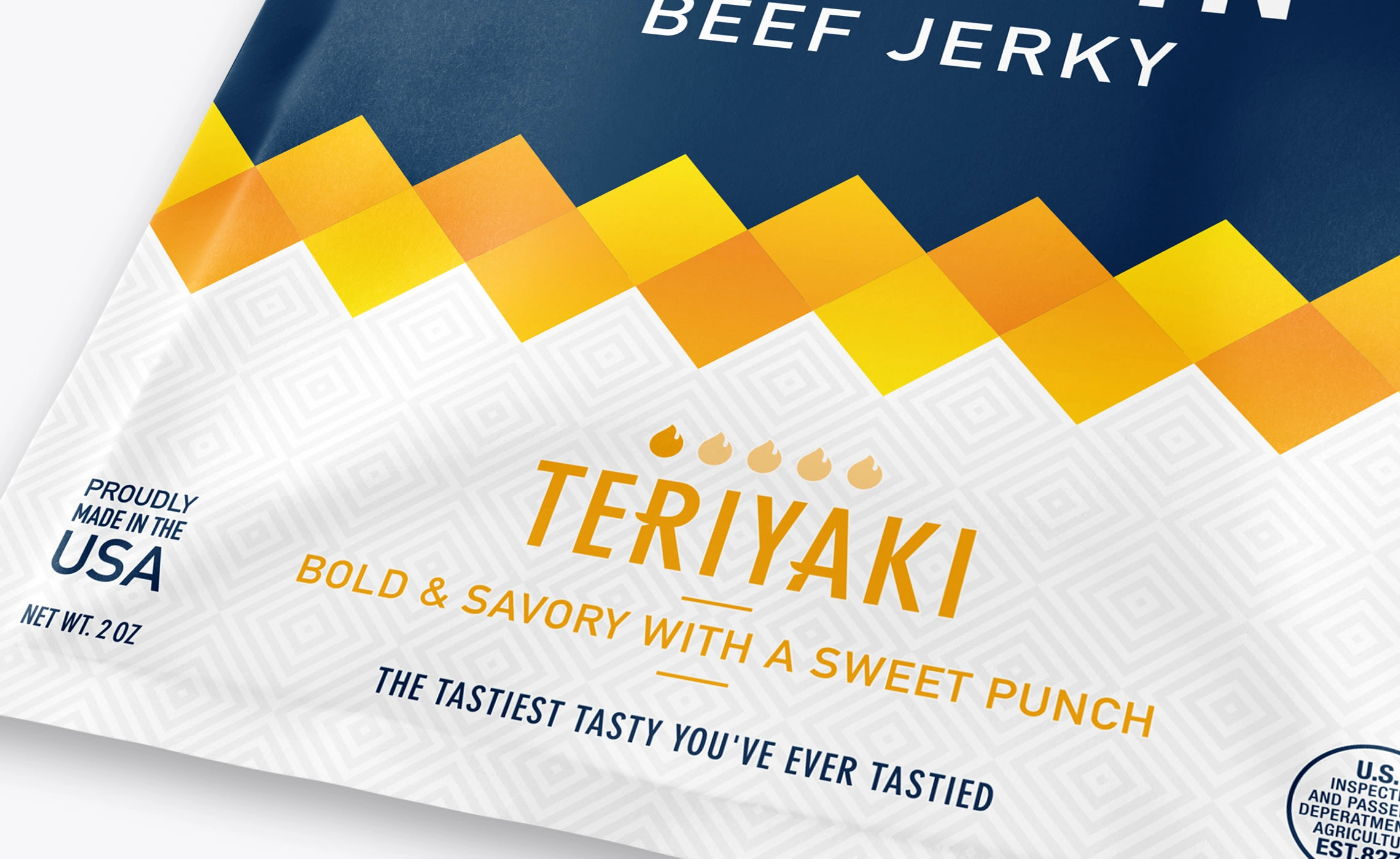
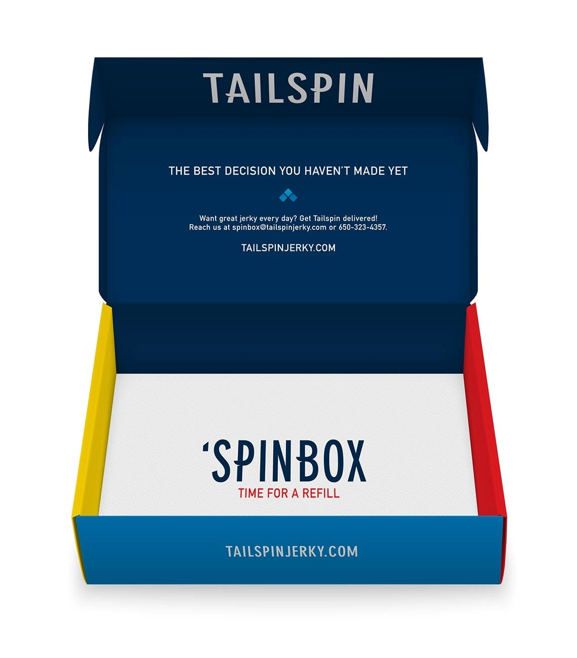
When it came to packaging, we knew that there were a few things dominating the jerky shelves—black and craft bags, overly macho themes, and loads of hand crafted, artisanal buzzwords. Straying from the status quo, we landed on a design system and visual language that's scaleable and much more approachable.
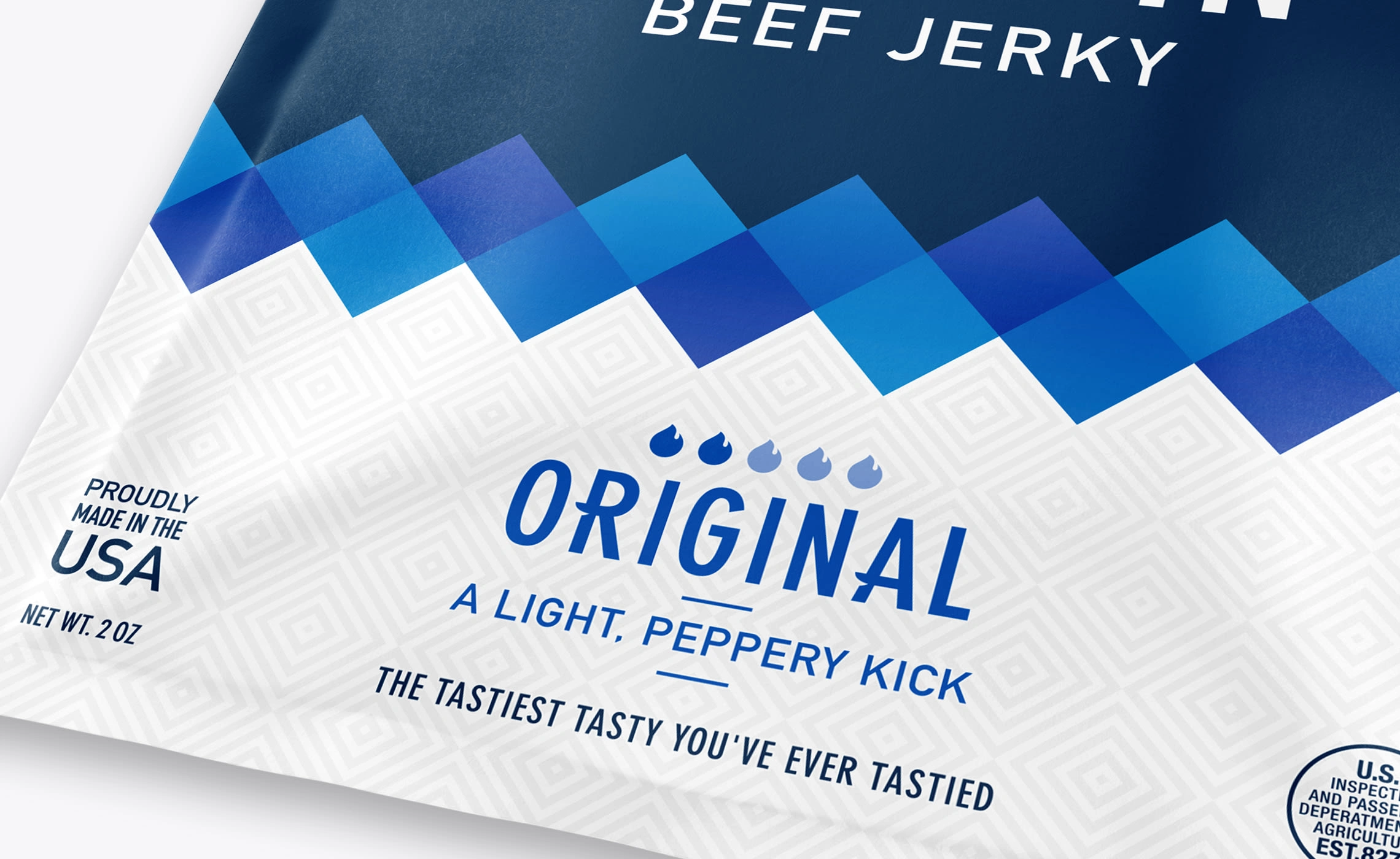
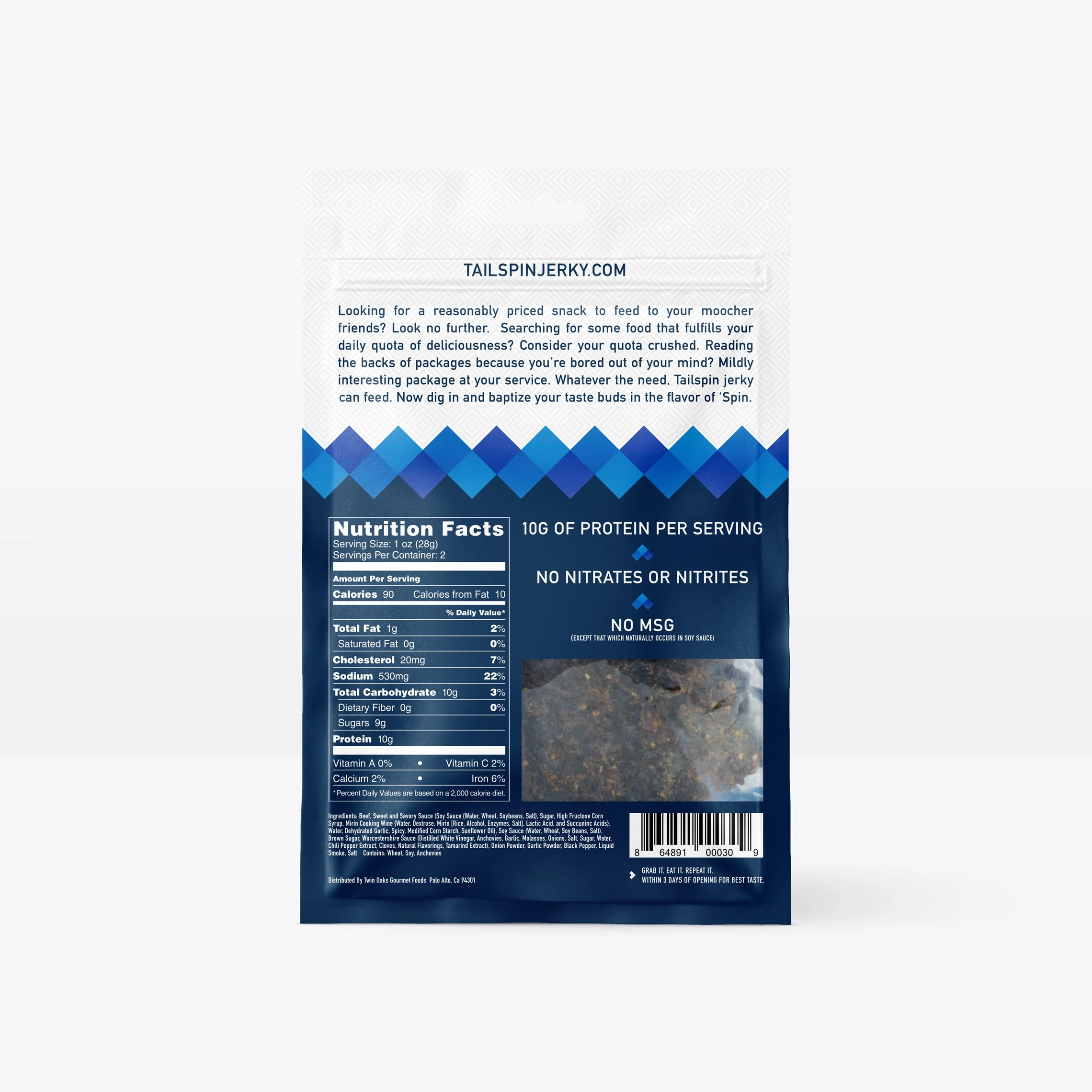
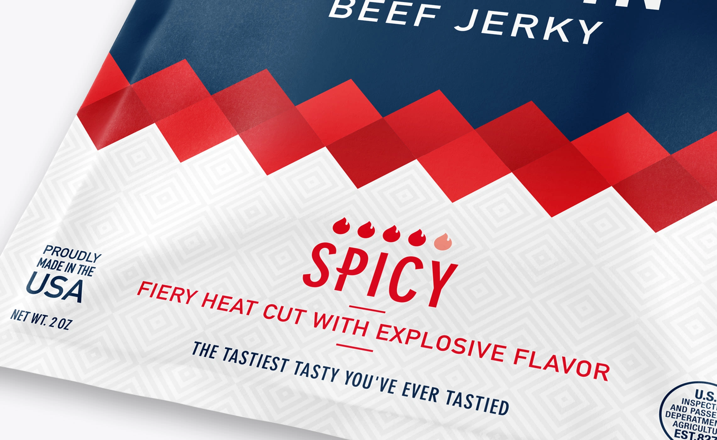
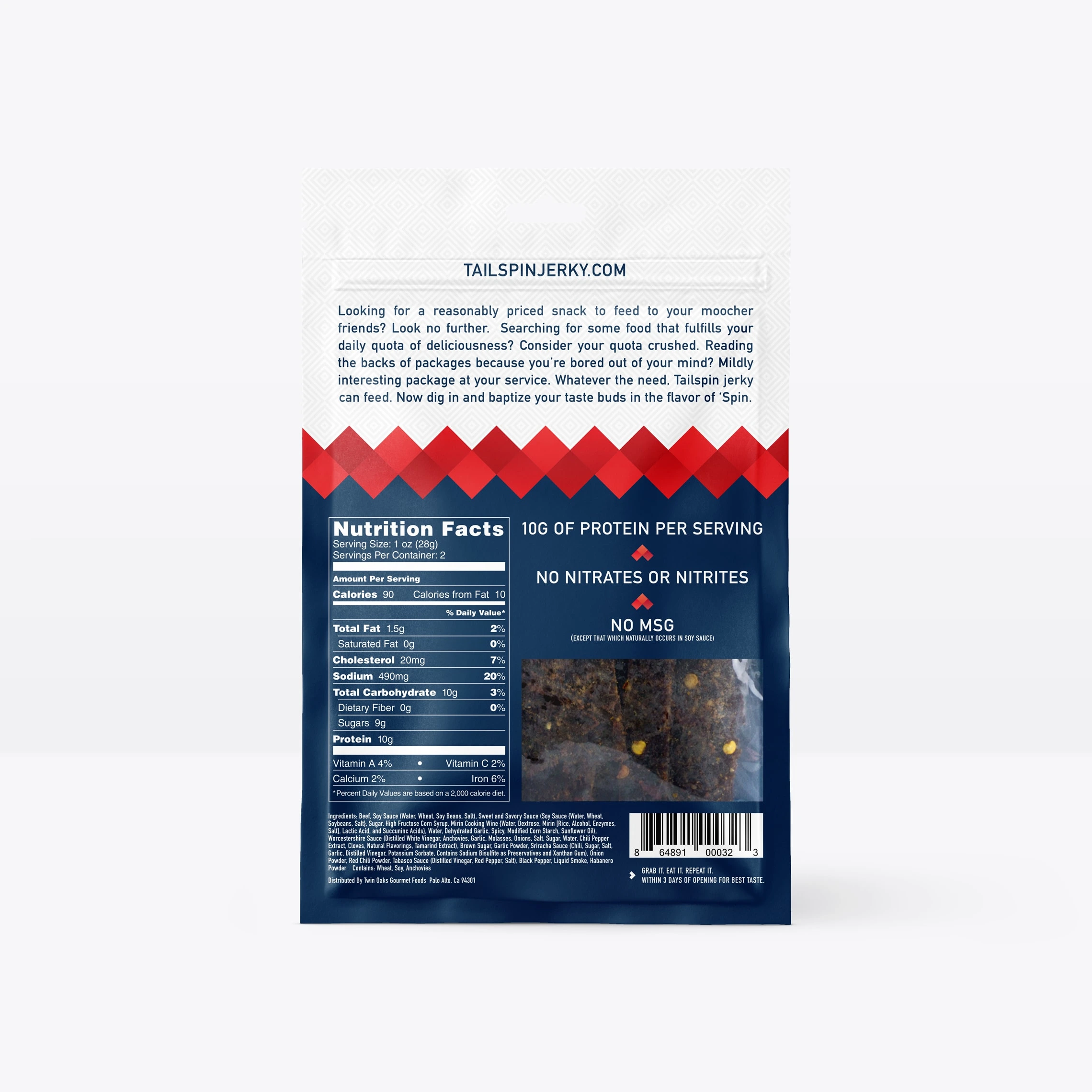
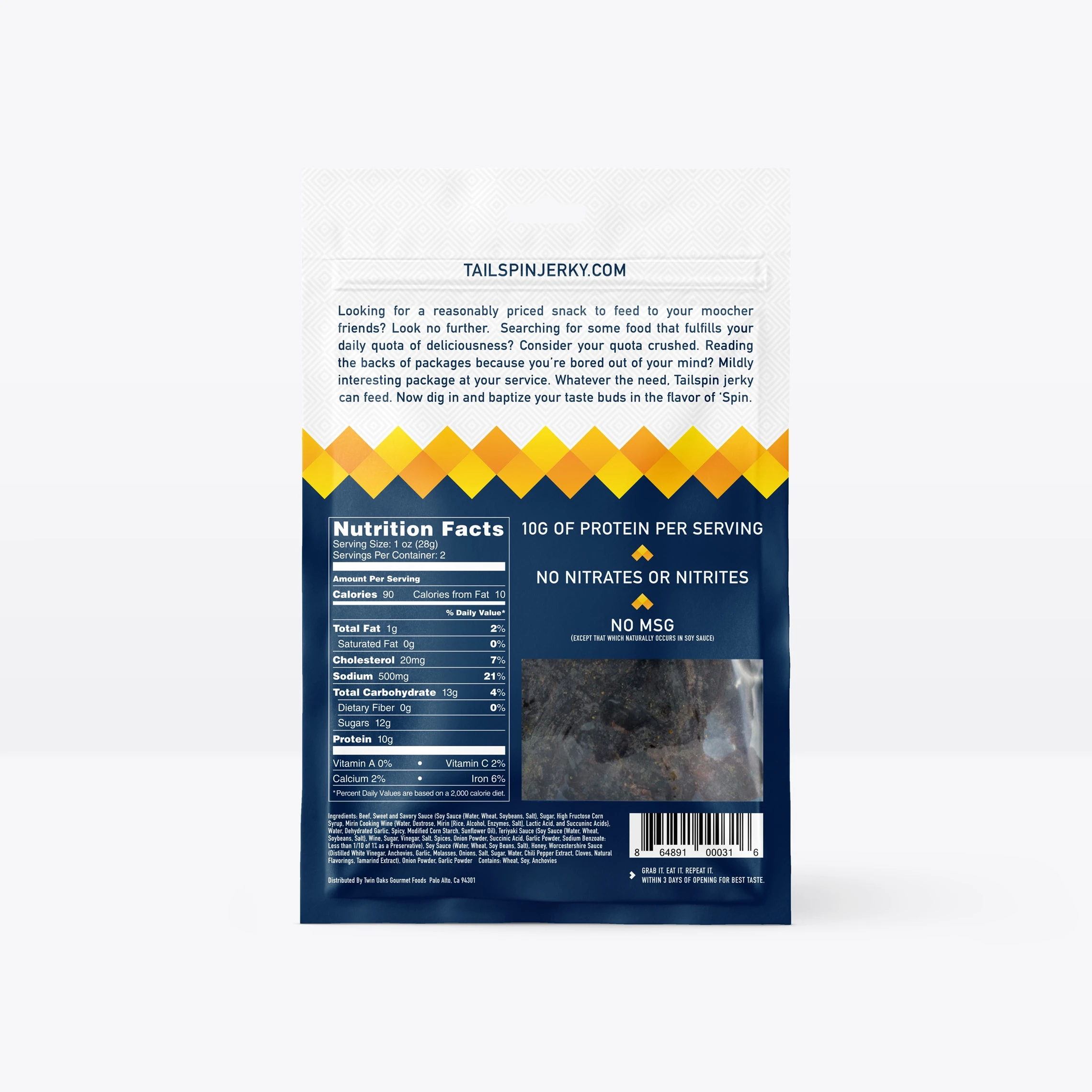
The bags feature a bold dividing line representing the waves of flavour you get with Tailspin Jerky. This element helps add distinction to each flavour, while simultaneously creating brand recognition in contrast to competing products. The heat indicator icons lead into the flavour and taste profile so within seconds you'll know which bag is perfect for you. On the back of the bag, the brand tone is reinforced through witty copy and a few nutritional stats that are featured above the window which shows off the thick cuts of delicious Tailspin Jerky contained inside.

Logos. Branding. Packaging.
www.brettlair.ca | hello@brettlair.ca
Like this project
Posted Jul 12, 2023
Branding and packaging for a US based beef jerky company that didn't want to be just another ‘cookie cutter’ jerky company.
Likes
0
Views
14
Clients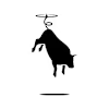
Tailspin

