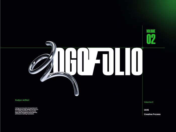
Brand Identity Design for ChemistryX
Rodjon Arifllari
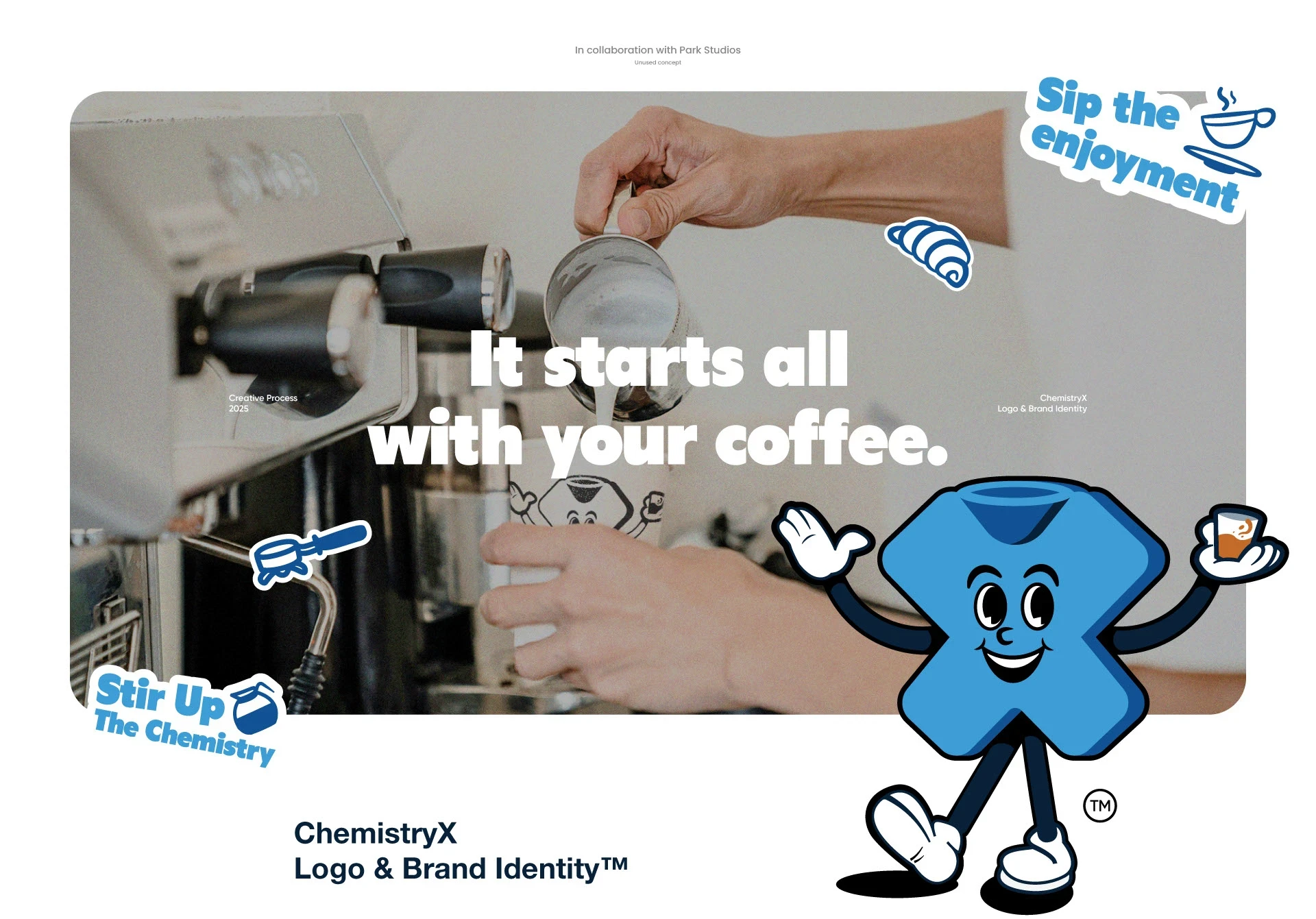
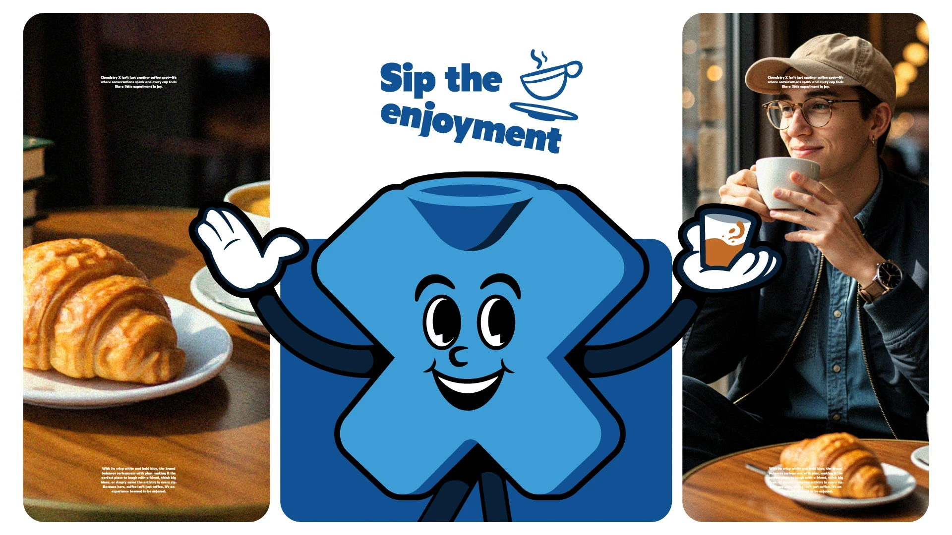
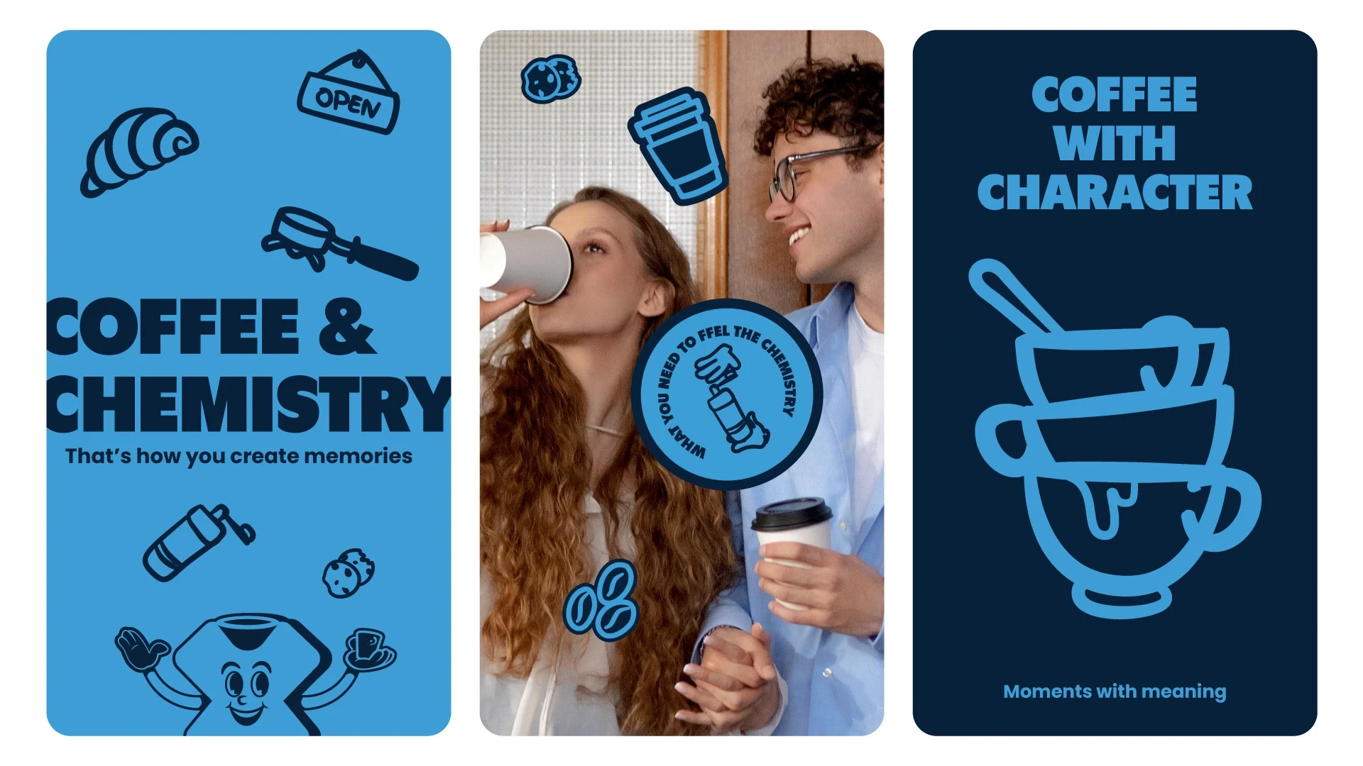
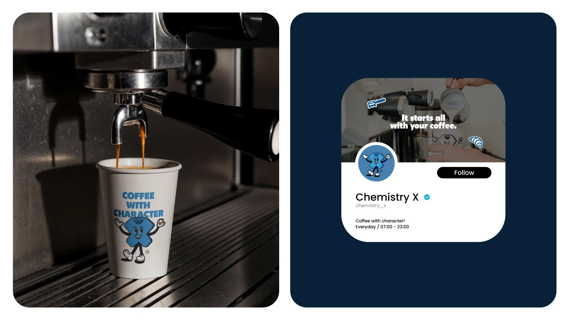
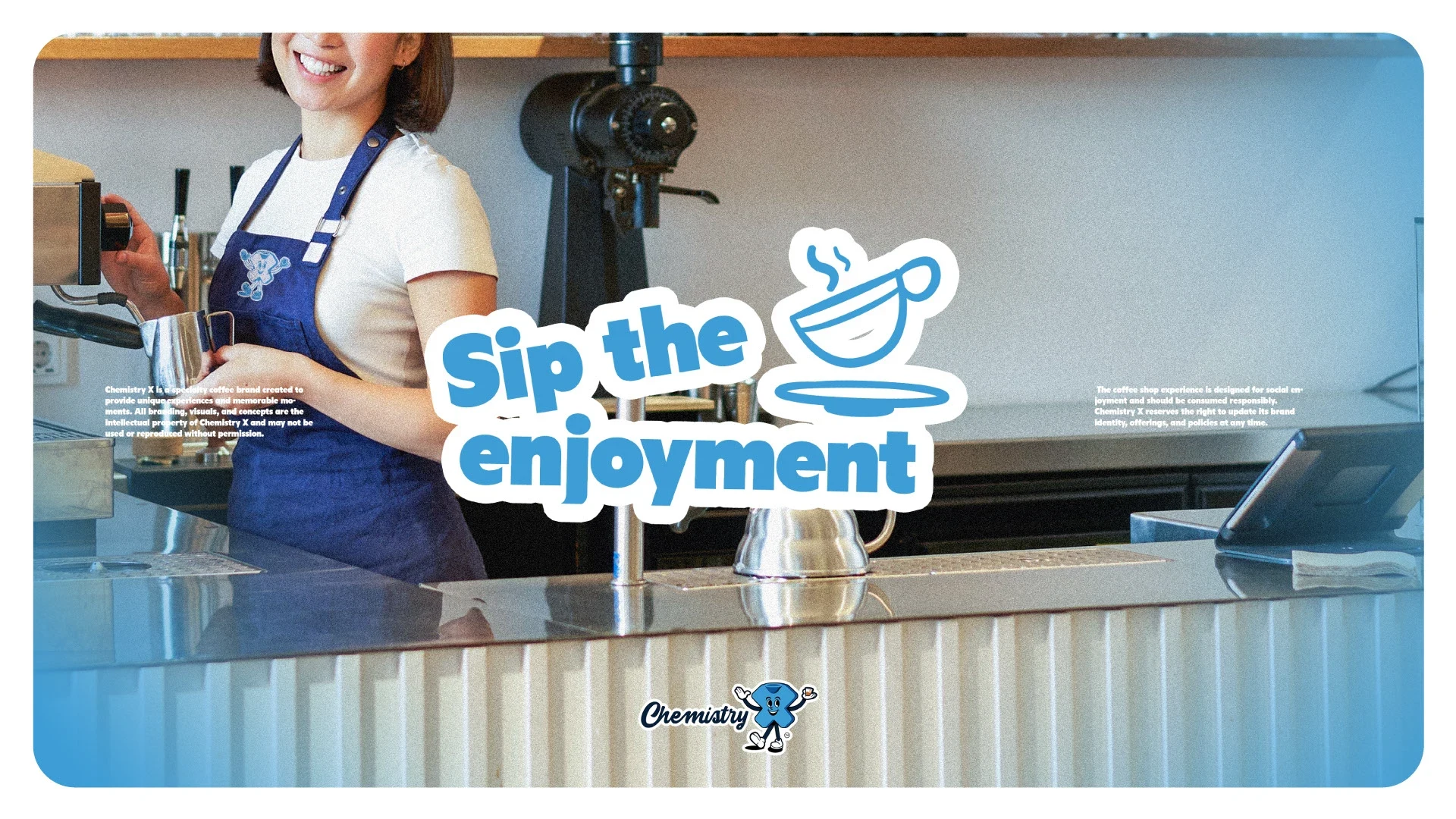
ChemistryX isn't just another coffee spot. It's where conversations spark and every cup feels like a little experiment in joy.
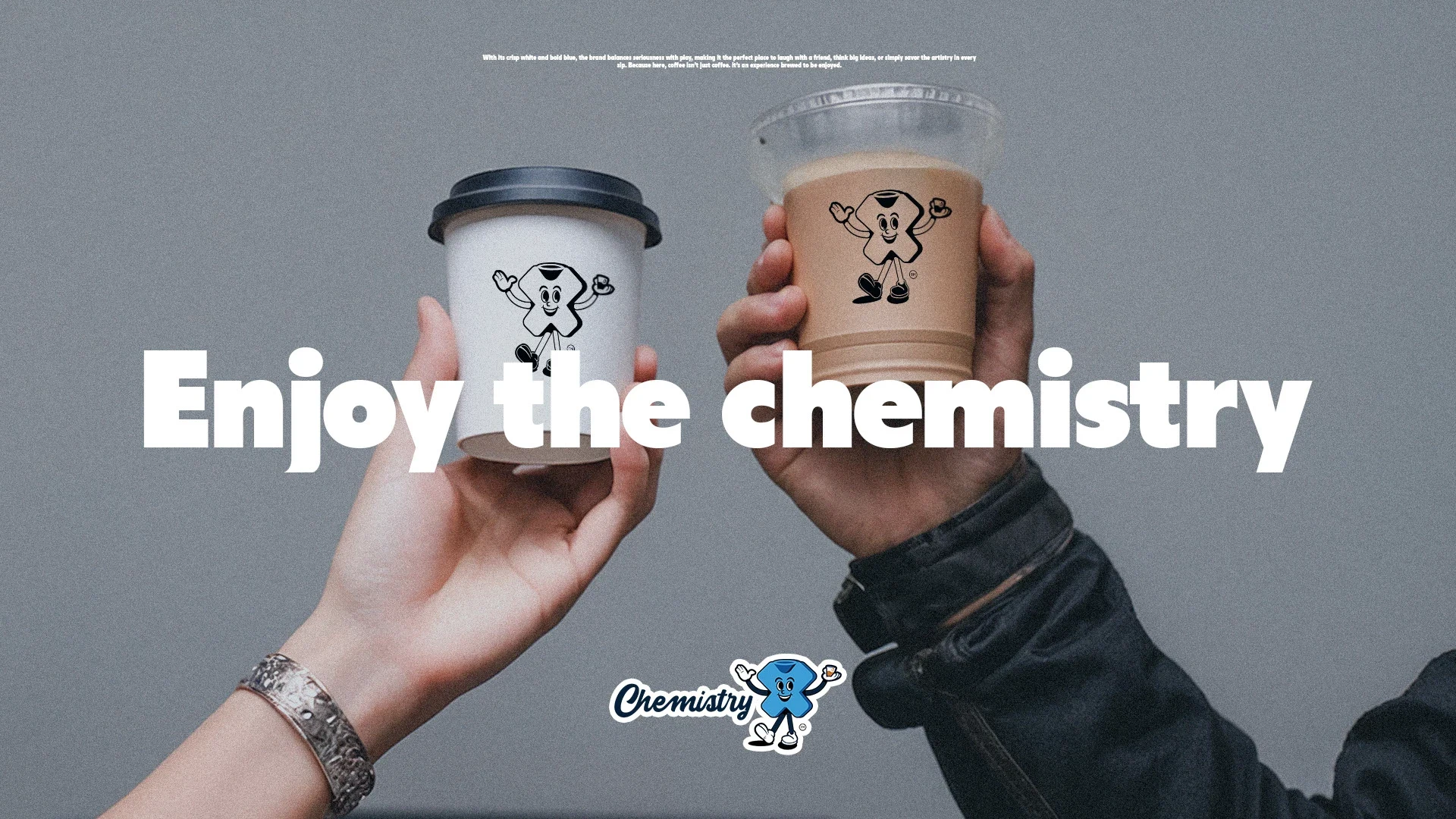
With its crisp white and bold blue, the brand balances seriousness with play. making it the perfect place to laugh with a friend, think big ideas, or simply savor the artistry in every sip.
Because here, coffee it's an experience brewed to be enjoyed.
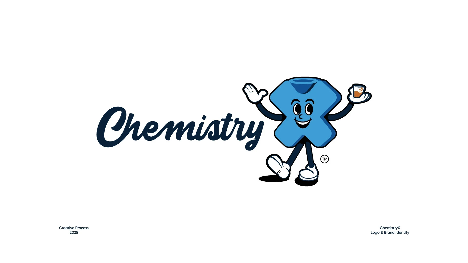
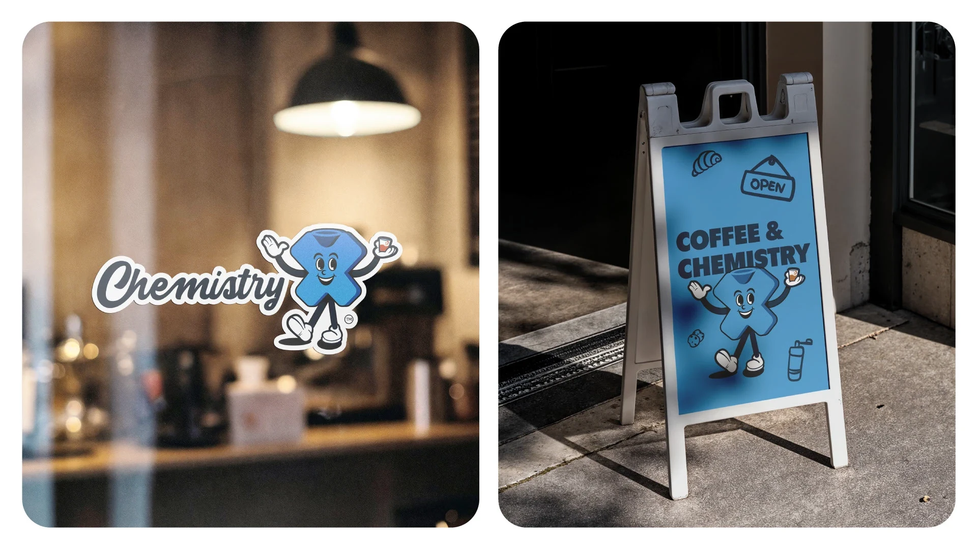
Icon Concept
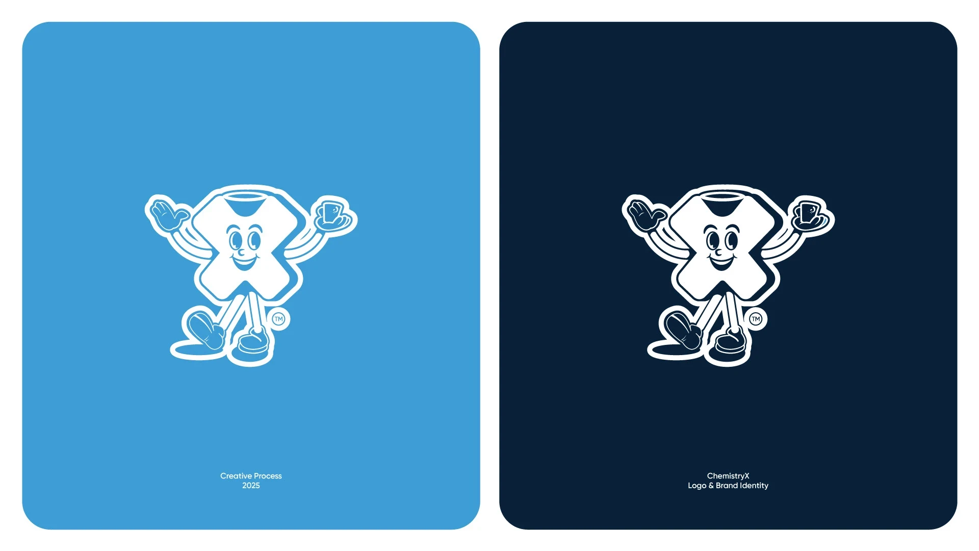
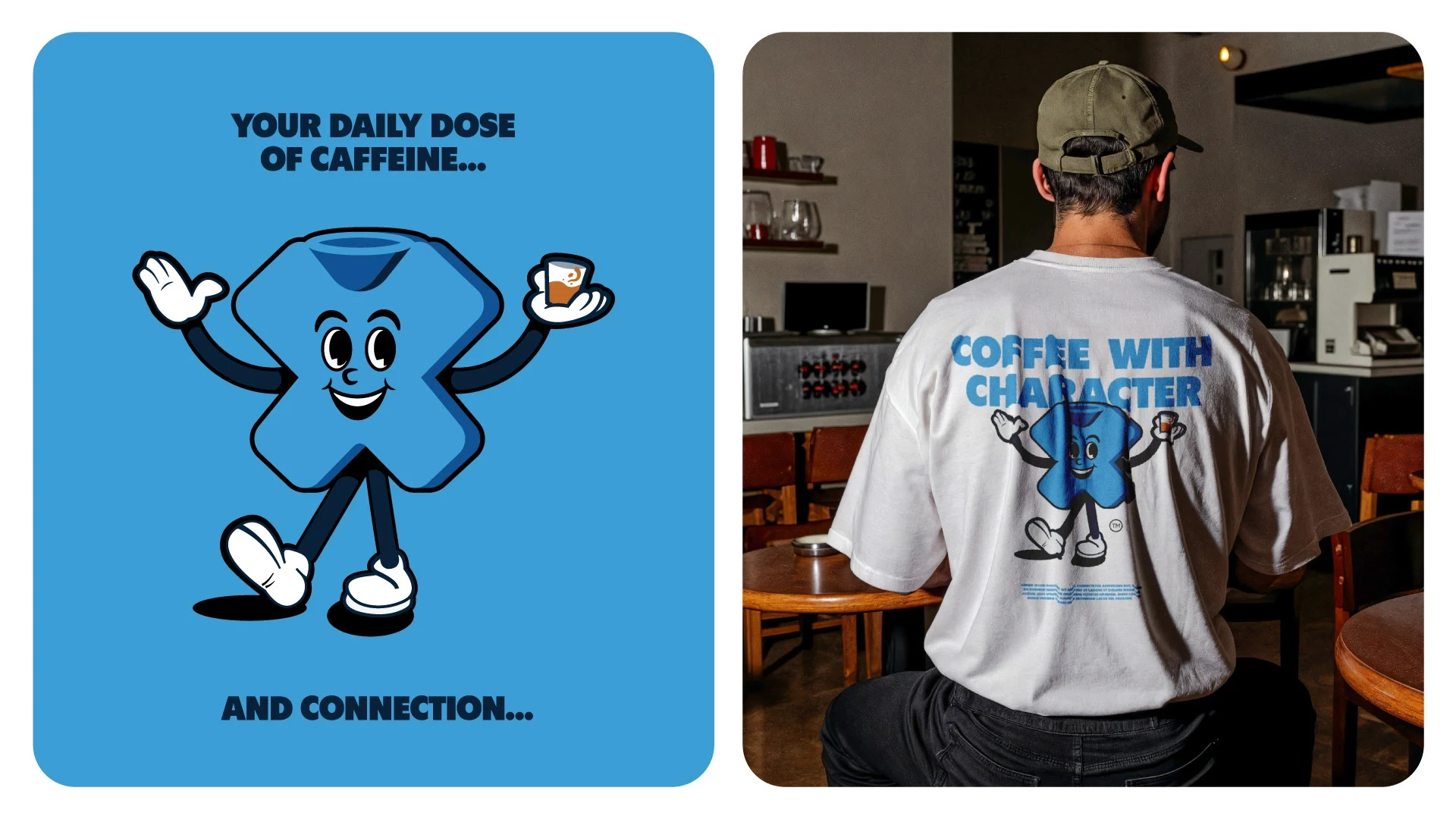
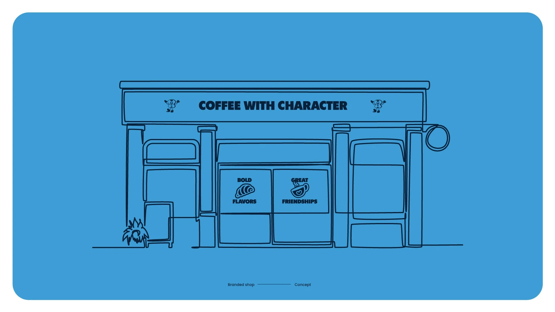
Since the brand begins with the word chemistry, I wanted to create a logo that feels both inviting and memorable. The icon is stylized in the shape of an ‘X,’ designed with a friendly character that instantly connects with people. The goal was to spark a warm, welcoming feeling—something so approachable that just by seeing the icon, you’re reminded of the comfort and pleasure of drinking coffee
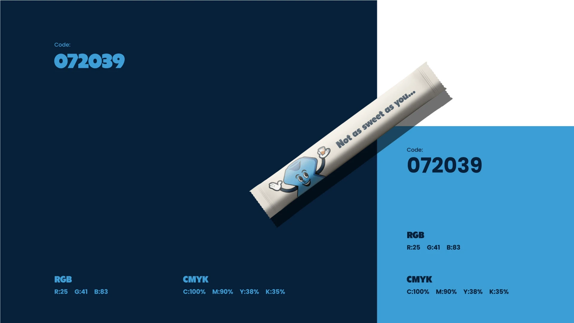
Color and Typography
The color palette of Chemistry X is built around two cool tones. At first glance, these are cold colors, but in the world of Chemistry X, they carry a deeper meaning.
Blue is often linked to trust, honesty, and calmness, which makes it the perfect backdrop for genuine conversations between friends. The lighter blue brings in a sense of playfulness and openness, while the deeper navy grounds the brand with seriousness and stability. Together, they create a balance that reflects the essence of Chemistry X: a place where coffee isn’t just about warmth in the cup, but about the warmth of connection that grows when friends share it.
Like this project
Posted Sep 22, 2025
Chemistry X blends playful energy and trusted calm, serving coffee as a shared experience of connection, warmth, and friendship.