
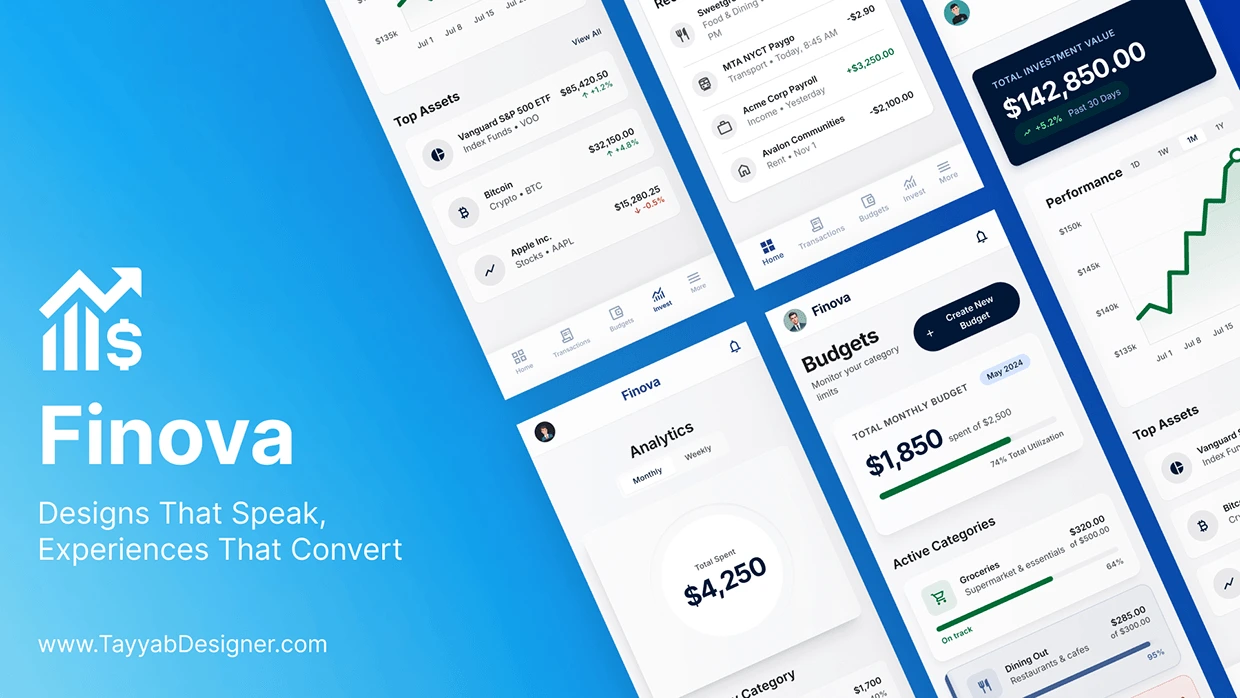
Finova is a modern personal finance mobile app designed to simplify how people track, manage, and understand their money. The goal was a clean, intuitive experience for anyone who finds traditional financial tools too complex.
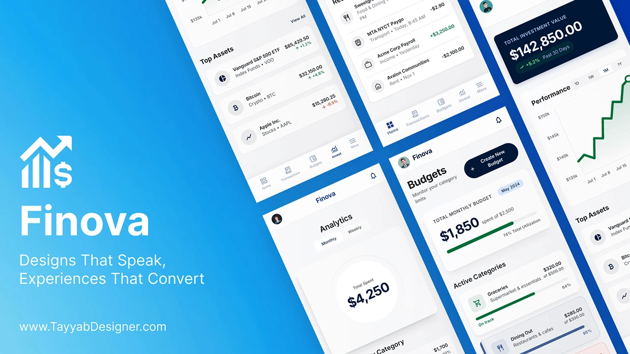
Finova personal finance app
01 — Project overview
Finova brings balances, spending, budgets and investments into one calm, readable dashboard — designed for people who find traditional banking and finance tools too complex.
02 — The problem
Most people's money lives in several places — a checking account, a second bank, a brokerage, maybe crypto — and no single tool gives them a clear picture of it.
Fragmented view: Balances, spending and investments sit in separate apps, so users never see their full position.
Data without meaning: Banking apps show long transaction lists but rarely answer the real question: where is my money going?
Intimidating interfaces: Investment and budgeting tools are dense with jargon, tiny charts and too many options.
Budgets that feel like punishment: Rigid setups are abandoned within weeks because progress is hard to read at a glance.
How might we give everyday users a single, calm place to see, understand and control their money — without needing financial expertise?
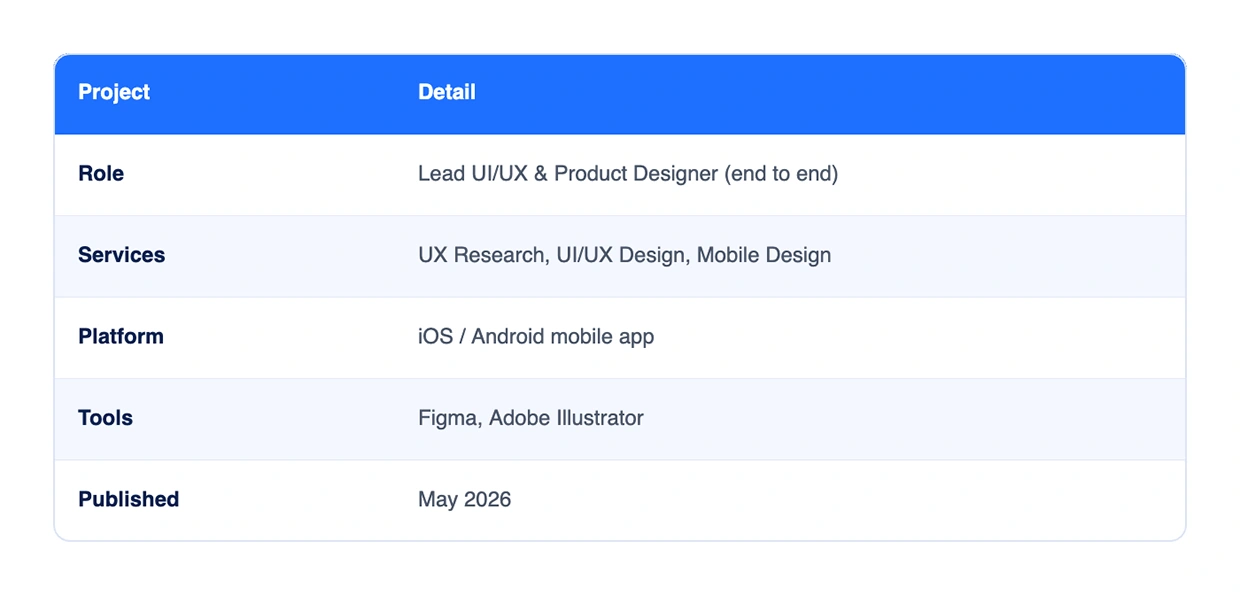
The problem
03 — Goals and success criteria
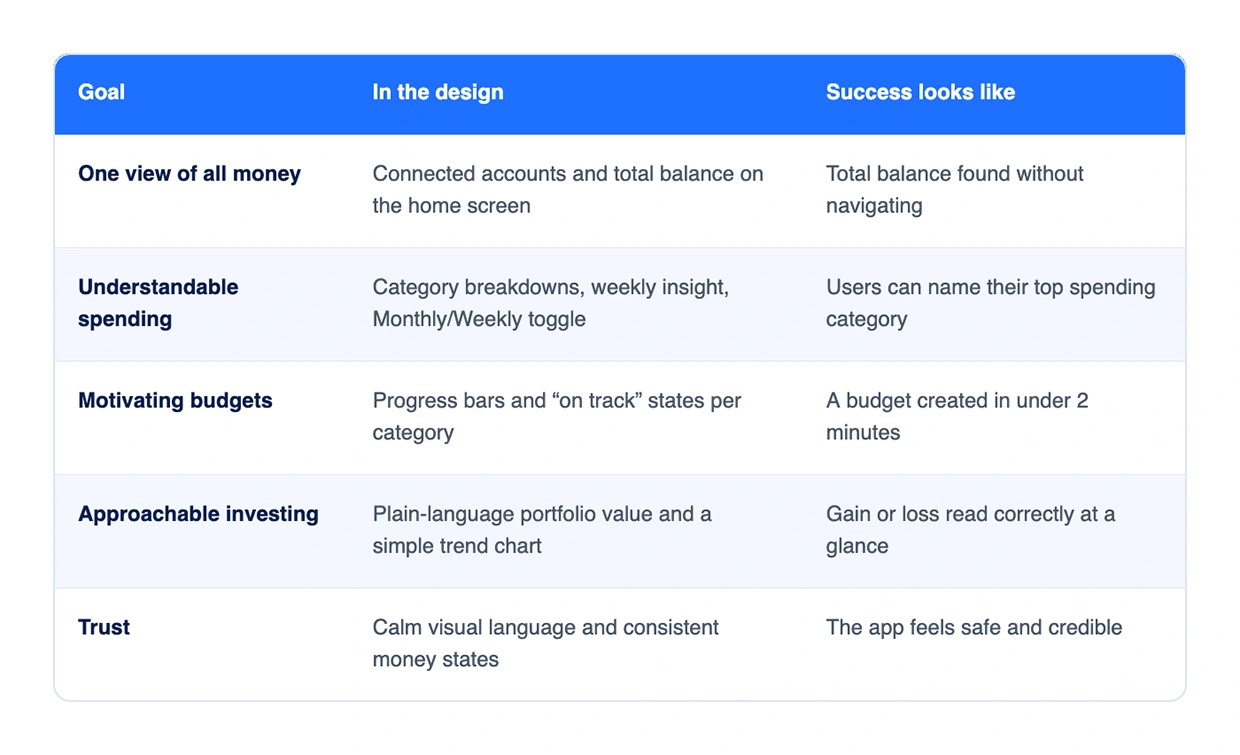
The goal was a finance app anyone can understand in five seconds: open it, know your balance, know where your money went, know if you're on track.
04 — Research
Research focused on why people avoid or abandon finance apps, and what a "clear" money picture means to non-experts.
Methods
User interviews: conversations with young professionals and freelancers about how they track money today.
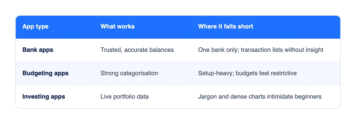
Competitor audit: banking, budgeting and investing apps reviewed for navigation, data density and tone.
Desk research: common pain points in personal finance tools and app-store reviews.
Research and competitor audit
Key insights
Users check their balance first and everything else second — the home screen must answer "how much do I have?" instantly.
People think in categories (food, housing, transport), not merchant names.
Progress feels better than limits: a filling bar motivates more than a red warning.
Investment data is welcome when it is one big number and one simple trend line.
Trust comes from calm visuals, consistent gain/loss colours and recognisable account logos.
05 — Who we designed for
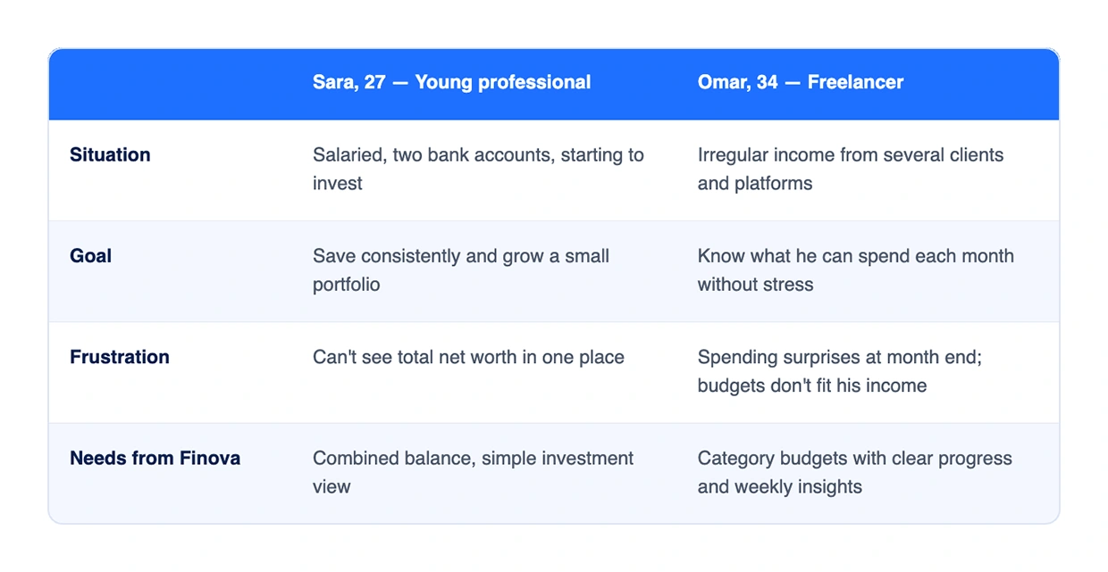
Personas are archetypes synthesised from the research themes above.
Personas
06 — Information architecture and flows
The app is organised around five bottom tabs, with Home as the hub that answers "how much do I have?" before anything else. Onboarding (Get Started) leads into the tab navigation:
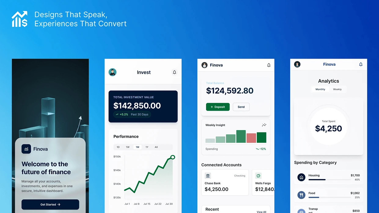
Home: total balance, Deposit / Send, weekly insight, bank accounts, recent activity
Transactions: all transactions, merchant + time, category tags, income in green
Budgets: monthly total, create budget, category bars, on-track status
Invest: portfolio value, trend chart, 1D to All ranges, top assets
More → Analytics: total spent, Monthly / Weekly, by category
Primary user flows
Check my money: Open app → Home → total balance and weekly insight → tap an account for detail.
Understand spending: Home → Analytics → switch Monthly/Weekly → open a category.
Set a budget: Budgets → Create New Budget → pick category and limit → track the progress bar.
Review investments: Invest → portfolio value → change time range → open a top asset.
Information architecture and flows
07 — Wireframes and iteration
Low-fidelity wireframes in Figma tested layout and hierarchy before any colour was applied.
Home: early versions led with a transaction list; iteration moved the total balance and quick actions (Deposit, Send) to the top, with the weekly insight chart directly below.
Analytics: a single donut showing total spent replaced several small charts, with a Monthly/Weekly toggle and a ranked category list underneath.
Budgets: cards evolved from plain numbers to progress bars with "spent of total" and a percentage, so status reads without maths.
Invest: portfolio value became one dark hero card, followed by a single performance line with 1D / 1W / 1M / 1Y / All ranges.
Wireframes
08 — Visual design and design system
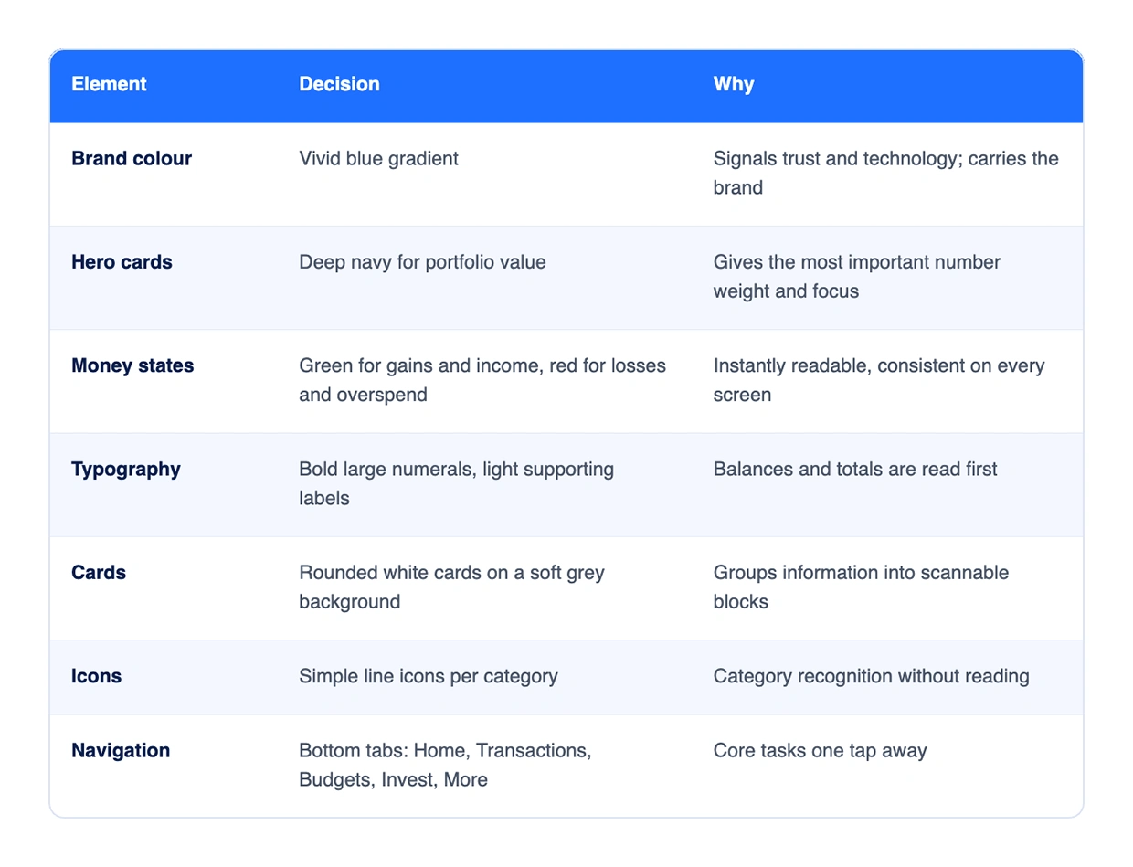
The visual language aims for calm confidence: generous white space, one strong blue brand colour and clear signals for money moving in and out.
Balance cards, category rows with progress bars, chart cards, segmented toggles and account tiles were built as reusable Figma components, so every screen shares the same spacing, type scale and colour tokens.
Design system
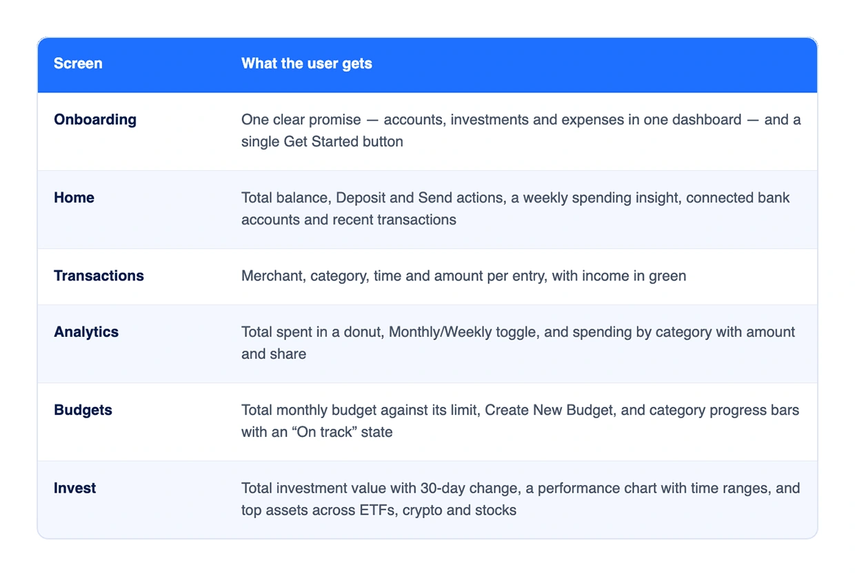
09 — Key screens and features
Key screens
10 — Validation and refinements
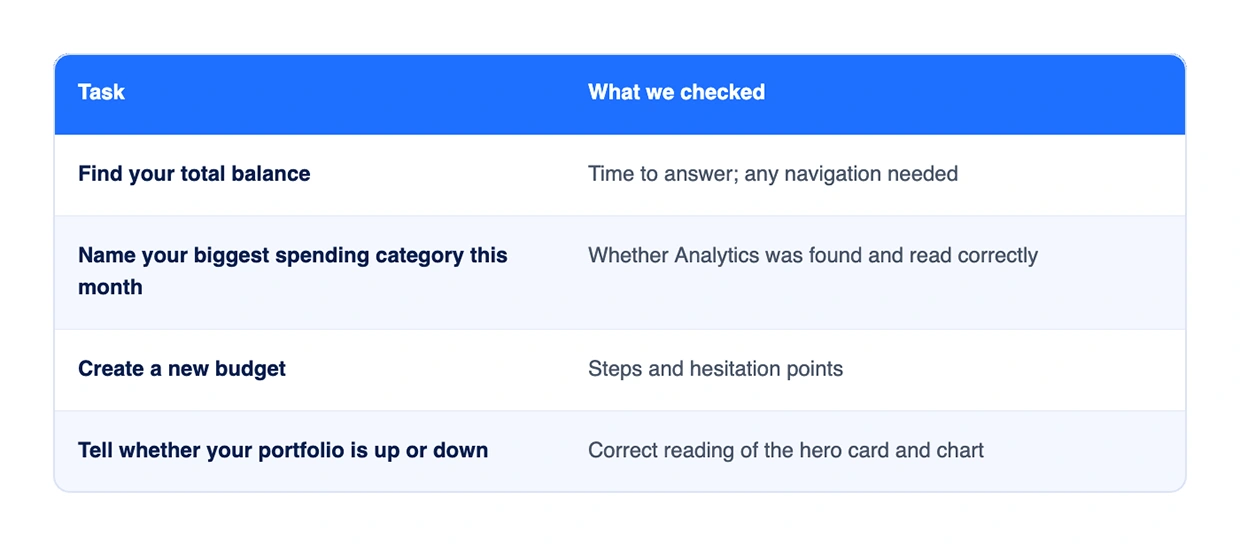
The clickable Figma prototype was built around four core tasks, each tied to a goal above, and the design was checked against them before visual polish.
Refinements made
Made the Monthly/Weekly toggle more visible.
Added percentage labels beside category progress bars so status doesn't rely on colour alone.
Kept the gain/loss figure next to the portfolio value instead of only on the chart.
Validation
11 — Outcomes and learnings
Finova delivers a complete, consistent mobile finance experience: six core screens, a reusable component system, and a visual language that makes money states readable at a glance.
Learnings
In finance, hierarchy is trust: the one number a user came for must be the largest thing on screen.
Colour must carry meaning consistently — green and red are never decorative.
Progress framing makes budgeting feel like a goal, not a restriction.
Next steps
Savings goals with milestones
Smart alerts for unusual spending and upcoming bills
Dark mode
Accessibility audit — contrast, dynamic type, screen readers
Developer handoff and design-token documentation
Thanks for watching! Have a project in mind? Let's talk.
Book a free 30-min call: calendly.com/teyyabhanif/30min
Connect on LinkedIn: linkedin.com/in/tayyabdesigner
0 likes · 0 views · Nov 19, 2026
A personal finance mobile app that brings balances, spending, budgets and investments into one calm, readable dashboard for people who find finance tools too complex.


