Built with Framer
Landing Page Design for a Sustainable Brand – Trendsphere.
Raymond A.
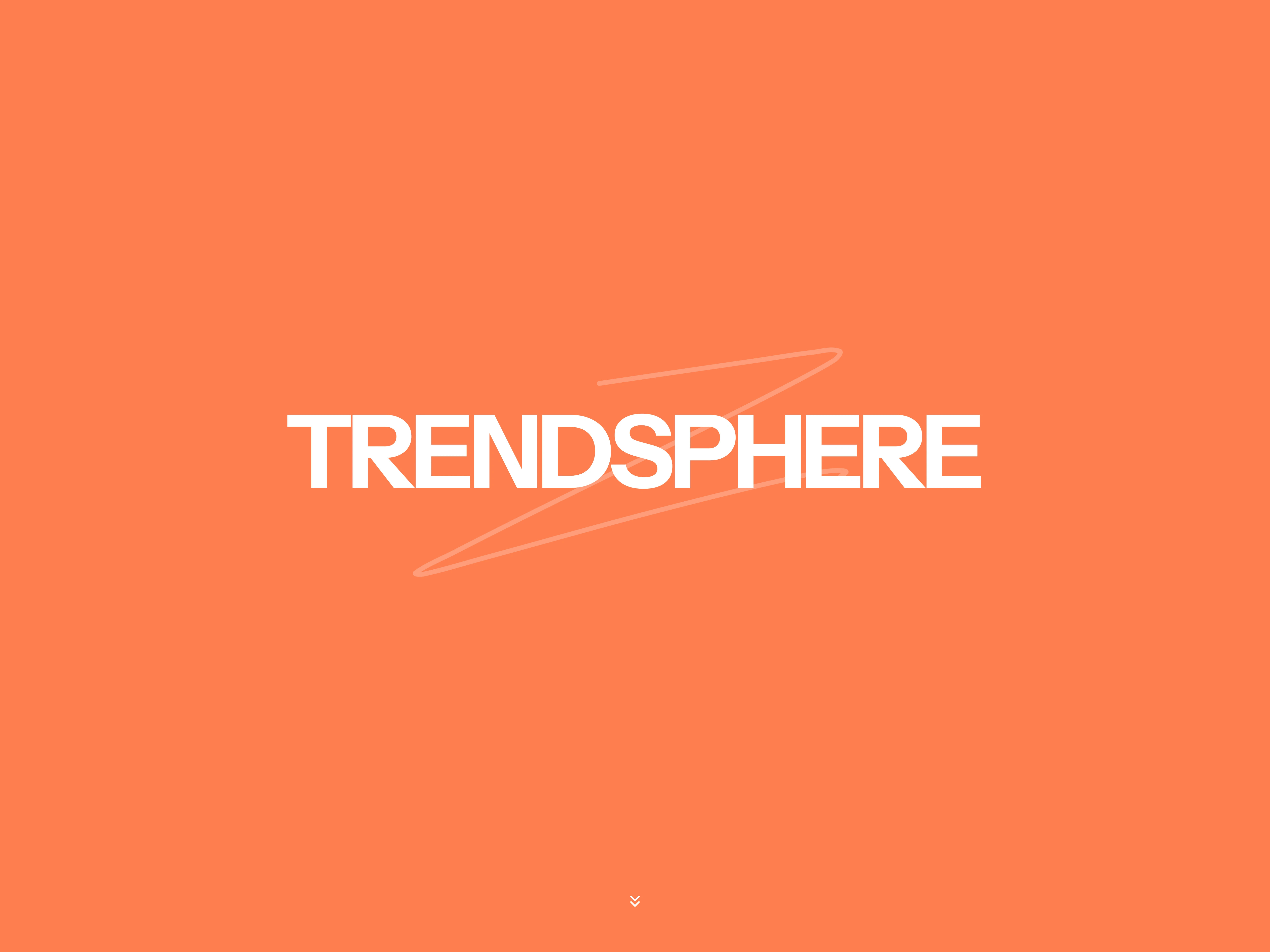
Landing Page Design for a Bold fashion brand - Trendsphere
Project Overview
Trendsphere is a modern fashion brand focused on redefining style through sustainable, ethically produced clothing. They needed a bold and compelling landing page that would tell their story, showcase curated collections, and convert visitors into customers, all while standing out in a sea of neutral-toned, minimalist fashion brands.
My Role
I led the complete design of the landing page experience. This included creating the visual direction, structuring the layout for flow and clarity, and crafting a user experience that merged story with shopability.
From concept to final UI, my focus was to design something that didn’t just look good, but aligned deeply with Trendsphere’s mission.
Hero screen ui
Goals & Challenges
The main goal was to build trust and excitement around a new brand while driving product discovery.
One of the early challenges was making the brand stand out with a bold look while maintaining visuals without compromising on clarity. Many sustainable brands lean toward soft, neutral palettes, but we wanted something louder and more memorable.
I chose a bold orange background that immediately grabs attention and created a modular layout that breaks the scroll into digestible, purpose-driven sections. We also needed to communicate the brand’s mission clearly and early.
To do this, I structured the page with a strong opening tagline, followed by a shop section, featured collections, and a human-centered About section that explains their values.
Shop section
The visual language reflects a mix of streetwear boldness and editorial sophistication.
Section headers use code-inspired double slashes (e.g., //DISCOVER, //SHOP) to add modernity and structure. And the CTA buttons remain consistent in shape and placement, keeping the user journey smooth and predictable.
Using large immersive visuals to do the storytelling was also another challenge— From curated fashion drops to close-ups of clothing on hangers.
Every image was chosen to feel raw yet elevated, matching the vibe of real-world style with a clean digital aesthetic.
Other Landing Page Sections
Tools Used
I used Figma for layout, UI, and the design structure. Notion was my base for organizing brand tone, content structure, and collaboration notes. The final layout is designed to be development-ready and easily expandable for future product drops or marketing campaigns.
Outcome
The final landing page gave Trendsphere a bold, memorable digital identity rooted in purpose. The design blends emotional storytelling with modern shopping behavior that can increase the chance of brand engagement and conversion. It’s not just a page; it’s a foundation the brand can grow on.
Full Landing Page
Design Breakdown
All of this was designed to create a modern storytelling experience for users and visitors. It starts with a clean logo, a concise mission statement, and a compelling call to action. From there, curated product sections with clear CTAs like “Shop Now” and “Explore Collections” guide the user journey.
The new arrivals section brings a sense of freshness, while the About section grounds the brand with authenticity and purpose. Lifestyle shots styled like physical Polaroids at the bottom of the page add a human, relatable touch to complete the narrative.
Final Closing
This project was about more than visuals, it was about capturing a mission-driven brand’s voice in a single scroll. The result is a high-impact landing page that feels as stylish as it is sustainable.
Like this project
Posted Jun 5, 2025
Elevated Trendsphere’s brand presence with a bold, immersive landing page that blends modern design with sustainable storytelling.
Likes
2
Views
9
Timeline
Oct 23, 2024 - Nov 1, 2024