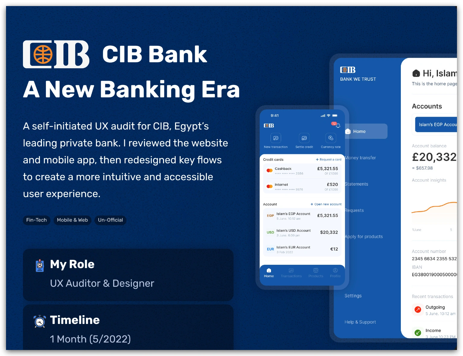
CIB Bank App UX Redesign
CIB Bank — Rethinking Banking for Real People
A few months after I opened a new account with CIB, I started digging into their mobile app. What I found wasn’t just bugs — it was friction. Visual inconsistencies, confusing flows, weak microcopy, and hidden features. As a product designer, that felt like an invitation.
I decided to run a self-initiated UX audit — combing through both their web and mobile experiences. My goal? Identify where the app betrayed trust, and redesign key flows to make them intuitive, accessible, and human.

What I saw / What I fixed
UI & Visual Design: The background imagery clashed with interface elements, confusing hierarchy. Icons lacked clarity, typography contrast was weak, and layouts felt disjointed.
Interaction & Feedback: Buttons, taps, form validations — many actions didn’t feel responsive. Error messages often left users guessing what to do next.
Navigation & Flow: Onboarding lacked guidance. Key actions were hidden. The way services, transfers, and product applications were structured wasn’t obvious to many users.
With that audit in hand, I sketched, rewrote, reorganized, prototyped. I aligned with accessibility standards (especially for non-tech savvy users), redrew flows so they felt natural, tightened microcopy, and gave navigation meaning and clarity.
The outcome? A version of CIB’s app that would feel smoother, cleaner, more trustworthy. While this was an un-official exercise (no full rollout), I consider it one of my most meaningful design explorations. It sharpened my ability to spot subtle UX debt, to push for clarity over aesthetics, and to design banking that’s not just functional — but human.
See full story here ↓
Like this project
Posted Oct 7, 2025
Conducted a UX audit and redesign for CIB Bank's app to improve user experience.


