When “Just Copy the Design” Isn’t That Simple

Abu Hanzallah

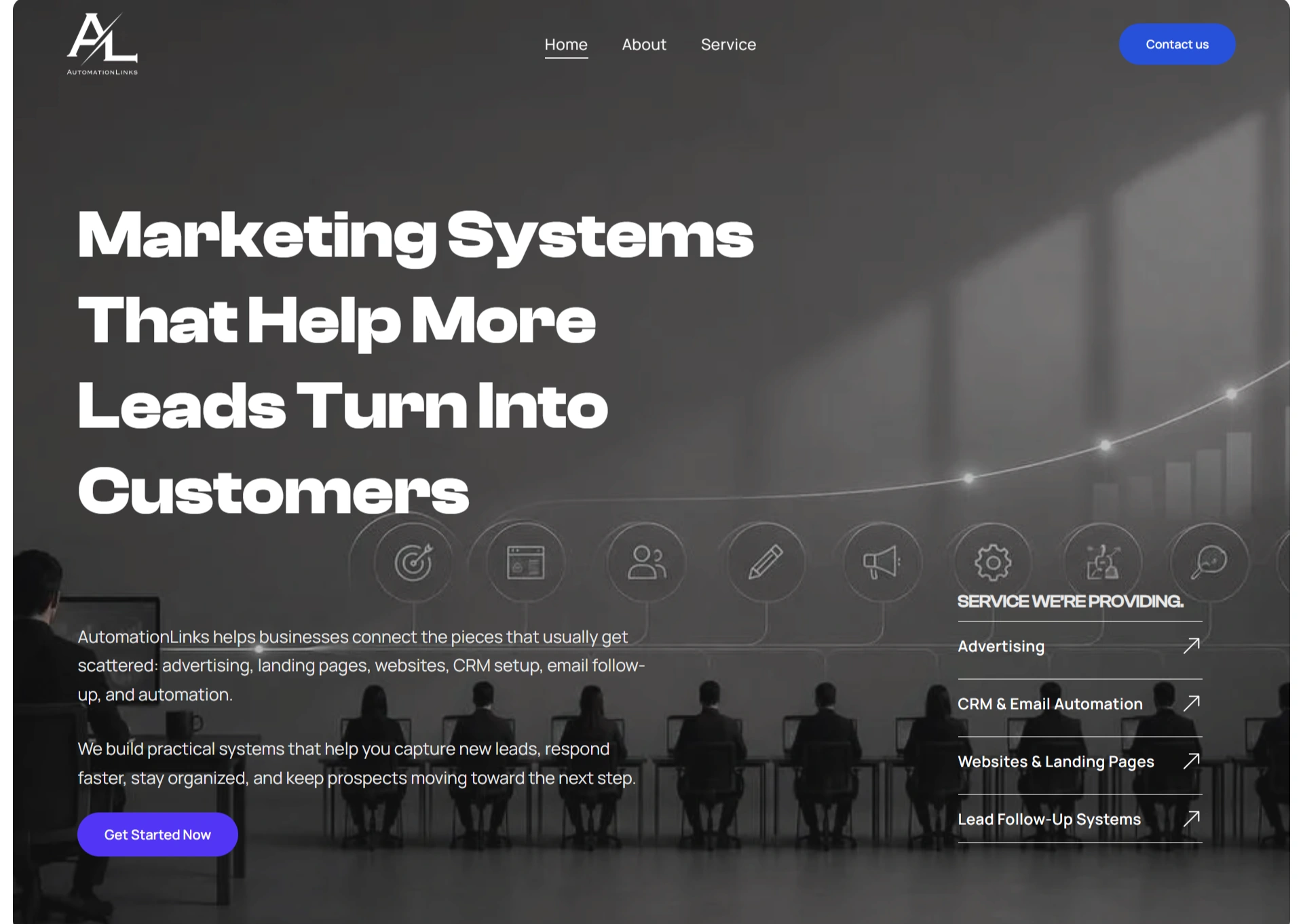
When “Just Copy the Design” Isn’t Actually That Simple
Building Automation Links from a clear visual direction into a complete Duda website.
There are two kinds of website projects.
One where the client says:
“Here’s the idea. Surprise me.”
And another where they say:
“Here’s exactly what we want. Now make it look like this.”
This was the second one.
The client already had a strong design direction for Automation Links and wanted that same visual experience brought to life in Duda.
So this wasn't about coming up with a completely new concept.
It was about taking an existing vision and making sure the final website actually lived up to it.
The Design Was Already There. The Work Wasn’t.
The reference gave me the direction, but a static design doesn't have to deal with real content, responsive layouts, awkward screen sizes, or the little things that suddenly look very noticeable once everything is on a live website.
That became the real task:
Recreate the design faithfully, but make it behave like a real website.
The page needed to feel intentional from the first screen to the last CTA, without turning the build into a pixel-hunting exercise that nobody asked for.
Well... maybe a little pixel hunting.
I Started With the Rhythm, Not the Sections
Instead of immediately building boxes inside Duda, I looked at how the page was supposed to move.
The dark hero introduced the brand and its message.
Then the client logos created trust.
The About section explained who Automation Links was, while the statistics gave visitors something they could understand at a glance.
From there, the services, work process, featured solutions, testimonials, FAQs, and blog gradually answered the questions a potential customer would naturally have.
The page wasn't just a collection of sections.
It had a conversation happening throughout it.
Here’s who we are.
Here’s what we do.
Here’s how we do it.
Here’s proof.
Now let’s talk.
That became the backbone of the build.
Then Duda Entered the Picture
With the structure figured out, I rebuilt the website from scratch in Duda.
This is where the reference design had to become something much more practical.
I worked through each section individually, matching the visual hierarchy, spacing, typography, imagery, cards, buttons, and overall proportions.
But I wasn't simply trying to make each section look correct on its own.
The bigger goal was making sure they felt like they belonged together.
Because a website can have ten beautifully designed sections and still look like ten different websites had a meeting and decided to collaborate.
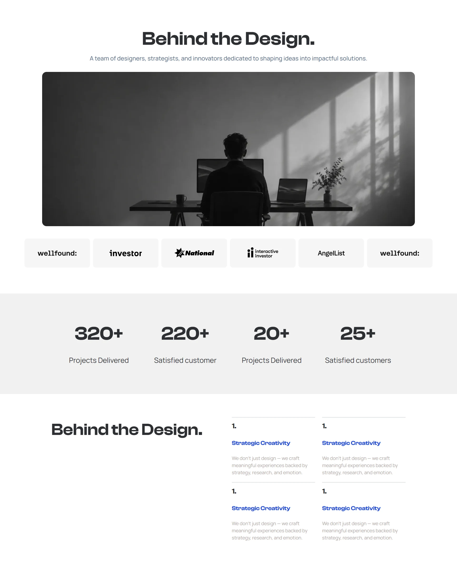
About Page
Making Information Easier to Consume
Automation Links had plenty to say.
Services needed explaining. Results needed showing. Testimonials needed space. FAQs needed answers. The blog needed somewhere to live.
The solution wasn't to remove information.
It was to control how visitors encountered it.
Large visual sections created breathing room.
Cards made information easier to scan.
Shorter content blocks prevented the page from becoming a wall of text.
And repeated CTAs gave visitors clear opportunities to take the next step without having to hunt for one.
The website could be detailed without feeling heavy.
The Last 10% Took More Attention Than the First 90%
Once the main page was built, I went back through it with fresh eyes.
This is usually where the tiny things start becoming annoyingly important.
Does that image crop feel right?
Is this section breathing enough?
Does the heading have enough presence?
Does the next section arrive naturally?
Does the CTA actually stand out?
None of these changes individually reinvent the website.
Together, they determine whether the website feels finished.
So I refined the spacing, hierarchy, imagery, and transitions until the design felt cohesive from top to bottom.
And That Was the Point
The final result was a complete Automation Links website built in Duda, closely following the client's original visual direction while turning it into a functional, responsive experience.
More importantly, the process proved something I really enjoy about this kind of work:
Good web design isn't always about inventing something new.
Sometimes, someone already has the right idea.
Your job is to understand why it works and then execute it well enough that the final website feels like it was always meant to exist that way.
No unnecessary redesign.
No “creative freedom” nobody asked for.
Just a clear idea, carefully translated into a working website.
That was Automation Links.
Like this project
Posted Sep 9, 2026
Recreating a client’s exact design in Duda from scratch, turning a clear visual concept into a polished, responsive website without losing the details.
Likes
0
Views
0