Built with Kajabi
Designing a High-Converting Opt-In Landing Page in Kajabi

Abu Hanzallah

Designing a High-Converting Opt-In Landing Page in Kajabi
Bringing a coach’s digital experience into a platform built for turning expertise into a business.
Great coaching businesses often start with one thing: knowledge worth sharing.
But turning that knowledge into an online experience requires more than just putting content on a page. There needs to be a clear journey from discovering the coach, to building trust, to taking that first step.
That’s where this project began.
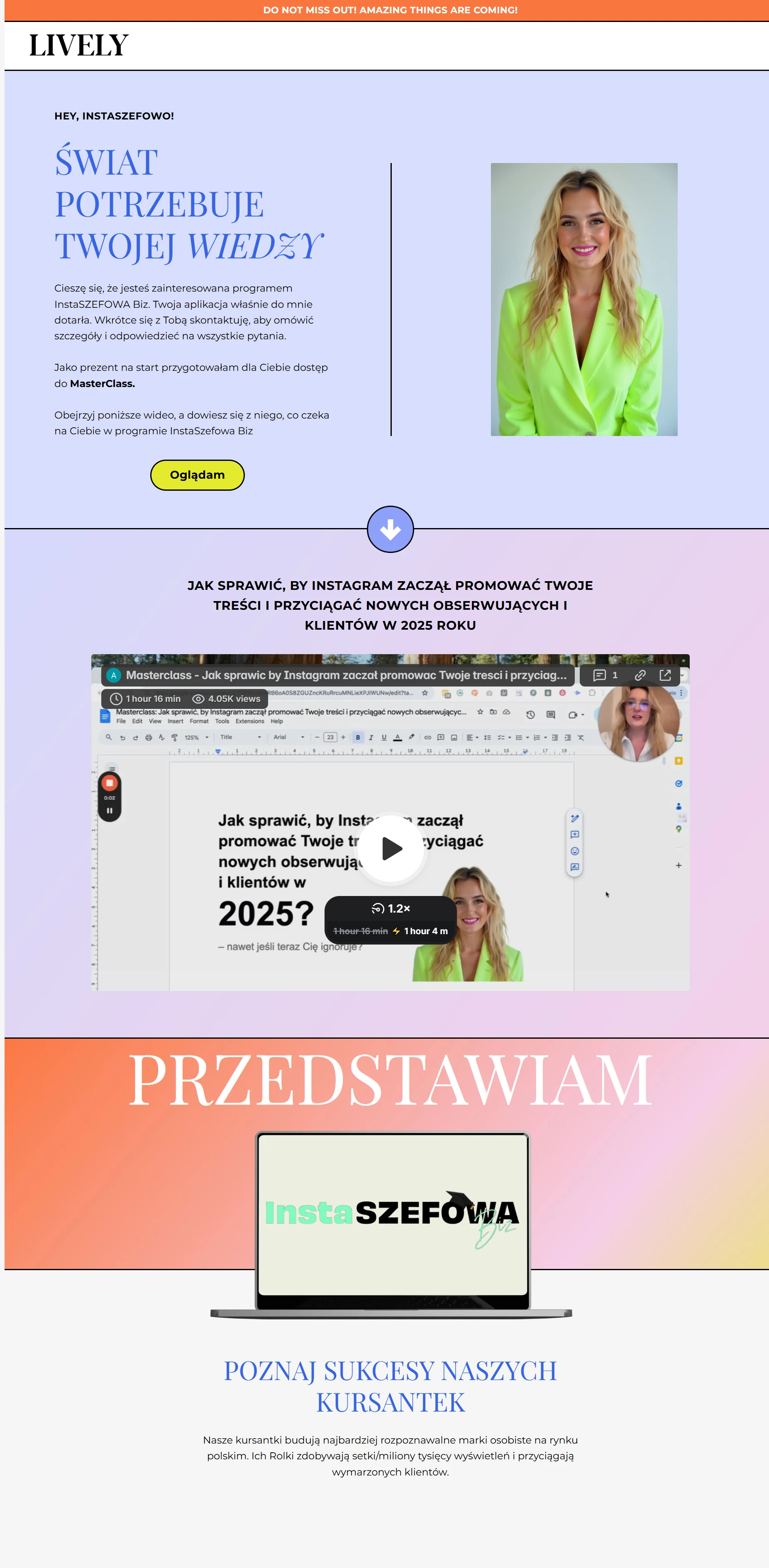
I had the opportunity to work with Marti Fox and her team, helping bring an existing opt-in landing page into Kajabi and recreate the experience for their audience.
It was another reminder of something I really enjoy about this work:
Design has no borders.
You can be working from one part of the world with a team somewhere completely different, yet the goal stays the same, create an experience that feels clear, credible, and effortless for the person on the other side of the screen.
Starting With What Already Worked
The project wasn't about throwing away an existing experience and starting over.
The original landing page already had a purpose, a structure, and a journey that had been carefully considered.
My role was to understand that experience and bring it into Kajabi while maintaining the visual hierarchy and overall feeling of the original.
Every section had a job.
The headline needed to create interest.
The content needed to communicate value quickly.
And the opt-in needed to feel like the natural next step rather than another interruption.
Landing Page
Why Kajabi Made Sense
For coaches, the website is rarely just a website.
It's often the starting point for an entire digital business; content, lead generation, programs, courses, and offers all need to work together.
That's what makes Kajabi interesting.
Instead of thinking about the landing page as an isolated design, I approached it as one part of a larger coaching experience.
The page needed to look good, but it also needed to fit naturally into the ecosystem around it.
That meant keeping the experience focused, intentional, and easy for a potential client to understand.
Designing for the Journey
The best opt-in pages don't make visitors work to figure out what to do.
They guide them.
So while rebuilding the page, I focused on creating a clear visual rhythm from the first section to the final call to action.
Information was given enough space to breathe.
Important messages were given visual priority.
And the CTA was positioned as part of the story rather than simply placed on the page.
The result was an experience designed around one simple idea:
Make the next step obvious.
A Global Collaboration
Working with Marti and her team was also a great example of how modern design work happens globally.
Different locations. Different perspectives. One shared digital experience.
The work moved between design decisions, implementation, feedback, and refinement, making sure the final result stayed aligned with the original vision while working naturally within Kajabi.
That's one of my favorite parts of working on projects like this.
You're not just designing pixels.
You're collaborating with people you may be thousands of miles away from to create something that will eventually be experienced by thousands of people you may never meet.
From Landing Page to Experience
The finished opt-in funnel brought the original concept into Kajabi as a clean, focused experience built around the audience's journey.
It wasn't about adding more.
It was about making every part of the page work together.
From the first impression to the final opt-in, the experience was designed to help visitors understand the value, build confidence, and take action.
And that's ultimately what good funnel design should do.
Less friction.
More clarity.
A better path from interest to action.
Built for coaches. Designed for people.
This project was a small piece of a much bigger idea:
When a coach has valuable knowledge, the digital experience should make it easier for that knowledge to reach the right people.
Kajabi provided the foundation.
Design provided the experience.
Like this project
Posted Sep 16, 2025
A Kajabi opt-in funnel for a global coaching business, designed to turn expertise into a clear, engaging journey from first click to action.
Likes
0
Views
15