Not So Mundane Studios | E-commerce Design & Development

Zinddin B. Louza

I began by studying Not So Mundane Studios’ photographs, collection names and the everyday routines behind the brand: errands, coffee and slow afternoons. I wanted those references to shape the shopping experience, from the first image to choosing a tote or cap.
My first homepage used a rotating arrangement of photographs and a heavy italic typeface. It was visually busy and did little to express this particular brand, so I dropped it. The next ideas used moods and short phrases, but some buttons had no useful destination and the writing took too much effort to interpret. I returned to the practical job of helping someone find and order a piece.
I built a working store, then reviewed why it still felt generic. A later version used small photographs within sentences. That worked as one moment, but repeating it across the page weakened it. I kept the brand’s photographs, gave them a consistent colour treatment and used a reference board to make concrete choices about sections and typography.
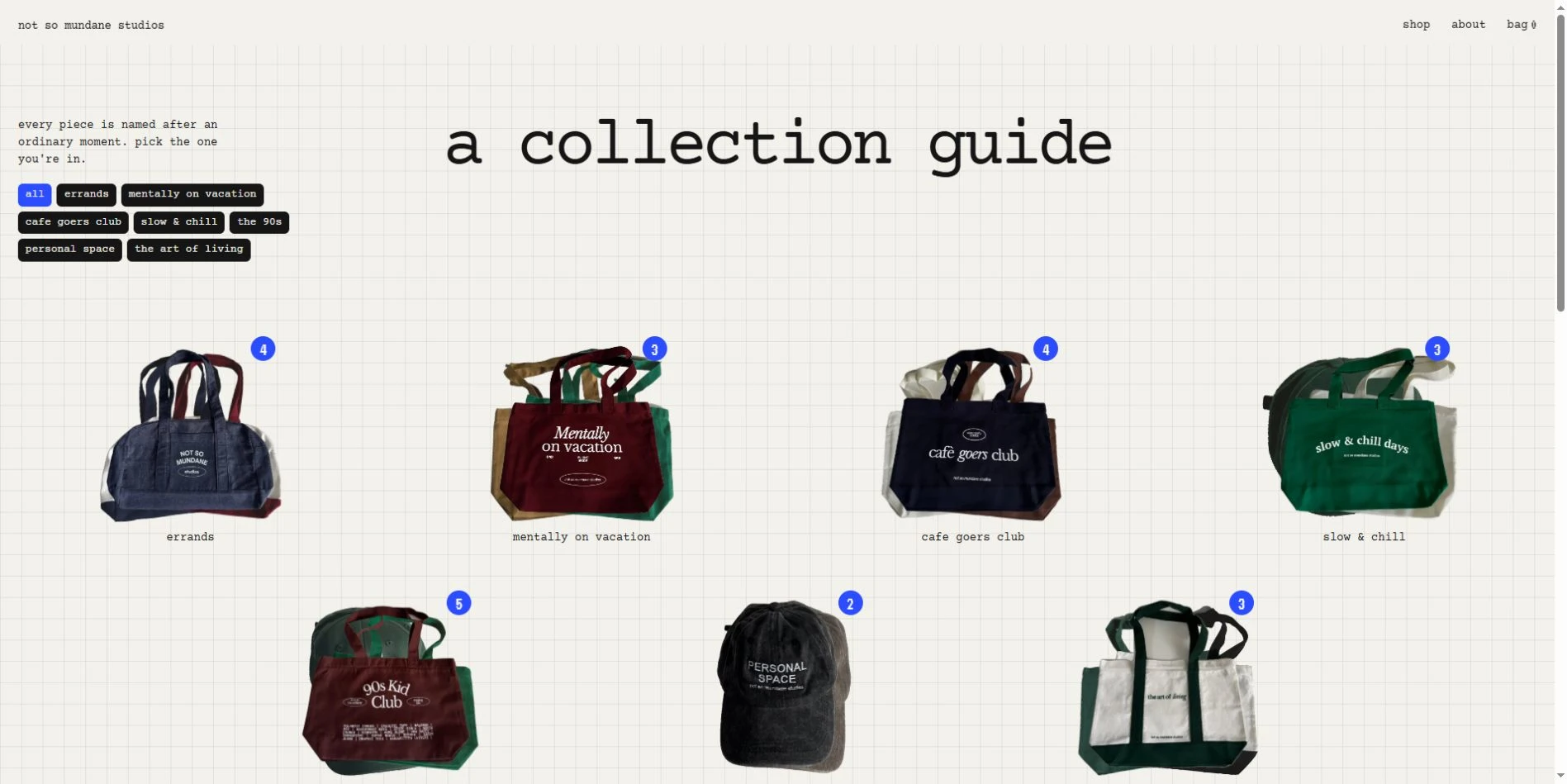
I chose Courier Prime for its connection to receipts and shopping lists, with VT323 referring to the screen language of the brand’s 1990s-inspired collection. I developed a collection guide on graph paper, product galleries arranged as photo strips and a shopping bag that fills out like a receipt. Those choices gave the browsing and ordering screens a shared visual language.
I refined the details as the pages came together: centring incomplete product rows, keeping text clear of image crops and making quantity changes update the order total. On mobile, I recomposed the strip of cities and photographs, adjusted the navigation and made the header respond to the background beneath it. The full case study shows the seven iterations and why I changed direction.
Explore the storefront: https://nsms.websdelcamp.cat/
Read the full case study: https://websdelcamp.cat/es/portfolio/nsms
Before and after: the original Wix store, then a walk through the new one, from the homepage to the receipt-style bag.
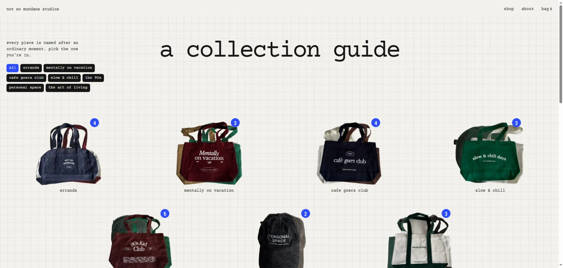
The collection guide uses graph paper, grouped products and collection filters to help visitors choose where to start.
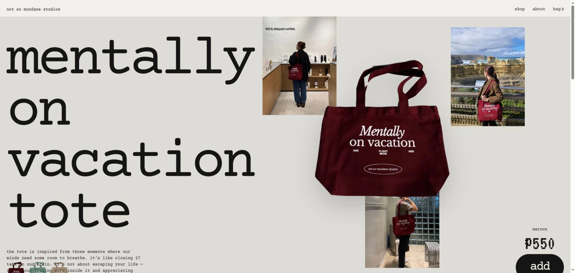
The product page brings together the tote, photographs of it being used, colour choices and ordering controls.
Like this project
Posted Oct 28, 2026
I worked through seven iterations to turn the brand’s everyday references into its typography, collection guide, product pages and receipt-style bag.
Likes
0
Views
0