Front-end Development for Picsart's Web Platform

Marco Wong


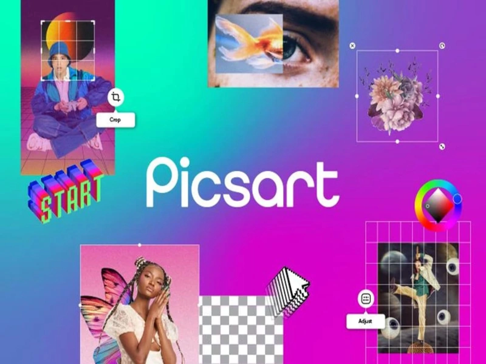
What is Picsart?
Picsart is a comprehensive AI-powered creative platform that provides users with advanced photo and video editing capabilities, graphic design tools, and creative assets in an accessible interface. The platform serves both individual creators and businesses, offering a suite of tools that democratize design by making professional-quality editing and creation accessible to users of all skill levels. Picsart combines powerful editing features with AI-driven creative tools across web, iOS, and Android applications, enabling users to create, edit, and share visual content for social media, marketing, personal projects, and professional design work.
Core Functionality
- AI-Powered Editing Tools: Advanced image manipulation capabilities enhanced by artificial intelligence, including background removal, object detection, and smart selection
- Photo Enhancement Suite: Comprehensive photo editing features including filters, effects, adjustments, retouching tools, and batch processing
- Graphic Design Platform: Template-based design system with customizable layouts for social media, marketing materials, and digital content
- Creative Asset Library: Extensive collection of stickers, fonts, backgrounds, templates, and design elements for creative projects
- Video Editing Capabilities: Tools for creating and editing short-form video content with effects, transitions, and text overlays
- AI Image Generation: Text-to-image generation tools allowing users to create custom visuals from text prompts
- Brand Kit Management: Tools for businesses to maintain brand consistency across designs with saved colors, fonts, and logos
- Social Sharing Integration: Direct publishing capabilities to major social media platforms with appropriate format optimization
- Collaboration Features: Team-based workflows allowing multiple users to contribute to projects with permission controls
- Premium Content Marketplace: Curated collection of premium templates, effects, and assets available to subscribers
- Mobile-to-Web Synchronization: Seamless project transfer between mobile applications and web platform
- Educational Resources: In-app tutorials, design tips, and creative inspiration to help users maximize the platform's capabilities
Technical Implementation
- Frontend Framework: React.js for web application with Redux for state management and styled-components for UI styling
- Mobile Web Optimization: Progressive Web App implementation for mobile browser experience with offline capabilities
- Canvas Rendering: HTML5 Canvas and WebGL for high-performance image manipulation and real-time effects preview
- Responsive Design System: Component-based architecture ensuring consistent experience across device sizes
- Asset Management: Dynamic loading system for creative elements with intelligent caching and preloading
- Animation Framework: Custom animation library for smooth transitions and interactive editing experiences
- Internationalization: Comprehensive localization system supporting 30+ languages with right-to-left text handling
- Accessibility Implementation: WCAG compliance measures ensuring usability for users with disabilities
- Performance Optimization: Code splitting, lazy loading, and bundle optimization for fast initial load and interaction
- State Management: Sophisticated state handling for complex editing operations with undo/redo functionality
- Testing Infrastructure: Jest and React Testing Library for component testing with visual regression testing
- Design System: Comprehensive UI component library ensuring consistent visual language across the platform
What I Did
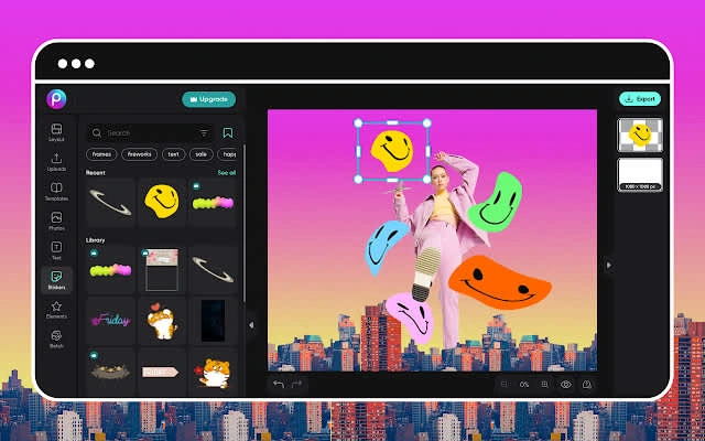
- Led front-end development for the web platform, creating an intuitive and responsive user interface for complex editing tools
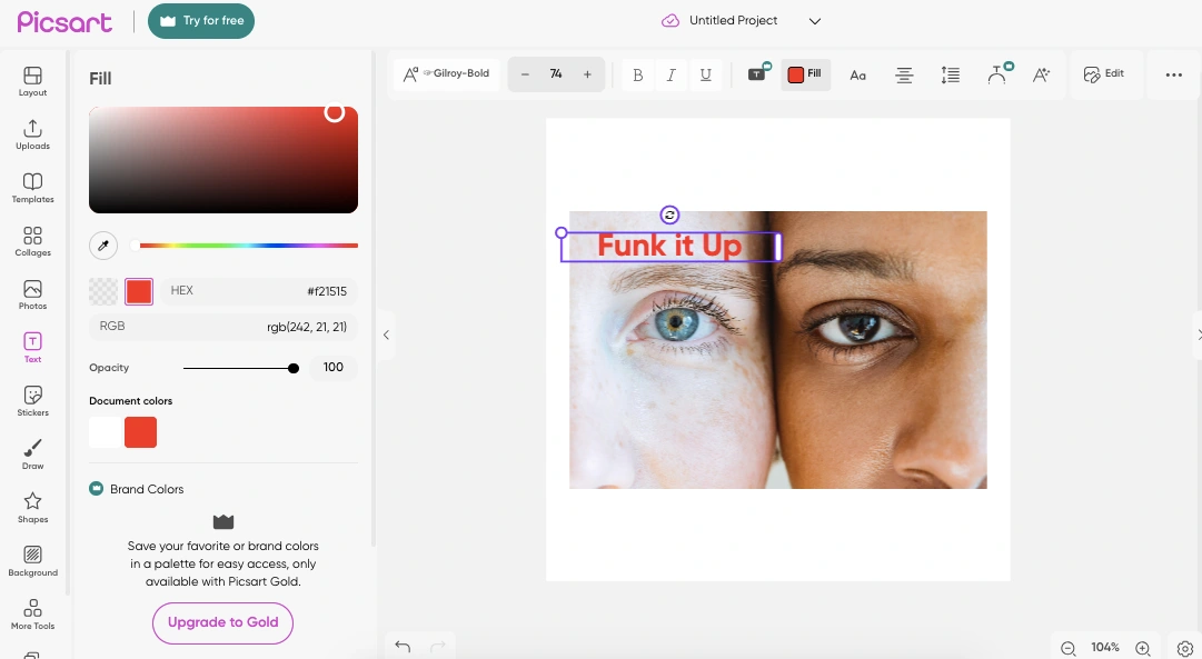
- Implemented the canvas-based editor using WebGL and HTML5 Canvas for high-performance image manipulation
- Developed interactive design tools including drag-and-drop functionality, resizing handles, and precision controls
- Created the component library that formed the foundation of the design system across the web platform
- Built responsive layouts ensuring optimal user experience from mobile devices to large desktop displays
- Implemented real-time preview system for filters and effects, providing instant visual feedback during editing
- Developed the template browser interface with advanced filtering, search, and preview capabilities
- Created the layer management system with intuitive controls for complex multi-layer compositions
- Implemented the color adjustment tools with interactive controls for brightness, contrast, saturation, and more
- Built the text editing interface with typography controls, effects, and alignment tools
- Developed the asset panel for accessing and managing stickers, backgrounds, and design elements
- Implemented the subscription interface with feature highlighting and conversion optimization
- Created interactive tutorials guiding users through complex editing features with step-by-step instructions
- Optimized rendering performance for complex compositions, achieving smooth 60fps interactions
- Implemented cross-browser compatibility ensuring consistent experience across Chrome, Safari, Firefox, and Edge
Achievements
- UI Performance: Achieved 40% improvement in interface responsiveness through rendering optimizations and efficient DOM management
- Load Time Reduction: Reduced initial load time by 65% through code splitting, asset optimization, and intelligent preloading
- Mobile Usability: Implemented responsive design patterns resulting in 50% increase in mobile web usage
- Cross-Browser Consistency: Ensured pixel-perfect rendering across all major browsers, eliminating platform-specific bugs
- Interaction Design: Created intuitive editing interfaces that reduced user learning curve and increased feature adoption
- Accessibility Compliance: Implemented WCAG 2.1 AA compliance across all major user flows
- Component Reusability: Developed a component library that increased development velocity by 35% for new features
- Visual Fidelity: Ensured high-quality preview rendering that accurately represented final output across device types
- Performance Metrics: Achieved and maintained 90+ scores on Google Lighthouse for performance, accessibility, and best practices
- User Engagement: Front-end improvements directly contributed to 25% increase in time spent in the editor
- Technical Innovation: Pioneered new approaches to WebGL-based image editing in browser environments
- Feature Adoption: UI improvements led to 30% increase in usage of advanced editing features
- Internationalization: Successfully implemented right-to-left interface support, expanding platform accessibility to new markets
- Conversion Optimization: Redesigned subscription interface resulting in 20% improvement in conversion rate
Like this project
Posted May 14, 2025
Led Picsart's front-end development using Next.JS, building responsive UI components and optimizing performance, driving 65% faster loads and higher engagement.
Likes
3
Views
36