Techland Rebranding and Logo Redesign
Techland Rebranding
Logo Redesign and Rebranding -// 2022
About
TechLand is a Computer hardware, software & service supplier company in Bangladesh. They offer a wide range of computing services, products, and Solutions. Tech Land’s mission is to provide computer systems and services for businesses and individuals - systems that are state of the art, highly efficient, and reliable; service that is highly competent, dedicated, and timely. Their ultimate objective is to be a complete support system for businesses and individuals, a support system that will empower our clients with enhanced productivity, increased competitiveness, and overall satisfaction.
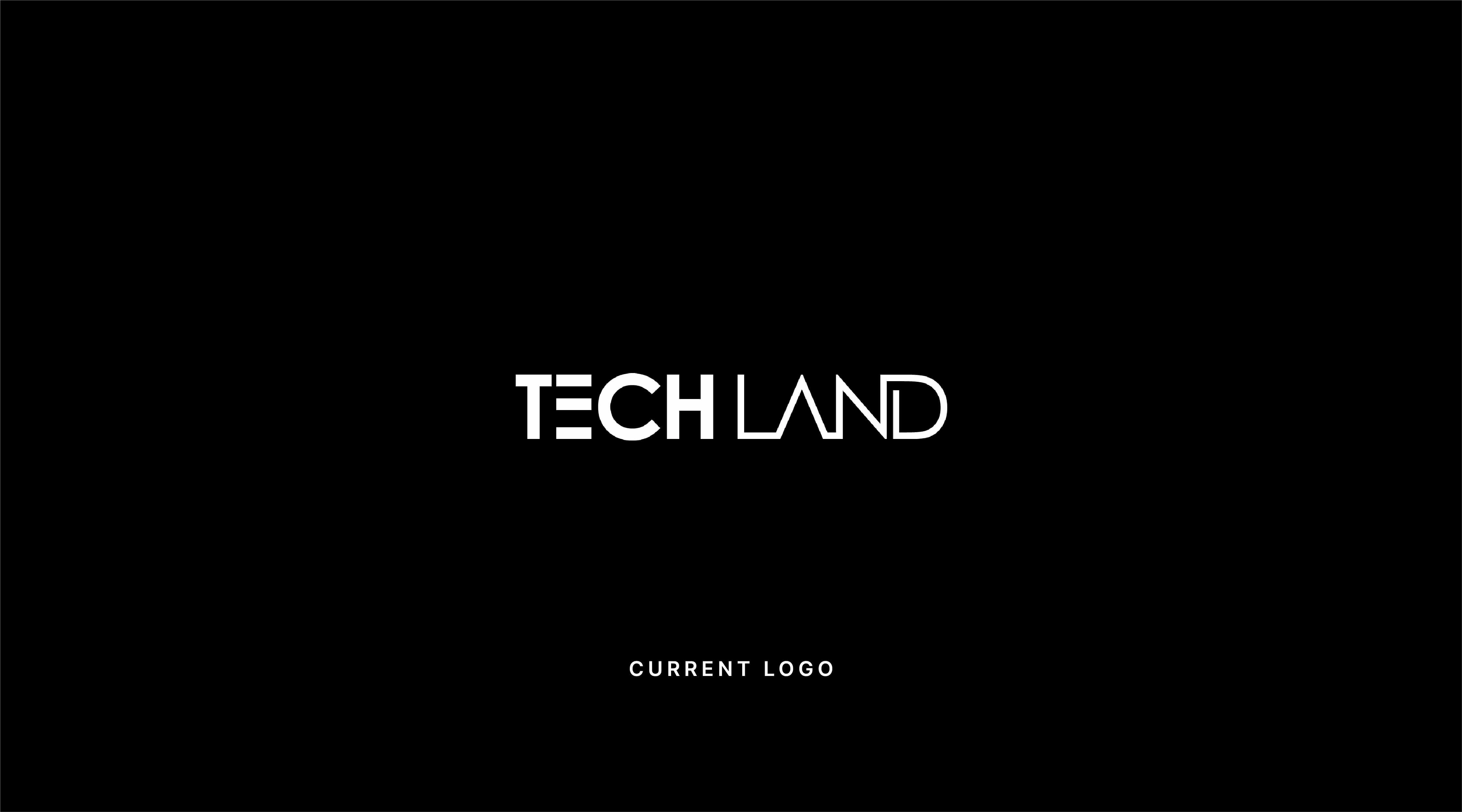
I found out that their Logo & Brand Identity system is not as up-to-date as their services. So, I thought of doing a Rebranding of Techland. The new Brand Identity will give the Brand a fresh, modern, and consistent look.
Challenges
The Current Logo is outdated
The logo is not balanced correctly
The logo is not responsive
The brand doesn’t have a unique identity
The brand doesn’t have consistency
The brand doesn’t have a unique tone
Solutions
New Logo is modern and unique
New Logo is responsive
New Logo is perfectly balanced
Rebranding will create consistency
Rebranding will make the brand stand out from the crowd
It will build a unique identity system for the brand
It will help people easily remember, recognize & trust the brand
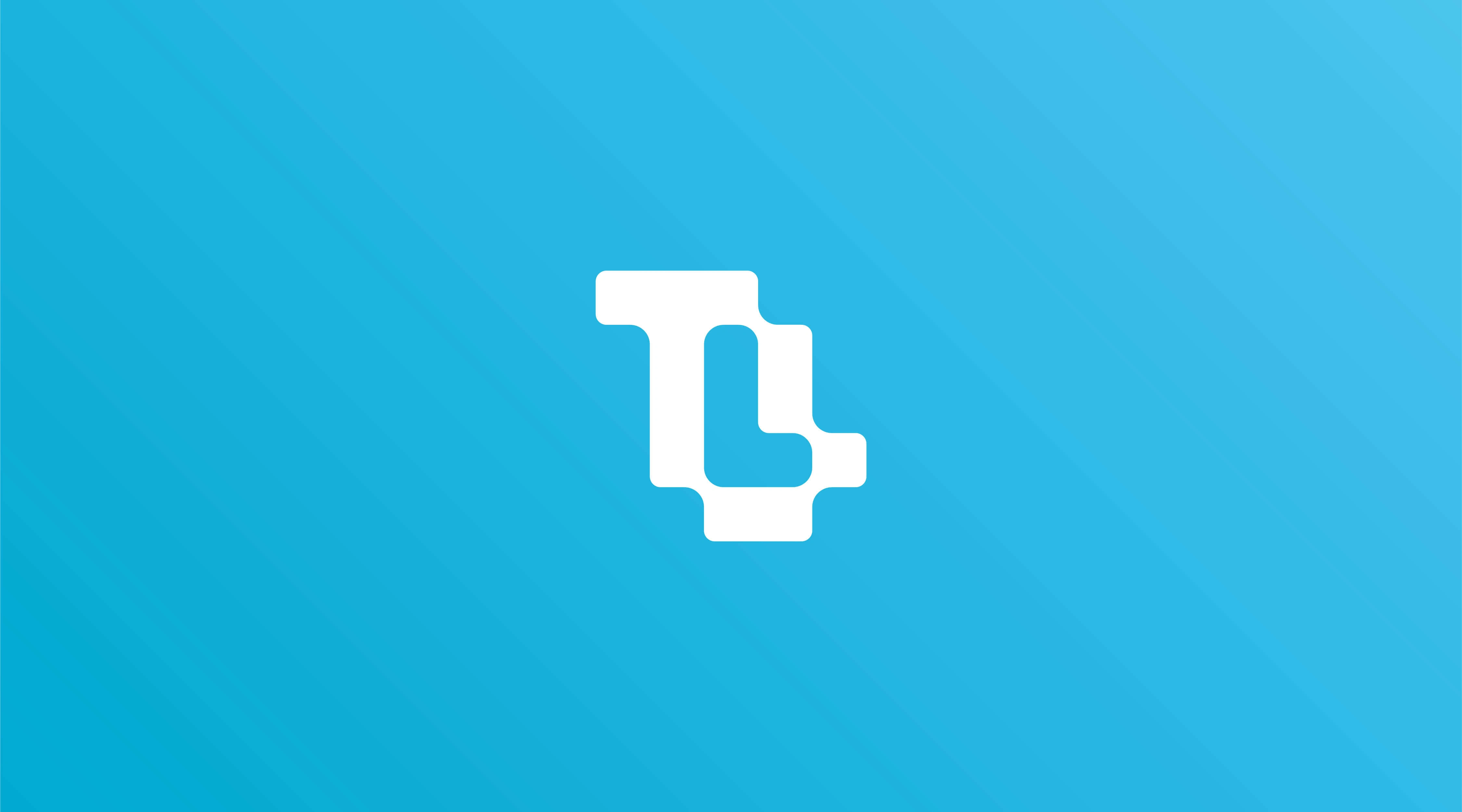
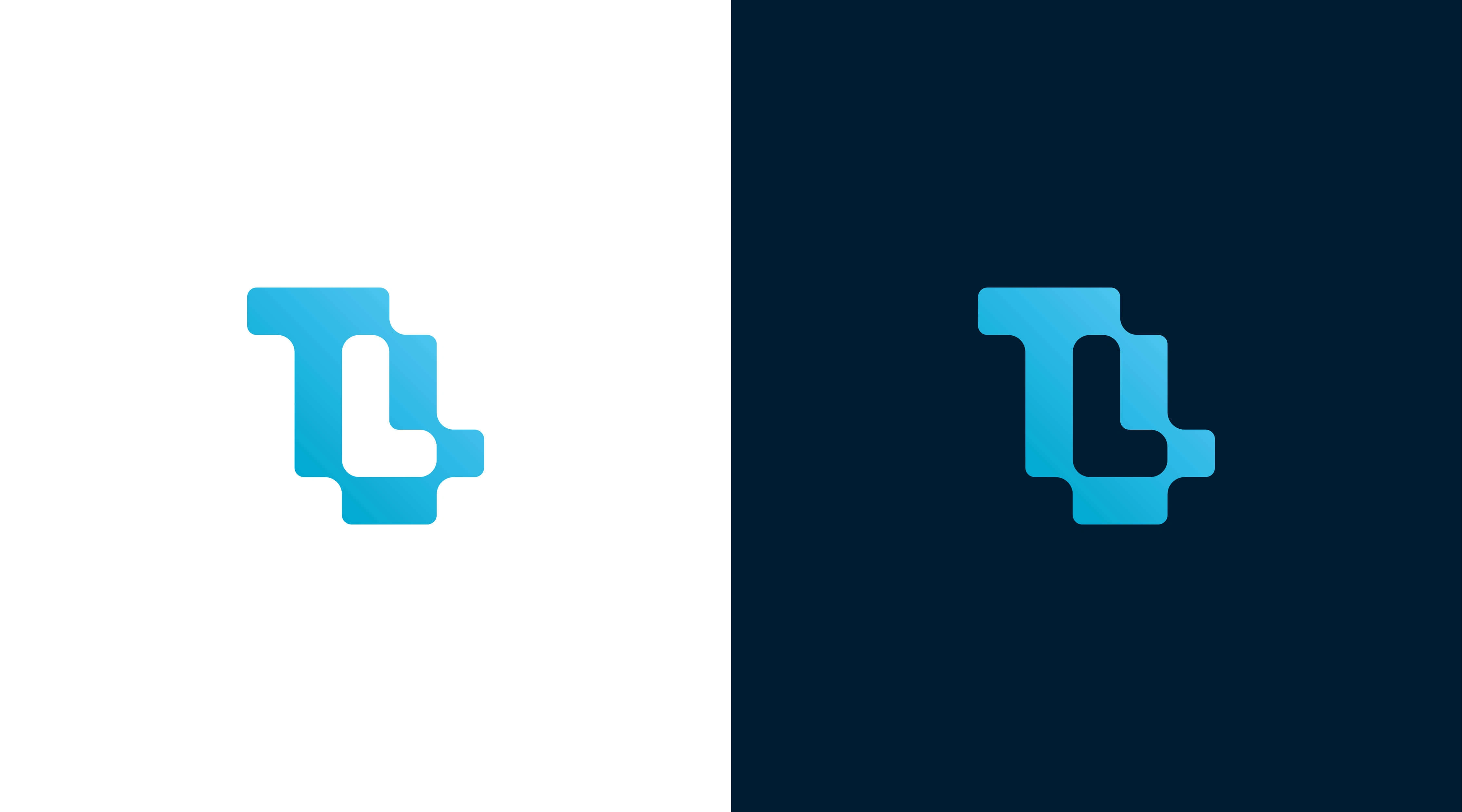
Idea behind the Logo
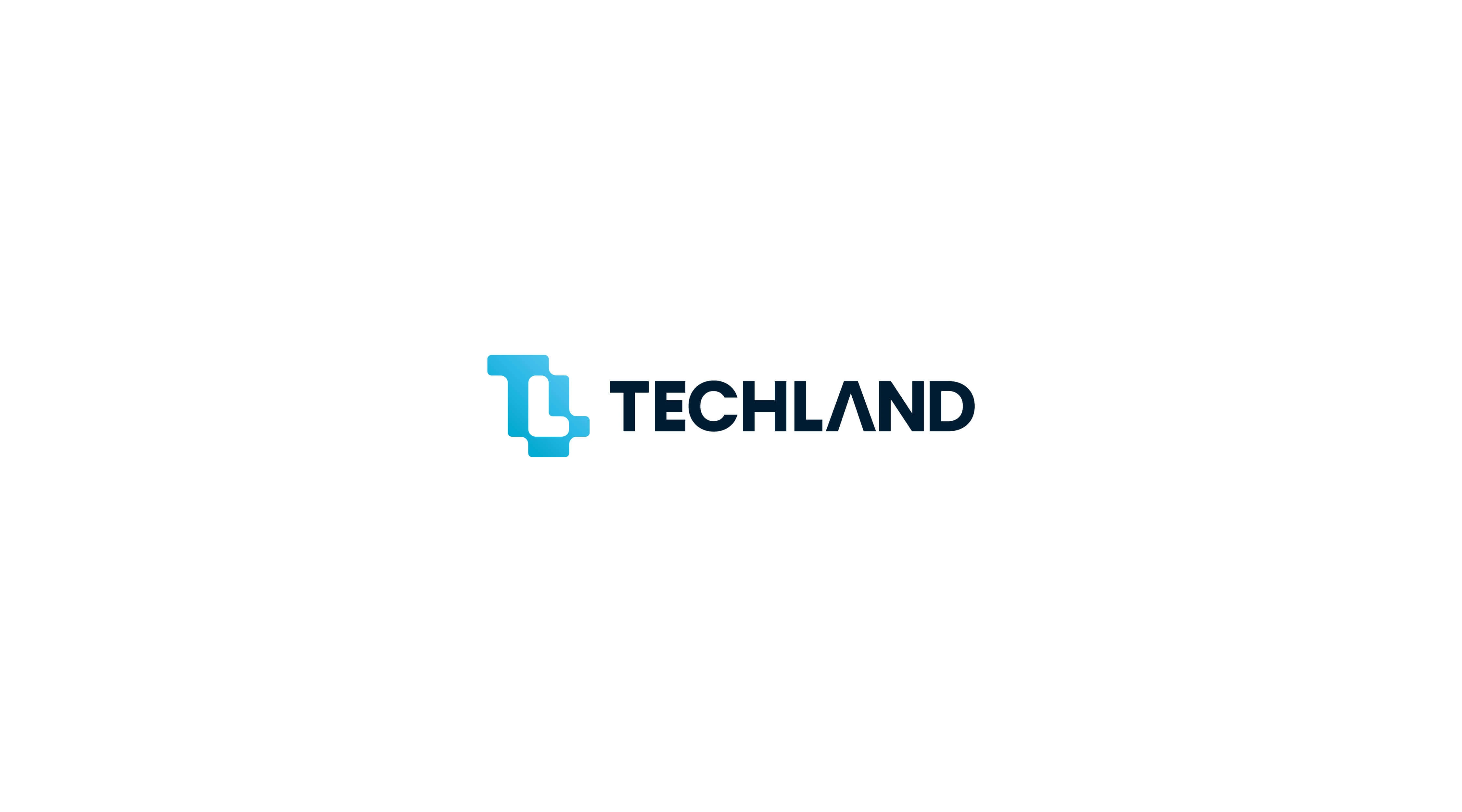
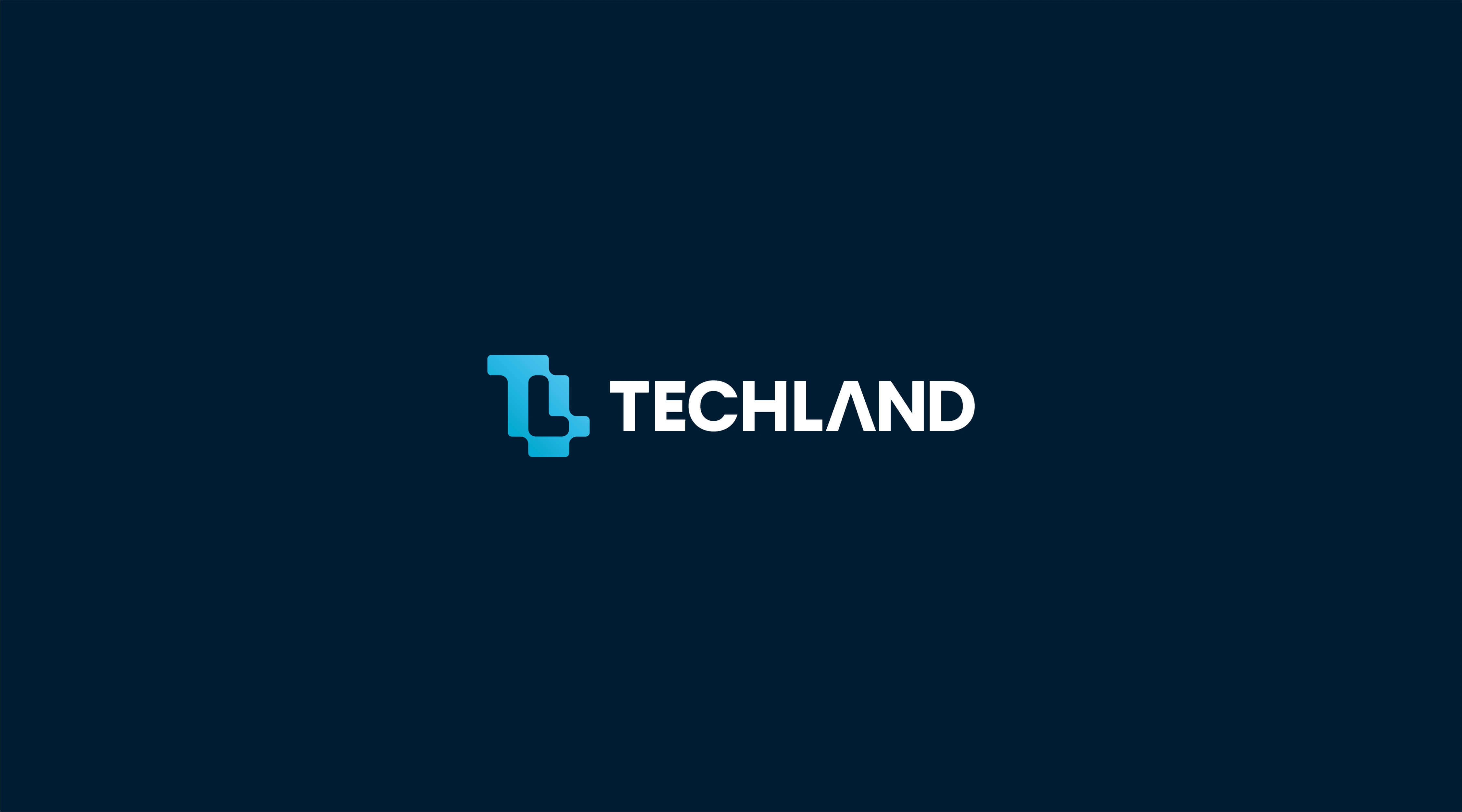
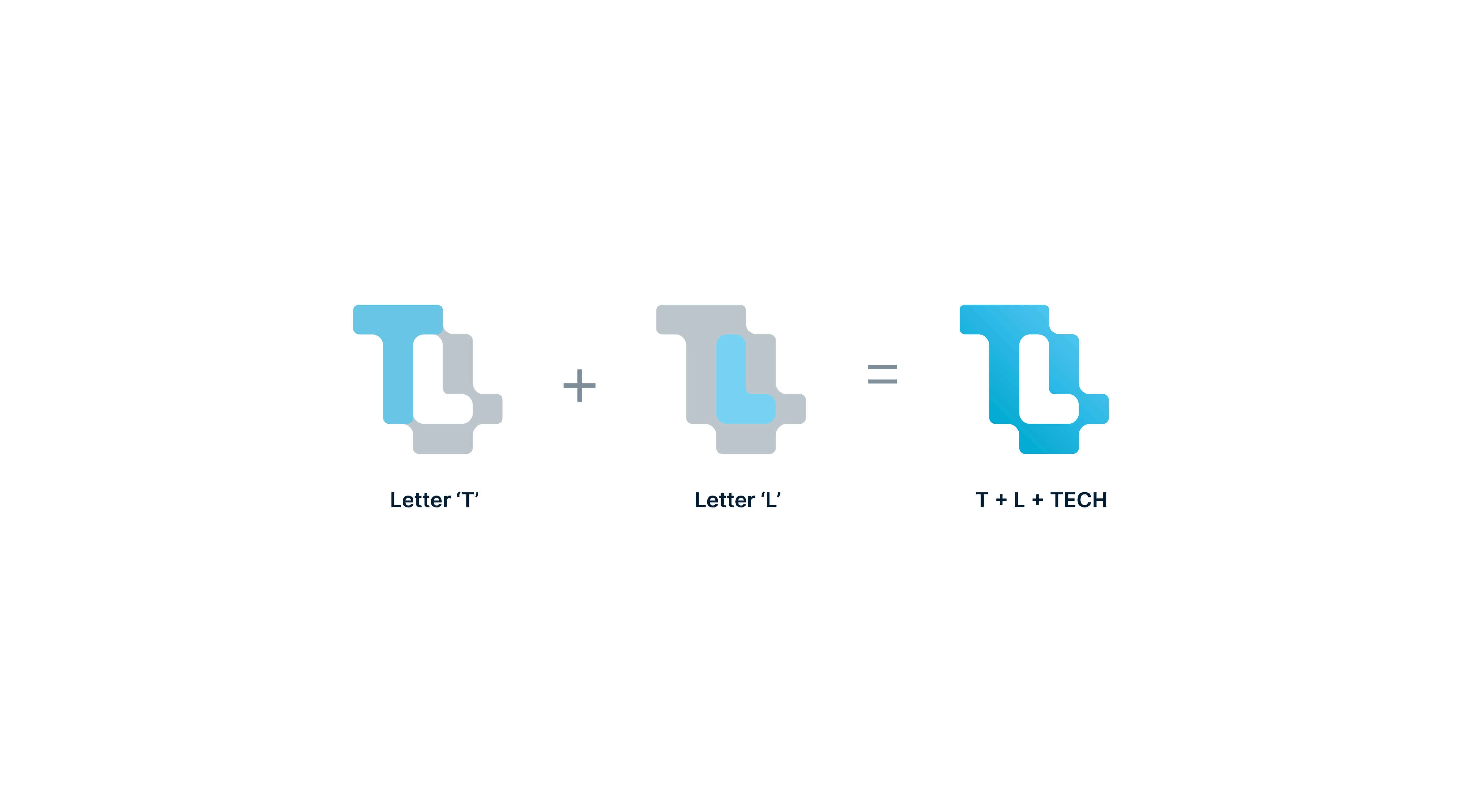
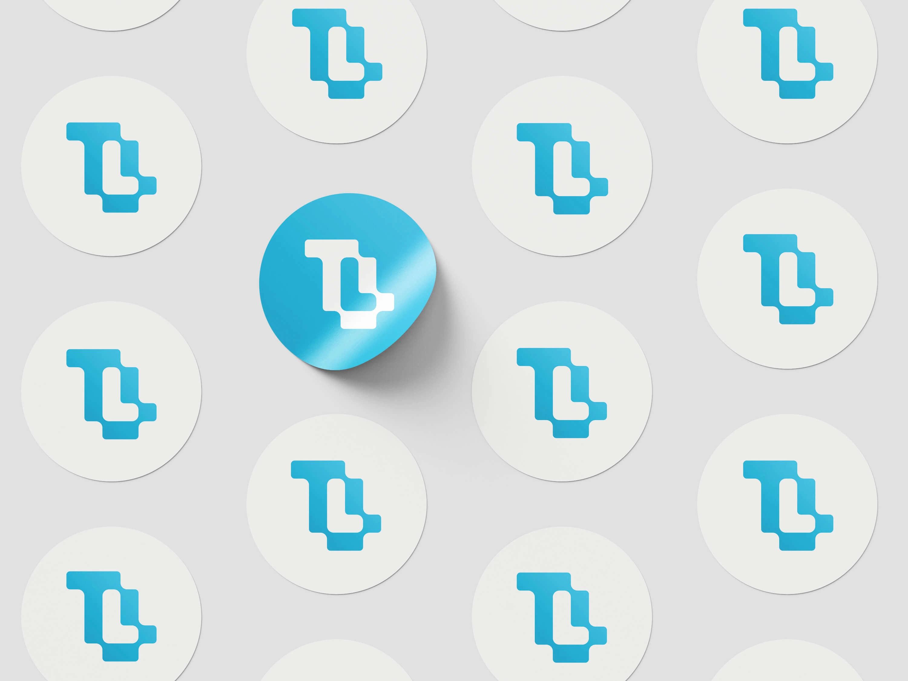
The logo mark is made based on the nature and personality of the brand. It is a modern mark based on two letters T+L which are extracted from the name TechLand. The L is placed as a negative space object in the logo. Basically, the logo has a tech vibe with those two letters.
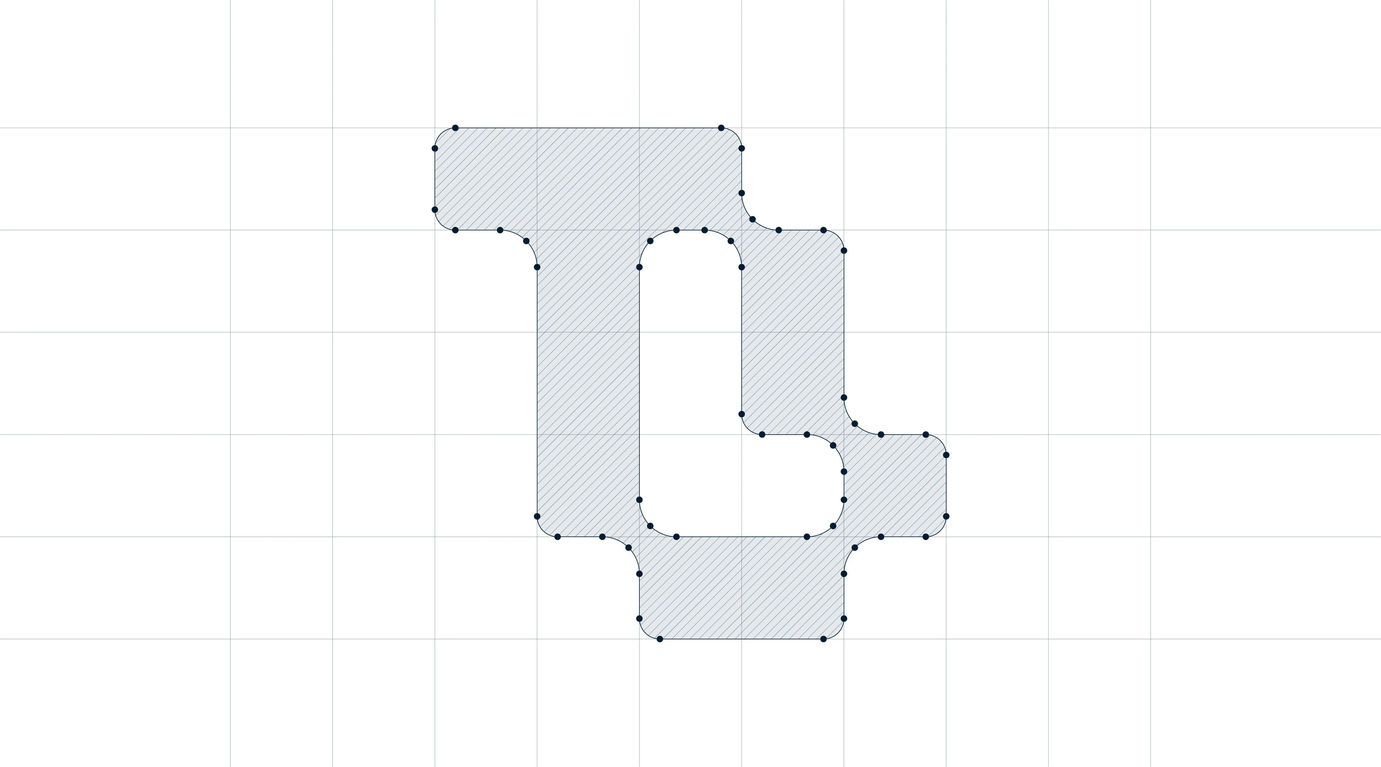
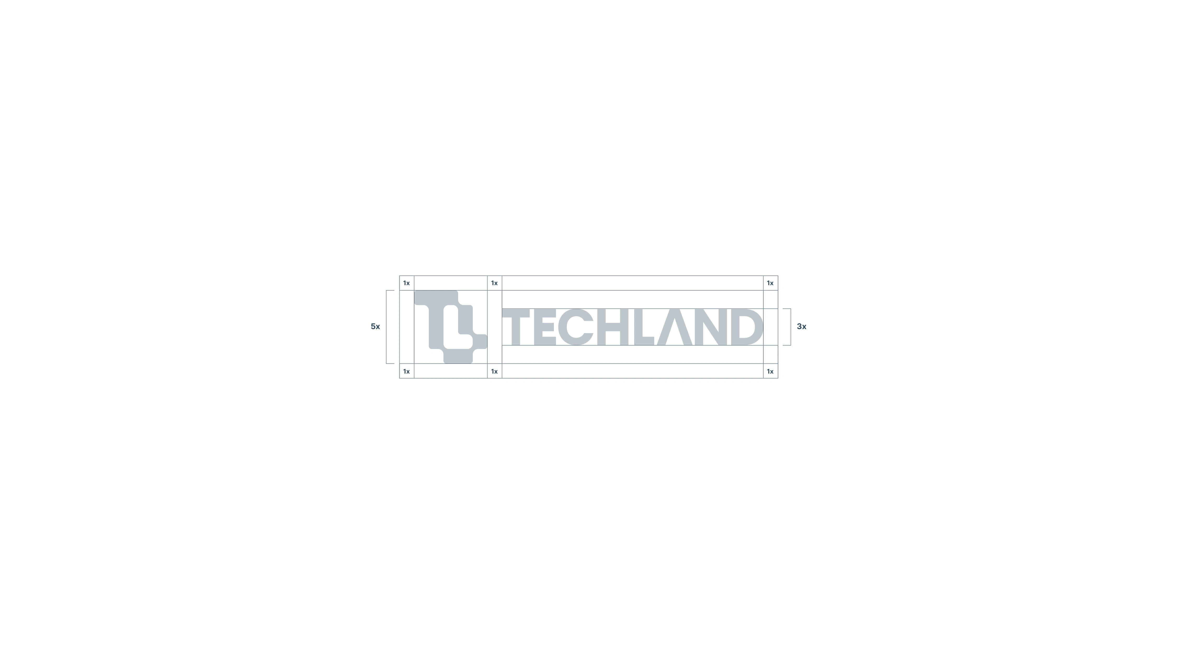
Logo Grid
A logo grid, also known as a construction grid or logo grid system, is a framework used by designers to create precise and proportionate logo designs. It serves as a guide that helps maintain consistency, balance, and harmony within a logo's elements. The purpose of a logo grid is to ensure that the logo's elements are properly spaced, aligned, and sized, resulting in a visually pleasing and well-structured design. This new logo is made using logo grid and it is perfectly balanced and proportioned using grid system.
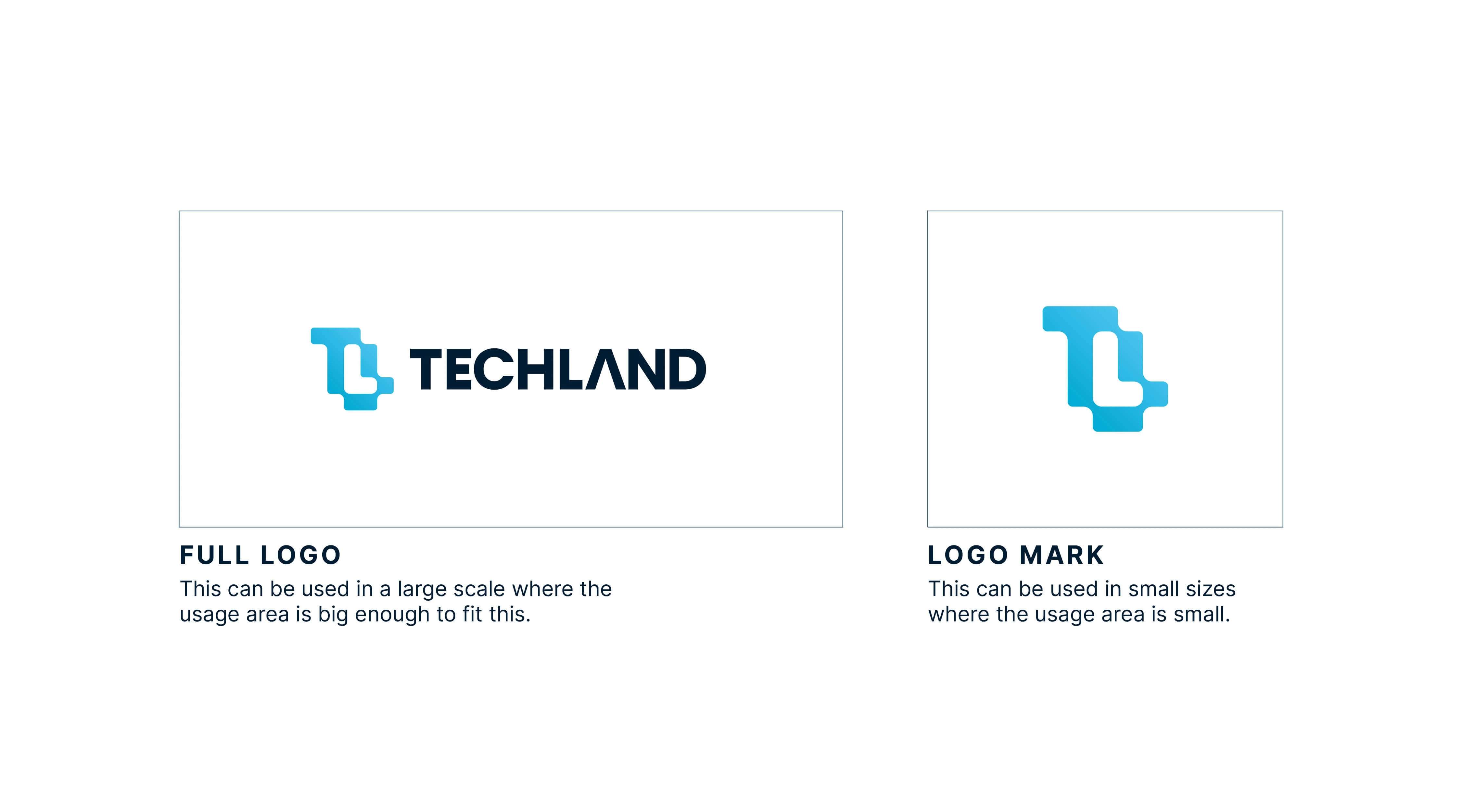
Responsive Logo
The new logo is a modern iconic logo and it is fully responsive. In this modern time a logo has to be used in different sizes and situations to make the perfect impression. The new logo can be used with or without the logo mark/icon depending on the use-case. Also the icon can be used alone in smaller scales to keep the consistency of the brand.
Brand Color
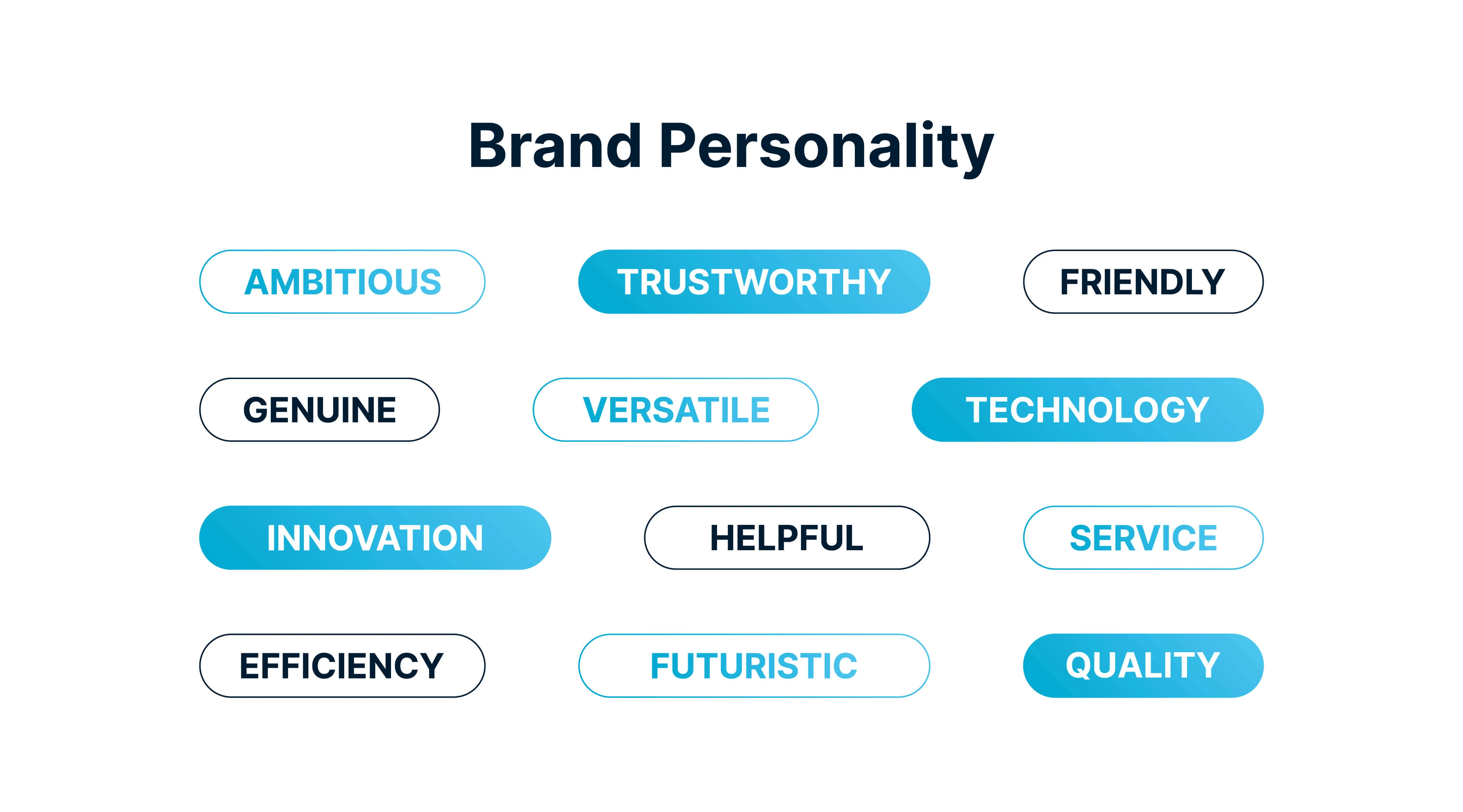
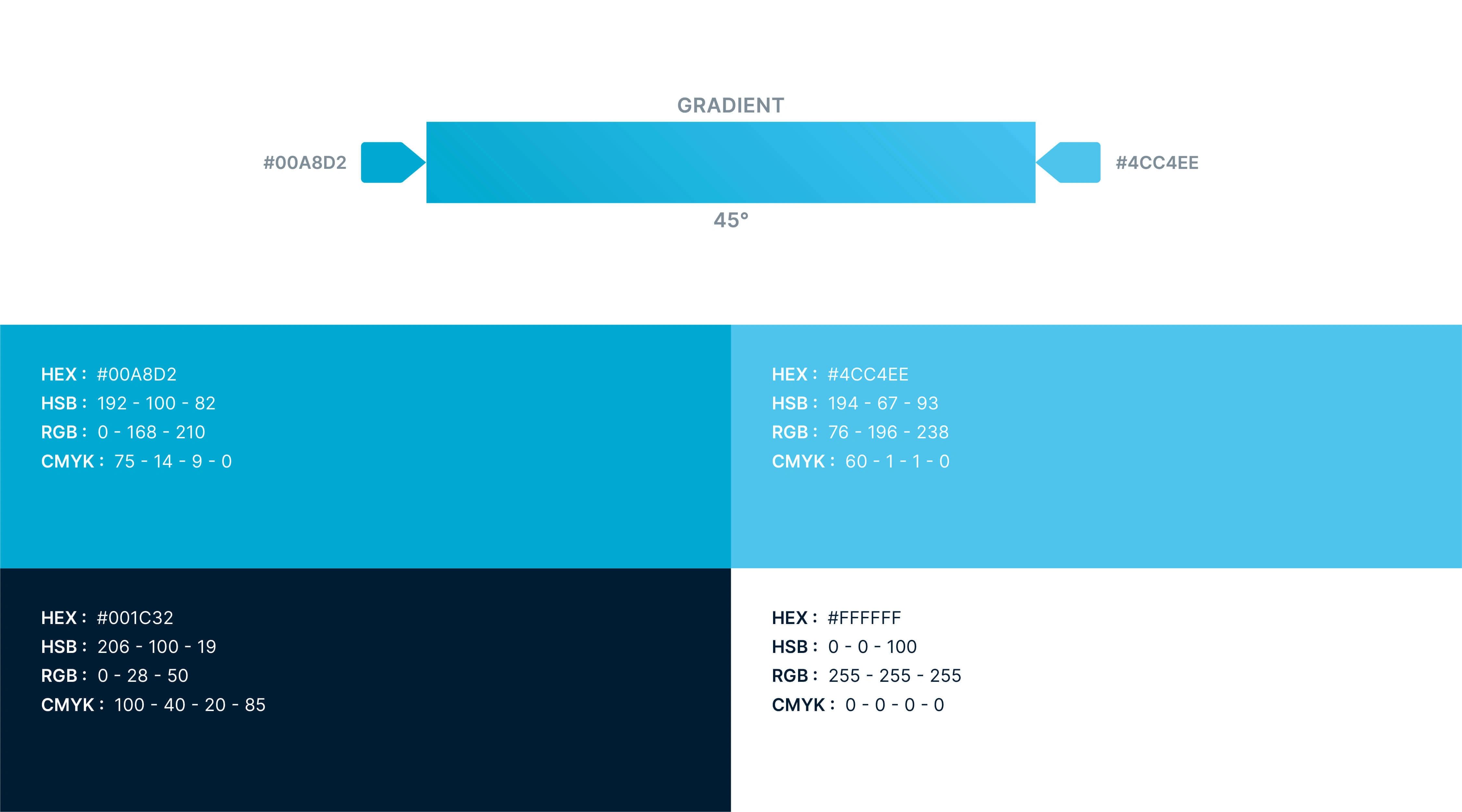
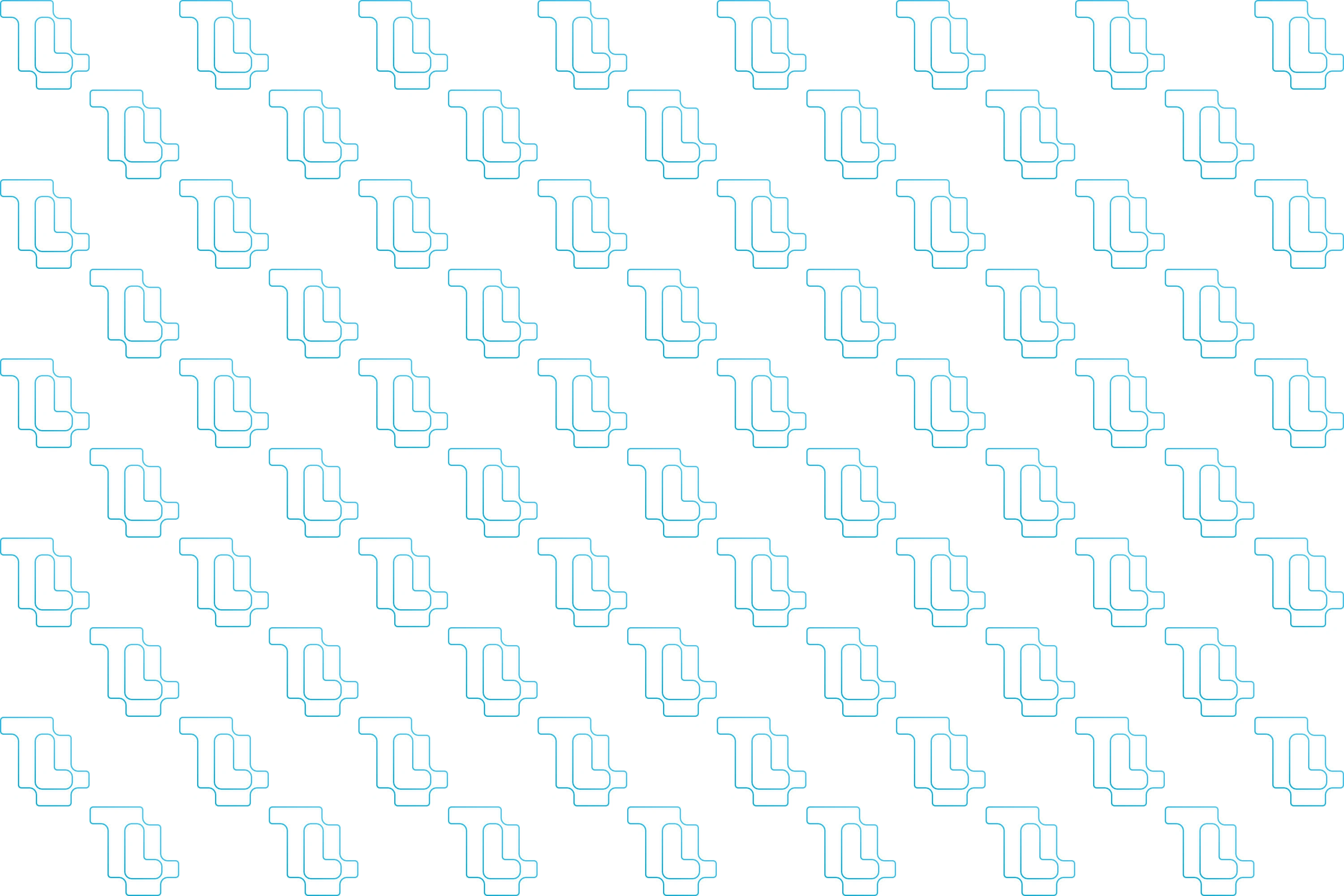
The colors are chosen based on the personality of the brand. As it is a brand that is related to the tech industry cool side of the color wheel is the best choice. So, we have chosen blue as the primary color of the brand. Blue is a color that evokes calmness, trust, stability, confidence and professionalism. That's why Blue can be a perfect fit for the brand. Also, it is important to have a pattern which can be used on different products or packaging. So, this simple pattern was created with the logo mark.
Stationery Design
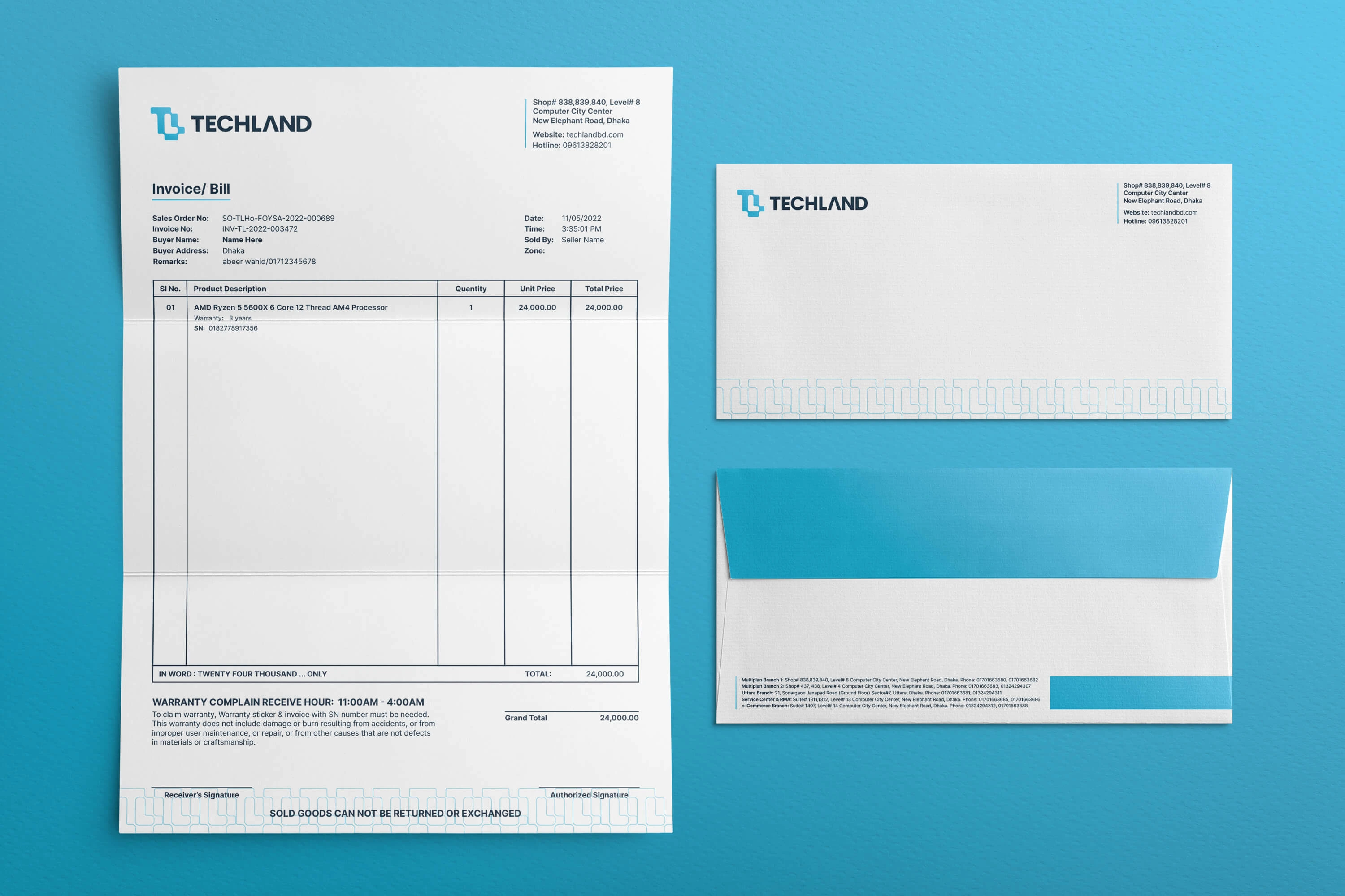
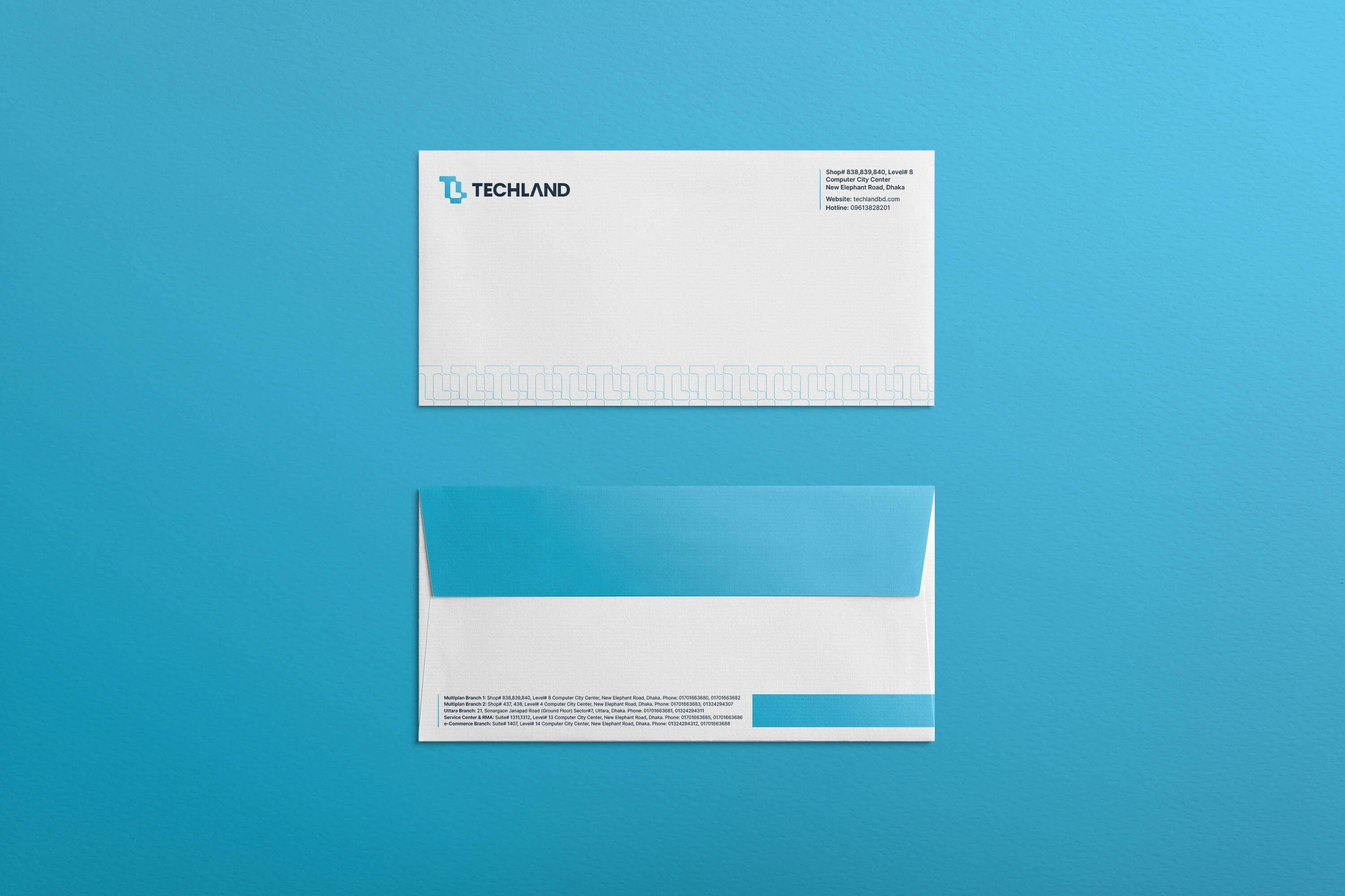
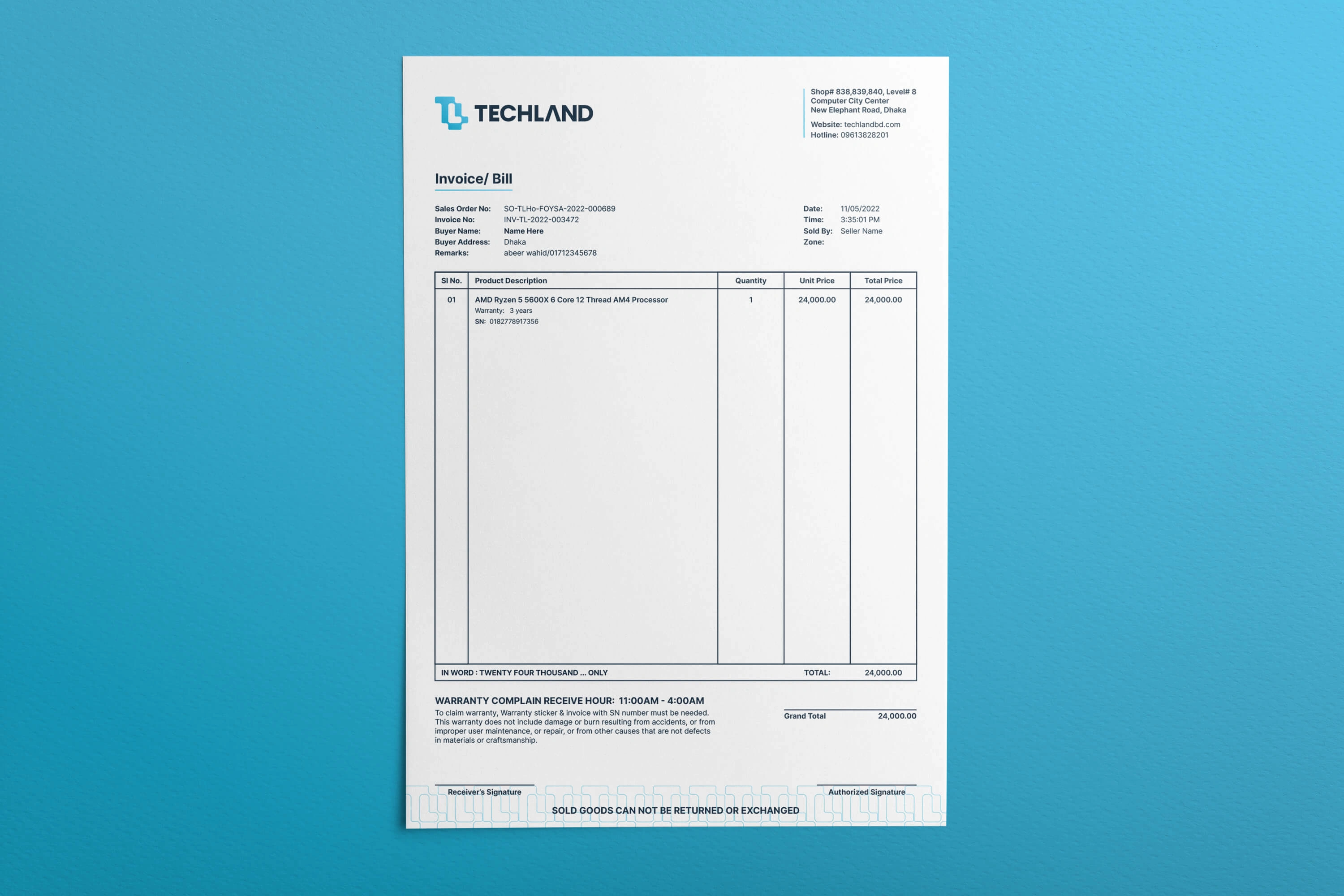
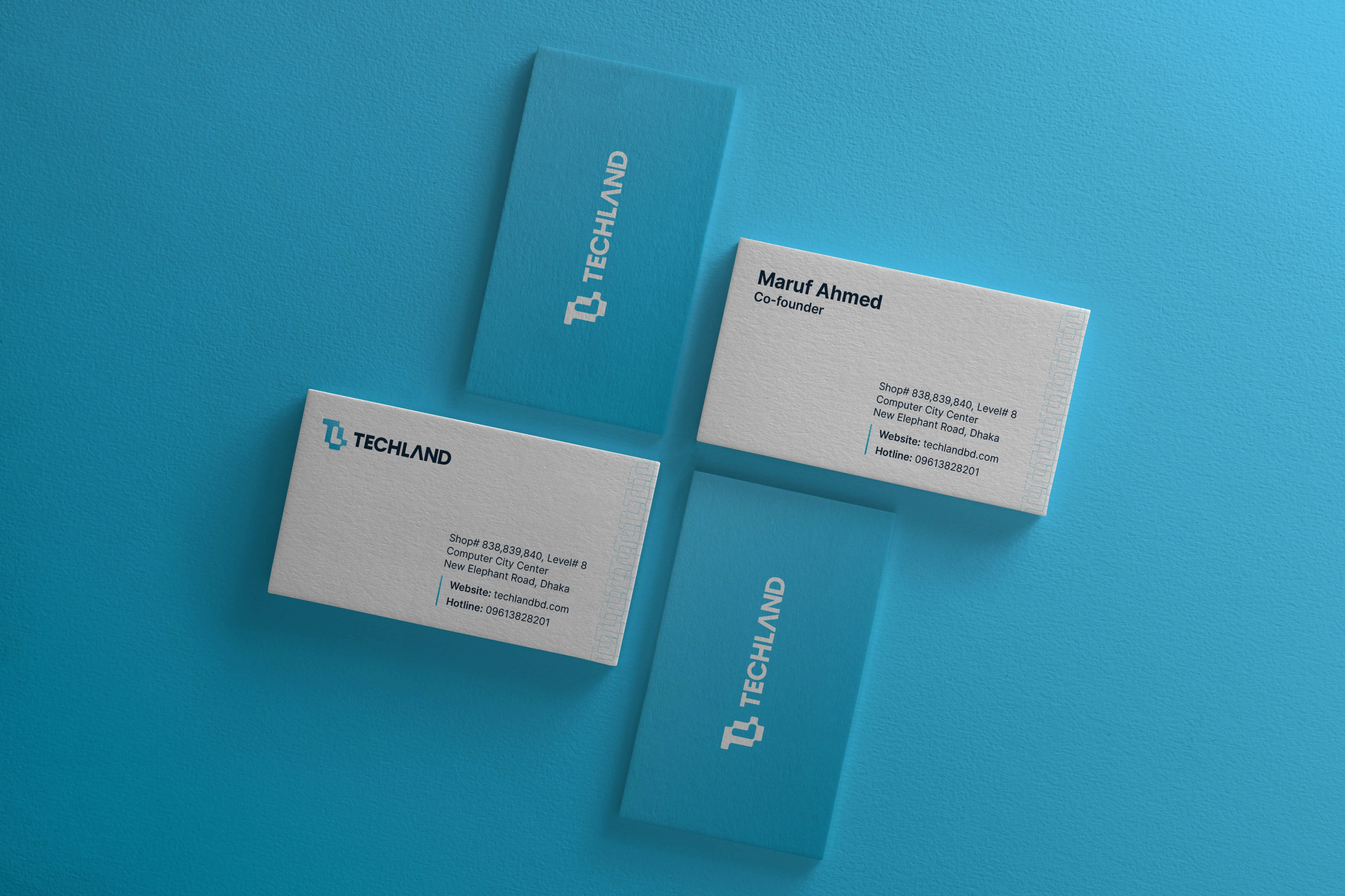
As a computer and tech service provider, it is necessary to have branded stationeries such as letterhead, invoices, envelopes, business cards, etc. So we have designed these stationeries with branded elements and colors to keep the consistency of the brand.
Website & Social Media
It is very important to show how the new logo and colors look on their website. As it was a personal project and not commissioned, it wasn't an easy or worthy task to redesign the whole website. So, we just implemented minor changes to the current website to show how it will look in different devices.
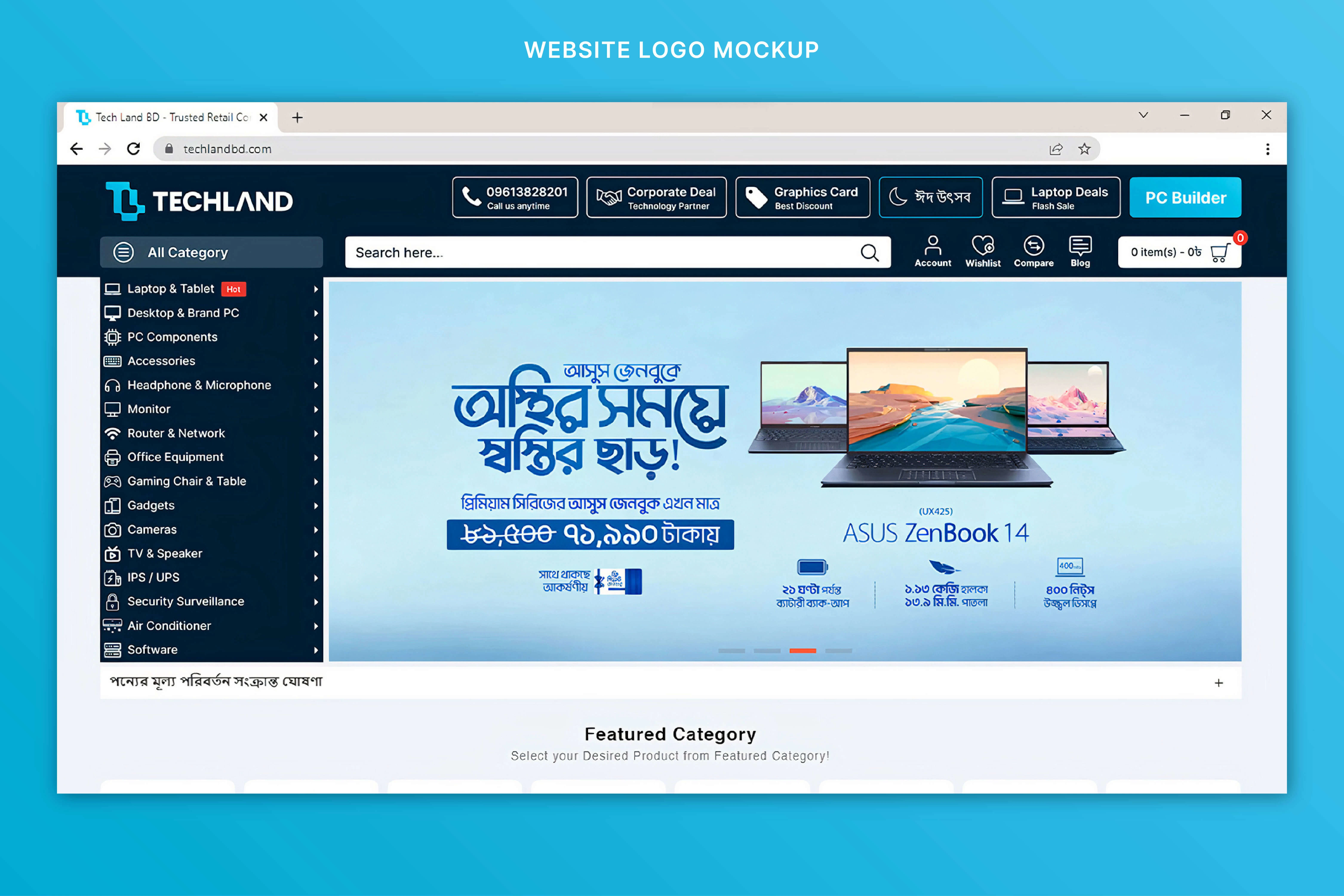
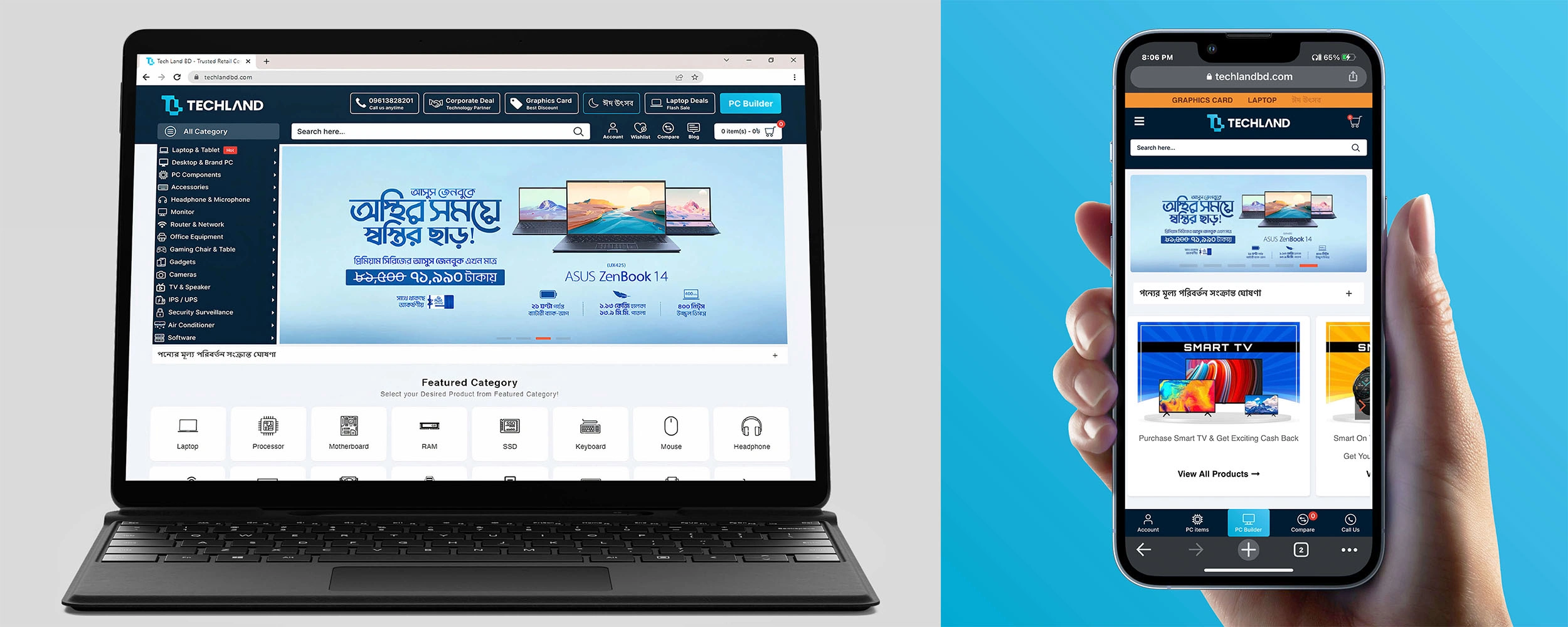
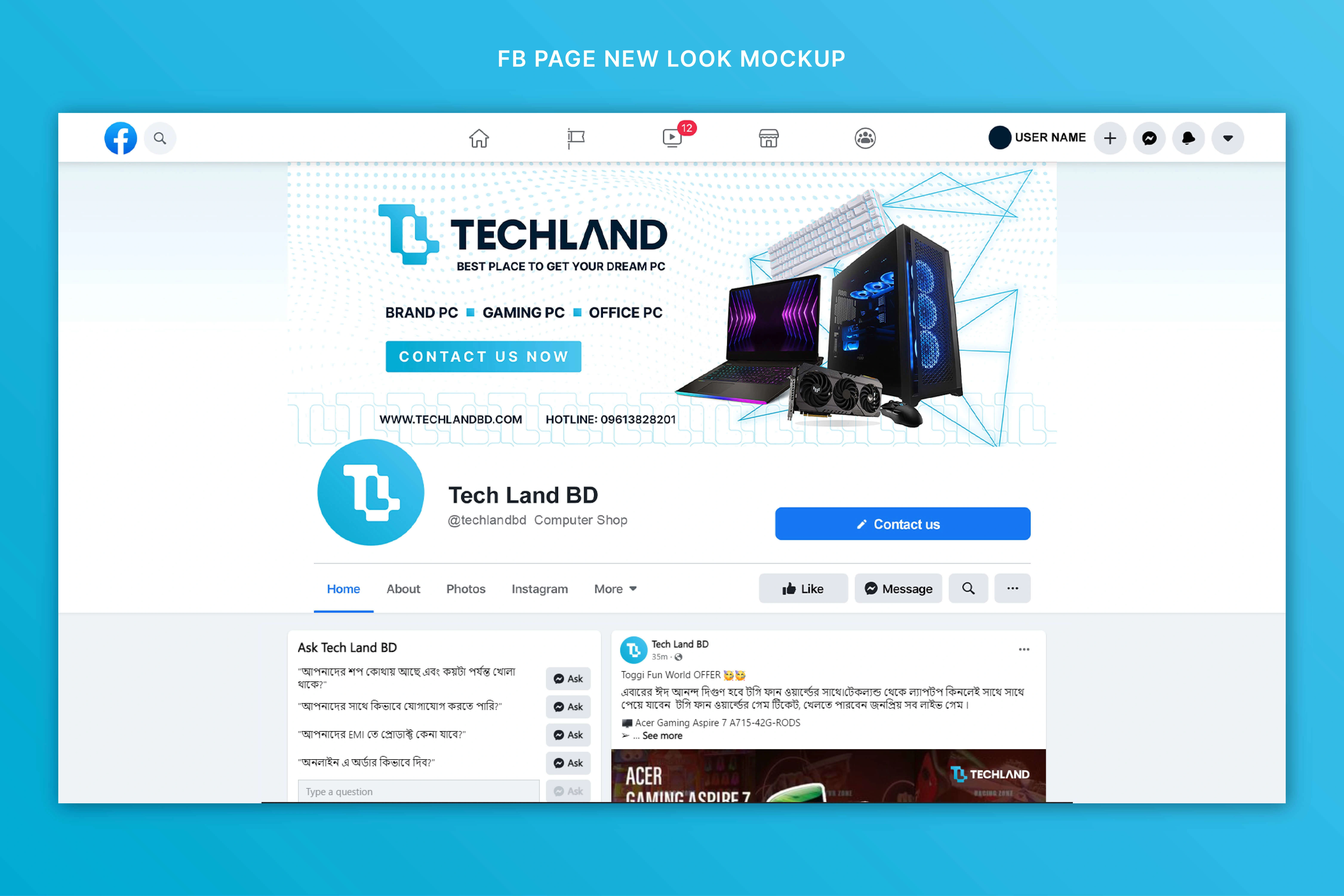
It is also important to keep the consistency on social media as well. So, we have also made social media cover art to show the impact of the new identity system.
Store Sign & Marketing
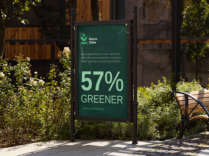
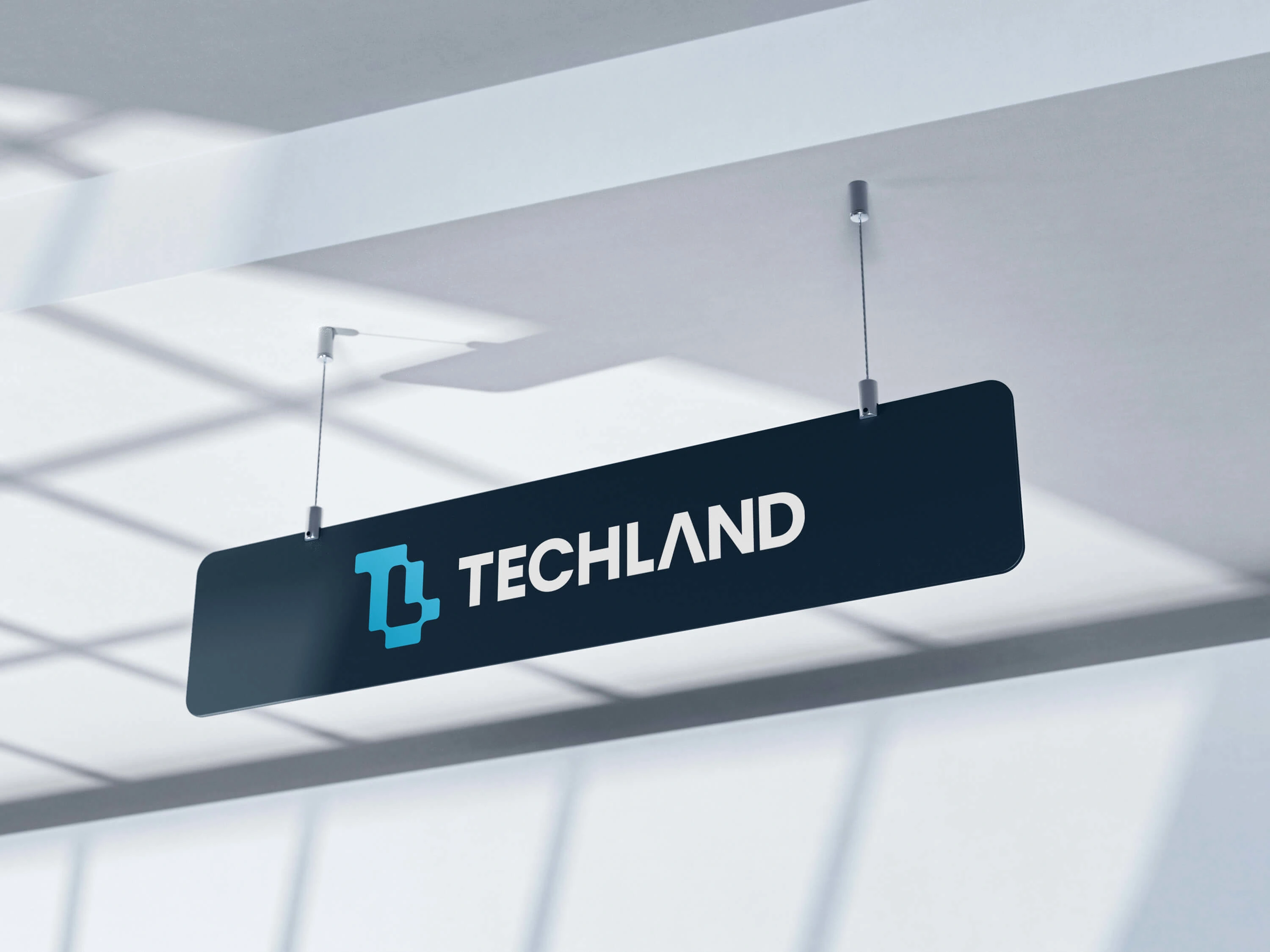
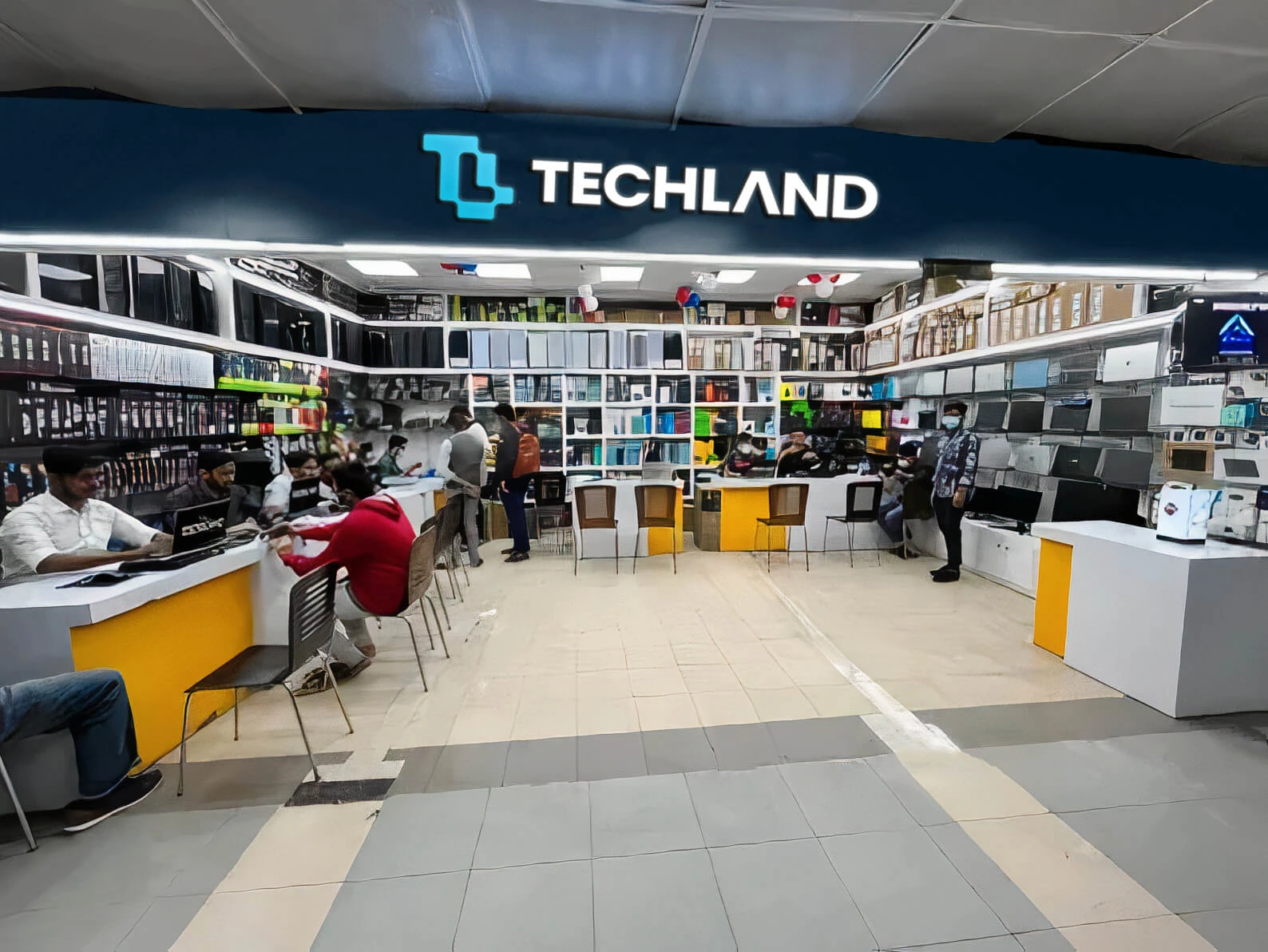
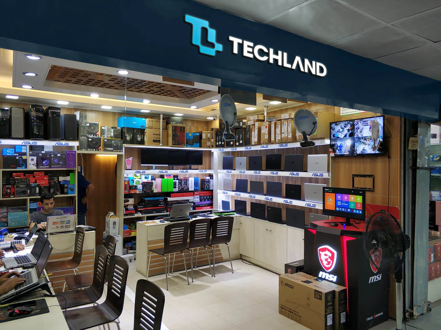
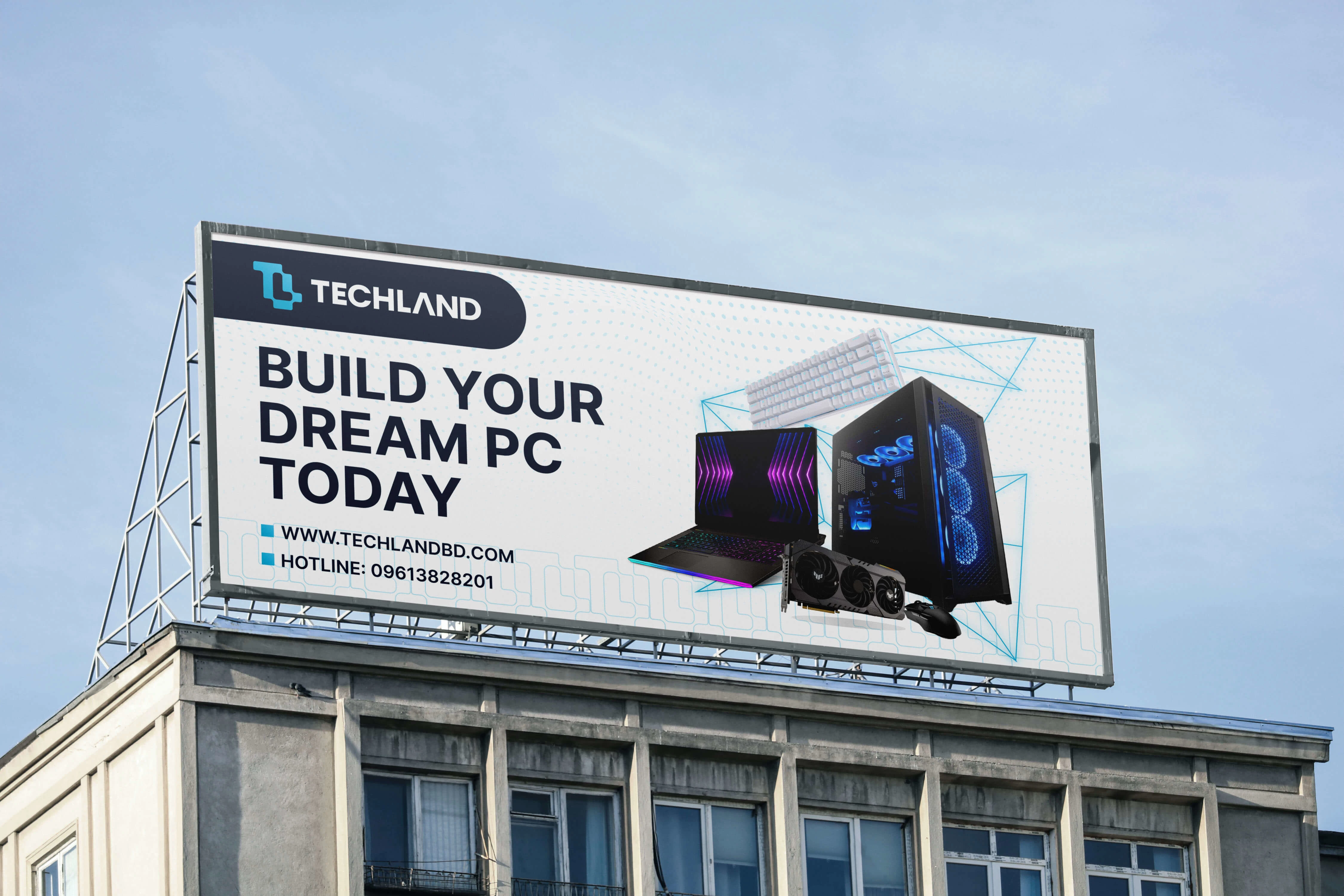
As they have physical stores it is a must to show how the logo would look in real life while used on their storefront. Here are some real-life mockups with their original stores to showcase the new logo. Also, it is important for a brand like this to market itself through billboards, that's why we also have a billboard mockup showing the real-life use case.
Branded Items
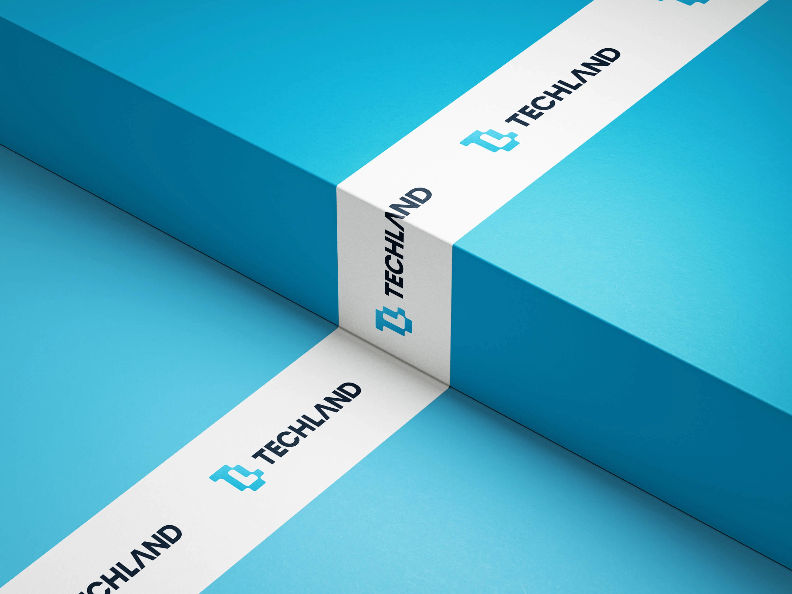
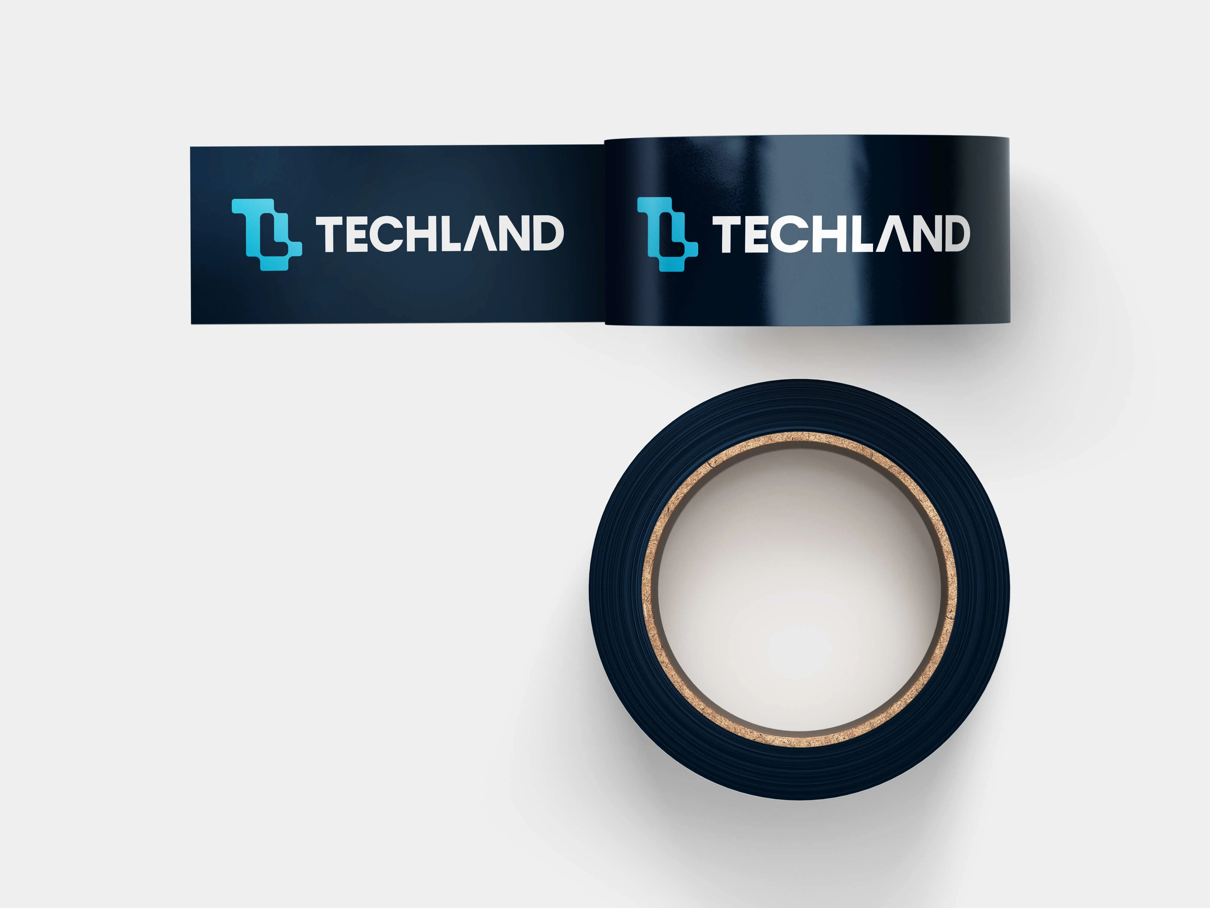
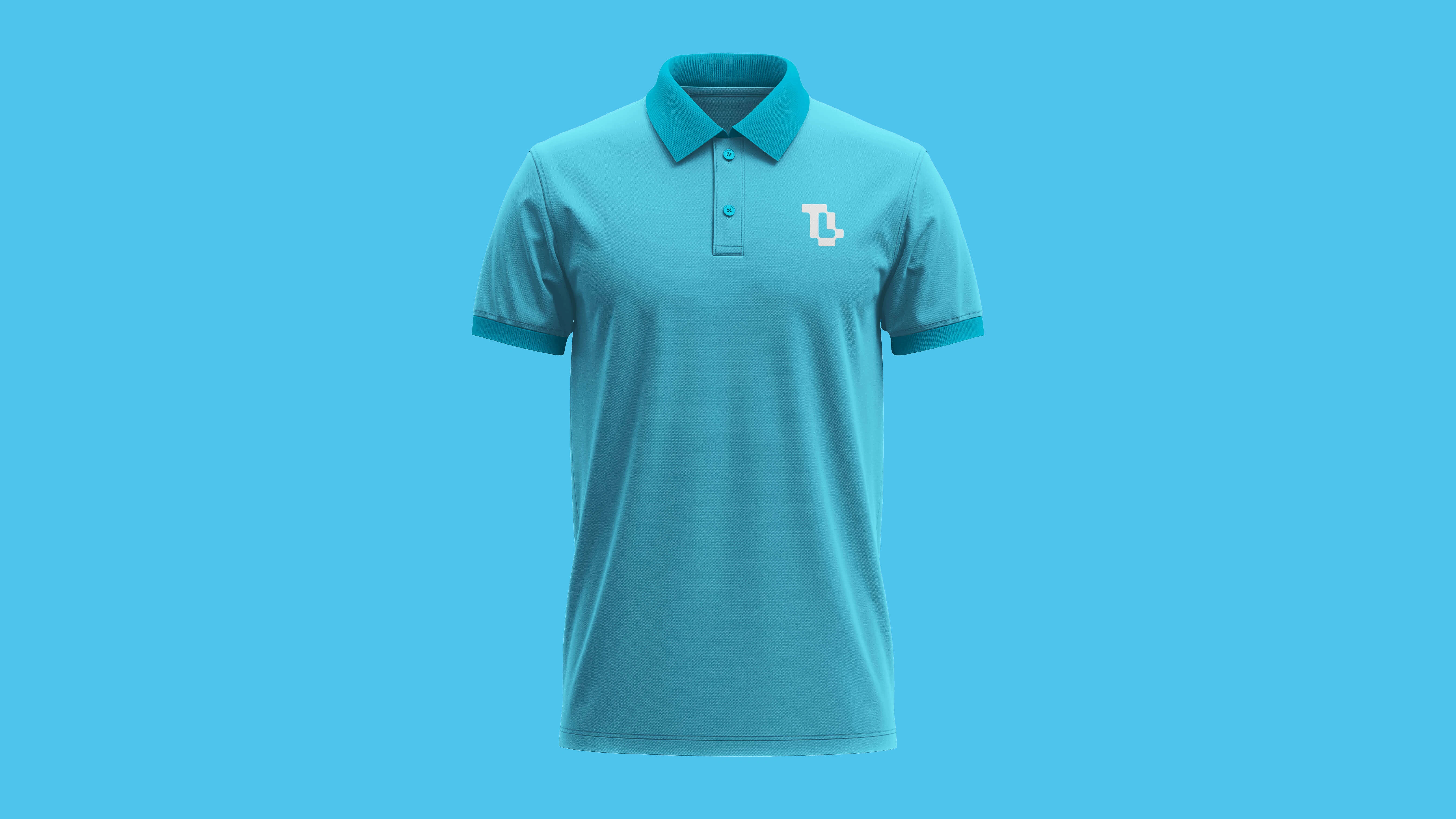
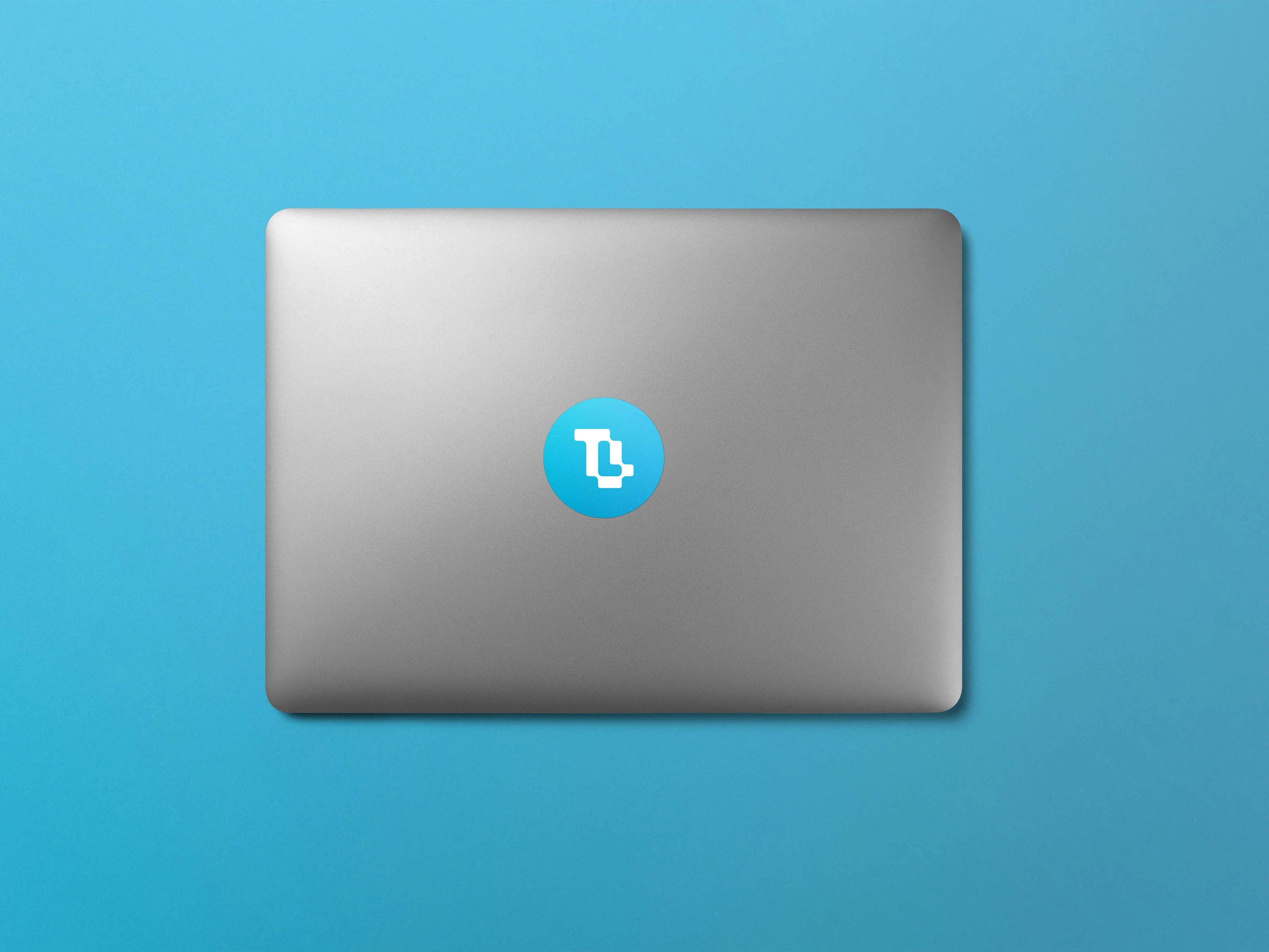
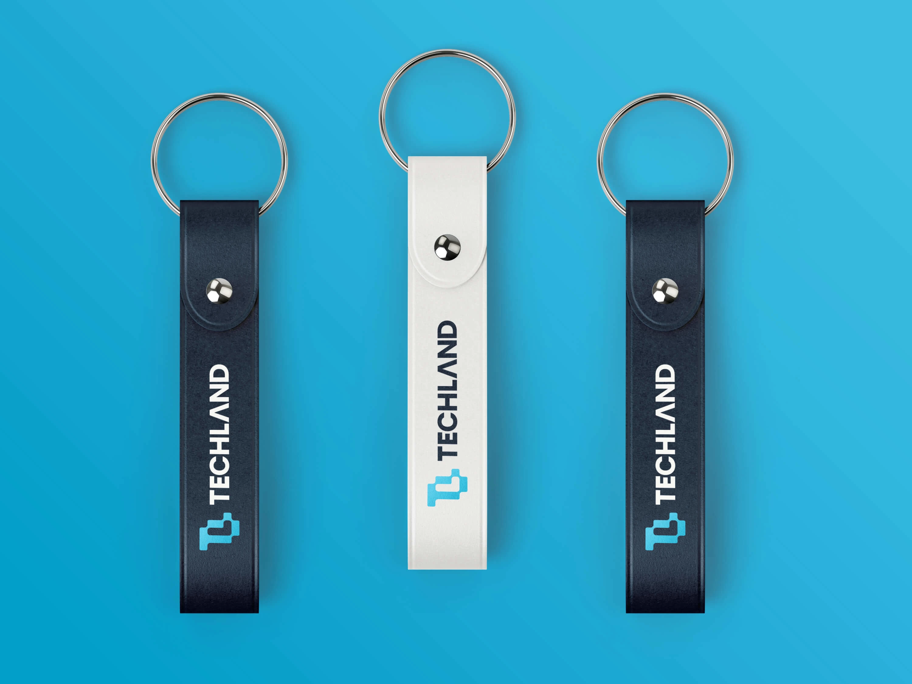
For a brand like this, it is important to make sure they use a consistent look even in the smallest items related to that brand. Here we have stickers, tapes, and t-shirts with their branded look to show how this rebranding can change the way it looks. Having branded items like this creates a perfect positive visual impact on the audience.
Project Completed: July 2022
Client: Proposed to Techland (They loved it but could not adapt because of some legal complexity)
Project Scope: Logo Redesign & Rebranding
Designer: Maruf Ahmed
Role: Logo Designer - Brand Identity Designer
Stay Connected - Dribbble | Instagram | Linkedin
Contact for your project - marufiam.01@gmail.com
Website - www.marufiam.com
Get mockups here: MockupCloud
THANK YOU
Marufiam.
Like this project
Posted Oct 11, 2025
Rebranding project for Techland, including logo redesign and brand identity update.
Likes
16
Views
14
Timeline
May 11, 2022 - Jul 29, 2022

