The Media Ant Redesign
Nandini arora
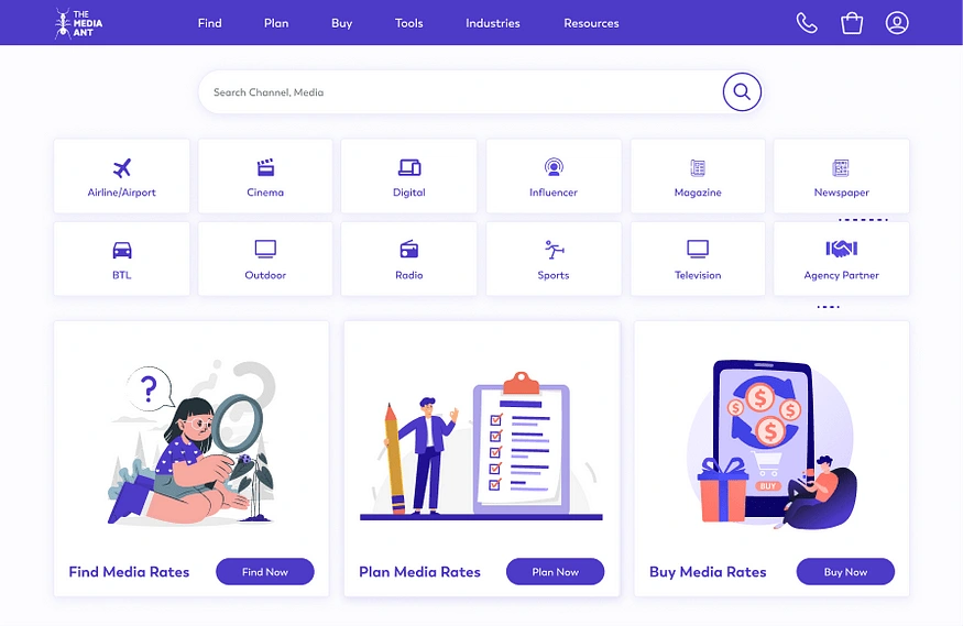
Homepage design showcasing a minimalist aesthetic, seamless navigation, and a bold search bar.
After much deliberation, I finally followed my heart and pursued product design. Since I made this decision, my conviction and belief in this path have only grown stronger. However, as my determination solidified, the path ahead became increasingly uncertain.
The greatest quality of a designer is the ability to empathize with their users, and I deeply value this trait in myself.
I decided to start looking for jobs, but self-doubt quickly eroded my confidence — and trust me, that gets you nowhere. Then, I came across a LinkedIn post by TMA seeking UI/UX designers. After facing multiple rejections, this felt like the one opportunity to prove my worth.
Task: Enhancing UI/UX of TMA Webapp
Role: UI/UX Designer
Context: The Media Ant is India’s largest marketplace for media discovery and advertising solutions. They bridge brands and advertisers with a diverse range of advertising options across platforms such as digital, print, radio, television, and outdoor.
Tools used: Figma, Freeform, Freepik.
Duration: < 3 weeks
Target Devices: Laptops and Tablets
Process: Design Thinking
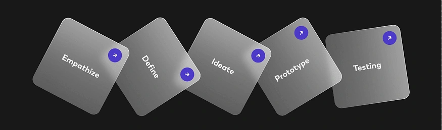
Design Thinking Process
Step 1: Empathize
My research began with a deep dive into understanding the problem statement, breaking it down into clear objectives. Before empathizing with others, it was essential to first empathize with myself — paying close attention to my thoughts and feelings while exploring the web app. At first glance, the web app resembled an e-commerce platform or a marketplace for advertisements, but its shortcomings became evident as I navigated through it.
This led me to conduct a self-heuristic analysis, where I identified every possible issue and proposed solutions for each. To ensure a structured approach, I categorized the issues based on urgency and priority. Recognizing that self-heuristic evaluations can be biased, I formulated hypotheses and validated them using quantitative data.
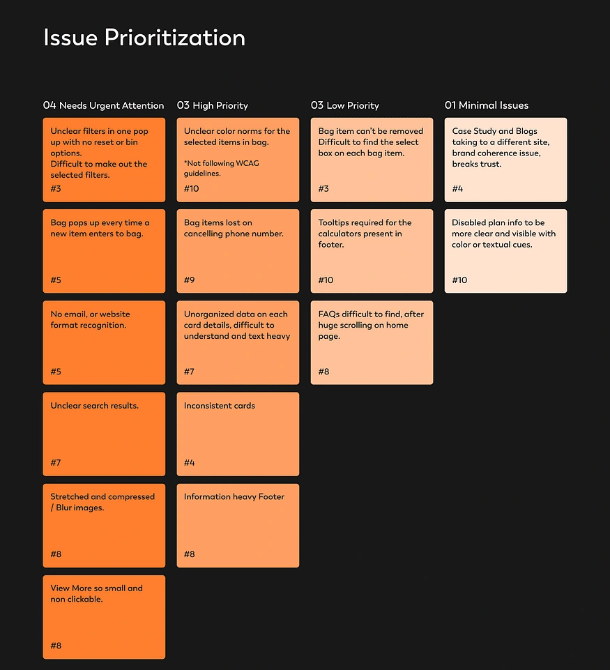
Collection of problems I detected while conducting self-heuristic analysis.
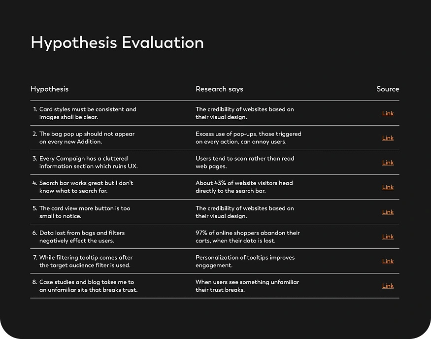
Quantitative proof for my hypotheses
No research is complete without understanding how users feel while interacting with a product. When it comes to redesigning, usability testing is one of the most effective ways to analyze problems. I reached out to users and designed tasks specifically for usability tests. These tasks were aligned with the objective of improving the current prioritized user journeys, as outlined in the assignment.
I conducted six usability test sessions, recording each one to ensure no subtle cues or insights were missed. I carefully reviewed the recordings and documented all observations. This process validated my hypotheses to a significant extent, giving me the confidence to move forward with the redesign.
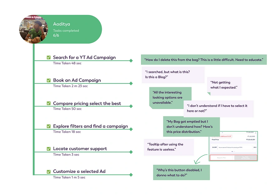
Usability Test Results with User Quates and status of task completion.
Step 2: Define
It was time to identify the key pain points and define the major redesigns needed to address them.
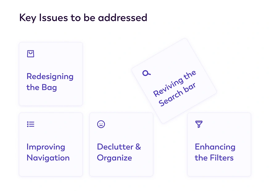
Key Issues stated
After finalizing the key issues to be addressed, I created a user journey map and site map to improve the current UI of the web app. This gave me a clear understanding of where users might encounter challenges. To ensure precision, I also analyzed the app against established UX laws and noted several violations:
Cognitive Load: Cluttered and disorganized text information overwhelmed users.
Hick’s Law: An excessive number of choices and unclear filters made decision-making difficult.
Jakob’s Law: The app employed unconventional pop-ups that deviated from standard e-commerce norms.
These insights, along with others, helped me identify critical areas for redesign and refinement.
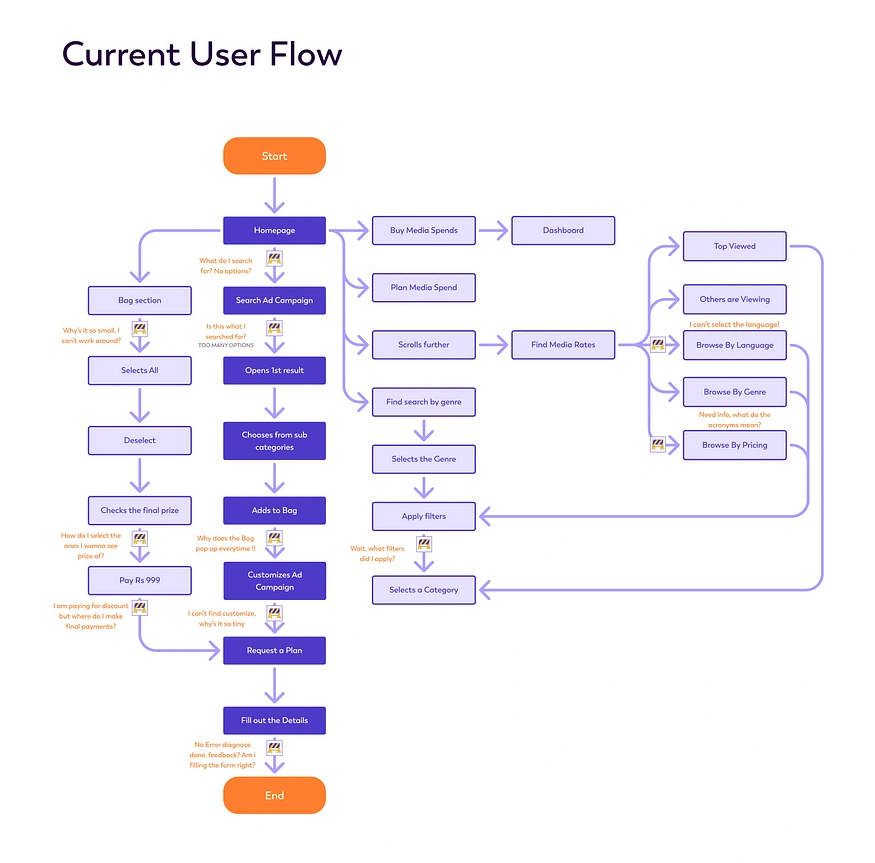
User flow journey with Roadblocks and causes.
Step 3: Ideate
After defining the issues, it was time for ideation, and for that, I turned to paper wireframes and sketches. Once the problems were clearly identified, sketching out potential solutions became much easier. When I was satisfied with my sketches, it was time to move on to wireframing. Mid-fidelity wireframes are the perfect way to visualize the final product without any visual elements, while still retaining the usability of a real product.
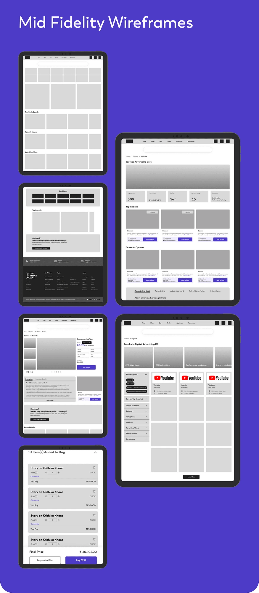
Mid Fidelity Wireframes
Step 4: Prototype
I created a visual style guide, choosing Boston as the primary typography and purple as the main color, complemented by various shades. I also defined the iconography, grid layout, and outlined the key components to ensure consistency throughout the design.
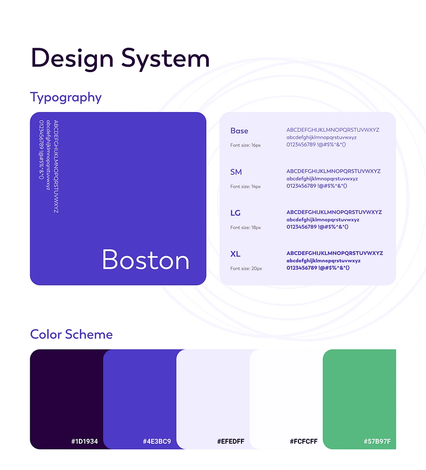
Style Guide
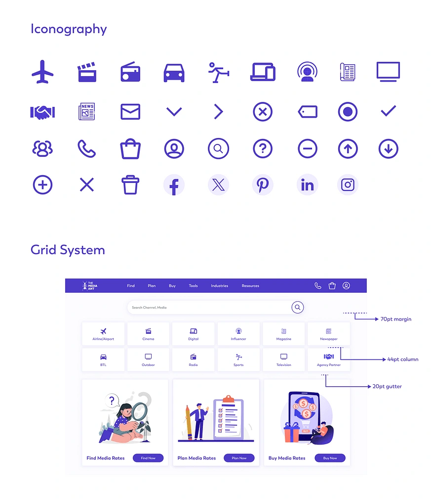
Iconography and important components.
After defining the style guide, I made sure to explain the rationale behind each proposed change. Every design decision must have a purpose, and as a designer, it’s crucial to answer the “why” behind each choice to ensure the design is purposeful and user-centric.
Search Bar
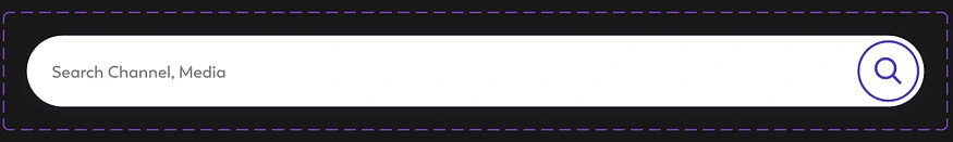
Search bar
I planned redesigning the search bar after observing that it is the most frequently used feature for users searching for Ad campaigns.
First, I positioned the search bar at the center of the page, inspired by the familiar and intuitive design pattern seen in Google’s search interface. This placement aligns with user expectations, making it the natural starting point for interactions.
Additionally, I increased the size of the search bar to establish it as the primary focal point on the website. This adjustment ensures that users can easily locate it and reinforces its importance as the gateway to the platform’s core functionality.
2. Filters
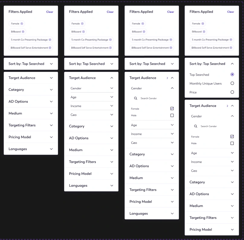
Filters
I decided to completely redesign the filters due to several usability issues in the previous design:
Difficulty identifying applied filters: Users often struggled to see which filters they had already applied.
Effort required to apply filters: Finding the filters and then clicking an “Apply” button added unnecessary steps, making the process more tedious — users often forgot to apply their selections.
Confusion with all filters in one pop-up: A single pop-up displaying all filters felt overwhelming and disorganized.
Lack of familiarity: Most e-commerce websites position filters on the left, which users are accustomed to and find intuitive.
To address these issues, I divided the filters into three sections: Filters Applied, Sort By, and Filter Categories, which open as dropdown menus for easy navigation. I kept the search bar intact to make filters easily discoverable.
For clarity, any applied filters now appear at the top with a clear “X” to remove them and an option to reset all with one click. This design ensures a smoother, more intuitive filtering experience for users.
3. Navbar

Navbar
I redesigned the navbar to ensure all key elements are directly accessible without requiring additional clicks, aligning with Steve Jobs’ principle that important actions on a website should take no more than three clicks.
To enhance usability, I introduced hover-triggered dropdown menus for each nav-item, providing users with an intuitive and efficient way to access sub-options.
Additionally, I moved essential tools like the calculator and AI tools from the footer to the navbar, making them more visible and accessible with minimal effort.
The “Resources” section is now organized into Case Studies and Blogs, making it easier for users to find the specific content they’re looking for.
Lastly, the “Buy” section now includes direct access to the dashboard and profile, ensuring that navigation aligns logically with user expectations for purchasing-related actions.
4. Footer
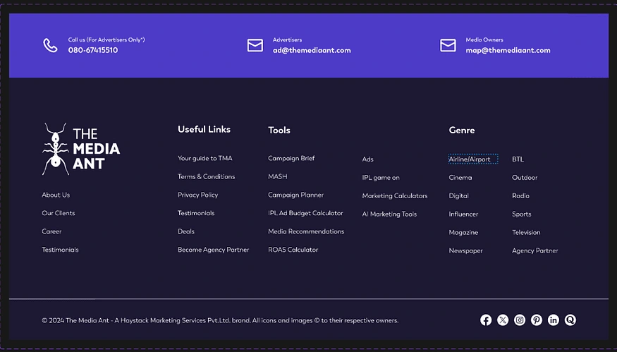
Footer
The redesigned footer is more streamlined and less cluttered, creating a cleaner and more user-friendly experience. Key elements that were removed from the footer have been thoughtfully relocated to more suitable sections:
Popular in… elements have been moved to their respective categories, making it easier for users to discover popular items within the relevant context.
Tools have been shifted to the navbar for greater visibility and quicker access.
Social media links are also readjusted.
5. Bag
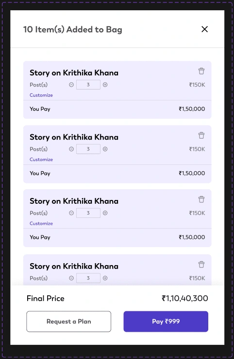
Bag section
The bag has been simplified and optimized to provide users with more space for comparing their selected options.
A delete icon has been added, enabling users to effortlessly remove items from the bag. Additionally, the select option has been removed to eliminate any potential confusion, ensuring a more straightforward and user-friendly experience.
And finally after all this, here is the redesigned UI.
Here’s what I learned:
Every user brings a unique perspective and reason for using a product, but a web app can’t be customized to accommodate every possible change. Every design will have a certain level of complexity, beyond which it cannot be simplified. This is where mental models come into play. Users bring inherent cognitive biases, and if research is conducted well with these biases in mind, the friction of using the platform can be significantly reduced.
Throughout this project, I continuously referenced The Design of Everyday Things by Don Norman. It helped me understand my users better, particularly how knowledge works, how our knowledge of the world influences self-knowledge, and why users panic when a product fails. It also taught me how system feedback can alleviate these issues. I delved into concepts like Signifiers, Affordances, and Mapping.
A key realization was that users often blame themselves when they struggle with a product, but as designers, we must take responsibility. It’s never the user’s fault; we, as designers, are responsible for creating intuitive and seamless experiences. Our role is to simplify life for others, and it’s a cause I hold dear.
Made with ❤ by Nandini Arora.
You can also check out the full case study on Behance. Don’t forget to leave your thoughts!
Like this project
Posted Jan 21, 2025
I redesigned The Media Ant web app, a marketplace for Ad buyers, using design thinking principles. I created prototypes, mock-ups, and wireframes in Figma.