Built with Framer
House Zara Premium Fashion Framer Landing Page
kenechukwu Eneh
🖤 HouseZara — Premium Fashion Landing Page Website
Role: Web designer / Framer developer
Tools: Framer, Figma
Duration: 1 Week
Type: Personal Concept Project
Overview:
HouseZara is a premium clothing brand website that combines editorial minimalism with right sales copy leading to a conversion-driven solution.
The project was built to explore how luxury brands can maintain aesthetic sophistication while guiding users toward clear actions — from discovery to purchase.
Situation:
Luxury fashion brands often face a challenge online:
they either emphasize high-end visuals at the cost of usability or rely on generic eCommerce templates that dilute their brand identity.
The goal for this project was to design and build a landing page that:
Embodies timeless minimalism.
Feels premium and editorial, like Jacquemus or The Row.
Still functions as a conversion-focused experience optimized for sales and engagement.
Task:
As the sole designer, I set out to:
Define a luxury-minimal brand direction for House Zara.
Design a responsive, conversion-optimized landing page.
Build and launch the site entirely in Framer.
Ensure visual consistency across sections, typography, and color usage.
Action:
I - Research & Insights
I began with competitive analysis of minimalist fashion brands like Acne Studios and The Row.
Findings:
Whitespace communicates sophistication.
Typography and imagery must carry brand tone.
Conversion cues should be subtle yet clear.
II - Brand Identity & Palette
Developed a minimal, warm palette inspired by modern fashion editorials:
Primary: Pure Black
#000000Secondary: Off-White
#F9F9F9Accent: Warm Beige
#D8C3A5
This created a balanced contrast that feels high-end and tactile.Typography was kept refined and minimal, echoing luxury lifestyle magazines.
III - Copywriting & Content Strategy
I wrote concise, emotionally resonant copy to connect brand voice and design.
Hero Section Example:
“Wear Less. Mean More.”
Simple, bold, and memorable — the statement sets tone and intent.
Each section was purpose-driven:
New Arrivals: Conversion-focused.
Philosophy: Brand storytelling and trust building.
Lookbook: Lifestyle imagery for engagement.
Community: Authentic user connection.
Newsletter: Conversion and retention.
IV - Design & Prototyping
Built and animated in Framer, emphasizing:
Clean grid layout with generous spacing.
Responsive design from desktop to mobile.
Soft hover transitions for a premium tactile feel.
Vertical stacking of CTAs for mobile clarity.
Horizontal scroll transition effect on the hero section with subtle animated effects to keep the interface engaging and user experience seamless
V - Testing & Refinement
Tested responsiveness and readability across multiple viewports.
Refined padding, hierarchy, and alignment to ensure consistent brand perception on all devices.
Selected screens:
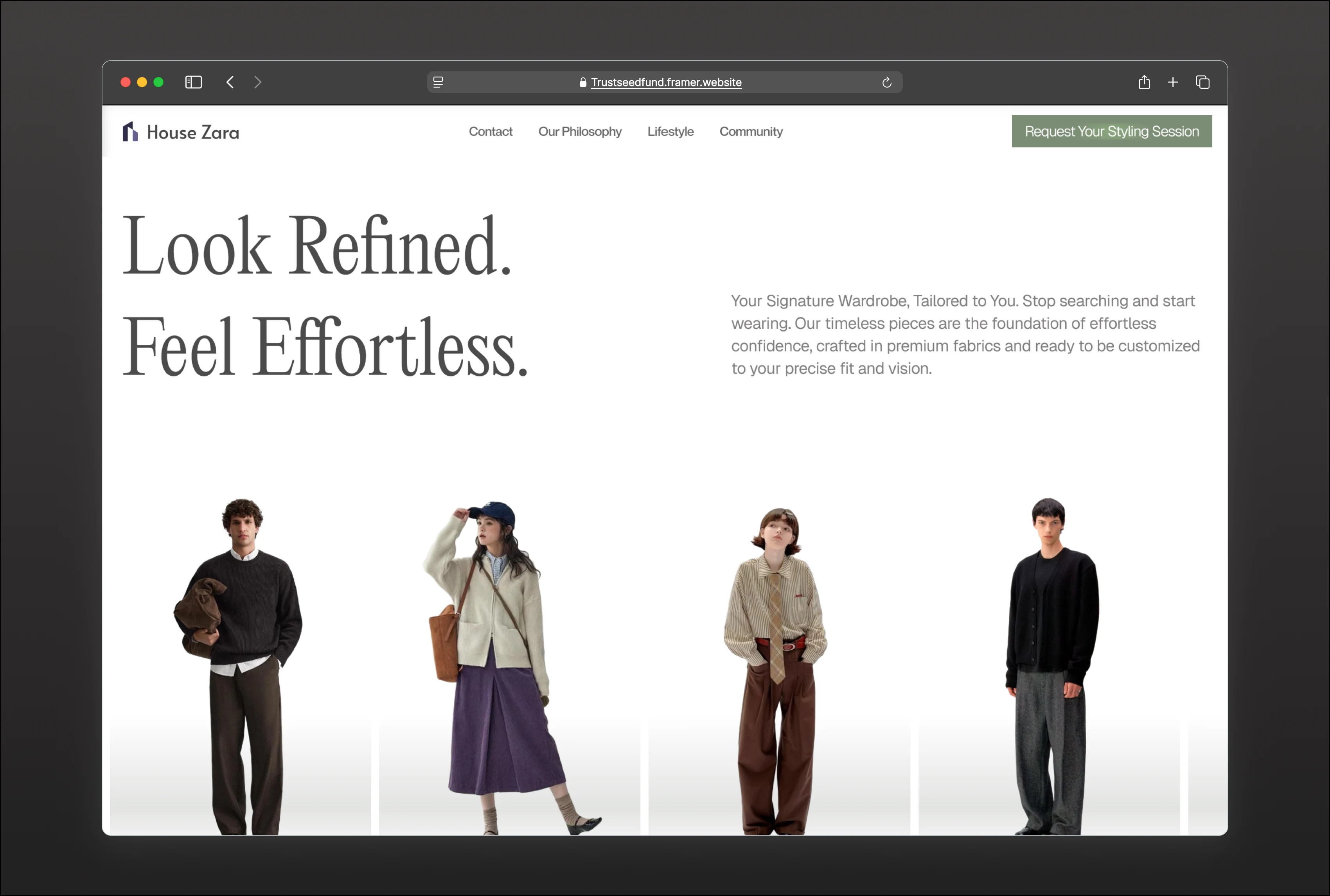
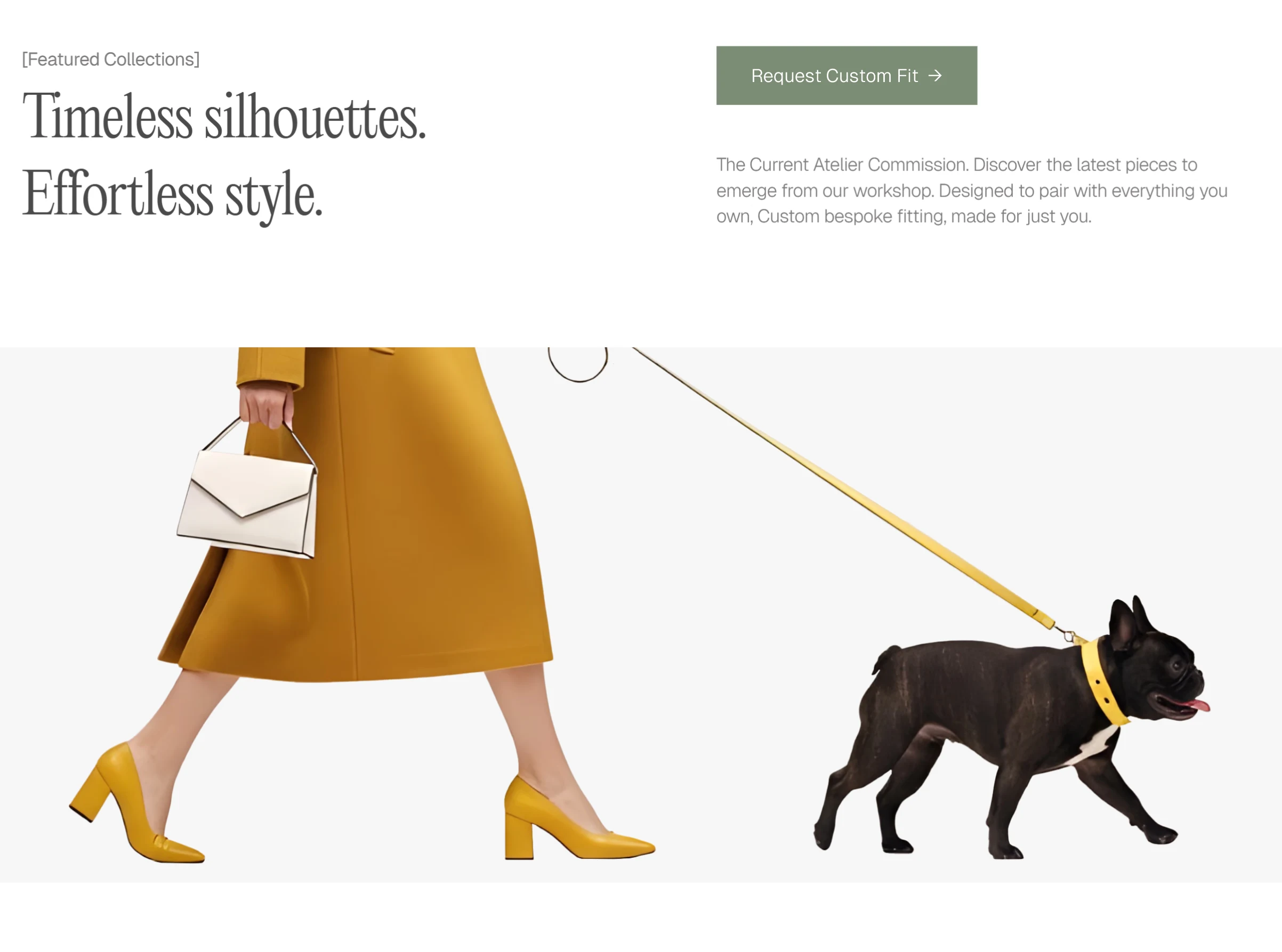
Hero Section — First Impression, Lasting Impact
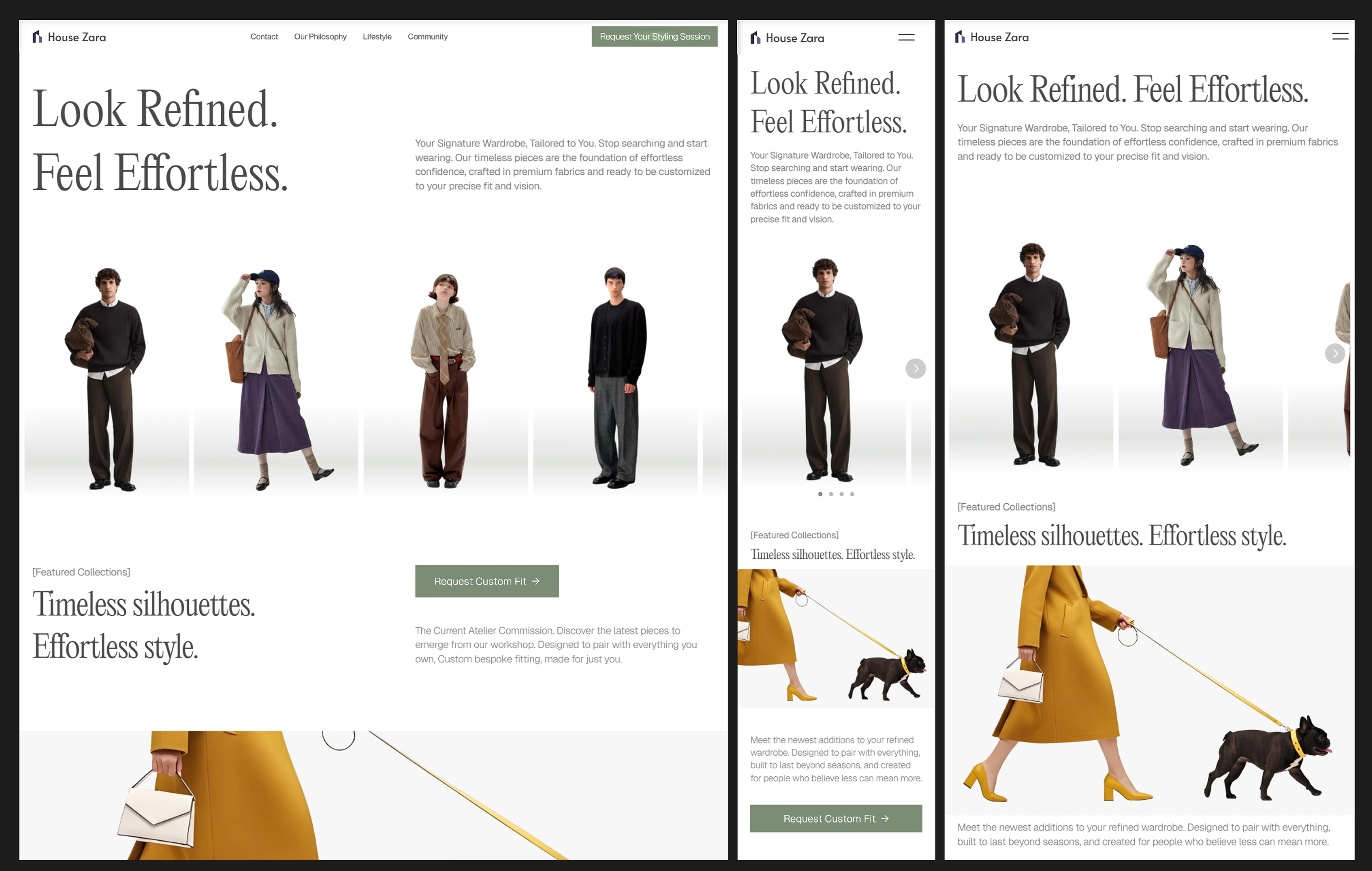
RESPONSIVE HERO AND FEATURED SECTION
The hero section establishes House Zara’s minimalist-luxury identity through a full-screen editorial image paired with the statement “Look Refined. Feel Effortless.” — a line that captures the brand’s essence of refined simplicity.
A horizontal scroll transition (ticker) introduces gentle motion, enhanced by subtle animated effects that keep the interface visually engaging without distraction. On hover, the slider slows down and a soft glow effect highlights the featured product, allowing users to appreciate details more intimately. When the cursor leaves, the movement resumes its calm, continuous flow.
The primary call-to-action in the navigation bar features a shimmer effect, designed to subtly draw attention and encourage interaction without breaking the clean, premium aesthetic. Together, these interactions create a smooth, immersive first impression that feels elegant, modern, and thoughtfully crafted.
New Arrivals — Drive Purchases
RESPONSIVE FEATURED SECTION
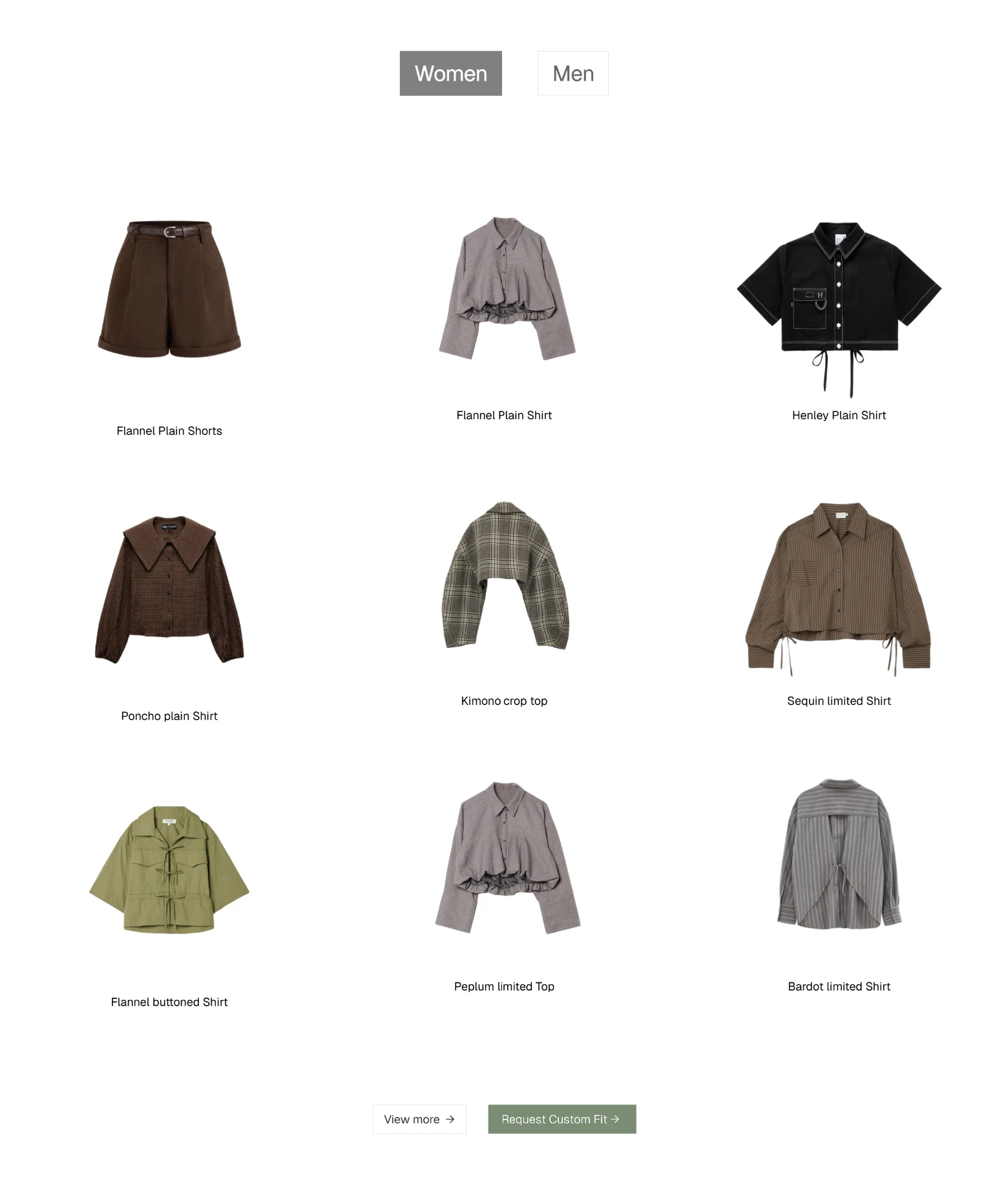
RESPONSIVE PRODUCT SECTION
Designed to highlight the latest collection with strong product visuals and a clear CTA.
Focused on simplicity and hierarchy ensuring the products remain the hero while encouraging immediate action through a conversion optimized “Explore timeless style→” button.
Our Philosophy — Build Trust
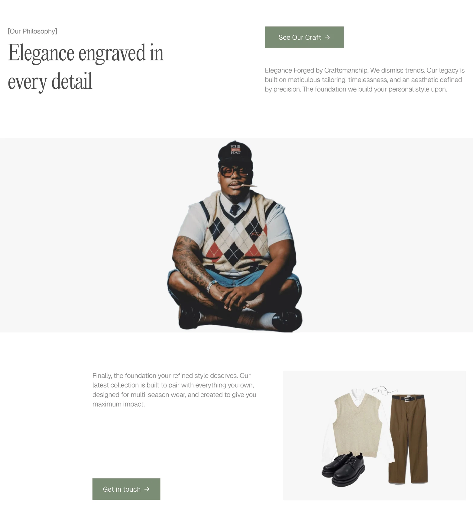
RESPONSIVE OUR PHILOSOPHY SECTION
Communicates brand values and craftsmanship through balanced copy and imagery.
The asymmetrical layout and calm tone reinforce authenticity, helping users connect emotionally with the brand beyond products.
Lifestyle — Inspire Lifestyle Appeal
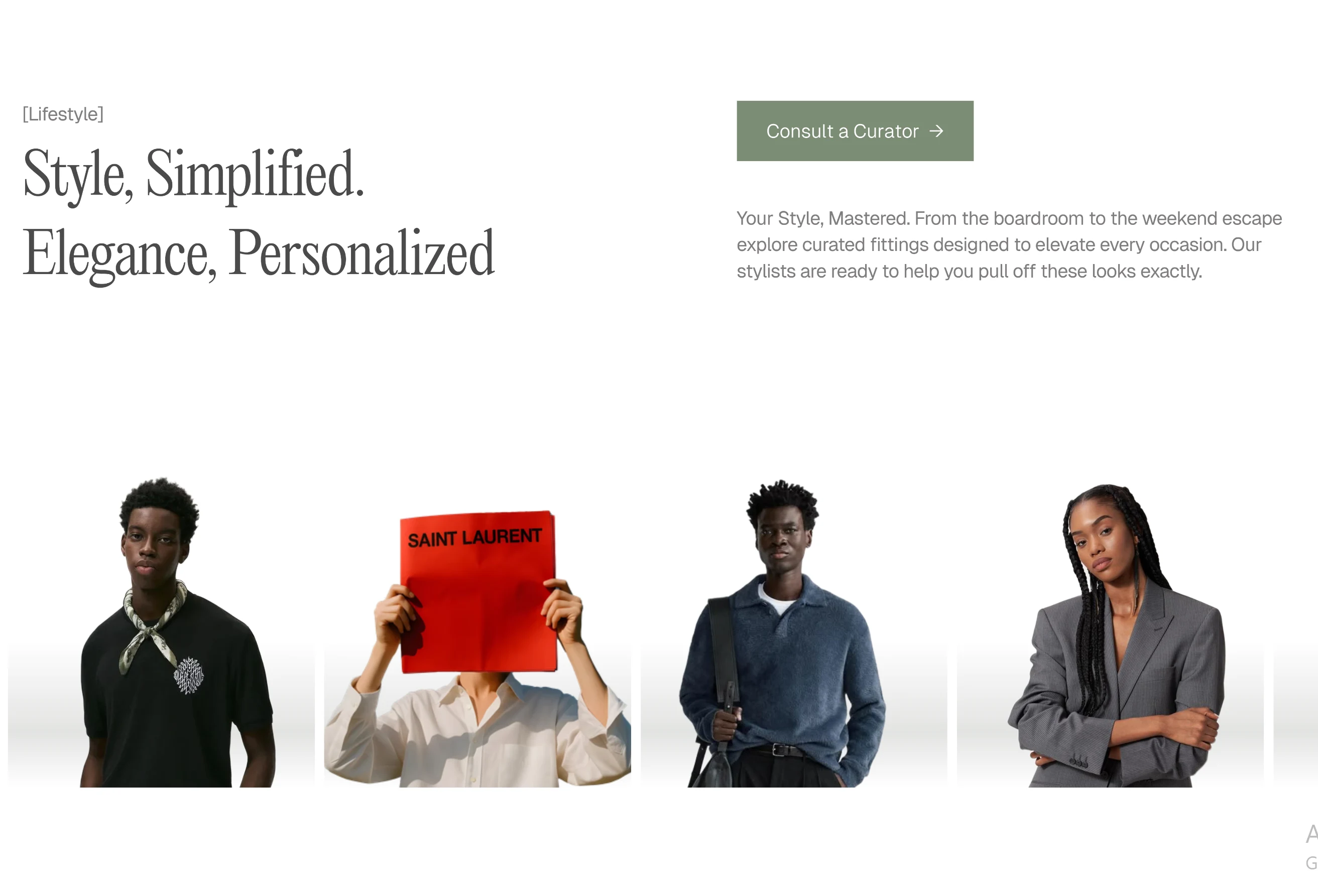
RESPONSIVE OUR LIFESTYLE SECTION
Showcases curated outfits and editorial photography to help users visualize the brand in real-life moments.
Encourages exploration and inspiration, positioning the brand as both aspirational and relatable.
Community — Encourage Engagement
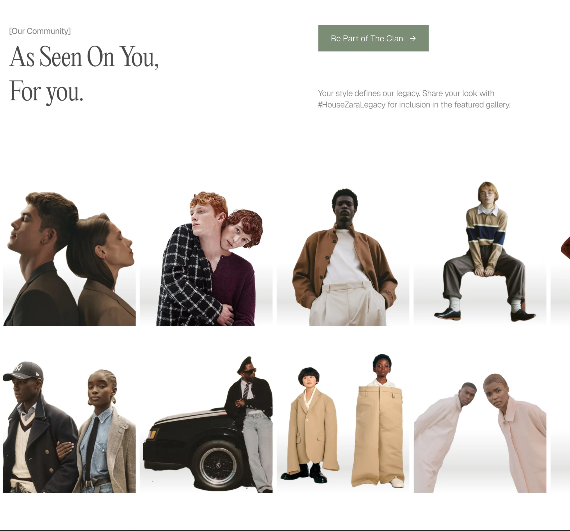
RESPONSIVE OUR COMMUNITY SECTION
Features user-generated content with the tagline “As Seen On You, For you”.
Builds social proof and fosters inclusion, turning real customers into brand advocates through #YourBrandName features, A CTA reading “Be part of the clan” taps into the innate human desire to belong—to be part of a tribe or community that understands them.
Newsletter — Capture Leads
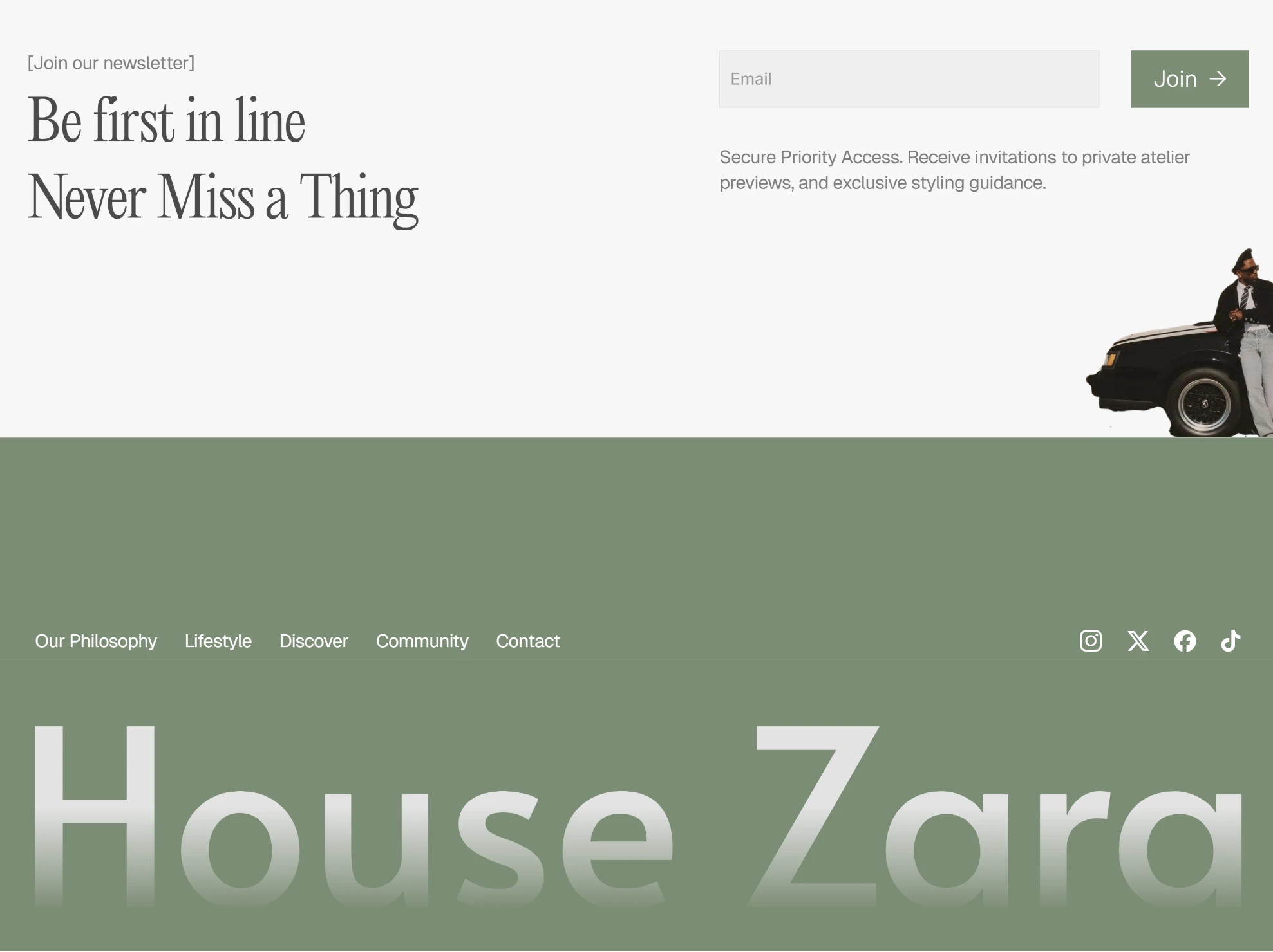
RESPONSIVE FOOTER SECTION
Clean off-white block designed for focus and conversion.
Short, persuasive copy (“Be First In Line”) and a single black CTA button guide users to subscribe effortlessly, reinforcing exclusivity and anticipation.
WEBSITE LINK: https://housezara.framer.website/
Like this project
Posted Oct 16, 2025
Premium Luxury fashion landing page designed in Figma and developed in Framer, built to convert with 100% SEO, 92% accessibility, and 100% best-practice scores.
Likes
1
Views
18
Timeline
Oct 6, 2025 - Oct 13, 2025