Brand Refresh for Aaqua
Aaqua Visual Identity Refresh
Aaqua is a new social media experience built around people, purpose and passions, aiming to unite a community of members, creators and brands.
While in stealth mode, my role involved leading and working alongside a team of visual designers through the creative strategy and execution of the global rebrand. The new visual identity we created was tested and validated by a team of 200 global employees prior to implementation.
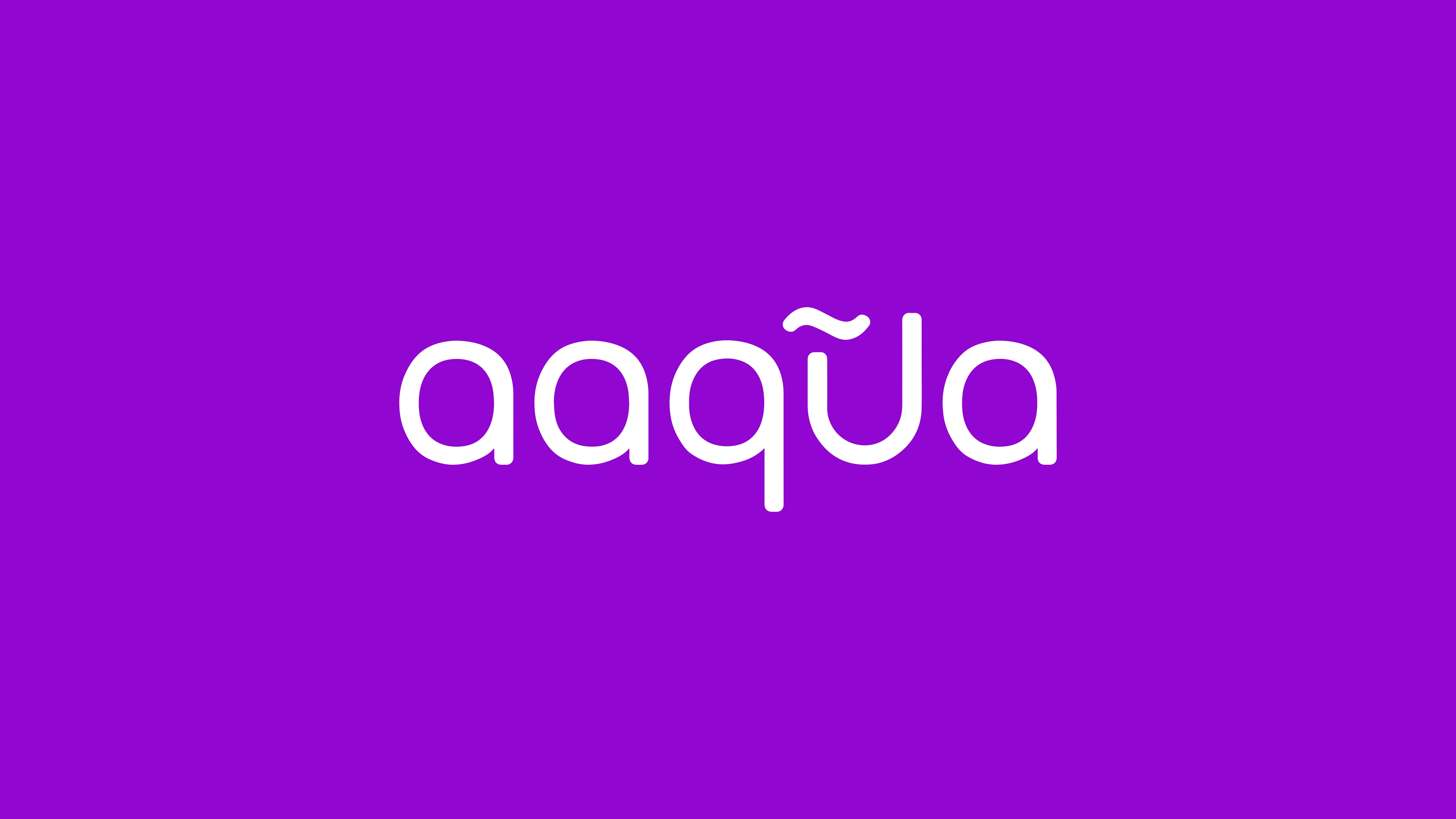
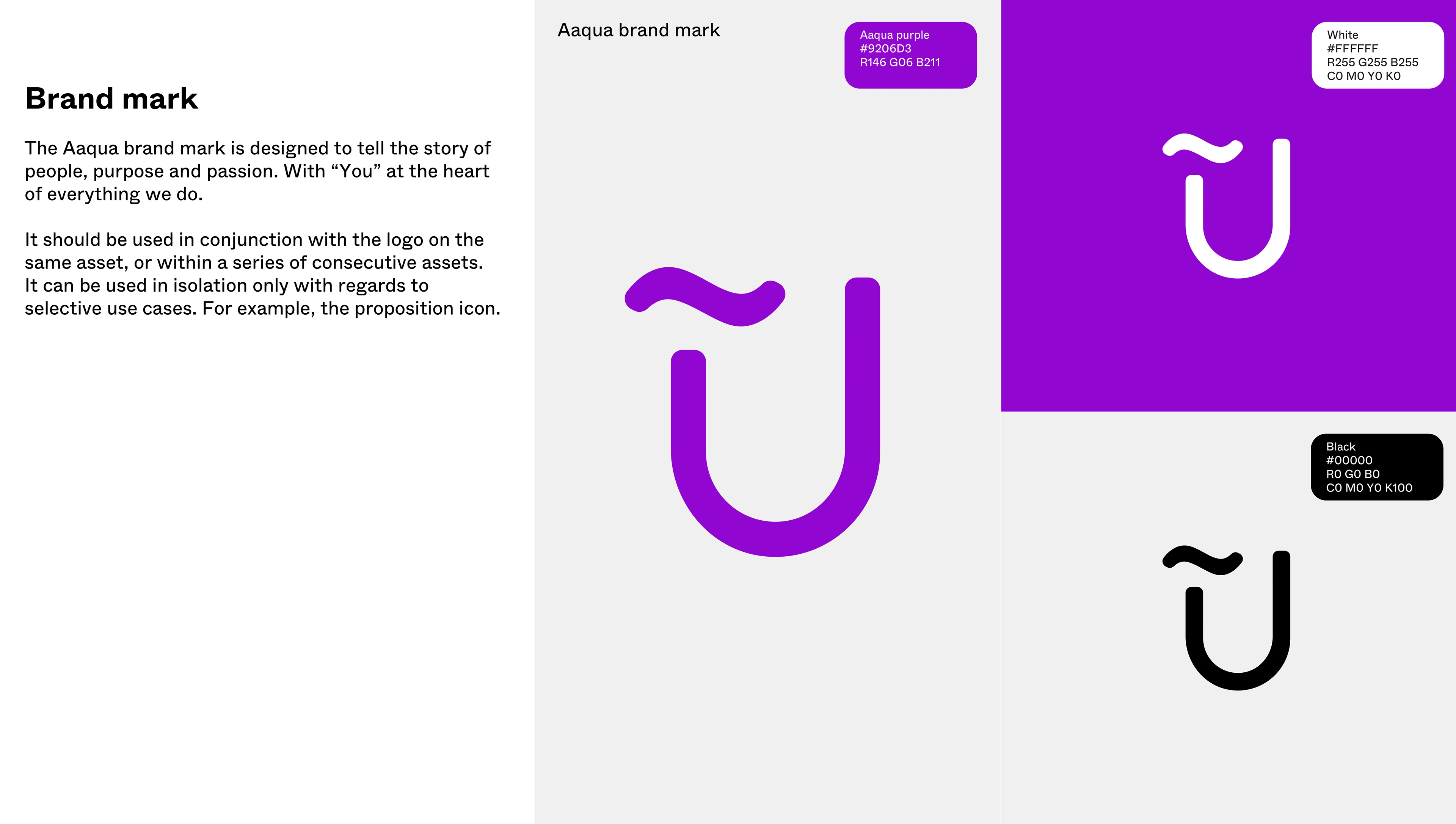
The logo needed to reflect the ideology the product is built on - you are at the heart of all experiences at Aaqua. This idea is communicated through the redesign using the letter “U” as the focal point of the logo. The tilde symbol (~) is used to represent the multitude of communities within the app. The "U" and "~" come together to form a key component of Aaqua's logo, symbolizing the symbiotic relationship between an individual and their communities.
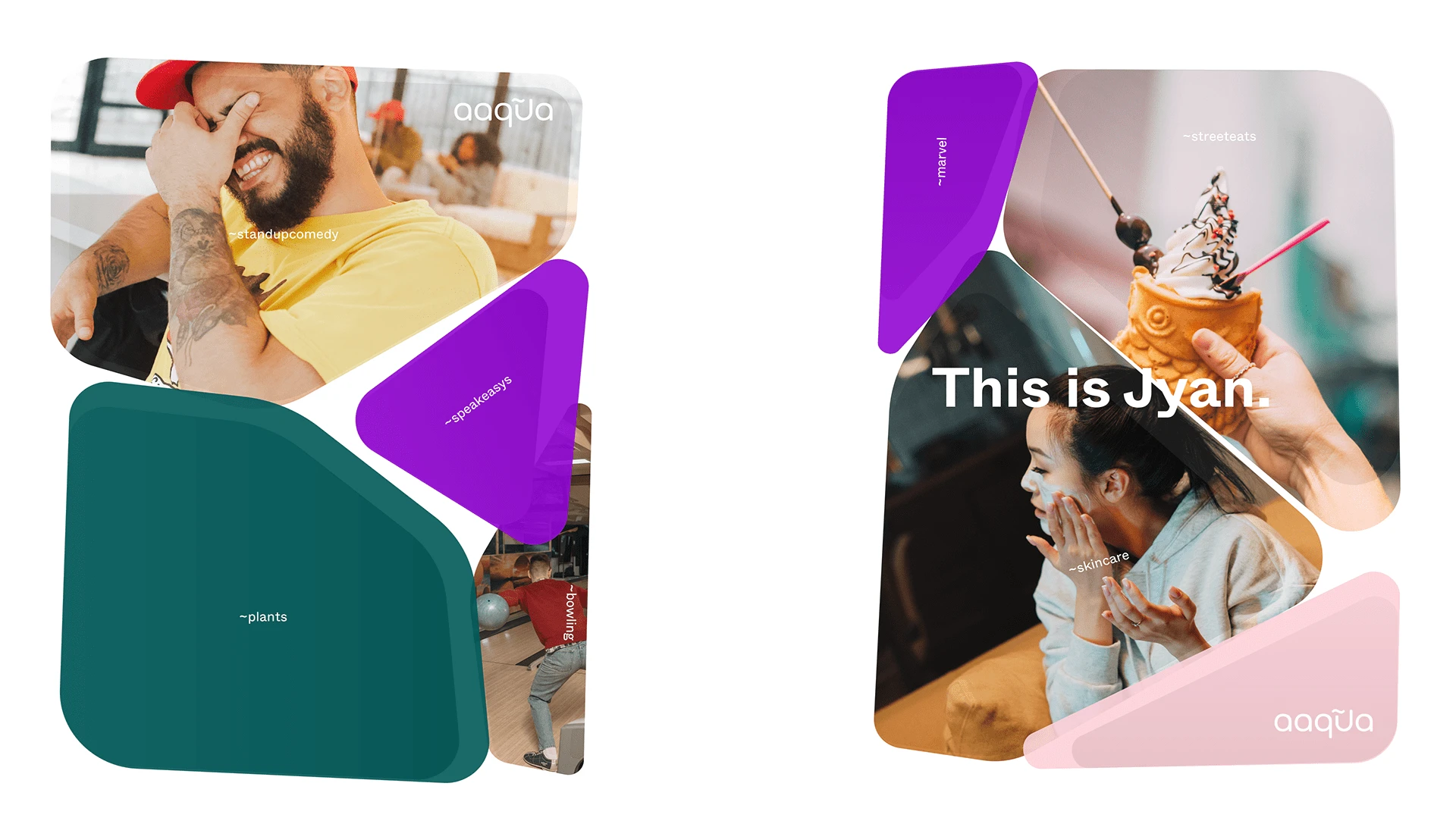
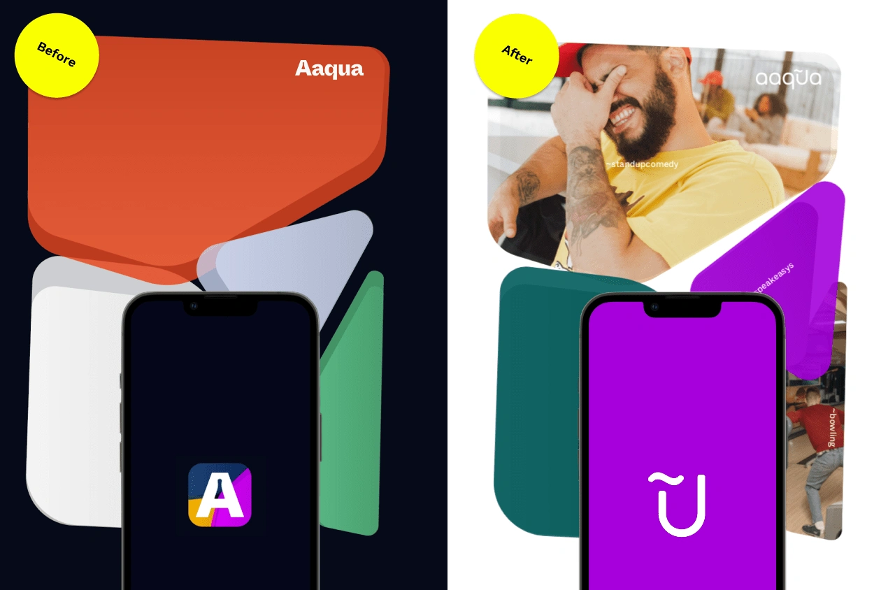
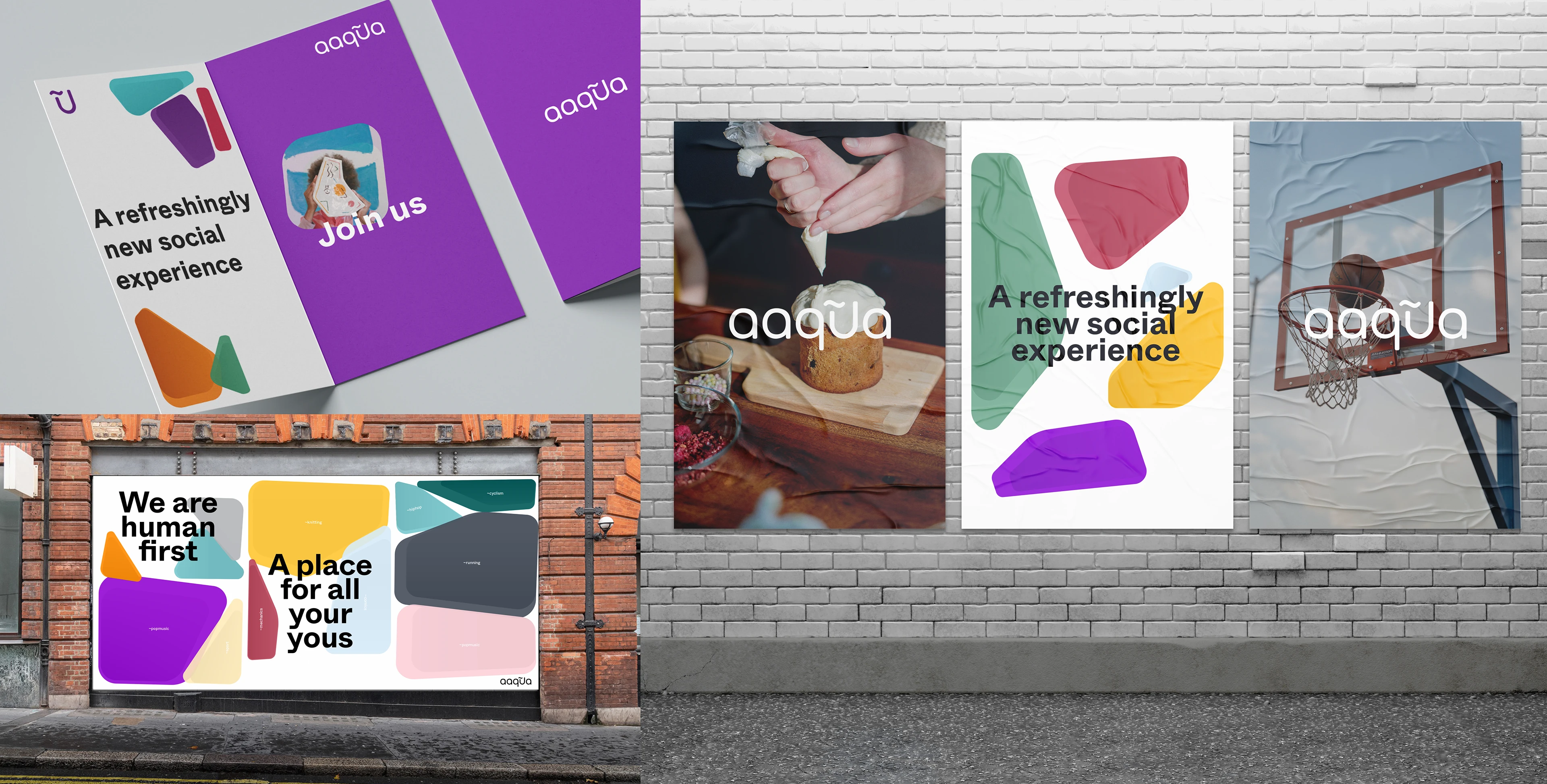
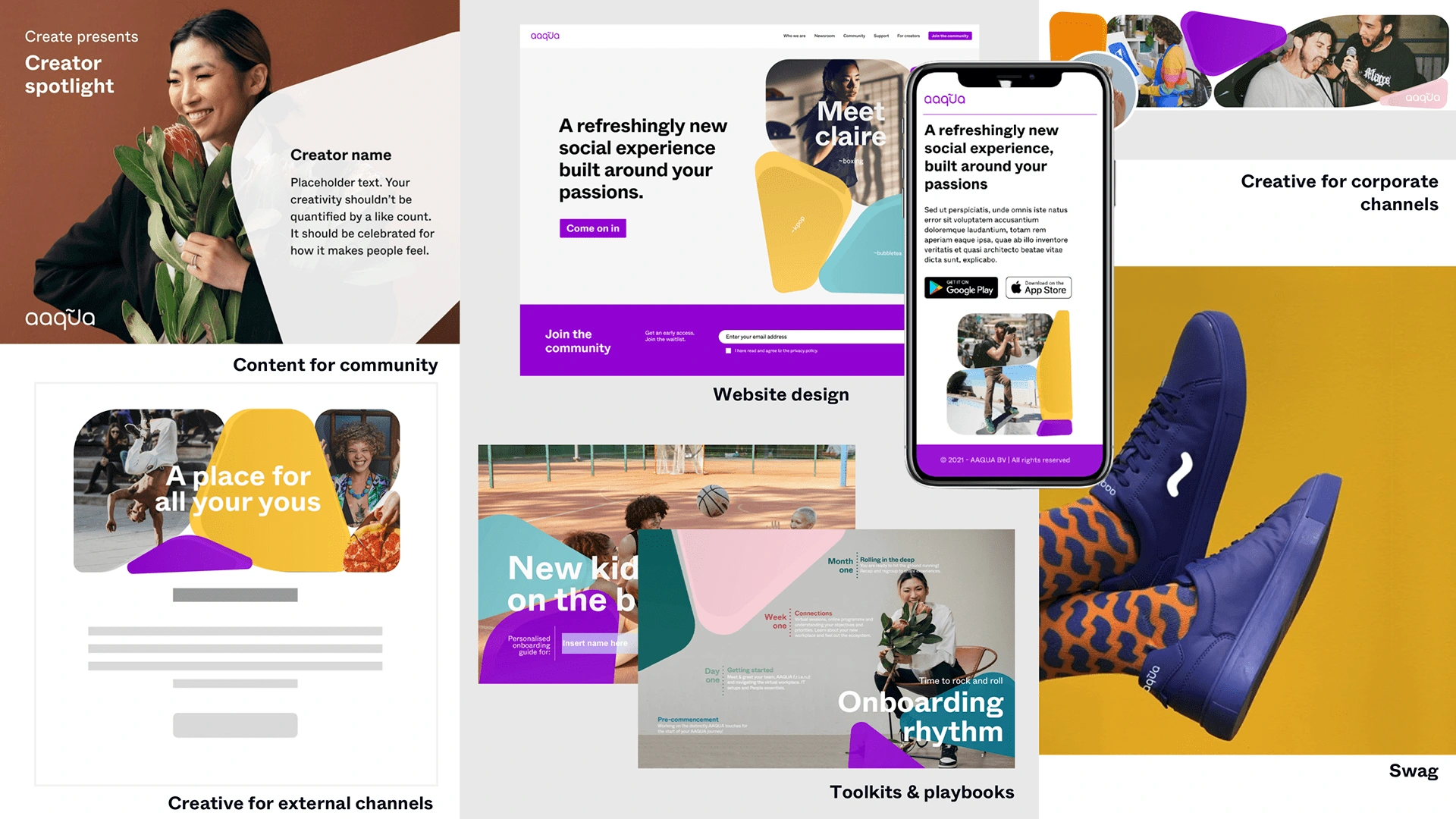
Aaqua’s visual design system is built on a language of organic shapes that represent one's interests, communities and passions. These shapes come together to form a whole - your Aaqua DNA.
Purple is the primary colour in Aaqua's palette. Combining the warmth of red and coolness of blue, it represents the spectrum of passions, interests and communities within the app.
Like this project
Posted Jul 4, 2023
Led and executed the brand refresh for Aaqua, a social experience build around your passions.
Likes
0
Views
29

