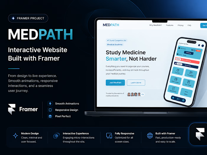
MedPath Student Medical Portal UX/UI Design

Raed Makhloufi


MedPath — Student Medical Portal App | UX/UI Case Study
Project Overview
MedPath is a digital platform designed to help medical students manage and access their academic information more easily.
The project focused on creating a clear and intuitive mobile experience that simplifies access to important academic data and improves the overall student experience.
My role included UX research, analyzing user needs, structuring the experience, designing the interface, and creating the final UI in Figma.
The Problem
Medical students often rely on multiple scattered sources to access academic information such as schedules, grades, lessons, and important university updates. This can make everyday academic tasks harder to manage and can create unnecessary friction when students need information quickly.
MedPath was designed to bring these essential academic resources into one centralized and accessible experience.
User Research & Insights
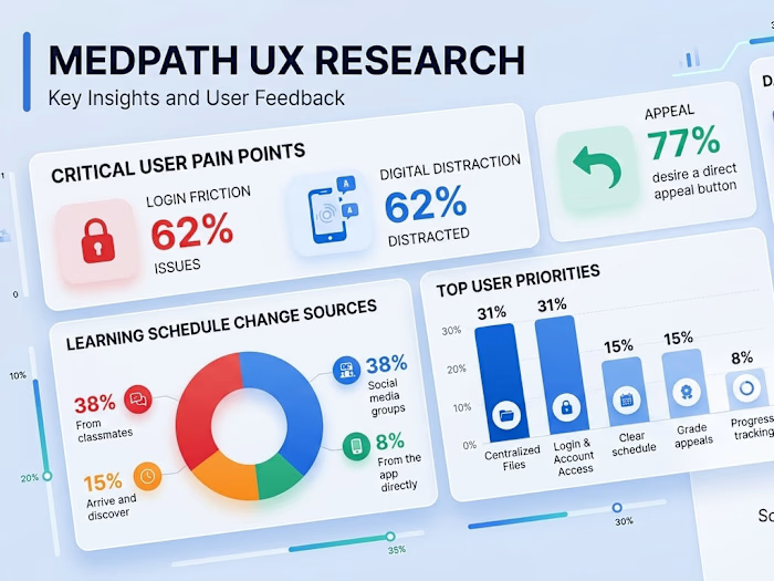
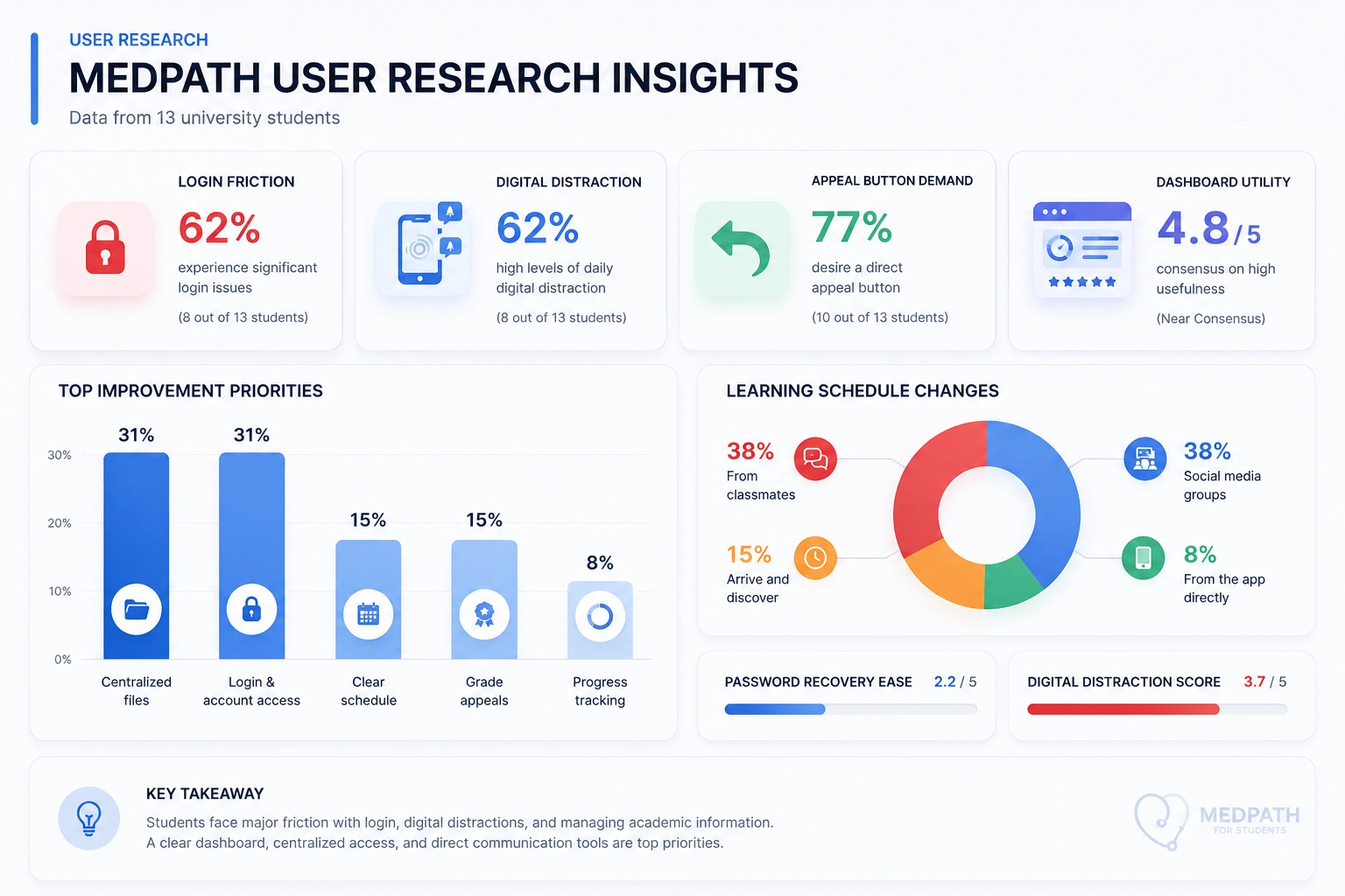
To better understand the main challenges faced by medical students, I conducted a survey with 13 university students and analyzed their responses to identify recurring pain points and priorities.
Key Insights
The research revealed several important areas that could be improved:
62% — Login Friction
8 out of 13 students reported significant login issues.
62% — Digital Distraction
8 out of 13 students reported high levels of daily digital distraction.
77% — Appeal Button Demand
10 out of 13 students wanted a direct appeal button.
4.8/5 — Dashboard Utility
The dashboard received near-consensus on its usefulness.
The research also highlighted centralized files and easier login and account access as the top improvement priorities.
From Research to Design
The research findings helped define the main priorities for MedPath. I translated these insights into design decisions focused on reducing friction, improving access to academic information, and making the most important actions easier to find.
01 - Simplified Access
Centralized important academic information to reduce the need to search across multiple sources.
02 - Clear Academic Overview
Designed the dashboard to provide students with an immediate overview of courses, schedule, progress, and important updates.
03 - Faster Actions
Prioritized frequently needed actions and information so students can reach them with fewer steps.
Final UI
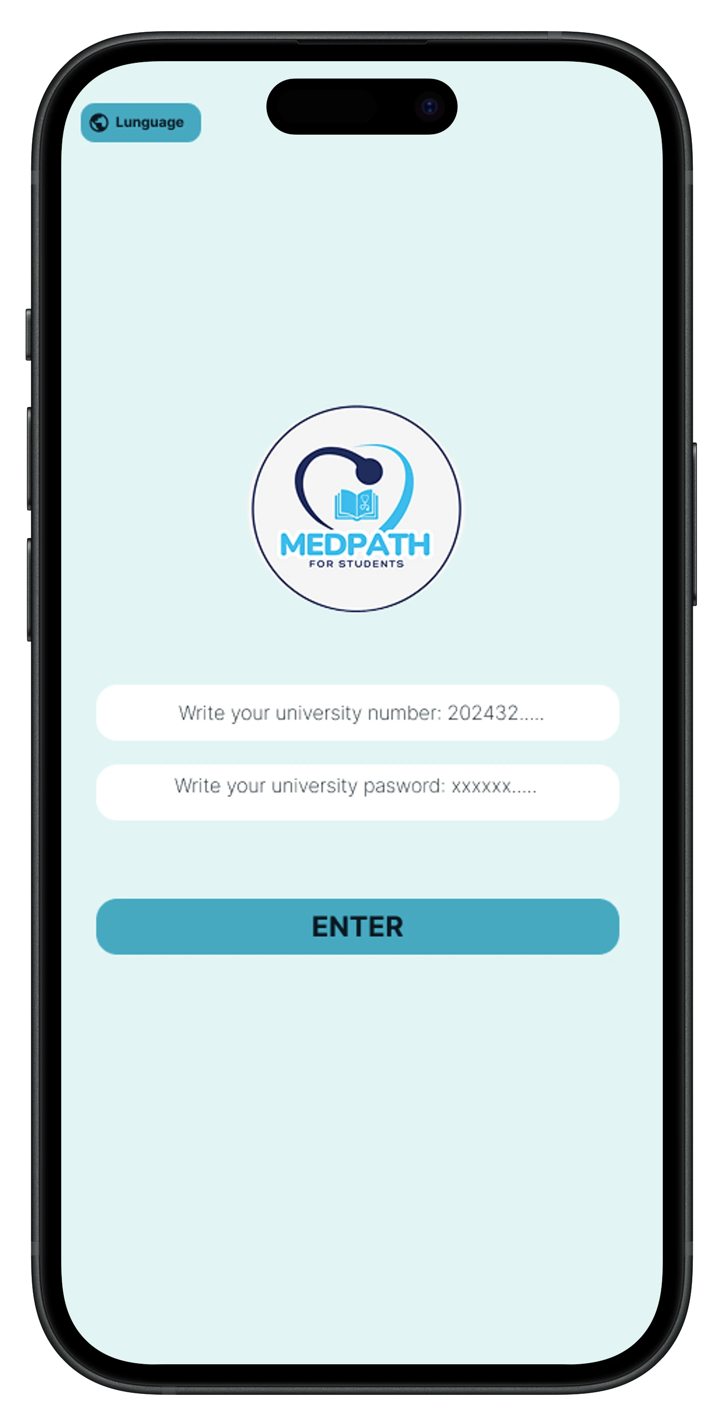
01 - Login Experience
A simple login experience designed to provide students with quick and clear access to their academic portal.
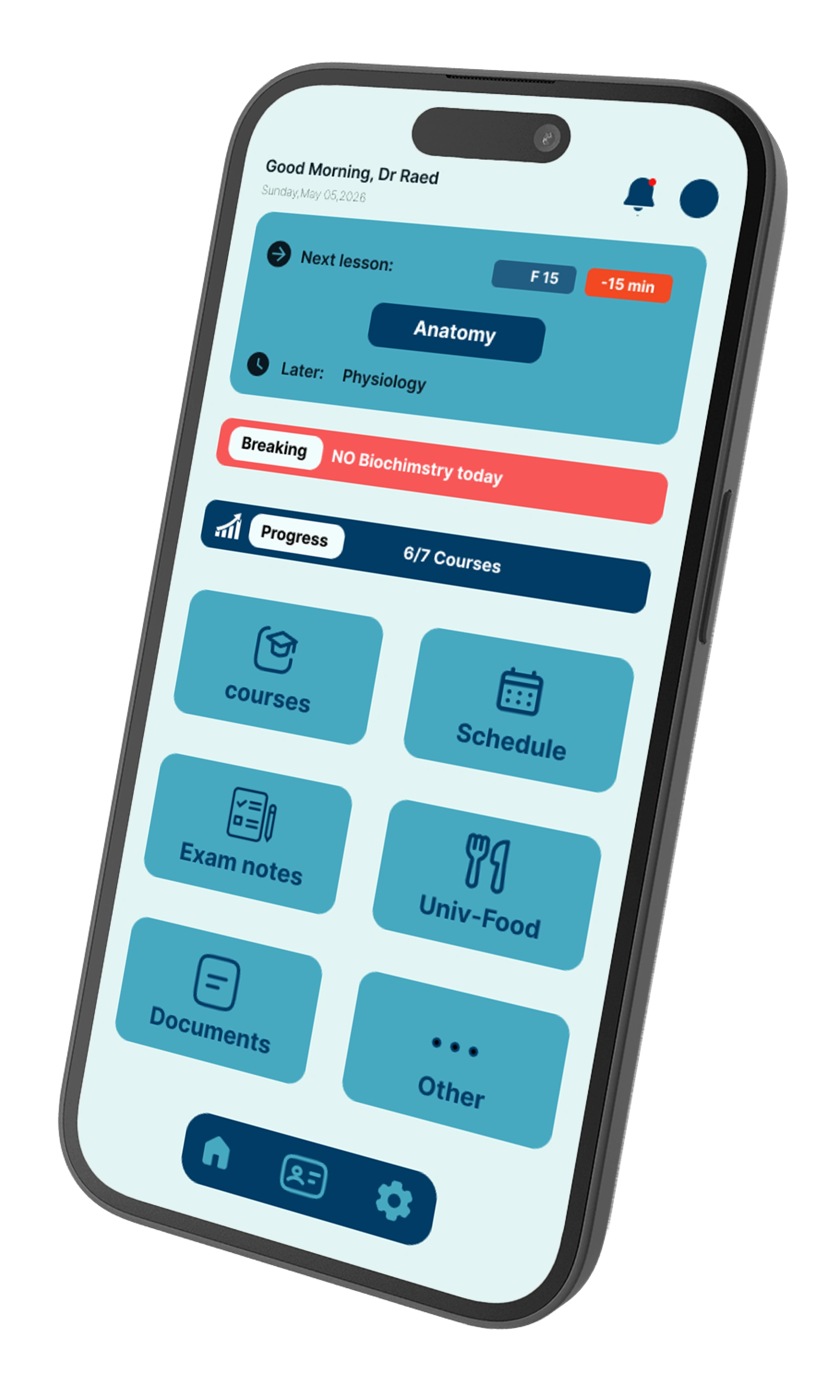
02 - Dashboard
The dashboard brings essential academic information into one clear and accessible overview, allowing students to quickly understand their current academic status and navigate to the information they need.
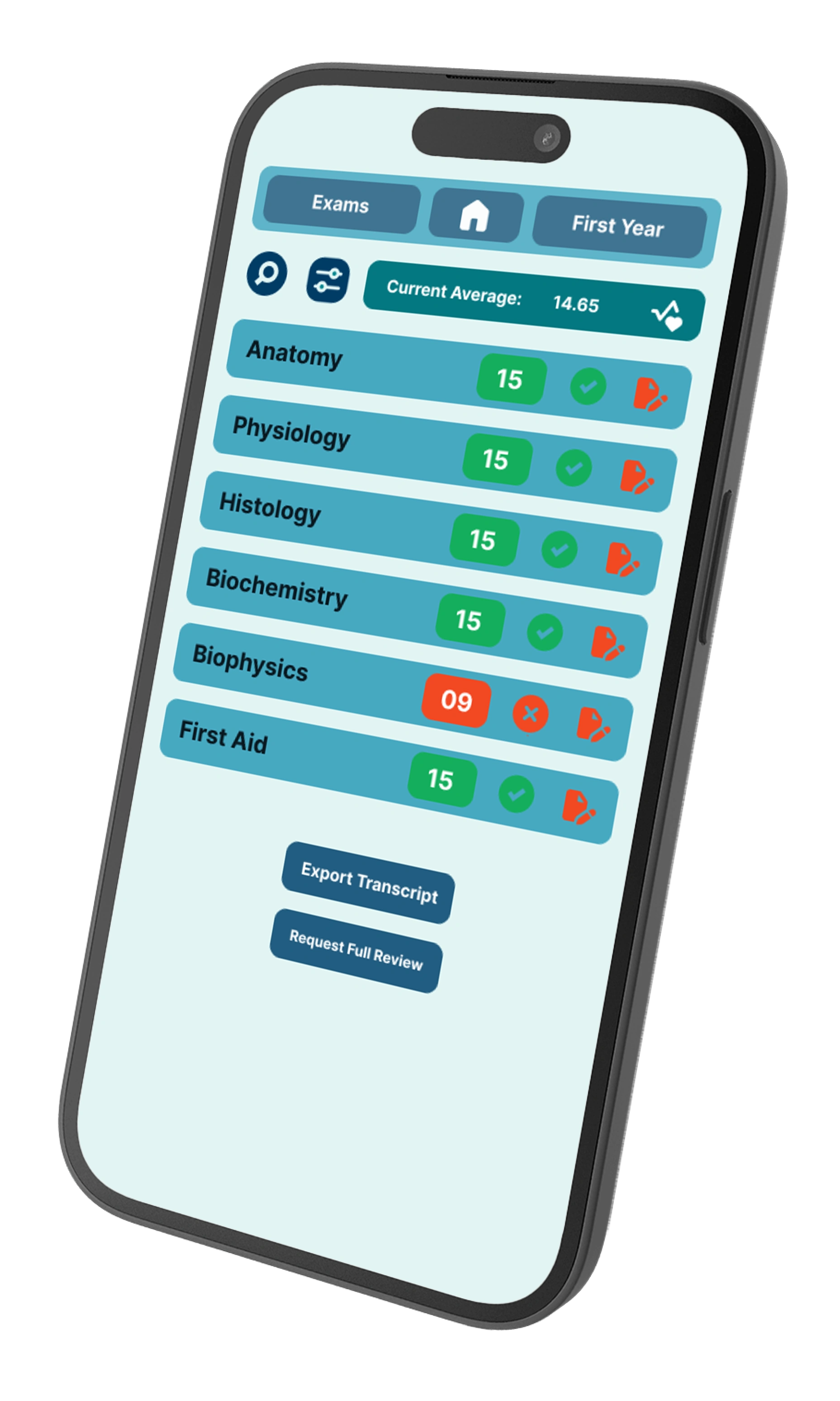
03 - Academic Performance
A dedicated space for students to quickly review their academic results and keep track of their performance across different subjects.
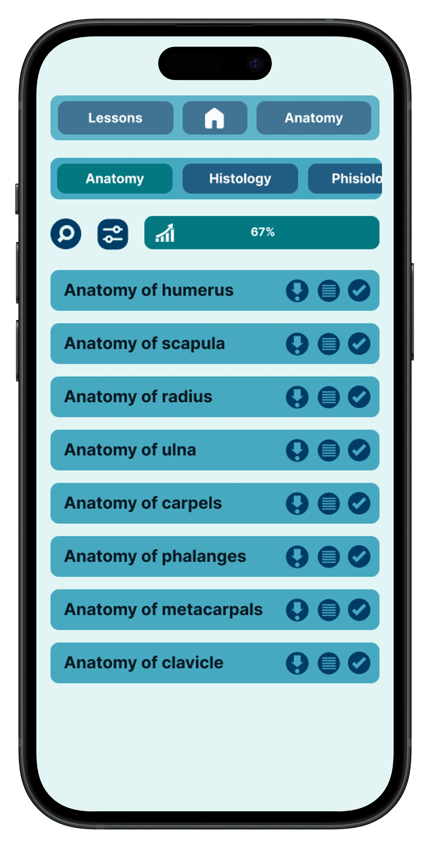
04 - Progress Tracking
A clear overview of students’ academic progress, helping them monitor their performance and understand how they are progressing throughout their studies.
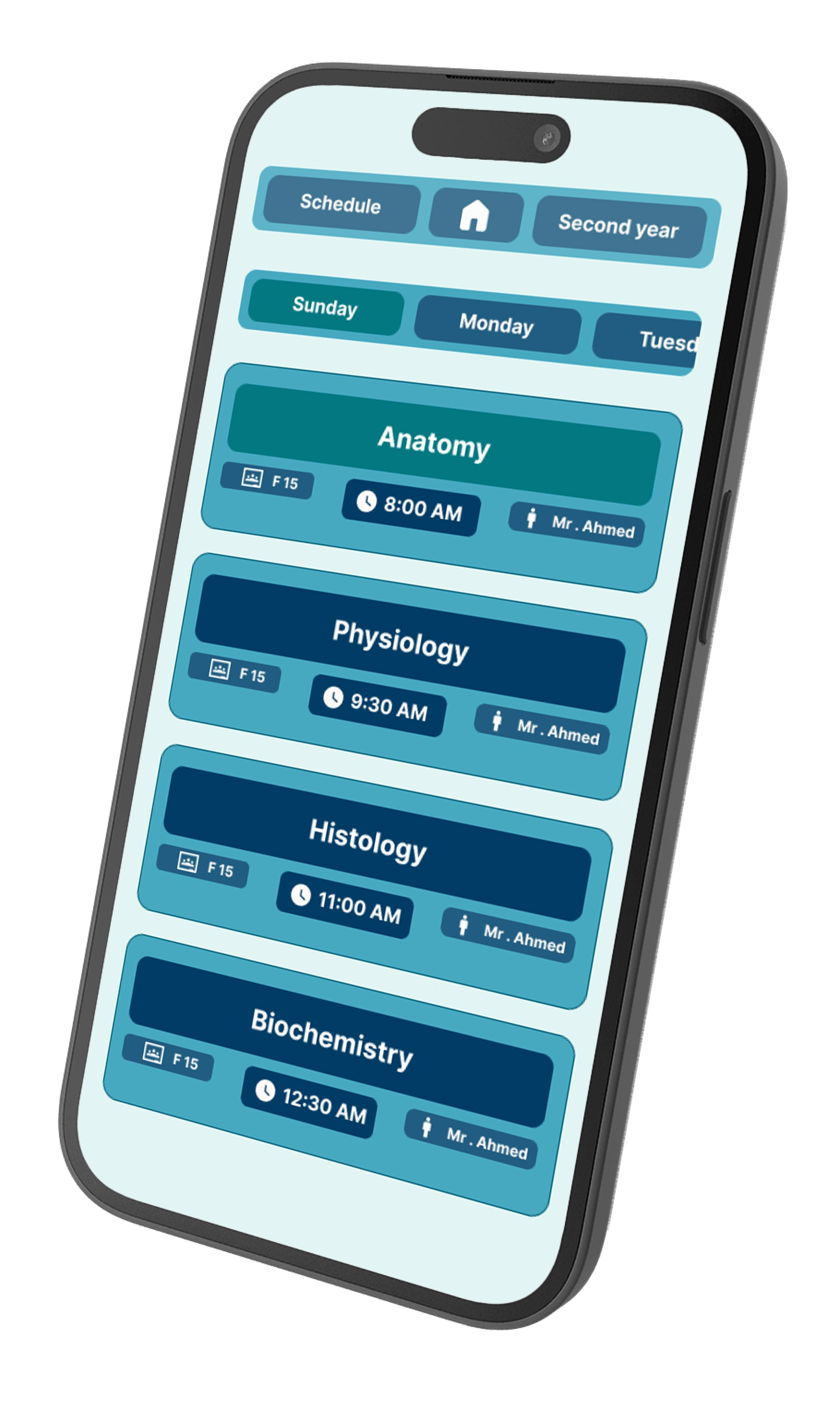
06 - Schedule
A structured schedule that gives students quick access to their classes and upcoming academic activities, making it easier to organize their day and stay on track.
Design Outcome
MedPath brings essential academic information into one clear and accessible experience. By combining insights from user research with a focused UI/UX approach, the design aims to reduce friction, simplify navigation, and help medical students manage their academic journey more effectively.
Tools & Skills
Figma · UX Research · UI Design · Wireframing · Prototyping · User Flow
Thank you for exploring MedPath.
Like this project
Posted Aug 24, 2026
Designed a UX/UI mobile app simplifying access to medical academic info.