B natural Juice Rebranding
Anushka shah
Project Overview
Rebranded B Natural juice brand to reflect a vibrant, health-focused identity with a fresh logo, modern packaging, and cohesive design, enhancing customer connection and brand appeal.
Overview
Brand Mission
B natural juice, made solely from Indian fruits and free from concentrates, captures the essence and nutrients. In partnership with local farmers, B natural crafts a beverage that elevates livelihoods and respects the earth's gifts, letting no fruit go unused.
B naturals method preserves every precious antioxidant and nutrient, bringing you the wholesome goodness in its purest form.

Goal of the branding
Brand USP
juices come straight from Indian orchards, crafted not from concentrate but from the full heart of the fruit. In forgoing the heat of concentration, we lock in the vibrant antioxidants, offering you not just a drink, but a burst of nature's best, in every sip.
Brand's tagline & voice
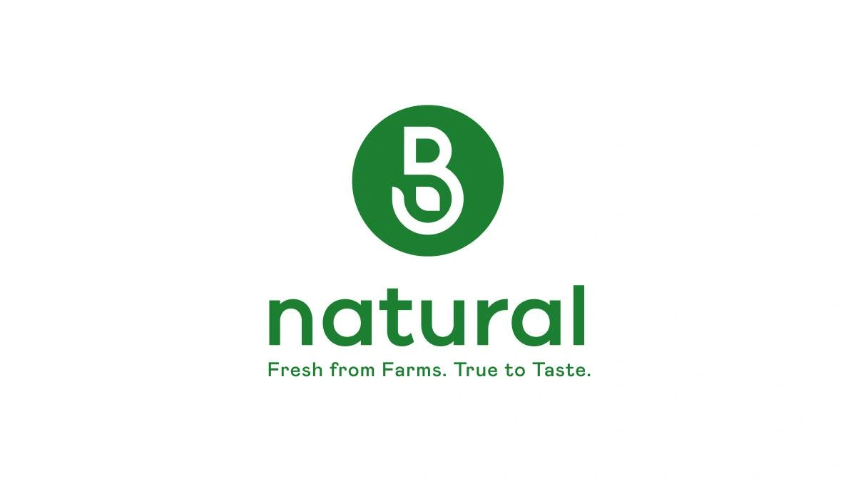
B Natural's tagline, "Fresh from Farms, True to Taste," guarantees farm-fresh authenticity and genuine fruit flavor.
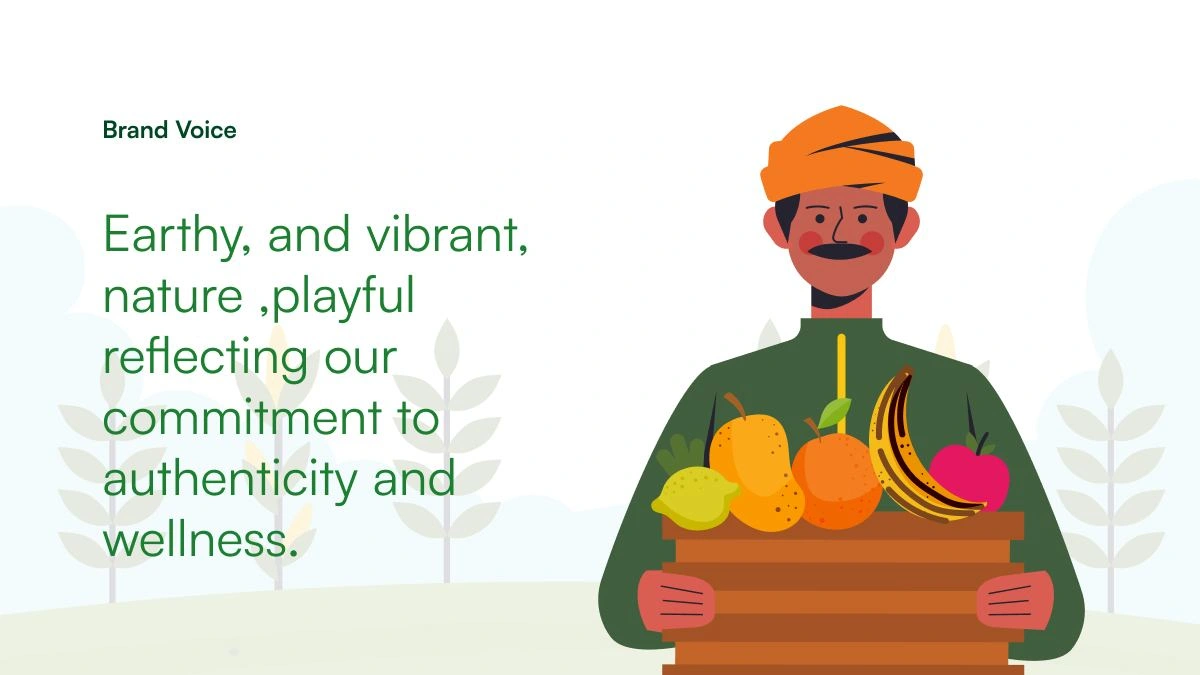
if brand has voice?
Logo Concept
The green circle represents the holistic approach of the brand towards health and the environment, also indicating a global perspective. The "B" balances the modernity with timelessness, with a leaf embeded depicting the nature.
logo creation
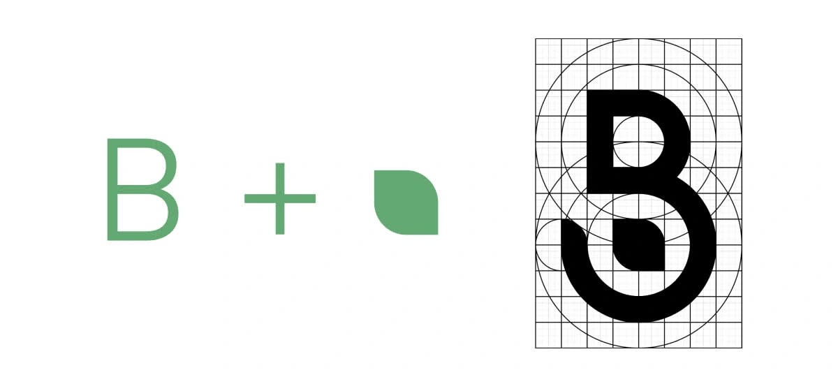
Logo Construction
Logo Clear space
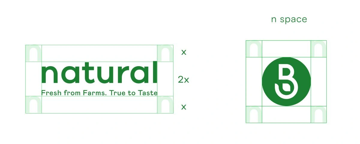
clear space
Color Palette
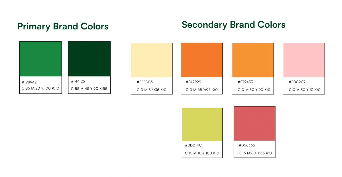
colors
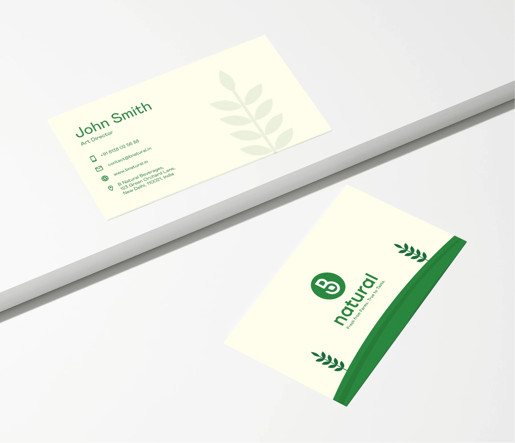
brand visiting card
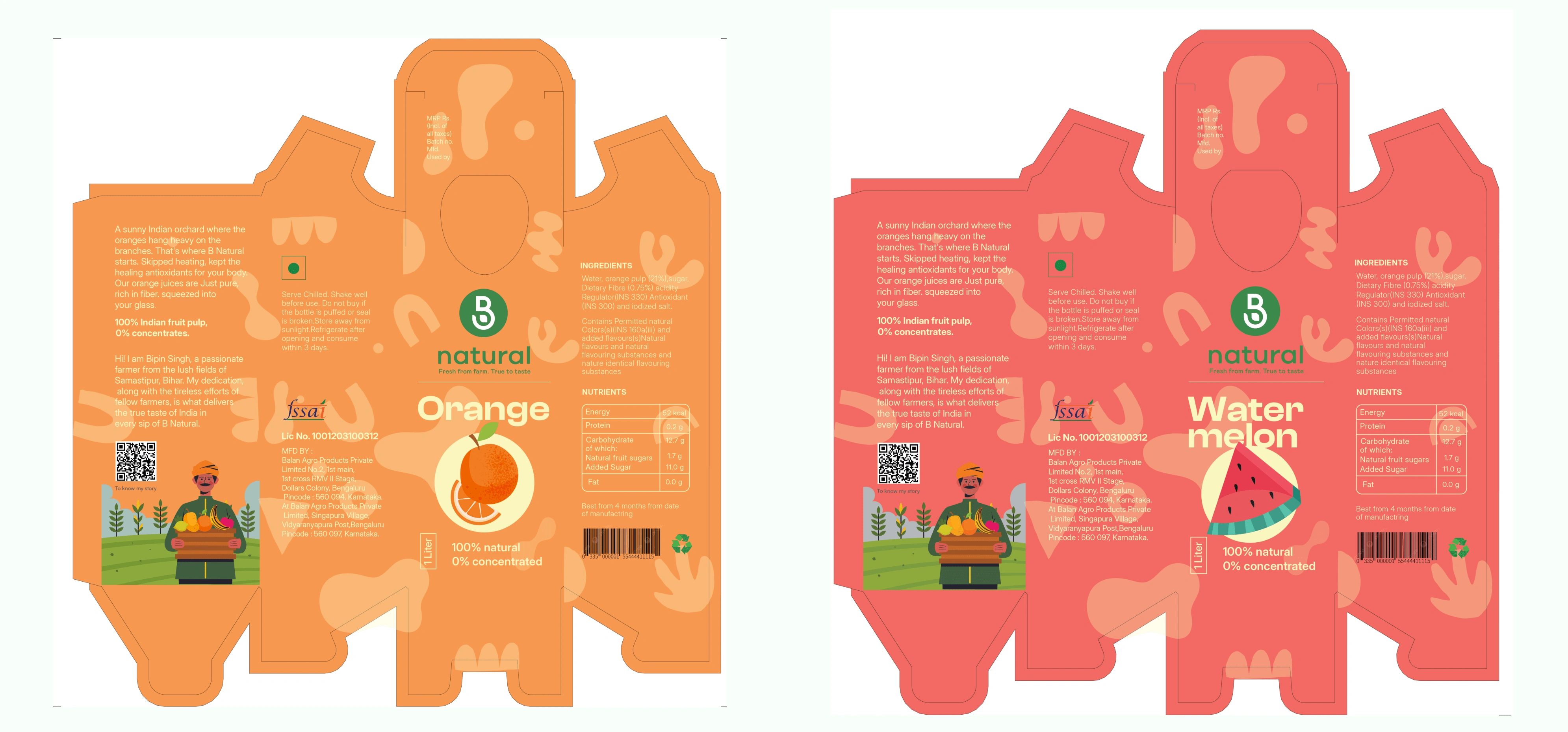
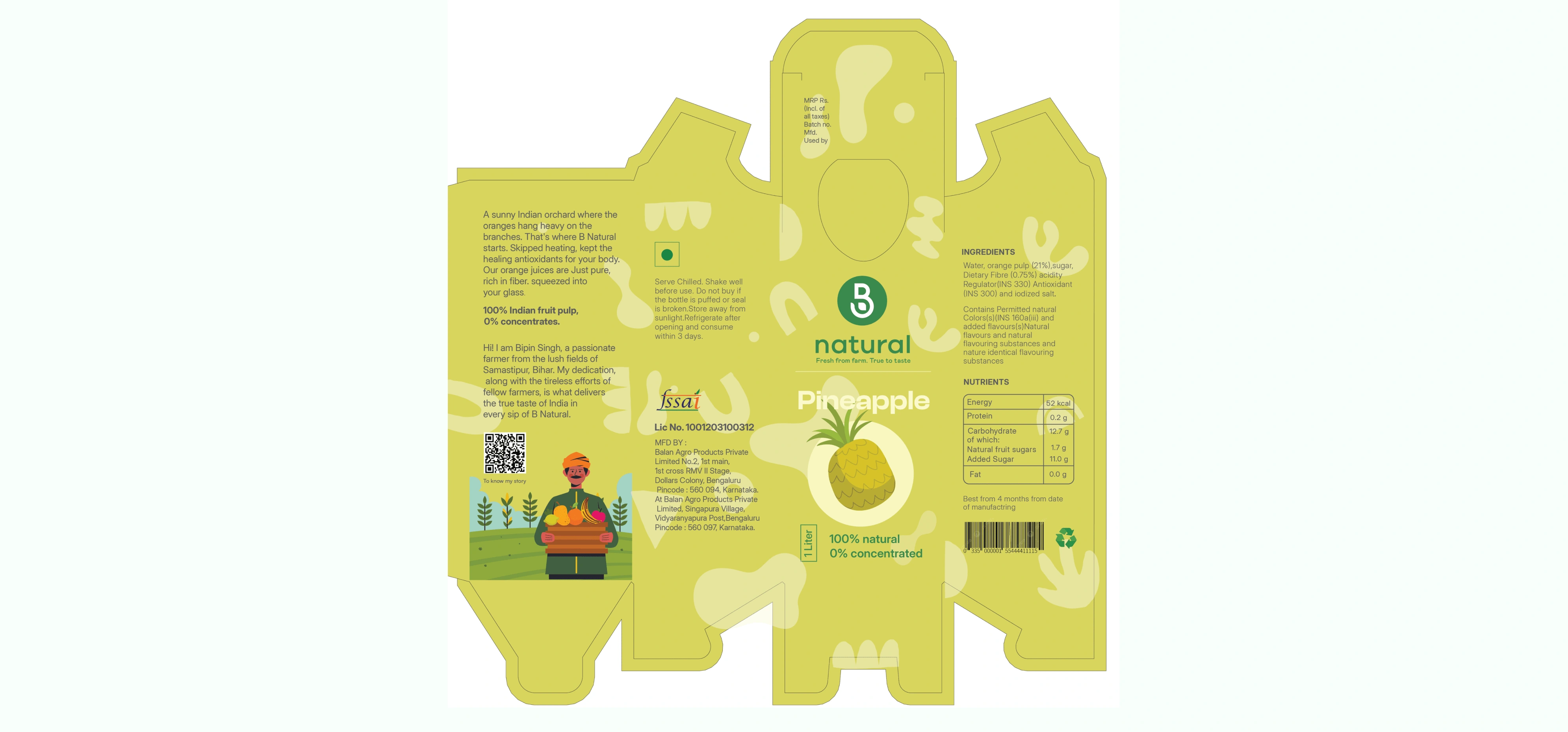
Juice packs
Signage System
Designed different signage system
Like this project
Posted Sep 30, 2024
I transformed a bland juice brand into a fun, playful, and exciting experience through a fresh branding redesign.
Likes
0
Views
5