Redesigning a Landing Pages for a SaaS brand
Introduction:
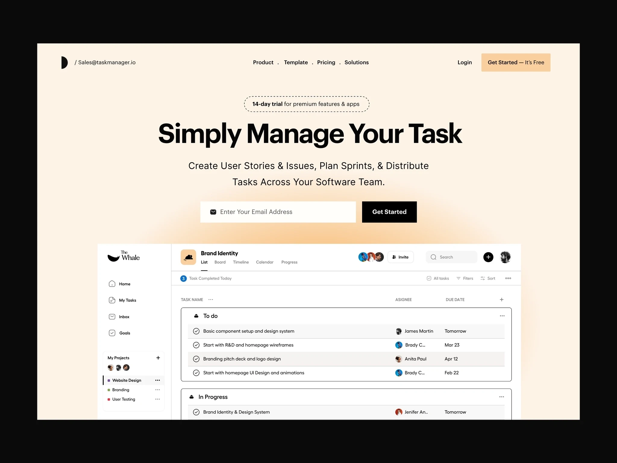
This case study focuses on the redesign of a Calendar SaaS landing page. The goal is to improve user experience, increase conversions, and enhance the overall visual appeal. The existing landing page lacks a clear hierarchy, visual consistency, and fails to effectively communicate the benefits of the SaaS product.
Problem Statement:
The current landing page for the Calendar SaaS lacks an intuitive and visually engaging design, leading to low conversion rates and user drop-offs. The page also lacks clear messaging about the key features and benefits of the product, making it difficult for users to understand its value proposition.
User Research:
Conducted user interviews, surveys, and competitor analysis to gather insights about user expectations, pain points, and preferences related to calendar management. Identified the target audience as professionals, freelancers, and small to medium-sized businesses seeking an efficient and user-friendly calendar solution.
Goals and Objectives:
a) Increase conversions: Improve the landing page's design and layout to engage users and encourage them to sign up for the Calendar SaaS.
b) Enhance usability: Create a seamless user experience by simplifying the interface, improving navigation, and reducing cognitive load.
c) Communicate value: Clearly communicate the key features, benefits, and unique selling points of the Calendar SaaS to users.
d) Establish credibility: Build trust and credibility through the use of testimonials, customer success stories, and social proof.
Design Solutions:
a) Information Hierarchy:
Develop a clear visual hierarchy that guides users through the page, highlighting the most important information and actions.
Use headings, subheadings, and visual cues to break content into scannable sections.
Utilize whitespace effectively to create a sense of balance and organization.
b) Visual Design:
Create a visually appealing and modern design that aligns with the brand identity.
Use a consistent color scheme and typography to create visual consistency.
Incorporate high-quality images and illustrations that resonate with the target audience.
d) Clear Value Proposition:
Clearly communicated the unique features and benefits of the Calendar SaaS.
by using concise and persuasive copy to highlight key selling points.
Included visual representations of the product's capabilities, such as screenshots or demo videos.
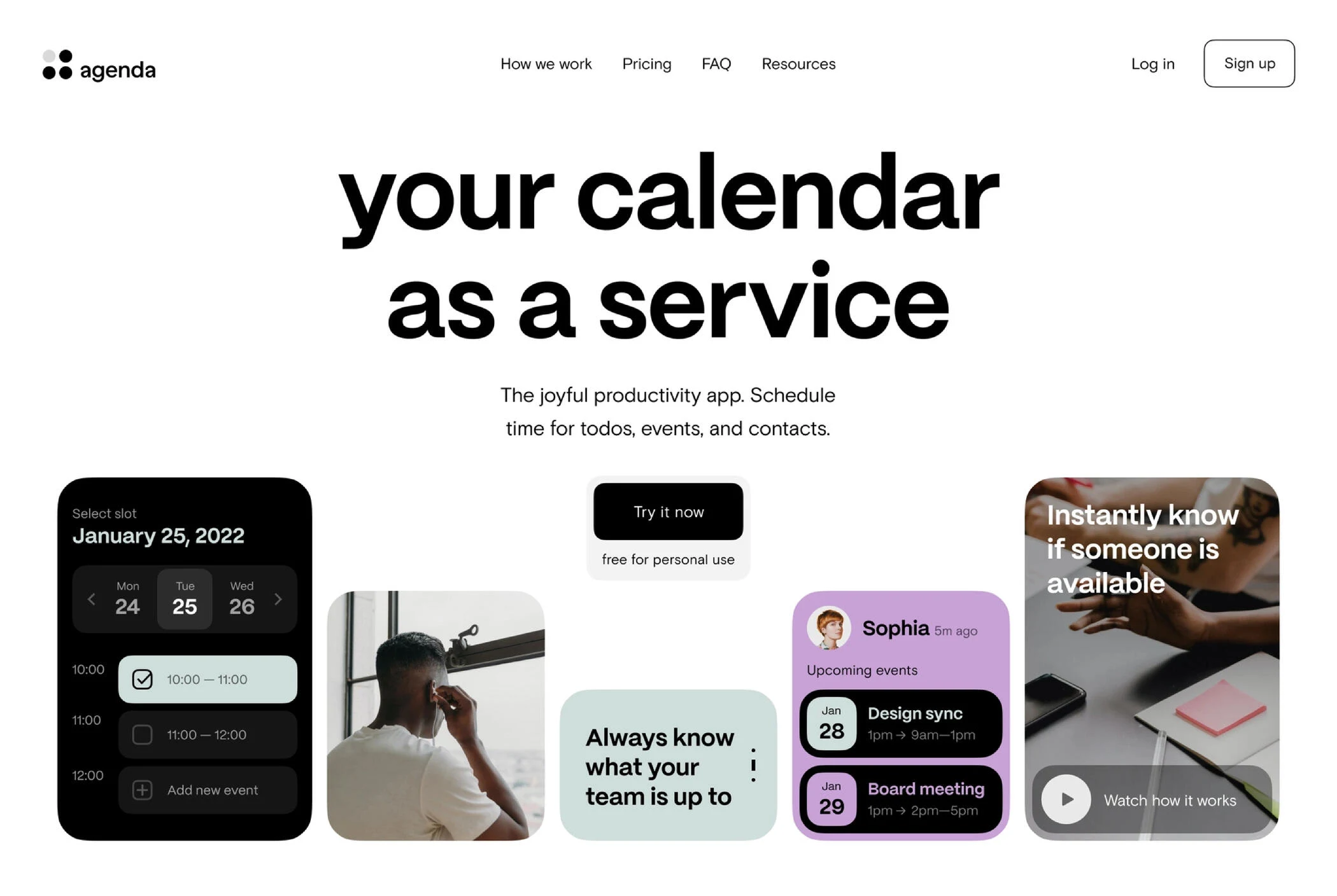
By applying user-centered design principles and addressing the pain points of the existing Calendar SaaS landing page, the redesigned page aims to improve user experience, increase conversions, and effectively communicate the value proposition to potential users.
Like this project
Posted Jun 8, 2023
Redesigned a landing page with strong calls-to-action that converted visitors into customers. Utilized A/B testing to optimize designs for maximum conversions
Likes
0
Views
47
