Helping people grow with talent hub - Abu Dhabi Government
The Abu Dhabi School of Government wanted to create a platform where people could grow their careers. Talent Hub was designed to be that place - a space for users to gain skills, explore opportunities, and advance in their professional lives.
We had two big goals: make the platform easy for users to navigate and use, while also giving executives the data and insights they needed to make smart decisions. It was all about finding that perfect balance.
As the UX/UI lead, I worked closely with a talented team of developers and stakeholders. My role was to ensure the platform was not only beautiful but also functional and easy to use - for both users and executives.
The platform comprises two primary divisions:
User perspective
High-level executives' perspective
I was employed by American Eagle agency to work on this project.
1. User Perspective
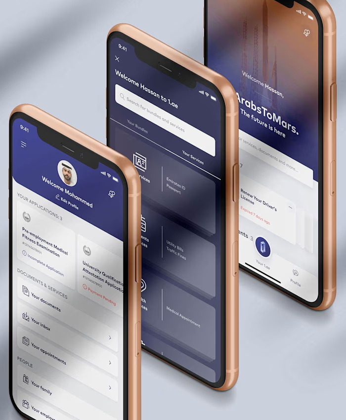
The platform allows users to establish their profile through onboarding process and offers a range of resources and services to assist them in enhancing their career prospects, acquiring new skills, and ultimately securing their desired job.
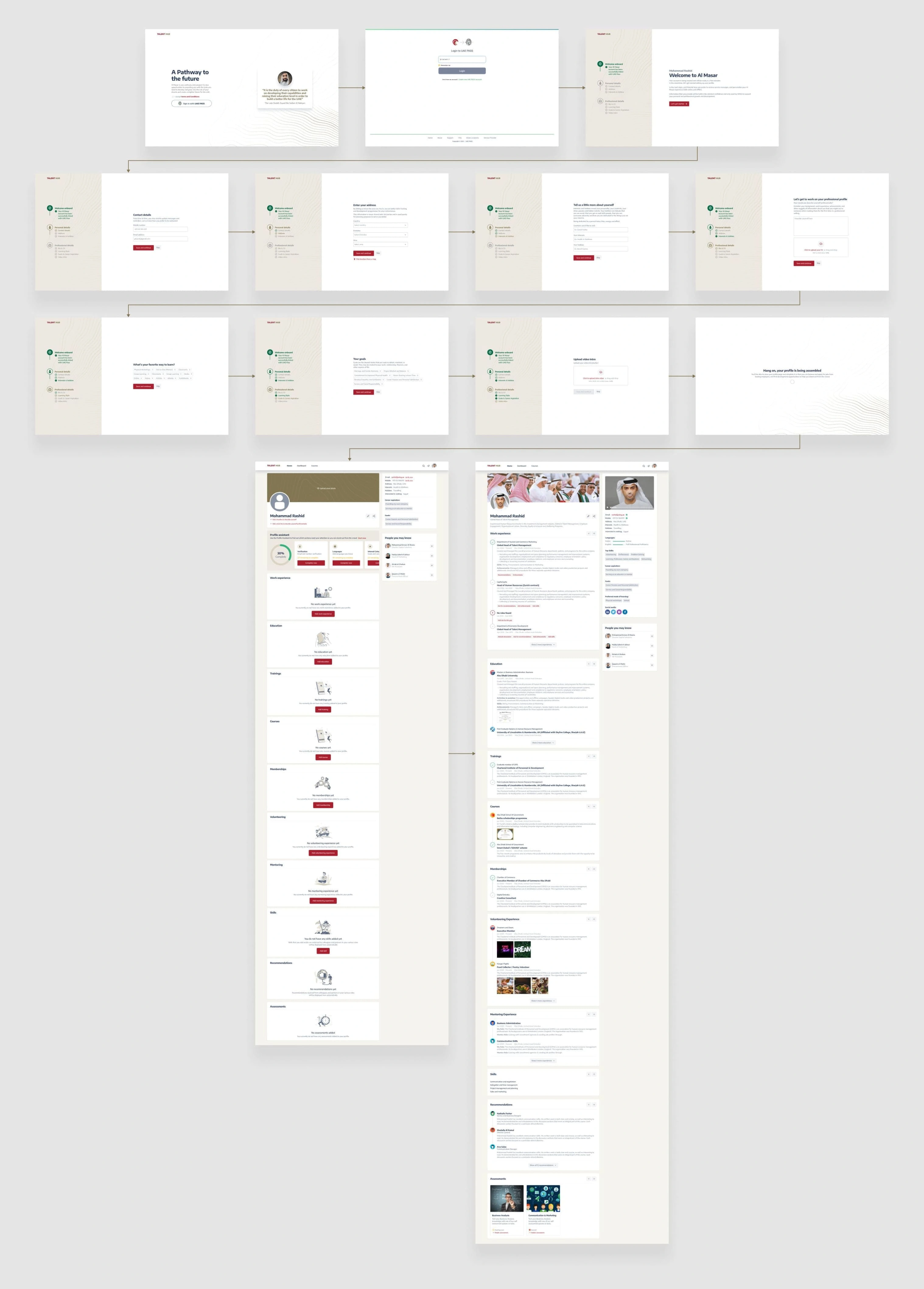
Talent onboarding process
To make signing up easy, we kept things simple. Users shared their contact info, hobbies, learning preferences, a quick video intro, and career goals.
We pulled additional data directly from government systems, like Emirates ID and labor department records, to save users time and ensure everything was accurate
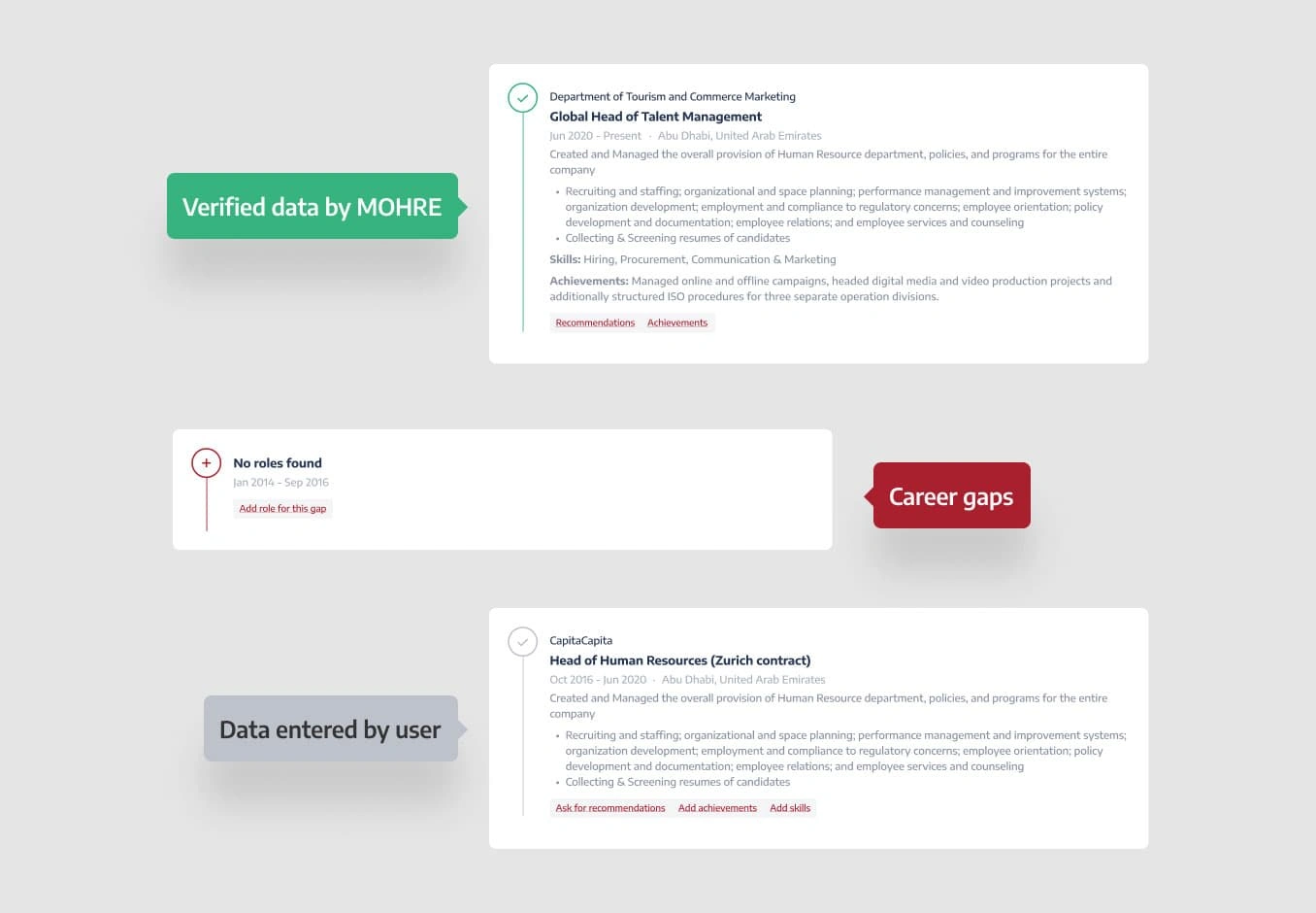
A quick overview of data validation for users.
We created a color-coded system to help users review their information:
1. Green Tick: Verified info from official records, not editable.
2. Red Highlight: Gaps in data, asking users to fill in the blanks.
3. Grey Text: Info users could edit or update themselves.
This approach gave users clarity and confidence in their profiles.
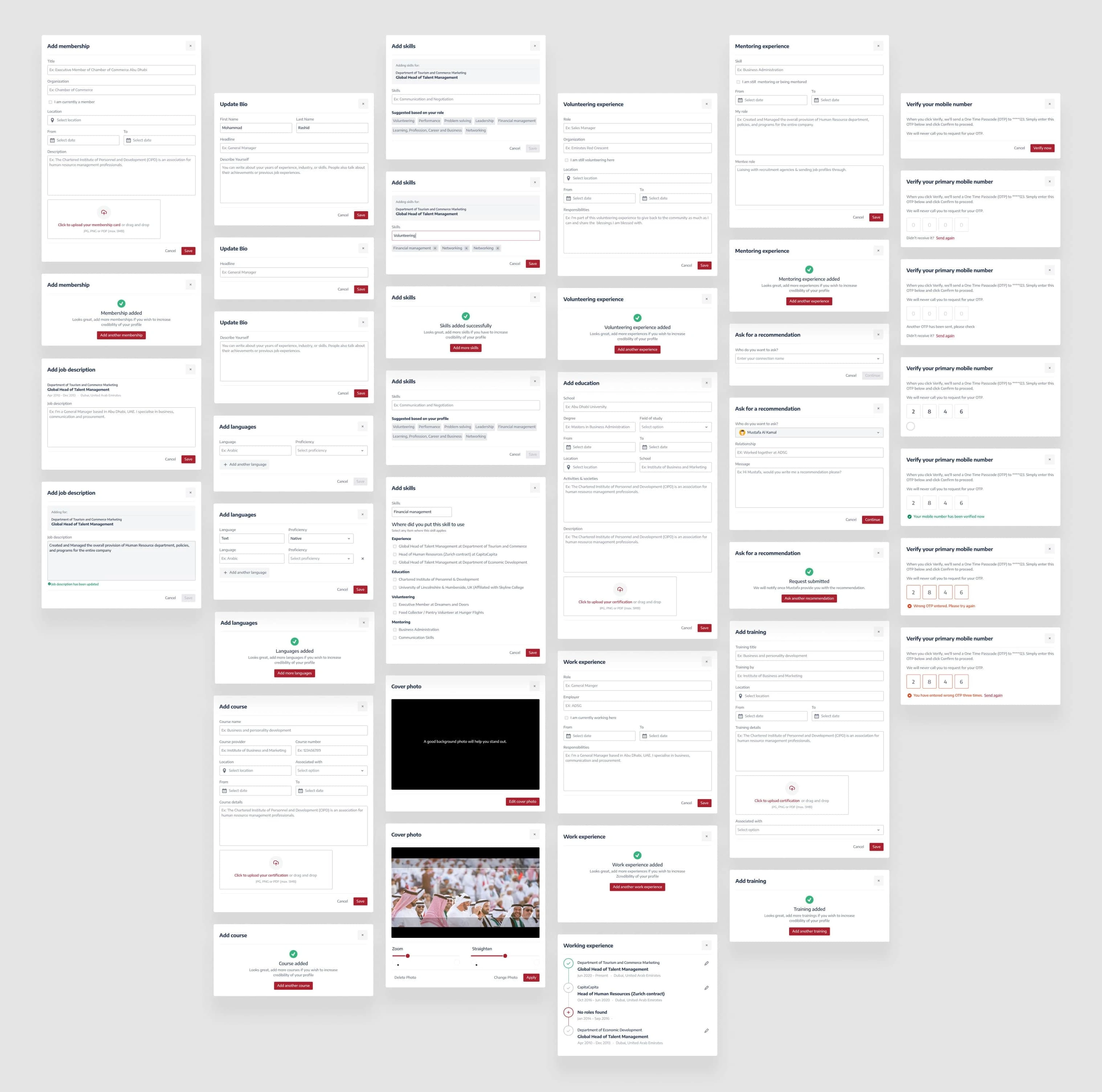
Interactive dialogues for better experience
To make the experience smooth, we added quick pop-ups that guided users to fill in different sections of their profiles. These small prompts made sure the process was clear and stress-free.
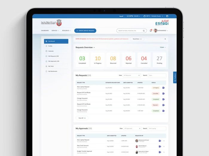
A dashboard that keeps you on track
The homepage was designed to keep users informed and focused, with three sections:
1. This Month's Recap:
A summary of what you've achieved so far.
2. Today's To-Do List:
Clear tasks to help you stay on top of things.
3. What's Coming Up:
A look at future events and opportunities.
This layout made it easy for users to see their progress and plan their next steps.
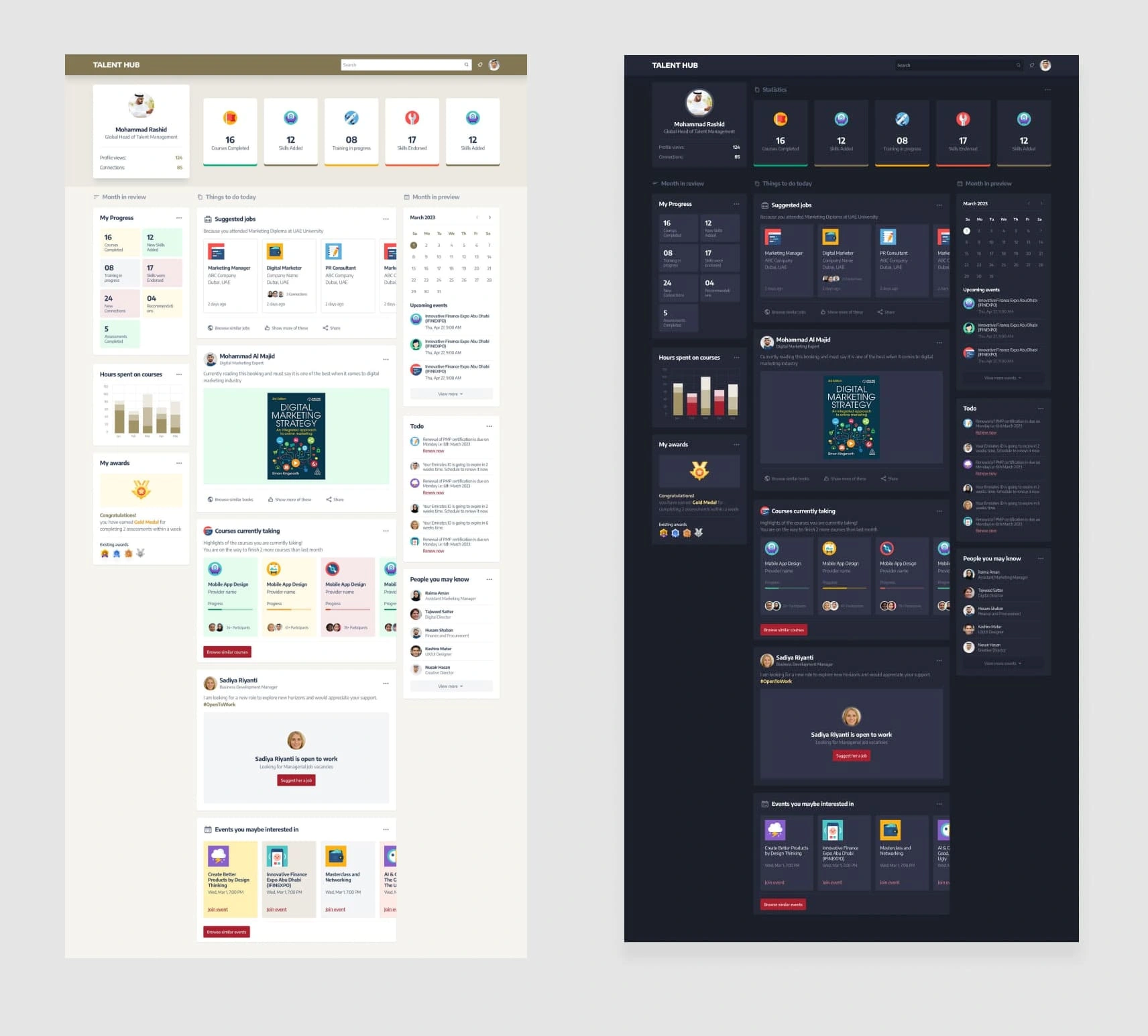
Design System
The purpose of creating a design system is twofold: to maintain consistency across design elements and to provide team members working on the project from different countries with the ability to utilize the same components without concerns about maintaining consistency.
2. High-level executives' perspective
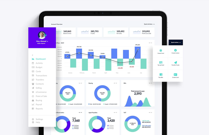
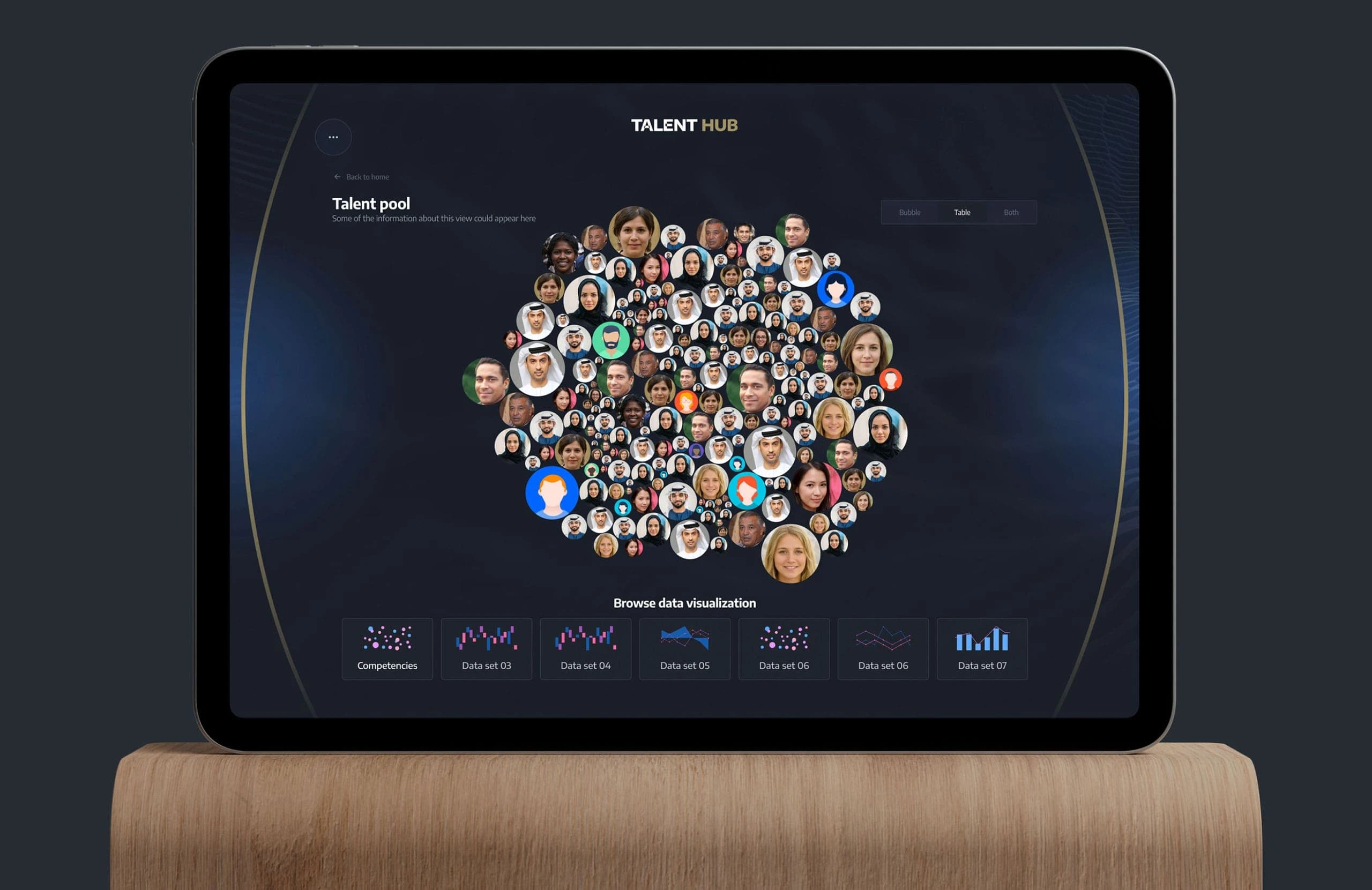
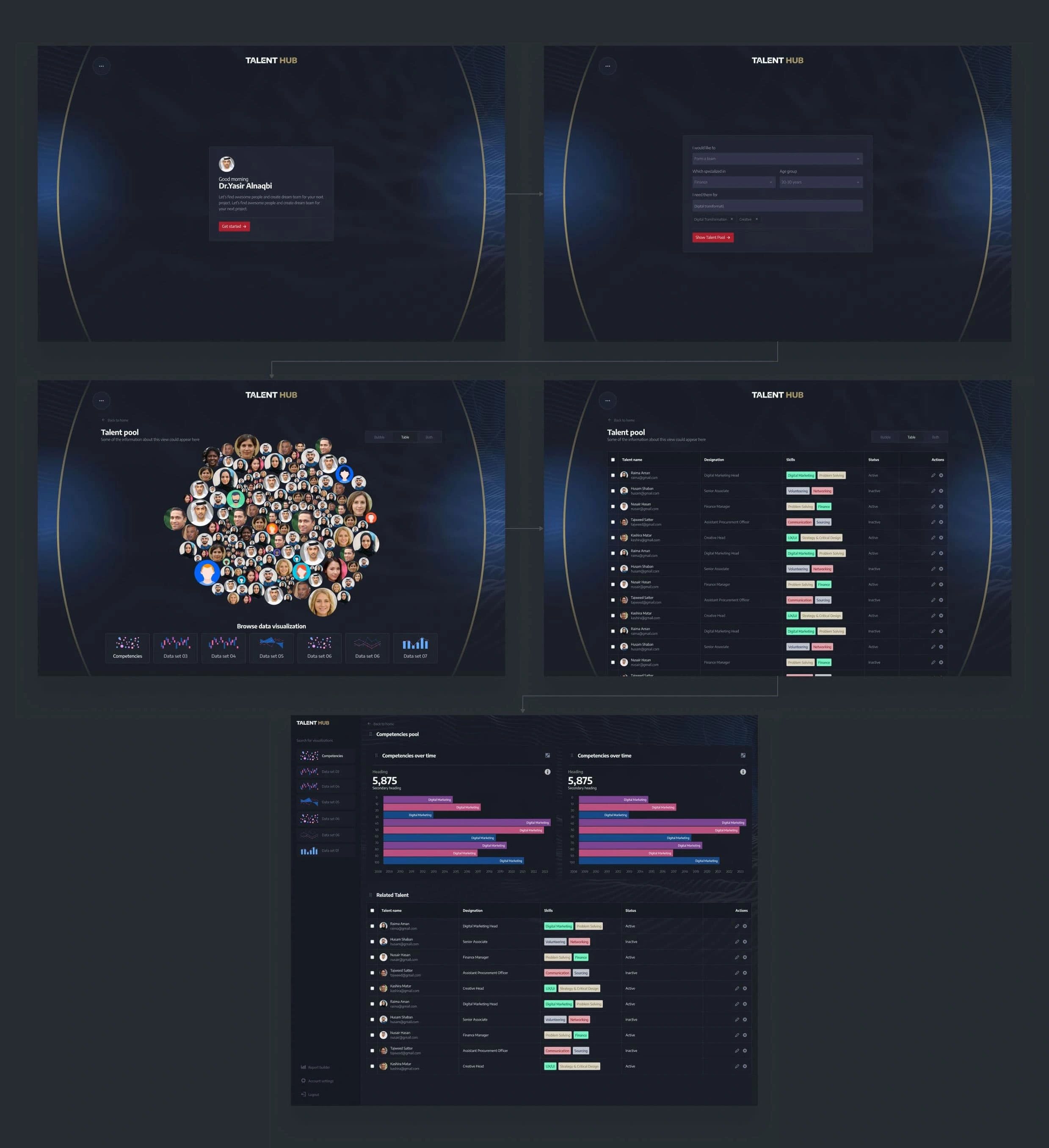
The Director General (DG) uses Talent Hub to assemble a team of IT professionals aged 20-30 for a digitalization project. The platform displays the talent pool with detailed statistics and visualizations, making it easy to select the right team members for the job.
Scenario 01
The DG wants to visualize the talent pool data
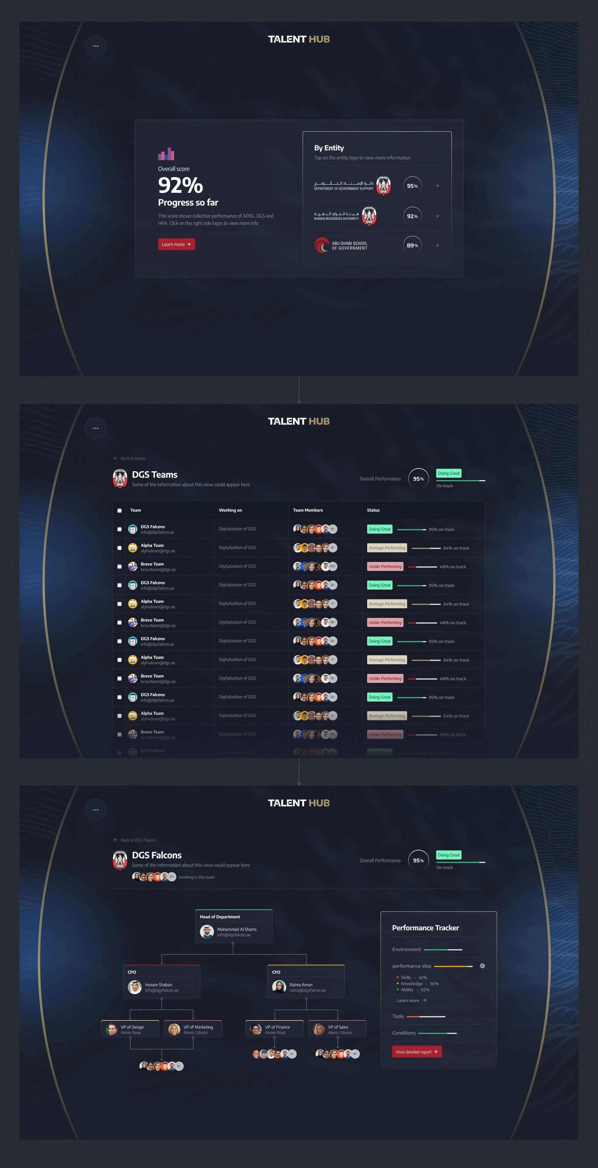
The DG evaluates team performance across ministries. Talent Hub provides an overview of ministry achievements, individual performance trackers, and team insights, complete with an organizational chart. This gives the DG a clear and actionable view to optimize performance and drive results.
Scenario 02
The DG wants to evaluate team performance
Director General (DG) used Talent Hub to assemble a team of IT professionals aged 20-30 for a digitalization project. The platform displayed the talent pool with clear data and visualizations, helping the DG select the best candidates effortlessly.
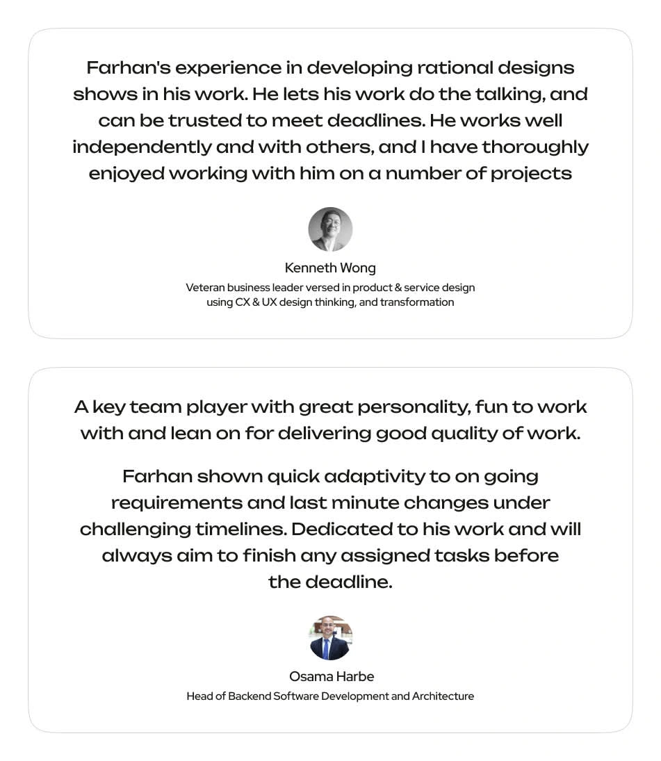
Client's Feedback
Want to make your digital presence stand out?
Connect with me at farhanrao.com
Or drop a message at emailme@farhanrao.com
Like this project
Posted Nov 12, 2024
Talent Hub is an all-inclusive platform designed to cater to the needs of individuals who are seeking to enhance their professional growth.

