Spot Brand Guidelines and App Redesign
Jana Styblova
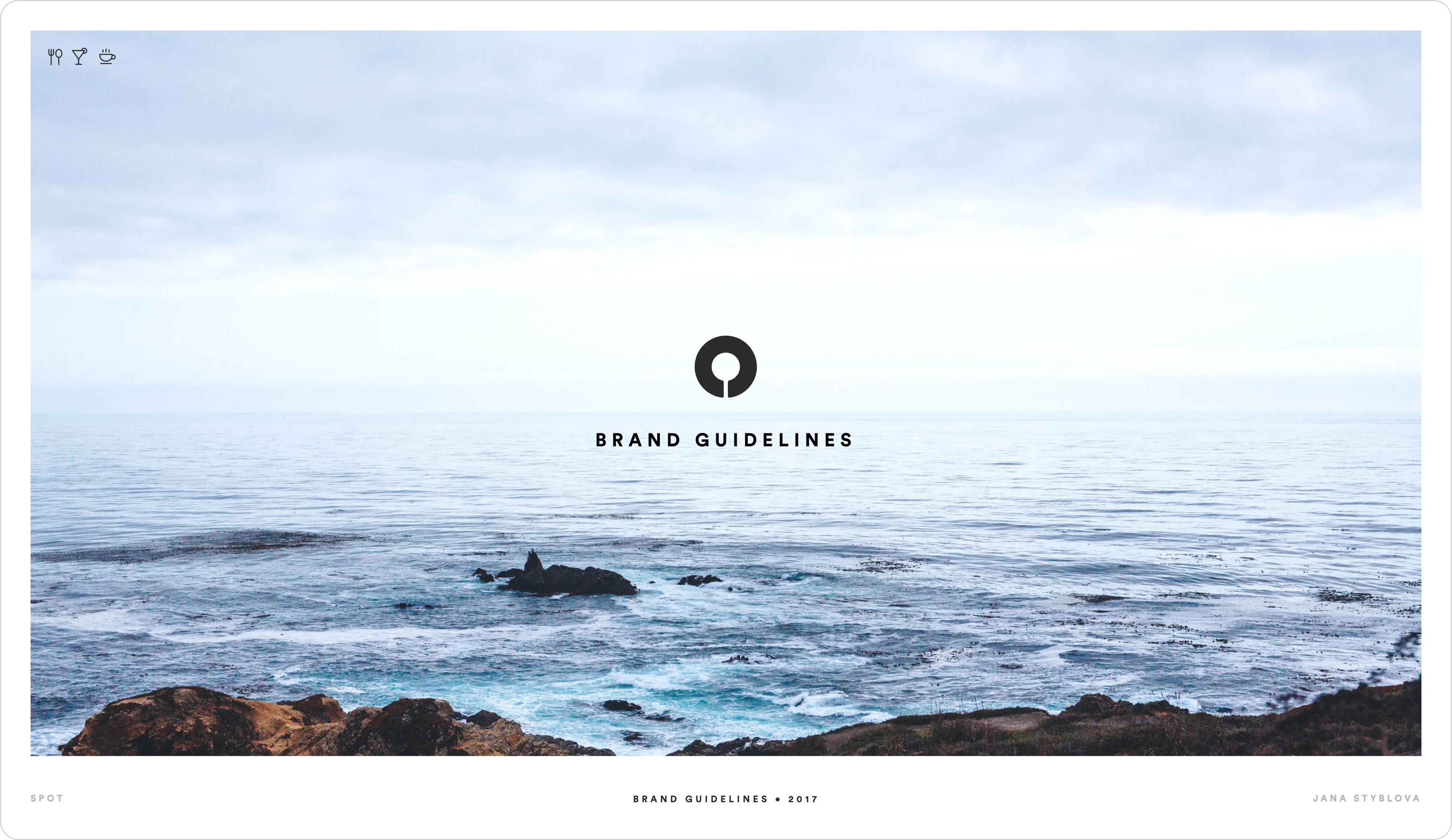
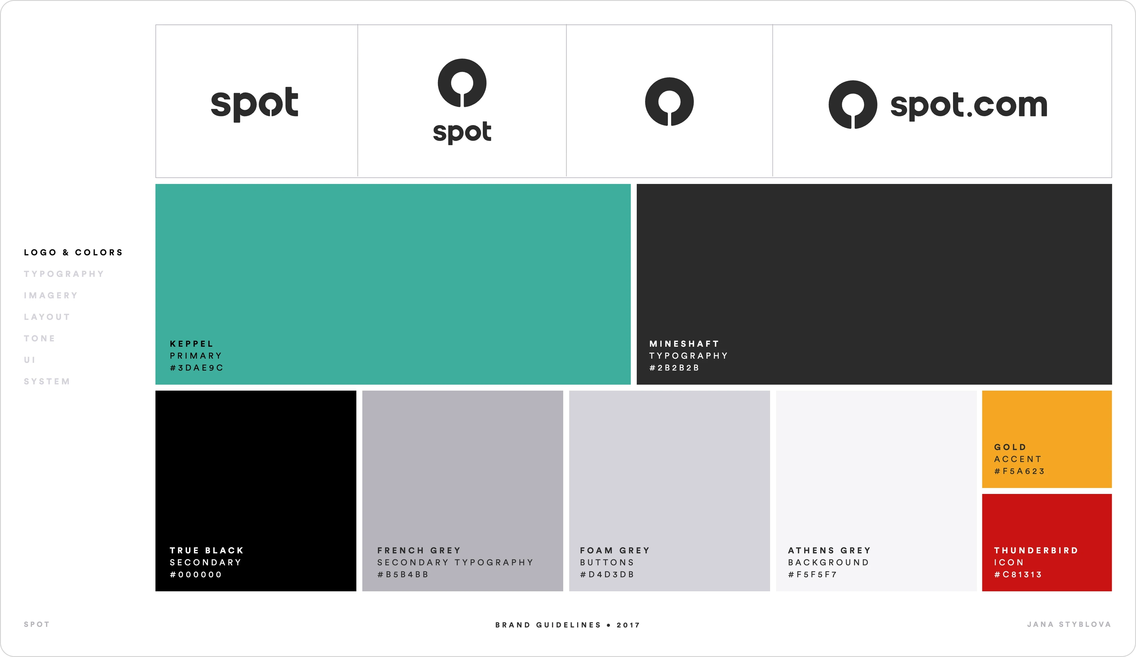
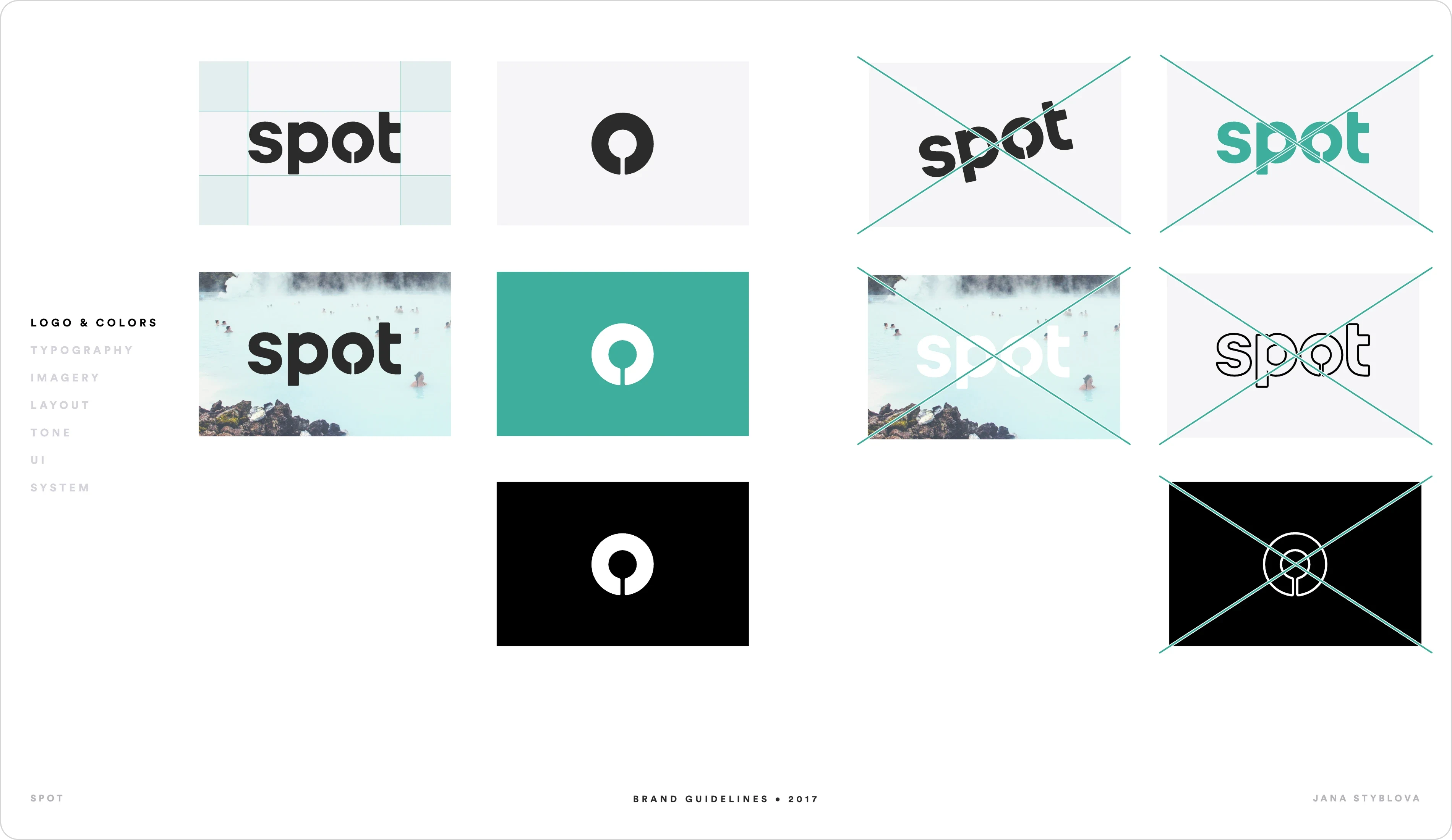
Spot Brand Guidelines
c. 2017
Spot
Brand Guidelines & App Redesign
Overview
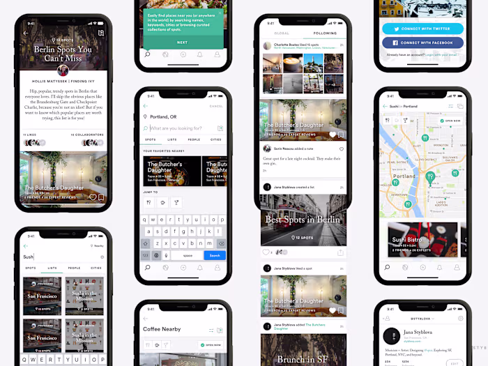
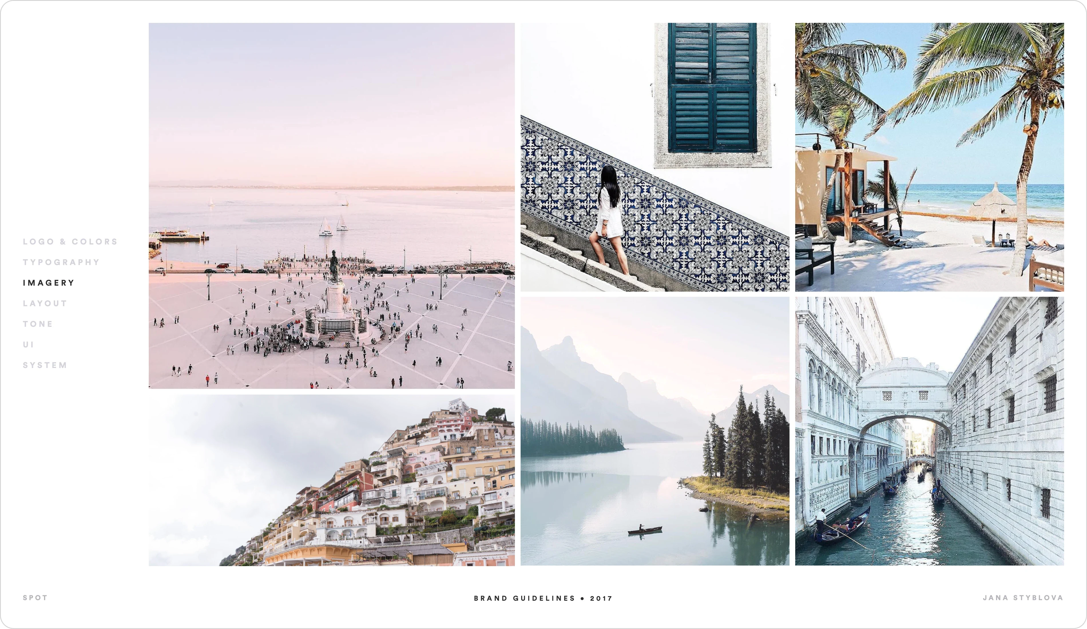
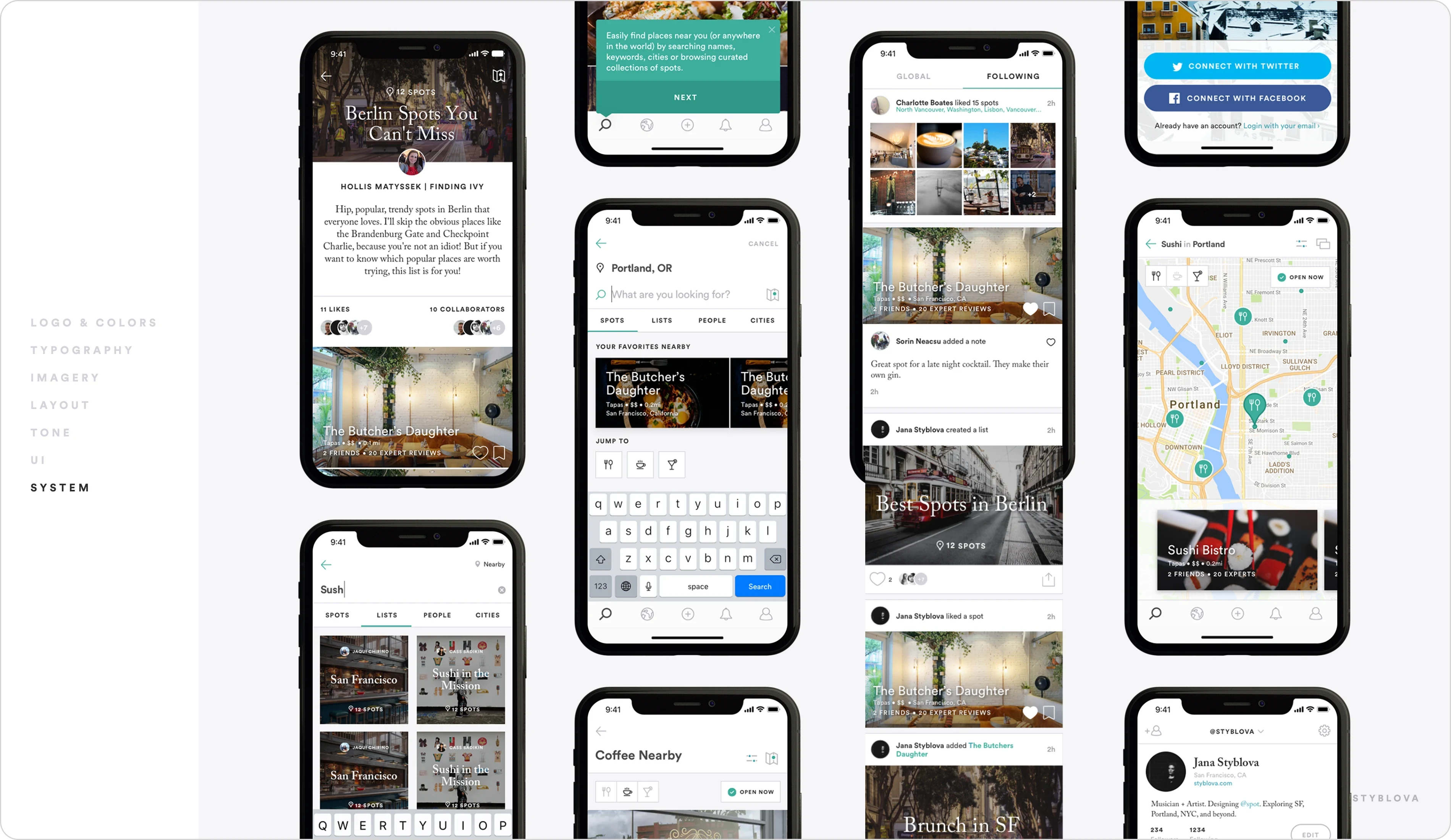
Spot is a collaborative trip planning and discovery platform built for food and travel enthusiasts.
In a saturated market of travel apps and review platforms, Spot needed to feel both editorial and utilitarian. The goal was to create a brand that connects people and places through clarity, community, and thoughtful design.
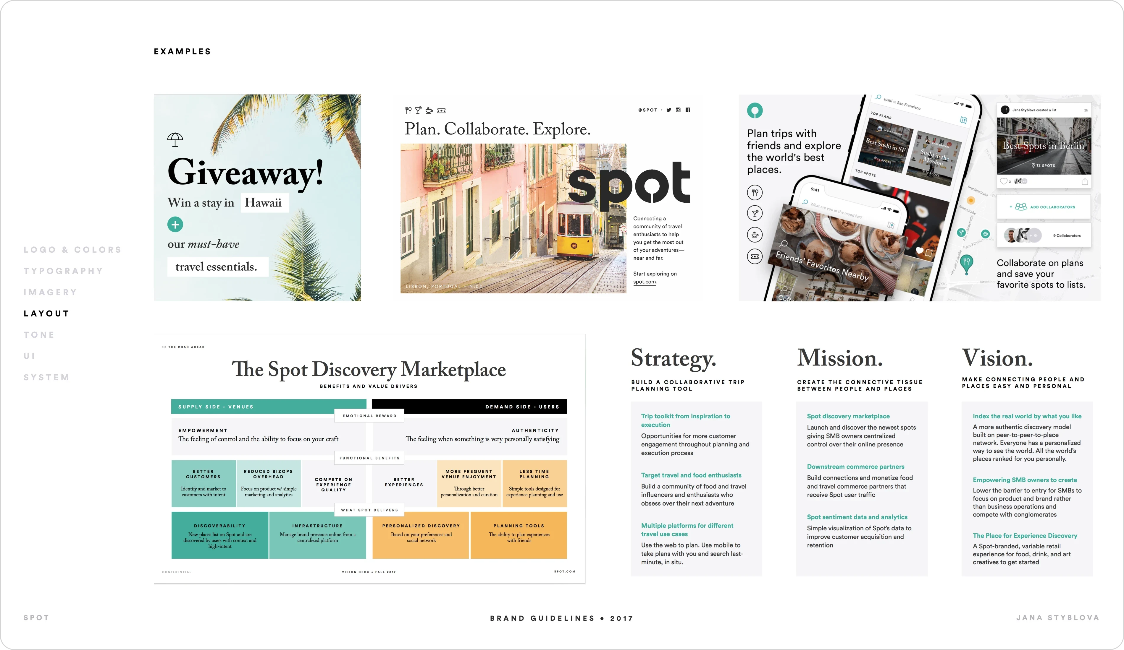
Vision
Make connecting people and places easy and personal.
Spot reimagines discovery as something deeply individual. Instead of ranking the world by popularity, Spot indexes places by personal taste — creating a peer-to-peer-to-place network where everyone sees the world differently.
The ambition extends beyond discovery: empower small businesses, lower barriers for creatives, and build a modern marketplace for experience-driven commerce.
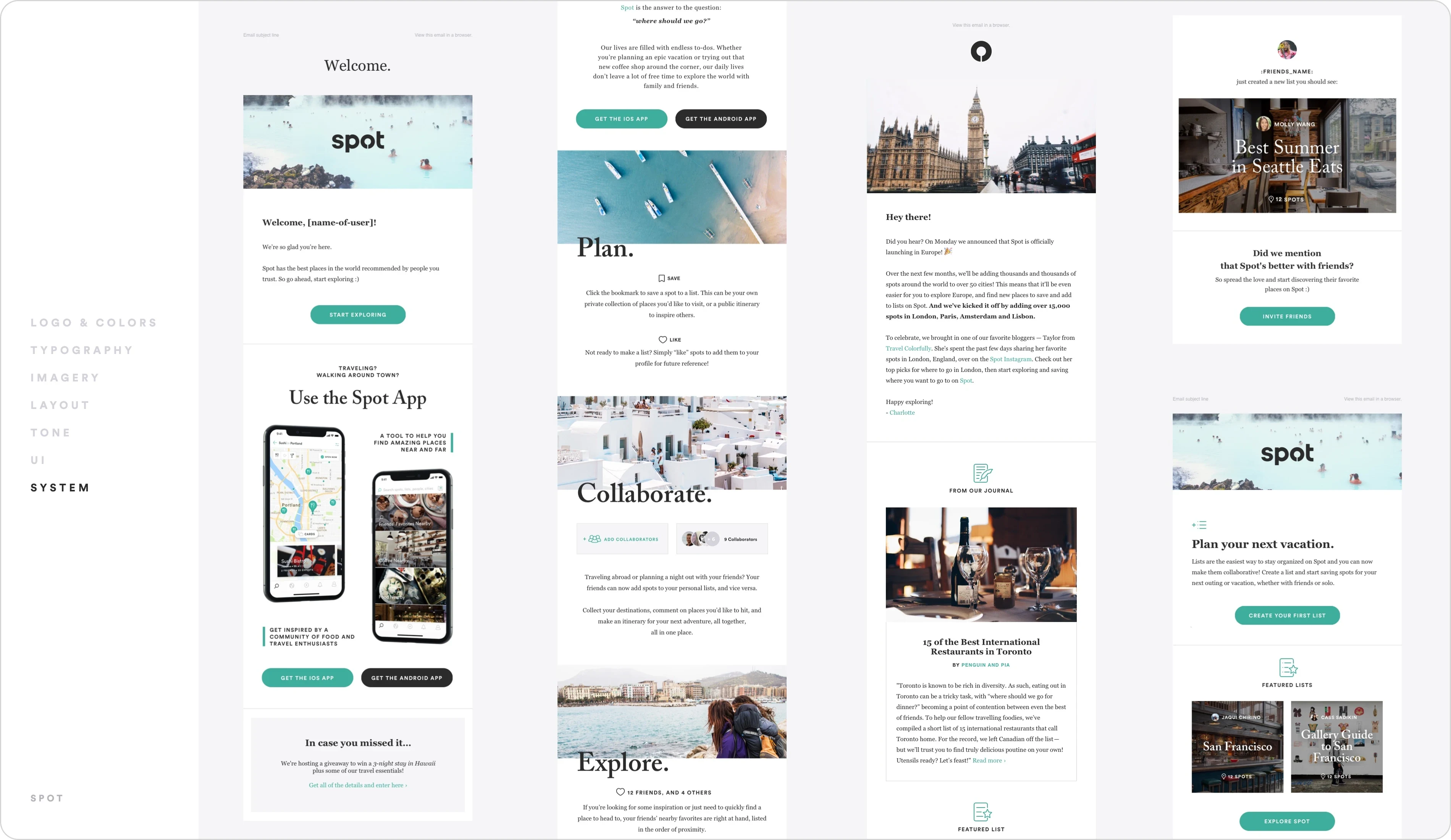
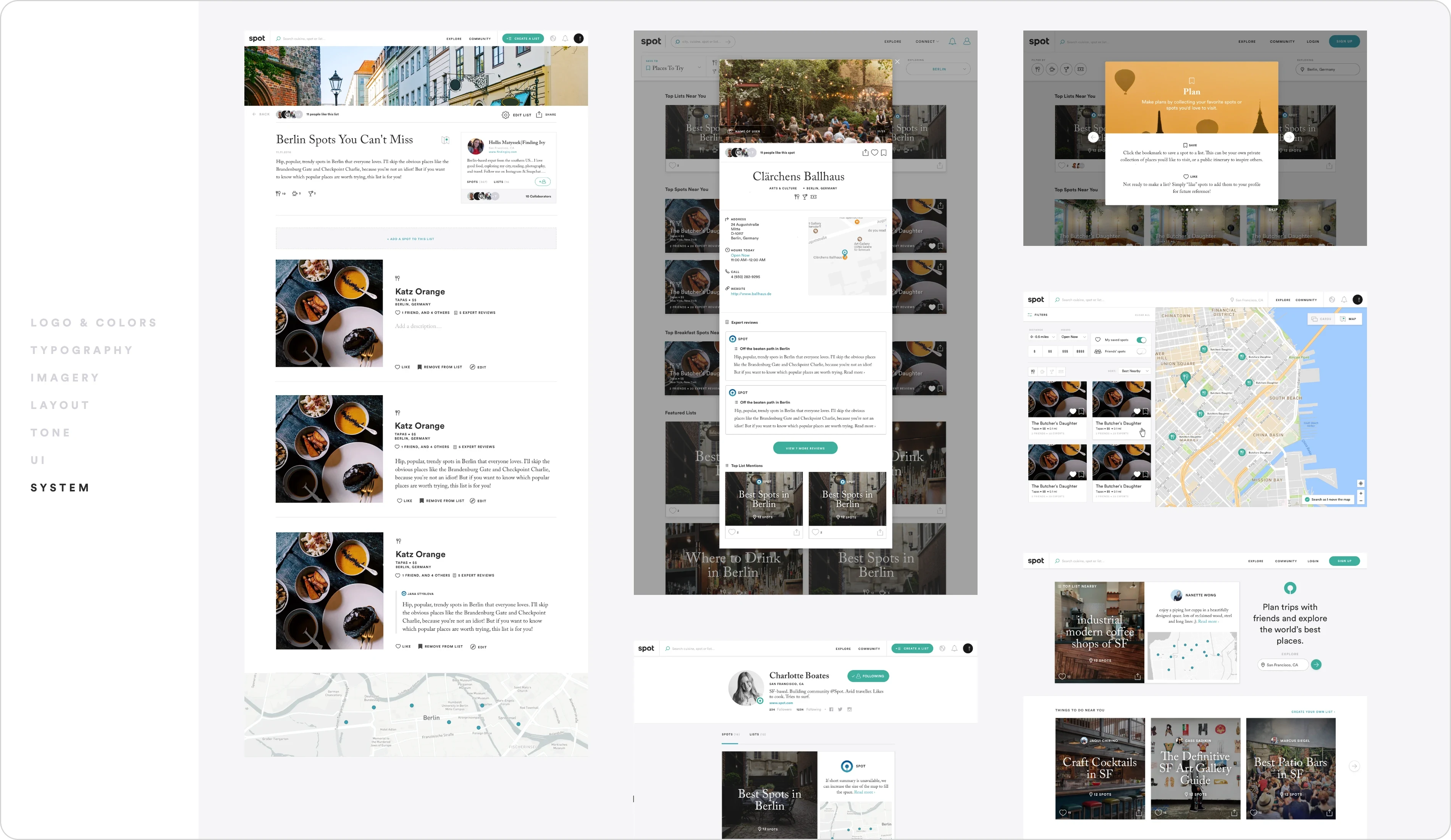
Strategy
A collaborative trip planning tool, from inspiration to execution.
Spot serves users across the full journey:
Discover inspiration
Plan collaboratively on web
Explore in real time on mobile
The platform targets travel and food enthusiasts, everyone from solo explorers to groups coordinating their next adventure, while building a community of creators and influencers who obsess over great experiences.
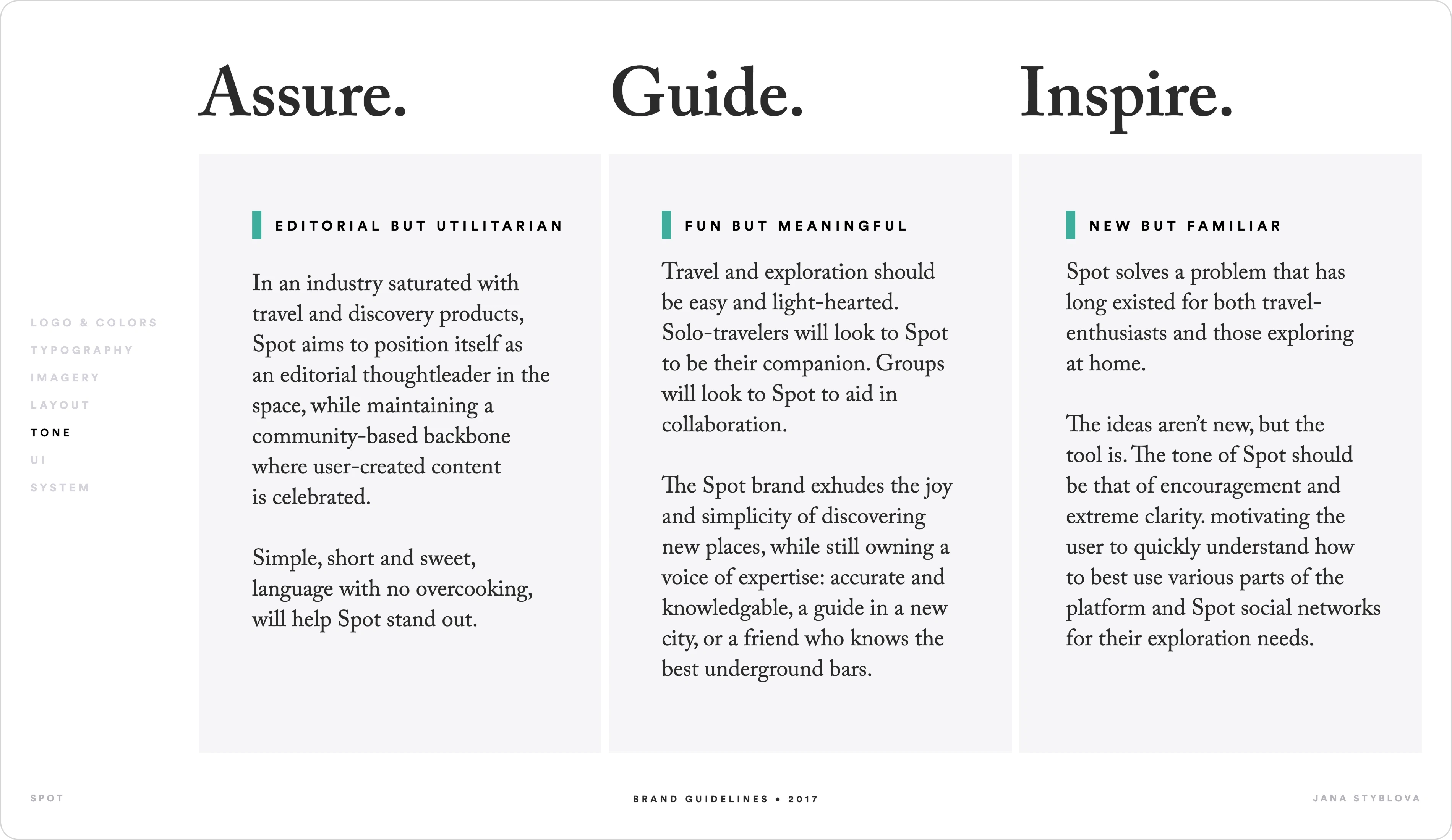
Brand Positioning
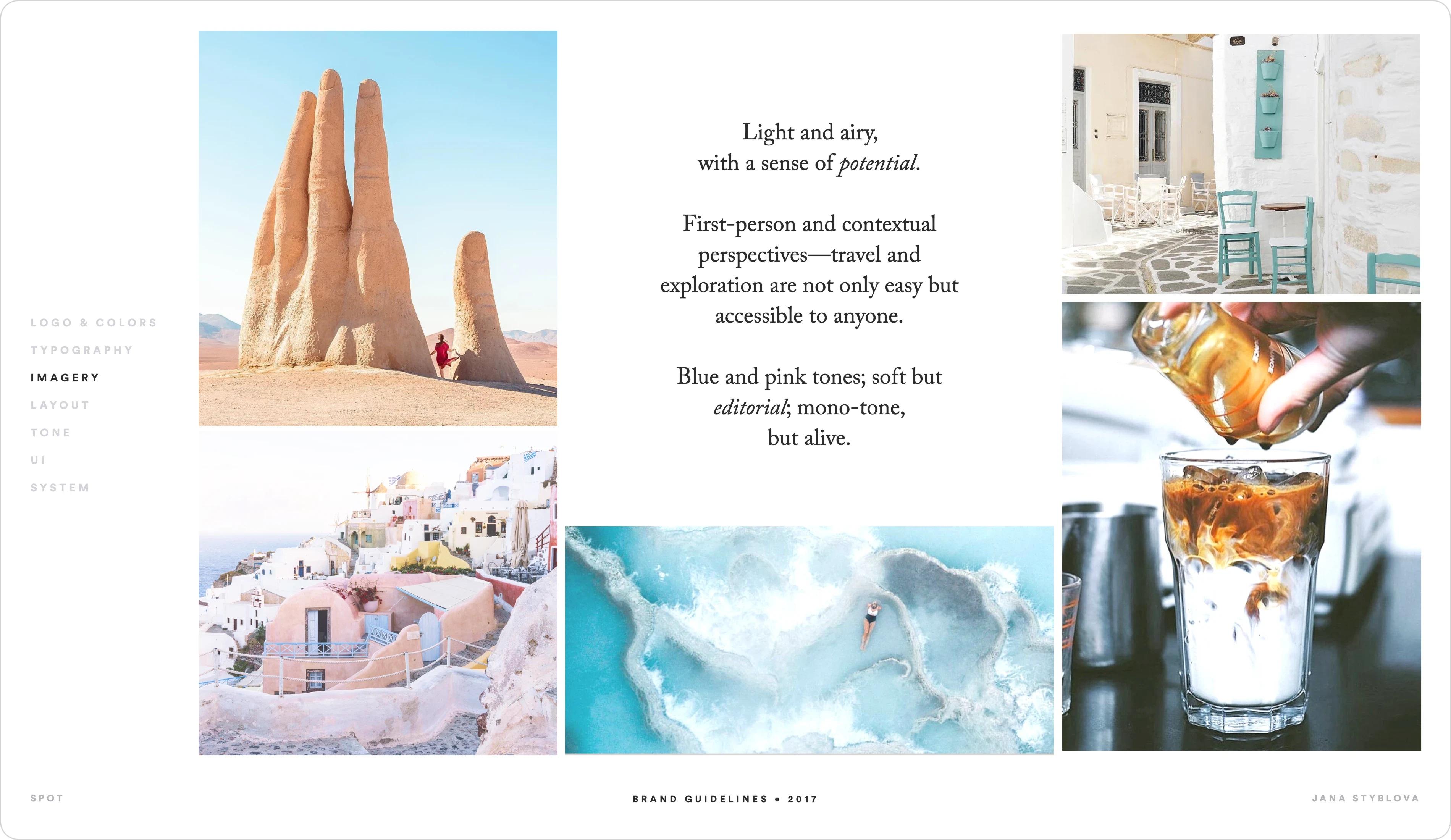
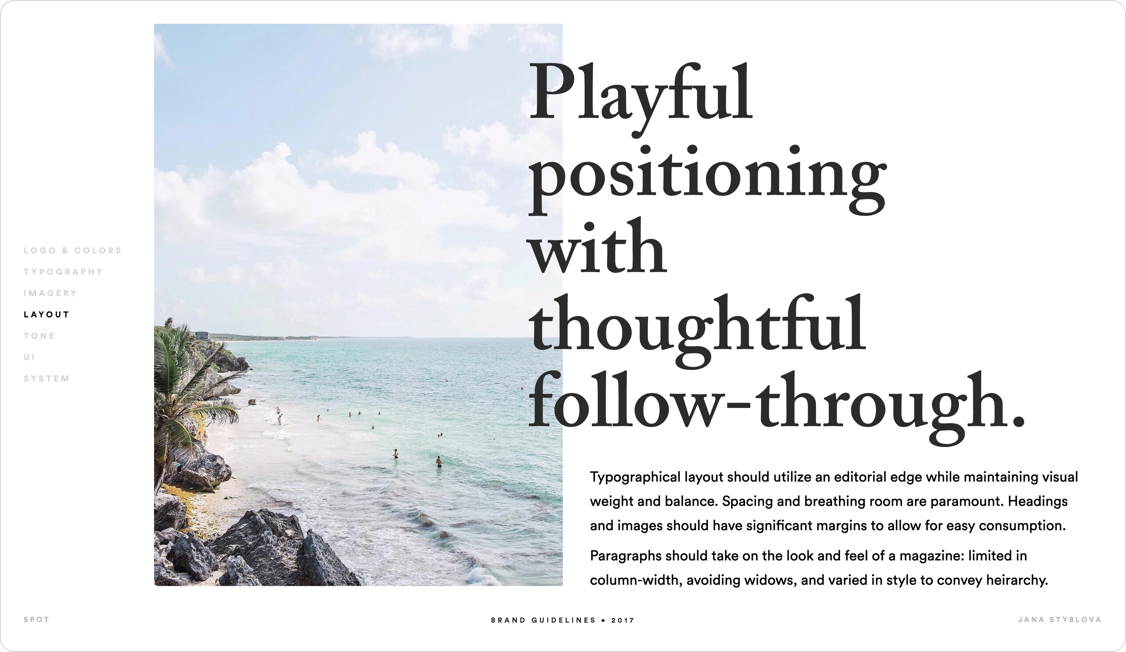
Playful positioning with thoughtful follow-through.
Spot balances lightness with precision.
It is:
Editorial but utilitarian
Fun but meaningful
New but familiar
The tone is simple, clear, and confident
Spot acts as a trusted guide in a new city or the friend who knows the best underground spots.
It assures.
It guides.
It inspires.
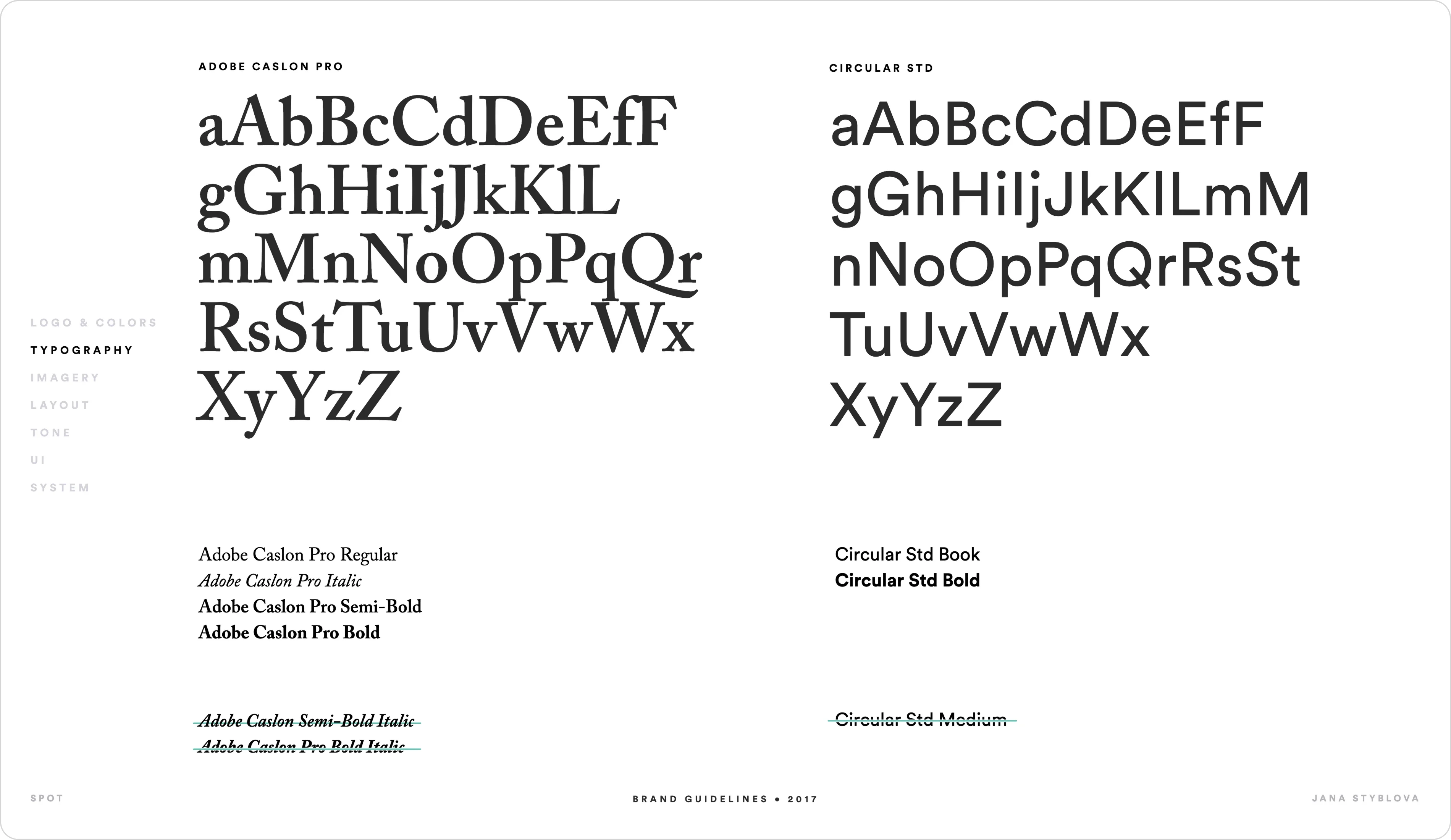
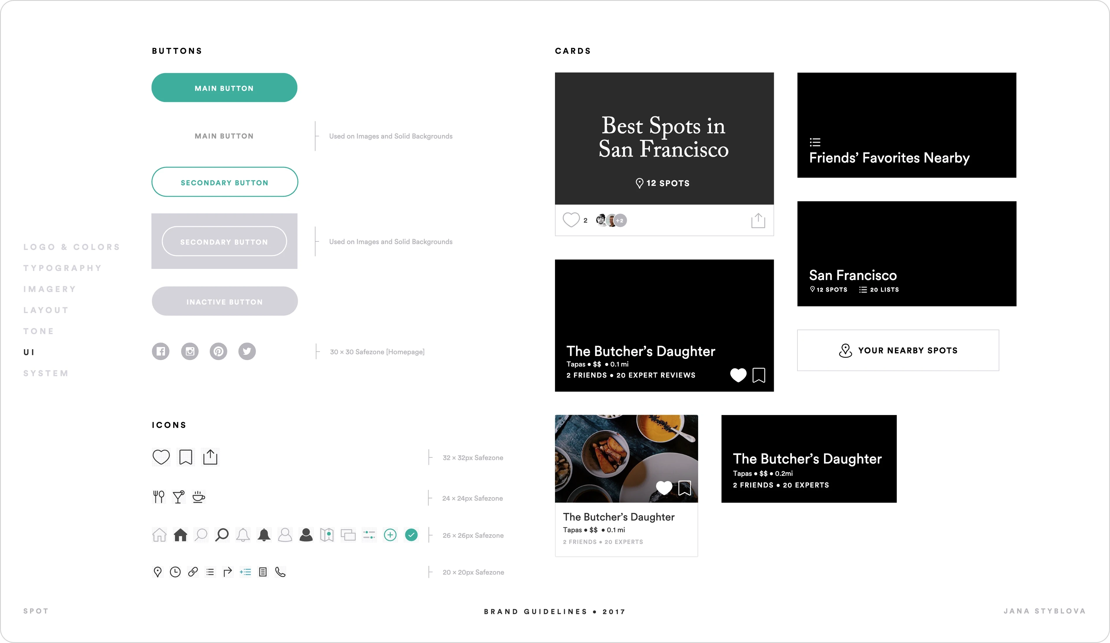
Visual System
Editorial Edge
The typographic system draws from magazine design principles:
Controlled column widths
Strong hierarchy
Generous margins
Intentional breathing room
Layouts emphasize clarity and balance, allowing content to feel curated rather than crowded.
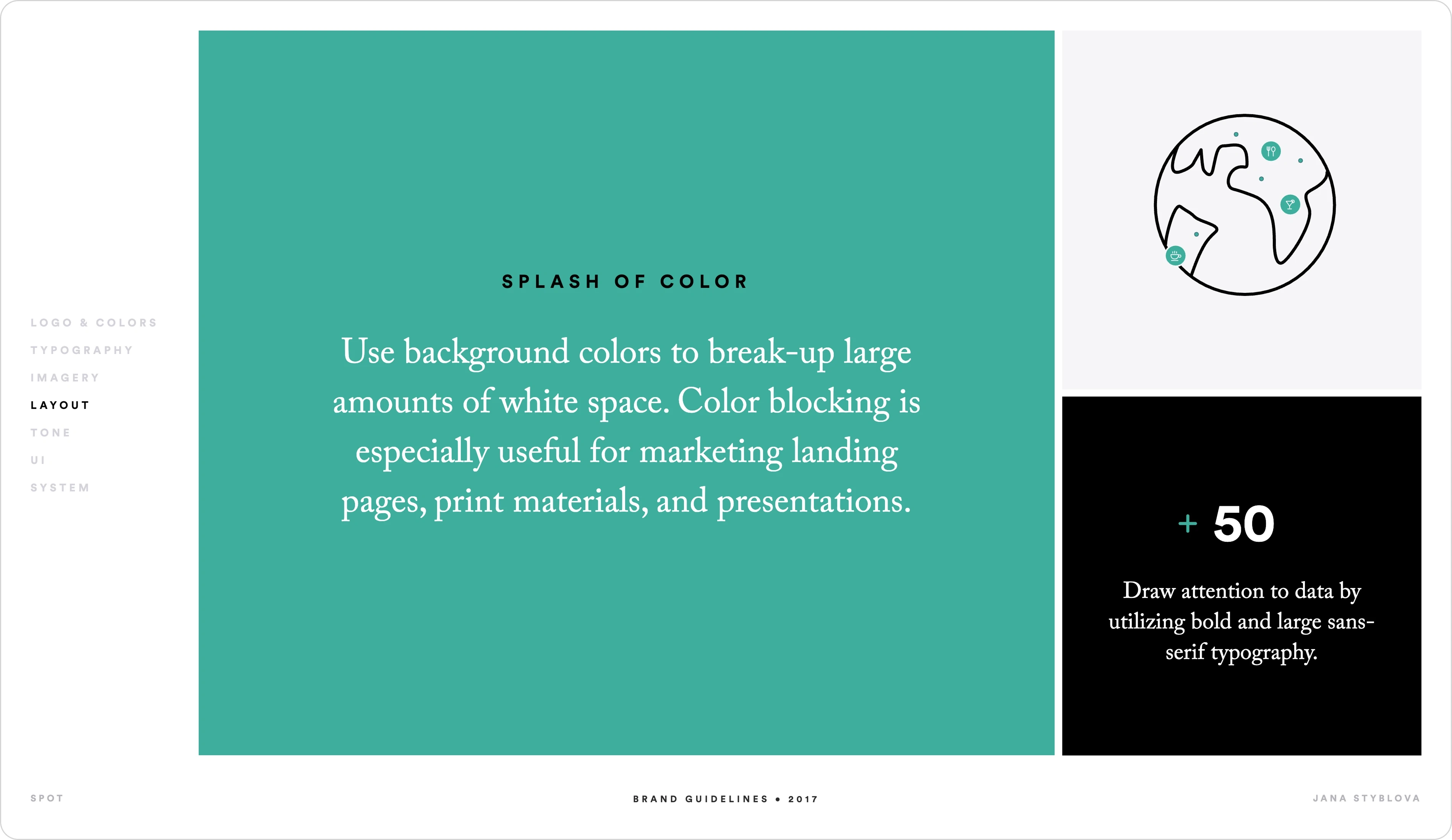
Strategic Use of Color
Color blocking breaks up white space and drives attention — particularly in marketing and data-driven moments.
Bold, oversized sans-serif typography highlights key metrics and reinforces authority.
Outcome
The redesign positioned Spot as a distinctive voice in travel and discovery, blending editorial sophistication with community-driven functionality.
The result is a scalable brand system that feels intelligent, approachable, and built for modern exploration.
Like this project
Posted Feb 11, 2026
Redesigned Spot into an immersive discovery platform and iOS app.
Likes
1
Views
6
Timeline
Dec 31, 2016 - Dec 30, 2017
Clients
Spot