Developing Bonaca: A Revenue-Decision Tool for Charter Fleets

Bozena Bulat


Bonaca — A Revenue Copilot for Charter Fleets
Bonaca is a revenue-decision copilot for professional yacht charter fleets. It reads bookings, seasonality and competitor pricing, and tells an operator when to hold a price and when to let it go — with the reasoning shown. The operator decides. Bonaca makes the call legible.
Early-stage product I'm developing, currently in concept and design. Role: market research, product strategy, information architecture, interaction design, visual identity. 2026, ongoing.
The design problem underneath: how do you build a tool for someone who is already panicking?
The problem
Croatian charter boats are booked about sixteen weeks out of fifty-two, so an empty week isn't a gap — it's the margin. When a boat isn't booking, the reflex everywhere is the same: drop the price and hope. Some of those weeks would have filled anyway; nobody knows which.
Croatia peaks by mid-June, Greece in August. Croatian operators make their hardest pricing calls earliest, with the least information.
Existing tools are booking systems, not decision systems. The largest compares competitor prices and leaves the call to you. In adjacent markets like short-term rentals, revenue management is a mature category — nobody was doing it for charter supply. That gap is where Bonaca sits.
Four states, not one dashboard
Every tool in this space is a dashboard: a screen full of numbers that leaves the decision to the user. I designed against that. Bonaca has four states, each matched to a moment in the operator's year.
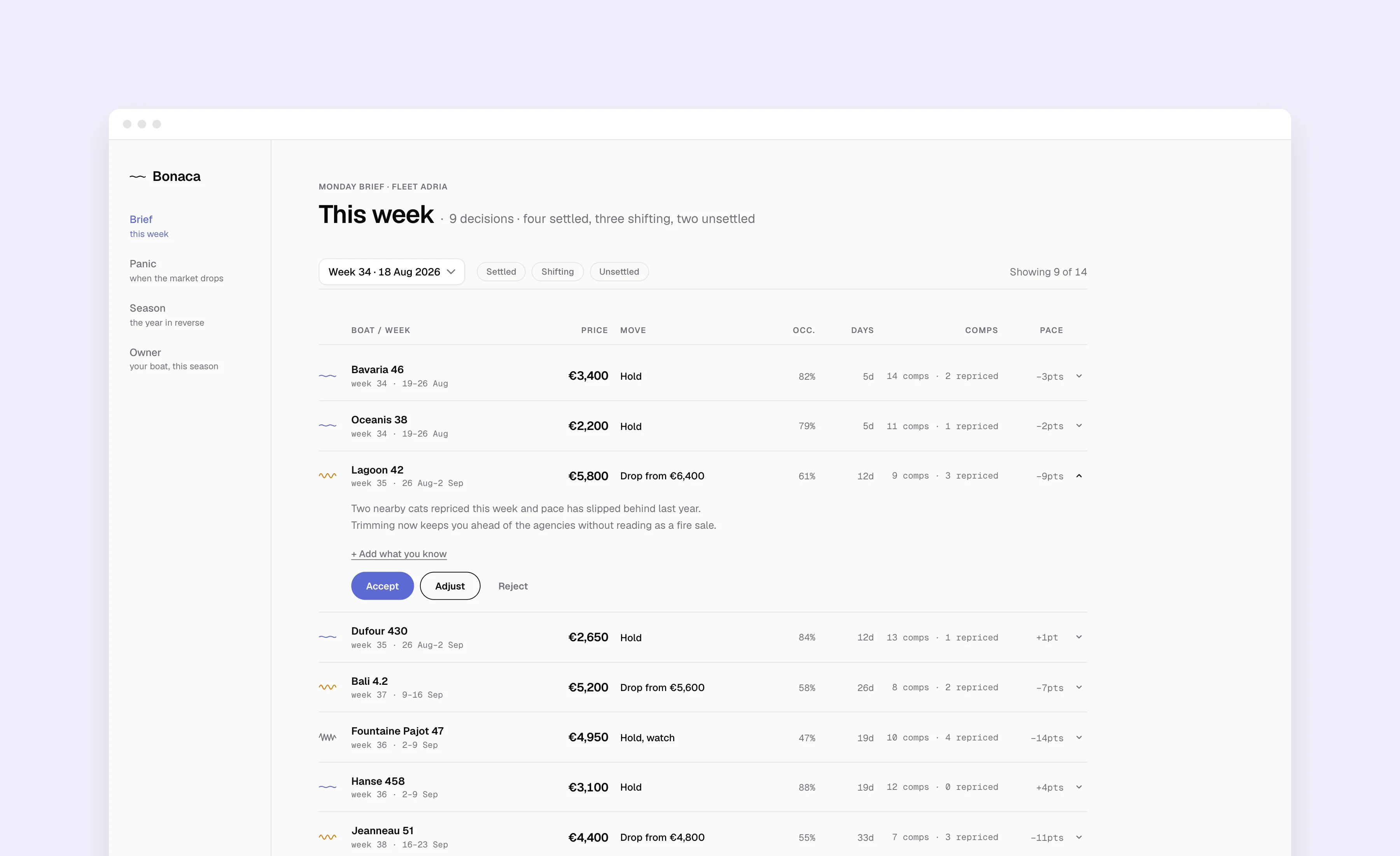
Brief — this week. A decision list, not a dashboard. Each boat is a row with the recommended price, the move, and the few numbers that justify it. Accept, adjust or reject; the system remembers why.
Panic — when the market drops. One boat, two futures: drop now for a certain smaller number, or hold for a larger uncertain one. The gap has a name — the price of panic.
Season — the year in reverse. Where money was left on the table, and where the system's own recommendations were wrong.
Owner — read-only. The same data in plain consequence, for the person whose boat sat empty.
Underneath all four: the operator can tell the system what the model can't know — "the festival moved", "my German guest always takes week 28" — and Bonaca shows how much that changed its own recommendation. An AI that listens back.
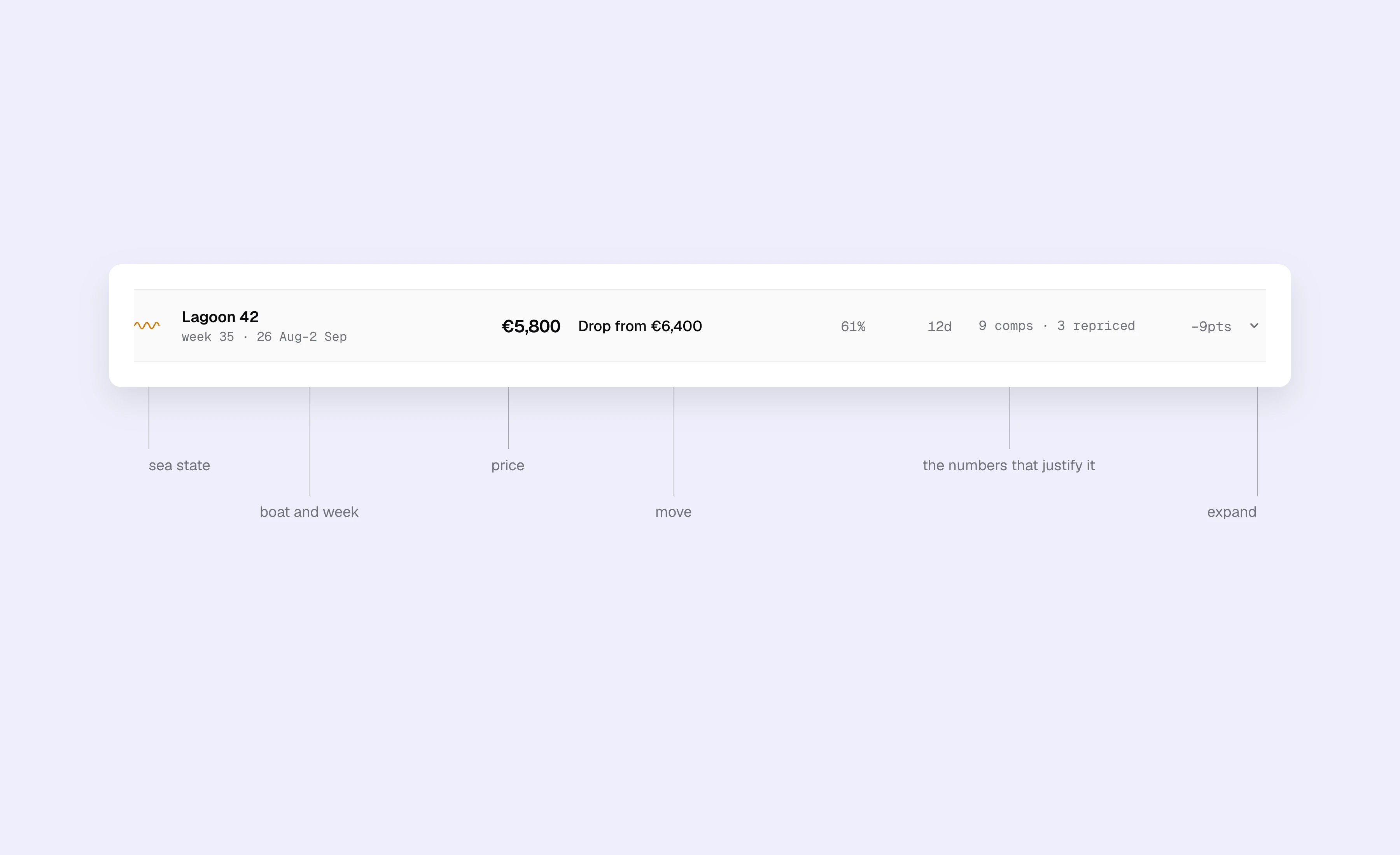
A single decision row expanded. The reasoning is two sentences, not a chart. "Add what you know" lets the operator feed the model something it can't see; the system then shows how much that changed its recommendation.
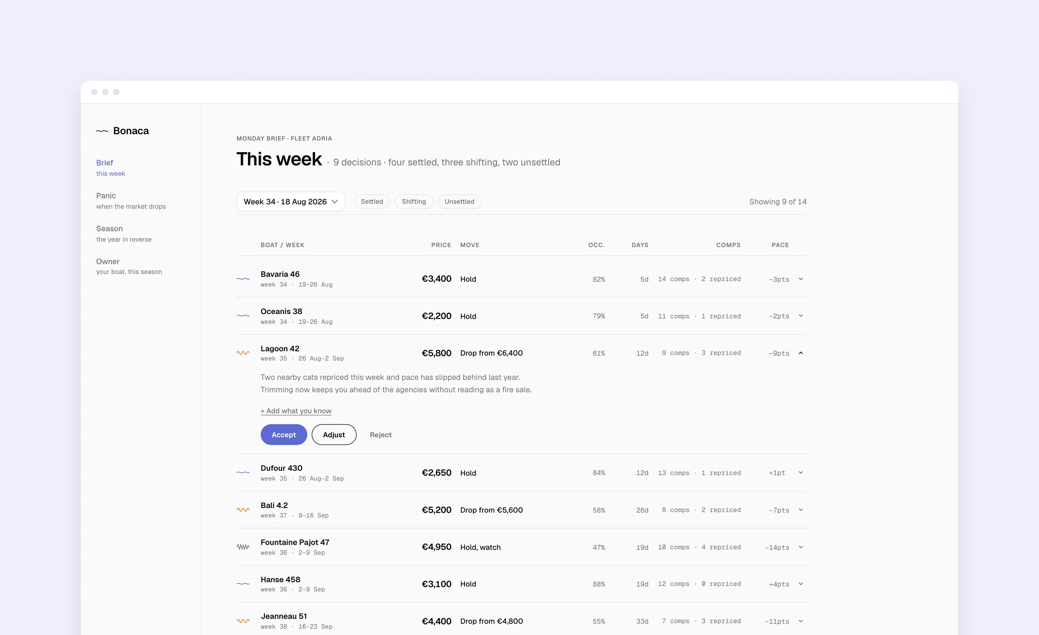
Brief — the Monday view. Nine boats, nine decisions. Each row shows the recommended price, the move, and the four numbers that justify it. Lagoon 42 is expanded to show the reasoning and the Accept / Adjust / Reject actions.
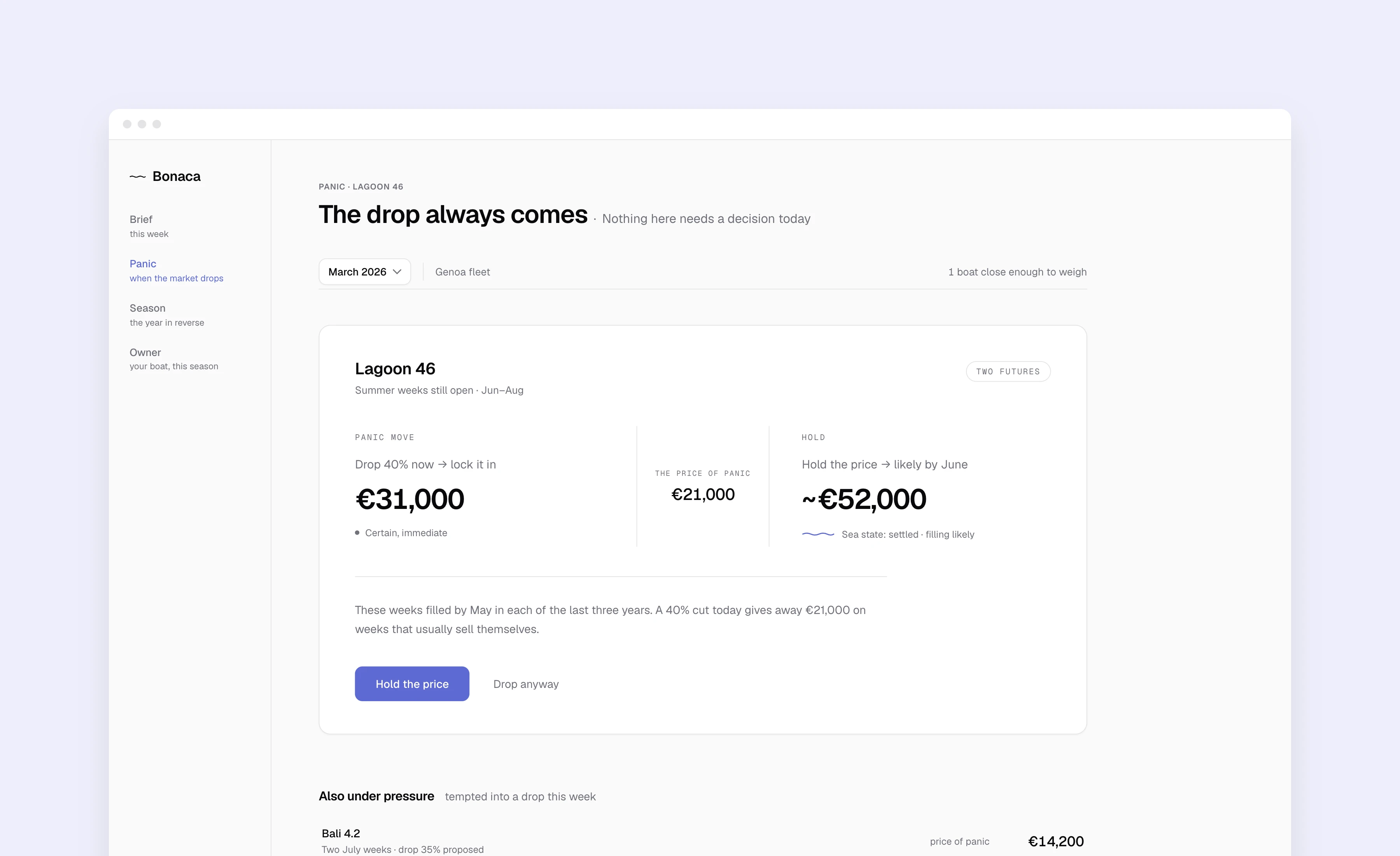
Panic — the crisis screen. One boat, two futures: drop now for a certain smaller number, or hold for a larger uncertain one. The difference is named in money. No red, no alerts, and "drop anyway" is always available.
The hard parts — every first instinct was wrong
Confidence without percentages
I reached for "78% likely to fill". Under stress nobody feels a percentage — they ignore it or over-trust it. So confidence became a sea state: a calm line, a ripple, chop. Shape carries the meaning, not colour, so it survives a bad screen and a colour-blind user. Low confidence became a feature: "not enough signal yet, I'd rather tell you Thursday" earns more trust than false precision.
Designing for panic
I reached for urgency — red, alerts, visual weight. Adding urgency to a scared person doesn't produce action; it produces a worse decision. So the crisis screen is the calmest screen in the product: no red, more whitespace than anywhere, one decision, the trade-off named in money — and "drop anyway" sits right there, unjudged. A tool that overrides you once doesn't get opened twice.
Accountability
My instinct was to keep the system's misses quiet. Instead, Season lists the calls it got wrong and what they cost — plainly, in the first person, without excuses. A tool that's never accountable never gets trusted twice.
None of these are data problems. They're trust problems. That's the whole product.
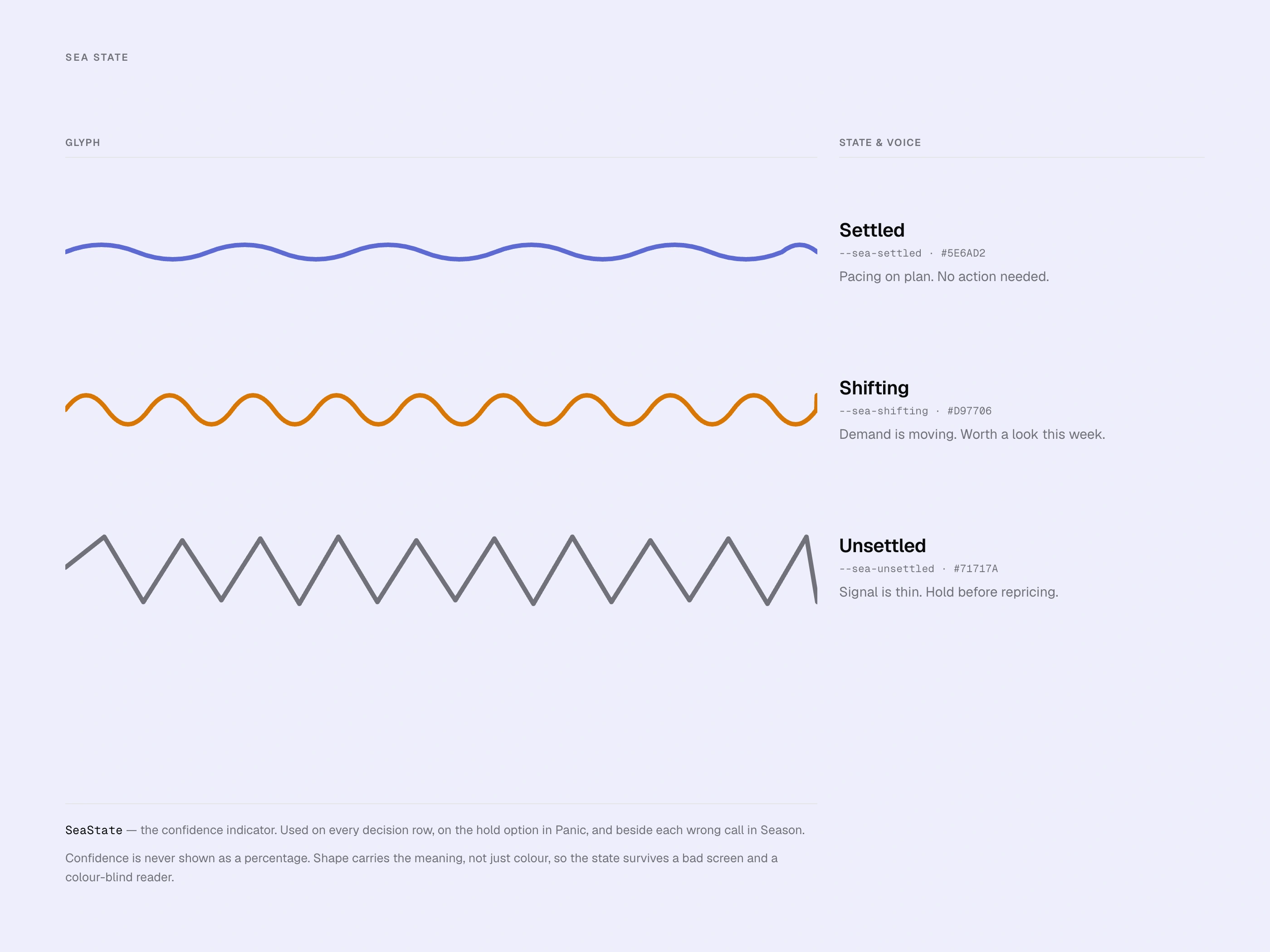
Confidence as a sea state. Calm line for settled, ripple for shifting, chop for unsettled. Shape carries the meaning, not colour, so it reads on a bad screen and for colour-blind users. No percentages anywhere in the product.
System and identity
Token-based design system, shared components across every screen, two users with adapted language — trade terms for the operator, plain consequence for the owner. The wordmark is the product's own settled sea-state glyph: identity and interface share one form. An accent in exactly three places, money always in ink, nothing ever red.
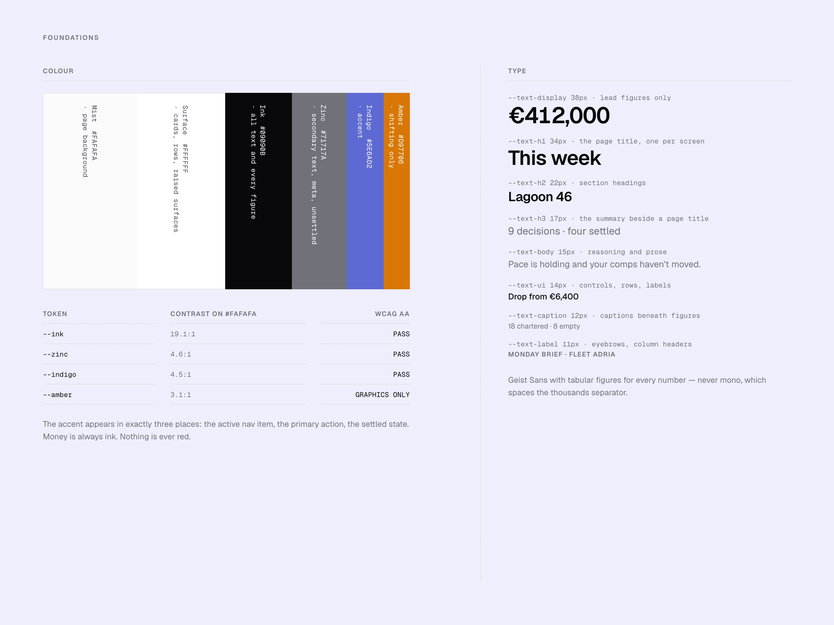
DesFoundations. Four colour tokens with contrast ratios documented against WCAG AA; the accent appears in exactly three places. One type scale, Geist Sans with tabular figures, so every number lines up. Money is always ink.ign system
The system is small on purpose: four colour tokens with WCAG AA contrast documented, one type scale with tabular figures for every number, and a handful of components with their states and a rule for when to use each. Colour signals action, never performance.
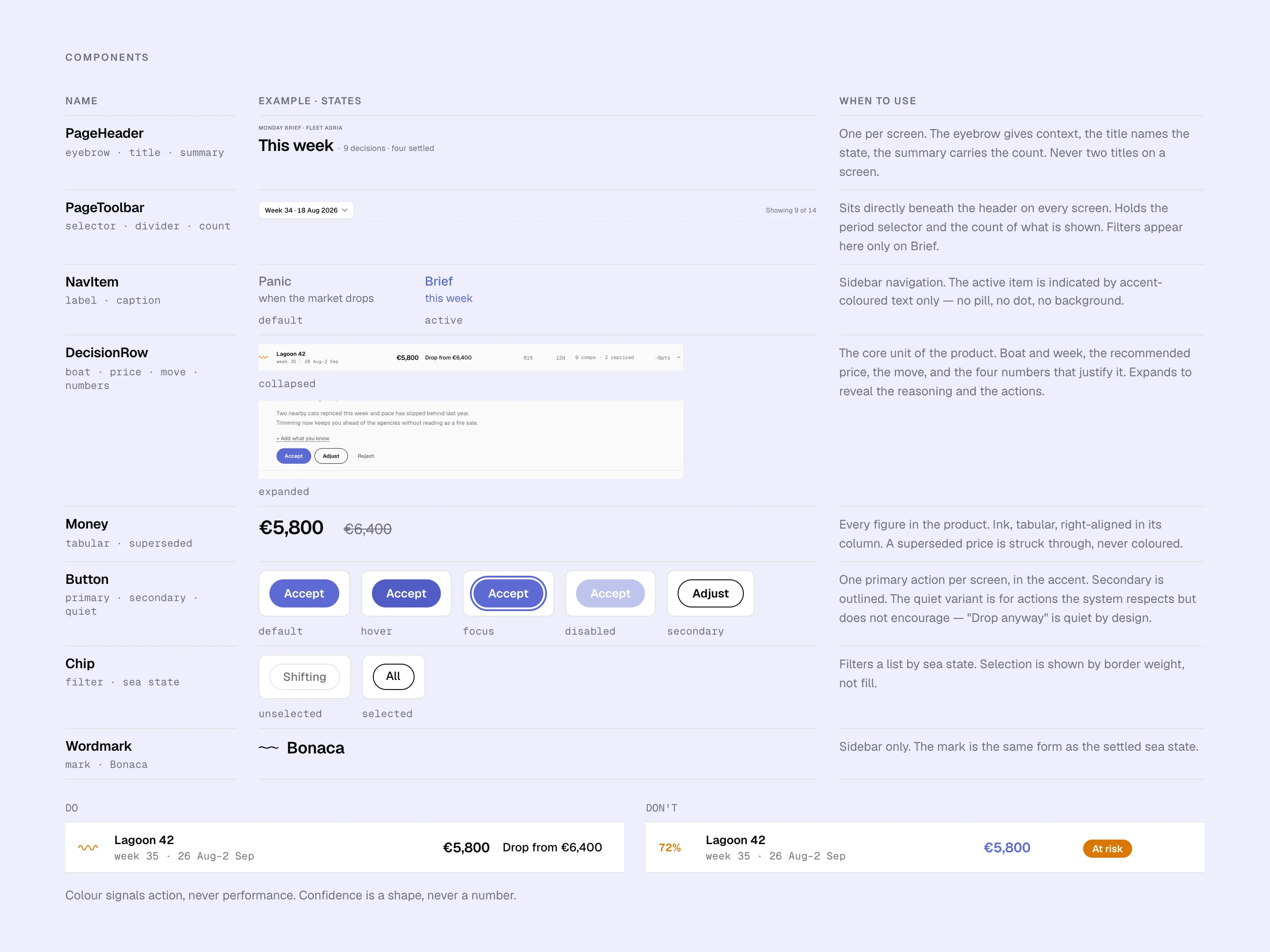
Components with their states and a rule for when to use each. The decision row is the core unit. Bottom: the DO / DON'T pair — colour signals action, never performance. Confidence is a shape, never a number.
This is the public version; happy to walk through the rest in a conversation.
Like this project
Posted Sep 24, 2026
Developing Bonaca, a revenue copilot for yacht charter fleets, focusing on market research and design strategies.
Likes
1
Views
1
Timeline
Jan 1, 2026 - Ongoing