Café Lumière: A Study in Beige
Mahek Jamil
Overview
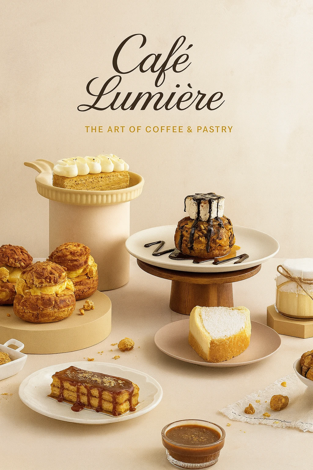
Café Lumière is a boutique café brand built around the philosophy of "The Art of Coffee & Pastry." The goal of this project was to craft a refined, Parisian-inspired visual identity that communicates elegance, warmth, and artisanal craftsmanship. The brand needed to feel timeless yet approachable, sophisticated enough for a premium positioning, while still evoking the comfort and intimacy of a neighborhood café.
Design & Layout
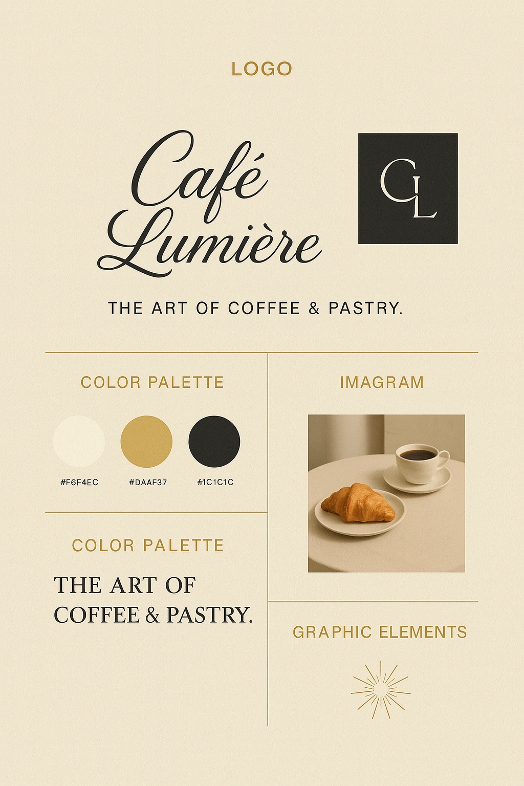
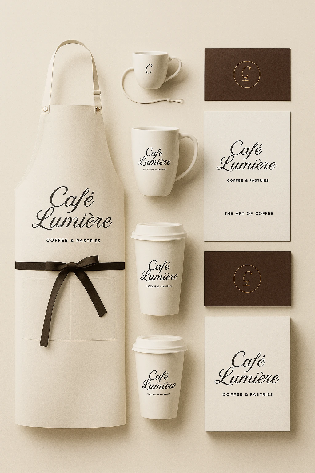
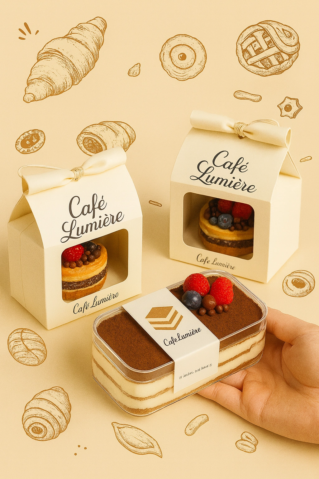
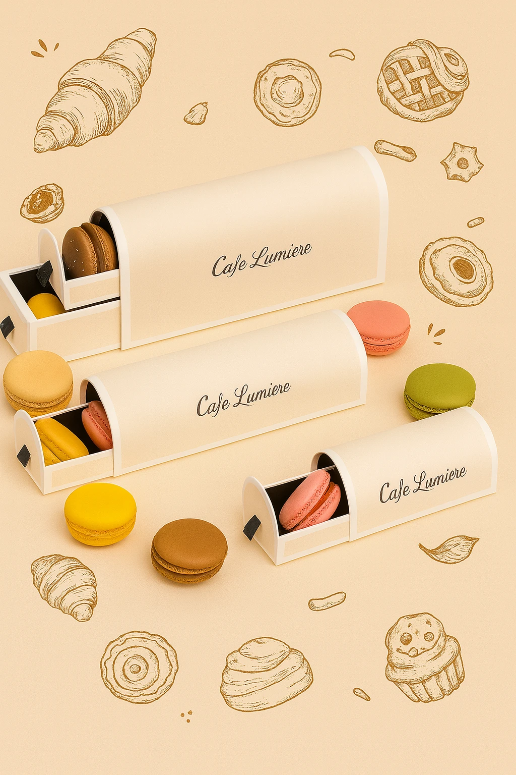
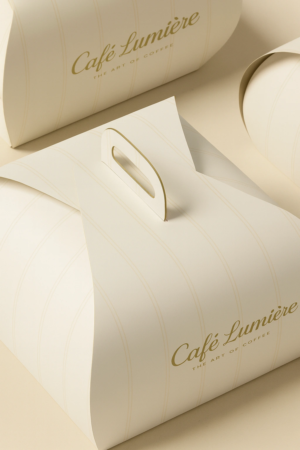
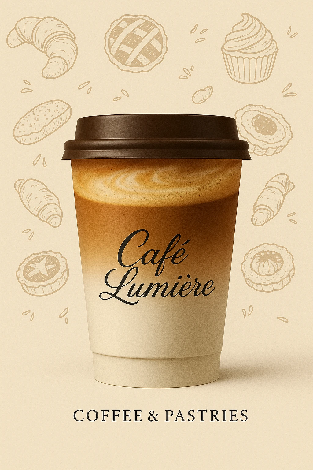
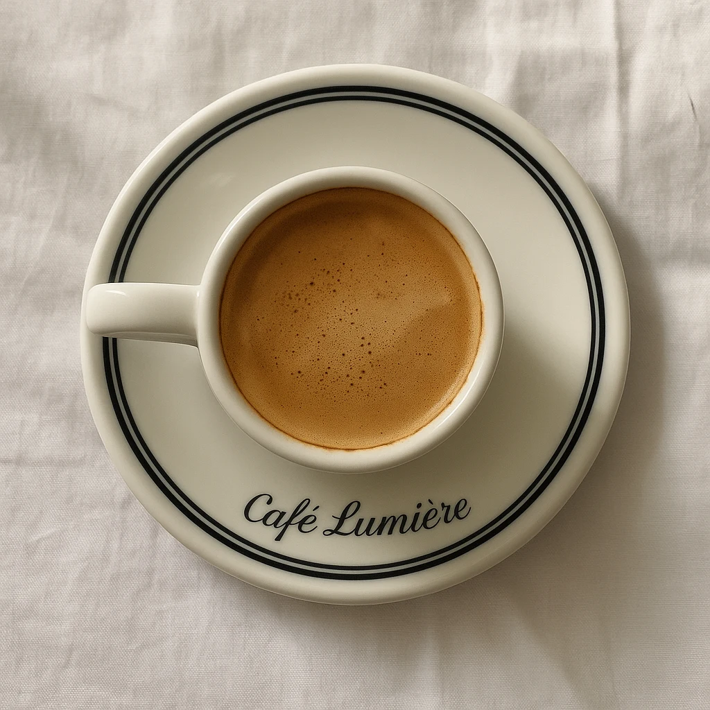
The identity system centers on a flowing script wordmark that draws immediate inspiration from classical French typography, pairing beautifully with a structured serif monogram mark (CL) for secondary use. This dual-logo system gives the brand flexibility across touchpoints — from signage and packaging to social media and print collateral.
The color palette was kept intentionally restrained: a warm cream (
#F6F4EC) forms the base, evoking parchment and natural linen; a muted gold (#DAAF37) adds richness and a sense of artisanal quality; and a deep charcoal (#1C1C1C) grounds the palette with contrast and legibility. Together, these three tones create a cohesive world that feels both luxurious and organic.A sunburst graphic element was introduced as a supporting brand motif, lending a subtle vintage elegance that works across decorative applications without overpowering the primary marks.
Methodology
The design process began with a mood and imagery direction centered on warmth, natural light, and the sensory experience of a French bakery. The Instagram grid mockup was developed to demonstrate how the identity translates into real-world content, showing how photography, logo placement, and whitespace interact at scale. The grid balances editorial lifestyle imagery (bakers at work, flour dusting, pastry close-ups) with clean brand announcement tiles, proving the identity is both content-flexible and visually cohesive in a social context.
Typography choices were deliberate: the script wordmark carries emotion and personality, while the all-caps tracking of the tagline "THE ART OF COFFEE & PASTRY" introduces a quieter, more structured voice that balances the expressiveness of the main logo.
Outcome
The final identity system delivers a complete and scalable brand toolkit, including primary and secondary logo marks, a defined color palette, a typographic system, graphic elements, and an applied social media layout. The result is a brand that feels immediately credible and premium, while remaining warm and human, qualities essential for a food and hospitality concept competing in a crowded market.
Conclusion
Café Lumière demonstrates how restraint in color, intentionality in type, and consistency in imagery direction can produce a brand identity that punches well above its weight. The project reflects a strong understanding of brand positioning, visual hierarchy, and the practical application of identity design across both print and digital contexts, making it a strong centerpiece for a design portfolio.
Like this project
Posted Mar 31, 2026
Crafting a Parisian-inspired brand identity for Café Lumière, from logo and color palette to packaging, merchandise, and digital touchpoints.