Couples often make mistakes while planning for their wedding

Couples often make mistakes while planning for their wedding
One telltale sign that I’ve entered a new stage of life is when more and more of my friends begin to talk, attend, and plan for weddings. With all this talk, I’ve noticed one underlying trend… couples make many mistakes while planning which results in difficult and expensive weddings. So I asked, how could I make this process easier and cheaper?
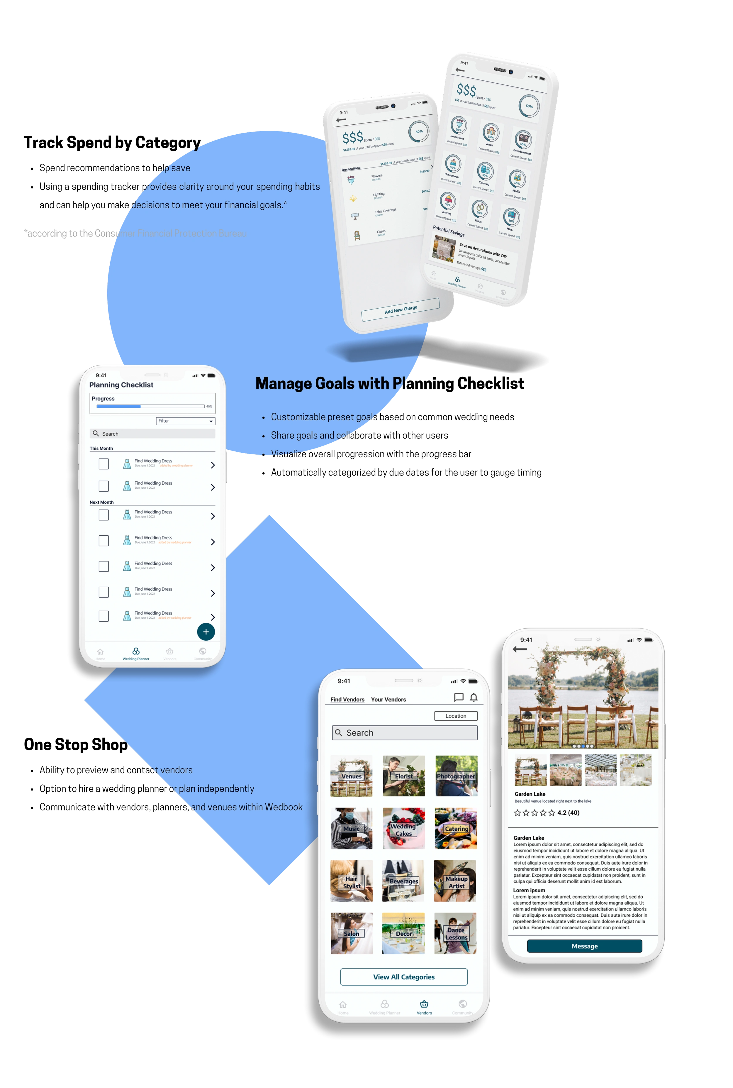
Users can efficiently plan and budget dream weddings
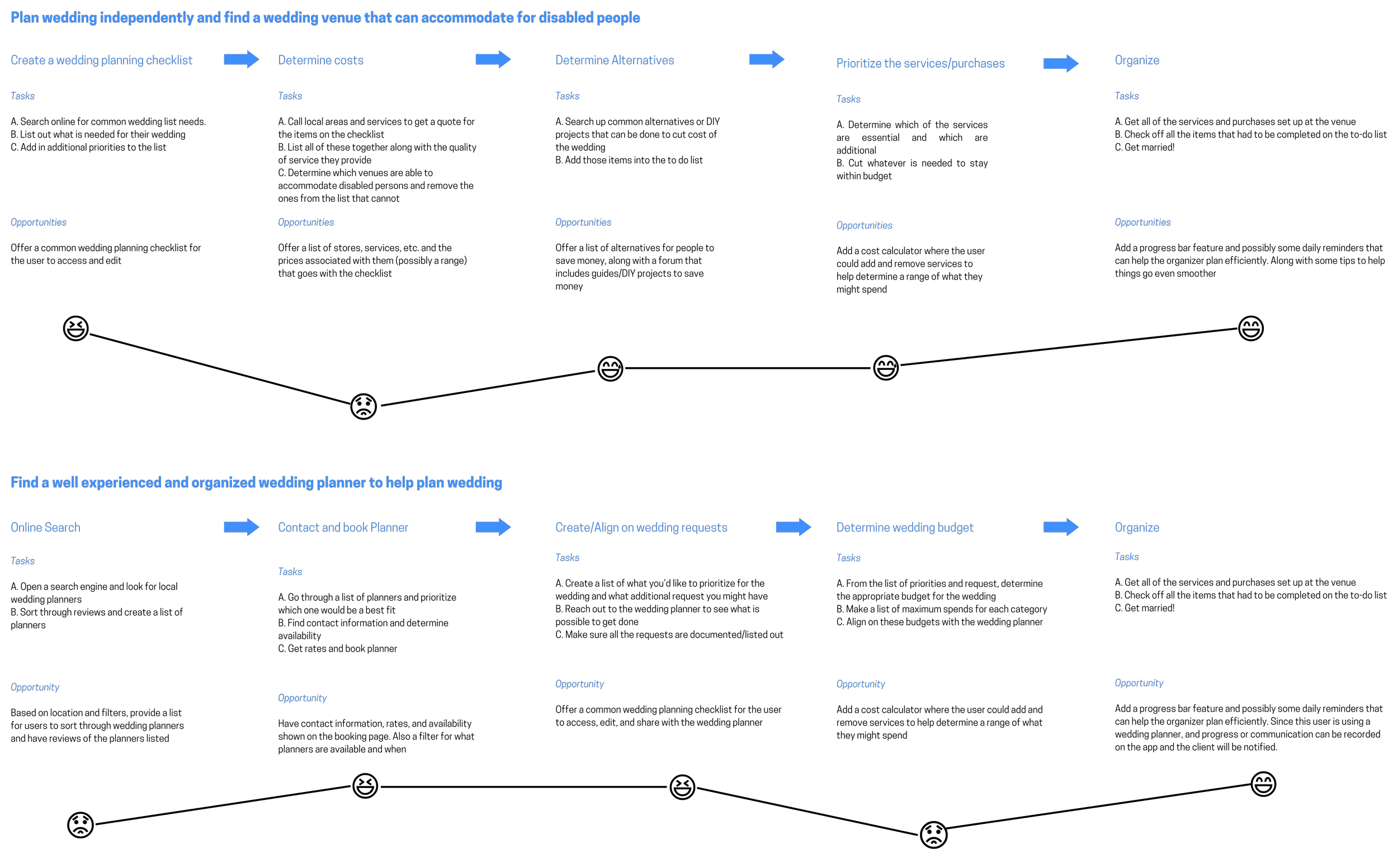
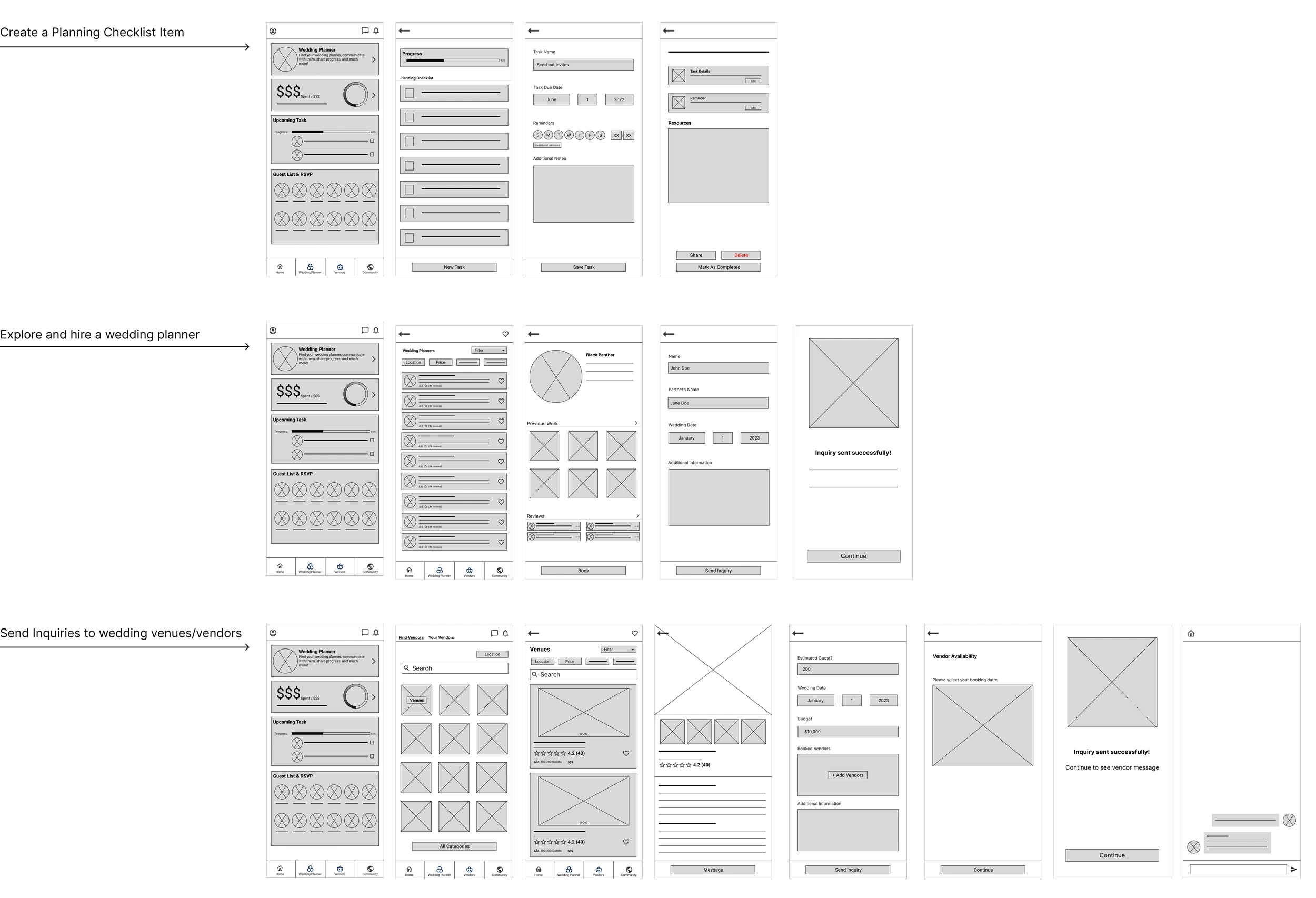
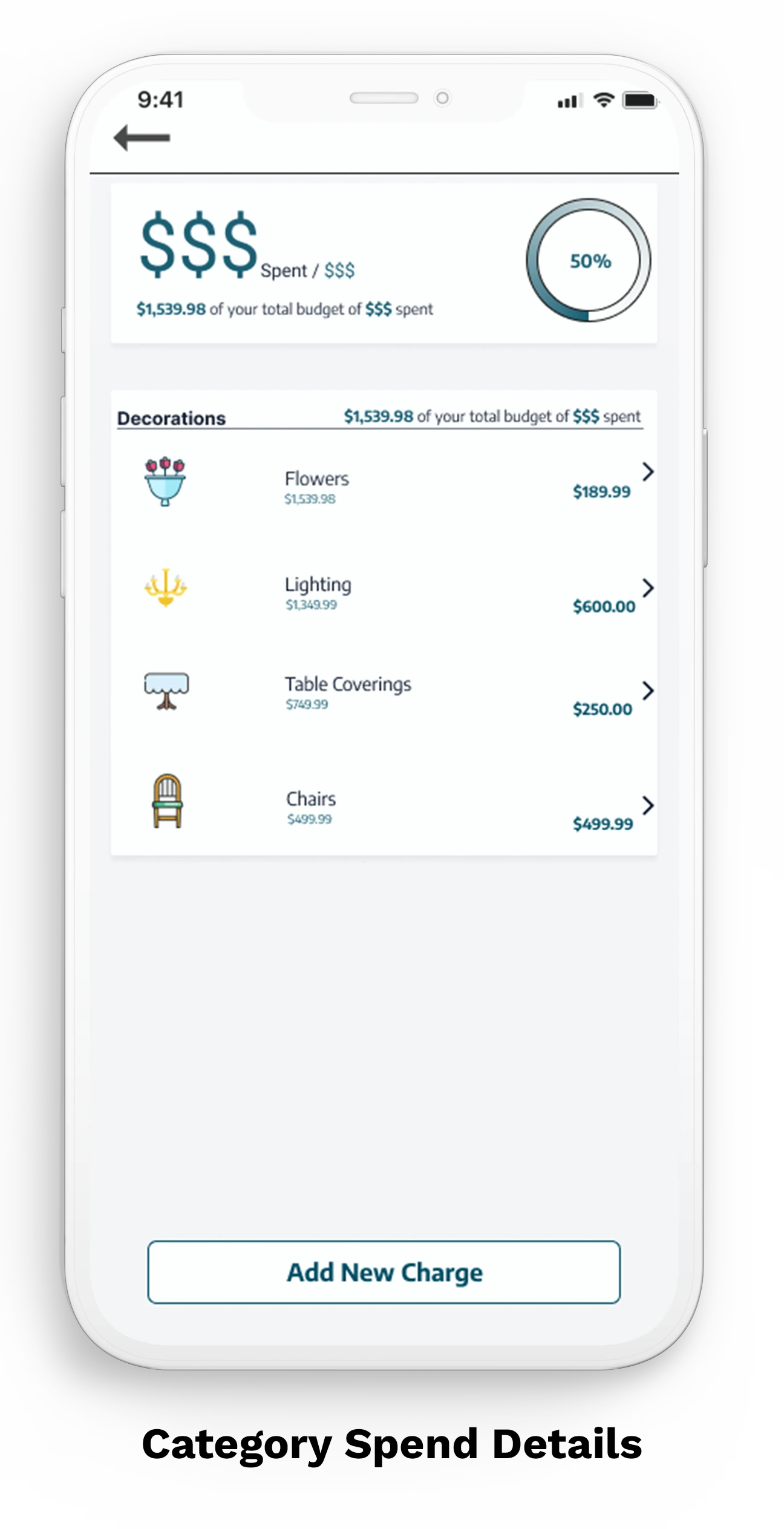
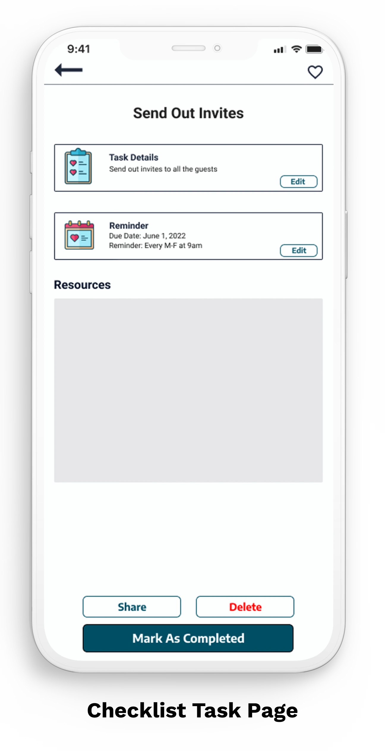
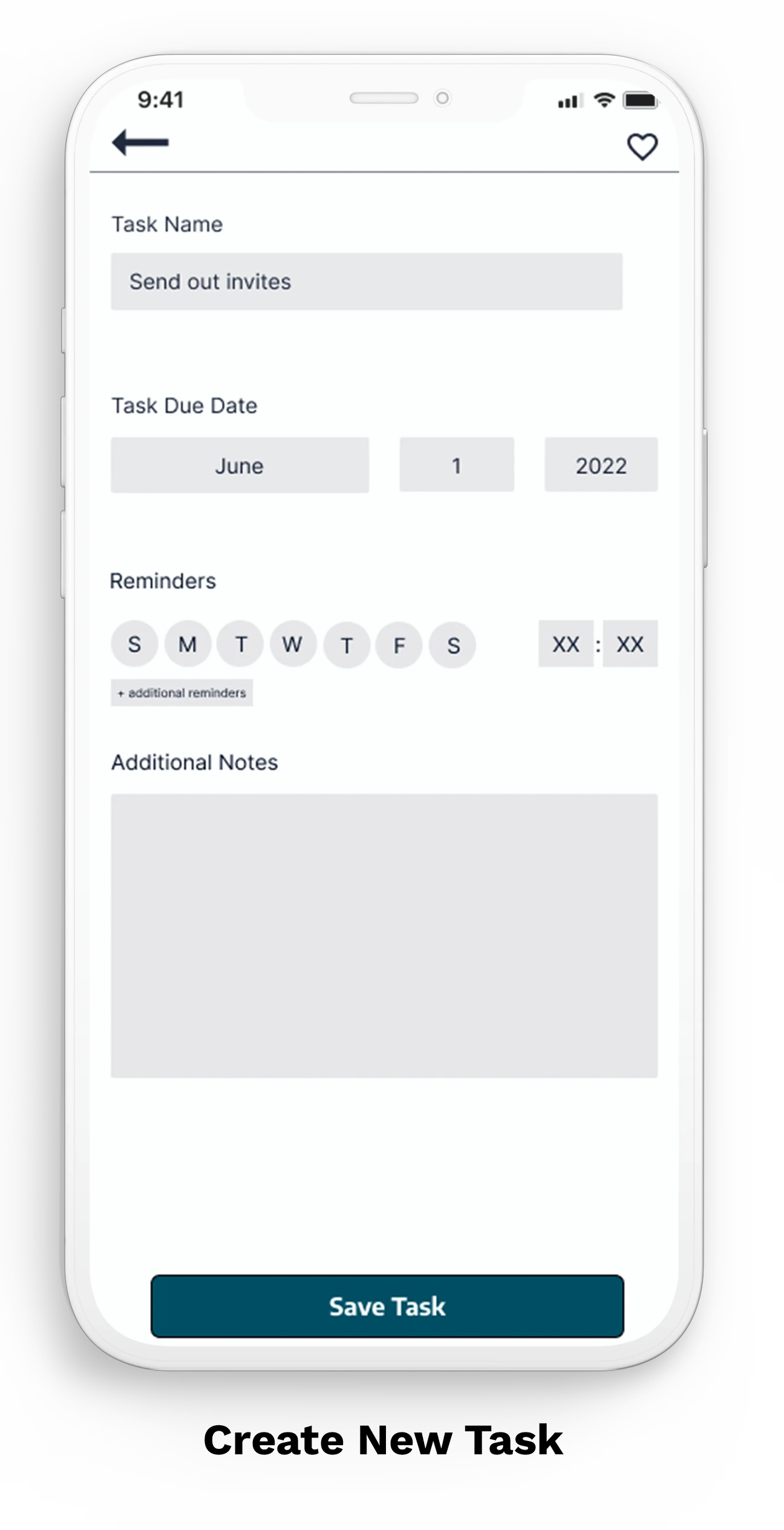
Allow users to plan wedding to-do and shopping lists while tracking progress.
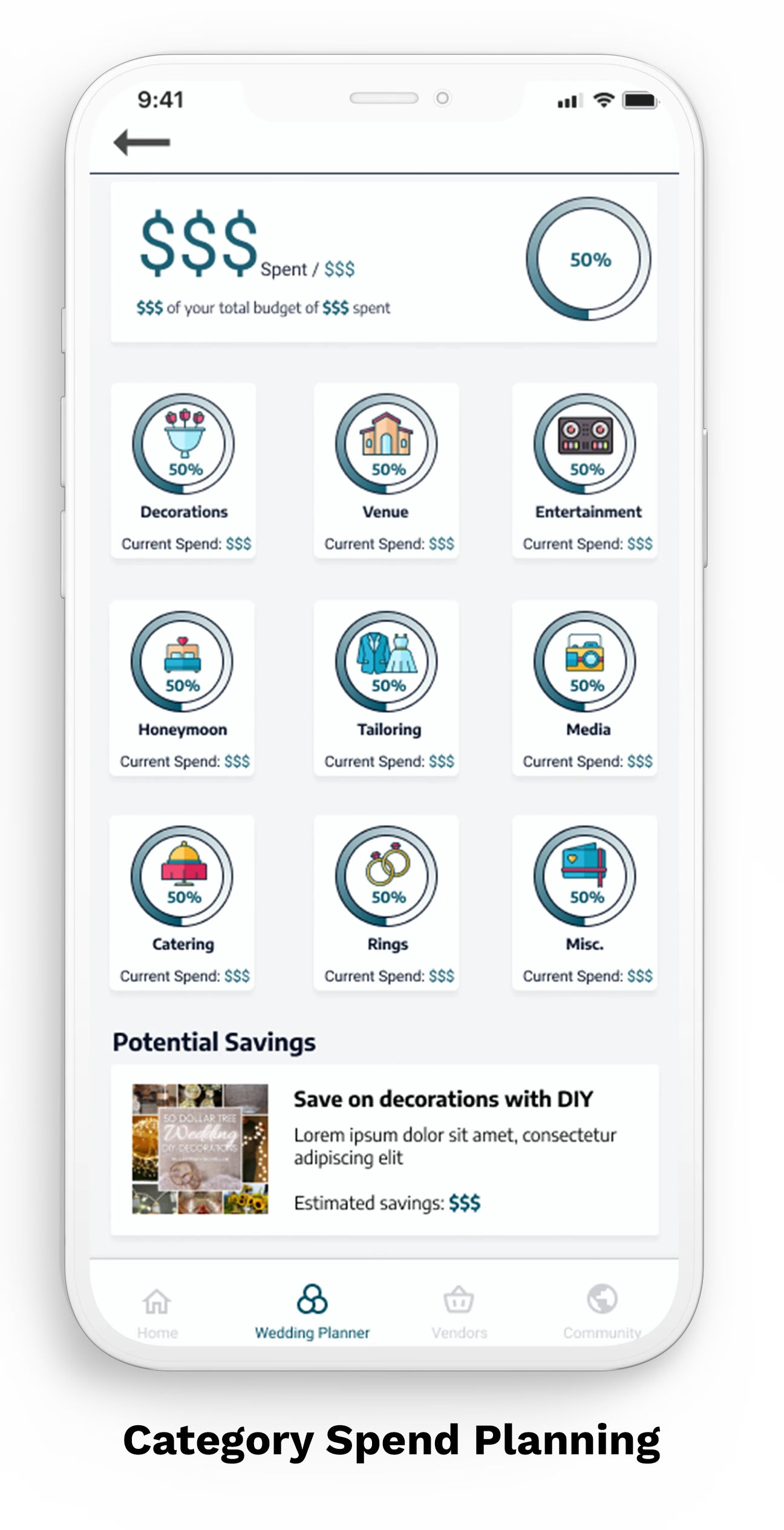
Provide alternatives in areas where users can save money
Shop wedding venues and communicate with vendors all in one place.
A large majority of couples chose their planning method based on budgets (40.9%)*
I began with secondary research in order to understand the process and emotions that people experience along with identifying common user behaviors and experiences with tasks associated with planning weddings. One observation that jumped out at me was that budgeting was the second highest stressor of couples planning their wedding.
The competition did not offer any solutions for users to save money
Based on the research, I analyzed four popular competitors (both direct and indirect) and noticed that only two of the four had budgeting tools. Additionally, I determined that none offer any money-saving solutions. It became my goal to implement a way to suggest alternatives or guides for users to utilize.
Many similar pain points across all interviewees
I interviewed five married individuals who’ve had wedding ceremonies. In order to understand what problems there were and what possible solutions I could offer, I had to understand the process along with the tools and resources that these people used to plan their weddings. My interview questions consisted of questions that helped me understand how they planned the wedding, what tools and resources they used, any challenges they faces, and planning behind their expenses.


Two personas were created based on interviews, target demographic, and accessibility. These personas represent users who are looking to save money and users who don’t mind spending a little extra to make the job easier.


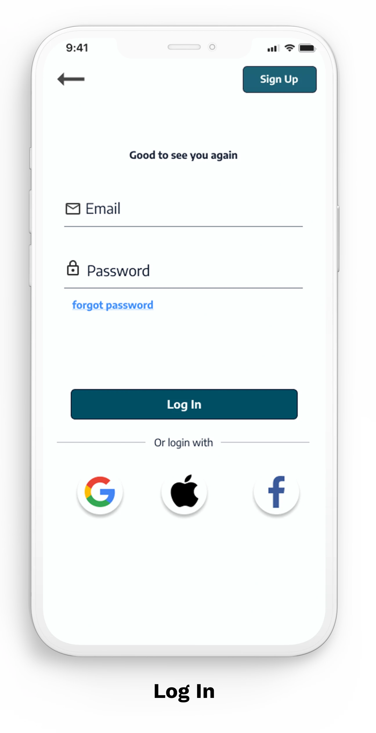
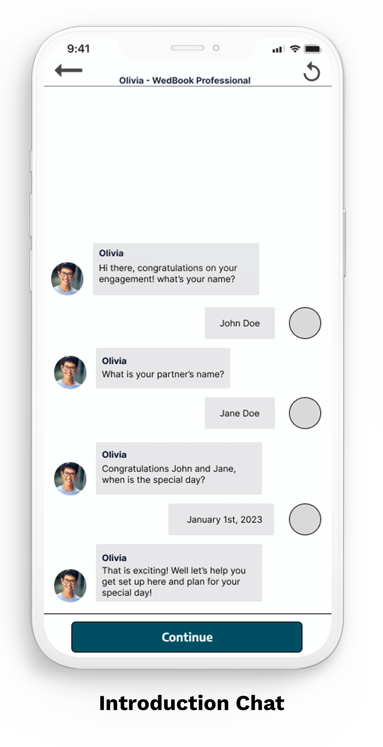
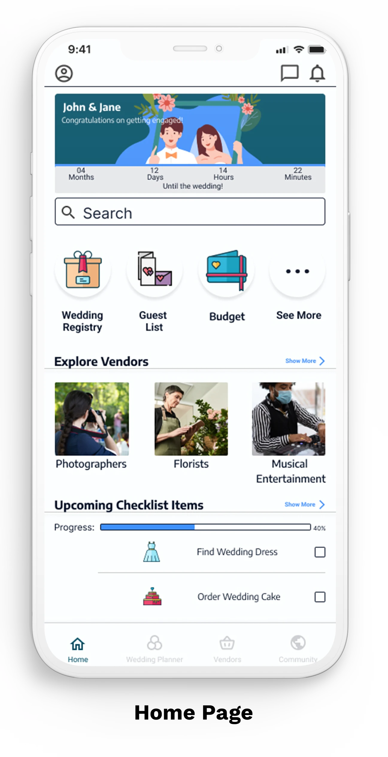
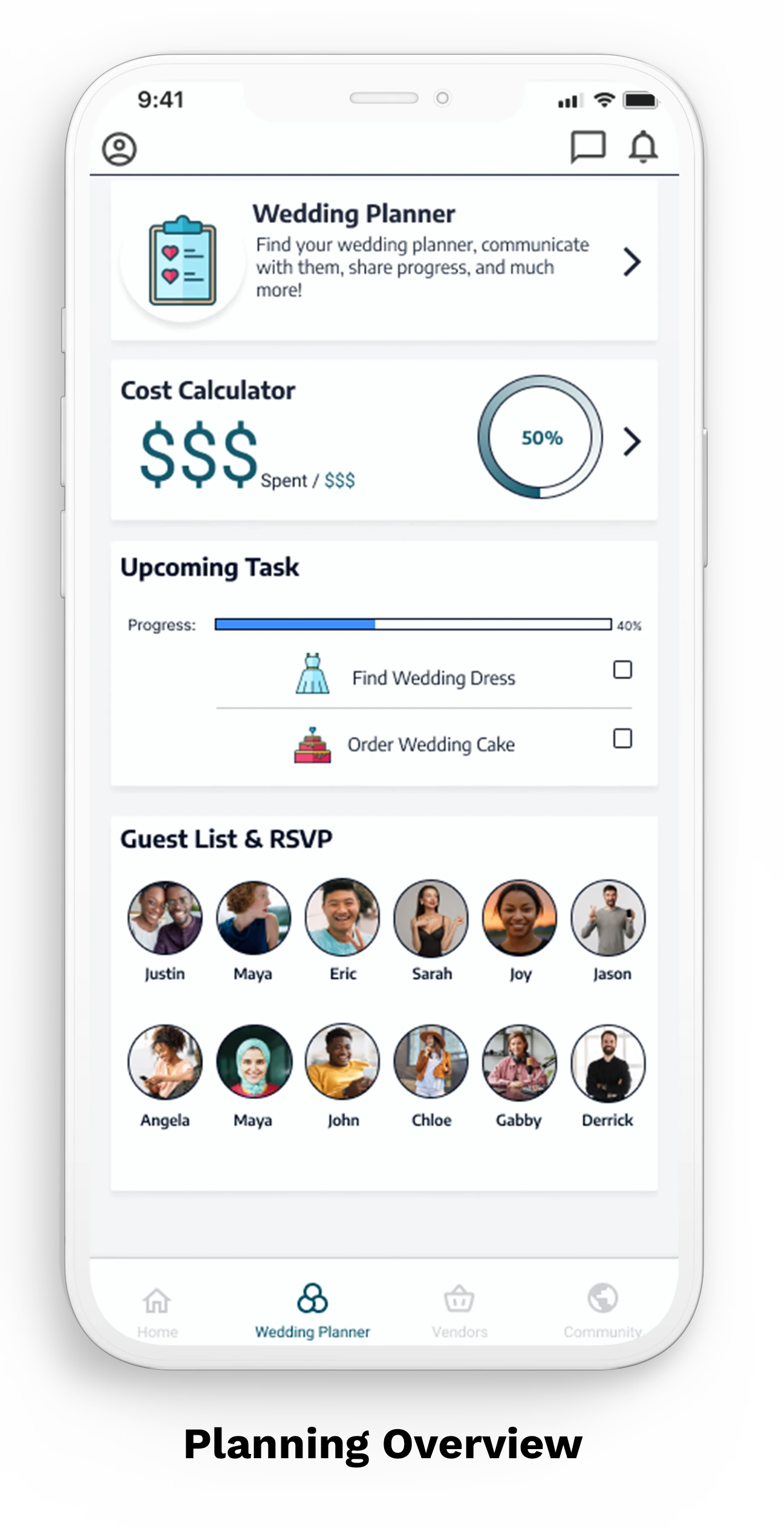
What I’d do differently next time
Stay focused on the bigger picture. I noticed that while I was brainstorming different features of the wedding planning app, I began to just create features that the other competitors had and focused too much of my time trying to make my product match their standard. Instead, I should have used that time to focus on features that stand out from the competitors and iterate on that.
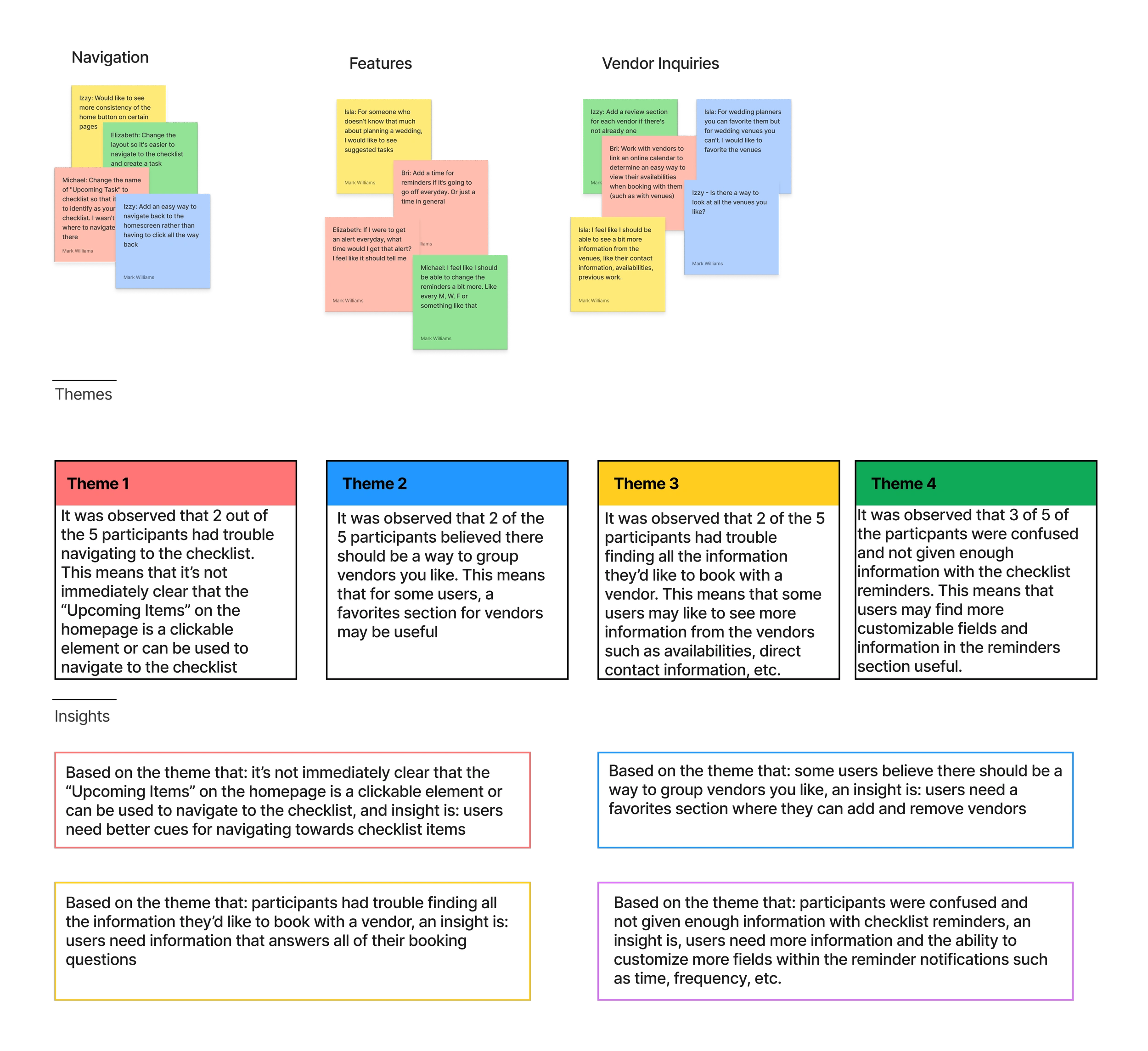
Utilize online resources for user testing. After conducting usability tests with my friends, family, and coworkers… I found online resources that offer free testing based on your account tier. I’d like to test some of these platforms to determine if I can get more in-depth user testing done.
Like this project
0
Posted Feb 5, 2024
This solo student project, completed for Google's UX Design Professional Certificate, tackled the challenge of simplifying the wedding planning process.
Likes
0
Views
5


