Esri Foundational Product: ArcGIS Online Redesign


Introduction
Project Overview
ArcGIS Online is Esri's powerhouse SaaS product, trusted by top-tier organizations worldwide to tackle some of humanity's most complex challenges. We embarked on a mission to modernize the ArcGIS Online overview page and subpages, making them not only visually stunning but also incredibly informative and engaging. The goal? To inspire our audience with the limitless possibilities of ArcGIS Online while providing a clear, concise, and impactful experience.
My Role
As the UX designer on this project, I took the lead in revamping the ArcGIS Online overview and capabilities pages.
Problem Statement/Challenges
Outdated Visuals and Content: The existing pages were bogged down with stock images and outdated graphics, failing to capture the authentic spirit of Esri and the real-world impact of ArcGIS Online.
User Engagement: While the main overview page had a robust 470,000 unique visitors in a year, the subpages lagged significantly, with only 1,000-20,000 unique visitors. We needed to make these subpages as compelling and informative as the main page.
SEO and Navigation Issues: The existing Google ads landing page was counterproductive for our SEO strategy, and users faced navigation issues when signed into an ArcGIS Online organization.
Objectives
Refreshed and Relevant: Update the ArcGIS Online product pages to reflect current capabilities, user types, and licensing. Modernize the design and replace stock photos with original, authentic imagery.
Impressive and Inspirational: Use real-world examples, enhanced UI/UX, and attractive graphics to showcase the global impact of ArcGIS Online and inspire our audience to delve deeper.
Simple and Consistent: Clearly demonstrate how ArcGIS Online fits into the broader ArcGIS ecosystem, highlight key value propositions, and ensure that the capabilities are comprehensively represented.
Criteria for Success
User Engagement Metrics: Increase trial sign-ups, product page sales form conversions, and mailing list form conversions. Enhance traffic on subpages and measure user engagement through UX research and web analytics.
SEO Performance: Improve natural search rankings and increase visits from target markets, international visitors, and non-customers.
Sales Impact: Track sales attributed to the updated web pages.
The Work
Stakeholder Interviews

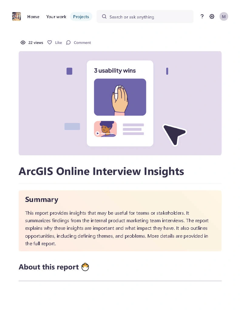
Screenshot of Dovetail board for UX Research Interviews, blurred for privacy.
To kick off the redesign project, we delved deep into the minds of our key stakeholders. Our mission? To uncover the wants, needs, and aspirations of those closest to the product. We conducted engaging internal interviews with product marketers, who provided invaluable insights into the audience, content, and features that would make the ArcGIS Online pages shine.
Data Organization and Analysis
After gathering a wealth of information, it was time to make sense of it all. Enter Dovetail, our trusty tool for organizing and analyzing qualitative data. Here’s how we transformed raw interview data into actionable insights:
Tagging and Highlighting: Each interview was transcribed and meticulously tagged based on common themes such as user engagement, visual preferences, and messaging priorities. The colorful tags made it easy to spot recurring ideas and crucial points.
Creating a Highlights Board: The tagged data was then organized into a dynamic highlights board, which visually showcased the most important insights. This board served as a central reference point for the team, making the data both accessible and engaging.
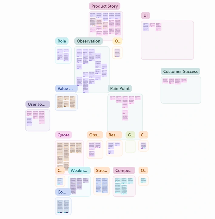
Screenshot of highlight board from UX research interviews
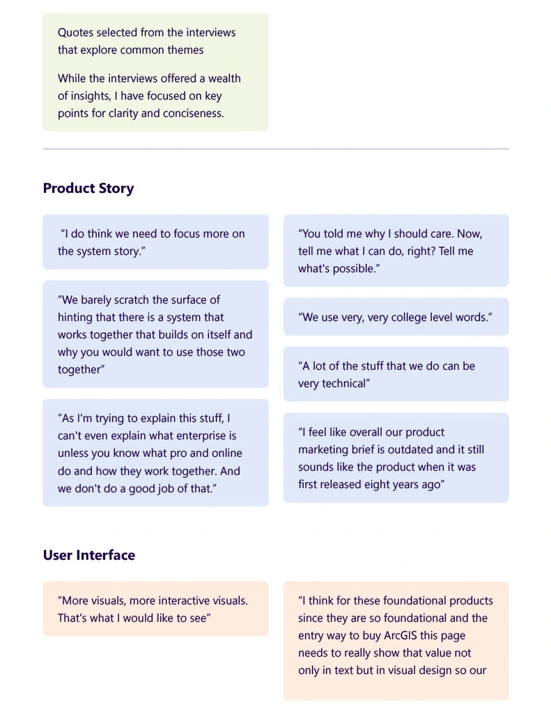
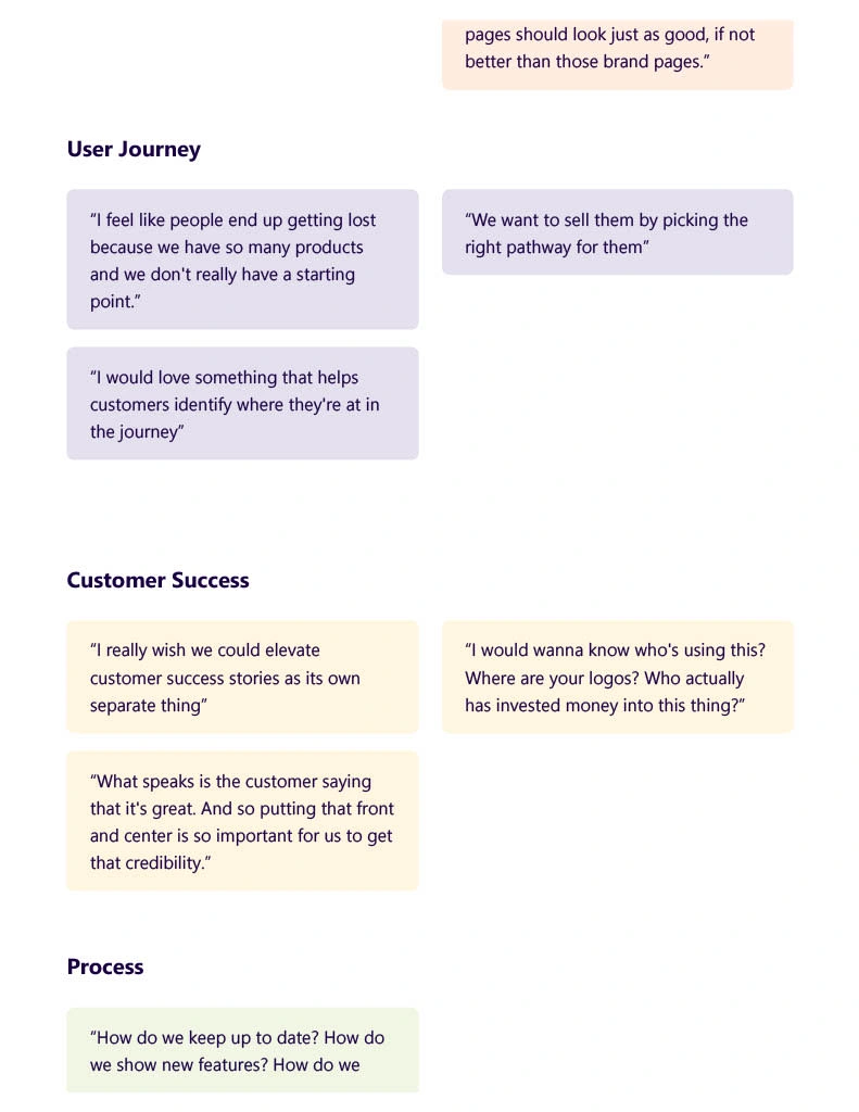
3. Synthesizing Insights: We distilled the tagged insights into clear, actionable themes. These included:
Visual and Content Preferences: What types of visuals and content our audience loves.
User Pain Points: The challenges users face and how our redesign can solve them.
Strategic Messaging: The key messages that would resonate most with our audience.
Presenting to Stakeholders
With the highlights board ready, it was time to share our findings. We presented the synthesized insights to our main stakeholders and UX team leads, making sure to keep things lively and interactive. The presentation included:
A Visual Overview: A summary of the key themes, presented in a visually engaging manner.
Design Implications: How the insights would influence our design decisions, from layout changes to content restructuring.
Interactive Feedback Session: We encouraged stakeholders to provide feedback and discuss their thoughts, ensuring that our proposed direction aligned with their expectations.
The response was overwhelmingly positive. Stakeholders appreciated the clarity and depth of the insights, which provided a strong foundation for making informed design decisions. This collaborative approach ensured that our redesigned pages would not only look great but also meet the needs of our users.
Collaborative Information Architecture
Armed with the valuable insights from our research, our team—comprising product marketers, content creators, and designers—collaboratively crafted the information architecture for the ArcGIS Online pages. This collaborative effort ensured that every stakeholder’s perspective was considered, creating a strong foundation for our design.
Initial Wireframes
With the information architecture solidified, I moved on to creating the initial wireframes. These wireframes served as the blueprint for the redesign, incorporating all the gathered insights and aligning with our design system.
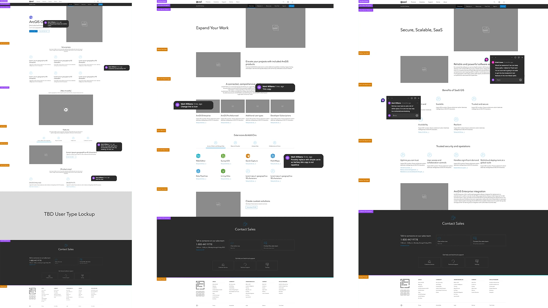
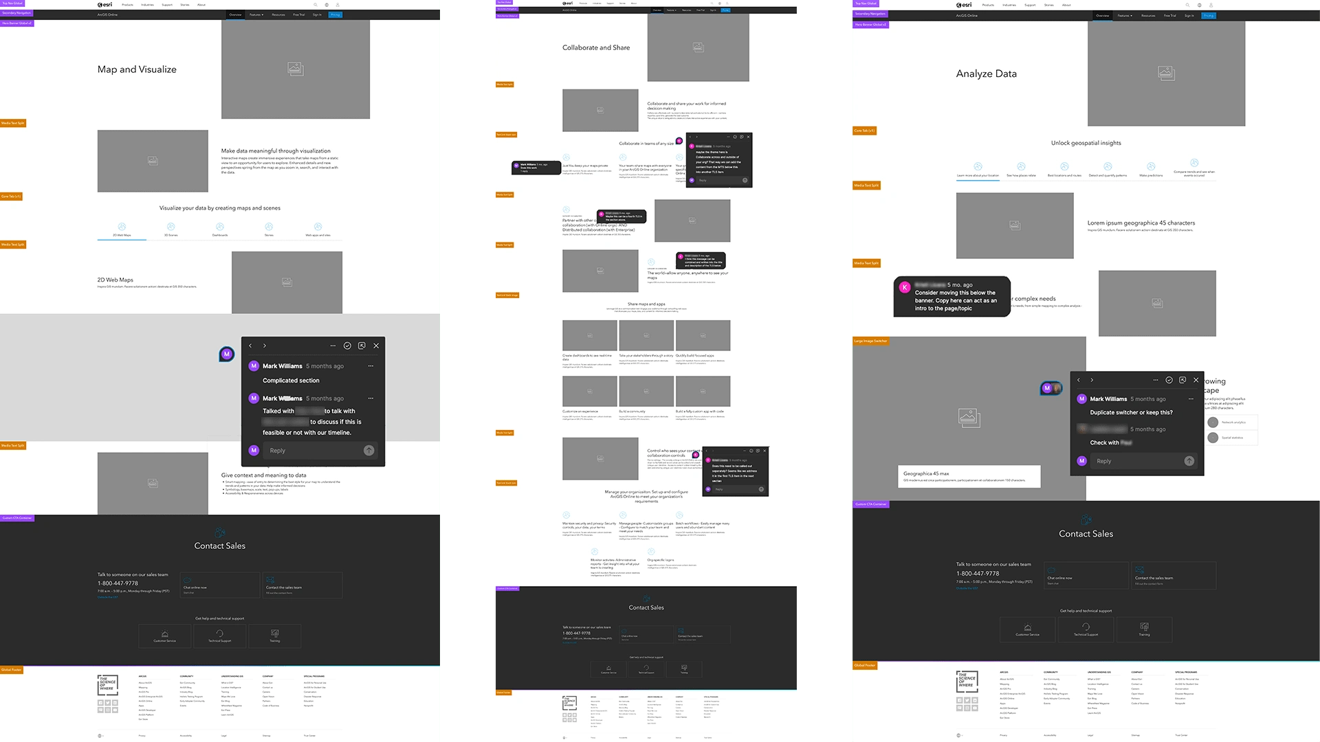
Internal Revisions and Iterations: The wireframes underwent 2-4 rounds of internal revisions and iterations. Each iteration was meticulously reviewed, with feedback loops ensuring that every detail was fine-tuned.
The Finale
Navigating Internal Challenges
Despite our progress, we encountered some internal complications and technical complaints that, unfortunately, cannot be disclosed. These challenges forced us to put the redesign of the subpages on hold temporarily. However, we used this as an opportunity to focus our efforts on perfecting the overview page.
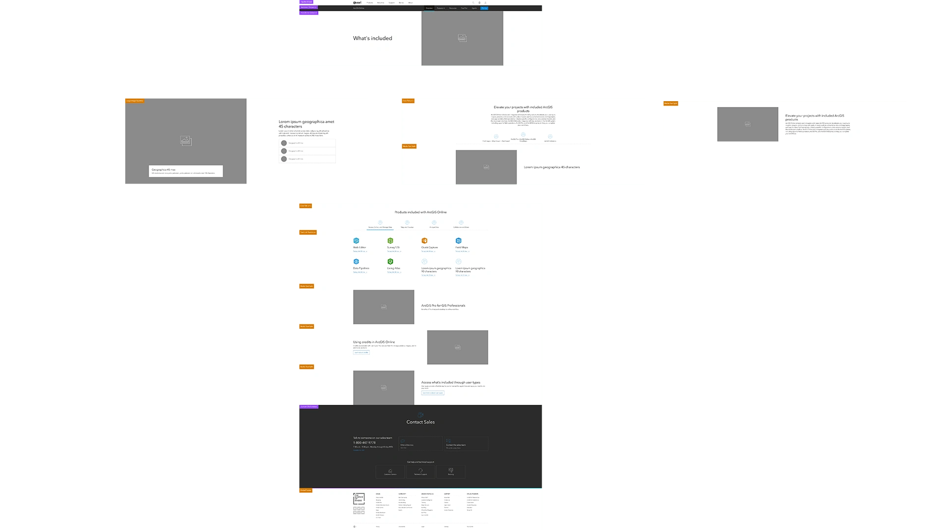
The Final Overview Page
By addressing the most crucial part of the project first, we ensured that the overview page not only met but exceeded stakeholder expectations. This page serves as the gateway to ArcGIS Online, embodying the refreshed, impressive, and user-friendly design we aimed to achieve.
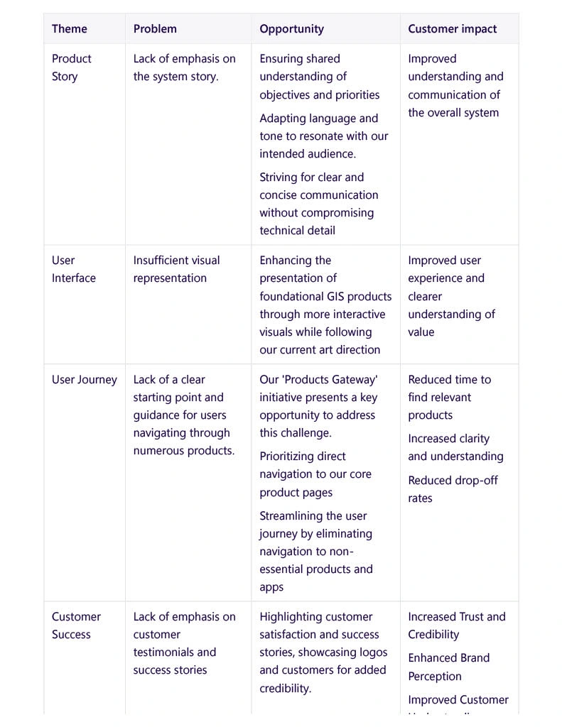
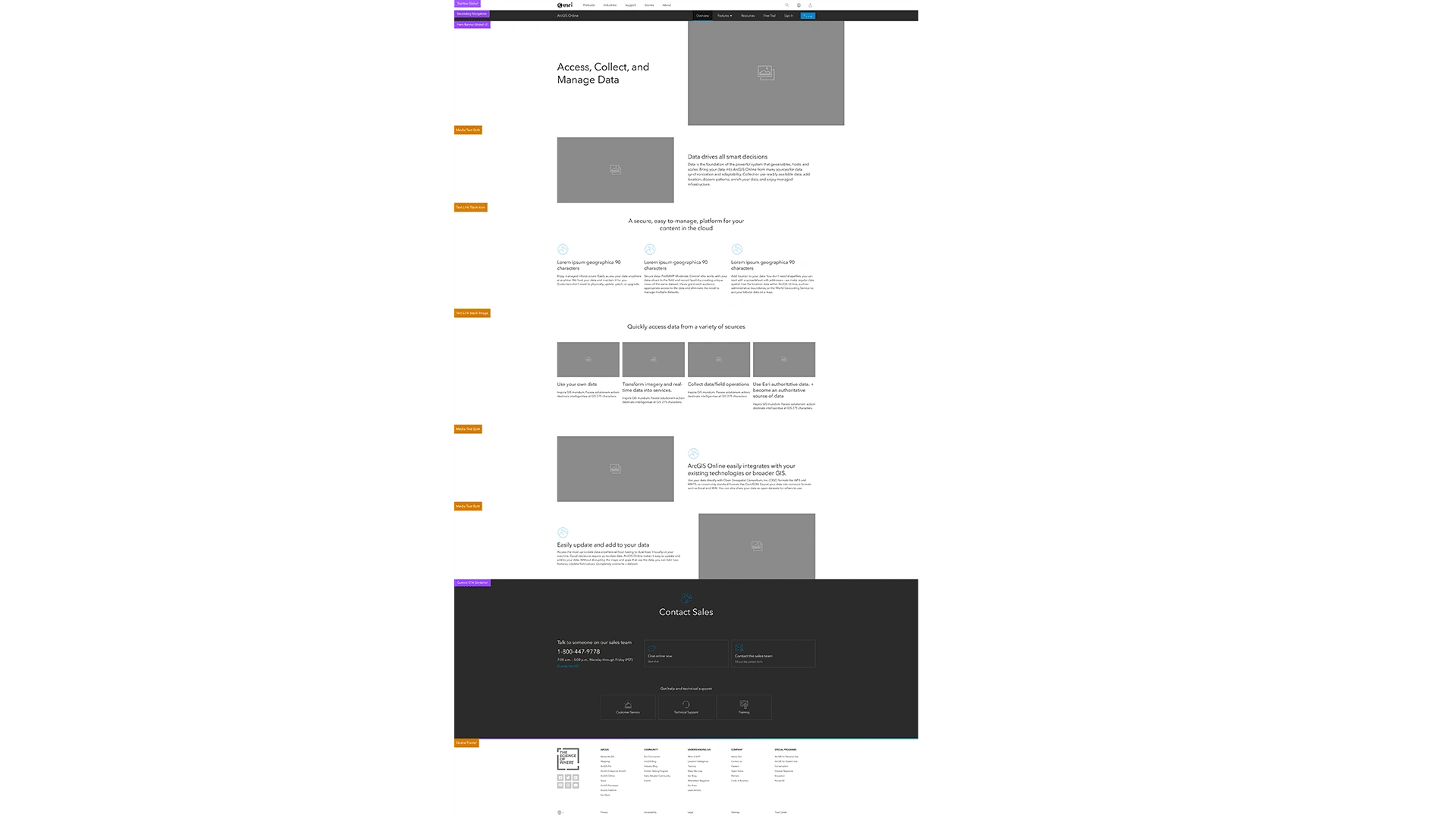
Mid Fidelity Wireframe
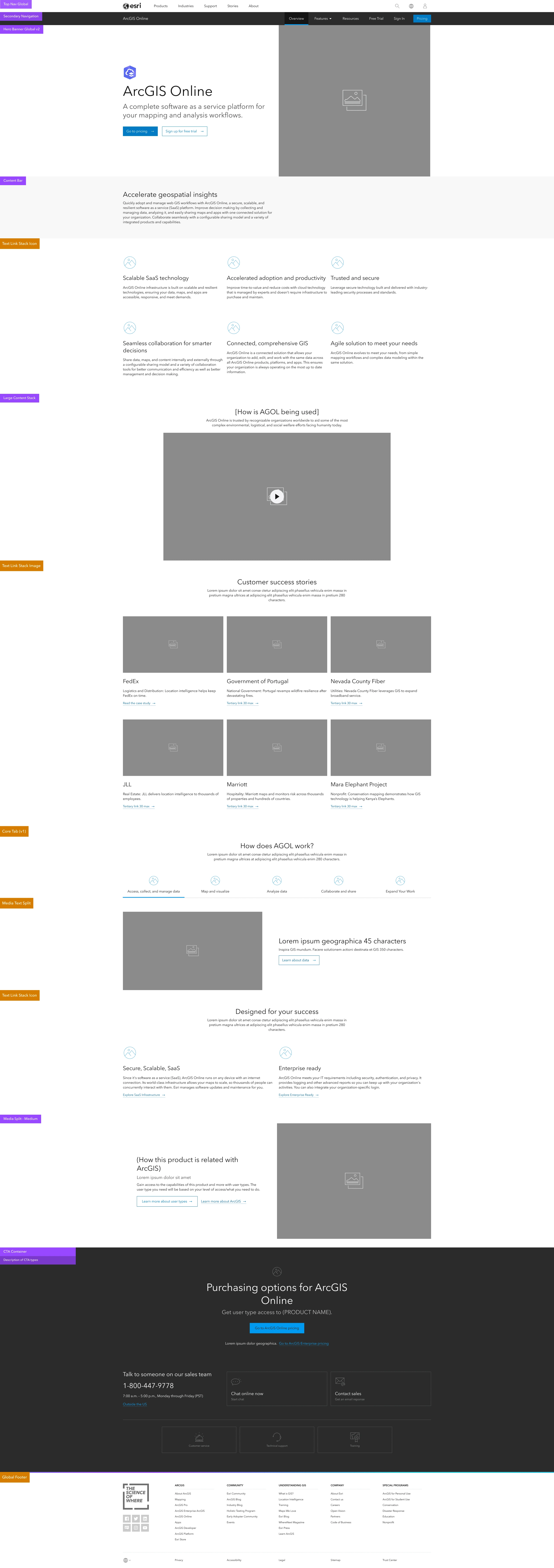
Final Overview Page

This structured approach ensured that our design decisions were well-informed and aligned with the needs and expectations of our users and stakeholders, ultimately leading to a more engaging and effective user experience on the ArcGIS Online overview page.
Like this project
0
Posted Aug 8, 2024
Crafting a dynamic ArcGIS Online page: From research to sleek design, we brought powerful stories to life. Explore our process!


NextSite

Couples often make mistakes while planning for their wedding