Kingston Council
Digitizing Community Support: Creating a Financial Eligibility Checker for Kingston Council
As a freelance UX designer for Kingston Council, I had the opportunity to work on a meaningful project to help residents access crucial resources through a more streamlined, digital process. The Council’s goal was to make it easier for residents to understand and apply for financial assistance, moving away from paper-based systems and bringing these processes online.
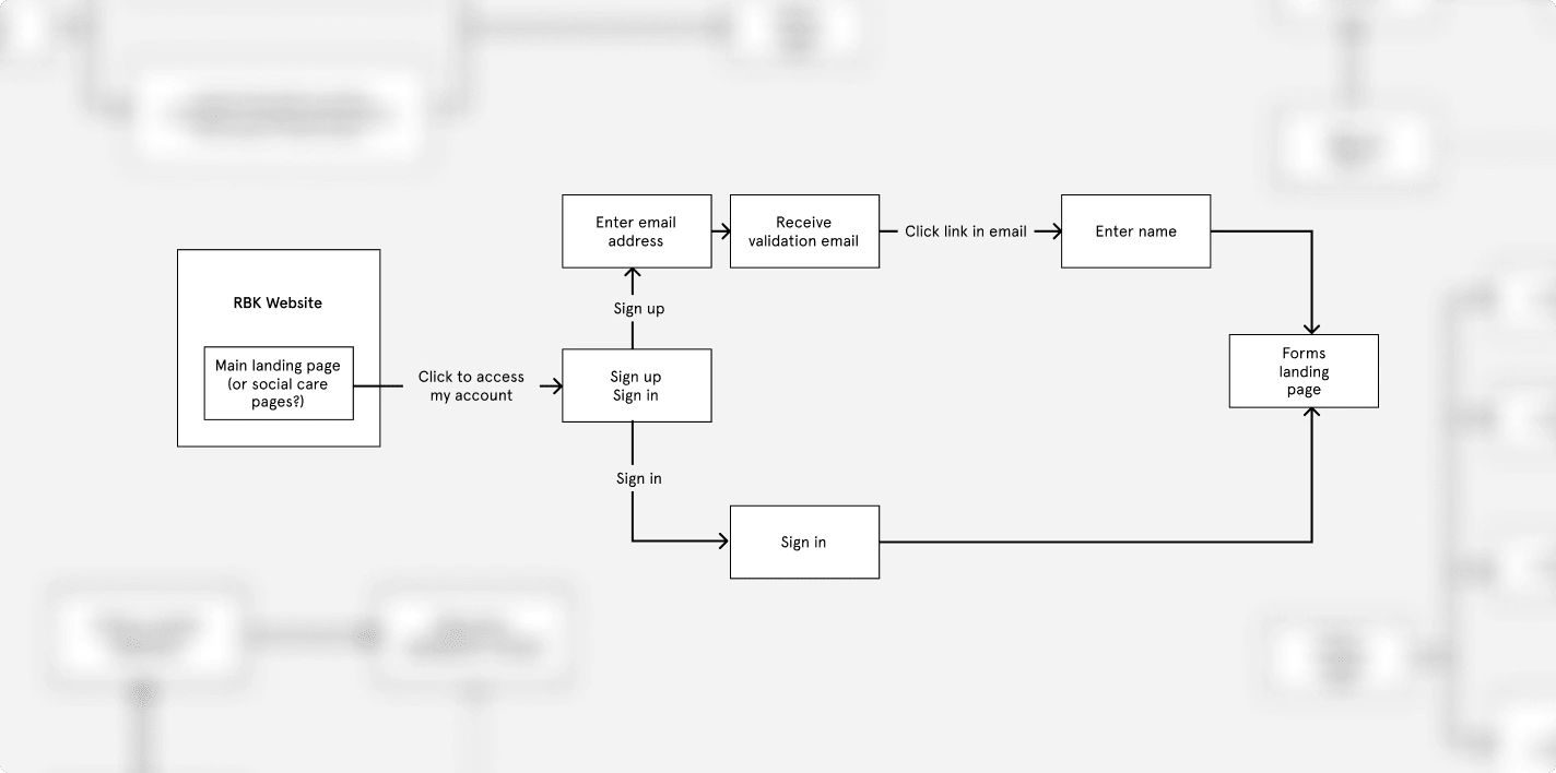
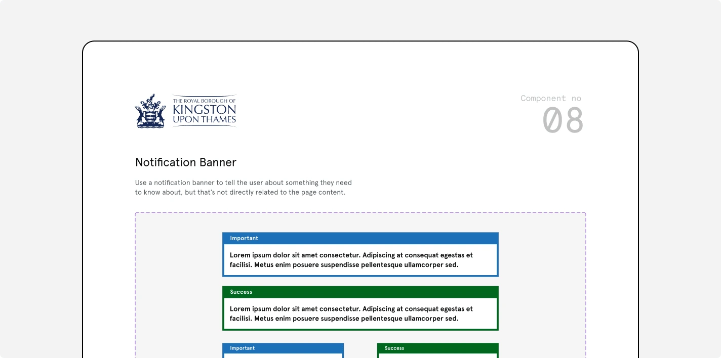
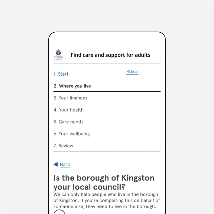
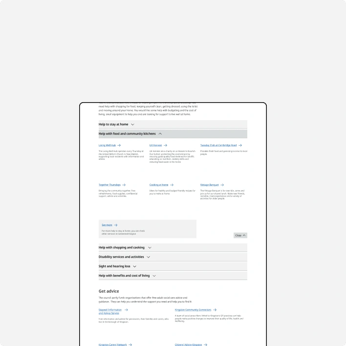
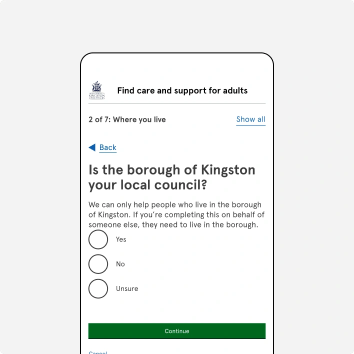
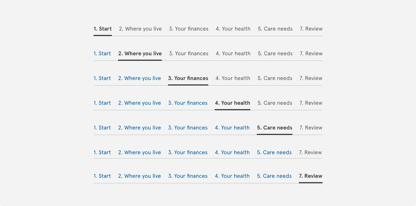
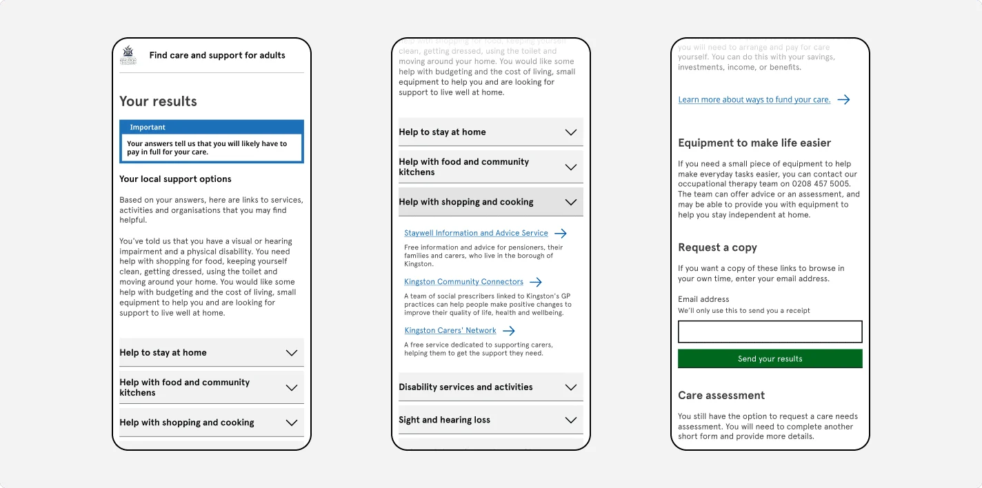
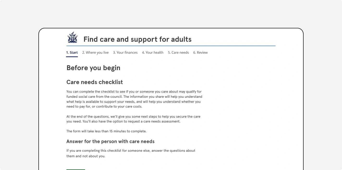
My role was to design a digital eligibility checker—a form that allows citizens to assess their financial assistance eligibility directly from the Kingston Council website. This tool guides users through a set of questions to evaluate their financial needs and, if they’re not eligible for Council funding, connects them with alternative organizations that might better meet their needs.

User-Centered Design Process: Collaboration and UX Methods
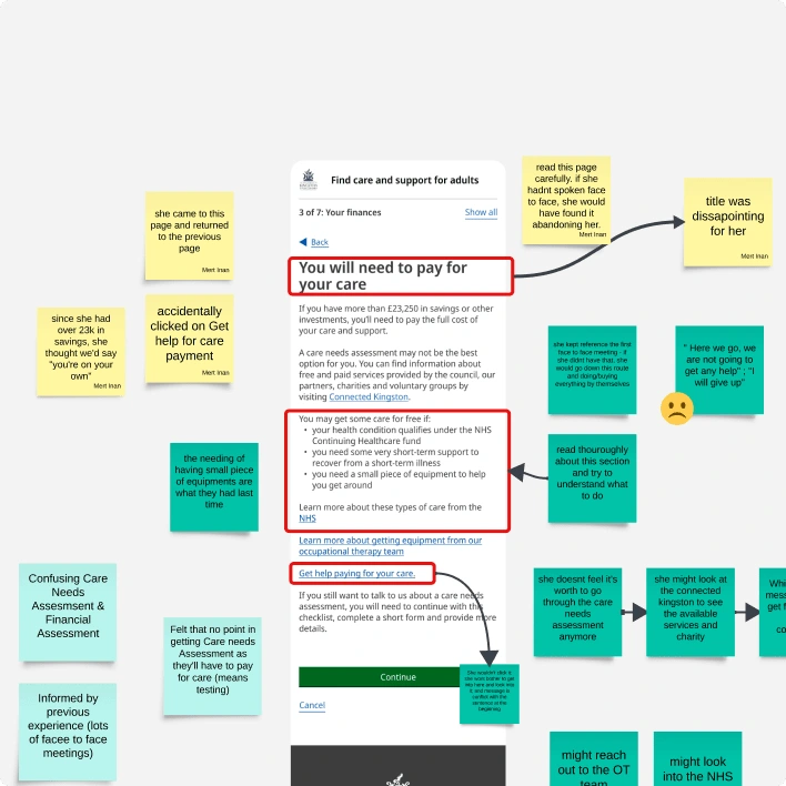
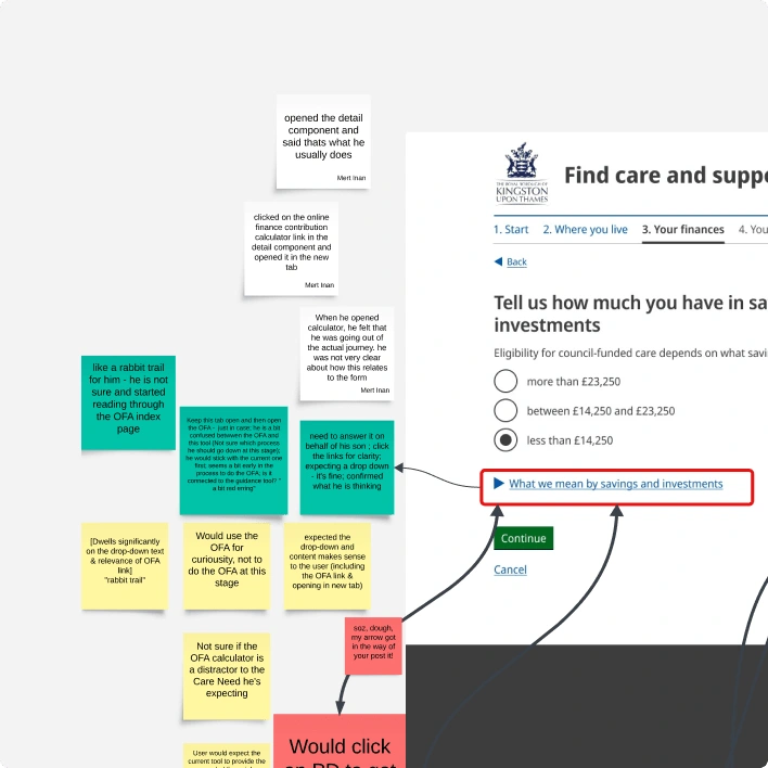
The project was highly collaborative, bringing together expertise from a content designer, a user researcher, and myself as the UX designer. Together, we worked to ensure the form was intuitive, accessible, and user-friendly. I conducted a variety of UX methods to validate and refine the design, including usability testing, focus groups, and card sorting exercises. These methods provided direct insight into the real needs of Kingston’s residents, helping us fine-tune each element for maximum clarity and ease of use.
Impact: A More Accessible Path to Support
Since its launch, the digital eligibility checker has simplified the process for residents, enabling them to quickly determine if they qualify for financial assistance. By removing barriers to access and providing clear signposts to alternative resources when necessary, this tool has contributed to a more efficient, supportive experience for Kingston’s citizens.
Reflecting on this project, I’m proud to have been part of an initiative that not only digitized a traditionally manual process but also brought genuine value to the community. It’s rewarding to see how user-centered design can help make public services more accessible and responsive to the needs of everyday people.
Like this project
Posted Nov 4, 2024
Designed a digital eligibility checker for Kingston Council, making financial aid more accessible and user-friendly for citizens with a seamless online form.
Likes
0
Views
7


